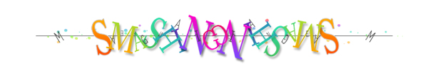
The Big Horizontal Line Archive - Download your <hr> line now!

Email Newsletter
Weekly tips on front-end & UX.
Trusted by 182,000+ folks.
 Register Free Now
 SurveyJS: White-Label Survey Solution for Your JS App
 Celebrating 10 million developers


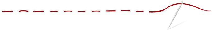
What is <hr />? Basically, it is an old HTML-tag which has been used since the very beginning of the Web. hr stands for the horizontal rule and represents exactly what you would expect — a horizontal line or a horizontal divider. By default, web browsers render hr as a simple horizontal line. In terms of semantics the tag is supposed to clearly separate content blocks. This is often used in design of footers, but also makes sense in other situations — for instance, if you want to separate two blog posts or make the divisions within the content structure sharper.
However, the design of horizontal lines is quite simple and not really appealing by default. HTML offers designers four styling attributes: align, noshade, width and size. This is the reason why designers often use CSS to make hr’s look a little bit more attractive. Alternatively, one can replace hr’s completely with an image using the background-property in CSS.
Some designers consider horizontal rule to be unnecessary — after all, you can simple assign some border styling to the container which contains the block. However, hr’s offer more possibilities as you can do whatever you want with a single, standalone HTML-tag. And here is where our contest comes into play.
Further Reading on SmashingMag:
- Blog Headers For Free Download
- 100 Beautiful Free Textures
- The Definitive Guide To Styling Web Links
- Beyond The Boring: The Hunt For The Web’s Lost Soul
We have encouraged our readers to participate in a contest by designing beautiful and creative horizontal lines. It was necessary, since this design-element was slowly disappearing and was often neglected in web design. But it is going to change now. We have received 1290 images and source-files from 384 designers across the globe. The result is an impressive collection of horizontal lines that designers can use for free without any restrictions whatsoever.
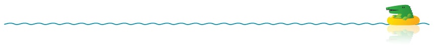
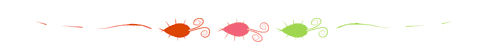
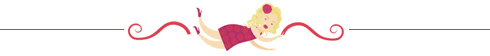
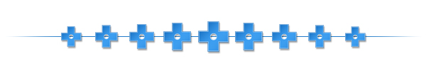
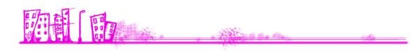
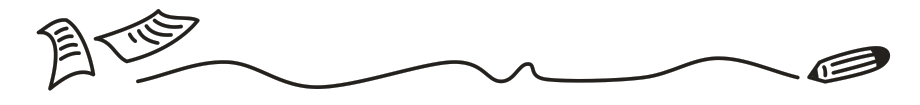
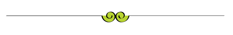
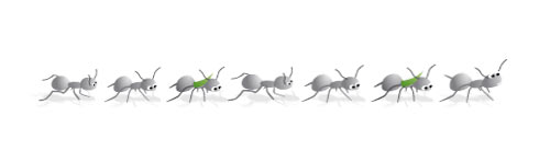
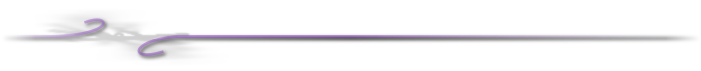
Here is the BIG Gallery of <hr>-Graphics. Some ideas were more popular than the other ones. For instance, a zipper, flowers and ornaments, pencils, Pac-Man, birds, scissors. You can see almost everything from geometrics designs to oriental designs. Our smashing readers show that even a small tiny line can become a piece of art.
For some users it may be too much, but here the idea counts most. And you can use as a starting point for horizontal lines in your projects. Or you can use some minimalistic designs. Most designs were black/white, and few of them were pretty colorful.
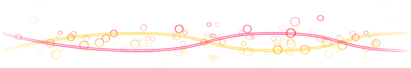
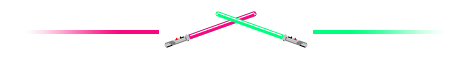
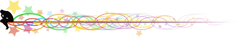
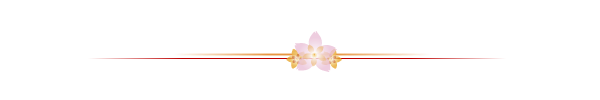
Colorful Lines
Andrea Baroni Ideas under the design: mmm….well…starting from a pencil sketch I then created the vectors in Illustrator and refined them in Photoshop.

Johannes Aagaard
Ratko Horvat
Lewis Keogh “Igloo eyes” - Odd alien type eyes that resemble mulitcoloured igloos. Could be adapted to match the colour scheme of a site/blog.
![]()
Ray Pham
![]()
Lewis Keogh “Noah’s arc” - As the name suggests.
![]()
Sandeep Singh

Isfahan Ashraf
![]()
Darren Northcott

Darren Northcott
![]()
Johannes Aagard
The ideas behind my 3 designs are mainly fresh and happy colours, while I love fresh colours. And I’m sure lots of other also does. But also 2 of them are a little unusual, and would fit nicely in a creative blog (in my opinion)
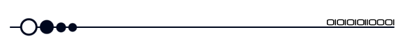
Jehzeel Laurente I love to experiment and explore the astounding features of Photoshop. In my green hr entry, I tried using pen tool to create bent vectors and combine it with other objects to see what’s the outcome. In my black entry, I just tried to make it simple and elegant by creating circles, lines and label it with binary code. I think it looks boring but it’s simple and clean, perfect for websites and blogs that want simple and clean horizontal divider.

Jehzeel Laurente
Jehzeel Laurente

Cameron Queen
Jade Gordon
I was eager to try out some recently learned techniques in Photoshop. I’ve been falling for patterns and textures, and fine brush details.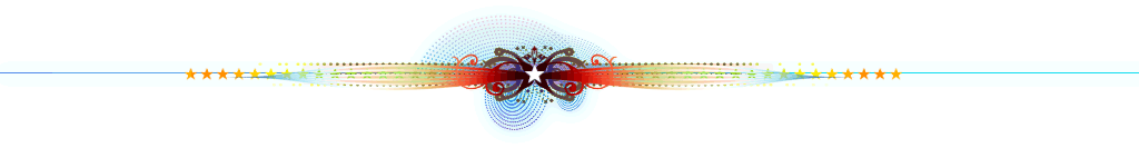
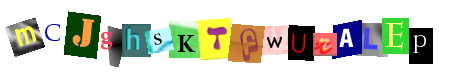
Heather van de Mark HR Ransom - Cutout letters create an hr divider that is funky and original. It is an array of colors and yet they all complement each other. This is definitely for an alternative blog/web site with humor and edge. I created multiple different backgrounds with jagged edges, so it looks as if they really came from the printed page. The graphic can easily be manipulated to cut the divider to make it longer or shorter or to rearrange the letter order. I didn’t want it to spell anything because that would be distracting.
Abhijit Sagade
I have tried to relate HR with real life observations and have tried to create simplistic visuals out of those ideas.
Abhijit Sagade
Joel Lueck
Alistair Symonds

Mihai Petica
![]()
Vincent Fromaget
Carina Kornowski

Yann Guerin
Olivier Courbet
![]()
Jeronimo Strehl This is a shoooooooooooooort break.

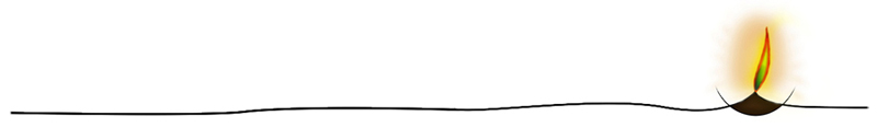
Manasa Malipeddi (the lamp) The idea of this lamp sprouted out of my own wishful thinking. I always wished (and still do) that I had better stuff to write about in my blog; posts that would enlighten somebody, and that is how I thought of a lamp representing enlightenment.
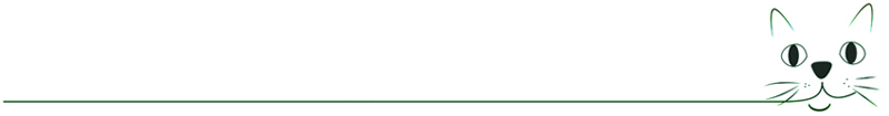
Manasa Malipeddi (the cat)
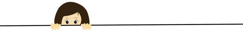
Manasa Malipeddi (the frightened girl) This was what I wanted to do when I realised that my new haircut looked aweful - hide behind a divider!
Manasa Malipeddi (the knot)

Dennis Meene

Dennis Meene
Ray Pham
![]()
Geo Sukarno

Priscilla Louzada
Guilherme Baiao
Guilherme Baiao

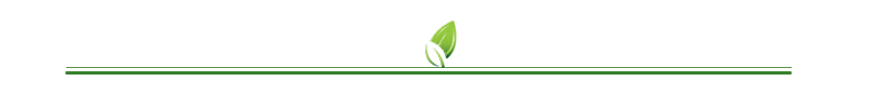
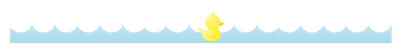
Ardy I have designed the HR keeping in mind the theme of nature and subtle relaxing ideas (duck in water, clouds, leaves, etc). I feel that these break the monotony of using typical HRs with straight lines. The colors used are also soft and comforting to the latest in designs. I hope you like them. We might plan on making use of the ‘cloudy HR’ within our own website which is currently undergoing major revamping. You can see a general design idea at www.anautix.com/v2
Vlad Mocanu

Ardy
Livia Radvanski
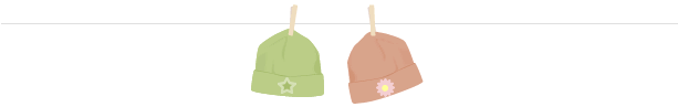
Reginald Balanga a set of hr graphics with a theme of “Baby’s Clothesline”. Inspired by my 1 year old baby boy. The graphics are in png format and is best used with white background.
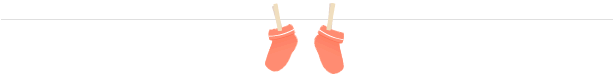
Reginald Balanga
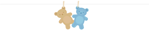
Reginald Balanga
Andrea Baroni

Peter Dzaluk
.jpg)
Peter Dzaluk
.jpg)
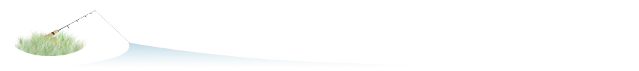
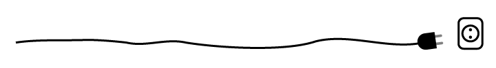
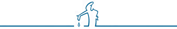
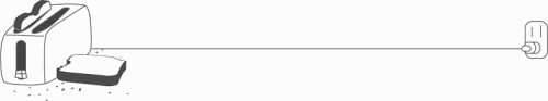
Fabienne Curty A power cable desperately reaching for its plug.

Ardy I have designed the HR keeping in mind the theme of nature and subtle relaxing ideas (duck in water, clouds, leaves, etc). I feel that these break the monotony of using typical HRs with straight lines. The colors used are also soft and comforting to the latest in designs. I hope you like them. We might plan on making use of the ‘cloudy HR’ within our own website which is currently undergoing major revamping. You can see a general design idea at www.anautix.com/v2

Milan van Bruggen For the creatives: A colourful ruler with crayons.
![]()
David Laplante
Valeria Kuzminska
Valeria Kuzminska
Johannes Aagaard
The ideas behind my 3 designs are mainly fresh and happy colours, while I love fresh colours. And I’m sure lots of other also does. But also 2 of them are a little unusual, and would fit nicely in a creative blog (in my opinion)
Kyle Theisen All of the designs were inspired by CMYK - nothing more, nothing less. I wanted to create something very simple, yet modern and fun.
![]()
![]()
Steve Lam

Ross Cooper

Ricardo Mestre

Tamer Yilmaz
![]()
Playing with
…
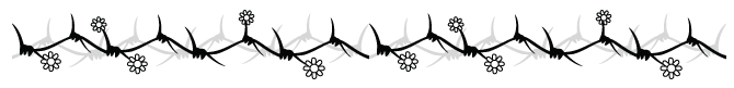
Some designers decided to use classic motifs.
Milan van Bruggen
![]()
Nathan Lyle
![]()
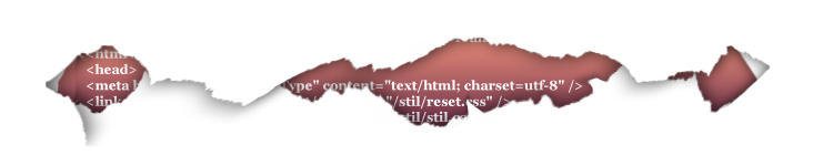
Björn Rohles After doing some research on web standards, I was surprised that none of the sites I found actually included code to create a visual representation of the topic of “web standards”. I imagine it would be easy to work with the text used to code a site for design purposes (for instance, using the text “div” in the background of divs). This hr is a start to realize this approach.
![]()
Dariusz Rusin
![]()
Vernon Kesner Driving force behind this idea was actually was a recent quarter (I think it was a quarter) I saw. On close inspection, there was actually inscription going around the outer ridge of the quarter. I actually think these turned out really cool.
![]()
Vernon Kesner
![]()
Ricardo Mestre
Vane Kosturanov
![]()
Mark MacDonald
![]()
Drawn Lines
Priyadarshi Kunal
Chris McLeod

Yiyi Zhou I’ve always like hand-drawn designs with lots of color. The first two are meant to look somewhat like beads on a string, and the second two are just meant to be fun designs of an owl and snails.

Yiyi Zhou

Jehzeel Laurente My pink entry was inspired with pink dirty-like brushes and cartoony buildings. My blue entry was inspired with simple blue lines in different thickness to make it look stylish, simple and creative. And my last entry was the orange arrows from splashed paint. This entry was some kinda accident. I just played around with the paint splatter brush then suddenly arrows appear in my mind and I included it.. and… I’m somewhat satisfied of the outcome.
Vernon Kesner Driving force behind this idea was actually was a recent quarter (I think it was a quarter) I saw. On close inspection, there was actually inscription going around the outer ridge of the quarter. I actually think these turned out really cool.

Vernon Kesner

Sandeep Singh
Stig Greve
![]()
Dominik Felber

Dominik Felber

Eric White
Brian Litzinger I didn’t have a lot of time to invest in making these HRs, so the first idea that came to mind is what you see. I have no clue if this has been done before…

Brian Litzinger

Brian Litzinger

Abhijit Kumar
Prijadarshi Kunal
Prijadarshi Kunal
Jeronimo Strehl No, this isn’t the end - just a little break…

Jeronimo Strehl Ok - this is the end, the post is finished - so, get unppluged and go outside.
Cheng Kam Wang

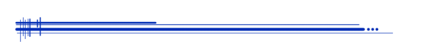
Thin Lines
These ones can be used for body copy.
Eva Hellmann
![]()
Eva Hellmann
![]()
Christoph Bach

Zsolt Kocsmarszky

Christina Böhme

Petar Pavlov
![]()
Christoph Bach

Cameron Queen This is just a design I’ve been playing around with for my own site and thought I’d interpret it for this competition as it’s an avenue I haven’t explored with my ‘donut’ graphics until now.
Arthur Rehm

Aren Lavilla

Vane Kosturanov
![]()
Nour Malaeb Equalizer: Another musical-themed design for a more minimalist blog.
![]()
Nour Malaeb Moustache: Just a fun design for hair-themed blogs, or perhaps a blog for gentlemen. Or the Monopoly guy.
![]()
Amer Aidi
![]()
Dariusz Rusin
Dariusz Rusin
Black & White
Jehzeel Laurente I love to experiment and explore the astounding features of Photoshop. In my green hr entry, I tried using pen tool to create bent vectors and combine it with other objects to see what’s the outcome. In my black entry, I just tried to make it simple and elegant by creating circles, lines and label it with binary code. I think it looks boring but it’s simple and clean, perfect for websites and blogs that want simple and clean horizontal divider. My pink entry was inspired with pink dirty-like brushes and cartoony buildings. My blue entry was inspired with simple blue lines in different thickness to make it look stylish, simple and creative. And my last entry was the orange arrows from splashed paint. This entry was some kinda accident. I just played around with the paint splatter brush then suddenly arrows appear in my mind and I included it.. and… I’m somewhat satisfied of the outcome.
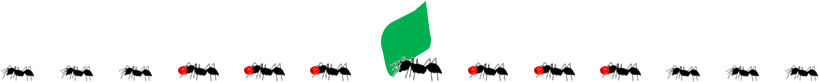
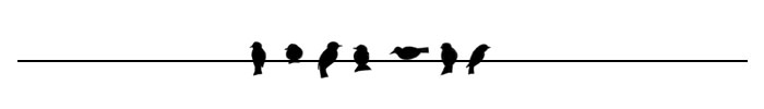
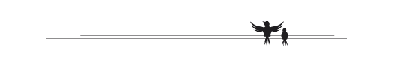
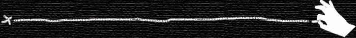
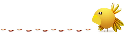
Wojciech Slowacki The birds sitting on a wire are a common sight when you travel between one place and another, so you can say the image of birds separates different places. That’s why I thought it could also separate content as a <hr /> background
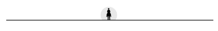
Wojciech Slowacki A cowboy riding off into the sunset - thats a good scene for an ending, so I thought it would be a fitting image for an ending of a post on some blog.
Nathan Lyle
![]()
Alistair Symonds
![]()
Richard Stellmach
Vlad Mocanu The general ideea of my images is a modest desire to reinvent the magic of 2D geometry. We live in a world that has forgotten the place it rose from … unfortunately …

Dennis Meene
Jon Lucas
![]()
Nathan Kelly

Dominik Felber

Vane Konsturanov While I was reading the <hr/> contest post on Smashing a couple of ideas came on my mind. This is what came out.
Marcin Dembek

Michael Koloch A tribute to osvaldo cavandoli’s “la linea” cartoon i watched since i was 3 or 4 years old.

Loveena Rayan
![]()
Emanuel Felipe

Anggun Pribadi
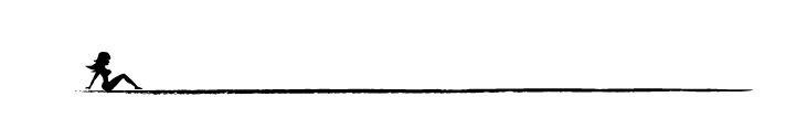
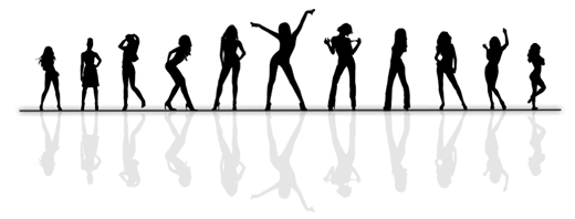
Amber Slooten The reason I created a <hr /> like this, was because I personally like silhouettes of women. I thought it was a lot of refreshment. There wansn’t really any inspiration source: It just hit me.
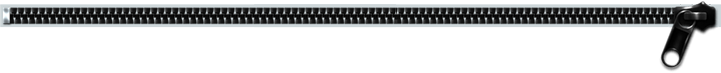
Jens Fiedler The first designs was forced through an old Mockup for my own portfolio, i liked the idea of usual things for the website functions, so i wanted to make them all look “real”… and the contest, reminds of it, so i made an zipper to make an remindable hr graphic.
Olivier Courbet

Andrea Baroni Ideas under the design: mmm….well…starting from a pencil sketch I then created the vectors in Illustrator and refined them in Photoshop. This three themes are pretty naturalistic and on the cute-side I think… Nothing so risky in the end, but I hope enjoyable and unusual.
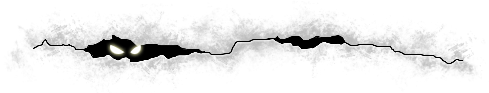
Fabienne Curty A horizontal crack in a wall, with a pair of scary eyes staring out - this <hr /> would fit into grungy layouts.
Fabienne Curty A horizontally torn paperstrip that’s being held together by staples and clips - this <hr /> would fit into papery layouts.
Sonali Vora

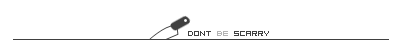
Jim Hargreaves Elegance meets wit…a classic design for journalistic blogging.
![]()
Jim Hargreaves
![]()
Jim Hargreaves
![]()
Jim Hargreaves
![]()
Stephan Hilbelink
![]()
Stephan Hilbelink
![]()
Daan Weijers
![]()
Giacomo Boccardo
![]()
Ehren Harber

Ehren Harber
![]()
Mario Santos My inspiration on the firts model/set is to have an end identifier on each part of site/text, nothing like a bar code.

Mario Santos

Abstract and Creative Ideas
Was nicht in die vorigen Rubriken passte…
Cornelius Dorgan
![]()
Lewis Keogh “Contemporary bubbles” - Witches cauldron with a modern twist.
![]()
Lewis Keogh “What now” - Working along the lines of, now that the article above has finished what is to follow - as if a line hr break could think.

Rob MacKay
![]()
Casey Smith

Elena Plyusnina
![]()
Gavin Steele My clean and simple designs…. its about the content, as a decoration the Hr should not draw the eye away from the content.
![]()
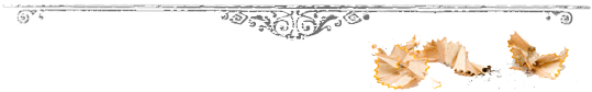
Tiffany Pilgrim This a play-off of the classic ornate divider, but this time hand sketched and with the pencil shavings left behind.
Zivko Condiv
Francesca Culatti
![]()
Francesca Culatti
![]()
Abhijit Sagade
I have tried to relate HR with real life observations and have tried to create simplistic visuals out of those ideas.
Abhijit Sagade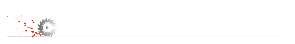
Ratko Horvat
Dennis Meene

Ratko Horvat
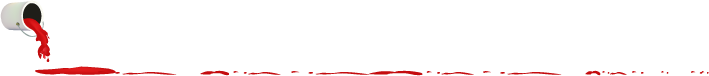
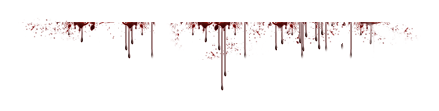
Tobias Goth So what drove me to do make this blood dripping <HR>? My addiction with the Showtime tv-series Dexter of course. I’m a sucker for the intro that rolls at the beginning of every episode. Here’s my adaptation of it into a horizontal ruler.
Alex Holt Is a background image that should be right aligned… Subtle, stacked paper design to break the page elegantly.
![]()
Tammy Hart
![]()
Tammy Hart
![]()
Vane Konsturanov
![]()
Vane Konsturanov
![]()
Vane Konsturanov
Lance Gililand

Lance Gililand
![]()
Aren Lavilla

Ehren Harber

Nathan Kelly

Regina Silva
Rubens Cantuni
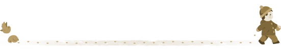
it’s inspired by the fable “Le petit poucet” bu Charles Perrault. This lil kid leaves pebbles behind is walk to find the way back to home, until one day he can’t find any pebbles so he left crumbs, but birds ate them all…

Rubens Cantuni a ninja running fast leave a trail of dust behind him

Rubens Cantuni realistic tear repaired with sticky-tape and staples.
Charles Bamam
![]()
Guilherme Baiao
![]()
Guilherme Baiao

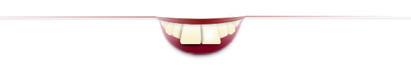
Katya Shulzhenko Text-style divider says “this is the end” without using brain

Stephan Hilbelink
![]()
Fouad Badawy
![]()
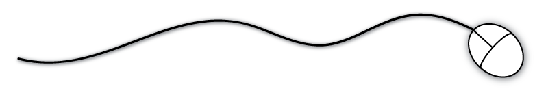
Alex Souto My theme for the competition is the mouse! This terrible but necessary element of those working on the computer.
![]()
![]()
Prijadarshi Kunal
Sergio Ruiz

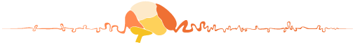
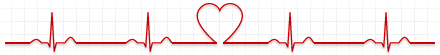
Fabienne Curty ECG - The typical ECG measuring curve, spiced up with a cute heart in the center.
Carina Kornowski
Anne Douglas
![]()
Anca Holostencu During the creation of the HR lines, I thought about fluid shapes and a subtle blending in the overall page design. The lines are meant to incite the reader and make her/him complete the nice feeling regarding what she/he read so far and continue with the next chapter.
Victor Fedyuk
Joro Yordanov
![]()
Ardy I have designed the HR keeping in mind the theme of nature and subtle relaxing ideas (duck in water, clouds, leaves, etc). I feel that these break the monotony of using typical HRs with straight lines. The colors used are also soft and comforting to the latest in designs. I hope you like them. We might plan on making use of the ‘cloudy HR’ within our own website which is currently undergoing major revamping.
Maria Paula Figueroa
![]()
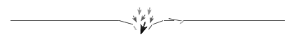
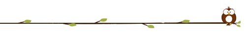
Adrian Pauly hr-branch was more of a decorative approach, taking the usual decorative squiggles as a parting point, but rendering it as a much more natural organic element.

Mihai Petica
Thank you!
We would like to express sincere gratitude to each of designers who participated in our contest! Further contest are already on their way. Please stay tuned.
So who is the winner of the contest?
We selected 25 designs which we liked most. Of course, the choice is subjective, but we had to choose the best ones. Please don’t feel angry if you have some other opinion.
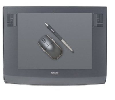
Each design has a number assigned to it. Everybody can vote for his or her favourite design. You decide who is the winner of our contest and who will be awarded with a Wacom Intuos3 9X12 USB Tablet displayed below. The poll will be closed in 4 days. The design with most votes will be awarded with the prize.
25 Finalists
1

2
3
4
5
![]()
6

7
8
![]()
9
10

11
 12
12
13
![]()
14
15

16

17
18
![]()
19
![]()
20

21

22

23
24
![]()
25


