How Simple Web Design Helps Your Business

Email Newsletter
Weekly tips on front-end & UX.
Trusted by 182,000+ folks.

 Custom Web Forms for Angular, React, & Vue. Your backend.


 Celebrating 10 million developers
Many e-commerce sites these days tend to be loaded down with too much information on their landing pages. The reasoning for cluttered e-commerce sites is simple: the more information you can cram on the page, the more the user will buy. Unfortunately, web buyers are a finicky bunch.
Jacob Nielsen reports that web users are becoming much more impatient while shopping and browsing online. Instead of spending their time going to a site’s homepage and finding the content by categories or other product recommendations, most shopping is done by quick Google searches. If the user can’t find what she’s looking for right away, she’s gone.
It’s crucial to have simple web designs to allow the user to quickly find the information they need, especially if you are selling a product. If the page is cluttered with useless text, widgets or unrelated products, the site becomes meaningless.
However, it’s become a common practice to do just the opposite. e-commerce sites have taken this “scatter shot” approach of trying to slap the potential buyer with as many options as possible. Instead of making the landing page solely about one product, sites usually clutter the page with unnecessary information, ads and related products.
Less Products Mean More Focus
Many web companies forget the cardinal rule of e-commerce: Web shoppers want as little hassle as possible. Instead of hopping in the car and driving to the store to buy a DVD, it’s much easier to go online and snag it from Amazon in a few clicks. The customer is even willing to wait longer and spend more money if the shopping experience is simple and fast.
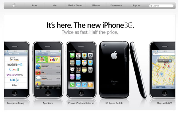
Apple has mastered the art of minimal homepage design. If you go to their homepage, they’ll only show you three things:
- A simple header navigation
- One product in the body of the page
- A few informational links about the featured product with images below the fold
Aside from the standard footer navigation, the homepage consists only of three parts. Here’s what you see if you click on a product link (like the iPhone).
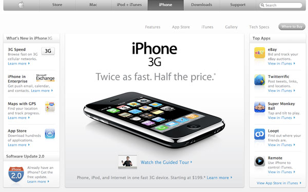
Even on the product page, you immediately see what the page is about: the iPhone. The product itself dominates the bulk of the page, and the surrounding information are apps and features of the new iPhone. But more importantly, notice what’s not on the iPhone page:
- Unrelated products
- Unrelated sidebar ads
- Lots of copy
- Clutter
Apple has effectively shown just enough information in a very pleasing manner. There’s nothing wrong with showing lots of information, as long as it doesn’t feel like a lot of information. You’ll also notice that all of the information, links and pictures are all centered around the iPhone and what it offers. There are no distracting ads or unneeded information about other products.
There are a couple of tried-and-true methods that any designer or web developer can take to ensure that the site layout doesn’t drive customers away with clutter.
- Only what you need. The biggest aspect of simple web design is only showing what’s needed to make the sale, and nothing more. This doesn’t mean that you can’t give the user lots of information. Just make sure they want to see more information. Apple uses “Learn more” links throughout the page to accomplish this.
- Reduce clicks. The less clicks it takes for a customer to buy a product, the higher returns. Don’t make them jump through hoops to buy your product.
- The “Grandma” rule. If your grandma (or any elderly person) can figure out how to buy a product for your site, odds are it’s put together pretty well. Unneeded information will turn Grandma away quickly.
- Reduce the number of columns. Each time you add a column to a page, the content is pushed into a smaller and smaller space. This puts less emphasis on the main product, and more on extra stuff the buyer isn’t really looking for.
- Give less options. There is an added stress put on web shoppers to make decisions. Ultimately, the buyer wants to think as little as possible when making the purchase. Displaying products in a way that eliminates extra thinking and decisions will streamline the buying process and give the customer more peace of mind.
- Keep it clean. A clean design keeps visitors happy. By taking the time to ensure that the layout of the site is aesthetically pleasing keeps the customer returning to the site.
Intuitive web design means thinking like a potential customer. Would you shop at your site?
Other Great Examples of Simple e-commerce Design
Bell.ca uses only a few colors to indicate the branding and offers visitors only the main navigation options. Notice how well the design manages to present a number of different options — shop navigation, support as well as personal and business areas. The design isn’t cluttered but clean and simple and provides the visitors with a broad overview of available options without forcing users to actually go through all of them. Also notice how clever the product navigation is designed at the top of the site. There is just nothing users can do incorrectly.
Etsy is a great example of how to place a lot of information on a page without it being cluttered. Etsy has a wide catalog of products to sell from, yet Etsy’s design has an earthy, relaxing quality. Creating a useful homepage that doesn’t distract is no small feat.
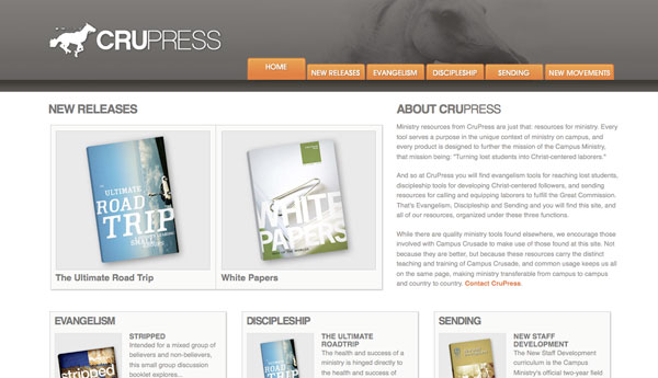
Crupress is an elegant book site without many distractions. The homepage manages to present a lot of text without agitating the user. The header navigation is prominent, but doesn’t demand attention. All the design elements flow together smoothly.
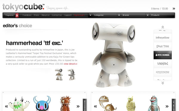
Tokyocube is a fun, trendy little site that sells Japanese products. Instead taking precious space explaining what the site sells, the products are put right in front of you. Also, the heavy use of white space allows the products to almost jump right off the page at you. You can’t help but click on one of the toys to learn more about them.
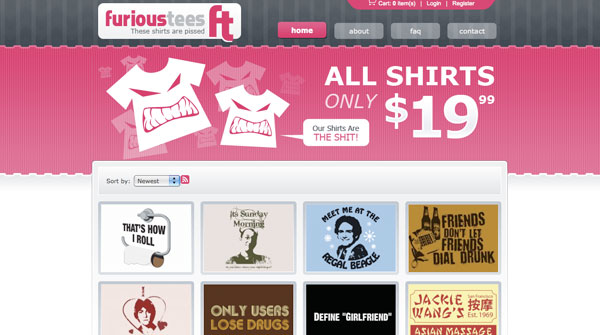
While Furious Tees is a tad busier in graphics than the previous sites, it helps do two things:
- Show the playfulness of the site
- Make it very clear that all shirts are only $19.99
You aren’t lost trying to figure out what Furious Tees is selling, the products are all in front of you. Having all the products on the homepage is especially beneficial for novelty sites that have merchandise people normally wouldn’t be looking for.
But sites with lots of products on the homepage run the risk of becoming cluttered very quickly. Furious Tees doesn’t have this problem. They don’t use any extra sidebars or ads taking attention away from the T-Shirts. The focus is solely on the shirts and the hilarious design.
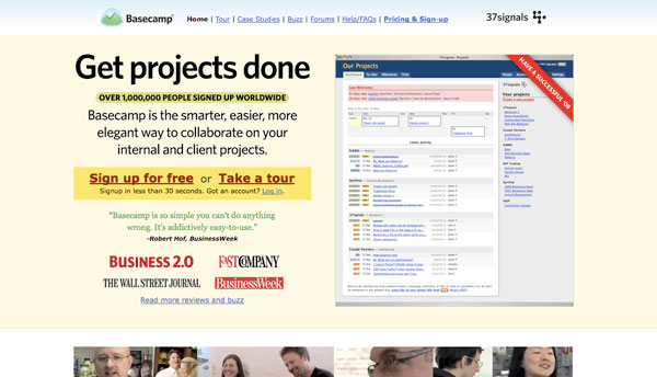
Look no further than 37 Signal’s project management tool Basecamp for an incredible example of mixing different types of information to sell a product. Yet there’s just enough information to make an effective sales copy. Every word, every image has to be weighed in a design. If there’s not enough information, the user won’t spend time trying to figure out what the product does. Too much information and the user becomes overwhelmed.
The tasteful use of heading backgrounds and company logos makes every bit of information stand out on it’s own. And they somehow made all of the different types of media blend together, with plenty of space so that the user isn’t bombarded by lots of text or images at one time.
You Only Have a Few Seconds
Every website is going to require a different type of layout, design and copy to sell products. But designers can strive to do more with less by:
- weighing every word
- removing unneeded elements
- using tasteful colors and whitespace
- and limiting the amount of overall information the shopper sees at one time
Remember, online shoppers are a fickle bunch. They don’t “window shop”. They use search engines to limit their searches to a very narrow field. If they don’t like what they see, they leave. Site owners only have a very small window of time to capture the attention of the prospective shopper. A tasteful, clutter-free design that places the focus on the product (and nowhere else) will allow the shopper to find what she wants faster.


