Smashing Magazine - we smash you with the information that will make your life easier. really.

40 Creative Design Layouts: Getting Out Of The Box

Advertisement

Over the last months we have seen a strong trend towards more individual web designs. These designs use realistic motifs from everyday life, such as hand-drawn elements, script fonts, pins, paper clips, organic textures and scrapbooks. That’s not a big surprise as they serve the function that faceless, shiny, glassy 3D-buttons completely fail to deliver: individuality and personality. “Personal” designs appear more familiar and more friendly. Used properly, such elements can give a human touch to design and communicate the content in a truly distinctive manner.

However, apart from visual design elements, one can also get creative with the layout of the site – its structure and the way the information is presented and communicated. To give you some ideas of how exactly it can be done, we have been collecting examples of creative design layouts. Design was more important to us than a concrete implementation of some creative idea. We also weren’t interested in whether the code validates or not. Below are some examples we have found so far.

In the showcase below we present 40 creative out-of-the-box layouts that break the boring 2- and 3-columned, boxed layouts. We have collected pure CSS -designs, CSS+JavaScript -layouts as well as Flash -designs. Most designs presented below risk their site structure and content presentation with unusual approaches. That’s what makes them different. Hopefully you will find some creative ideas that you can develop further in your future projects.

We strongly encourage designers to break out of the usual boxed layout conventions, experiment with new approaches and risk crazy ideas. Show what you are capable of!

[Offtopic: by the way, do you know the Smashing Network has its own Smashing Network RSS Feed? Only excerpts are displayed in the feed.]

20 × Getting Creative With CSS

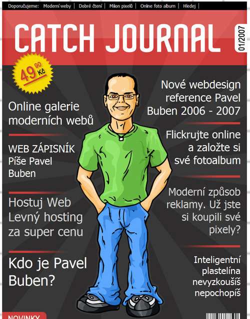
Pavel Buben
Pavel Buben uses a magazine cover-style layout for his one-page-site. Unfortunately, there are no internal pages — it would be interesting to seek how they would be designed. An interesting and unusual approach.

Layouts-14 in 40 Creative Design Layouts: Getting Out Of The Box

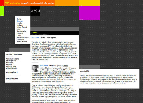
AIGA Los Angeles
AIGA Los Angeles uses boxes in a creative way. All design elements are placed according to the underlying grid, however they clearly break out of the boxes. This approach creates tension within the design and looks truly distinctive.

Layouts-4 in 40 Creative Design Layouts: Getting Out Of The Box

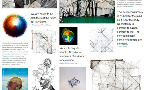
SpaceCollective
For its gallery section SpaceCollective uses a five-column grid. Text and images are perfectly placed on the grid giving the layout a complete form and a sense of order. Notice various font sizes and text styling in the design — they introduce a profound visual hierarchy into the layout that works perfectly within the complex, unpredictable layout.

Layouts-2 in 40 Creative Design Layouts: Getting Out Of The Box

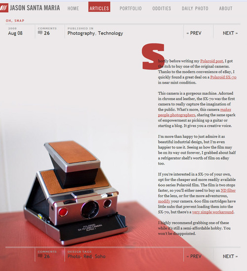
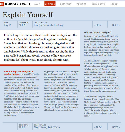
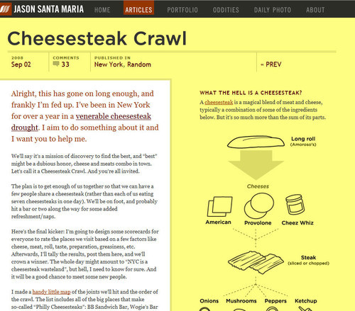
Jason Santa Maria
Jason Santa Maria has taken a truly different route with his site layout. Each article is laid out differently, with strong focus on typography and visual clarity. Below three of the layouts are presented. You may have a hard time finding similar layouts on the Web.

Layouts-6 in 40 Creative Design Layouts: Getting Out Of The Box

Layouts-7 in 40 Creative Design Layouts: Getting Out Of The Box

Layouts-5 in 40 Creative Design Layouts: Getting Out Of The Box

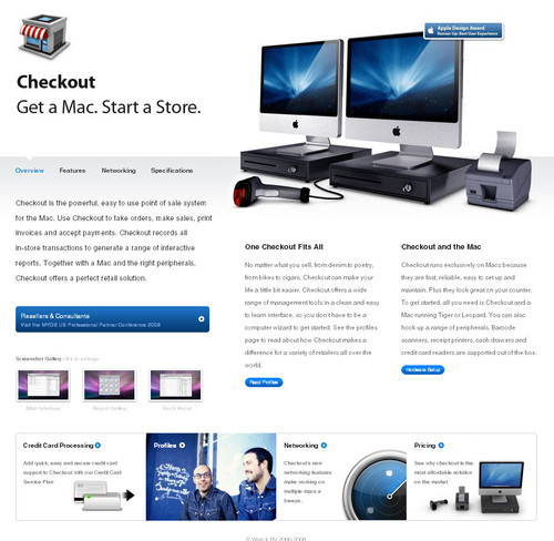
Checkout: Point of Sale for Mac (POS)
At the first glance, Checkout looks like an ordinary Apple grid-layout. What makes the layout interesting is not only the position of its visual elements, but the fact that each section of the page has its individual (although consistent) design. Still, the layout is very scannable and intuitive.

Layouts-17 in 40 Creative Design Layouts: Getting Out Of The Box

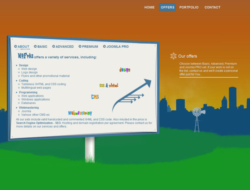
NOFRKS.design
NOFRKS uses JavaScript to slide between various parts of the site. What we found more interesting was the way the content is presented. Most elements are placed within a context, giving the content a secondary meaning.

Layouts-18 in 40 Creative Design Layouts: Getting Out Of The Box

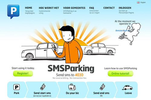
SMS Parking
At the first glance SMSParking has no layout at all. The design appears to be one single illustration — all elements fit perfectly with each other, creating visual harmony and a sense of balance and closure.

Layouts-43 in 40 Creative Design Layouts: Getting Out Of The Box

Tri-Win
Sometimes a background image is enough to make the layout stand out. Although one can recognize a conventional layout structure here, the design looks distinctive and memorable. The background image of the site perfectly fits the company, which offers mailing services.

Layouts-27 in 40 Creative Design Layouts: Getting Out Of The Box

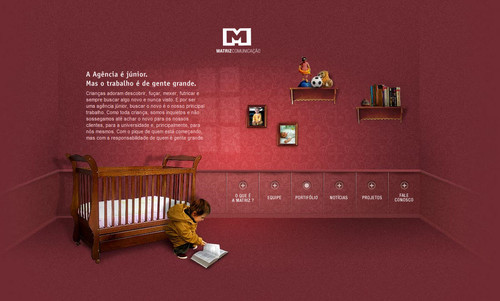
Matriz Communicacao
This Brazilian company delivers a perfect example of how design and content can seamlessly be integrated within a complete yet simple layout.

Layouts-28 in 40 Creative Design Layouts: Getting Out Of The Box

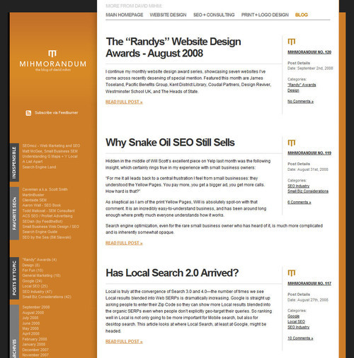
Mihmorandum
Mihmorandum uses a common 3-column-layout in an unusual way. Although the structure is quite usual, the design itself looks distinctive and resembles a pile of paper put inside a folder.

Layouts-33 in 40 Creative Design Layouts: Getting Out Of The Box

3rdM
3rdM uses icons to indicate various navigation options. This is not a type of layout you will find in many other web designs. And that’s what makes the layout creative.

Layouts-3 in 40 Creative Design Layouts: Getting Out Of The Box

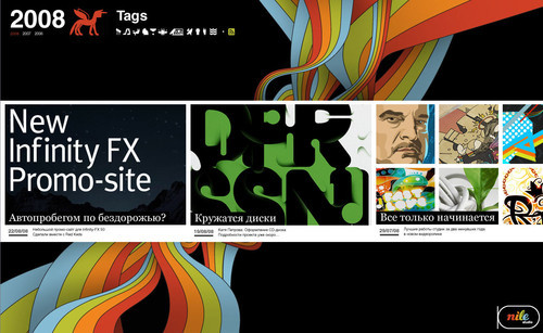
Nile Inside
Many portfolios use vertical layout to showcase their works. Nile.ru displays its works in a chronological order as if it was a horizontal blog.

Layouts-40 in 40 Creative Design Layouts: Getting Out Of The Box

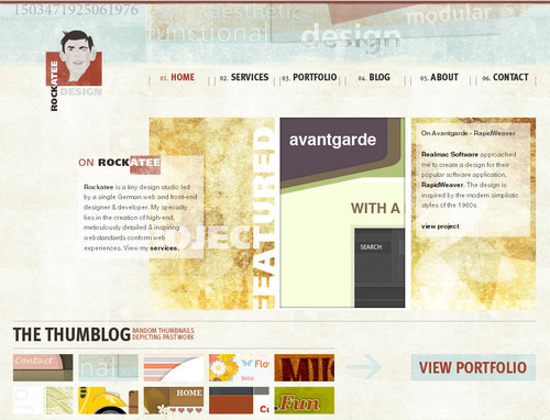
Rockatee
Rockatee uses asymmetry to position content blocks in an unusual yet appealing style. Notice that the left block perfectly aligns with the navigation option “Home” at the top of the page. The screenshot in the middle of the page spans exactly two navigation options and has the same width as the description block on the right side of the page.

The distortion in the layout is caused by the underlying organic texture. Although the design is perfectly aligned according to the grid, it seems to be chaotic at first glance. The tension between order and chaos creates tension in the layout and looks very appealing.

Layouts-41 in 40 Creative Design Layouts: Getting Out Of The Box

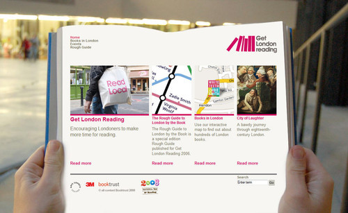
Get London Reading
An effective background image can help a layout stand out. The effect achieved here fits with the objective of the project — to encourage people to read more.

Layouts-45 in 40 Creative Design Layouts: Getting Out Of The Box

BL:ND ( blind )
At the first glance, the layout looks underwhelming. What distinguishes it, though, are the choice of images sizes and a good use of white space. Notice how well negative space is used in the sidebar, where individual elements are clearly separated and properly aligned. The width of the images equals the width of the content blocks. Yes, the layout is boxy, but the wise use of whitespace makes it far from boring.

Layouts-46 in 40 Creative Design Layouts: Getting Out Of The Box

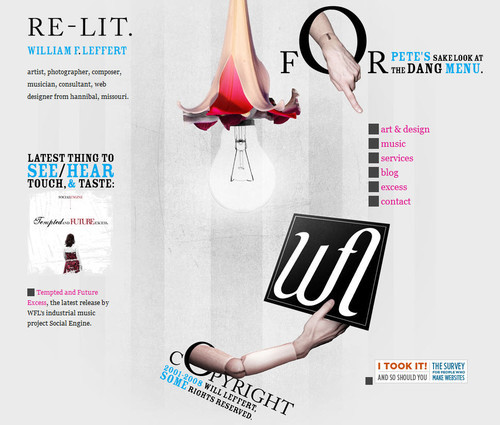
The portfolio of Hannibal
Usually, navigation menus are placed in the sidebar or at the top of the site. William F. Leffert does it differently. His non-linear layout literally breaks out of the boxy structure and offers something quite different. Sometimes it’s enough to simply experiment with the position of design elements to achieve striking design solutions.

Layouts-47 in 40 Creative Design Layouts: Getting Out Of The Box

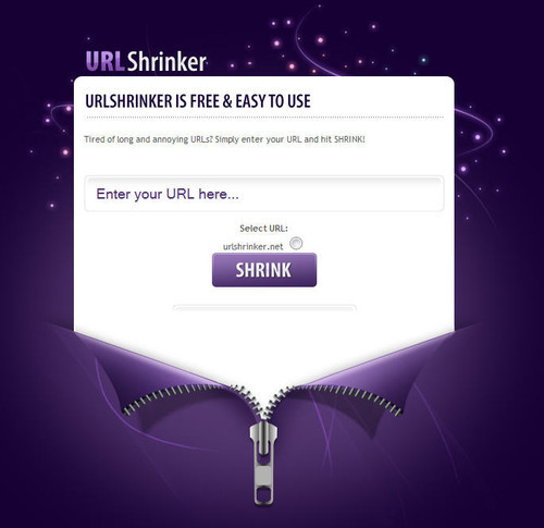
URLshrinker
Creative design solutions can be as simple as this one. An elegant and attractive layout by URLshrinker.

Layouts-49 in 40 Creative Design Layouts: Getting Out Of The Box

15 × Getting Creative With CSS+JavaScript

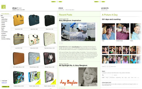
ShopComposition
ShopComposition offers a sliding navigation at the top of the site. Users can choose the content they would like to read and select the width of the content blocks. This store has an integrated blog and some further projects (such as picture-a-day) to attract customer’s attention. JavaScript in use.

Layouts-35 in 40 Creative Design Layouts: Getting Out Of The Box

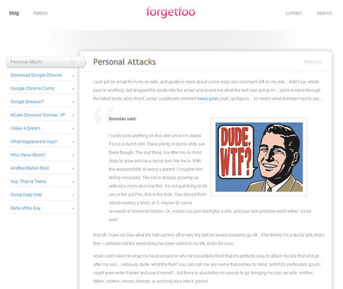
forgetfoo
Forgetfoo uses an almost minimalistic, simple layout with a sidebar and a content area. Designers removed all necessary and unnecessary details focusing only on last blog entries. The design doesn’t contain any category navigation options. That’s unusual, but may be a little bit too much of the minimalism. Navigation through blog posts is realized with Javascript.

Layouts-36 in 40 Creative Design Layouts: Getting Out Of The Box

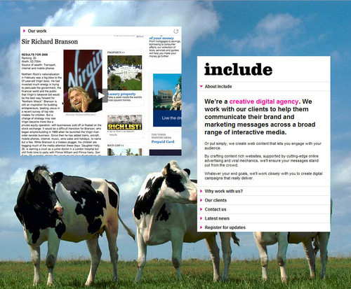
Include
On Include one content block and the corresponding navigation block seem to “hang in the air”. Essentially the page has two columns; however. the layout seems to be quite original — maybe because of the cows placed on the background for some reason. The navigation on the right-hand side is realized with Javascript.

Layouts-38 in 40 Creative Design Layouts: Getting Out Of The Box

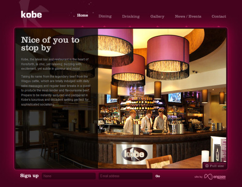
Kobe
The navigation options at the top of the site are slightly animated yet creating an appropriate atmosphere. Once one of the sections is clicked, the main content area slides vertically — first the background image, then the content. If the content area also has some navigation options, they are slided vertically as well. In this situation it might be a slightly better design decision to use horizontal navigation instead to make it easier for visitors to distinguish between the primary and secondary navigation.

Kobe in 40 Creative Design Layouts: Getting Out Of The Box

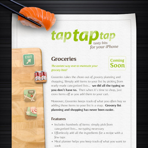
tap tap tap
tap tap tap uses a bold and eye-catching layout to deliver the message to its visitors. The layout, although basically consisting of the sidebar and content area, is not boring at all and looks attractive. The left-hand side navigation and further effects are created using JavaScript.

Layouts-42 in 40 Creative Design Layouts: Getting Out Of The Box

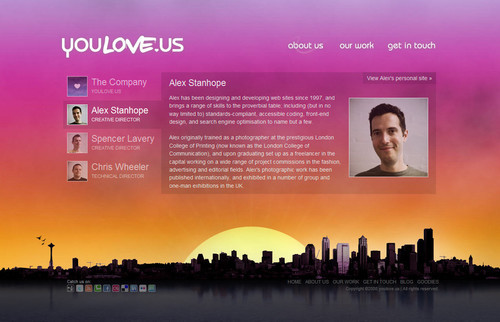
youlove.us
The layout on youlove.us is definitely very vibrant. It uses a large vivid background-image and a the scroll-effect to enable users to quickly jump from one section of the site to another. Notice that the navigation area is repeated four times, in each of the categories. Sliding effects are also used for each of the categories. Instead of using 20 separate page, the layout combines them all on one single page. The result is compact and user-friendly.

Layouts-48 in 40 Creative Design Layouts: Getting Out Of The Box

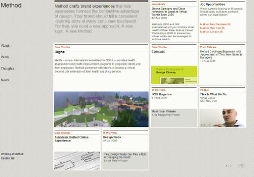
Method: A Brand Experience Agency
This design agency uses a flexible JavaScript-based layout which updates its size depending on the browser window size. The content is “packed” in boxes is usual for such a grid-based design; however, the alignment of the boxes makes the design literally stand out.

Layouts-50 in 40 Creative Design Layouts: Getting Out Of The Box

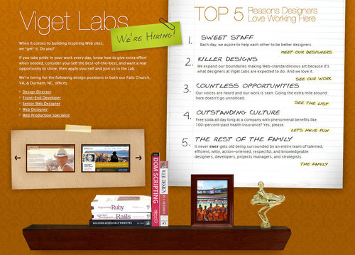
Viget Labs
Viget Labs also uses a sliding navigation and a horizontal scroll-effect to make the user interaction more dynamic and hence more appealing. However, more importantly, the layout itself stands out: the layout is invisible and resembles interactive Flash-interfaces. CSS+JavaScript in use. Smashing says: five out of five stars.

Layouts-1 in 40 Creative Design Layouts: Getting Out Of The Box

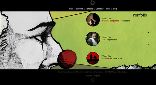
Lucuma
Lucuma also uses horizontal layout as well as a horizontal slider-navigation. The simple yet effective integration of background images, navigation, videos and content makes the layout unusual and distinctive.

Layouts-8 in 40 Creative Design Layouts: Getting Out Of The Box

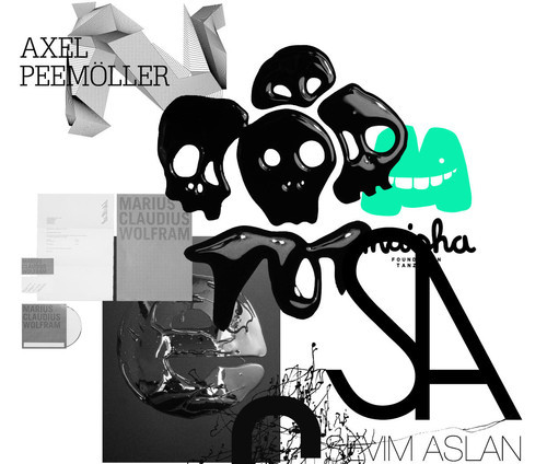
Axel Peemoeller Design
On this page all design elements are draggable and some of them are clickable. Images seems to be thrown on you in the first moment, but in the end they all make sense. This is an unusual portfolio which is memorable and interesting to explore.

Layouts-12 in 40 Creative Design Layouts: Getting Out Of The Box

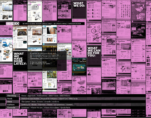
IDEO
IDEO presents everything on its main page. The navigation options are placed in the black boxes and somehow arranged among other content boxes. Once one of the black boxes is hovered, related content blocks are highlighted. That’s not something most users would expect from a layout.

Layouts-16 in 40 Creative Design Layouts: Getting Out Of The Box

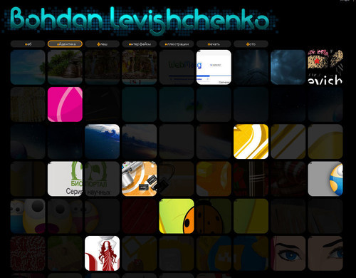
Bohdan Levishchenko
Bohdan Levishchenko uses the same approach as IDEO, but presents all navigation option at the top of the page. Single works are presented as images under the navigation and spread throughout the layout.

Layouts-13 in 40 Creative Design Layouts: Getting Out Of The Box

MelissaHie.com
Melissa Hie places all deign elements on a single large page. Visitors are basically driven from one site are to another using a scroll-effect.
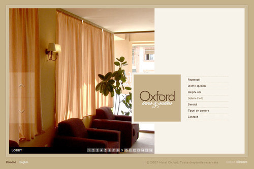
Layouts-19 in 40 Creative Design Layouts: Getting Out Of The Box

Hotel Oxford – Timisoara
A single-page-site with a very calm and comforting layout. All navigation options are available at the first glance. Once some of the options is clicked, the content block on the left is dynamically replaced. The logo of the Hotel Oxford always remains on its place.

Layouts-20 in 40 Creative Design Layouts: Getting Out Of The Box

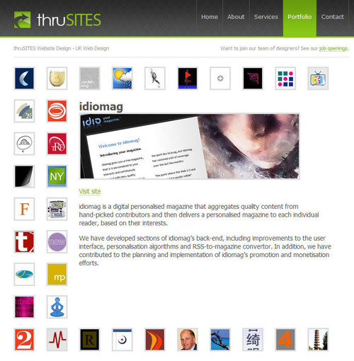
thruSITES / Portfolio
In this portfolio the illustrations of a designer’s works seem to somehow be loosely placed on an invisible rope. When one of the illustration is clicked, all other elements arrange themselves in such a way that the content which this illustration represents becomes dominant.

Layouts-21 in 40 Creative Design Layouts: Getting Out Of The Box

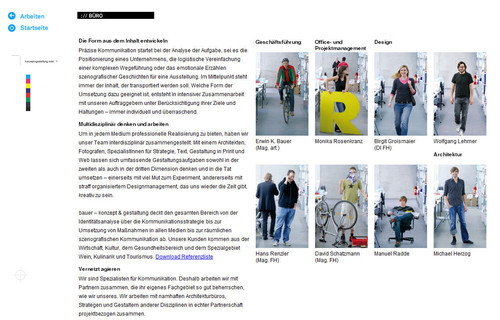
Erwin Bauer KEG
The portfolio site of Erwin Bauer takes a different approach to using a pannable user interface, but implementing in JavaScript rather than in Flash. The site allows users to click and drag to pan the canvas, or to use links positioned around the content to move around. The design is clean, and mimics a design document with regisration and crop marks, and visual cues about the directions the canvas will pan to when you navigate. [via]

Layouts-26 in 40 Creative Design Layouts: Getting Out Of The Box

5 × Getting Creative With Flash

The Secret Location
The Secret Location, a media agency based in Toronto, Canada exemplifies their work, by providing an immersive flash experience around a conjured up story leading a character to follow a mysterious path that leads to the secret location. Very interactive approach, a very unusual site layout. [via]

Layouts-25 in 40 Creative Design Layouts: Getting Out Of The Box

Kamil Gottwald
In his layout Kamil Gottwald enables users to define the width of site columns manually. To navigate vertically users need to scroll horizontally. Hence no vertical scrollbar is necessary. Multiple site views are possible.

Layouts-10 in 40 Creative Design Layouts: Getting Out Of The Box

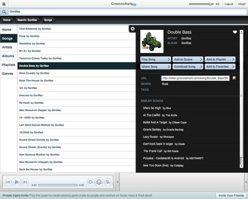
Grooveshark Lite
Grooveshark seems to imitate an iPod-interface and does it indeed very well. Although it may be not very creative, such layouts are hard to find on the Web.

Layouts-15 in 40 Creative Design Layouts: Getting Out Of The Box

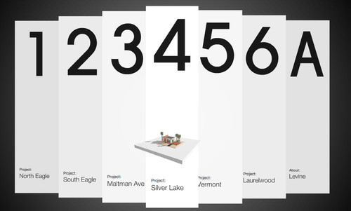
Jeremy Levine Design
Flash offers many creative possibilities for an interactive navigation design. Jeremy Levine uses dynamic paper strips which seem to hang in the air.

Layouts-23 in 40 Creative Design Layouts: Getting Out Of The Box

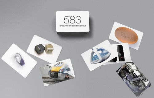
SeymourPowell
SeymourPowell has come up with an interesting idea to provide its visitors with some intuition of how good its work is. Click on the pile to find out.

Layouts-39 in 40 Creative Design Layouts: Getting Out Of The Box

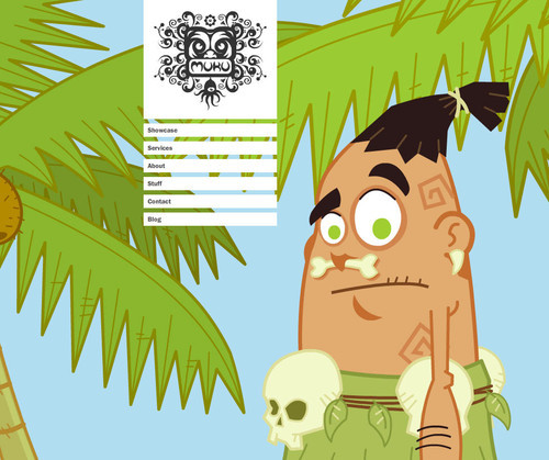
Muku Studios
“Let Muku Do You”: this friendly buddy just wants to remain visible and hence he tries to find some place on the screen to keep an eye on site’s visitors. The layout of the site is simple yet memorable — well, Muku makes sure he’ll be remembered after the browser window is closed.

Layouts-44 in 40 Creative Design Layouts: Getting Out Of The Box

Related Resources

You may also be interested in the following articles we published earlier:

Vitaly Friedman, editor-in-chief of Smashing Magazine (www.smashingmagazine.com), an online magazine dedicated to designers and developers.

Post Rating
1 Star2 Stars3 Stars4 Stars5 Stars (6 votes, average: 4.33 out of 5)
Loading ... Loading ...

Tags: ,

Advertising
  1. 1
    Nick
    September 3rd, 2008 2:52 pm

    Great list!

  2. 2
    Point and Stare
    September 3rd, 2008 2:52 pm

    You should do a ‘top ten’ list of URls contained in your comments

    :)

  3. 3
    Runa
    September 3rd, 2008 2:54 pm

    “Over the last months we have seen a strong trend towards more individual web designs.” — Excuse me, are you kidding? We have a totalitarian ans pandemic hell of Wordpress box design with totoo-like oranaments and brain-wash-pastel-blue. Everything is blue and Wordpress now.

  4. 4
    Paul
    September 3rd, 2008 2:56 pm

    Great !

  5. 5
    Beer is my poison
    September 3rd, 2008 3:18 pm

    Nice compilation! Very inspirational and refreshing.

  6. 6
    Scott
    September 3rd, 2008 4:36 pm

    Using Kobe again as an example I see…

  7. 7
    mikemike
    September 3rd, 2008 4:47 pm

    That’s what I’m talking about

  8. 8
    Sonny
    September 3rd, 2008 5:38 pm

    Thanks everyone, I will keep updating URLShrinker and thanks for listing me on your magazine.

  9. 9
    Anish Trehan
    September 3rd, 2008 8:42 pm

    It was again a great article .. Ek dum Fresh :)

  10. 10
    gaurav_m
    September 3rd, 2008 9:47 pm

    ultimate post 5 *****

  11. 11
    Ash
    September 3rd, 2008 10:50 pm

    Awaesome collection, very inspiring ! Thanx again !

  12. 12
    Roland
    September 3rd, 2008 11:04 pm

    No longer caring about website design, it would of course be easy for me to complain about the shortcomings of a great number of websites — especially Flash-based and those scrolly single-page POSes. But if you give yourself a title (web designer, photographer, graphic designer, etc.) you need to work on being the best of the trade, not settle for “okay it looks cool on screen” and ignore the parts you care less about (usability, printer-friendliness).

  13. 13
    ranvier
    September 3rd, 2008 11:27 pm

    I am honoured to enter my 1st reply for smashingmagazine for this is an amazing article entry. I like the design of the sites ya displayed here very much.

  14. 14
    Justin
    September 4th, 2008 12:01 am

    Love the site layout of Jason Santa Maria. It really breaks out of the stereotypical blog layouts by incorporating some design techniques from magazines. Get London Reading and Tri-Win both deserve praise from the way they manage to give you a feel of what the site is all about within a couple of seconds. From a user perspective, i love the design of the URL Shrinker but I really can’t see any use for the application …. aren’t there bookmarks to remember long URL’s ? Great collection overall ! Keep it up !

  15. 15
    Brandon
    September 4th, 2008 12:02 am

    Truly a great list (I’ve come to expect nothing less, but still)… my favorites were URLShrinker (genius layout) and the Axel infinite scrolling site… one of the hardest things to do with a web design is break out of the box (whether that box be literal or figurative). This collection will definitely be an idea starter for me in the future. Thanks for posting these :)

  16. 16
    Gert-Jan
    September 4th, 2008 12:10 am

    That’s a great list of websites. Thanks!

  17. 17
    Jon Aizlewood
    September 4th, 2008 12:39 am

    What a wickedly inspiring round-up. I totally agree with the simplicity but effectiveness of Tri-Win’s site. Seems so basic, but done so well!

  18. 18
    Amanda Fazani
    September 4th, 2008 12:42 am

    A while back I came across this unusual layout: http://okaydave.com/ It’s a flash based portfolio which I simply adore! At first, there seems to be no navigation, but when you hover over areas of the screen, the design comes to life.

    This is a great article and very inspirational. I design blogs much more than websites, and this has offered me many ideas for layouts I could experiment with for future projects – I love taking design out of the box!

  19. 19
    Curt Simon Harlinghausen
    September 4th, 2008 12:44 am

    Some interesting sites and ideas. Thanks.

  20. 20
    Tim Holmes
    September 4th, 2008 12:58 am

    Some really interesting and different layouts, very nice :o) Just wondered how my site would site with regards to good layout.
    Thanks for this article, very good.

  21. 21
    Tim Holmes
    September 4th, 2008 12:59 am

    Sorry forgot the closing tag, my bad….

  22. 22
    Herr Voß
    September 4th, 2008 1:55 am

    How do you like: http://foerdefluesterer.de/ – on the one hand it’s a regular 2 column design on the other hand the (daily changing) upside-down background image has an interesting effect and overall it has a slightly raw look.

  23. 23
    Roxana Popa
    September 4th, 2008 2:48 am

    yes indeed, great designs… some of the idea are really original. Love all your articles, keep it going:)

  24. 24
    Dave Bowker
    September 4th, 2008 3:45 am

    Excellent compliation. Some great inspiration here.

  25. 25
    Edwardo Boala
    September 4th, 2008 4:27 am

    I am self-confessed web design geek. Some of these websites made be salivate.

  26. 26
    Tabris Chen
    September 4th, 2008 4:36 am

    Took me a while to browse through all of these, I must SpaceCollective is my favourite. Very nice grid design and brilliant use of typography.

  27. 27
    Mila Jones
    September 4th, 2008 4:42 am

    Nice collection, however with a title like “Getting out of the Box” I expected more of them to be…well… out of the box! So many are cased in, or are just a series of boxes that float out of their background. Some are just a regular boxy layout with a few embellishments, others are just liquid layouts. When I think of taking websites out of the box, I think environmental and organic.

    NOFRKS, Tri-Win, Matriz Communicacao, youlove.us, Viget Labs, and The Secret Location seem to have really achieved that, the rest look like regular sites to me… but they’re still nice to look at :)

    Cheers,

  28. 28
    Monte Rilk
    September 4th, 2008 5:06 am

    I’d also recommend the collage style at Aquasparkle

  29. 29
    Misty
    September 4th, 2008 6:02 am

    I thought this site has an interesting composition as well.

    http://www.jonjon.tv

  30. 30
    Fred
    September 4th, 2008 6:03 am

    Always like javascript scrolling-between-parts kind of sites.

  31. 31
    Justin
    September 4th, 2008 6:18 am

    What I’ve noticed about a majority of these designs is that they are websites for individuals or design firms in which the designer is the client. Does this fact disqualify them from being included in a list of cutting-edge sites? No. But working with a client who isn’t yourself can prove to be a bit more challenging when it comes to retaining “outside the box” design values.

    To bring this list a little more into the realm of reality, I would have compiled a gallery of sites that managed to retain some of their original elegance in spite of going through the long and often unpredictable process of site development, design and client feedback.

  32. 32
    David Mihm
    September 4th, 2008 6:19 am

    Hey guys, thanks for featuring Mihmorandum on this list. I’ve read your site for a long time & it’s truly an honor to be included. Great list.

  33. 33
    chestah
    September 4th, 2008 6:23 am

    The article is gassy
    TY

  34. 34
    Bobo
    September 4th, 2008 6:26 am

    Please stop spamming all the article & news sites with your lousy articles. This is useless and obviously biased to your site. You are not doing anything useful.

  35. 35
    Gill
    September 4th, 2008 6:39 am

    I was highlighting Information Architects as a possible to the list, and also they provide a fantastic wordpress template. Feel free to remove my links – but i do feel they should be represented on this list!

    Cheers

    Gill.

  36. 36
    Anon
    September 4th, 2008 7:23 am

    The SpaceCollective site is more than 5 columns. It depends on your screen size. If you have a huge monitor it could have 6 /7/8 etc. columns.

  37. 37
    Lee
    September 4th, 2008 8:36 am

    What happens to the designs when one turns off js?

  38. 38
    Torley
    September 4th, 2008 8:42 am

    URLshrinker.net is the first TinyURL-style service I’ve seen with a beautiful layout. Alas, “URLshrinker” is a comparatively longer word than other services like snurl.com, so I hope they add extra valuable features to make the service stand out beyond slick purple design.

  39. 39
    Julia
    September 4th, 2008 8:49 am

    Here’s another one that I think would fit on this list.

  40. 40
    foO
    September 4th, 2008 9:22 am

    for what it’s worth, i’m totally humbled to see my site on here… received a crapload of emails about it, and i’m still sort of stunned.

    love this site.

  41. 41
    jacksuc
    September 4th, 2008 9:53 am

    thanks great

  42. 42
    Erich Stauffer
    September 4th, 2008 10:01 am

    I love the 3D designs and try to incorporate them as much as possible. Great list. I hadn’t seen most of these already. I enjoy smashingmagazine.com.

  43. 43
    Mike Smith
    September 4th, 2008 10:10 am

    Nice list. Some great designs there for sure.

  44. 44
    Abhijit Kumar
    September 4th, 2008 12:10 pm

    this was a great article, and cool websites
    but taptaptap, kobe, shopcomposition were already in some articles
    But i loved this post

  45. 45
    Hartman
    September 4th, 2008 12:55 pm

    Very good examples!!!! Good shit!!!

  46. 46
    Will Leffert
    September 4th, 2008 1:59 pm

    Lee: RE, Javascript..

    Well, mine relies on no Javascript aside from my Twitter feed on my blog, which is powered by Blogger, and my Google stats – so rendering is consistent even on older browsers. Heck, my site is actually functional for screen readers and text based browsers (I grew up using the command line, and am also a bit of a Linux geek and ex-BSD geek).

    It was a pleasure to check my stats this morning and see the huge traffic spike from here. It was completely unexpected.. Not to say I don’t think my site is good, but I didn’t expect it to attract as much attention as it has (this isn’t the first traffic spike I’ve had from design inspiration lists).

  47. 47
    Katie Chen
    September 4th, 2008 2:59 pm

    Another wonderful articles. Thanks for the inspiration!

  48. 48
    Sonny
    September 4th, 2008 4:41 pm

    RE:

    Torley (September 4th, 2008, 8:42 am)

    URLshrinker.net is the first TinyURL-style service I’ve seen with a beautiful layout. Alas, “URLshrinker” is a comparatively longer word than other services like snurl.com, so I hope they add extra valuable features to make the service stand out beyond slick purple design.

    I just wanted to comment that we will be adding many more short domains to our collection to enable true url shrinking and more features in the next few days.

    Thanks again.

  49. 49
    Charly
    September 4th, 2008 10:05 pm

    Very interesting article

  50. 50
    Nathan Beck
    September 5th, 2008 1:29 am

    Absolutely fantastic list there. Some heavy inspiration. Thanks again SM!

    Nathan

  51. 51
    Donal
    September 5th, 2008 4:43 am

    you guys should check out http://www.thefwa.com there are some amazing sites there.

  52. 52
    Michael Hellein
    September 5th, 2008 6:39 am

    youloveus is a 2.7MB pageload (including 98 images weighing in at 2.5MB). even in the broadband era, that seems like a lot of data to throw at someone all at once.

  53. 53
    helen
    September 5th, 2008 9:23 am

    The best advice that I’ve ever received from an instructor is that designing a web site is about creating an environment. While all of these web sites are stunning, only a small handful of them – in my opinion – go beyond looking like a well-executed print piece to a true experience.

  54. 54
    Cosmi
    September 5th, 2008 10:10 am

    Wonderfull

  55. 55
    Philip Downer
    September 5th, 2008 10:29 am

    I really enjoyed this post, and while each design is certainly innovative and well thought out, the post itself wasn’t really “out of the box”.

    I always enjoy SM’s posts and read them religiously. Have you considered highlighting website designs that aren’t neccessarily bad, rather, they are lacking in some dimension. Maybe the graphics are captivating, but perhaps the navigation lacks the same lustre.

    Think sites that are good, but have with simple tweaks could become great.

  56. 56
    elperroverde
    September 6th, 2008 7:03 am

    I think the real masters on “getting out of the box” are the russian designers, they are way beyond western agencies on this particular subject.

  57. 57
    johno
    September 6th, 2008 8:33 am

    Jason Santa Maria’s site is, I think, probably the best designed site on the Web. Great list. Some inspiring examples; and some I’d never come across before.

  58. 58
    aja
    September 6th, 2008 1:07 pm

    i wonder when the parking site will get sued by pownce for ripping off their logo.

  59. 59
    Common
    September 7th, 2008 6:53 am

    it’s really not.

  60. 60
    ade
    September 7th, 2008 8:29 pm

    so this is late trend or later trend?if say so this is we turn arround to middle 90’s where no wordpress tamplate and all just web designer ego. so this is late or later? confuse me too.

  61. 61
    Rakesh.S
    September 7th, 2008 11:48 pm

    Outstanding list, good source of information indeed.

  62. 62
    gr8pixel
    September 8th, 2008 2:01 am

    I really like what they have done in http://www.desero.net/en/. It looks like a flash website!

    http://www.gr8pixel.com

  63. 63
    alecs stan
    September 8th, 2008 3:37 am

    Excuse me. Am i the only one here thinking that lots of example from that list somehow don’t cut it ?

    I completely agree with @Runa and the guy that said that most of them are made by designers for themselves or design firms.

    I think smashing magazine has a responsibility as a trend setter to push projects and works that really work and that really help clients rather than looking spectacular and doing nothing else.

    Anyway the list contains some good examples between many that i would advise not to follow.

  64. 64
    intermission*
    September 8th, 2008 10:20 am

    Really cool ideas for layout. Seems a lot of web page design was getting boring for a while there with the obvious “crazy vector background graphic” style dominating!

  65. 65
    Adam Alyan
    September 9th, 2008 2:11 am

    It’s mind refreshing! … Great inspiration

  66. 66
    grumpy_git
    September 9th, 2008 7:39 am

    Its alright having fancy designs like that, but if they are not accessible, then they might as well be castles in the sky!

    For instance, ‘NOFRKS.design’ is totally unusable with JavaScript off – it just doesn’t work. None of the links on the main page work whatsoever. I can’t believe that you never noticed that when you visited the page.

    When ever I see a fancy design, I always see what it would look like/behave like without its ‘main ingredient’ (in this case javascript). If that wasn’t enough, It gets even worse once CSS is turned off!

    The links that appear at the top of the document don’t work either, and that’s with JavaScript turned on! Obviously these guys never gave a passing thought about accessibility, and it shows in the poor implimentation of their website. I suppose we should be grateful that it even validates…

    If your going to heap praise on a website, please can you make sure that it is deserving of the praise.

  67. 67
    Guillermo
    September 10th, 2008 4:34 am

    valve.fi this is one of the best i’ve seen

  68. 68
    grumpy_git
    September 11th, 2008 12:55 am

    @Guillermo: Yet another ……..! Turn off JavaScript, and then read the little banner at the top of the page.

    I’ve looked at most of these website on this this page, and I’m no expert (far from it in fact), but they all fail in one respect or another when it comes to accessibility and interoperability. That might of been fine and dandy 5 years ago, but its a cardinal sin in this day and age!

    Every web page should have a valid DOCTYPE, work WITHOUT JavaScript, work WITHOUT CSS, and be accessible to the majority of devices. I know I’m stating the obvious here, but judging by the list of sites in this article, you’d be surprised at how ‘unobvious’ it appears to be!

  69. 69
    animald
    September 11th, 2008 1:25 am

    The Kobe website is the local bar where I drink??

    Lol!

  70. 70
    Elleonor
    September 11th, 2008 3:17 pm

    Duuds,
    will You create a topic about cartoon style websites ?

  71. 71
    Will Leffert
    September 12th, 2008 9:44 pm

    @grumpy_git – scroll up a few comments.. My site works fine and dandy without JS, has proper doctype declarations, and is accessible on a variety of devices (including Links/Lynx and other ncurses based browsers).

  72. 72
    SoAwesomeMan
    September 14th, 2008 5:02 pm

    Remix: SMSParking Welcome vs Salad Fingers

    No disrespect to SMS Parking intended by this, I just couldn’t resist…

    http://www.flickr.com/photos/soawesomeman/2857390135/

  73. 73
    michaelportent
    September 23rd, 2008 3:55 pm

    Wow! Some great designs here. Jason Santa Maria’s site is the standout for me though. Takes everything I love about magazine article design and distills it in a blog format. Lovely!

  74. 74
    honour chick
    October 13th, 2008 5:35 pm

    nice

  75. 75
    Shashikant
    October 20th, 2008 1:41 am

    A very good collection for everyone.

  76. 76
    Andy Sowards
    October 24th, 2008 7:07 am

    Really nice collection you have here!

  77. 77
    Mufeed(Web Dsigner)
    November 12th, 2008 9:43 pm

    yes good designs
    i like it

  78. 78
    Hyder
    November 28th, 2008 7:23 am

    Superb list… I love your blog for its quality content.

    Also, check out omnia.ae
    It’s a full site thrown up on a single long organized page.

  79. 79
    Zain Shaikh
    December 15th, 2008 2:35 am

    wow, wonderful, very impressive designs… (Y)

  80. 80
    alexctrow
    December 21st, 2008 11:56 pm

    Very good and helpful list. I am going to refer back to this page for inspiration for my future website project. I made a flash page that has different layout to the norm, it was one of my class projects from when i was studying, it relates to this page. so here it is abc project

  81. 81
    Corlu
    December 31st, 2008 7:17 am

    its fantastic thank you very much very helpful websites. i will use some of this websites technics in my new website.

  82. 82
    Musafar
    January 28th, 2009 7:55 pm

    Great ! :)

  83. 83
    Dibakar Jana
    February 3rd, 2009 4:17 am

    awsome deisgns, Now a day one of my client is really addicted to this type of 3d layout designs.

    This will be the nex-Gen designs
    “Out of the box”

    !!!!!!!!!!!!!!!!!!!!!!!!!!!!!————–Great————!!!!!!!!!!!!!!!!!!!!!!!!!!!!!!!!!!!!!!!!!!!!!!!!!!!!!

  84. 84
    Arlyn Tan
    February 17th, 2009 8:48 pm

    Great compilation, and gives a new breadth to the usual boxy character of a website

  85. 85
    Pipe Estudio
    February 24th, 2009 7:56 am

    Great compilation!!!

  86. 86
    xjoschax
    April 6th, 2009 4:30 pm

    http://www.sectionseven.com/ LOL!!!

  87. 87
    Steve
    April 28th, 2009 11:37 am

    This is a GREAT list

  88. 88
    Jhenrique
    May 13th, 2009 8:50 am

    Very cool post!

  89. 89
    Geodetske storitve
    May 23rd, 2009 11:49 am

    Good post! It was a useful article for web designers and programmers. Thanks.

  90. 90
    Rafee
    June 4th, 2009 12:45 am

    Samples are excellent. Lot of creative thinking has gone into this kind of designs.
    like to see more into it..

  91. 91
    gamehome
    June 13th, 2009 12:57 pm

    Nice layout and nice idea, but I think the compatibility is more important in web design.

  92. 92
    Swedish Swede
    July 25th, 2009 11:34 am

    wow, ur numbe 1 on google!
    awesome article!! inspires me!
    thanks!

  93. 93
    Francis Xavier
    September 9th, 2009 2:57 am

    u guys r really challenging.u have some cool stuff in here.as a graphics designer inspired and challenged.
    xavier.

  94. 94
    thatdesigner
    September 17th, 2009 4:35 pm

    Inspirational list! some really cool off the wall sites.. keep up the great work!

  95. 95
    Manu gomez
    September 28th, 2009 6:40 am

    fantastic ones.. i really admire these works.
    I have also find another one
    http://www.tulipweb.in

  96. 96
    Davidb
    October 26th, 2009 10:31 am

    From a UX perspective, it’d be nice to see the examples of designs working creatively within the principles of good user experience. Is the navigation quickly found, prominent, and intuitive? Are you avoiding over-reliance on metaphors? These probably constitute the “boxes” that people are trying to break out of, but in my field they’re essential for good design. I think a few of these designs accomplish this nicely, but the majority are merely pretty to look at. I agree with the earlier post that the majority look like they were designed by designers for other designers, and don’t keep goal and task-oriented design in mind at all. Now doing that and offering a design that’s creative and unique is a neat trick!

  97. 97
    Sergio
    December 29th, 2009 4:54 am

    Hi all,

    I am software developer. I am starting to built a social network for developers and designers. Actually I am looking for a social network template or free template that I can use for it. I have not knowledges in designing and I have not time for learning how to design a really good and atractive web site.
    Do you know any site where I can download free templates focused in social networking?

    thanks in advance!

  98. 98
    vikram
    January 9th, 2010 10:40 am

    I am Also web designer and creaive artist……

    excelant work, and rellay inspayared design….

  99. 99
    ferizaenal
    January 17th, 2010 6:53 pm

    cool, very inspiring….

  100. 100
    suresh
    January 25th, 2010 11:04 pm

    so nice

  101. 101
    emily Compston
    January 26th, 2010 4:13 am

    Check out Taschen’s new book The Internet Case Study Book. Beautifully designed by award-winning creative group KentLyons, it is number 5 on Amazon’s e-commerce bestseller list – and it’s not even published yet! It features 60 success stories of website design from client briefing through to final project.

    Internet-Case-Study-Book

  102. 102
    Riyaz khan
    February 8th, 2010 1:35 am

    ohh wow,,,,,,,,,
    that’s great creativity this is very nice collections

  103. 103
    Eric
    February 8th, 2010 6:48 am

    Some of these I disagree with, but for the most part, they are very creative, beautiful designs, while also being user-friendly. I think one of the hardest parts of web design is walking the thin line between creative and usability. A lot of web designers end up trying to be too creative. It would do them some good to look at some of these sites, especially the one for “Kobe”.

    One comment I saw on here had a really good point that too many websites are WordPress themed. I see TONS of corporate websites(even online stores) that use a WordPress theme and it makes me cry alittle. Why would anyone think it’s a good idea to use a blog as the main website for a business? Especially when they don’t even use it as a blog!

  1. 00

    There are no trackbacks at this time. If you are interested in leaving a trackback, please use this URL.

Leave a Comment

Make sure you enter the * required information where indicated. Please also rate the article as it will help us decide future content and posts. Comments are moderated – and rel="nofollow" is in use. Please no link dropping, no keywords or domains as names; do not spam, and do not advertise!


Advertisement Advertise with us!
Join in Smashing Forum
Post your job