How To Choose A Wordpress Theme

Email Newsletter
Weekly tips on front-end & UX.
Trusted by 182,000+ folks.
 Register for Free


 Celebrating 10 million developers
 Custom Web Forms for Angular, React, & Vue. Your backend.
Economists have taught us that a lot of choice is not always a good thing. Having many options can lead to “analysis paralysis” and a feeling of being overwhelmed, due to the increased effort required and the level of uncertainty in making the right choice.
If you are hesitant about choosing the perfect template for your website, then maybe it is high time to stop browsing and order one for yourself. There are many professional companies who can forge your concept into an ideal template. However, gathering all the necessary details and information about these suppliers can be troublesome and time-consuming. To simplify this process, you should employ a professional RFP template for software development.

With a nearly unlimited pool of WordPress themes to choose from, it becomes so easy to feel overwhelmed and resort to inaction or choosing a low-quality theme. In cases where you have a lot of options, it pays to know exactly what you need.
In this post, I’ll share what I believe are the most important factors to consider, so that you know exactly what to bear in mind the next time you’re on the hunt for a good theme.

Put another way, how much easier is buying a bottle of wine when you know that you prefer reds and that your favorite red is Australian Shiraz? This small amount of knowledge cuts a choice between 500 bottles in a store down to 10.
To start off, let’s answer one of the most common questions asked: Is it worth paying for a WordPress theme, or can you get away with a free one?
1. Price: Free Vs. Premium WordPress Themes
Several years ago, the price of a theme was a good indicator of its quality. Free themes were often poorly coded at best, and were used to capture sensitive user data at worst. But times have changed, and developers in the WordPress community have created thousands of great free themes to choose from.
As such, there is no conclusive winner. Both free and premium themes have their pros and cons, which are detailed below.
Pros Of Premium Themes
- More updates. Perhaps the most compelling reason to choose a premium theme is that such themes are typically updated more often. Given the rapid evolution of the WordPress content management system (CMS), having a theme that is regularly updated to patch new security issues is critical.
- Less recognizable design. Because free WordPress themes are so popular, it’s not uncommon for tens of thousands of websites to use the same free one. Premium themes are less common, which set them apart a bit more.
- Better documentation. Most premium themes include a detailed PDF explaining how to get the most out of them. Such documentation is less common with free themes.
- Ongoing support. Premium theme developers certainly offer the best support, usually through a combination of a public forum, live chat and an email ticketing system. Free themes usually just have a public forum for support.
- No attribution links. Many free themes often require a link to appear in the footer crediting the theme’s author. While this is becoming less common in free themes, you can be sure that no links are required in premium themes.
Cons Of Premium WordPress Themes
- The price. You’ll have to invest anywhere between $50 to $200 in a premium theme.
- More configuration. Most premium themes have their own custom administration panel, with a variety of customization settings, which can take a while to learn and set up.
- Unwanted features. Premium themes tend to include a lot of bells and whistles, such as multiple slider plugins, a portfolio manager and extra skins. While these do make a theme very versatile, a lot of unwanted features will bloat the theme.
In general, the most important aspect to look for in a theme, whether free or paid, is the quality and care that’s gone into making it. The quality of the code will influence everything we discuss in this article, from security to page speed.
The easiest way to gauge quality is to read what customers are saying. If a theme has a public support forum, read what kinds of issues people are having, and how responsive the developers are in resolving them.
2. Speed: Lightweight Vs. Feature-Heavy Themes
In my last post here on Smashing Magazine, I emphasized the importance of optimizing website speed. Fast page-loading speed does not just improve the general user experience of a website, but has also been confirmed to improve search engine rankings, conversion rates and, thus, online revenue.
It should come as no surprise that I recommended avoiding sluggish themes like the plague.
Understanding a problem is the first step to avoiding it. So, what causes a theme to drag a website’s page speed into the gutter?
In general, it comes down to three things:
- Too feature-heavy. Be wary of themes that boast 10 different sliders, 20 preinstalled plugins and a lot of JavaScript animation. While this might sound like a good deal, no website that makes HTTP requests to 50 JavaScript files will run optimally.
- Overuse of large file formats. The keyword here is “overuse,” which admittedly is a bit subjective. Try to steer clear of themes that use a lot of full-width images, background videos, etc. Less is more.
- Poor coding. From wildly scaled images to inline CSS injection, poor coding has a significant impact on website performance. As mentioned, poor code usually means that a theme hasn’t been updated in a long time, so always check a theme’s update history.
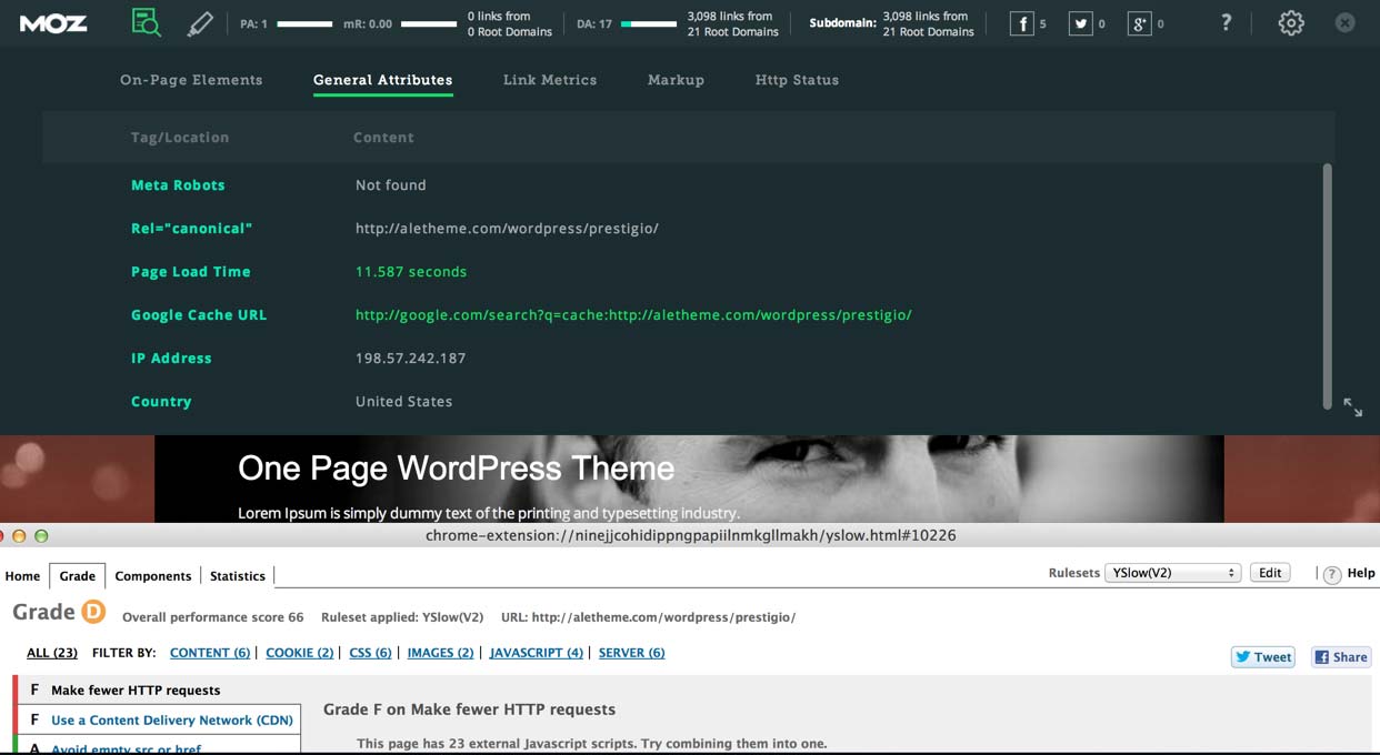
Here’s a litmus test you can use to figure out how bloated a theme is. Go to the Pingdom Website Speed Test, enter the URL of a theme’s demo and see how long the page takes to load and how many HTTP requests are made.
Let me give you a quick comparison as a benchmark. Earlier this year, I built two websites with very different theme frameworks. The first website, BrokerNotes, was built with the Frank theme (a very lightweight theme designed for speed). According to Pingdom, the home page makes 38 HTTP requests and loads in under 1 second. 3.9 Mb in bandwidth is way too heavy though.

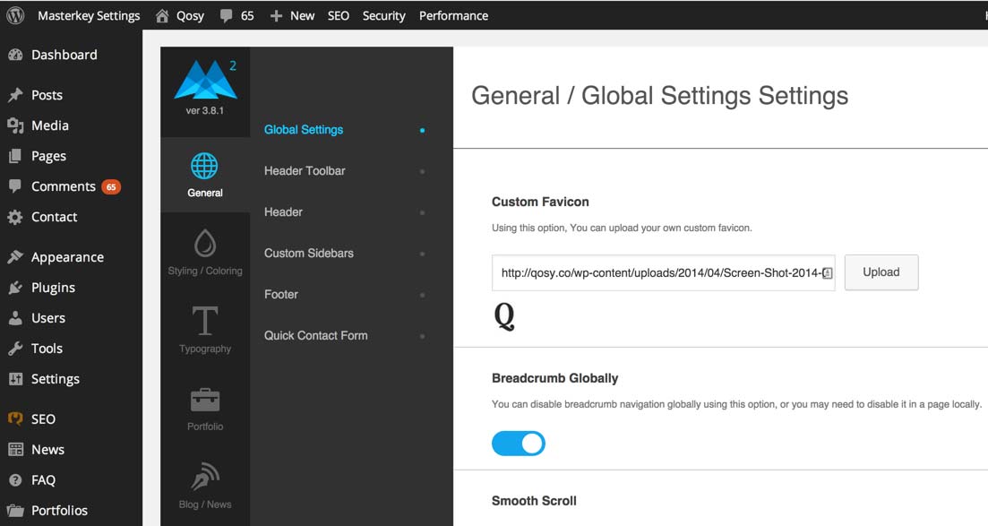
Now, let’s compare this to Qosy, a website I built using a relatively feature-heavy theme. As you can see, the home page makes 61 HTTP requests and take just over 2.5 seconds to load. While still not bad, that’s a noticeable increase in loading time.

Themes that make hundreds of HTTP requests before showing any content are not uncommon. Avoid them unless you’re confident that you can slice off some of that fat.
3. Design And User Experience
Of course, the purpose of a theme is to make your website look great and show off your brand in the best possible light. While design can be quite subjective, you will boost your odds of finding a well-designed theme by following a few steps.
First, search on websites where the best designers sell their themes. This might sound obvious but is still worth mentioning. ThemeForest is my personal favorite, but plenty of other good ones are out there, including StudioPress and Elegant Themes.
Secondly, spend some time browsing the demo. Does the website feel easy to use? Is there enough white space? Do you get a headache looking at it? Does it excite you? This is where your gut feeling plays an important role.
Finally, be sure to choose a theme that is cross-browser compatible and has been built with accessibility in mind.
4. Responsiveness
While mobile traffic varies between industries, most reports seem to agree that, on average, about 30% of all website visits now come from mobile and tablet devices.
Regardless of the exact ratios, there’s no excuse to use anything but a responsive theme.
Thankfully, virtually all reputable themes are mobile-friendly out of the box, so the lack of responsiveness in a theme is really a red flag. Most theme vendors allow you to filter out themes that are not responsive. Another good option is to look through a curated list of responsive themes.
One of the best ways to determine whether a responsive theme is good or not is to run the demo through Google’s new mobile-friendliness tool.
5. SEO
When enabled with one of the many good SEO plugins, WordPress is one of the most SEO-friendly CMS’ around.
However, plenty of themes render all manner of on-site SEO mistakes, such as the omission of header and alt tags, full-blown duplicated content and dynamic URL errors.
When choosing a theme, look for “SEO optimized” or “SEO ready” in the theme description, but don’t trust it blindly. A lot of developers include this to check of a box and sell their theme. That being said, knowing that a designer has at least considered SEO when developing their theme does offer some assurance.
A good practice is to install an extension for the Chrome browser, such as MozBar or SEO Site Tools, to run some quick SEO checks on a theme’s demo.
Explaining what to look for is beyond the scope of this article, but that has been covered in depth by Joost de Valk.
6. Ease Of Customization
A customization dashboard has become standard in a lot of themes. This saves you the hassle of having to make direct changes to style sheets.
In addition, plugins such as Visual Page Editor make it easy to build complex page structures without having to touch code. While some of these WYSIWYG editors are somewhat limiting, I find that overall they’re very beneficial to getting a website looking very nice with little effort. If a developer has a demo of their administration panel, I’d recommend playing around with it to make sure you can customize everything you need to.
7. Security
A lot affects the security of a website, including hosting, plugins and password strength. Look at reviews of the best hosting companies, and pay attention to which of them prioritize security. Daniel Pataki has already covered some great steps to secure your WordPress installation. This should not be an afterthought; rather, consider it when selecting your theme.
As when you’re buying a home, one of the best things you can do to gauge a theme’s security is to read what customers say about it. Unless a theme was created by a trustworthy developer, I avoid any theme that doesn’t have many downloads or reviews.
My advice is to evaluate themes on community websites like ThemeForest, where all customer reviews are displayed by default. This level of transparency tends to reveal the truth about themes, which you wouldn’t get directly from a developer’s website.
While buying a theme directly from its developer’s website is fine, do so only after evaluating it on a community website with transparent reviews.
If a theme has a security loophole, then customers have probably picked up on it and flagged it in their reviews for future customers. While the developer might have fixed such issues, the overall ratings from customers should give you an idea of a theme’s overall quality.
How To Choose A Wordpress Theme - Conclusion
While ticking off all of these boxes might sound ambitious, the truth is that they’re interrelated, and they all come back to a single point: Themes should be built with quality in mind.
One of the best things you can do when choosing a theme is to learn about the person or company who made it. If they have a reputation to live up to, then their themes will undoubtedly be of a higher quality than developers who don’t.
Of course, no theme is perfect, and you’ll almost always have to make some compromises. That being said, with the recommendations in this post, you are hopefully now better informed to avoid the really bad themes and to choose one that is fast, well coded and SEO-friendly and that includes all of the features you need.
Further Reading
- Are You Getting Cheated When Buying A WordPress Theme?
- How To Create And Customize A WordPress Child Theme
- A Guide To The Options For WordPress Theme Development
- A Detailed Guide To WordPress Custom Page Templates


