User Interface Design In Modern Web Applications

Email Newsletter
Weekly tips on front-end & UX.
Trusted by 182,000+ folks.

 Celebrating 10 million developers
 Custom Web Forms for Angular, React, & Vue. Your backend.


What is user interface design? What makes a user interface effective, and more importantly, how do you go about crafting a good user interface? This chapter looks at the theory as well as the practical techniques involved in visual interface design in modern Web applications.
What Is A User Interface?
“The way that you accomplish tasks with a product – what you do and how it responds – that’s the interface” — Jef Raskin
User interface design isn’t just about buttons and menus; it’s about the interaction between the user and the application or device, and in many cases, it’s about the interaction between multiple users through that device. This means that user interface design isn’t about how a product looks, but rather about how it works. It’s not just about arranging buttons and picking colors, but rather about choosing the right tools for the job. Does a particular interface even need buttons? If so, what do those buttons need to do? What do I need to provide users with so that they can figure out how my application works and accomplish what they want to do with ease?
Working on the user interface early on in the product development life cycle is vital because, as Jef Raskin succinctly puts it, “As far as the customer is concerned, the interface is the product”. The user sees and interacts with the user interface, not the underlying back-end architecture of your application. Getting this element right will thus have a big impact on how much your customers enjoy using your product and how easy your product is to use. Start by designing the interface first and then coding the back-end engine that powers it, rather than building the back-end first and then putting an interface “wrapper” over top.
What Makes A Great User Interface?
Before we proceed to build a user interface for our product, it’s important to first understand what makes a good user interface; what are the qualities we should aim to achieve? All great interfaces share eight qualities or characteristics:
- Clarity
The interface avoids ambiguity by making everything clear through language, flow, hierarchy and metaphors for visual elements. Clear interfaces don’t need manuals. They also ensure users make less mistakes while using them. - Concision
It’s easy to make the interface clear by over-clarifying and labeling everything, but this leads to interface bloat, where there is just too much stuff on the screen at the same time. If too many things are on the screen, finding what you’re looking for is difficult, and so the interface becomes tedious to use. The real challenge in making a great interface is to make it concise and clear at the same time. - Familiarity
Something is familiar when you recall a previous encounter you’ve had with it. Even if someone uses an interface for the first time, certain elements can still be familiar. You can use real-life metaphors to communicate meaning; for example, folder-style tabs are often used for navigation on websites and in applications. People recognize them as navigation items because the metaphor of the folder is familiar to them. - Responsiveness
This means a couple of things. First, responsiveness means speed: a good interface should not feel sluggish. Secondly, the interface should provide good feedback to the user about what’s happening and whether the user’s input is being successfully processed. - Consistency
Keeping your interface consistent across your application is important because it allows users to recognize usage patterns. Once your users learn how certain parts of the interface work, they can apply this knowledge to new areas and features, provided that the user interface there is consistent with what they already know. - Aesthetics
While you don’t need to make an interface attractive for it to do its job, making something look good will make the time your users spend using your application more enjoyable; and happier users can only be a good thing. - Efficiency
Time is money, and a great interface should make the user more productive through shortcuts and good design. After all, this is one of the core benefits of technology: it allows us to perform tasks with less time and effort by doing most of the work for us. - Forgiveness
Everyone makes mistakes, and how your application handles those mistakes will be a test of its overall quality. Is it easy to undo actions? Is it easy to recover deleted files? A good interface should not punish users for their mistakes but should instead provide the means to remedy them.
Designing a user interface that incorporates all of these characteristics is tricky because working on one characteristic often affects others. The more interface elements you add, the more stuff your users will have to process. Of course, the converse is also true: not providing enough help and support may make certain functions ambiguous. Creating something that is simple and elegant and at the same time clear and consistent is the difficult goal of a user interface designer.
Visual Interface Design Toolbox
Visual interface design is the process of designing the physical representation of your interface as your users would see it on the screen of their electronic device. The objective of visual interface design is to communicate meaning, which is done by crafting appropriate visuals that best represent what the application does and how it can be operated. Creating the look and feel of a product is not the primary aim of visual interface design, merely a component. The primary aim is communication: communicating behavior to help your users understand how your application works.
A number of core elements make up visual interface design. Selecting appropriate types, calibrating each element and then combining them all in a meaningful way let us convey meaning for all the different functions and features of our user interface.
Here are the main building blocks of visual interface design:
Layout And Positioning
Layout provides structure to all the visual elements in your interface. It also defines hierarchy and relationships through the spacing between elements. Bringing elements closer together indicates a relationship between them; for example, labels under icons. Positioning can improve flow, too. For example, positioning labels in forms above text fields, rather than to the left, allows us to move our eyes down them easily, rather than have to keep looking left to check which label applies to which field.
Shape And Size
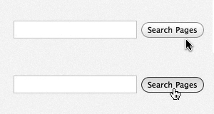
Shape can be used to differentiate elements; for example, by varying the silhouettes of icons to make them easier and quicker to recognize. Size can be used to indicate importance, bigger elements being more significant. Size can also make clickable controls more usable; Fitt’s law tells us that the bigger a clickable area is, the quicker users can move their mouse cursor over it. Making the most frequently used controls bigger will make it easier for your users to click on them, and thus improve the efficiency of the interface.
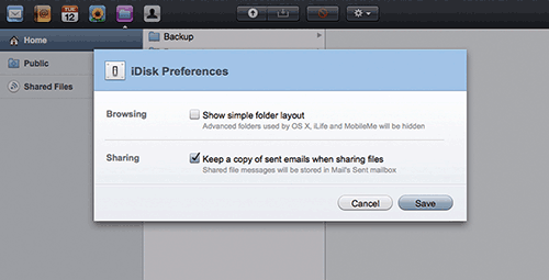
Color
Color is useful for several things. Color can attract attention, provided that it contrasts enough with the background (for example, a bright-yellow notice box on a white background). Color can express meaning. For example, red usually symbolizes danger or stopping (as at a traffic light) and so is best reserved for error messages; while green generally tends to mean success or an invitation to proceed and so should be used for content of this kind. Color can also highlight relationships, such as color coding things like buttons and toolbars to aid the user.
Keep in mind a couple of things when using color. First, different cultures will associate different things with colors, so make sure that any meaning you intend to communicate with your color selection works in your markets. Secondly, don’t forget about color-blindness; take extra care when differentiating items through color, like bars on a chart. If a user is color-blind, they may not be able to distinguish between certain colors, most often red and green, so you may need to use other indicators, such as shape and texture, as well.
Contrast
How light or dark something is in relation to the elements around it will have an effect on the usability of an interface. The key here is contrast. Black text on a white background has a higher contrast, and is easier to spot and read, than gray text on a white background. Tuning down the contrast of certain elements allows you to fade them into the background, letting the user differentiate between more important and less important elements.
Texture
There is a concept in interactive design called affordance. Affordance is the quality that communicates to the user how something is meant to be used. Think of door handles. The best way to make a door that opens one way is to attach a handle on the pull side and leave a flat handle plate on the push side. People will know whether to push or pull automatically because the interface communicates how it should be used; i.e. it affords less methods of interaction and so focuses the user on the correct one.
We can translate this idea into user interface design on the screen with texture. For example, some elements in a visual interface may be draggable, like the corner of a window that lets you resize it. To indicate that you can click and drag it, a set of ridges usually appears on it, illustrating a rougher texture. Rough textures are often used to add a stronger grip surface to real-life objects to help us pull them with our fingers, and that idea is translated onto the screen, where instead of fingers you would use a mouse cursor.
Practical Techniques For Crafting Effective User Interfaces
We’ve talked about what user interfaces are, what characteristics all user interfaces should have and the core tools we can use to build them, so now let’s look at some practical techniques you can use in your own Web applications and websites.
Use White Space To Build Relationships
White space is the empty space between various content elements, such as headings, text and buttons. White space is a great tool for building relationship between different elements. By tightening the space between elements, you can form groupings of related items. Increasing the space between these groupings will further accentuate their connection by separating them from the rest of the content. Use white space to group related controls and to build a hierarchy of items on the page.
Rounded Corners Define Boundaries
Rounded corners are often used to improve the look and feel of graphical elements. They look nice and add that extra bit of visual polish to your interface; but that’s not all they can be used for. Rounded corners define boundaries of objects. When you see a rounded corner, you know it is the end of the container. If the corner is straight, it could be attached to another container, so the boundary is not as clear. Rounded corners, or any other visual corner treatment for that matter, can thus reinforce the boundaries of containers.
Convey Meaning With Color
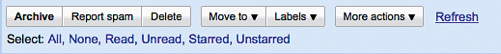
Color is a great tool for communicating meaning; for example, to define different elements. You could, if you so choose, use color coding to distinguish between different types of buttons in your application. Red could be used for destructive buttons like delete and remove, blue could be used for standard buttons and green could be used for save and update actions. Color coding can also be used to distinguish between various pieces of user-created data on overview screens to make them easy to scan.
Direct Attention
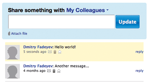
Use animation to draw attention. Sometimes, color and contrast alone aren’t enough to attract a user’s attention. If something crucial has happened, and you really must make sure the user has noticed it, use animation. The human eye is attuned to catching movement, especially on static backgrounds. If a user adds a to-do item to a list in a productivity application or adds a product to their shopping cart, use animation to highlight what has happened. For example, you could use a highlight effect when an item is created on the screen. This is especially useful for applications that use AJAX heavily; in these cases, the page won’t refresh when a particular action has been taken, so it’s up to the interface to tell the user that something has happened.
Shadows And Darkened Backgrounds For Focus
Another great way to focus user attention on an area is to use shadows and darkened backgrounds. Shadows can be used around pop-up menus and modal windows and act as blankets that block out visual noise around the window. Shadows decrease the contrast of elements that lie under them, which in turn increases the contrast of the items they’re used for. Modal windows can also have a darker (or lighter) semi-transparent layer underneath, which also helps reduce the visual noise of the content it covers and so focuses the user’s attention on the modal window itself.
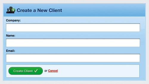
Emphasize Core Actions
Many applications have screens that feature primary and secondary actions. For example, if you’re creating a project in a project management application, the main form will probably have fields for the name of the project, the deadline, the priority level and so on. At the bottom, you may see a “Create” button. Often, you’ll also see a “Cancel” button or link next to it. The cancel action is less important because your users usually won’t need it, so you can decrease its visual “weight”. For example, you could make “Create” a button and “Cancel” a simple hyperlink with no visual decoration. This shifts the focus to the main action and helps the user locate it more quickly when they finish filling out the form.
More Efficiency With Block Links
Use padded block links for easier cursor targeting. Web applications rely on HTML building blocks for their construction, which means they make heavy use of the anchor (better known as the “link”) element. The anchor element is “inline” by default, which basically means that its width and height cover only the text inside it. This in turn means that the clickable area of the link is only as big as the text itself, which may be too small in many cases for users to comfortably click on. We can apply padding to the anchor element to make it larger.
For links in a list, like in a sidebar, turning the anchors into “blocks” may be an even better solution. You can specify an element’s type by using the CSS “display” property; so, specifying the anchor as a “block” will turn it into a block element, which means its height and width will no longer follow the size of the text inside it but will instead span the full width of its container by default. This is ideal for lists of links in a sidebar.
Use Verbs As Labels
When using your application, people will always be looking to do something. This means they’ll be thinking in verbs. “I want to save this file”, or “I want to update this entry”. When building dialog boxes, or any other type of user prompt, use verbs rather than exclamations like “Yes”, “No” and “Okay”. When the user sees options like “Okay” and “Cancel”, they will have to read the message above to understand what they’re being asked to do. However, if you present the choices as verbs – for example, “Save”, “Don’t Save” and “Cancel” – you make the dialog and selections clear to the user without them even having to read the accompanying message.
Auto-Focus/Re-Focus On Input
Form-oriented applications might benefit from automatically activating the main form’s input field when the Web page loads. For example, search engines like Google focus on their main search field on the assumption that almost everyone arriving on their home page will want to type a search query into the input field, and so when the page loads you can start typing right away. Automatically activating input fields can work in other contexts: for example, in applications that require successive inputs, like a shopping-list builder. After the first item is entered, the user may want to enter more, so you should automatically re-focus on the input field to allow for quick, successive inputs.
Use Hover Controls To Simplify And De-Clutter
Many applications have a set of context-sensitive controls, like buttons for deleting and editing individual records in a list. To make it easy to target something directly, they’re usually placed next to each item, but this causes a lot of duplication. Most of the time the user won’t need these controls, and when they do, they’ll only need them for one particular item.
To simplify your interface, use hover controls, which only show up when you hover over a specific area. So, for example, when hovering over the record you want to edit, an edit button will show up, but the button will be hidden for all other records.
Hover controls are a great way to de-clutter and simplify interfaces, but you should consider a couple of things before implementing them. First, think about discoverability. People need to discover the user interface element before they can use it: are your controls prominent enough that a user would stumble on them? People naturally move the mouse around the screen and hover over items they’re looking at, so this may not be a big issue but is still worth taking into account. Secondly, Web browsing interfaces on mobile devices like phones may not be able to simulate mouse cursor hovering, so these controls may be inaccessible.
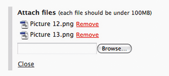
Expanding Forms
If your form requires multiple data items to be entered into the same input fields – for example, attaching multiple files to a message or adding multiple people to a company record in your database – then you could use expanding forms to achieve this in an elegant fashion. Because the user only works with one field at a time, you should display only one field at a time to them. When they fill out and add a record, the application creates an extra input field below it to allow them to enter more information. This way, instead of displaying several empty input fields at once, you display only one empty field and add more as necessary.
Labels Inside Input Fields
Simplifying interfaces depends mostly on thoughtful reduction. You want to cut out the unnecessary and make better use of space for the stuff that remains. One clever idea for forms is to put labels inside the actual input fields themselves. This saves space and also makes it dead clear to which field each label applies.
Context-Sensitive Interface Elements
Sometimes you need to integrate additional functionality for more experienced users of your application but don’t want to add weight to the interface. What you can do is offer context-sensitive interface elements on demand. For example, if you have a search bar somewhere in your application that has advanced filters, you could display just the search bar when it’s not being used, and then reveal more controls when the user clicks on the box. This way, the interface remains slim, while the advanced functionality is only a click away.
Icons
Icons can be used to simplify the interface and make it look more visually appealing, but there are some considerations to take into account before you implement them. Icons are almost always less clear than words. Writing out a label is easy: you just say exactly what the button does. When designing an icon, however, you have to come up with an effective metaphor to describe the action in question. Also, the metaphor you choose may not translate very well in different countries if the illustration is of something local (even trash cans vary in appearance across the globe).
Icons work best when there aren’t too many of them on the screen at the same time and each one is visually different enough from the others to stand out. This means that varying shape and color is key to building a successful set of icons. Implemented correctly, icons make the interface easier to use, because once users familiarize themselves with the icon set, the distinctive shapes and colors help them jump right to the icon they want.
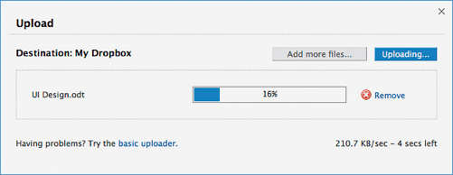
Make It Responsive With Loading Indicators
Nobody likes waiting. Waiting means you’re spending time doing nothing while you could be doing something valuable. Unfortunately, every application has features that take time to execute; whether it is exporting a large document or fetching the results of a search query, your users will have to wait. But you can make the wait time feel considerably shorter by showing a loading indicator. Whenever something loads, add a loading indicator, such as a spinning animation or progress bar. Research shows that users perceive the wait time to be less when such indicators are displayed2.
Loading indicators are great for short wait times, but what if an action takes a minute or more to complete? While you can’t do anything about the load time itself (assuming you’ve already done everything in your power about that), you can do something about the waiting experience of your users. Take this time to entertain or inform. For example, many applications display interesting hints and tips during long wait times. If the user isn’t doing anything productive, at least they can learn something new.
Make It Responsive With Pressed Button States
The responsiveness of your application doesn’t depend solely on the optimization of your back-end architecture. The way your user interface behaves plays a big part in this, too. One of the most used elements of any visual interface is the button. In desktop applications, buttons have several states, the most common being the default state, in which the button just sits there, and the pressed state when you click on it.
The pressed state looks just like that: the button appears to have been pressed. This state sends instant feedback to users that their click was successful. Just as on the desktop, pressed button states can be used in Web applications to provide that extra bit of feedback and responsiveness.
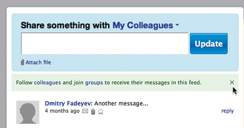
Helpful Blank States
When a user loads your application for the first time, there likely won’t be very much on the screen; the user hasn’t entered any data yet, so there is nothing to display. Take this blank state as an opportunity to aid the user by including a short help message that provides information on how to get started. To make things even easier, you can provide a link right in the help message pointing to the action it recommends; so, for example, if your application is for managing email campaigns, and the user has just created a new account and logged in, the help message could provide a link to the creation page for new campaigns.
Advertise Features
Your users won’t know your application inside out, so in some situations it may be a good idea to advertise features in the application itself. Also, because Web applications tend to be updated constantly and substantial new features are introduced from time to time, it makes sense to inform your users about them. Do this by placing a small notice in a prominent area of the screen. It should be fairly eye-catching but not distract or handicap the user in performing their tasks. The users should also be able to close the notice once they’ve read it.

Undo
One of the most relied-on features in desktop applications is the trusty undo shortcut. Accidently changed the formatting of that chart you’re working on? No problem: hit Ctrl/Cmd and Z on your keyboard, and the application takes a step back and restores the document to its state before your last action. Undo is a crucial tool in forgiving interfaces, and it can be used in Web applications as well. For example, you could either integrate the familiar keyboard shortcut or show temporary notice messages with undo links in them.
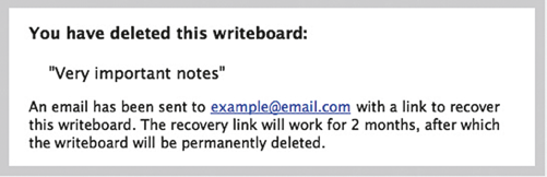
Restore
People often change their mind after deleting something, so it’s wise to implement some extra protective measures when dealing with the more important bits of data in your application; for example, project files in a project management application. When a user deletes a project, you could, instead of deleting it right away, archive it for a certain amount of time. If they change their mind and decide they need the project files back, you will be able to restore them easily. A few extra megabytes of used space is worth the trade-off for making your customers really happy when they discover that all is not lost.
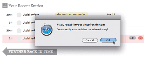
Confirmation Dialogs
When allowing destructive actions in your application, such as deletion of items, it is a good idea to provide a confirmation dialog to ensure that the user really wants to go ahead with his action. This is more important if the delete button is located close to other controls; if users accidently click it, they should be able to cancel the action before it happens. Be careful not to overuse this feature, though, because it will introduce interface friction by making actions longer and more tedious to perform than necessary.
Conclusion
There is a Japanese philosophy called Kaizen, which focuses on continuous improvement through small, gradual steps. User interface design, especially in modern Web applications, doesn’t have to be in a finished state because you can always keep evolving and improving it. Think of it like Kaizen.
The old model of distributing software on CDs carried a big downside: once you burned and shipped the product, you couldn’t change it… well, not very easily. You could release a patch, but your users would have to download and install it before any changes took effect, and you couldn’t guarantee that everyone would update. Additionally, releasing a patch for every small change wasn’t feasible, so you pretty much had to get things as perfect as possible the first time, which required a lot of testing before the release. The software-as-a-service model changed all that. The benefit of hosting your Web application online is that you can deploy little changes whenever you want, and all of your users will instantly gain access to them.
This means you don’t have to get your interface 100% right the first time. If something doesn’t work, you can change it. By observing how users interact with your interface, you will begin to get a good feel for how well it works and where the friction is – where things slow your users down. If any parts of the UI need improvement, you can update them for all of your users very easily. This is the Kaizen approach to interface design: small, gradual, regular improvements. So don’t worry about getting things perfect the first time; instead, iterate as you go, and you’ll soon end up with a great interface that has evolved through real usage.
Further Reading
- Web Design Criticism: A How-To
- Facing Your Fears: Approaching People For Research
- How To Respond Effectively To Design Criticism
- The Rainbow Spreadsheet: A Collaborative Lean UX Research Tool
 (mrn, il)

