Showcase Of Beautiful Retro And Vintage Typography

Email Newsletter
Weekly tips on front-end & UX.
Trusted by 182,000+ folks.
 Register for Free
 Celebrating 10 million developers


 Custom Web Forms for Angular, React, & Vue. Your backend.
Typography surrounds people daily as they move through their routines, rarely taking notice. It’s literally everywhere. In advertising, product packaging, printed publications, graphic designs, and more. Accentuating and centralizing the overall theme of the design that it inhabits, communicating the message to the masses through creative inclusions in the work.
For decades this design tool has given rise to some truly elegant type that still have impressions echoing through design today. Revisiting these themes is a cyclical commonplace that the design community embraces with stunning results. In this article, we go retro, finding beautiful examples of vintage typography and the modern work they’ve inspired. Looking back, it’s easy to see why some of this type has stood the test of time and is still lingering in the design community today.
Further Reading on SmashingMag:
- Sexy, Bold and Experimental Typography
- Breathtaking Typographic Posters
- Showcase Of Beautiful Vintage and Retro Signage
- 30 Beautiful Vintage and Retro Photoshop Tutorials
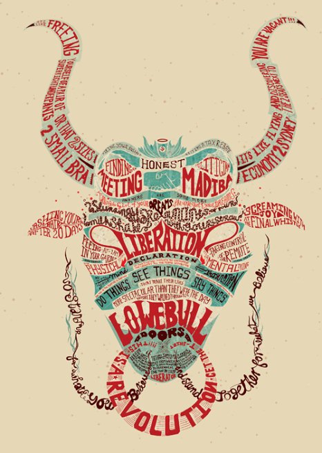
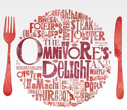
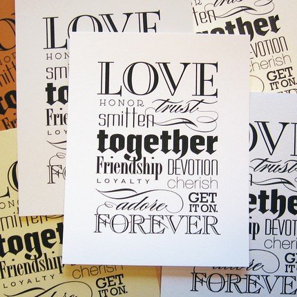
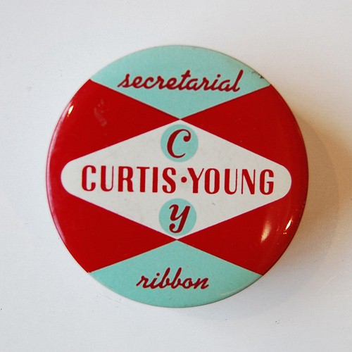
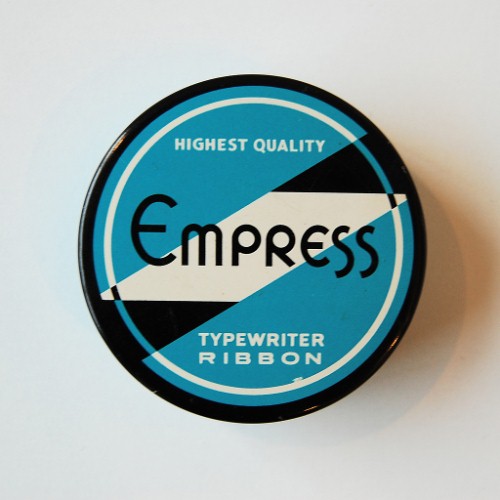
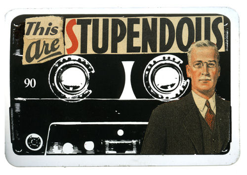
Let the Good Types Roll
Typography Retro Poster
Marcus Walters
Festival der Sinne
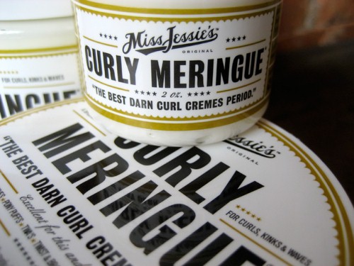
Miss Jessie’s
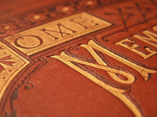
Book Covers
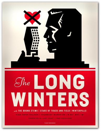
The Long Winters
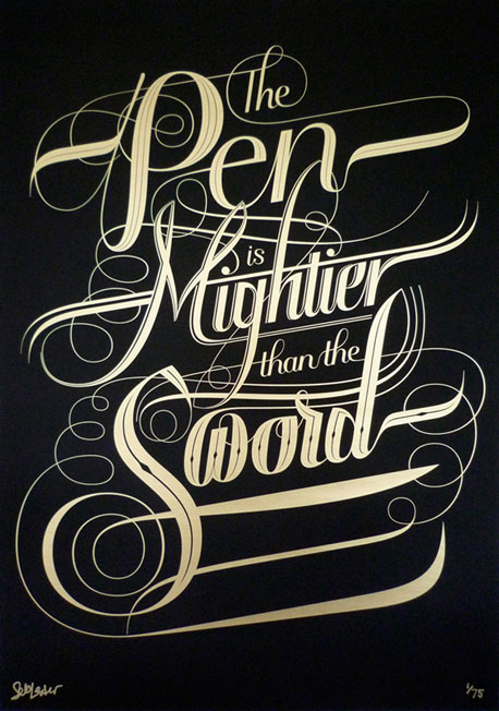
The Pen Is Mightier Than The Sword

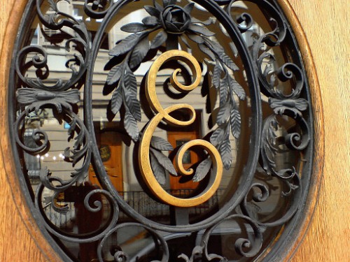
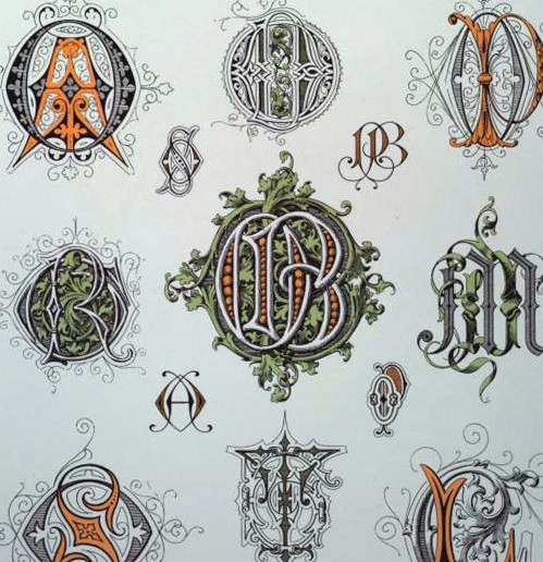
2100 Victorian Monograms (via)
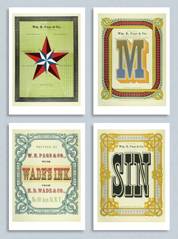
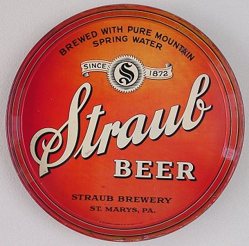
Last Click
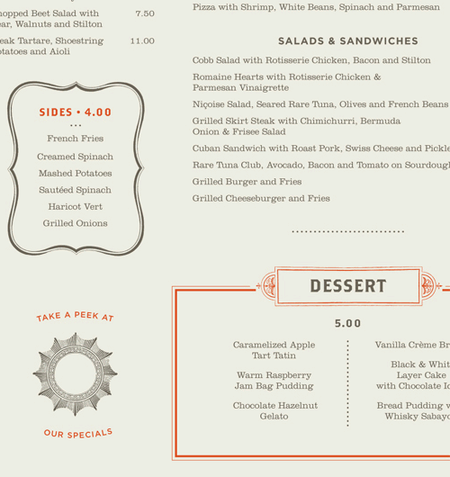
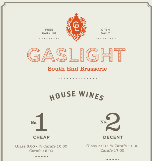
Gaslight Menus Gaslight is an American Brasserie in Boston’s South End district. The menus incorporate the feel of a traditional brasserie with an American twist. Designed at Tank Design by Rebecca Alden.