Image Caption Design: Techniques and Trends

Email Newsletter
Weekly tips on front-end & UX.
Trusted by 182,000+ folks.
 See the full picture →
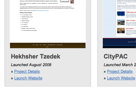
 SurveyJS: White-Label Survey Solution for Your JS App

 Celebrating 10 million developers
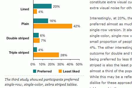
Image captions are an often-overlooked element of Web design. They’re often thought of more in terms of function than form. As long as they include the proper photo credits or identifying information about the image subject, not much more thought is given to them.
But image captions are a great place to add a bit more style to your website or to give some unique insight into the subject of the image. Whether the captions are for photos on a news website or design samples in a portfolio, they present an opportunity for reinforcing the overall look of the website. When done properly, they can even add more visual interest and become a distinguishing trademark of a particular brand or website.
There are two basic kinds of photo captions. There is the simple, minimalist, down-to-business style. These usually have a simple sans-serif font in white, black or shades of gray. They are usually positioned either to the side or below an image, though sometimes they overlay or are above it. This type is commonly found on news websites but is also seen in portfolios and other websites.
The other major style is more graphic. This often include effects, such as the caption only appearing on a mouse-over or a “Details” button displayed that leads to the full caption. While fonts are still generally sans-serif, much more color is used, and the captions are often overlaid on the actual image. These types of image captions are generally seen on portfolio websites of designers and ad agencies. Of course, there are websites that use a crossover-type image caption, displaying elements of both styles.
Image Captions: Popular Styling Techniques
Designers use a variety of different approaches to style image captions. In most cases designers experiment with colors, using lighter colors on darker backgrounds. Italics are used very often, while the font size of image captions is usually smaller than the body copy. Let’s take a look at the overview of various techniques we have identified during our research.
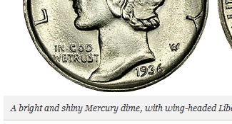
caption text at the bottom, in italics
caption text at the bottom, with light background color
caption text at the bottom on a semi-transparent background
caption text at the bottom on a dark background
caption text with focus on typography
caption text as an overlay
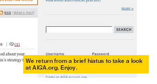
image surrounded by a background
icons in use
![]()
image enumeration in use

captions are right-aligned
captions are right-aligned at the top
captions are centered
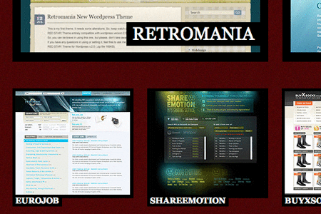
1. Simple and Minimalist Image Captions from 2008
Simple caption designs are the most common image caption designs. They can make a website appear more elegant, but if not integrated carefully into the overall design style of the website, they can end up just plain boring. Here are some that aren’t:
Viget.com
A List Apart
The New Yorker
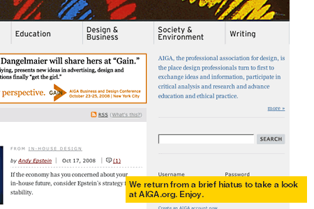
AIGA.org
37Signals
Jason Santa Maria
Wired.com
Inspirationbit.com
Astheria.com
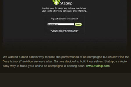
Garrett Dimon
Design Observer
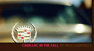
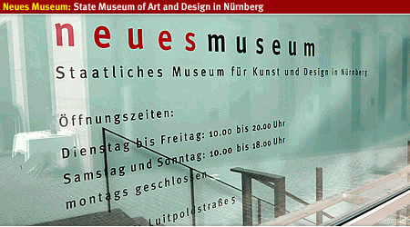
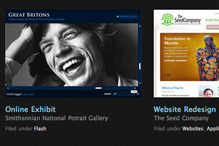
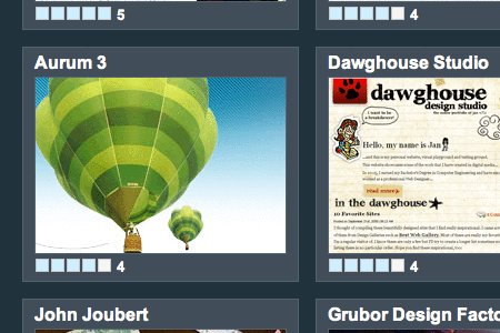
Reactive Web Design and Development Design portfolio. This is about as minimalist as it gets: gray sans-serif type on a white background.
Phony Lawn Graphic design portfolio. Another website that includes a lot of information about the images but uses a light-gray and white-on-dark-gray color scheme.
Pixelight Creative Web design portfolio. The photo captions on this website are light-on-dark and set off to the side of the image.
![]()
Les Artistes Art gallery website. Another minimal caption style, but this time made more interesting with a mouse-over effect.
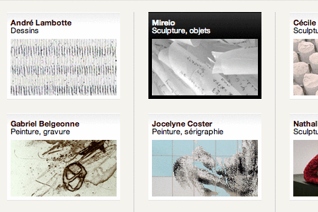
Bainbridge Studios Design portfolio. Simple white and light-gray on black captions set to the side of each image. This website includes a serif font in the captions.
Studio7Designs Web design portfolio. Another very simple dark-gray-on-light-gray style, with the image and caption both set against a light-gray box.
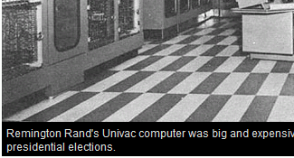
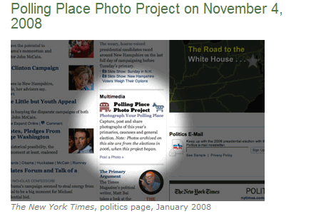
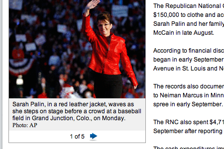
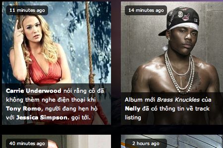
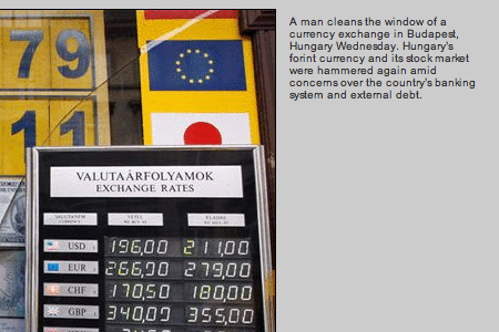
New York Times News website. This is probably one of the simplest caption styles out there, with the photo credit in small gray text and a description of the image in slightly larger same-color type.
Politico News website. Gray background with black type. It doesn’t get much more minimal than this.
Thomas Cheng Photography portfolio. Another set of captions that makes good use of typography and a gray-on-white color palette.
2. Bold and Graphic Image Captions
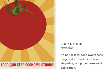
Graphic image captions make use of brighter colors and bolder shapes to make the image captions stand out. They incorporate the image captions fully in the overall design of the website. Hot pinks, lime green and electric blue seem to be the most popular colors to use.
Vibrant captions
JeffCroft.com
Typesites
Segd.nl
Designslices Design portfolio. Lime green and hot pink can be a tough combination to pull off, but it’s done beautifully here. The black overlays, both transparent and opaque, add to the graphic appeal.
Graphic Image Captions in Use
SuperflousBanter.org
ILoveTypography
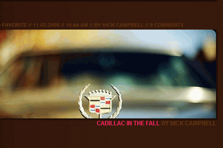
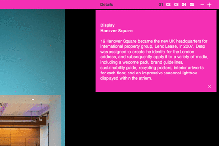
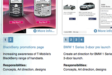
Deep Ad agency portfolio. The hot-pink header and drop-down details box give this website a very hip feel, while providing all of the pertinent details.
Power to the Poster Poster design showcase. The transparent color effects of these captions set them apart, and the mix of serif and sans-serif fonts adds interest.
Design Snack Web design showcase. The rounded corners and monochromatic color palette give a fitting Web 2.0 look to this Web design gallery.
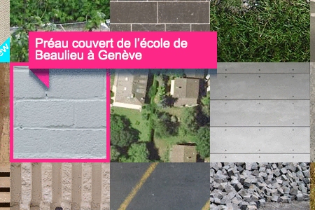
Freshivore Web design portfolio. The oversized hot-pink titles and the light-gray meta information on the graphic, paper-like background combine to create a very appealing visual style.
Mayor + Beusch Architecture portfolio. The mouse-over captions are very bold in lime green, hot pink and electric blue.
3. Hybrid Image Captions
These image caption designs combine elements from both simple and graphic designs. They’re a bit bolder than the minimalist designs, often using different colors or more graphic shapes, but more subdued than the bolder, graphic image captions above.
Hybrid Image Captions in Use
Frederica Cau Design portfolio. The captions on these images provide tons of information, and the electric-blue headers tie in with the border of the image.
Klinkov Art portfolio. The captions for these images are set to the side and include nice blue-green and gray colors.
PixelFuze Design portfolio. Another website that makes use of lime green in the image captions, this time combined with electric blue and light gray.
![]()
BestWebGallery Web design showcase. The grayish-green type and tiny icon set these captions apart.
Jay Hafling Web design portfolio. The oversized type and overlaid black caption space give these a graphic appeal while actually being quite simple.
SOObox Design gallery, I think (I don’t read whatever language this is in). The semi-transparent black overlays with white text are graphic while still being minimalistic. The rounded-corner overlays in the upper-left corner add a bit more visual appeal.
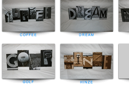
Letter Art Gallery Art gallery website. The simple, all-caps, electric-blue captions are simple while still providing some “pop.”
Aten Design Group Design portfolio. The slightly muted electric-blue headers provide some extra visual pop, while the remaining light gray text keeps the caption design from being overwhelming.
ten24 SEO SEO site. Another relatively simple light-gray-on-dark-gray caption design, but with some nice mint-green type.
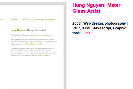
Albert Lo Design portfolio. Simple serif type over a light background, but with a pale-blue header color.
ILoveTypography
Deep Ad agency portfolio. The hot-pink header and drop-down details box give this website a very hip feel, while providing all of the pertinent details.
Power to the Poster Poster design showcase. The transparent color effects of these captions set them apart, and the mix of serif and sans-serif fonts adds interest.
Design Snack Web design showcase. The rounded corners and monochromatic color palette give a fitting Web 2.0 look to this Web design gallery.
Freshivore Web design portfolio. The oversized hot-pink titles and the light-gray meta information on the graphic, paper-like background combine to create a very appealing visual style.
Mayor + Beusch Architecture portfolio. The mouse-over captions are very bold in lime green, hot pink and electric blue.
3. Hybrid Image Captions
These image caption designs combine elements from both simple and graphic designs. They’re a bit bolder than the minimalist designs, often using different colors or more graphic shapes, but more subdued than the bolder, graphic image captions above.
Hybrid Image Captions in Use
Frederica Cau Design portfolio. The captions on these images provide tons of information, and the electric-blue headers tie in with the border of the image.
Klinkov Art portfolio. The captions for these images are set to the side and include nice blue-green and gray colors.
PixelFuze Design portfolio. Another website that makes use of lime green in the image captions, this time combined with electric blue and light gray.
![]()
BestWebGallery Web design showcase. The grayish-green type and tiny icon set these captions apart.
Jay Hafling Web design portfolio. The oversized type and overlaid black caption space give these a graphic appeal while actually being quite simple.
SOObox Design gallery, I think (I don’t read whatever language this is in). The semi-transparent black overlays with white text are graphic while still being minimalistic. The rounded-corner overlays in the upper-left corner add a bit more visual appeal.
Letter Art Gallery Art gallery website. The simple, all-caps, electric-blue captions are simple while still providing some “pop.”
Aten Design Group Design portfolio. The slightly muted electric-blue headers provide some extra visual pop, while the remaining light gray text keeps the caption design from being overwhelming.
ten24 SEO SEO site. Another relatively simple light-gray-on-dark-gray caption design, but with some nice mint-green type.
Albert Lo Design portfolio. Simple serif type over a light background, but with a pale-blue header color.
MSNBC News website. Very simple, with dark gray and blue type, set off to the side.
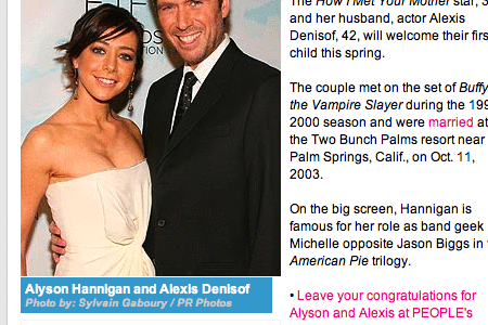
People News website. A caption with a bright-blue background, with white and light-gray type in a serif font.
CLD Web Gallery Web design showcase. Very simple captions that show the title of the website and its rating in gray and light-blue on a darker, steel-gray background.
Junghoon Park Design portfolio. Hot-pink and black sans-serif type on a plain white background.
Addicott Web Dark-gray and light-blue sans-serif type on a light-gray background, with the caption widely spaced and underneath the image.