Newspaper Website Design: Trends And Examples

Email Newsletter
Weekly tips on front-end & UX.
Trusted by 182,000+ folks.


 Custom Web Forms for Angular, React, & Vue. Your backend.
 Celebrating 10 million developers

News websites can be intriguing to examine from a design perspective. Regardless of what type of news they cover, they all face the challenge of displaying a huge amount of content on the home page, which creates plenty of layout, usability and navigational challenges for the designer. The lessons that can be learned from examining how news websites address these challenges can be valuable for designers who work with other types of websites, including ones with blog theme designs.
Monetization is also a major factor for news websites, and it’s interesting to see how they integrate advertisements in the design. In some cases, the ads are somewhat intrusive or excessive, but most news websites are able to use ads without turning readers away, in part because of the content that’s available.
For the purposes of this article, the term “newspaper website” refers to any news-related website that has the editorial focus of an online periodical. Many of the websites mentioned here are the online versions of major newspapers, but others are standard news websites and some blur the line between news website and blog.
You may want to take a look at the following related posts:
- Award-Winning Newspaper Designs This post is supposed to provide you with some examples of outstanding newspaper designs which have been rewarded with prestigious awards (see references at the bottom of this post), and demonstrate unusual approaches of newspaper design.
Common Trends of Newspaper Websites 2008
1. Color Schemes
Most news websites use dark text on a white background. Obviously, these websites contain a huge volume of content, and readability is important. A few of the websites mentioned later in this article use darker colors for headers or for the body of the page outside the content.
A large percentage of news websites also use blue and red in addition to a dark gray or black for text. Blue is extremely common for headlines, article titles and links. Red is often used sparingly as an accent color. Some news websites also mix in more colors in other places, such as in the navigation.
The L.A. Times website demonstrates a common color scheme:

2. Header and Sidebar Banners
Of course, all of these websites need to produce revenue, and banner ads in headers are a key source of income. Some websites use banner ads on all pages, and others exclude banners on the home page but display them above the header on other pages.
While blogs commonly use 125 by 125 pixel banners in sidebars, news websites commonly use 300 by 250 banners or tall skyscrapers. Many of the websites mix in some AdSense or other text link ads.
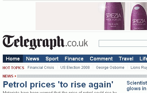
The Telegraph uses a 730 by 90 pixel banner over its header.
3. Top Navigation
Although there are a few notable exceptions to this trend, most news websites put their primary navigation menu just below the header and above the content. The New York Times and MSNBC are two of the exceptions, as they both use the left sidebar for the main navigation.
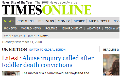
The Times Online uses a two-level navigation menu.
4. Tabbed Content Areas
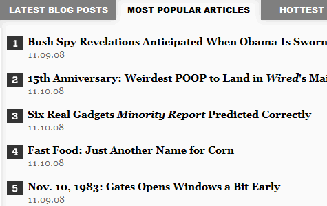
Many news websites use tabbed content areas that allow visitors to see popular articles, recent articles, most commented articles, etc. This is sometimes used in the sidebar, and other times in the main content area, such as on Wired. This allows for more control by users over what content and links they see, and it can save space in the design by making more content accessible in a specific area.
5. Grid-Based Layouts
Newspaper websites are commonly built with grid-based designs. The grid is a popular choice not only because of the sharp look it creates but because it’s one of the most effective ways to manage and organize a large amount of content. The New York Times has one of the more well-known grid-based layouts.
Notable Differences Between News Websites and Blogs
The line between a news website and a blog is a fine one, and the two types are difficult to distinguish sometimes. For the purpose of this article, “blog” refers more to a traditional blog than to a commercialized news blog by a team of writers. While there are certainly similarities between blogs and news websites, there are also some key differences.
Social Media Integration
Seeing widgets or voting buttons on blogs is extremely common; in fact, most blogs use them in one form or another. Most news websites, however, use them more subtly, if at all. It’s common to see a “Share” section on articles, such as the one shown below from ABC News, but voting buttons are not used in quite the same way as on blogs, where a standard “Digg This” button may appear at the top of every post. A growing number of news websites recognize the impact of social media, but they are still using such tools subtly in their designs.
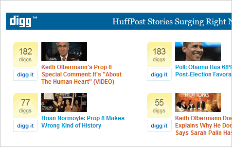
A few websites shown in more detail below do make more use of social media than others. The Huffington Post has a section specifically to display stories that are new on Digg, and the website certainly makes plenty of front page appearances.
RSS Feeds
Subscriptions and RSS feeds are a huge part of blogging, and most blogs use large icons or FeedBurner counts to make it easy for visitors to subscribe. Most news websites, however, don’t push RSS feeds on readers like a blog would. Most news websites do offer feeds, often according to category of content, but they’re not a major part of the design or layout. In fact, most visitors probably don’t even notice the small icons or links to feeds. As RSS feeds become a part of the daily lives of average readers, this will probably change.
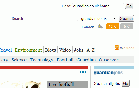
The Guardian promotes a link to its feed in the website’s header, but with much less attention drawn to it than most blog themes.
Comments
Reader comments and discussion are a critical element for most blogs, but they’re not as important to news websites. Many news websites allow readers to leave comments, but they’re usually an afterthought in the design and are rarely promoted the same way as they would be on a blog. For example, many blogs show excerpts of posts on the front page, and almost all will also show a comment count with the excerpt that links to the comment section. This is used on a few news websites, but it’s rare.
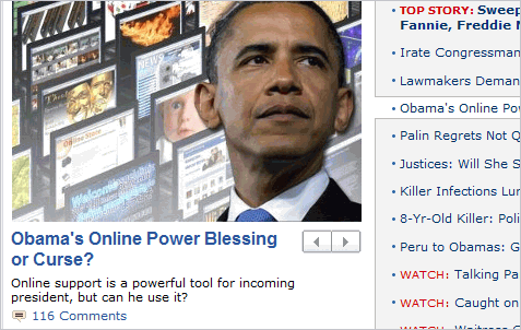
ABC News is one of the rare news websites that shows a comment count by the post excerpt on the home page.
A Look at 20 Leading Newspaper Websites
The Onion Satirical news website The Onion features a grid-based design (it’s been called the funniest grid you ever saw) that makes excellent use of the screen space that’s available. There is a lot going on on the website, which can be both good and bad. The main navigation separates the content into video, radio, sports, election, etc.
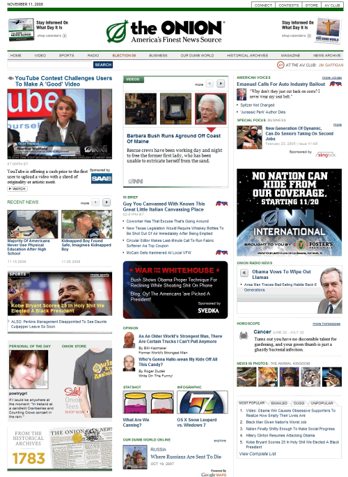
The header includes an ad on each side, and the sidebar has some advertising as well, but nothing too intrusive. Some parts of the home page are used essentially as advertisements for features that are part of The Onion, such as The Onion Personals and The Onion Store.
New York Times The website of the New York Times is another well-known grid. The majority of the website’s navigation is down the left side of the page, which is not as common as top navigation. The website does use a tabbed navigation bar at the top with links to such features as “Today’s paper,” “Video,” and “Most popular,” but all of the content category links, such as World, U.S., Politics, Business, etc., are down the side.
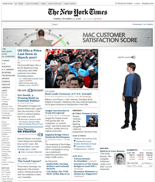
The website’s design includes a nice use of blue and black headers and links, with a touch of red added in a few places, such as the time of an article’s publication. Overall, the New York Times presents one of the better newspaper websites.
Chicago Tribune Unlike many of the other websites featured here, the Chicago Tribune uses only one small banner in the header of its home page, although individual article pages use a 730 by 90 banner. Aside from the header, the rest of the home page is fairly ad-heavy, including text link ads.
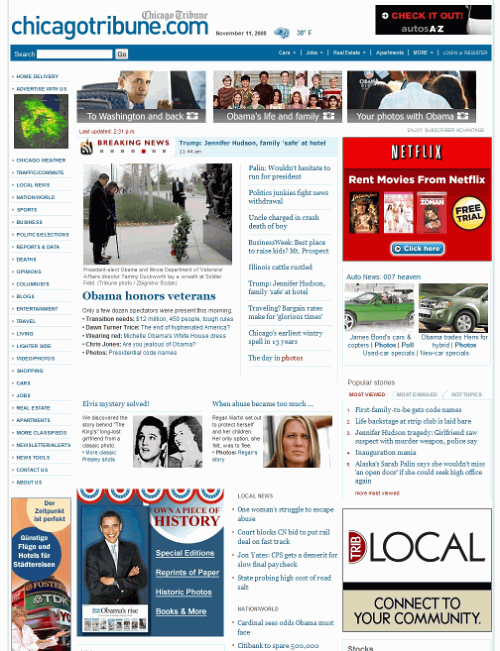
The content on the Chicago Tribune website is spaced out a bit more than, for example, the New York Times’. Again, blue is used for headers and links, with a touch of red.
Washington Post The Washington Post also uses the common colors of blue, black (or dark gray) and red on a white background. The header includes a small 290 by 45 banner, and the top of the sidebar includes a 300 by 250 banner. The rest of the home page contains only a few other small banner ads.
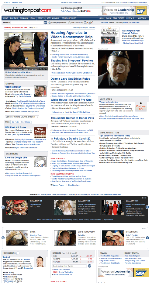
The layout of content on the home page is focused on providing categorized links to specific content. An image is included for the lead story, but other headlines above the fold do not have thumbnails. At the top right, there is a section for the most-viewed articles.
Los Angeles Times The L.A. Times website takes a different approach with its header than some other news websites. There is relatively little going on there, with plenty of unused space that could be filled with ads, something that most other news sites are doing. The rest of the home page uses only two 300 by 250 banners and a few text link ads. Individual article pages use a 730 by 90 banner above the header.
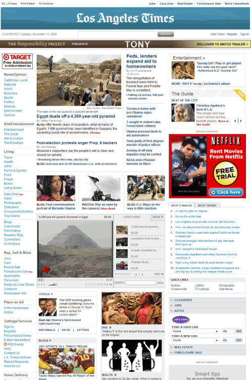
The content of the L.A. Times home page is contained in a grid-based layout, with primary navigation on the left. Again, blue, black and red are the colors of choice for text, links and headlines.
Tennessean The Tennessean isn’t one of the largest newspapers in the U.S., but its website is worth noting. The Tennessean breaks some of the norms of the other websites that have been examined so far, primarily in terms of color. A dark orange is used for headlines and links, instead of a more common choice, such as blue. Additionally, a green background color is used on the sidebar.
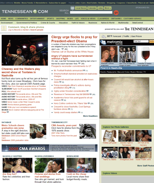
There is a 300 by 250 banner in the sidebar and a skyscraper in the left sidebar, with more ads at the very bottom of the page. Individual article pages include a 730 by 90 banner above the header.
Houston Chronicle The Houston Chronicle packs a large number of headlines onto the home page, including in the top center of the layout. This means there are more links to content above the fold, but each of them stands out less than it would on a news website that uses more thumbnails.
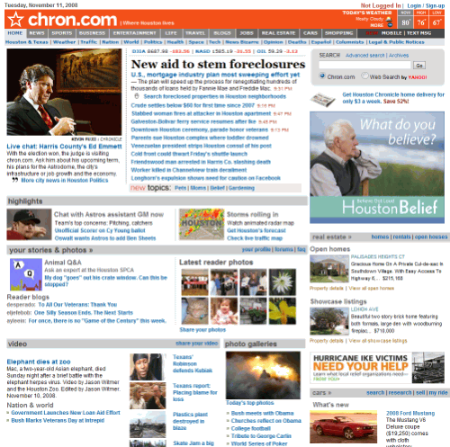
The website has no ads in the header of the home page, but has a few banners in the right sidebar and some text link ads at the bottom of the page. Article pages have a 730 by 90 banner above the header.
USA Today The USA Today uses more color than many other news websites, particularly in the navigation menu and with links throughout the website. Category links for feature articles, such as sports, markets, education and people, all use different colors, which help them stand out.
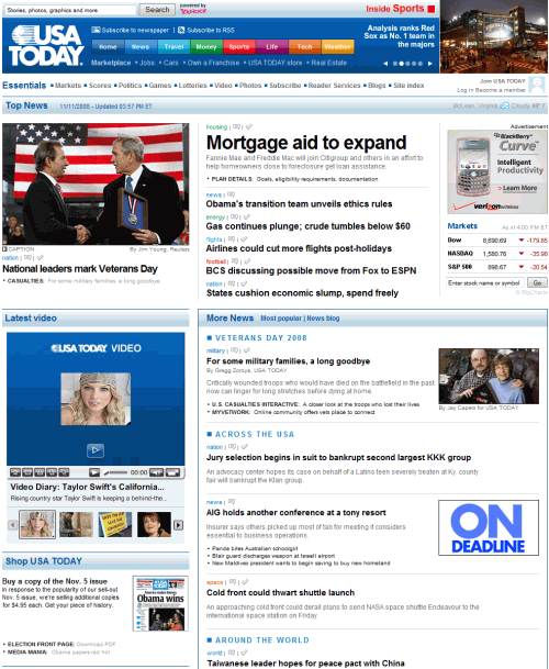
Unlike most news websites, the USA Today shows the number of comments on articles right by the headlines on the home page. Only a few smaller banners are located on the home page, aside from a 730 by 90 banner at the very bottom of the page. Individual article pages are much more ad-filled, and at times while navigating through the website you may encounter a full-page ad that you have to skip to get to the content.
Mail Online British news website Mail Online uses a more colorful design than many other news websites. The headlines and links are a lighter blue than those on the New York Times or Chicago Tribune websites, and they turn red on hover. The right sidebar includes tons of thumbnails from recent posts and colorful headers and roll-overs.
The website includes AdSense ads in the header and various ads throughout the rest of the layout, including some in the middle column. The grid layout keeps the content organized and makes use of virtually the whole page, which is incredibly long.
Telegraph Another leading UK news website, the Telegraph, uses a nice, clean grid-based layout. Above the header is a 730 by 90 banner, and the only other advertising on the home page is a 300 by 250 banner and a skyscraper, both in the right sidebar.
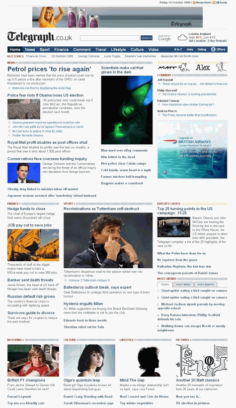
The home page design makes extensive use of thumbnails to go along with article headlines and brief descriptions. Blue and red are used for headlines and links. The main navigation is located at the top of the page.
Guardian The Guardian uses a clean but colorful design. The main navigation at the top of the page consists of various colored links to different sections of news. The home page uses little advertising, but individual article pages include a 730 by 90 banner above the header of the page, and 300 by 250 ad at the top of the sidebar.
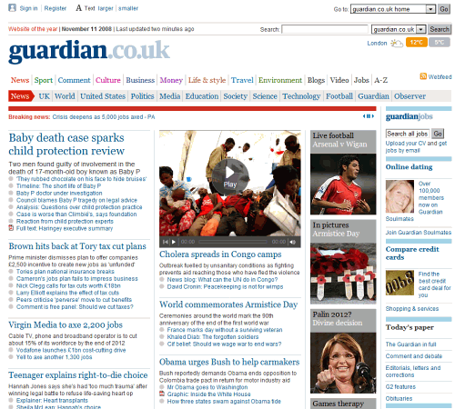
Headers on the Guardian website are a common blue, but colorful borders are used to add some visual appeal. Thumbnails are used in several spots on the home page, but most stories have only a headline and brief description or just a headline.
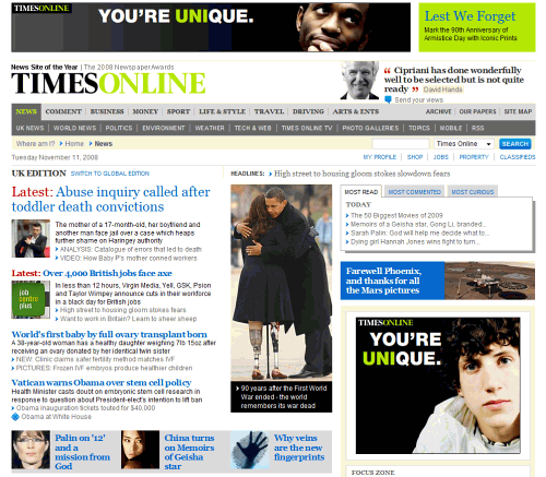
Times Online The Times Online is one of the few news websites to use a bright color in its logo/branding area, but it does accomplish the goal of distinguishing the website. Above the header is a 730 by 90 banner.
The home page uses a two-level navigation menu above the content and a fairly typical blue color for headlines. Several article excerpts on the home page include thumbnails, but there are no large images for featured articles as there are on many news websites.
MSNBC MSNBC stands out among other news websites due to its dark yet colorful header, a look that’s been imitated by many Photoshop users. The header includes no advertisements, and in fact there is only one ad visible above the fold. Text link ads are used in a few places throughout the home page. Individual article pages do include a 730 by 90 banner above the header at the very top of the page.
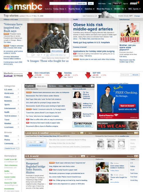
Overall MSNBC is a very well-designed website, with an attractive color scheme and a layout that’s well-structured but not overly cluttered. Like the New York Times, MSNBC uses the left sidebar for its primary navigation.
ABC News ABC News features a dark header that helps distinguish the website from other news leaders. There is relatively little advertising on the home page. The right sidebar contains a 300 by 250 banner and the only other ads are at the very bottom of the page.
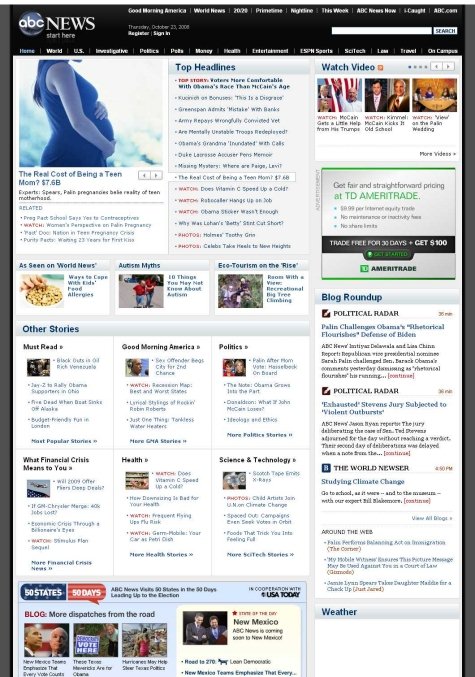
At the top right of the page there are three current videos, plus a link to more video content. While other news websites include video, most don’t place videos as high on the page as ABC News does.
Ars Technica Tech news website Ars Technica has a vastly different design than mainstream general news websites, which should be expected. Unlike the image-heavy general news websites, Ars Technica does not use thumbnails on its home page. Additionally, the article pages have very few images in comparison to general news websites.
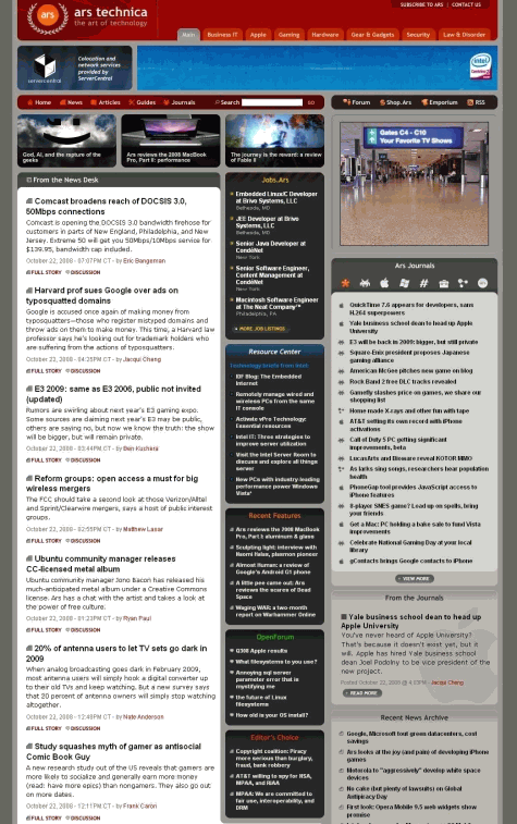
The website uses tabbed navigation at the top of the page to take visitors to different categories of news, such as Business, IT, Apple, Hardware, etc. The header includes a 730 by 90 banner, and the top of the right sidebar includes a 300 by 250 banner ad. Further down the sidebar is a skyscraper banner.
CNET News Tech news website CNET News uses a fairly basic design with a dark header, a featured content area, and a long list of headlines with brief excerpts. Blue and red are used for headlines and links.
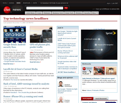
The header includes a small text link ad on the right side of the screen and a few 300 by 250 ads in the sidebar. No additional ads are used on individual articles.
TechRadar UK technology news website TechRadar includes a few items that currently aren’t very common on other news websites. Just above the content of the page, there is a “TechRadar Update” section that scrolls through links to the most recent content. Additionally, there is a featured content area that rotates through the six leading stories. Below the featured content area is a grid of the latest news headlines with brief excerpts.
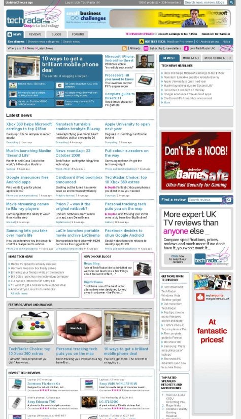
The website header includes a 730 x 90 banner, and the sidebar contains some other banners and text link ads. The navigation on TechRadar is a bit different as it uses tabs for news, reviews, blogs, and forums.
Wired The design for Wired is rather unique. Most notably, thumbnails, headlines and excerpts of featured content reside above the main navigation menu. Thumbnails are used below for the most recent article in each of seven different categories.
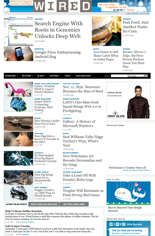
The header includes no banners, just an internal advertisement for WiredBiz. The sidebar contains a few ads as well as additional monetization through a job board widget that links to recent job postings on the website’s job board.
The Huffington Post The layout and design of individual pages on The Huffington Post is quite different than that of the home page. On individual pages you see a small logo/branding area at the top left, with a very long banner on the right that takes up most of the width of the page. Advertisements throughout the rest of the page are fairly minimal.
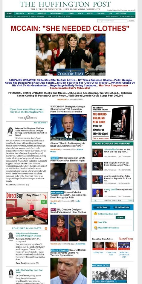
On the home page, most of the area above the fold is used for a headline and image from a featured article. The rest of the home page includes a lot of images and headlines, as well as post excerpts from a variety of writers in the left sidebar.
Sporting News The Sporting News has one of the most outdated designs. The header is used primarily for displaying scores, but with less space efficiency than other major sports websites. Above the header is a 730 by 90 banner.
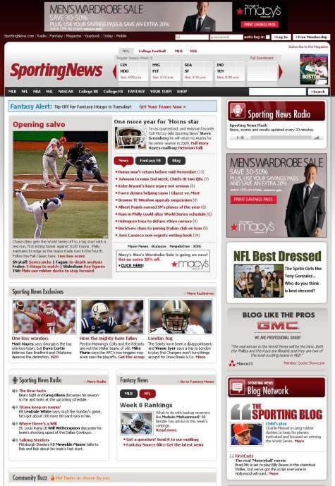
Much of the real estate of the sidebar is used for directing visitors to other sections of the website, such as Sporting News Radio, the Blog Network and community blogs.
Related posts
You may want to take a look at the following related posts:
- Award-Winning Newspaper Designs This post is supposed to provide you with some examples of outstanding newspaper designs which have been rewarded with prestigious awards (see references at the bottom of this post), and demonstrate unusual approaches of newspaper design.
At the top right of the page there are three current videos, plus a link to more video content. While other news websites include video, most don’t place videos as high on the page as ABC News does.
Ars Technica Tech news website Ars Technica has a vastly different design than mainstream general news websites, which should be expected. Unlike the image-heavy general news websites, Ars Technica does not use thumbnails on its home page. Additionally, the article pages have very few images in comparison to general news websites.
The website uses tabbed navigation at the top of the page to take visitors to different categories of news, such as Business, IT, Apple, Hardware, etc. The header includes a 730 by 90 banner, and the top of the right sidebar includes a 300 by 250 banner ad. Further down the sidebar is a skyscraper banner.
CNET News Tech news website CNET News uses a fairly basic design with a dark header, a featured content area, and a long list of headlines with brief excerpts. Blue and red are used for headlines and links.
The header includes a small text link ad on the right side of the screen and a few 300 by 250 ads in the sidebar. No additional ads are used on individual articles.
TechRadar UK technology news website TechRadar includes a few items that currently aren’t very common on other news websites. Just above the content of the page, there is a “TechRadar Update” section that scrolls through links to the most recent content. Additionally, there is a featured content area that rotates through the six leading stories. Below the featured content area is a grid of the latest news headlines with brief excerpts.
The website header includes a 730 x 90 banner, and the sidebar contains some other banners and text link ads. The navigation on TechRadar is a bit different as it uses tabs for news, reviews, blogs, and forums.
Wired The design for Wired is rather unique. Most notably, thumbnails, headlines and excerpts of featured content reside above the main navigation menu. Thumbnails are used below for the most recent article in each of seven different categories.
The header includes no banners, just an internal advertisement for WiredBiz. The sidebar contains a few ads as well as additional monetization through a job board widget that links to recent job postings on the website’s job board.
The Huffington Post The layout and design of individual pages on The Huffington Post is quite different than that of the home page. On individual pages you see a small logo/branding area at the top left, with a very long banner on the right that takes up most of the width of the page. Advertisements throughout the rest of the page are fairly minimal.
On the home page, most of the area above the fold is used for a headline and image from a featured article. The rest of the home page includes a lot of images and headlines, as well as post excerpts from a variety of writers in the left sidebar.
Sporting News The Sporting News has one of the most outdated designs. The header is used primarily for displaying scores, but with less space efficiency than other major sports websites. Above the header is a 730 by 90 banner.
Much of the real estate of the sidebar is used for directing visitors to other sections of the website, such as Sporting News Radio, the Blog Network and community blogs.
Related posts
You may want to take a look at the following related posts:
- Award-Winning Newspaper Designs This post is supposed to provide you with some examples of outstanding newspaper designs which have been rewarded with prestigious awards (see references at the bottom of this post), and demonstrate unusual approaches of newspaper design.


