Principles Of Minimalist Web Design

Email Newsletter
Weekly tips on front-end & UX.
Trusted by 182,000+ folks.
 Register for Free


 Custom Web Forms for Angular, React, & Vue. Your backend.
 Celebrating 10 million developers
Minimalism is achieved by reducing a design to only the most essential elements. Expressions of minimalism span multiple disciplines, as well as other art forms such as music and literature. For website designers, though, minimalism can be intimidating and difficult to master.
Less Is More
“Less is more” is probably the most well-known catch phrase of the minimalist movement. It was popularized by architect Ludwig Mies van der Rohe in describing the minimalist aesthetic.
In Web design, less is more is achieved by using only elements that are necessary to a given design. Using less to achieve an effect that’s more than the sum of the design’s parts is the goal. Examples:
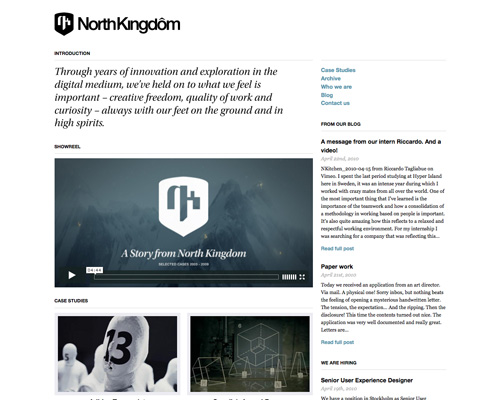
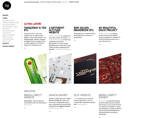
North Kingdom Simple, straightforward typography and a bare use of color make for a design that’s aesthetically pleasing but minimal.
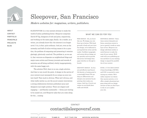
Sleepover A simple design that puts content above all other elements. The simple double-border above and below certain areas helps to delineate the content without cluttering the design.
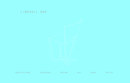
Lindvall A&D The simple line-drawing of a chair, barely visible if you’re not looking for it, exemplifies the “less is more” ideology.
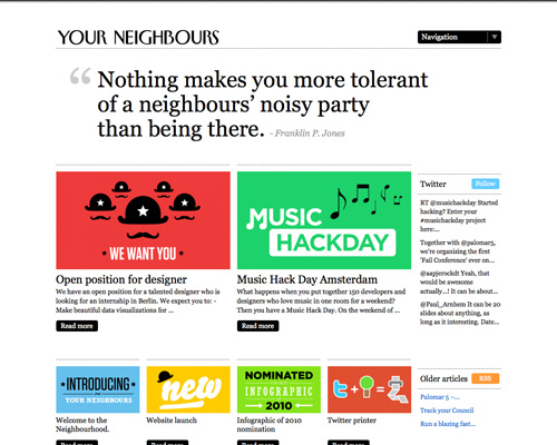
Your Neighbors Another simple design, this one with many more graphics.
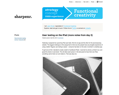
Sharpenr Simple navigation and graphics add to the overall minimalist feel here. The graphics are bold enough that they have visual impact without adding clutter.
Omit Needless Things
In their book The Elements of Style, Strunk and White coined the phrase “Omit needless words.” It has been adapted to minimalist philosophy as, “Omit needless things.” In other words, don’t include unnecessary elements in your designs.
Think of what’s necessary to the content and function of your website. Then focus on only those things, and omit anything that doesn’t directly contribute to either the content or function. Remember, though, that certain design and graphical elements will directly affect the readability or usability of your website.
Minimalism, in the context of design, refers to simple, unadorned designs that embody only the most basic and fundamental needs. In art, it is a movement that has its roots in the post-World War II era, started by highly regarded minimalist artists such as Donald Judd, Carl Andre, and Robert Morris. Minimalism today refers to a certain style (or even a certain attitude or way of life) that transcends different fields, such as architecture, philosophy, law and, of course, Web design.
In this article, we explore the meaning of minimalism in the context of Web design. First, we’ll look at some features of a minimalist Web design in the hope of learning by way of deconstruction. Then, we’ll see a showcase of minimalist designs. Finally, you’ll find some useful resources on the topic of minimalism in Web design.
Examples
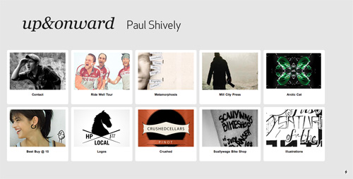
up&onward A simple gray background, white borders around the images and simple typography are the minimum elements necessary for this page. If any were removed, the website would not have the impact that it does.
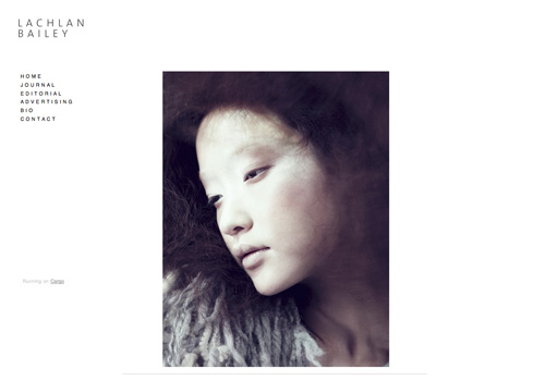
Lachlan Bailey A single image and vertical navigation are as simple as it gets.
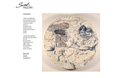
Sarah Hultin Another example of a single image and vertical navigation.
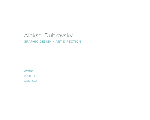
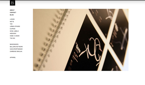
Aleksei Dubrovsky This website goes a step further and omits any images, opting instead for just a header and simple navigation.
Subtract Until It Breaks
When crafting an extremely minimalist design, try subtracting elements until the design stops working the way it should. When the website is on the verge of breaking, you know you’ve achieved the most minimalist design possible.
Remember that “breaks” is relative in design. Technical functionality is only one way to gauge whether something is broken. Usability considerations are equally important. Make sure your website is still user-friendly and delivers the experience you want visitors to have.
Though there are different ways to achieve a minimalist Web design, and designers have varying definitions and interpretations of what minimalist Web design truly is, there are certainly some commonalities among what we can consider minimalist designs.
Examples
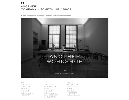
Anothercompany A minimalist design with a single-column body and three-column footer. If any element was removed, the website would be less user-friendly.
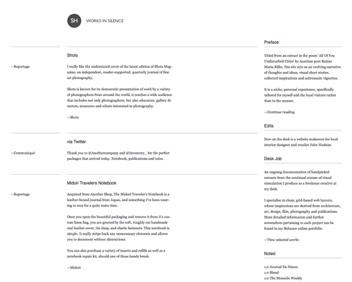
Works in Silence The elements of this information architecture, including the borders between sections and posts and the white space between columns, are vital to keeping everything visually pleasing, organized and readable.
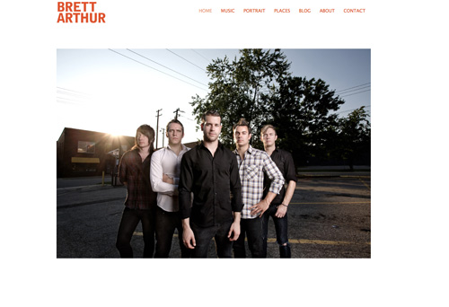
Brett Arthur Photo Another great example of using a minimum of elements.
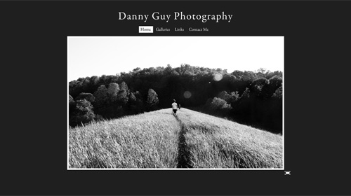
Danny Guy Photography The black background sets this apart from many other ultra-minimalist designs. Notice the full-screen option in the lower-right of the image.
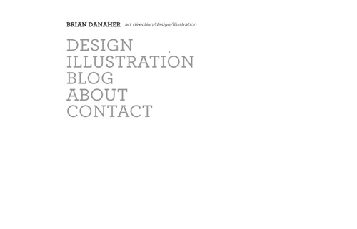
Brian Danaher Another website that opts for a single column and bold typography.
Every Detail Counts
In a minimalist design, every detail has significance. What you choose to leave in is vital. A border around an image, the color palette, the white space, every part becomes important to the overall look and feel of the website when the elements are few.
Think of the feeling you want your website to give visitors, and then decide on the details that would impart that feeling. While many designers view minimalism as one size fits all, there is still room for different emotions based on individual design elements. A minimalist website can easily be funky and modern, fresh and clean, reserved and sophisticated, elegant and refined, or anything in between, based solely on its details.
Examples
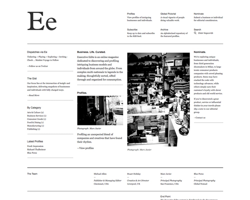
Executive Edits Details like the oversized typography in the header and the thin borders between elements make the Executive Edits website stand out.
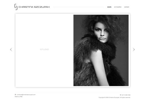
Christine Szczupak Photography The stylized arrows and subtle drop-shadow are important details that increase the visual appeal of this website.
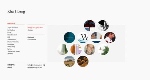
Kha Hoang The effect of the details here—circles, gray box, red typography—definitely add up to a lot more than the sum of the individual parts.
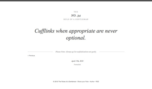
The Rules of a Gentleman Everything from the thick black border at the top to the mix of typography make this website elegant and sophisticated.
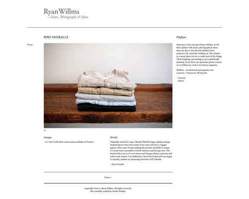
Ryan Willms The spacing and arrangement of content here, along with the elegant typography and simple lines, make for a fresh design.
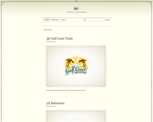
Visual Craftsman This has more detail than many minimalist websites, particularly with the border and other subtle graphics.
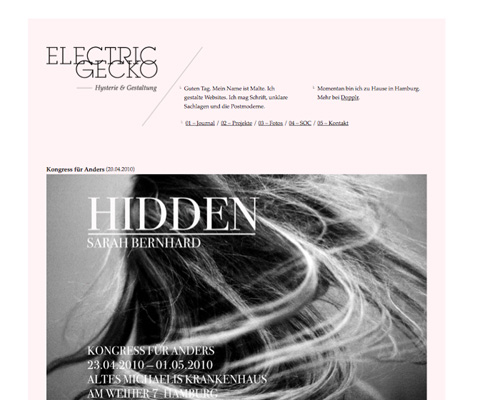
Electricgecko The subtle colored box behind the content sets this design apart.
Color Minimally
Color takes on added significance in a minimalist design. Choosing the right palette or accent colors is vital. Many designers opt for a simple black, white and/or gray palette, but minimalism has room for any color in the rainbow.
Like details, color becomes critical with fewer elements. Pay attention to the meanings of the colors you choose and how they interact with one another.
Examples
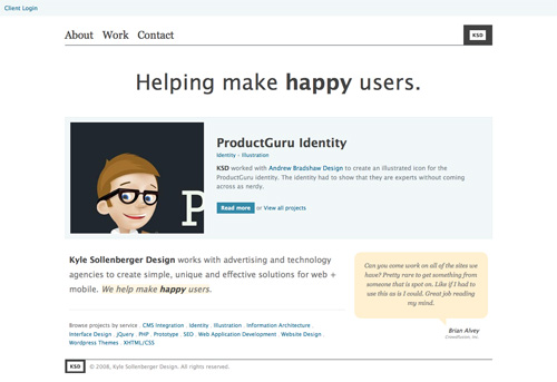
Kyle Sollenberger Design Subtle pastel colors set apart certain content here.
Pixelbot Webdesign Bright colors stand out against this otherwise black-and-white design.
![]()
MattBango.com The shades of blue are subtle but highlight special areas of this otherwise black, white and gray design.

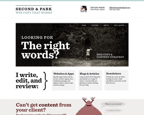
Second and Park Muted colors work well in a minimalist design, particularly when combined with gray.
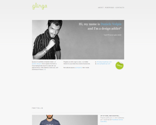
Glinga A simple website with a gray background and colored accents.
Deartoy Another simple design with colored accents.
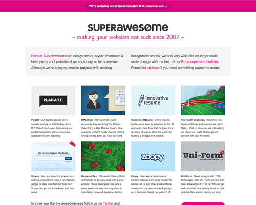
Superawesome Magenta is a popular accent color for minimalist sites.
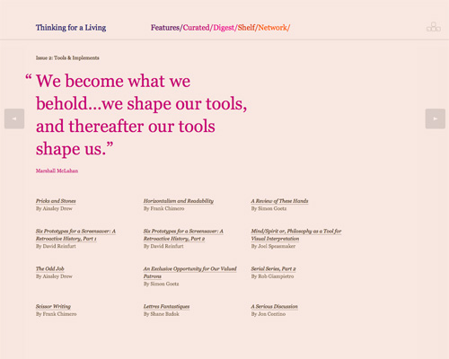
Thinking for a Living A website with a lot more color than many other minimalist websites, but the palette is well thought out.
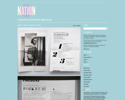
Nation Another colorful website with a great palette.
White Space Is Vital
White (or negative) space is the backbone of any minimalist design. What you leave out of a design is just as important as what you put in. White space is critical to emphasizing certain elements over others.
White space “makes” a design minimalist to a large extent. Without it, you’d end up with a grid design or grunge or some other style that’s not truly minimalist.
Examples
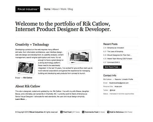
Rikcat Industries Ample space between elements keeps this website from feeling cluttered.
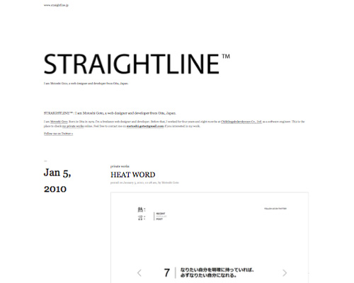
Straightline Another example of a ton of white space around elements.
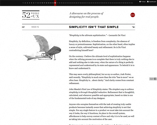
52 Weeks of UX Filling every column on the page is not necessary, as evidenced here on the 52 Weeks of UX website.
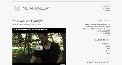
Metro Gallery The Metro Gallery pays a lot of attention to white space, right down the spacing of letters in its category headers.
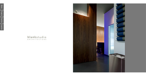
Blank Studio Ample white space is used here.
Trends
There are plenty of trends in minimalist design. Some have been around for so long that “trend” is probably not even the right word to use. In any case, the following elements are being put to good use in a variety of minimalist designs.
Gray
Gray is fundamental to minimalist design. Shades of it are used for backgrounds, text, images and pretty much all other elements, often combined with black and white or other colors.
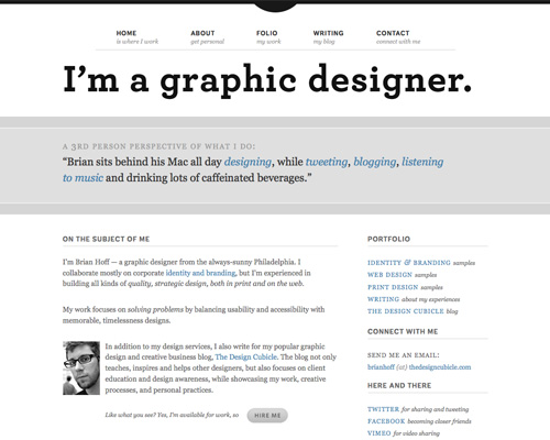
Brian Hoff Gray can be used as an accent, not just for typography or backgrounds.
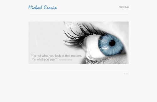
Michael Cronin Of course, gray also makes for a great background color, and it takes on a cool tone when combined with icy blue.
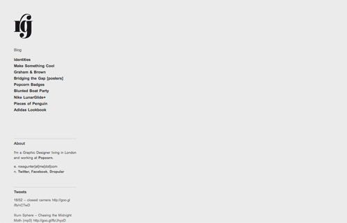
Ross Gunter Another very simple design with a gray background.
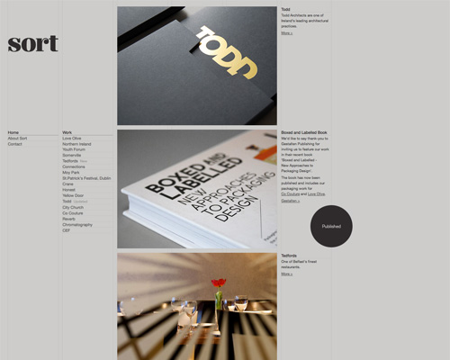
Sort Design Medium gray allows for good contrast with typography, while also making a stronger impact in the background than light gray.
Jack Osborne Gray lends itself particularly well to gradients.
5-Squared Combining multiple shades of gray lends visual interest without cluttering.
Big Typography
Big typography is often used in place of images to add more graphic interest to a website.
Blake Allen Design Oversized typography is used throughout this website.
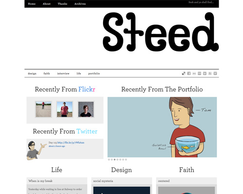
Kyle Steed Big typography is a popular choice for minimalist headers. It makes an impact while also conveying vital information.
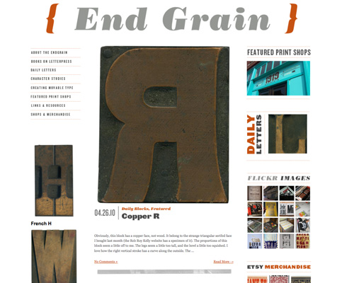
EndGrain Another example of oversized type in the header.
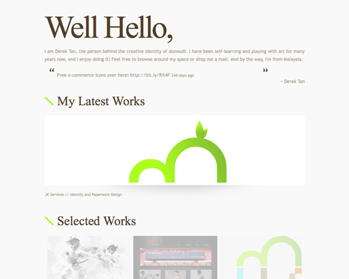
Dunnodt Combining different-sized fonts is a great way to add visual interest without clutter.
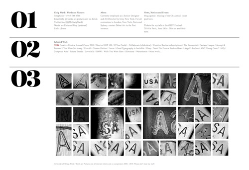
Words Are Pictures Large typography is also popular as an accent, rather than a focal point.
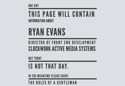
Ryan Evans Another website that combines multiple font sizes. It’s a great fit when the page has little content.
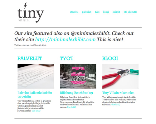
Tiny Villain Varying the size and color of type makes for an arresting design.
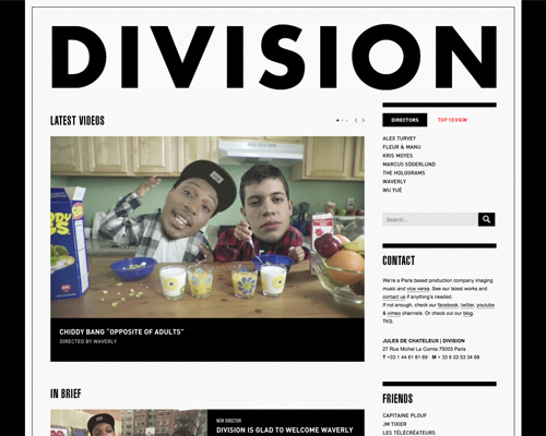
Division Paris Another great example of big typography in the header.
Background Patterns and Images
Subtle background patterns and bold images can add a huge visual interest to a minimalist design.
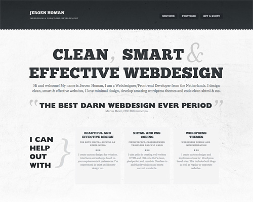
Jeroenhoman.com A subtle grunge pattern gives this design an edgy feel.
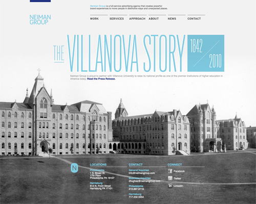
Neiman Group Keeping the background image in grayscale adds visual interest without adding clutter.
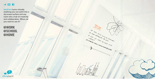
IdeaPaint A large background image is still minimalist when the rest of the website’s content is very simple.
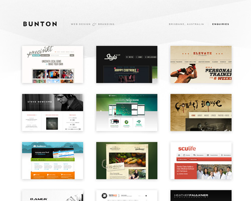
Bunton The subtle texture and pattern in this background is aesthetically pleasing without being overwhelming.
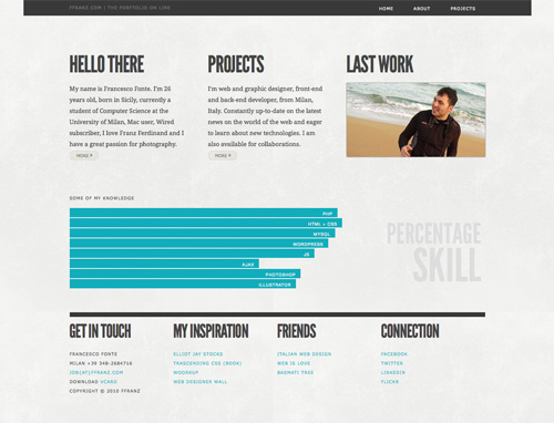
Francesco Fonte Another subtle grunge pattern.
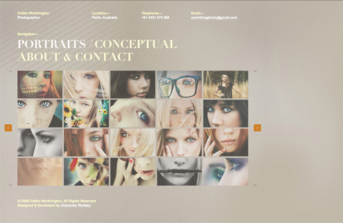
Caitlin Worthington Photography This taupe grunge pattern is unexpected.
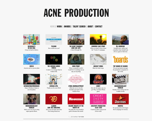
Simple Grids
Grids aren’t necessarily minimalist by nature, but simple ones can bring order to a bare design.
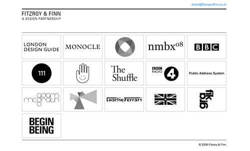
Fitzroy and Finn Simple grids make sense for organizing equally sized images.
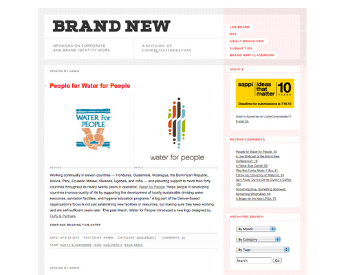
Brand New A simple grid like this organizes without adding complexity.
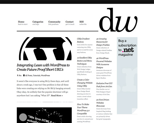
Design Woop A more traditional grid design that has plenty of white space to keep things looking minimal.
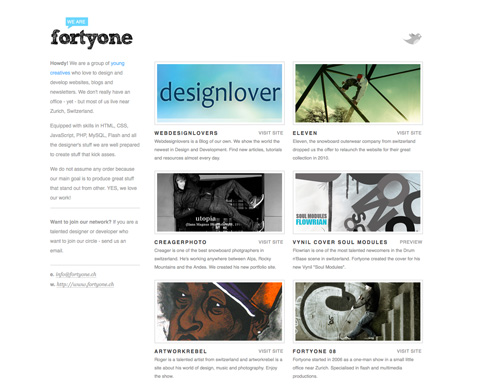
Fortyone Another great example of using simple grids to organize images, this time including text.
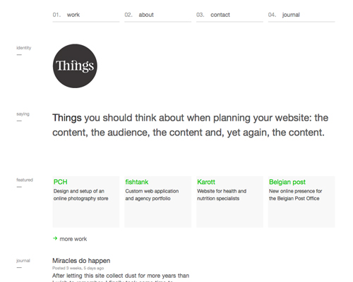
Things This simple-looking grid belies the careful thought that went into it.
Corporate Risk Watch This grid is set apart by the roll-over effects in the navigation (visit the website to check them out) and the subtle grid lines.

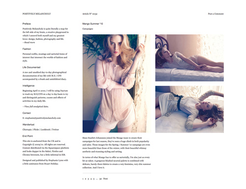
Positively Melancholy A simple grid like this works well for organizing different-sized images, too.
Circles
Circles can be found on many minimalist websites. I’m not sure whether designers who like circles are more inclined to have a minimalist aesthetic or whether they choose circles because they fit minimalist designs particularly well. In any case, circles are often found in headers and are also used as accents in navigation.
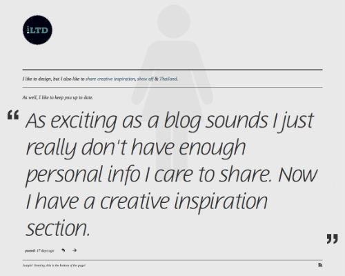
iLTD A simple circular logo in the header.
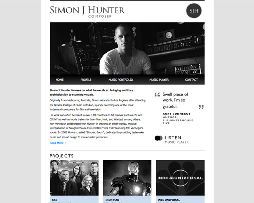
Simon J Hunter Another circle in the header, this time with a monogram.
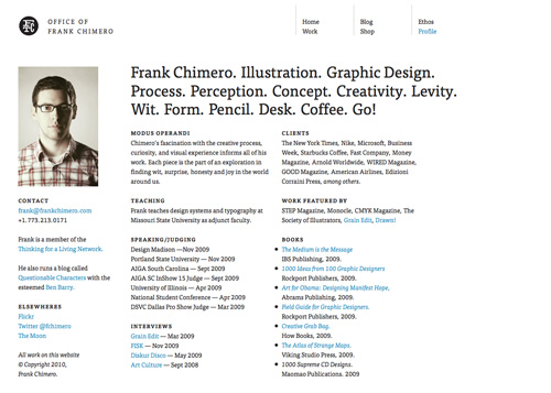
Frank Chimero Another circular monogram for a logo.
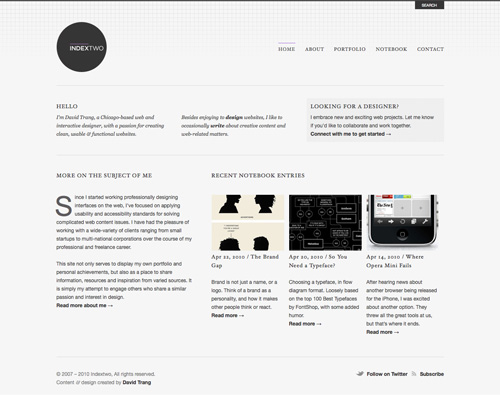
Indextwo And another.
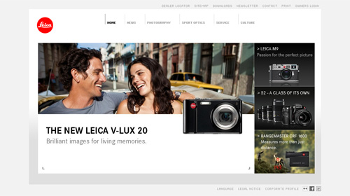
Leica Leica’s logo is a bright red circle, used across its products and marketing materials, including its website.
io And another.
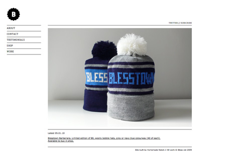
Bless Circular badges like this are also popular.
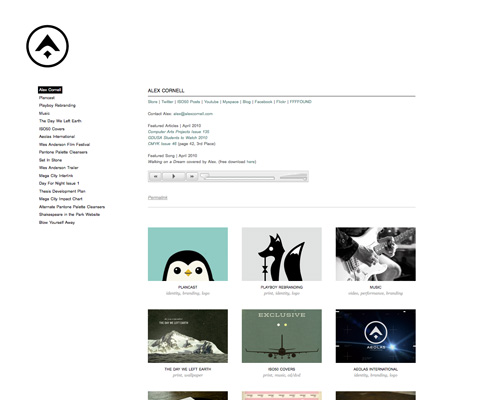
Alex Cornell A circular logo with a more abstract design.
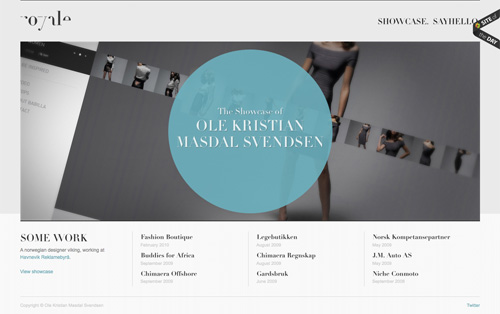
Royale Circles aren’t just used for logos, though. Here’s a great example of a circle used for content.
Bonus: Transparency
This isn’t really a trend per se, because it’s not often seen in minimalist designs. But it can make a huge visual impact and should really be used more by minimalist designers.
Slideshow Press The subtle transparency in the logo gives this design an added dimension without creating clutter.
More Examples
Here are some more examples to inspire you.
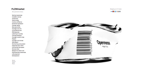
FLOWmarket
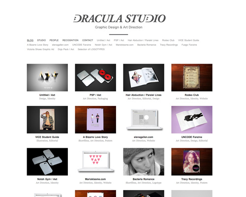
Dracula Studio
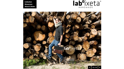
Laboixeta
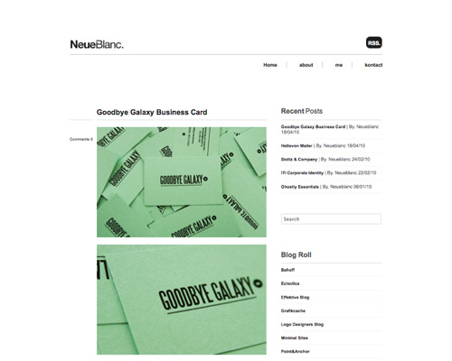
NeueBlanc
Further Resources
- MUD: Minimum Usable Design
- Authentic Design
- Flat And Thin Are In
- Minimalist Web Design: When Less Is More
A comprehensive introduction to minimalist design from Webdesigner Depot. - “Minimalism” Is Just Designer-Speak for Laziness
A great breakdown of the differences between minimalist and simplistic designs. - New Minimalist in Web Design
A discussion of the “new minimalist” trend in Web design. - Design 2.0: Minimalism, Transparency, and You
Learn the reasoning behind a design company’s choice of minimalism for its designs. - Is Minimalistic Design More Effective?
A showcase of minimalist designs by Adelle L. Charles. - Administrative Debris
Ryan Tomayko talks about his journey into a minimalist design. - Minimal Sites
A showcase of minimalistic web designs.


