A Short Story About “Back To Top” Links
Often it is the close attention to small details that makes a design outstanding. During the development of a website, designers tend to quickly forget about small details and focus on major design elements, such as navigation, typography and layout. If done properly, the result is usually a solid, impressive and highly professional design that communicates information. However, it is not memorable. The reason is that such designs often do not have a memorable voice: they may look visually appealing, but they don’t provide a vivid anchor for users to remember a website after leaving it.
In this way, little details are important because they can help the design stand out. Have you ever thought about the design of your shopping cart? What about the design of tags, date stamps, “Previous” and “Next” links? All of these small details are not crucial for website navigation, but they add up to a more user-friendly, more convenient and sometimes also more sophisticated design. And this is why we have focused the attention of our readers on such things as image captions, block quotes, pagination, <hr> lines and tag clouds.

In this post, we showcase the design of “Back to top” links, a forgotten and rarely used link that helps users jump to the top of a given page. A visitor can achieve this effect by pressing the “Home” button on his or her keyboard; however, not every user is aware of that shortcut, and most probably use the vertical scroll bar in the browser for that purpose. As designers, we can help our users out by adding a stand-alone “top” link to our designs.
When “Back to Top” Links are Useful
Unfortunately, this friendly service – letting users jump to the top of the page – is offered very rarely. Most designers don’t include it, which is why it took us over 5 weeks to collect at least a few dozen nice examples for this post.
In fact, “Back to top” links are not always useful. For example, they may be unnecessary for websites that have rather short pages or articles. In such cases, there is no need for users to jump to the head of the page, because the whole page is completely visible anyway; if a “top” link is included on such pages, clicking on it will produce no effect, which is rather irritating. This is another reason why many designers don’t use it: the variety of currently available screen resolutions makes the “top” link unusable and unnecessary. That’s why using “Back to top” links for rather short pages is not a good idea.
However, websites with long pages can offer visitors a nifty feature that saves time and avoids the need for vertical scrolling with the mouse.
Where Should the “Top” Link be Placed?
The most obvious and common place for a “Back to top” link is the footer. This is where it belongs and should be placed. We weren’t able to identify a common design scheme for the alignment of the “Back to top” link. Some designers place it on the left side of the footer, others place it in the middle and yet others put it on the right side of the footer. It is also very common to place the “top” link on the left-hand side of the content area, directly under the article.
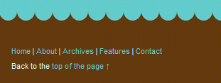
Meet the friendly “top” link: it is often placed in the footer of the page and almost always appears very modest and almost bashful.
“Back to top” links are also often used in FAQs, help sections and site maps, where they help divide chapters or paragraphs and provide users with a quick way to jump to the beginning of the page, where the main navigation is placed.
How to Create a “Top” Link?
To point the link to the top of the page, in most cases it is enough to define an empty anchor and put it right after the <body> tag:
<div id=“footer”> <!– footer goes here –><a href=“#”>top</a>
</div>
However, older browsers and, in particular, legacy browsers have problems interpreting this markup. An alternate solution is to use a real anchor that is explicitly defined and placed right after the <body> tag:
<body><a name="top"></a> <!-- content goes here --> <a href="#top">top</a></body>
Update: another method that avoids unnecessary markup and therefore should be preferred is to use the ID of the wrapper or header for the same purpose. For instance, if you use the div-container with the ID “wrapper”, you may use the following markup:
<body>
<div id=“wrapper”>
<!-- content goes here -->
<a href="#wrapper">back to top</a>
</div>
</body>
Of course, the link itself doesn’t have to be text; it can also be an image, a button or any other element of your choice (using images may have some usability issues – see below).
Wording
Never mind what phrase you actually use: you just need to make sure that visitors understand the function of the link and aren’t irritated by it. For instance, it’s probably not a good idea to use the word “Return” because it is not immediately clear if the user will be taken to the home page, the previous page in the browser’s history or the top of the page.

Use clear and concise terms, such as “Go to top,” “Back to top,” “Return to top” or “Jump to top.” Sometimes a harmless “Up” is used. However, we’re not sure if that’s actually a good idea. Probably not.
Problems and Disadvantages
Some usability experts and even the Yoda of usability, Jakob Nielsen, reject the “top” link unanimously. According to them, in-page links should be avoided at all because the scroll bar suffices completely, and additional options can be irritating and unnecessary. However, they agree that “Back to top” links may be useful if pages are extremely long, which should be avoided anyway.
One major problem with “top” links is that they have an impact on the browser’s navigation buttons and as such pollute the browsing history. Because “top” links are anchors just like any other links, clicking on the browser’s “Back” button will take users to the foot of the page they are currently viewing, not to the previous page. On top of that, accessibility experts claim that “Back to top” links may disrupt the use of speech-based user agents, that the “top” concept is vague and that “Back to top” links are not used consistently across websites.
“Back to Top” Link vs. “Home” Link
In our search for interesting “Back to top” examples, we stumbled across some solutions in which designers used images to allow users to jump to the top of the page. However, it is worth mentioning that images should make it clear to users that the link leads not to the home page of the website but to the top of the page. “Home links” are not “Back to top” links, and “Back to top” links are not “Home links”. If you decide to use such links in your design, make sure that visitors can understand the difference immediately.
Mistake: “Home” instead of “top”
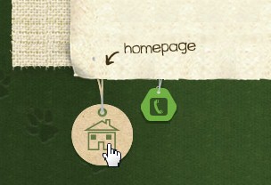
Home, sweet home…

Back to the home page in Spanish

Another “home” example in the footer.
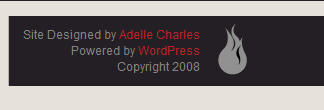 The icon on the right-hand side is not clickable: it could be used to lead to the home page, but not the top of the page.
Same here: the illustration is not clickable.

And here, too.
“Back to Top” Links Showcase
Here are some more examples of “Back to top” links. It took a while to collect them. Hopefully, they’ll serve as a good source of inspiration for some of our readers.
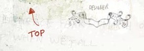
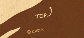


An animated “Back to top” link
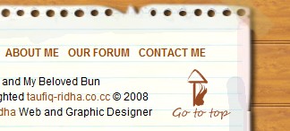




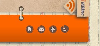
A link as part of the navigation. Looks good but may be a little irritating at first glance.
 The “top” icon here follows the scroll bar vertically.

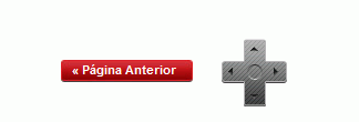
We don’t know why the remote control is placed there: it is not clickable, but it could be.


Sources and Resources
- Replicating Browser Behavior: The Top Link
- Nielsen: Within-Page Links for AJAX, “Return to Top”, Skip Links


 See User Testing Live
 Celebrating 10 million developers


 Custom Web Forms for Angular, React, & Vue. Your backend.


