Type & Grids: Free Responsive HTML5 Template

Email Newsletter
Weekly tips on front-end & UX.
Trusted by 182,000+ folks.

 Celebrating 10 million developers


 Custom Web Forms for Angular, React, & Vue. Your backend.
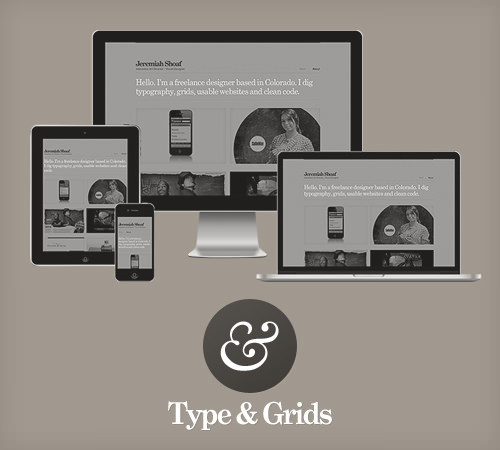
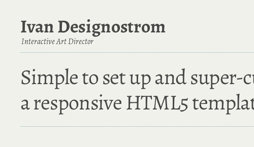
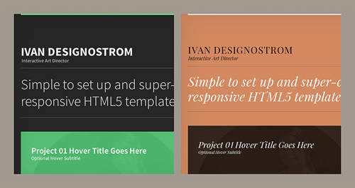
Today, we are pleased to introduce Type & Grids, a free responsive HTML5 template by Jeremiah Shoaf. It looks great on all devices, including desktops, laptops, tablets and phones. All of the content resides in a single HTML file, so setting it up is super-simple.
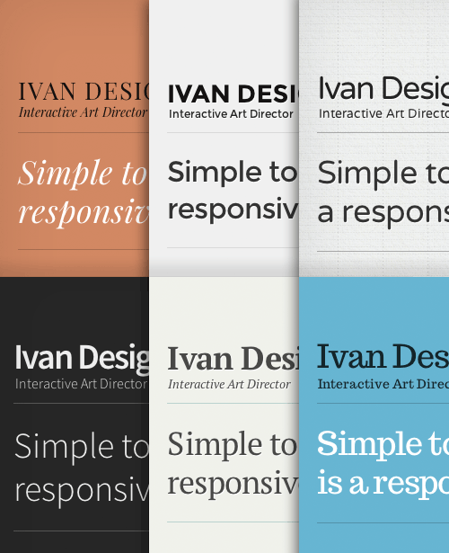
Its extensive customization options set Type & Grids apart from other templates out there. The template has 21 type themes and 29 color themes built in, giving you over 500 unique design combinations. Type theme number 21 is a bonus theme that Jeremiah has created exclusively for Smashing Magazine’s readers — it features the beautiful font Alegreya.
Each type theme is meticulously handcrafted, with attention paid to the smallest typographic details. The 16 thumbnail shape variations and 58 background textures that are included allow for a nearly endless combination of design styles — no two Type & Grids websites will look the same.
Instructions
- Download and open the ZIP file.
- Edit the only HTML file,
index.html, to add your own content. - Mix and match the included type and color CSS files to customize the design. All fonts shown in the demo are included.
- Upload your new website to your Web host. Done!
- Please include a “Powered by Type & Grids” link in the footer of your website as a credit link.
Demo And Downloads
- Demo
- Type & Grids official website
- Live website demo
- Download the set (ZIP, 7.32 MB)
Features
- The code is clean, semantic and SEO-friendly.
- It’s coded using the latest HTML5 and CSS3 standards, and all code is W3C-valid and cross-browser compatible.
- Video is supported. Easily embed your videos from Vimeo or YouTube.
- Works great for non-portfolio websites as well.
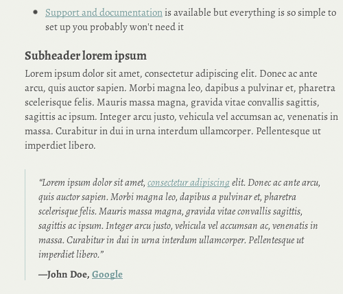
- Support and documentation are available. (But everything is so simple to set up that you probably won’t need it.)
Behind The Design
Here’s what Jeremiah Shoaf has to say about his thinking behind the design:
"I created Type & Grids to use for my own design portfolio website. I’m the type of designer who is never happy with the final design, and I will just keep tweaking things forever. I’ll create one color scheme for a website and then get sick of it and create a new variation. So, I decided to create “theme” CSS files for each color variation and for each typographic variation. This makes it easy to satisfy my need to constantly change things up. I ended up with 20 type themes and 29 color themes. When I turned Type & Grids into a template, my goal was to make it as simple to set up as possible. Other templates and themes out there seem to pack in so many features that the website ends up feeling bloated and difficult to use. I tried to limit the features of Type & Grids to just the bare basics. So, I feel it’s a great solution for someone who wants to set up a simple website quickly. And the design customization options make it easy to make your website look unique and not at all like a template."
Thanks for your fantastic work, Jeremiah!
Further Reading
- Coding An HTML 5 Layout From Scratch
- Learning to Love HTML5
- 40 Delightful High-Quality Free Fonts
- Why Content Is Such A Fundamental Part Of The Web Design Process
 (al, ea, mrn)

