Designing The Holy Search Box: Examples And Best Practices
Email Newsletter
Weekly tips on front-end & UX.
Trusted by 182,000+ folks.
 Custom Web Forms for Angular, React, & Vue. Your backend.


 Celebrating 10 million developers
On content-heavy websites, the search box is often the most frequently used design element. From a usability point of view, irritated users use the search function as a last option when looking for specific information on a website. If a website’s content is not organized properly, an efficient search engine is not only helpful but crucial, even for basic website navigation. In fact, search is the user’s lifeline to mastering complex websites. The best designs offer a simple search box on the home page and play down advanced search and scoping.
In practice, websites tend to grow over time, adding new content and, more importantly for us, adding new navigation options, such as additional content sections. However, these new content islands do not necessarily fit the whole information architecture that was well-designed and thoroughly structured when the website was initially designed. The consequence is a poor navigation scheme that is more irritating than helpful, because the content appears to be scattered all over the place instead of contained in separate, very distinct folders (in fact, this is a problem we encountered here at Smashing Magazine a couple of weeks ago).
You may want to take a look at the following related posts:
- Principles Of Effective Search In E-Commerce Design
- 10 Useful Usability Findings and Guidelines
- 10 Useful Techniques To Improve Your User Interface Designs
When content organization appears to be a mess and it seems nearly impossible to find information, users are very unlikely to decide to browse the available sections of the website. They are more likely to either leave the website (hitting the “Back” button and returning to Google’s search results), or turn to the only escape hatch they (hopefully) have: the holy search box.
Although the back-end process of searching a website is very important, we shouldn’t neglect the front end, the design, either. Below you will find a few, but important, guidelines to keep in mind when creating search box designs. All of the examples shown below are linked to the pages from where they were taken.
When to Use Search?
Not every website needs internal search functionality; however, you often have to meet users’ needs for quick access to information, particularly when the website is growing. If the website’s navigation is simple and intuitive and there are very few articles “lying around” and not really fitting your navigation scheme, search, and hence a search box, won’t be necessary.
An efficient search engine puts users in control of their search for information. When users encounter a relatively complex navigation system, they will immediately look for a search box to get to their final destination quickly and painlessly. Essentially, it’s a defence reflex: search lets users assert independence from the website, which can (unintentionally) irritate users and dictate how they should use the Web.
Consequently, if your website is pretty large and likely to grow in the future, it is a good idea to consider adding search functionality up front. Your users will be grateful to you for that.
Search Box = Input Field + Submit Button
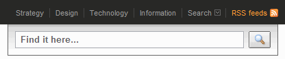
And this is where the design of the search box becomes important. The box must be clearly visible, quickly recognizable and easy to use. One may think that the search box doesn’t need a design; after all, it’s just two simple elements: an input field and submit button. How much harm could a poor design do? Well, there are a number of things that can go wrong; for instance, the text displayed in the input field may be hard to read, or the input field may be too short or too long (you’ll find more examples below). Some designers even prefer a minimalist solution and don’t provide a submit button at all: the “Return” key has to be used instead. Well, in our humble opinion, that’s not the most usable solution out there.

Indeed, the design of the search box is a big deal. Ideally, the search box would fit the website’s overall design perfectly yet manage to stand out slightly when users need it. Adding advanced search options may have benefits if users are looking for very specific information, but simple search usually works best and should be presented as an input field with a submit button. Remember, the submit button is a button, which means it should be designed like one. In particular, the submit button should look different than the input field. We are not sure if styling the submit button using the border properties in CSS is a good idea because that would make the button look like any other design element. Instead, giving the button a “button look” (i.e. another color, a different shape, a search icon, etc.) will always work.
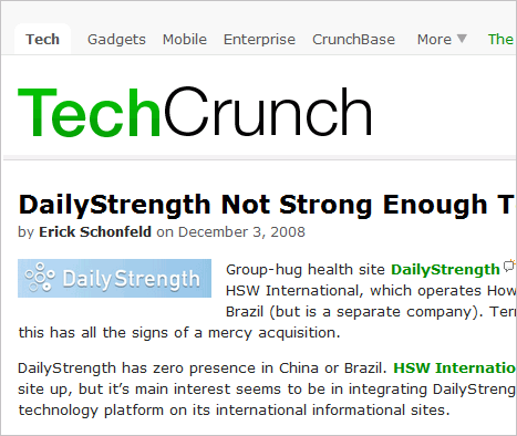
TechCrunch (example above) uses the same color for the input field and submit button. The color scheme perfectly matches the website’s overall color scheme. However, it leads to a problem: at first glance, it’s really hard to see where the search box is. Users have to search for it because it doesn’t stand out and is not easy to spot. Although the placement of the search box is fine, it is easy to overlook, which is not a good thing.
A search box should be a box. Reason? Your visitors don’t read the page; they scan it. The most common design for the search function is a box, with the input field being a relatively wide box. Users tend to scan for this pattern on a Web page, so as good practice, try to avoid any other kind of design, such as linked text or a button without a text field.
A search box should be simple. According to usability studies, it is more user-friendly to have no advanced search options displayed by default. Advanced search, as the name suggests, is advanced, and users get confused trying to use it. One study shows that most users don’t know how to use advanced search or Boolean search query syntax.
Bottom line: if you design a search box, make sure it looks like one and is as simple to use as possible.
Frequent Mistakes in Search Box Designs
In our research, we identified a couple of problems with many search box designs. One wouldn’t expect these problems to occur often, but apparently, designers can be quite creative:
- Placing the search box at the bottom of the page, or hiding it in the navigation menu.
- Making the input field too short; users are forced to use short, imprecise queries, because longer queries would be hard and inconvenient to read.
- Making the submit button too small, so that users have to point the mouse very precisely.
- Making the search box hard to find.
 Where is the search box here? On Bridge55.com, looking for it is like a “Where’s Waldo” search. In our opinion, the choice of colors here doesn’t really help users. Even when the box is found, it’s hard to understand where the search query should be typed. There should be a better way to do this.
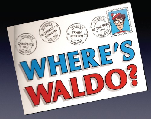
- Putting the search box together with other forms, such as a newsletter box, which is irritating.
- Over-designing the search box, making it really hard to spot.
- Overloading the user with advanced search functionality, making it hard to perform a simple search.
- Naming the submit button something very unintuitive.
- Making non-search design elements look like a search box.
- Providing multiple submit buttons.
The search box design on Wikipedia is not really intuitive. Should users click “Go” or “Search”? Hints appear when the mouse hovers over the buttons: “Go” takes users to the page with the title that exactly matches their search query, if one exists, and “Search” is traditional full-text search. Maybe two radio-input elements and a submit button would be a more user-friendly design solution?
Search Box Design Considerations
Let’s take a look at some frequently recurring problems and questions designers are likely to face when designing a search box.
Where to place the search box? There are many possibilities, but only a couple of right ones. The most convenient spot for users would be the top left or top right of every page on your website, where users could easily find it using the common F-shaped scanning pattern. However, some blogs tend to place the search box in the bottom of the (left or right) sidebar. That’s probably not a good idea but is likely done because of advertising considerations.
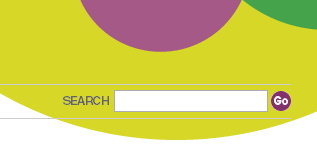
What to name the submit button? It is good practice to give the search button a meaningful name, such as “Search” or “Find,” instead of “Go.” Make the search button stand out from the whole search box design, showing users where to click.
The search button in the image below is very confusing for users. They wouldn’t be able to figure out if it is a search box or something else, although the description in the text field suggests it is.
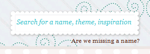
Where to place the title of the search box? Users need to know that that boxy-looking thing is a search box. And the easiest way to do that is to tell your users that it is; for example, by giving it a section title. According to eye-tracking tests published by UXMatters, the optimal position for section titles is the upper-left area above the search box. That seems like a plausible design decision to us.
How to make it clear what users can search for? It is a good idea to include a sample search query in the input field to suggest to users what the function can be used for. But make sure this text is deleted when the user focuses the mouse on the input field; this can be achieved with the help of a little JavaScript code.
Many websites implement Google’s SiteSearch API, which gets its search results from Google’s index. If you use this feature, make sure to state as much next to the search box. Users don’t like unexpected results, and the search algorithm of Google may be different than your website’s, thus breaking the consistency rule.
Search Box Showcase
Notice that not only is it important how the search box is designed, but it is much more important that search works properly. As Jakob Nielsen states, the first results page is golden: “Users almost never look beyond the second page of search results. It is thus essential that your search prioritizes results in a useful way and that all the most important hits appear on the first page.”
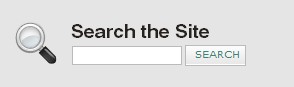
1. Classics
When it comes to search boxes, the simplest design is usually the best. The look of the traditional input field and submit button is easy to understand for both experienced and inexperienced users; therefore, designers often stick to the default and don’t mess around with the holy grail.
Here are two classics from Jakob Nielsen and Fontshop, designs that haven’t changed since the early days of the Web.
2. Making the submit button stand out
We found that many designers choose to clearly highlight the submit button to make the search box stand out. Very often, input fields are designed with a background color that fits the surrounding design elements. Consequently, to make the box more visible, visual pointers are needed. In these situations, the submit button is often given a more vivid color or unusual shape.


Beyond Current Horizons uses a clever idea to make the search box stand out. The website’s whole layout is mostly white; only the upper-right part is quite colorful. The search box is placed at the bottom of this area.
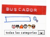
3. Using a magnifying glass
Over the last decade, the magnifying glass has become a conventional icon for search and is still used very often when designers want to communicate the function of the search element. The magnifying glass can be found to the left or right, in the input field or near the submit button, near the search box or far from it. We couldn’t identify a particular trend, so in most cases designers are left to find the location that works best for them.
Decodeunicode.org has a very creative – and strange – design. Clicking on the magnifying glass with the letter “A” above it opens a modal pop-up window with advanced search options. Don’t try this at home or at work.
4. Using illustrations


5. Rounding the search box
For some reason, designers still use rounded corners for input fields and submit buttons. Both elements are usually designed very carefully, with attention to small details that result in attractive and appealing search boxes. We don’t know if this approach is more effective, but it definitely looks more user-friendly (compared to the default design of search boxes).

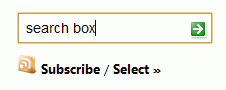
6. Using arrows
Sometimes the submit button is labeled not with text but with a symbol or character; for example, an arrow. Arrows are usually pointed to the right; in some cases they are pointed down (which is strange and quite unusual).
The submit button in the form of an arrow:
The down-pointing arrow is used very rarely: Here is the magnifying-glass image is carefully integrated in the input field. This is a nice solution that doesn’t irritate the user, because the designer has taken care to pad the space between the image and inputted text.
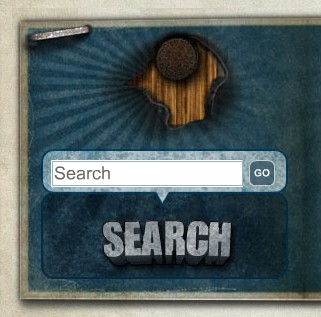
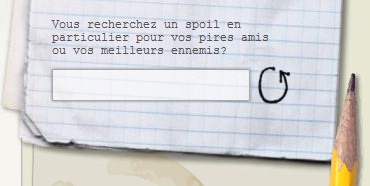
7. Using handcraft
Handcraft strikes back in this search box design:

And in this one:
This search box looks nice but is hard to recognize.

A tiny, harmless, humble hand-written search box.
The “Return” key is used here for a submit button:
8. Boxy designs
Because they’re called search boxes, many design them accordingly. Unfortunately, such designs are often quite boring and not really nice to look at.
9. Experimental solutions
Web designers are creative folk. Hence, it’s no wonder we have found dozens of really unusual, strange, creative and absolutely inappropriate designs. It’s up to you to build new ideas upon the ideas of the designers presented above. But please keep in mind: usability should have the highest priority. The form follows the function, not the other way around.


On Uxmag.com, the search box opens after clicking on the “Search” link.