10 Useful Techniques To Improve Your User Interface Designs

Email Newsletter
Weekly tips on front-end & UX.
Trusted by 182,000+ folks.


 Celebrating 10 million developers
 SurveyJS: White-Label Survey Solution for Your JS App
 Register Free Now
Web design consists, for the most part, of interface design. There are many techniques involved in crafting beautiful and functional interfaces. Here’s my collection of 10 that I think you’ll find useful in your work. They’re not related to any particular theme, but are rather a collection of techniques I use in my own projects. Without further ado, let’s get started.
1. Padded block links
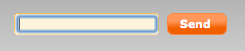
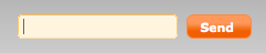
Links (or anchors) are inline elements by default, which means that their clickable area spans only the height and width of the text. This clickable area, or the space where you can click to go to that link’s destination, can be increased for greater usability. We can do this by adding padding and, in some cases, also converting the link into a block element. Here’s an example of inline and padded links, with their clickable areas highlighted to show the difference:
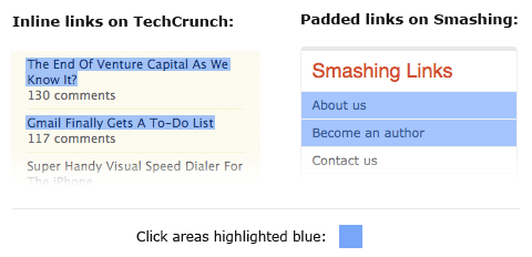
Obviously, the larger the clickable area is, the easier it is to click on the link because there is less of a chance of missing it. Converting links into block elements makes the text area span the whole width of the container, unless the width is specified otherwise. This makes it ideal for links located in sidebars. We can do it with the following code:
a {
    display: block;
    padding: 6px;
}
Make sure to also add a healthy dose of padding to the links, because converting a link into a block only affects its behavior and width; adding padding ensures that the link is high enough and has some room to breathe.
2. Typesetting buttons
Attention to every detail is what separates a great product from a mediocre one. Interface elements such as buttons and tabs are clicked on many times a day by your users, so it pays to typeset them properly; and by typesetting I mean positioning the label. Here’s a couple of examples of the kind of misplaced labels I sometimes notice:
At first glance they look okay, but notice that the text is placed too high because the lowercase letters have been used as a guide to align the text vertically in the center, like so:
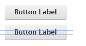
However, if we use uppercase letters as well as lowercase letters with ascenders (“t,” “d,” “f,” “h,” “k” and “l”), the balance shifts upwards, making the label appear too high on the button. In such cases, we should set the type using the uppercase height as a guide – or set it a little bit higher if most of the letters are lowercase. Here’s what I mean:
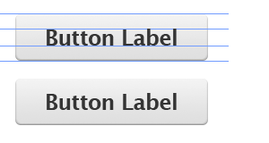
This gives the whole button a more balanced look and feel. Little touches like this go a long way towards making your interface more polished and satisfying to use.
3. Using contrast to manage focus
Similarly, you can also manage the focus of your visitors’ attention with contrast between elements. Here’s an example of a post headline and some meta information underneath regarding who posted the article and its date:
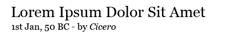
All the text is set in black. Let’s decrease the contrast between the meta information (the date and author’s name) and the background by putting the text in a light shade of gray:
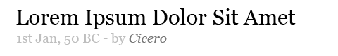
The highest contrast element here is the headline, so it literally pops out at us. The other elements fade into the background. Here, I’ve chosen the author as the second-most important element, and the date as the least. The font also differs in size and style, but the contrast level can be very powerful. Let’s reverse the order of importance to date, author and headline:
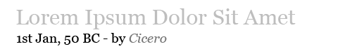
You can see how effective it is in shifting focus: the date now pops out at you, while the headline fades away. This technique comes in very handy for information-heavy websites, such as blogs, forums and social networks, in which you want to make a lot of information easily scannable while still showing a lot of additional things, like dates. Fading the extras allows visitors to easily focus their attention on the most important pieces of text.
4. Using color to manage attention
Color can also be used to effectively focus your visitors’ attention on important or actionable elements. For example, during the US presidential election, pretty much all of the candidates’ websites had the donation button colored red. Red is a very bright and powerful color so it attracts attention, and it stands out even more when the rest of the website is blue or another colder color.
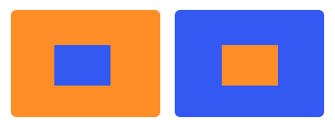
Warmer tones like red, yellow and orange are naturally bright and so tend to attract the eye. They also “expand” when set against colder colors like blue and green. This means that an orange button on a blue background looks like it’s flowing outwards and taking the front seat. Conversely, a blue button on an orange background contracts inward, wishing to stay in the background. Here’s a picture to illustrate:
Here’s a couple of examples of websites that use color effectively to direct users’ attention to the important elements:
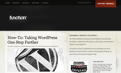
Function features a “We’re Hiring” link on its jobs page. To ensure the link is not missed, the designers set it against a red background that pops out from the dark background header, effectively grabbing attention.
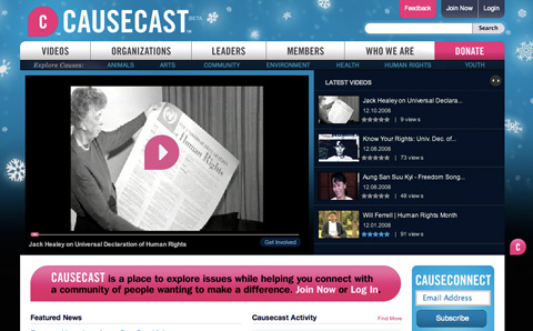
Causecast use color effectively. Four bright pink elements pop out at you: the logo, the feedback link, the donate link and the website description message.
Want the “About” blurb on your website to grab the visitor’s focus? Make the background yellow. Want to make the “Join” button stand out? Color it orange. Make sure not to highlight too many elements, though; if you do, they may get lost in each other’s company.
5. White space indicates relationships
One of the most crucial elements in an interface is the white space between elements. If you’re not familiar with the term white space, it means just that: space between one interface element and another, be it a button, a navigation bar, article text, a headline and so on. By manipulating white space, we can indicate relationships between certain elements or groups of elements.
So, for example, by putting the headline near the article text we indicate that it is related to that text. The text is then placed farther away from other elements to separate it and make it more readable. Here’s an example in which white space could be improved:
The text looks all right and is certainly readable, but because the spaces above and below each heading are equal, they don’t separate each piece of text clearly. We can improve this by increasing the white space between each section and also by slightly tightening the line height of the paragraphs:
This results in more clearly defined blocks; we can easily tell which headings go with which pieces of text and can see the separate sections clearly. Good designers often squint or glance at their work from a distance, which lets them see the blocks of elements separated by white space as they merge together. If you cannot see these groups clearly then you may need to tweak your white space.
6. Letter spacing
Web design is pretty limiting for typographers. But while there are only a few safe Web fonts and not a great many things you can do to style them, it’s worth remembering that we do still have some level of control. “Tracking” is a term used in the field of typography to describe the adjustment of spacing between letters in words. We’ve got the ability to do this with CSS using the letter-spacing property.
If used with restraint and taste, this property can be effective in improving the look of your headlines. I wouldn’t recommend using letter spacing on the body text because the default spacing generally provides the best readability for smaller font sizes.
Here’s an example of letter spacing in use:
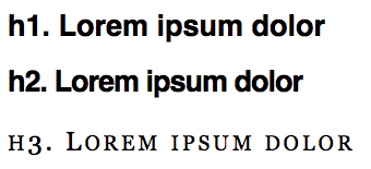
And here’s the CSS code used for the above examples:
h1 {
    font-family: Helvetica;
    font-size: 27px;
}

h2 {
    font-family: Helvetica;
    font-size: 27px;
    letter-spacing: -1px;
}

h3 {
    font-family: Georgia;
    font-size: 24px;
    letter-spacing: 3px;
    font-variant: small-caps;
    font-weight: normal;
}
The effect can be useful when you want to craft a more aesthetically pleasing or more original heading. Here, I’ve used only a couple pixels for letter spacing, but already it makes a big difference to the style of the font.
7. Auto-focus on input
Many Web applications and websites feature forms. These may be search forms or input forms inviting you to submit something. If this form is the core feature of your application or website, you may want to consider automatically focusing the user’s cursor on the input field when the website loads. This will speed things up because users can start typing right away without having to click on it. A good example of this is Google and Wikipedia’s websites.
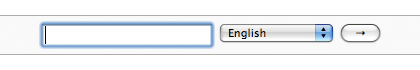
Upon arriving at Wikipedia.org, the search box is already highlighted, ready to accept text.
To automatically focus on input fields, you’ll need a little bit of JavaScript. There are various solutions, and the one you should use depends on the functionality you want to achieve. The simplest way to do it would be to add the following to your body tag:
<body onLoad=“document.forms.form_name.form_field.focus()”>
Your form code should look something like:
<form method=“get” name=“form_name” action=“#”>
    <input type=“text” name=“form_field” size=“20” />
    <input type=“submit” value=“Go” />
</form>
Now, every time the page loads, the text field called “form_field” will be automatically selected, ready for input.
The only problem with this is that if your users want to return to the previous page using the Backspace key, they will be out of luck because they’ll just be deleting characters in the input field. Thankfully, Harmen Janssen has another simple JavaScript solution you can find here. Harmen’s script allows the Backspace key to go to the previous page when there are no characters left in the input field to delete.
8. Custom input focus
While the default look of form elements suffices for most functions, sometimes we want something a little prettier or a little more standardized across various browsers and systems. We can style input fields by simply targeting it with an “id,” “class” or plain old “input,” like so:
input {
    border: 2px solid #888;
    padding: 4px;
    font-size: 1em;
    background-color: #F8F8F8;
}
What’s more interesting is also being able to style the input field when it’s in focus; that is, the state it’s in when it has been clicked. To do this, we need to attach a “:focus” after the “input” property:
input:focus {
    border-color: #000;
    background-color: #FFFE9D;
}
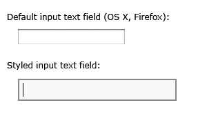
If you’re using custom backgrounds to style your input field, they may clash with some browsers and operating systems’ default focus styles. For example, here’s a screenshot of a custom-styled form clashing with the default blue OS X glow effect:
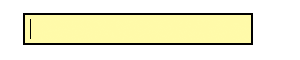
In such cases, you could also use the “input:focus” property to remove the default styling. The default blue glow in the screenshot above can be removed by disabling the “outline” property:
input:focus {
    outline: none;
}
The blue glow effect will now be gone:
Obviously you would only want to remove the outline if you’re replacing it with your own styling, so that you don’t negatively affect the accessibility and usability of your forms.
9. Hover controls
Some Web applications have extra utility controls, such as edit and delete buttons, that don’t necessarily have to be shown beside every item at all times. They can be hidden to simplify the interface and focus visitors’ attention on the main controls and content. For example, these hover controls are used in Twitter when you hover over messages:
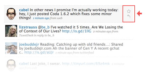
These hover controls can be achieved with some simple CSS code, without any JavaScript. Simply style the <div> with the controls when its parent <div> is in a hover state. Here’s the code to hide and show the controls (using a <div> with the class “controls” inside a <div> with the class “message”):
.message .controls { display: none; }
.message:hover .controls { display: block; }
When you hover over the “message” <div>, the “controls” <div> inside it will appear, along with all of its content, giving you the same functionality as shown in the Twitter screenshot above.
There may be an issue with accessibility because screen readers may not be able to read the hidden <div>. There are plenty of other ways to hide the inner <div>, such as offsetting it with a negative margin that takes it off the page (e.g. “left-margin: -9999px”), coloring its text the same color as the background or simply placing another <div> on top of it.
This technique should of course be used with restraint because you don’t want to hide your important controls; but if used correctly, it can be useful for cleaning up your interface by removing those extra utility links that you don’t want to show up at all times.
Note that this doesn’t work in IE6, so you’ll need to override the hiding property in your IE6-specific style sheet or, if you don’t have one, simply use the following IE6-specific code inside the <head> section of your code:
<!--[if lt IE 7]>
  <style type="text/css" media="screen">
    .message .controls { display: block; }
  </style>
<![endif]-->
10. Verbs in labels
You can make options dialogs much more usable by thinking through the labels you use on buttons and links. If an error or message pops up and the options are “Yes,” “No” and “Cancel,” you have to read the whole message to be able to answer. Seems normal, right?
But we can actually speed things up by using verbs in the labels. So, if instead of “Yes,” “No” and “Cancel,” we have “Save,” “Don’t Save” and “Cancel” buttons, you wouldn’t even need to read the message to understand what the options are and which action to perform. All the information is contained in the button labels.
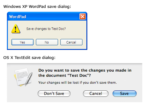
Using verbs in labels on buttons and links makes the options dialogs more usable because the labels contain all of the information the user needs to be able to make a decision.
To Conclude
Hopefully, you’ve found a few new techniques that will be useful in your work. As always, using them effectively comes down to restraint and thoughtful implementation. For example, controls that appear on hover may clean up your interface, but they will also increase the learning curve because people may not notice these controls at first. But showing all controls at all times may not be the best strategy either because users would need to scan more things to find what they’re looking for.
Striking the right balance between what you show and what you hide is a delicate art and is completely in your hands as the designer. Don’t use a technique just because it exists: use it if it makes sense in your context. (al)


