Textures In Modern Web Design

Email Newsletter
Weekly tips on front-end & UX.
Trusted by 182,000+ folks.


 Custom Web Forms for Angular, React, & Vue. Your backend.
 Celebrating 10 million developers

If you look around at well-designed websites in CSS galleries or any other source of design inspiration, you’ll see that texture is extremely common in modern Web design. One of the reasons it’s so popular is because of its versatility. Textures can be used in countless different ways and in a wide variety of design styles. As you look around, you’ll see how textures can be used in so many different ways by Web designers.
Textures in Web design can be very subtle, so that the visitor hardly notices, or they can be a focal point of the design. In some cases, textures are used to emphasize certain parts of the design. Because of the versatility of textures, they can be used in combination with many other design elements, such as typography, lighting and colors.
When examining exemplary Web designs that employ textures, you’ll notice that textures are used in background images, headers, footers, sidebars, content areas and even fonts. Although texture is sometimes associated with a grunge style of design, its reach extends far beyond just grungy websites. Texture adds dimension to virtually any style of design, if applied properly. In this post, we’ll look at 50 examples of websites that use textures in different ways.
You might be interested in the following related posts:
- 100 Beautiful Free Textures
- The Whys And The Hows Of Textures In Web Design
- Showcase Of Beautiful Textured Web Designs
- Textures and Patterns Design Showcase
One of the reasons texture is so useful to designers and so popular is because adding it to a design can be quick and easy with a program like Photoshop. Later in this article, we’ll look at some of the different techniques you can use to apply texture to your own work.
Gallery: Texture in Modern Web Design
Now, we’ll take a look at 50 websites in which texture has been applied to the design to improve it in some way. The websites are categorized according to how the texture is used. Many of the examples could fit more than one section, but they’re categorized like this to show their diversity and to point out specific elements of the design.
Textured Backgrounds
When it comes to textures in modern Web design, background images are probably the most common area of use. As you’ll see in the examples below, a textured background image can easily be a significant feature in a design. There are countless options for using textures in this way, and many designers are using creativity here to create stunning results.
Edit Studios Many designers and studios use a dark background for portfolio websites, but Edit Studios gives its background some variety with a textured look. The main content area has a few cracks in the background, and the rest of the design and background has a grungy style that’s not overwhelming on the dark background.
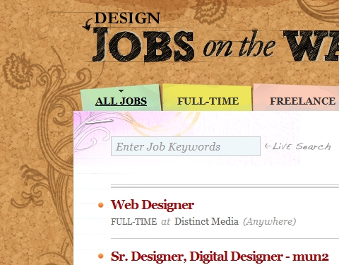
Jobs on the Wall Web Designer Wall is well known for its colorful and artistic background. The job board on WDW features a similarly creative but less colorful background with a textured approach. The texture of the background resembles a cork board. You’ll see some design elements such as staples that help complete the bulletin-board look.
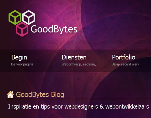
GoodBytes The background image of GoodBytes includes different shades of purple overlapping each other, and a subtly highlighted area for the logo. The result of these effects is a textured background that gives the website a much different feel than it would have with a solid single-color background.
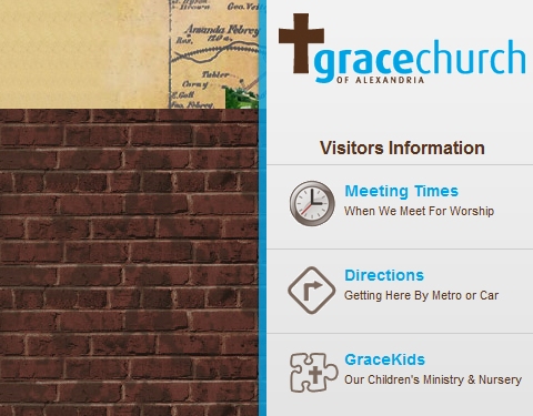
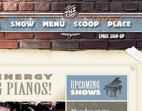
Grace Church of Alexandria While it’s common to see wood backgrounds used for a textured look, brick backgrounds are a little less common. The main content area of the Grace Church website is very clean, but it sits on a textured brick background.
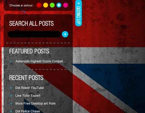
Jason Bradbury Jason Bradbury’s website contains multiple different backgrounds that appear randomly, most of which use some sort of textured look. The screenshot below shows one of those images, a grungy British flag. The texture gives the flag a completely different feel than it would have otherwise.
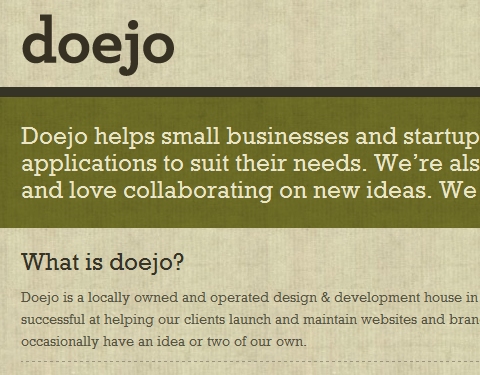
Doejo The Doejo portfolio website features a nice clean layout. The entire website, except for the footer, has a slight texture, giving it a different feel.
Design Sponge The main content area of Design Sponge is rather narrow, which exposes more of the textured background. The image has a canvas-like feel in a neutral color.
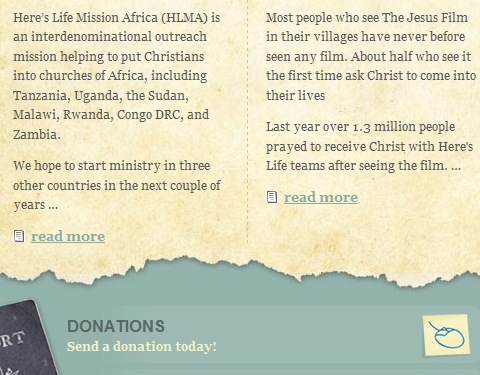
Here’s Life Mission Africa The content area of Here’s Life Mission Africa has a slight texture that may not even be noticed at first next to the dark background. But at the bottom of that textured area is a torn edge that dramatizes the texture.
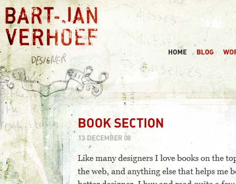
Bart-Jan Verhoef Bart-Jan Verhoef uses a textured background that gives the website an old-paper look. In addition to the background, the text logo/website title also has a grungy, textured effect.
Church on the Rock Almost the entire website of Church on the Rock has a textured effect. Some wood is used in the header image, and below that is the textured image shown in this screenshot.
Design Commission Design Commission is another website that uses a very clean content area with a textured background. The background of Design Commission also includes a slight red color on the left side to give it some variety.
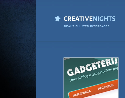
Creative Nights Creative Nights has a blue content area and a dark blue background with a textured effect at the top. Lighting is used to spotlight the content area and darken the rest of the background.
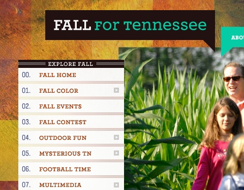
Fall for Tennessee All of the websites in the Tennessee vacation series are very well designed. The Fall website features a textured, fall-colored background.
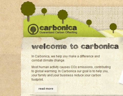
Carbonica Carbonica uses neutral-colored textures throughout the design of its website. Headlines, icons and the navigation menu in the sidebar also used textured fonts.
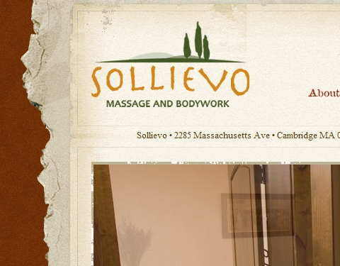
Sollievo The brown background for Sollievo has a subtle texture that wouldn’t stand out on its own, but combined with the torn-paper effect of the main content area, the website is left with a more substantial textured feel.
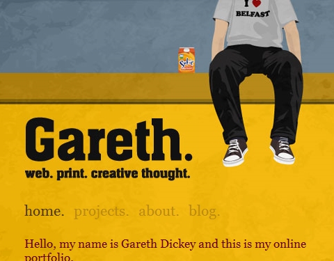
Gareth Dickey The header and background of Gareth Dickey’s website include an illustration. The texture used in the illustration is subtle, but it gives a different look than the website would have otherwise.
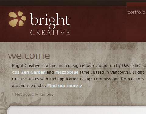
Bright Creative Bright Creative, the studio of Dave Shea, uses textures throughout its design. The header is a textured dark red, and the body is a textured neutral color.
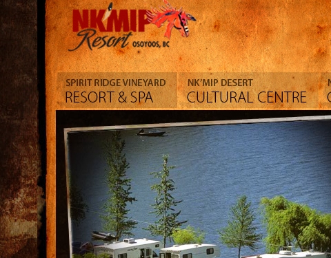
NK’MIP Resort The website of NK’MIP Resort has a grungy feel, with a dark textured background and a lighter textured content area.
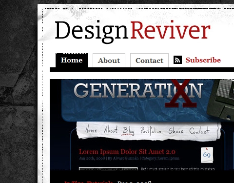
Design Reviver The dark textured background of Design Reviver eventually fades into a solid background lower on the page. The white header also includes a slight texture in some areas.
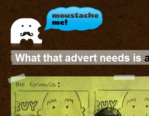
Moustache Me Moustache Me uses a dark textured background that’s similar to the lighter cork-board effect used at Jobs on the Wall. Images of tape and push pins are used to complete the cork-board look.
Textured Headers
Many websites use header images as a major part of the design and to stand out from other websites. With a large space usually reserved for images, these areas have plenty of potential for dramatic textures. As you look around at well-designed websites, you’ll no doubt find many examples of textures being used in headers. The examples below show just some of the possibilities.
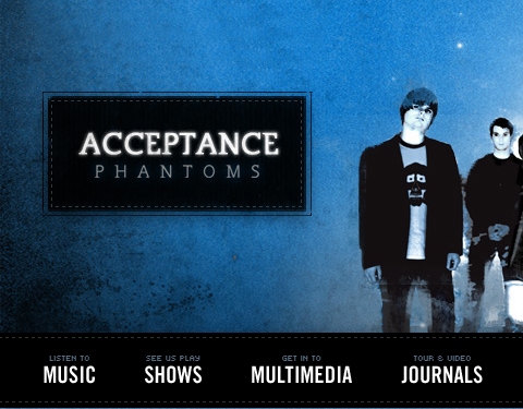
Acceptance The Acceptance header uses blue and black with a textured effect in the background, especially on the sides where the colors are darker. The navigation menu also has a similar texture on hover.
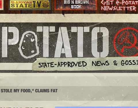
Slabovia.tv Slabovia.tv has a wood background to give the website some texture, but it also uses a textured header. There’s a coffee mug ring behind the header in one spot, and the website’s tagline appears as a handwritten font on a piece of tape in the header.
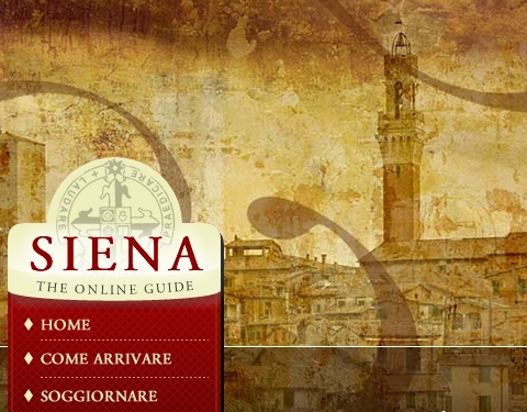
Sienna Online The content area of Sienna Online has a dark black background, but the header adds plenty of texture. The header image has an old-paper look.
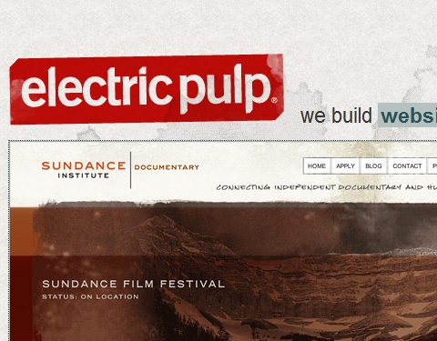
Electric Pulp The light-colored background of Electric Pulp has a slight texture to it, but the one big spot that begins in the header stands out much more. The logo/branding area also includes some texture.
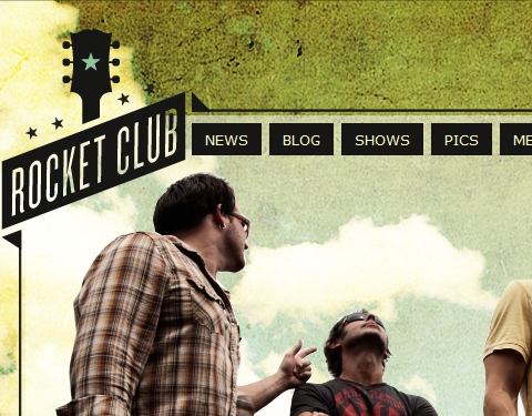
Rocket Club The background image of Rocket Club includes a dramatic header texture that significantly changes the look of the website. The texture can also be seen through the somewhat transparent picture of the band.
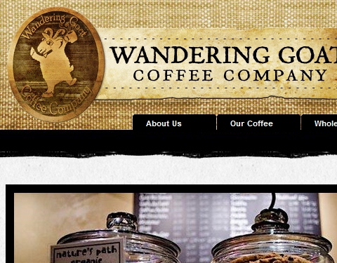
Wandering Goat Coffee Company The header of Wandering Goat Coffee Company has a canvas image to give it a striking texture. The logo itself that sits in the header is also textured.
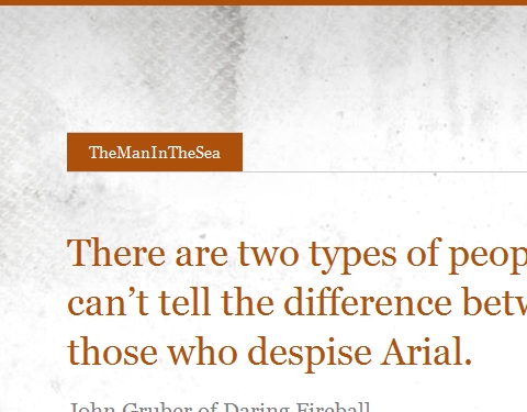
TheManInTheSea The background image of TheManInTheSea gives texture to the header and to the sides outside of the content area, but it fades to white for readability of the content.
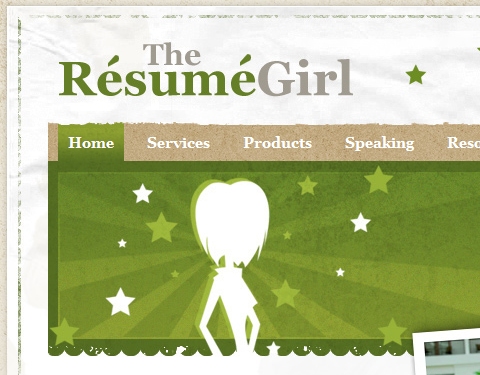
The Resume Girl The website of The Resume Girl includes a few different textures in the header. The white area has a paper texture, while the navigation menu has its own texture with a torn edge. The green starburst area also includes a texture.
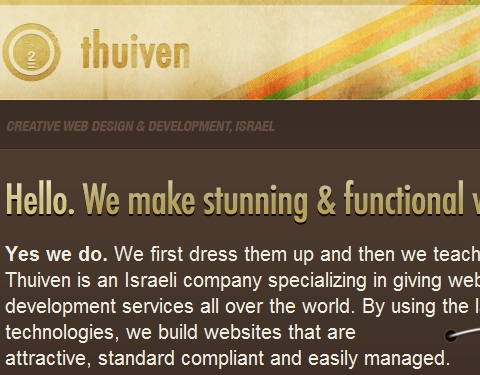
Thuiven The Thuiven portfolio website uses a clean design that includes very little texture outside of the header. The header includes some multi-colored stripes on a neutral background.
Sidebar Texture
While background images are often used to create columns for sidebars, textures in these images are not nearly as common as they are on full background images. The websites shown below all make interesting use of textures in their sidebars. A few different approaches are represented.
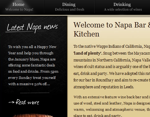
Napa Bar and Kitchen The Napa Bar and Kitchen website doesn’t include a lot of textures. The texture in the dark sidebar isn’t overpowering, but it’s a nice addition to the design.
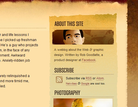
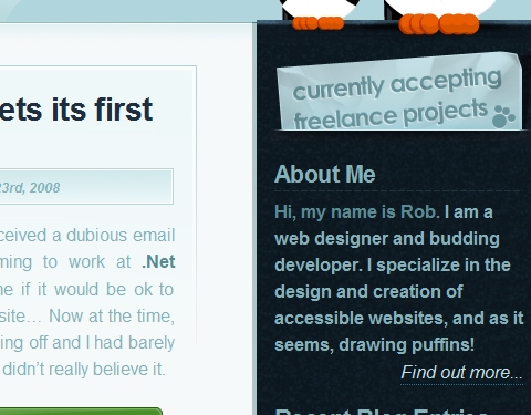
Rob Goodlatte Rob Goodlatte’s website has textures all over the place, but the sidebar stands out a bit because it’s not as common a way of using textures. Sidebar design is often very basic and not a lot of thought goes into it, but Rob’s sidebar draws more attention because of the look.
Branded07 Branded07 uses a dark-blue sidebar to contrast the light background color of the content area. This dark blue includes a slight texture. The same dark-blue texture is also used in the website’s header.
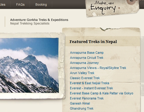
Adventure Trekking Like the Branded07 design, Adventure Trekking’s website does not use textures everywhere, just in a few select places. The sidebar has a textured paper look with a torn and folded edge at the top. Next to a light and untextured content area, the sidebar stands out a little more.
Textured Navigation Menus
Navigation menus can be one of the most visually interesting parts of a website. Textures, of course, can be used in background images of menus to create a different and very attractive look. You’ll see several different approaches here, all using texture to improve a standard navigation menu in one way or another.
Matt Dempsey Matt Dempsey’s portfolio website uses a background of orange brushstrokes. The textured strokes are also integrated in the navigation menu of the website, and they have a lighter-colored brushstroke on hover.
Von Dutch Von Dutch features an artistic textured design for the entire website. The main navigation menu is interesting because of the textured background images that are used. Each link has a slightly different image.
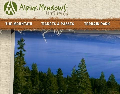
Alpine Meadows The Alpine Meadows website includes a few different textures, but the navigation menu is perhaps the most interesting. The texture and the frayed effect make it a focal point of the design.
Blue Moon The brick background of Blue Moon obviously gives the website plenty of texture, but the navigation menu also has a rusty texture in the background as well as in the font.
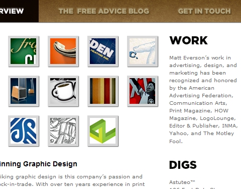
Astuteo The Astuteo portfolio website is another example of a clean design that uses texture in a specific area for impact. The header, which includes the main navigation menu, has a textured look that does a good job of contrasting the clean white background of the website.
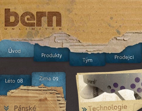
Helmy Bern The header area and navigation menu of Helmy Bern are extremely textured, with the torn-cardboard look at the top of the menu drawing the most attention. Additionally, the sidebar has a similar texture.
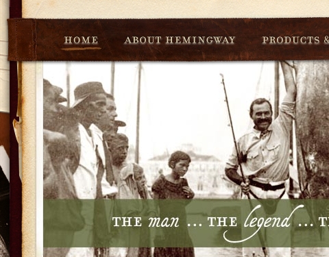
The Ernest Hemingway Collection The Ernest Hemingway Collection uses a desktop environment as a background, with the main content area sitting on top of the desk. The navigation is a textured dark brown with a leathery feel.
Subtle Use of Texture
Some of the most interesting uses of texture are those that don’t jump out and grab you. Some designers are able to use textures in subtle ways that improve the overall look without being overpowering. The examples below show attention to detail in design that gets great results.
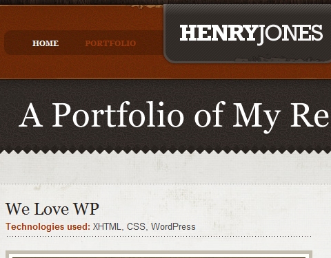
Henry Jones The portfolio website of Henry Jones makes use of textures but in a rather subtle way. The border that surrounds the header and navigation area has a few very small spots where some texture is applied. The gray bottom border of the logo/branding area does the same thing. While these design elements don’t stand out in the first few seconds of a visitor’s time on the website, they provide detail that helps create a complete look.
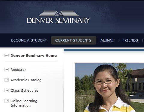
Denver Seminary Rather than having a solid-blue background behind the logo, Denver Seminary’s website includes a soft texture in another shade of blue. The texture adds some visual interest to the header and the logo.
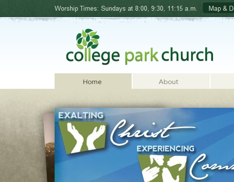
College Park Church The website of College Park Church uses several different textures throughout the website that work together to create a complete look. The header includes some subtle textures in the background of the green bar, as well as directly below the bar where it meets the branding area. The texture may not even be noticed at first, but it gives the header a look that fits the rest of the design, which includes some textures below.
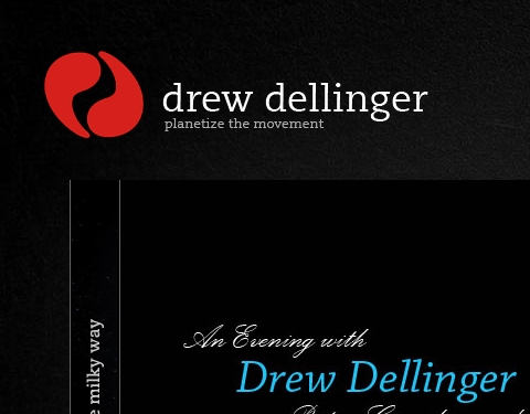
Drew Dellinger Rather than just having a solid black background, Drew Dellinger adds a slight texture to his website’s background. As with the other examples in this section, no one dramatic design element is present that grabs the attention of visitors, but the website is an excellent example of how texture can be used to subtly enhance a design.
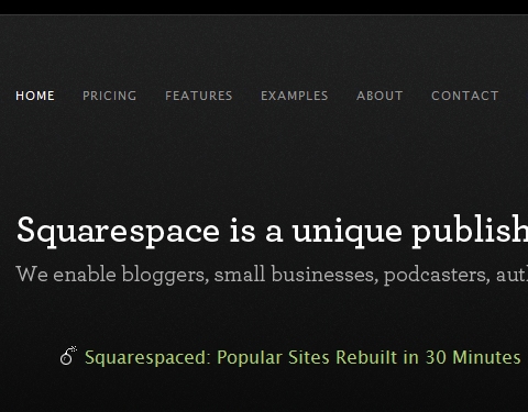
Squarespace The approach of Squarespace is very similar to that of Drew Dellinger. The dark background is given a slight texture, which gives the website a different feel. At Squarespace the texture fades into a solid background color as you scroll down the page.
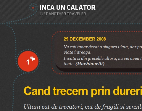
Inca Un Calator The design of Inca Un Calator is broken up vertically into a few different sections. Each section has a slightly different color and texture combination. The textures and the change from one section to the next are not drastic but really enhance the look of the website.
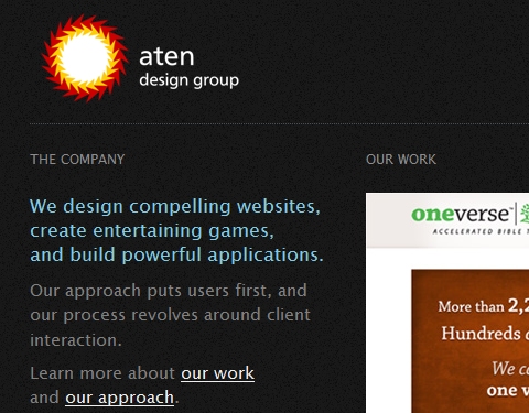
Aten Design Group Aten Design Group, like many other portfolio websites, uses a dark background. However, the background is slightly changed by use of a subtle texture.
Different Ways to Add Texture to a Design
Applying a texture to a design can be accomplished in a number of different ways. It’s possible to create very similar end results using different approaches if you’re comfortable and experienced with Photoshop. Here are a few of the most common techniques for creating a textured website.
1. Use a free stock image to create your own texture
One of the quickest and easiest ways to add texture to just about anything you create in Photoshop is to use a simple stock image and some layer effects. Fortunately, there is no shortage of high-quality free textures, and there are even some premium options if you’re willing to spend a little money. David Leggett of Tutorial9 has a nice tutorial that shows how you can quickly add texture with a stock image.
If you’re looking for free textures to use in your own work, some of the best resources are:
2. Create your own texture from scratch in Photoshop
Instead of using an image to create texture, you can get a very similar effect by creating one from scratch with no images. If you know a few techniques in Photoshop, creating textures is not that difficult or time-consuming, and it may give you more control than using a found stock image.
There are a number of Photoshop tutorials that teach different techniques for creating textures. Here are a few good ones:
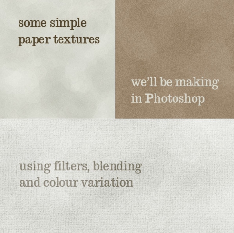
Photoshop Paper Texture from Scratch then Create a Grungy Web Design with It
3. Use Photoshop brushes
Photoshop brushes can be another quick and easy alternative to creating your own effects from scratch, and there are plenty of free brushes to choose from. Brushes are great for adding grunge effects to a design, getting texture from brushstrokes and working with just about any other type of texture. Free brushes exist for just about any type of texture you can imagine; it’s just a matter of finding the right one. The ease of using free brushes makes it possible to experiment with all kinds of different approaches if you want to see what works best. Here are some resources to help with that:
- 300+ Vintage Style Textures and Photoshop Brushes
- Watercolor Roundup: 200+ Beautiful Brushes and Textures
- 200+ Free Grunge Photoshop Brushes
4. Use ready-made textures
Rather than finding stock textures that can be used with your own work, you could buy some textured images to use as a background with little or no adjustment. Many designers sell their work on stock websites. Finding the right image for your work is not always easy, but if you find it, the price is pretty minimal for the amount of time you save.
5. Scan Textures
The scanning technique is similar to creating your own image in Photoshop from scratch, and it’s also similar to working with free stock textures. Essentially, you scan something, like a piece of textured paper, and then make adjustments to it in Photoshop. If you’re interested in this approach, Bittbox has an excellent tutorial on scanning paper and working with the texture in Photoshop.
(al)


