Symptoms Of An Epidemic: Web Design Trends
Since Elliot Jay Stocks so poignantly told us to destroy the Web 2.0 look, we’ve witnessed a de-shinification of the Web, with fewer glass buttons, beveled edges, reflections, special-offer badges, vulgar gradients with vibrant colors and diagonal background patterns. The transformation has been welcomed with relief by all but the most hardened gloss-enthusiasts. However, design and aesthetics work in mysterious ways, and no sooner does one Web design trend leave us before another appears.
You might be interested in the following related posts:
The Symptoms
So, exactly what is this new epidemic? Well, let’s start by looking at some of the most common symptoms, many of which you have probably noticed. They are easy to spot, and as with many other conditions, they often appear in conjunction with each other. (This is why the contagion spreads so effectively — seemingly independent symptoms grow more infectious when combined with others.)
Please note: The following list appears in no particular order and does not indicate the level of infectiousness or severity, which seem to be stable across the board. Note also that the instances given often exhibit more than one symptom, making classification more difficult.
Stitching
Stitching appears gradually, often as a result of the designer playing too long with borders and lines, particularly of the dotted variety. A full-blown stitch is evidenced by the subtle shift from dots to dashes, augmented by drop shadows and other effects to give the impression of 3-D. The purpose of the stitch is somewhat elusive, but it seems to thrive in environments where certain textures are applied, most notably fabric and leather, but also generic graininess.
While determining the exact cause of stitching is difficult, scientists are certain that it belongs to a larger strain of the infection known as “Skeuomorphism.”
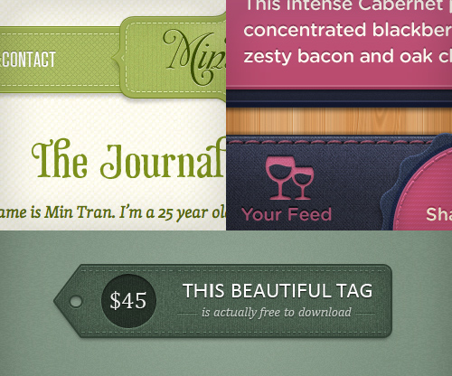
Clockwise from top: The Journal of Min Tran; Dribbble shot by Mason Yarnell; Dribbble shot by Liam McCabe.
Zigzag Borders
Borders are common elements of Web design, and as such, they are difficult to avoid; luckily, they are usually harmless and often have a positive effect on the layout. However, for some reason, a particular type of border — the zigzag — has grown exponentially in the last few years and is now threatening the natural habitat of more benign border specimens. Exactly why this is happening is unknown, although some researchers claim that the pattern created by the repeating opposing diagonals has such an alluring effect on designers and clients alike that straight borders have somewhat lost their appeal.

Clockwise from top: You Know Who; Dribbble shot by Christopher Paul; Dribbble shot by Meagan Fisher.
Forked Ribbons
Like borders, ribbons have long existed in various forms. What we’re seeing now, though, is the near dominance of a particular style of ribbon, easily identified by a fork at one or both ends. Some ribbons are also folded over twice, creating a faux effect of depth and reinforcing the diagonal lines in the fork. Whether the fork is related to the zigzag effect is unknown, but it seems that diagonal lines are the key to the ribbon’s survival, along with its ability to evoke memories of times past.
The danger of the ribbon lies mainly in its ability to exist independent of other symptoms (although it thrives in the company of vintage typography), meaning that it could date your design long after the epidemic ends, even if the symptom itself appears dormant. In many ways, this is reminiscent of the “special offers” badge of the Web 2.0 look.
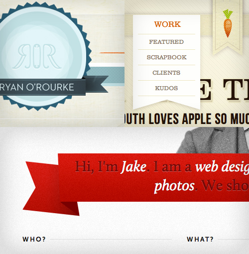
Clockwise from top: Ryan O’Rourke; Cabedge; Jake Przespo
Textures
In the age of all things digital, it’s a conundrum that textures should dominate our illustrations and backgrounds, and yet they are indeed one of the most common symptoms on our list. Manifested by subtle grain, dirt and scratches, paper-esque surfaces and fold marks, they seem to embrace the spirit of the handmade. But ironically, they’re often the complete opposite: computer-generated effects or Photoshop brushes.
Possible explanations for the widespread use of textures include a yearning for tactile media (especially considering the emergence of touchscreens) or envy towards print designers, who have a much richer palette of materials and surfaces to play with.
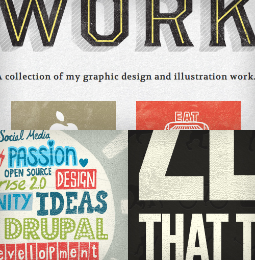
Clockwise from top: Gerren Lamson; Zero; Amazee Labs.
Letterpress
A Smashing Magazine article from 2009 outlined letterpress as one of the emerging trends of the year and, boy, were they right. The simple effect has gone from strength to strength and is now a household technique for sprucing up typography online. A relatively harmless symptom, letterpress might also have infected designers through other digital interfaces, such as operating systems and games, as early as the turn of the millennium, indicating a very long incubation period.
Scientists disagree over whether the incubation period is due to the infection needing a critical mass before emerging from dormancy or whether the infection simply needed the right conditions — CSS3 text shadows, to be specific — for symptoms to appear.
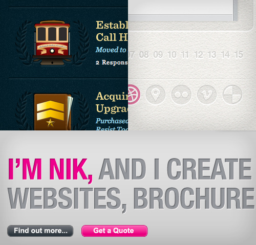
Clockwise from top: Billy Tamplin; Dribbble shot by Phillip Marriot; Remix.
19th-Century Illustration
After being released from copyright quarantine, this symptom, favoured by fashionable ladies and gentlemen, was nearly eliminated during the last epidemic due to its inability to cope well with gloss and shine. But in this new vintage-friendly environment, it has found its way back into our visual repertoire. For better or worse, the 19th-century illustration will most likely hang around for a while, emerging stronger from time to time like a flu virus.
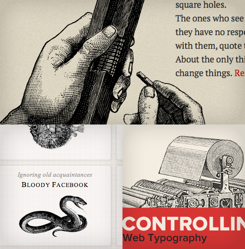
Clockwise from top: Killian Muster; Dribbble shot by Trent Walton; Simon Collison.
Muted Tones
After a long period of vibrancy, the average online color scheme seems to have been somewhat desaturated across the board. We’re seeing widespread use of browns, earthy greens and mustards and a general leaning towards “impure” colors, although this is generally thought to be a minor symptom of the epidemic. Some scientists will even argue that muted tones are, in fact, not a symptom themselves but rather a side effect of other symptoms, in the way that sweating is a natural response to a fever.

Clockwise from top: Dribble shot by Dave Ruiz; Cognition; Web Standards Sherpa.
Justified or Centered Typography (JCT)
This symptom is nothing new; in fact, it was pretty much the standard for the first 500 years of typography, until Tschichold and the New Typography showed up and quarantined it on the grounds that it was old fashioned, difficult to read and inefficient. Although we’re not sure at this point, this link with history might be what has made JCT reappear so vigorously under the umbrella of vintage symptoms. We do know that overall reading habits among humans have not changed in recent years (most Westerners still read left to right), and there is no plausible argument that JCT improves legibility; so, whatever the cause of the outbreak, we know it’s rooted in subjective emotion rather than rational thought.

Clockwise from top: Grip Limited; Tommy; Visual Republic.
Circular Script Logotypes (SCL)
A circle is a basic shape and, in isolation, is no more a symptom of an epidemic than a triangle. However, if you repeat enough triangles in a line, you get a zigzag. Similarly, if you include a circle in your logotype, you end up with a circular logotype. And if that logotype happens to be set in a script font, you’ll get — that’s right! — a Circular Script Logotype (SCL). Not that SCL is lethal or anything, but it is relatively contagious and can be highly detrimental when enough hosts have been infected.
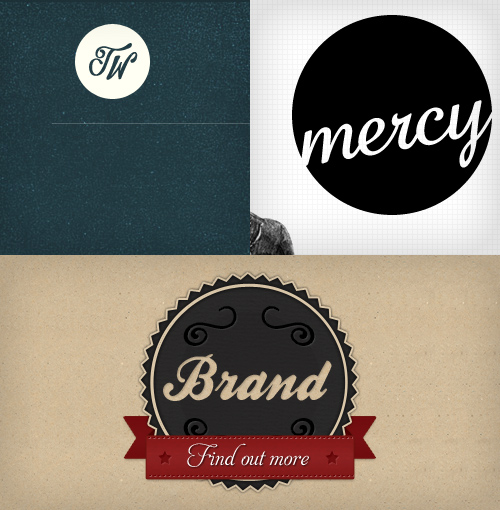
Clockwise from top: Trent Walton; Mercy; Dribbble shot by James Seymor-Lock.
Skeuomorphic Features
Skeuomorphic features — i.e. ornamentation or design features on an object that are copied from the object’s form in another medium — are rife, particularly in mobile applications, and this symptom is one of the defining indicators of the epidemic. Possibly a mutant cancerous strain of mildly skeuomorphic features such as stitches and letterpress, it can sometimes grow to overtake an entire interface, bloating it with redundant visual references to physical objects and materials. However, due to the labor involved in preparing the graphics and the heavy reliance on image resources, some researchers argue that we’re unlikely to see full-blown skeuomorphism dominate our desktop browsers any time soon.
In fact, most scientists regard the phenomenon as a curiosity and predict that some virtual metaphors for physical attributes will prove useful (as tabs have) and some won’t. Interestingly, while Apple has embraced and continues to pioneer the technique, Google seems to some degree to resist the urge to mimic physical reality in its interfaces. Perhaps it has developed a vaccine?

Clockwise from top: iBooks; Dribbble shot by skorky; Dribbble shot by Igor Shkarin.
How Did It Start?
Pinpointing the epicentre of a design epidemic (read: trend) is always hard, especially given the myriad of symptoms and the contagious nature of the Internet. Identifying Patient Zero is virtually impossible, and, to be pragmatic, doing so would serve no purpose. What we can say is that we’re most likely experiencing a reaction to the Web 2.0 aesthetic — a craving for textured surfaces and retro imagery, something tactile and natural-looking, as an antidote to the shiny impersonality of the past — and that this is both healthy and necessary for pushing the design industry forward. Whatever the sources of trends, they often start with applying smart design to solve a particular problem or, indeed, to counter another trend.
Let’s say that everyone used sans-serif fonts, strong contrasting colors and crisp white backgrounds as a rule. Imagine, in this environment, if a designer went against the grain by using Clarendon or some other warm serif to infuse some personality into their website (which happens to be selling “Grandma’s homemade jam”), and then complemented the personality of their font selection with earthy colors and some brown paper textures. The result would inevitably stand out from the crowd: beautiful, emotional, different.
Incidentally, this aesthetic inspires another designer who happens to be working on a website with a global audience, exposing the new approach to a whole generation of designers who, in turn, apply it at will (often without considering the context). A trend is born. And yet, paradoxically, the potency of the epidemic is under constant threat. The more people get infected, the less differentiated the symptoms appear; and once the infection reaches a critical mass, the symptoms begin to work against themselves. Infusing personality into your visuals is meaningless if everything looks the same.
Is It Dangerous?
In today’s open collaborative world, avoiding an epidemic of this scale is difficult; so, in a sense, everyone is affected to some degree. The symptoms listed above are not restricted to small-scale up-and-coming designers, but affect even the elite of the design community. This means that even though some symptoms are harmless — like a light fever or a runny nose from a flu infection — the viral onslaught of trendy features puts constant pressure on our immune system to protect our creativity, and staying vigilant is important to maintaining a healthy dose of original thought.
If you’re displaying a handful of symptoms, it’s really nothing to worry about — catching a cold that’s going around is not hard, but recovering from it is also easy. If, on the other hand, you display most or all of these symptoms, then there’s reason to be extra cautious in your next project. Using all of a trend’s identifiers as cornerstones of your work might make your portfolio look oh so contemporary, but in a way this practice is no different than passing off the work of your favorite designer, artist or musician as your own. Granted, symptoms with no identifiable origin are not protected by copyright, but that’s beside the point — you should be worried not about legal implications, but rather about the creative integrity of your output. The danger is not only that your work will be seen as a passing fad, a popular aesthetic that will look dated in a couple of years’ time, but that you will lose the respect of your peers when they catch on to you.
While nothing is original, we all need to respect the difference between inspiration and imitation. As Jean Luc Goddard said, “It’s not where you take things from — it’s where you take them to.” And if you don’t take them anywhere, what’s the point?
Worse perhaps than the loss of respect and integrity is the effect that epidemics have on clients and, in turn, the design community as a whole. The more designers are infected and the more symptoms they show of the same disease, the less your clients will believe that you’re capable of solving real business problems. Eventually they’ll exclude you from the early stages (where all the real design thinking takes place) and employ your services merely to skin their wireframes, in the process reducing the whole profession to an army of decorators.
What Can You Do About It?
Now that we’ve seen how detrimental trends can be, how does one avoid them? Is this even possible? Trends, by definition, are popular, and arguably nothing is wrong with tapping into that popularity to increase the exposure of your product. Convincing a client to accept a design that is off-trend can be difficult, and you run the risk of alienating the audience by going completely against the trend just for the sake of it. On the other hand, blindly following others is never a good idea, and you could severely stifle your creativity, integrity and client base by accepting what’s “in” as a given and copying it without purpose.
So, what’s the right thing to do? Trends are intrinsic to our society, whether in politics, culture, design or even religion, and as the consensus sways in one direction or another, so will your opinion (or “taste”) — to some degree, at least. Alas, avoiding trends altogether seems an impossible and pointless undertaking, but that doesn’t leave you powerless. In fact, you can do a host of things to combat the lemming syndrome.
Ask Why
Always question your design decisions (and make sure they are your own), and keep asking the magic question, Why am I doing this? Am I doing this simply because it looks cool or because it suits the message I’m trying to communicate? Why am I using this ribbon? Does the zigzag border add to or detract from the personality of the website? What does this leather texture have to do with the finance app I’m designing? The moment you stop asking questions, you fall prey to the epidemic.
Put Some Effort In
In his article “The Dying Art of Design” Francisco Inchauste asserts, among other things, that inspiration requires perspiration, and I couldn’t agree more. I was lucky enough to attend a college where no computers were allowed in the first year, which meant we had to use physical tools to express ourselves — tracing letters by hand, drawing our photography, stocking up on Pantone pens (remember those?), abusing the copier. Not only did our creativity grow, but we learned an important lesson: good design is not effortless, and the best results come from your own experimentation.
Try Something Different
Remember that being distinctive is, for the most part, a good thing. Most great artists in history, regardless of their field, stood out enough for the world to take notice. Who painted melting clocks before Dali? Who would have thought to build a huge wall on stage before Pink Floyd? While mimicking what’s popular might be comfortable and might secure short-term victories, long-term success requires a unique, memorable approach.
Diversify Your Inspiration
In order to remain creative, staying curious and looking for inspiration all around you is crucial, not just in the latest showcase of fashionable WordPress themes. Read a book, perform a scientific experiment, listen to music you haven’t heard before, walk through a new neighborhood, or experience a foreign culture. Widening your horizons beyond your favorite websites and finding more than one source of inspiration is critical to making original, lasting designs.
Focus on the Basics
Finally and most importantly, study the underlying principles of design in order to understand what is and isn’t defined by style. Grid systems, contrast, legibility, juxtaposing imagery, well-written copy — these are the key components of successful design, yet they are entirely independent of fads and styles.
At the end of the day, design is not so much about style as it is about communication, and all style, imagery and typography should be inspired by the content, functionality and personality of the product, not by what simply looks cool at the moment.
No matter how cool something looks, it too shall pass.
(al) (fi)


 See the full picture →
 SurveyJS: White-Label Survey Solution for Your JS App

 Celebrating 10 million developers

