The Web Design Navigation Menu - Articles And A Beautiful Showcase

Email Newsletter
Weekly tips on front-end & UX.
Trusted by 182,000+ folks.
 Custom Web Forms for Angular, React, & Vue. Your backend.


 Celebrating 10 million developers
This overview features a hand-picked and organized selection of the most useful and popular Smashing Magazine’s articles related to Web Design navigation and published here over all the years.
The Elements Of Navigation
When users look for information, they have a goal and are on a mission. Even before you started to read this article, chances are you did because you either had the implicit goal of checking what’s new on Smashing Magazine, or had the explicit goal of finding information about “Navigation Design”.

This article is about the tiniest of details that goes into creating the main centerpiece of your digital product—the construction of the elements of your navigation. This is the most important aid you can possibly give to your users as they are constantly seeking a reason to walk out on you.
Planning And Implementing Website Navigation
The thing that makes navigation difficult to work with in Web design is that it can be so versatile. Navigation can be simple or complex: a few main pages or a multi-level architecture; one set of content for logged-in users and another for logged-out users; and so on. Because navigation can vary so much between websites, there are no set guidelines or how-to’s for organizing navigation.
Designing navigation is an art in itself, and designers become better at it with experience. It’s all about using good information architecture: “the art of expressing a model or concept of information used in activities that require explicit details of complex systems.”
Showcase of Creative Navigation Menus: Good and Bad Examples
Good navigation is the main cornerstone of an effective website. In practice, however, it’s often a tough challenge to come up with a meaningful, unambiguous way to organize, arrange, and display content to users; and it’s often not much easier to find a visually interesting solution either. The wide adaption of JavaScript libraries like jQuery is making it increasingly easy to add various kinds of sleek animations to navigation design.
For instance, many recent promo websites are essentially single page websites with an array of animation effects used to make navigation a smoother and richer user experience. We need to be very careful and cautious when using these dynamic effects in our designs. A simple, calm navigation is usually much more user-friendly than an evolved, dynamic one. Users want to use the website, not be baffled by the weird and hardly usable navigation. But that’s not to say that a creative navigation should be avoided at all costs.
Showcase of Interesting Navigation Designs
Everyone is always looking for interesting and effective ways to organize their website and allow users to move about and find things. But there’s a fine line between unexpected and unusable. Three points to consider in any navigation scheme are consistency, user expectations and contextual clues.
If page is long and provides different levels of navigation, will users be able to find their way through the site and use proper navigation quickly? Forcing visitors to use certain keystrokes to navigate, rather than what they’re used to, might be novel, but is that effective if you have to explain instructions prominently on your home page? Here are some examples for your reading pleasure.
Showcase Of Beautiful Vertical Navigation Designs
Go to any website and you’re guaranteed to find one thing: a navigation menu. Navigation menus enable visitors to move from page to page; without them, we would have no way to conveniently explore websites. Perhaps this is why designers, information architects, usability researchers and user experience specialists invest so much time and resources into devising aesthetically pleasing and user-friendly navigation systems.
Website navigation menus generally come in one of two orientations: vertical and horizontal. Horizontal navigation menus display items side by side. Vertical navigation menus stack items on top of each other. In this post, we highlight some remarkable vertical navigation menus, for your inspiration.
Showcase Of Modern Navigation Design Trends
The navigation menu is perhaps a website’s single most important component. Navigation gives you a window onto the website designer’s creative ability to produce a functional yet visually impressive element that’s fundamental to most websites. Because of their value to websites, navigation menus are customarily placed in the most visible location of the page, and thus can make a significant impact on the visitor’s first impression.
The design of a navigation menu has to be outstanding in order to sustain the user’s interest. As the adage goes, “Content is king,” but getting to the content requires navigation. In this post, we’ll be explore some of the more recent trends in navigation design. We’ll look at the aesthetics that recur in today’s best Web designs. The focus here is on the visual direction that leading designers are taking.
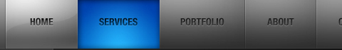
Horizontal Navigation Menus: Trends, Patterns, and Best Practices
The horizontal navigation menu has become a mainstay in Web design. It is safe to say that nowadays most websites use some form of horizontal navigation to facilitate content browsing. The dominance of horizontal navigation over vertical (i.e. down a sidebar) is obviously due to the design and content limitations of the latter. Notably, CNN discovered those limitations before switching from vertical to horizontal a few years back.
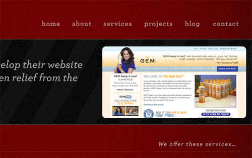
There are, however, many styles of horizontal navigation in modern Web design. Some offer usability advantages for certain types of websites, while others are aesthetically better. In this article, we will focus on a variety of techniques and best practices to improve the usability of horizontal navigation bars, and we will note less effective styles. We’ll also look at several trends that developers can choose from when working on the navigation design for their next project.
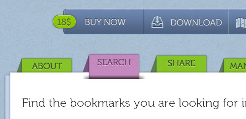
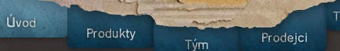
Showcase Of Well-Designed Tabbed Navigation
There are an extensive amount of roads you can take in web design, specifically in navigation. Here, we will talk about one specific navigation technique, tab-based navigation. If properly carried out, tabbed navigation can be very clean and organized within a web layout.
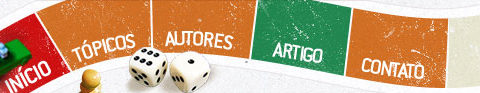
So what is tabbed navigation? Well, it is essentially a set of buttons most often set horizontally. Tabs generally follow numerous different styling guidelines. First, a tab set usually is attached to or slightly protrudes from a container, like in the example below. Also, notice how the open tab matches the background color of the container, and the other buttons are darker. This is another common styling guideline.
When you look at tabbed navigations, you will also notice many styling trends. First, many tabs will have rounded corners on buttons. This helps to create a clean look. Also helping to make a clean look is the use of separation between buttons. Most designs use space to separate buttons, but a bevel, single line, or background color contrast will also look nicely.
Designing Drop-Down Menus: Examples and Best Practices
As a general rule, most Web developers, especially usability enthusiasts, say it is bad practice to use drop-down menus because they are confusing, annoying and oftentimes dysfunctional. From a design standpoint, however, drop-down menus are an excellent feature because they help clean up a busy layout. If structured correctly, drop-down menus can be a great navigation tool, while still being a usable and attractive design feature.
Yes, that’s right: drop-down navigation menus can be user-friendly. Just yesterday Jacob Nielsen the results of his recent drop-down menus study, in which he found out that big, two-dimensional drop-down panels that group navigation options help users to avoid scrolling and can precisely explain the user’s choices with effective use of typography, icons, and tooltips.
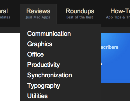
In this article we take a closer look at the nature of drop-down navigation menus, analyze situations in which they should or should not be used, discuss various implementations and finally showcase a couple of bad and good examples of such menus. The article also includes various tips and suggestions to help you work with your drop-down menus.
Navigation Menus: Trends and Examples
Navigation is the most significant element in web design. Since web-layouts don’t have any physical representation a user can stick to, consistent navigation menu is one of the few design elements which provide users with some sense of orientation and guide them through the site. Users should be able to rely on it which is why designers shouldn’t mess around with it.
That’s why in most cases it’s where simple, intuitive and conventional solutions are usually the best option. However, it doesn’t mean that they need to be boring. One year ago we’ve presented modern approaches of navigation design. Let’s take a look at what’s different now, which trends one can observe and what ideas you can develop further in your projects.
This article presents recent trends, examples and innovative solutions for design of modern navigation menus. All images are clickable and lead to the sites from which they’ve been taken. We’ve missed something? Definitely! Let us know in the comments!
Can User Experience Be Beautiful? An Analysis Of Navigation In Portfolio Websites
When users land on your website, they typically read the content available. Then, the next thing that they will do is to try and familiarize themselves with your website. Most of the time this involves looking for navigation.

In this article, I’ll be analyzing the navigation elements of a particular category of websites, i.e. portfolios. Why portfolios, you ask? Because they represent an interesting blend of creativity and development techniques. As they offer an intriguing user interface and interaction, this often borderlines with what is ultimately defined as an enjoyable user experience. Should aesthetics, originality and creativity come at the expense of usability? Can they reside on the same website in harmony?
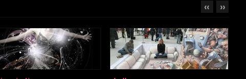
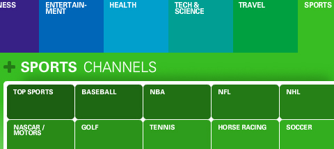
Navigation Menus Showcase
Below we present over 50 excellent navigation menus — we feature CSS-based design solutions, CSS+JavaScript-based menus and Flash-designs. However, they all have something in common: they are user-friendly yet creative and perfectly fit to the style of their respective websites.
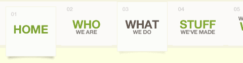
A colorful menu that adds to the feel of the website.
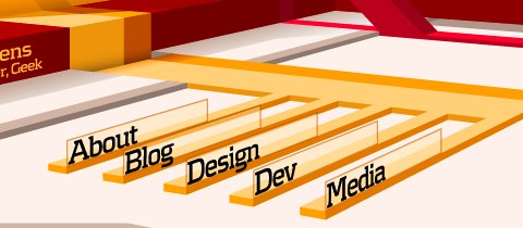
Steven Wittens takes a look at the navigation menu from a quite unusual perspective.
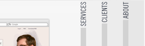
Web Design Ledger has an excellent menu; its large size is convenient but doesn’t intrude on the content.
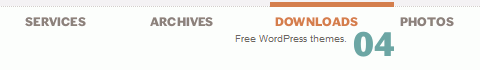
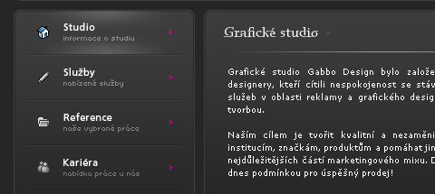
UX Booth uses a a stylish text box under the navigation as a sort of subtext for each menu item.

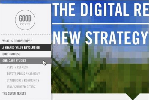
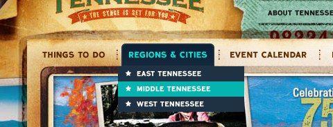
Vertical navigation menus are used very rarely, for the simple reason: they are harder to use. However, some designers risk unusual approaches. Nopoko Graphics uses an arrow and a hover-effect for its vertical navigation menu.

This website uses a large image-based menu on the home page. The user’s attention is drawn directly to this large menu, making it convenient for users.
This large and colorful menu is very noticeable and uses a slight hover effect to further define the menu items.

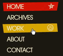
An intuitive drop-down navigation that uses 2 colors effectively to communicate the active navigation item and the passive ones.
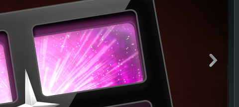
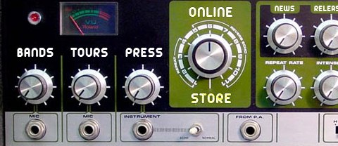
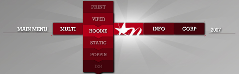
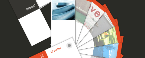
A U.S. record label, presents its navigation menu in the form of a the so-called Space Echo Roland SE-201.
It’s pretty hard to find a nice-looking drop-down menu. This one is a beautiful exception.
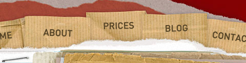
Clearleft uses a couple of paper pieces for its navigation.
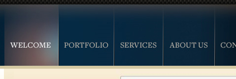
A simple, clean and beautiful navigation with a nice hover effect.

An excellent example of block navigation that shows how effectively “speaking” hover effects can be used with a clean and simple navigation menu.
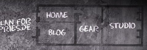
A navigation menu doesn’t have to look like a traditional navigation menu. Ronny Pries uses a floor plan to lead site visitors through the pages of the site.
Jiri Tvrdek presents the navigation options of his site as leaves on a tree. Creative, unusual and memorable.
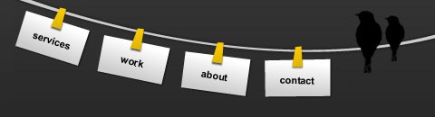
Patricia Abbott uses clothespins for the navigation options.
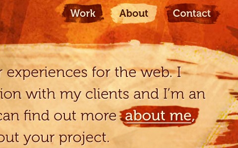
Matt Dempsey highlights his navigation options with a brush stroke.
The current navigation option is pressed — clear and intuitive.

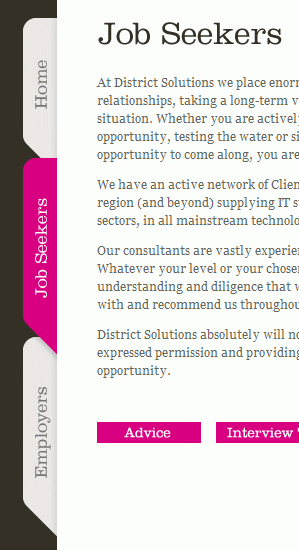
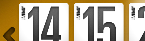
Vertical tabs are used very rarely. But they can look good!
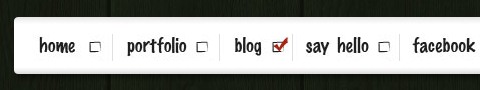
This website seems to like setting “done”-marks…
Jeff Sarmiento Why not try a sloping navigation options once in a while?
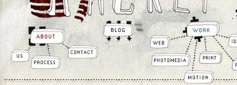
A really unusual navigation menu that uses some kind of a mindmap to illustrate the navigation. And, apart from that, the navigation menu is hand-drawn!
A subtle yet distinct menu that is out of the way of content. Excellent colors and a nice hover effect also add to the menu.
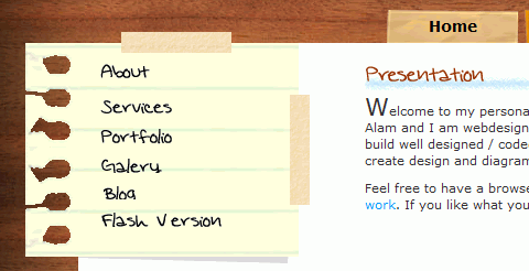
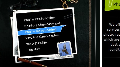
This Portuguese designers uses handwriting and a piece of paper for its main navigation.
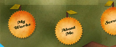
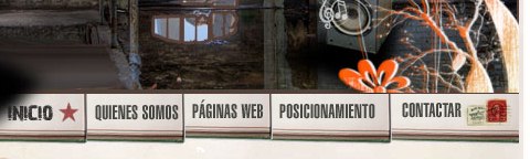
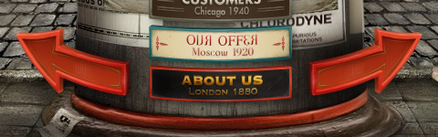
Some designers integrate a stamp in the contact navigation option.
This website uses large navigation buttons and has a good hover effect.
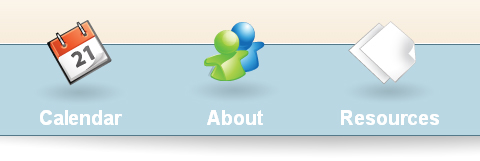
One more example of a large and clean menu. This one uses icons to aid the reader in recognizing each item’s function.
This menu has a clean and smooth layout, and it has a great sub-menu that uses transparency to separate it from the main menu.
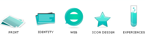
Icons reinforce the menu items on this website and add emphasis to each option.
This website has a great grunge style, and the menu fits right into the layout.
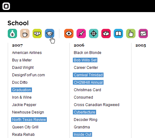
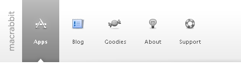
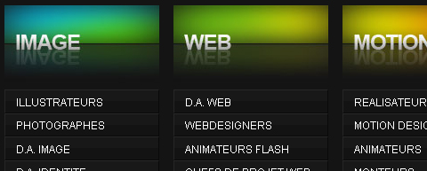
This menu is located close to the content, where it is easy to use. It uses large icons, which adds a visual element to the navigation. Also, the menu on other pages uses the same icons in a vertical layout, bringing consistency to the website. The icons may not fit perfectly, but it’s a nice idea.
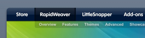
This navigation has a rather unique style that emphasizes selected items. Also, the menu layout stays consistent throughout the whole website.

Tutorial9 recently got a nice redesign, which came with a very usable and well-organized menu.
Designers sometimes use tooltips for their navigation. However, tooltips and aqua are quite an unusual combination.

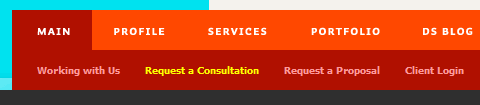
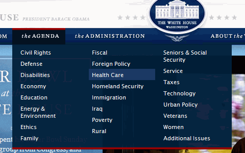
A perfect example of how one should organize huge amounts of content into clear and easily distinguishable sections. Also, excellent design of the drop-down menu.
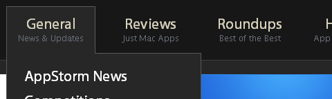
AppStorm is a new website by Envato. A jQuery effect is used to create an excellent and very usable drop-down menu.
Eric Johansson, a designer from Sweden, uses tall vertical blocks and images for his navigation.
This conveniently located menu has a beautiful hover effect. The sub-menus are consistent and include every item.
Dragon Interactive has a colorful jQuery-based menu with a great effect.
I am a big fan of this navigation layout. I like how the menu fits in with the grunge theme. It also uses another jQuery drop-down effect.
For its recent redesign, Abduzeedo introduced a jQuery slider into the navigation.
Colorful sloping Flash-based navgation from an Indian Web design agency.
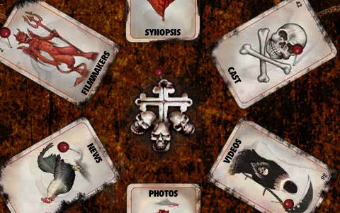
Most entertainment websites use Flash and unusual navigation menus to capture users’ attention. On this one, an instant classic, navigation items are put on cards.
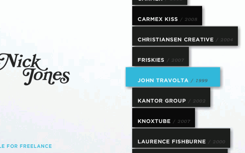
Nick Tones, with a dynamic, colorful and yet still somehow usable navigation menu.
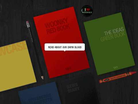
This Argentinian design agency puts CDs and books on a table, each representing a navigation option, of course. When hovered over with a mouse, each object reveals what can be found inside.
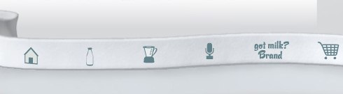
The designers of this Flash-based site came up with something truly original. The navigation menu is put on a ribbon; each navigation item has a nice and simple hover-effect: when an icon is hovered, it is replaced with the site area the icon stands for. Usually tooltips are used for this puprose, here designers use a different approach. Outstanding!
A beautiful and very colorful Flash menu that is a good example of excellent usability.
This unique website is all about easy-to-use navigation.
This amazing portfolio has very well-thought out and convenient navigation.
This website has a beautiful layout and a menu with great effects.
Visitors here use a large and well-laid out slider to move through news items.
The content on the home page of this portfolio website has an extremely simple yet usable organization.
This visually stunning Flash-based portfolio uses an accordion-like layout for the content, so there is no loading of new pages. The large type stresses the importance of menu items.

Colourpixel has a very interesting layout for its portfolio. It combines all of its sections onto a single page, and allows each item to be hidden or revealed, as demanded by the user.
Yet another excellent Flash-based portfolio. This website organizes all gallery items onto an interesting revolving list.
This portfolio is rather well known for its beautiful layout. An accordion effect allows users to navigate through projects and portfolio items.
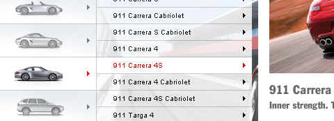
Porsche Canada’s website has very user-friendly navigation, with many sub-items for each menu item. The convenience and usability of this menu is great.
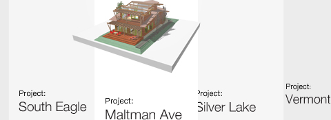
This architecture portfolio has a unique layout that allows users to easily browse the website. The line of menu items has many effects and transitions that make it very convenient.
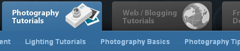
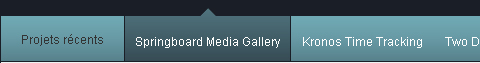
Firstborn, a well-known design studio, uses scrollable, horizontal navigation for its portfolio. The navigation items can also be displayed in other modes, such as thumbnails, making it even better.
This portfolio has a vertical slider that automatically moves through menu items. Many large items are placed together in a single glowing menu.
Another stunning portfolio with creative navigation, this one with Flash-based “color samples” to choose from. Like items are grouped together.
Accordions are useful when trying to squeeze many items into a small space. Jason Reed used a stylish accordion in his portfolio to allow users to navigate pages.
Another usable accordion menu that groups portfolio items.
Danny Blackman’s website is often regarded as one of the better portfolios out there, in part because of the amazing vertical layout.

This website is yet another portfolio that uses a vertical layout to incorporate multiple pages onto one, while allowing users to move vertically between sections.

Volll uses a vertical layout with a beautiful illustrated landscape background.

Mediocore is an awesome portfolio. It has a few more elements than usual on its pages, but still looks excellent.

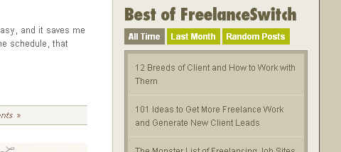
FreelanceSwitch organizes its articles using a great menu.
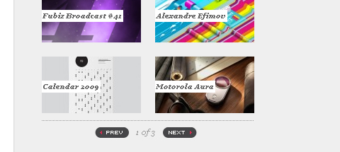
The redesign of Fubiz brings an excellent sidebar. Slide effects are used to fit a large amount of content into a small sidebar.
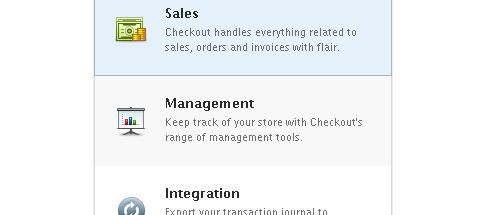
Checkout has a stunning website. An extremely clean list-style menu in the features section also displays nice icons.
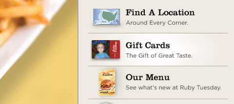
Ruby Tuesday has a very nice website. The sidebar menu has exceptional icons and smooth hover effects.
A simple and minimalist menu with sliding effects.
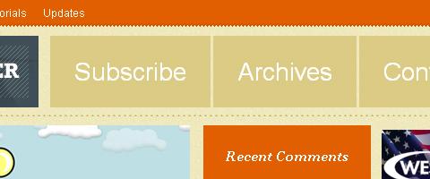
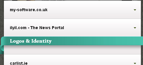
Another clean and well-spaced list menu.
(vf) (il) (sl) (al)


