10 Harsh Truths About Corporate Websites

Email Newsletter
Weekly tips on front-end & UX.
Trusted by 182,000+ folks.

 Celebrating 10 million developers
 Custom Web Forms for Angular, React, & Vue. Your backend.


We all make mistakes running our websites. However, the nature of those mistakes varies depending on the size of your company. As your organization grows, the mistakes change. This post addresses common mistakes among large organizations.
Most of the clients I work with are large organizations: universities, large charities, public sector institutions and large companies. Over the last 7 years, I have noticed certain recurring misconceptions among these organizations. This post aims to dispel these illusions and encourage people to face the harsh reality.
The problem is that if you are reading this post, you are probably already aware of these things. But hopefully this article will be helpful to you as you convince others within your organization. In any case, here are our 10 harsh truths about websites of large organizations.
1. You Need A Separate Web Division
In many organizations, the website is managed by either the marketing or IT department. However, this inevitably leads to a turf war, with the website becoming the victim of internal politics.
In reality, pursuing a Web strategy is not particularly suited to either group. IT may be excellent at rolling out complex systems, but it is not suited to developing a friendly user experience or establishing an online brand.
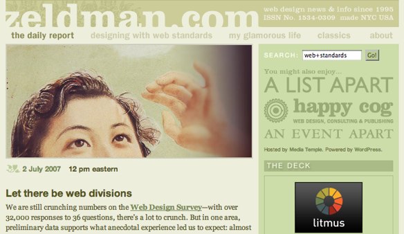
Marketing, on the other hand, is little better. As Jeffrey Zeldman puts it in his article Let there be Web divisions:
“The Web is a conversation. Marketing, by contrast, is a monologue... And then there’s all that messy business with semantic markup, CSS, unobtrusive scripting, card-sorting exercises, HTML run-throughs, involving users in accessibility, and the rest of the skills and experience that don’t fall under Marketing’s purview.”
— Jeffrey Zeldman
Instead, the website should be managed by a single unified team. Again, Zeldman sums it up when he writes:
“Put them in a division that recognizes that your website is not a bastard of your brochures, nor a natural outgrowth of your group calendar. Let there be Web divisions.”
— Jeffrey Zeldman
2. Managing Your Website Is A Full-Time Job
Not only is the website often split between marketing and IT, it is also usually under-resourced. Instead of there being a dedicated Web team, those responsible for the website are often expected to run it alongside their “day job.” When a Web team is in place, it is often over-stretched. The vast majority of its time is spent on day-to-day maintenance rather than longer-term strategic thinking.
This situation is further aggravated by the fact that the people hired to “maintain” the website are junior members of the staff. They do not have the experience or authority to push the website forward. It is time for organizations to seriously invest in their websites by hiring full-time senior Web managers to move their Web strategies forward.
3. Periodic Redesign Is Not Enough
Because corporate websites are under-resourced, they are often neglected for long periods of time. They slowly become out of date with their content, design and technology.
Eventually, the website becomes such an embarrassment that management steps in and demands that it be sorted. This inevitably leads to a complete redesign at considerable expense. As I point out in the Website Owners Manual, this a flawed approach. It is a waste of money because when the old website is replaced, the investment put into it is lost, too. It is also tough on finances, with a large expenditure having to be made every few years.
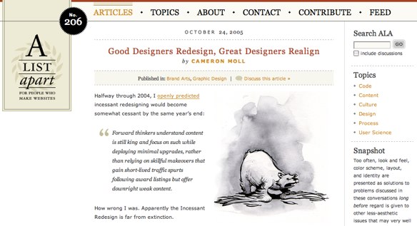
A better way is continual investment in your website, allowing it to evolve over time. Not only is this less wasteful, it is also better for users, as pointed out by Cameron Moll in his post Good Designers Redesign, Great Designers Realign.
4. Your Website Cannot Appeal To Everyone
One of the first questions I ask a client is, “Who is your target audience?” I am regularly shocked at the length of the reply. Too often, it includes a long and detailed list of diverse people. Inevitably, my next question is, “Which of those many demographic groups are most important?” Depressingly, the answer is usually that they are all equally important.
The harsh truth is that if you build a website for everyone, it will appeal to no one. It is important to be extremely focused about your audience and cater your design and content to it. Does this mean you should ignore your other users? Not at all. Your website should be accessible by all and not offend or exclude anybody. However, the website does need to be primarily aimed at a clearly defined audience.
5. You Are Wasting Money On Social Networking
I find it encouraging that website managers increasingly recognize that a Web strategy is more than running a website. They are beginning to use tools such as Twitter, Facebook and YouTube to increase their reach and engage with new audiences. However, although they are using these tools, too often they do so ineffectively. Tweeting on a corporate account or posting sales demonstrations on YouTube misses the essence of social networking.
Social networking is about people engaging with people. Individuals do not want to build relationships with brands and corporations. They want to talk to other people. Too many organizations throw millions into Facebook apps and viral videos when they could spend that money on engaging with people in a transparent and open away.
Instead of creating a corporate Twitter account or indeed even a corporate blog, encourage your employees to start Tweeting and blogging themselves. Provide guidelines on acceptable behavior and what tools they need to start engaging directly with the community connected to your products and services. This demonstrates not only your commitment to the community but also the human side of your business.
6. Your Website Is Not All About You
Where some website managers want their website to appeal to everybody, others want it to appeal to themselves and their colleagues. A surprising number of organizations ignore their users entirely and base their websites entirely on an organizational perspective. This typically manifests itself in inappropriate design that caters to the managing director’s personal preferences and contains content full of jargon.
A website should not pander to the preferences of staff but should rather meet the needs of its users. Too many designs are rejected because the boss “doesn’t like green.” Likewise, too much website copy contains acronyms and terms used only within the organization.
7. You’re Not Getting Value From Your Web Team
Whether they have an in-house Web team or use an external agency, many organizations fail to get the most from their Web designers. Web designers are much more than pixel pushers. They have a wealth of knowledge about the Web and how users interact with it. They also understand design techniques, including grid systems, white space, color theory and much more.
It is therefore wasteful to micro-manage by asking them to “make the logo bigger” or to “move that 3 pixels to the left.” By doing so, you are reducing their role to that of a software operator and wasting the wealth of experience they bring.
If you want to get the maximum return on your Web team, present it with problems, not solutions. For example, if you’re targeting your website at teenage girls, and the designer goes for corporate blue, suggest that your audience might not respond well to that color. Do not tell him or her to change it to pink. This way, the designer has the freedom to find a solution that may even be better than your choice. You allow your designer to solve the problem you have presented.
8. Design By Committee Brings Death
The ultimate symbol of a large organization’s approach to website management is the committee. A committee is often formed to tackle the website because internal politics demand that everybody has a say and all considerations be taken into account. To say that all committees are a bad idea is naive, and to suggest that a large corporate website could be developed without consultation is fanciful. However, when it comes to design, committees are often the kiss of death.
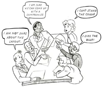
Design is subjective. The way we respond to a design can be influenced by culture, gender, age, childhood experience and even physical conditions (such as color blindness). What one person considers great design could be hated by another. This is why it is so important that design decisions be informed by user testing rather than personal experience. Unfortunately, this approach is rarely taken when a committee is involved in design decisions.
Instead, designing by committee becomes about compromise. Because committee members have different opinions about the design, they look for ways to find common ground. One person hates the blue color scheme, while another loves it. This leads to designing on the fly, with the committee instructing the designer to “try a different blue” in the hopes of finding middle ground. Unfortunately, this leads only to bland design that neither appeals to nor excites anyone.
9. A CMS Is Not A Silver Bullet
Many of the clients I work with have amazingly unrealistic expectations of CMS (content management systems). Those without one think it will solve all of their content woes, while those who have one moan about it because it hasn’t!
It is certainly true that a CMS can bring a lot of benefits. These include:
- reducing the technical barriers of adding content,
- allowing more people to add and edit content,
- facilitating faster updates,
- and allowing greater control.
However, many CMS are less flexible than their owners would like. They fail to meet the changing demands of the websites they manage. Website managers also complain that their CMS is hard to use. However, in many cases, this is because those using it have not been adequately trained or are not using it regularly enough.
Finally, a CMS may allow content to be easily updated, but it does not ensure that content will be updated or even that the quality of content will be acceptable. Many CMS-based websites still have out-of-date content or poorly written copy. This is because internal processes have not been put in place to support the content contributors.
If you look to a CMS to solve your website maintenance issues, you will be disappointed.
10. You Have Too Much Content
Part of the problem with content maintenance on large corporate websites is that there is too much content in the first place. Most of these websites have “evolved” over years, with more and more content having been added. At no stage has anybody reviewed the content and asked what could be taken away.
Many website managers fill their website with copy that nobody will read. This happens because of:
- A fear of missing something: by putting everything online, they believe users will be able to find whatever they want. Unfortunately, with so much information available, it is hard to find anything.
- A fear users will not understand: whether from a lack of confidence in their website or in their audience, they feel the need to provide endless instruction to users. Unfortunately, users never read this copy.
- A desperate desire to convince: they are desperate to sell their product or communicate their message, and so they bloat the text with sales copy that actually conveys little valuable information.
Steve Krug, in his book Don’t Make Me Think, encourages website managers to “Get rid of half the words on each page, then get rid of half of what’s left.” This will reduce the noise level on each page and make the useful content more prominent.
Conclusions
Large organizations do a lot right in running their websites. However, they also face some unique challenges that can lead to painful mistakes. Resolving these problems means accepting that mistakes have been made, overcoming internal politics and changing the way you control your brand. Doing so will give you a significant competitive advantage and allow your Web strategy to become more effective over the long term.
Further Reading On Smashing Magazine
- “Strategic Design: 6 Steps For Building Successful Websites,” Dmitry Fadeyev
- “TiDesigning Style Guidelines For Brands And Websitestle,” Kat Neville
- “A Comprehensive Website Planning Guide,” Ben Seigel


