Space Explosion Photoshop Tutorial

Email Newsletter
Weekly tips on front-end & UX.
Trusted by 182,000+ folks.
 Celebrating 10 million developers


 Custom Web Forms for Angular, React, & Vue. Your backend.
Digital space art is one of the most inventive and beautiful art genres of this era. This tutorial shows you how to create your own space scene using three stock photos and Adobe Photoshop. The majority of the effects use the brush tool, layer effects and the filter gallery. You may want to set aside an hour or two before starting this tutorial because it requires quite a bit of work to accomplish. So get those creative juices flowing and let’s get started! [Updated Dec/31/2016]
Further Reading on SmashingMag:
- 50 Photoshop Tutorials For Sky and Space Effects
- Beautiful Photoshop Illustrations By Artists Around The World
- 32 Stunning Outer Space Science Fiction Photoshop Tutorials
- Out of This World Typography
- Photoshop Techniques And Professional Tutorials
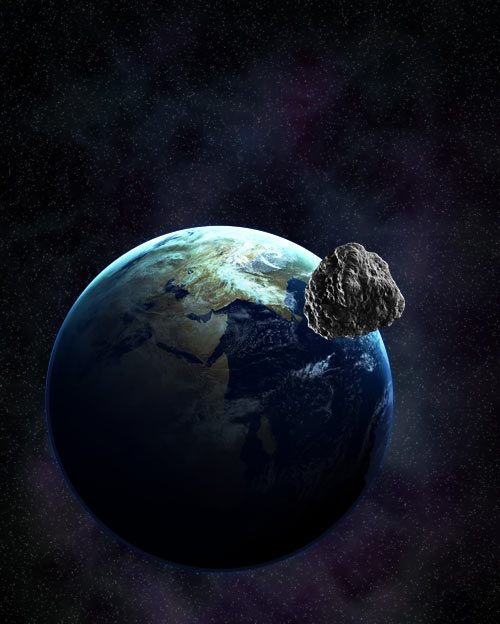
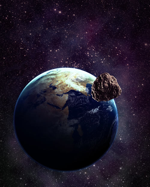
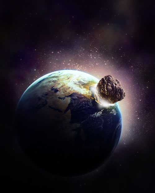
Step 1: Placement of Planets
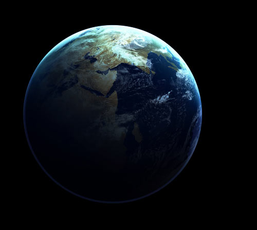
Create a new document that is 1200 x 1600px with a black background. Then, place the image of a planet (use NASA images) in your document and move it to where you want it located.
Because the colors of the planet are a little dull, let’s modify a little. Duplicate your planet layer by right clicking it and selecting Duplicate Layer. Set the new layer’s Blending Mode to Overlay.
Go back to your original planet layer and grab your Burn Tool. Set the brush size to 300 px and make sure the Range is Midtones and the Exposure is 50%. Burn the lower left half of the planet, making sure you follow the curve of the planet as you do so.
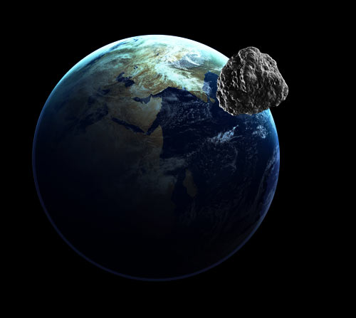
Place the image of a meteorite in the upper-right area of the planet. Like we did with the planet, duplicate the meteorite and set the layer to Overlay.
Step 2: Creating the Environment
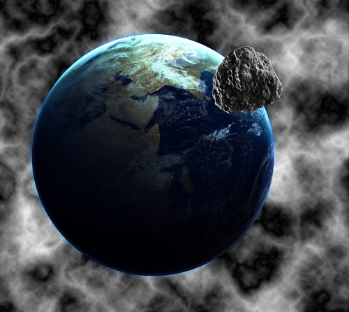
Before creating an environment for our space scene, you may want to look at some resources and art work done by others to get some inspiration and knowledge. PSDTUTS has a great post with some amazing artwork done by talented artists.
Make sure all of these layers are located beneath the planet layer. You may also want to put them in a group.
Creating the Coloration
Create a new layer and fill it with White. Grab a 300 px soft brush with 75% opacity and turn Scattering on. Erase across your layer so that there are random areas of white and gray. Then set the layer opacity to 25%.
Create a new layer. Make sure your foreground and background colors are black and white, and go to Filter > Render > Clouds to fill your document with some black and white “clouds.” Then apply Filter > Render > Difference Clouds about three or four times.
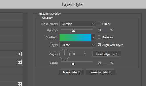
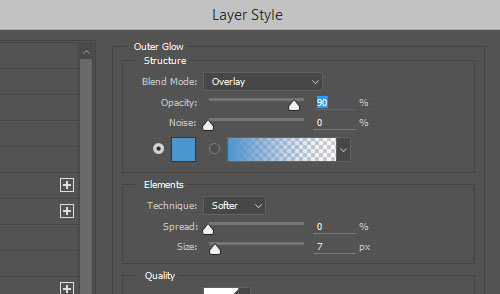
Set the blending mode to Overlay, the Fill to 75% and apply the following Gradient Overlay.
Create two new layers. On each of them, render some clouds and apply difference clouds on only one of them. Set both of them to Overlay.
Creating the Stars
Make a new layer and fill it with black. Go to Filter > Noise > Add Noise. Set the Amount to 10%, Distribution to Gaussian, and make sure Monochromatic is checked.
However, this adds way too many stars to our document. To fix this, go to Image > Adjustments > Levels. Set the left slider to 50 and the right slider to 100. This will keep only the larger stars and a few medium ones in the image. Then, set the blending mode to Screen so that only the stars show up and that the black areas of the layer are hidden. You may want to create multiple layers with this technique and lower the Opacity to create more depth.
Create a new layer and grab a white 5 px soft brush. Then change the brush settings to the following:
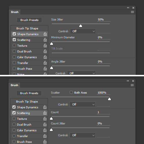
Brush areas of the new layer to add some larger stars. Don’t add too many, and try to put them in places that make them pleasing to the eye. Then add a white Outer Glow, with the blending mode set to normal.
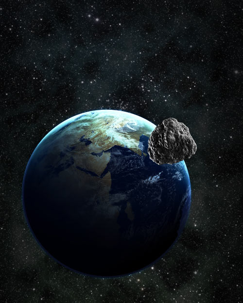
More Coloration
Create a new layer and fill it with a dark blue color, such as #1b1464. Grab a large 300 px soft eraser brush with 75% opacity. Turn the Scattering on and erase areas of the layer so that only certain parts are colorized. Try to leave more in the upper-right area of the layer, because this is the focal point of the graphic. Set the layer to Screen, and lower the opacity to 40%.
Repeat this process again with a different color, such as with a green, #20410a. Set this layer to 50% opacity. Create a new layer and grab a large soft black brush, between 300 px and 800 px. Brush once or twice behind the upper-right corner of the planet. Lower the opacity to 40%, and then apply Outer Glow of the white, set to Overlay.
Color Balance
Now for the fun part. This next step brings the background environment together! Go to Layer > New Adjustment Layer > Color Balance.
Shadows:
- Cyan/Red: +20
- Magenta/Green: -3
- Yellow/Blue: +20
Midtones:
- Cyan/Red: -1
- Magenta/Green: +23
- Yellow/Blue: +31
Highlights:
- Cyan/Red: +52
- Magenta/Green: -17
- Yellow/Blue: -76
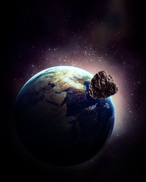
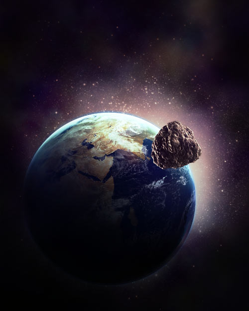
Light Bursts
Create a new layer. Grab a 300 px soft white brush, set to Dissolve, and brush once on the layer in the upper right. Then go to Filter > Blur > Radial Blur. Set the amount to 75, Zoom, and Best. Set the layer to Overlay. Repeat the process using a larger brush and apply it further down.
Empty Space
On a new layer, grab a 500 px black brush and brush around the outer edges to create some nice black space. Make sure the bottom-left corner has more because we want that area to be dark.
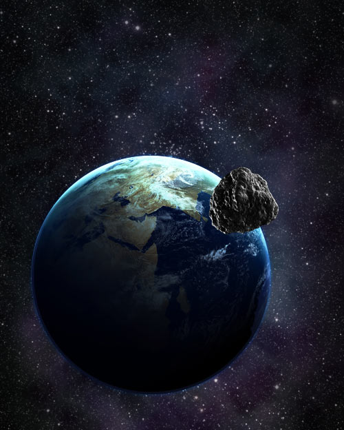
Step 3: Planet Effects
Make sure the following layers are all placed beneath the moon layer, so that they only apply to the planet. You may also want to put them in a group.
Darkening Areas
Duplicate your planet layer. On the bottom planet layer, apply a Filter > Blur > Gaussian Blur of 3 px. Then apply an Outer Glow of white, set to Overlay. Create a new layer above your planet. Then, select your planet by Ctrl + clicking on the layer thumbnail of the planet. Fill the selection with black, and set the layer to Overlay. Then lower the opacity of the layer to 40%.
Create another new layer, and once again select your planet. Grab a 500 px soft black brush and brush around the outer edge of the planet, but leave the upper right untouched, because we want this to be the bright side of our planet.
Creating an Inner Glow
Create a new layer, and select your planet. Grab a 300 px soft blue (#00aeef) brush, and brush around the outer edge of the selection, making sure you get more blue on the upper right of the planet because this is where our bright side is.
Create a new layer and select your planet. Fill the selection with white. Drag the selection diagonally down and to the left, and delete most of the white. Then apply a Gaussian Blur of 5 px. Then give the layer an Outer Glow of white, set to Overlay.
Color Balance
Once again, select your planet. Then go to Layer > New Adjustment Layer > Color Balance. You’ll notice that the color balance layer now has a mask applied to it of the selection we made.
Shadows:
- Cyan/Red: +6
- Magenta/Green: -1
- Yellow/Blue: -3
Midtones:
- Cyan/Red: -78
- Magenta/Green: 0
- Yellow/Blue: +29
Highlights:
- Cyan/Red: +47
- Magenta/Green: -8
- Yellow/Blue: -33
Glow Effects
Once again, create a new layer and select your planet. Grab a 300 px white soft brush and brush around the bottom ¾ of the planet. Try to make the brushes fit the curvature of the planet. Then set the layer to Overlay, and lower the opacity to 50%.
Create another new layer and select your planet. Using a 300 px white soft brush, brush inside the upper-right side of the planet. Then set the layer opacity to 20%. Create another layer, similar to the last one, except create more white space on this layer. Also, change the layer to Overlay and the opacity to 50%.
Create another new layer. This time, grab a 300 px brush and a nice red-orange color (#e6602b). Select your planet and then brush an orange area underneath the moon. Change the brush color to a yellow (#fdfc92) and brush a smaller area underneath the moon. Lower the layer opacity to 50%.
On a new layer, select a 200 px black brush and then brush around the bottom ¾ of the planet. Don’t restrict the selection to the planet this time. Let some of the brush overlap the background.
Intermission!
I would like to take this moment to congratulate you if you’ve made it this far. This is quite a long tutorial and requires a lot of dedication from you to follow. Don’t be frustrated, either, if your example doesn’t look like mine. It takes years to develop your skills in Photoshop. Keep experimenting, and find some great inspiration and resources to keep you moving along.
When working on a document of this complexity, make sure you keep all of your layers organized and labeled. Below you can see how I currently have my groups and layers organized and labeled, so that I can easily recognize them when I look back at them later. Ignore the hidden layers, those will come later.
Step 4: Moon Effects and Explosion
Make sure all of the following are located above the moon layer. You may also want to put them in a group.
Glow Effects
Remember when we used a red brush and a yellow brush to create a glow in the upper right of the planet? We are going to do the same thing to the lower edge of the moon. Grab a 200 px red-orange (#e6602b) brush, and brush around the outer edge, ¾ of the way around the moon. Repeat the same process with a 100 px yellow (#fdfc92) brush. Then lower the opacity of the layer to 20%.
Remember how we created the white glow in the upper-right area of the earth? Repeat the same process for the moon. Select the moon on a new layer, fill it with white, move the selection down some and then delete most of the white. Apply a Gaussian Blur of 1 to 2 px. Then give it an Outer Glow of white set to normal.
Explosion
Create a new layer and grab a 65 px white soft brush. Then brush a small area where the moon meets the planet. This layer will add to the effect that the next two layers create.
Create another new layer and keep your 65 px white brush. Brush a larger area underneath the moon. Make sure you follow the curvature of the moon as it meets the planet. Then, grab a small 3 px brush and turn Scattering to 1000% and Size Jitter to 75%. Brush some white particles around the area that you just brushed white.
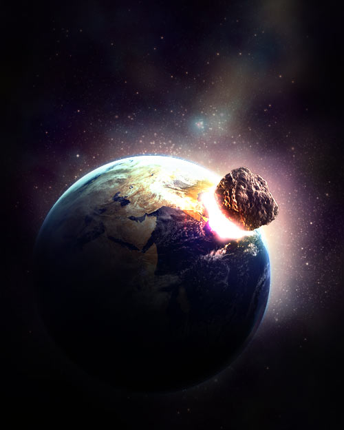
While still on this layer, apply an Outer Glow with the color #ffa800, set to Overlay.
Create a new layer and fill it with black. Then go to Filter > Render > Lens Flare. Set the Brightness to 100% and the Type to 50 to 300 mm Zoom. Move the flare so that it is positioned towards the bottom left, and then press “Okay.”
Erase most of the layer, only leaving a small area around the main part of the flare. Then position the center of the flare over the moon. Then set the layer to Linear Dodge.
Create a new layer. Use a number of soft brushes with a nice red color (#ed1e26) to create a red hotness above the moon. Then lower the opacity of the layer to around 10 to 15%.
Step 5: Creating the Asteroids
To create our asteroids, we are going to add another stock image to our document. There’s a great picture of a huge rock over at stock.xchng, so we’ll use that! Normally, you would use the pen tool to cut the rock out yourself, but I’ve done it for you to speed up the process.
Open the image, and select the white background using the Magic Wand Tool. Then go to Select > Inverse to invert your selection, so that the rock is selected. Copy and paste it into your document. Then position it over the planet, rotate it so that the light part is facing the explosion, and finally resize it to a nicer size. Then duplicate it, and set the new one to Overlay. Press Ctrl + E to merge the two layers together so your asteroid is one layer again.
Duplicate your asteroid multiple times, resize it and rotate it. Do this until you have a nice little cluster of asteroids. If any of the asteroids gets blurry, go to Filter > Sharpen > Sharpen to sharpen it up a bit.
If you have any asteroids above other asteroids, they need to cast a shadow. Select the asteroid that has a shadow cast on it. Then, on a new layer above that asteroid, use a small soft black brush to brush a shadow in.
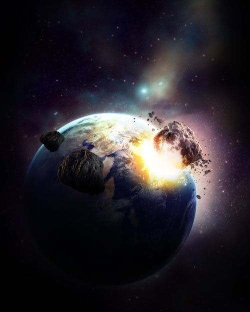
As before, use a nice orange (#e6602b) and yellow (#fdfc92) color to color the edges of the asteroids. Do this by Ctrl + clicking on the layer thumbnails and then using a large soft brush to brush the edges on a new layer. Set the layer mode to Multiply and the opacity to 50%.
Repeat the process multiple times for the other asteroids. Try to find other pictures of rocks to get some different sizes and shapes.
Step 6: Final Touches
These next steps are for really going in and chiseling out the look we want. This stage usually involves a lot of experimentation and patience to get the look you want.
Create a new layer on the top level of your document. Go to Image > Apply Image and press “Okay” to paste a merged copy of your document onto the layer. Go to Image > Adjustments > Desaturate to make the image grayscale.
Then go to Filter > Blur > Gaussian Blur and apply a blur of 2 px. Set the layer to Overlay and lower the opacity to 50%. What we just did was make our dark colors darker and our light colors lighter, and also add a small blur between them to give it a glow.
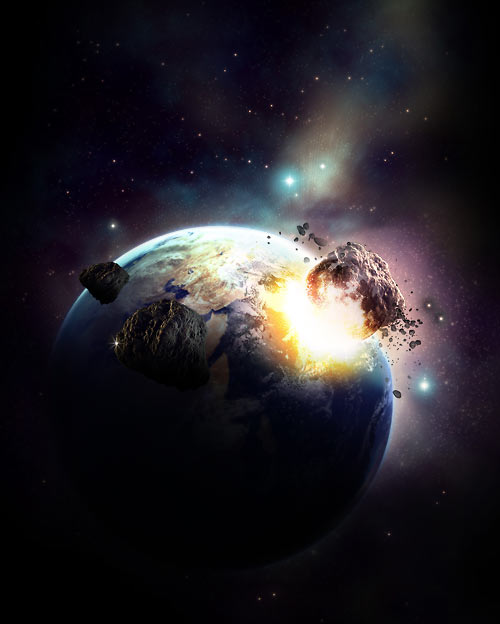
Final Step: Pat Yourself on the Back
There we have it: our Space Explosion is complete! I don’t know about you, readers, but I’m exhausted. Normally, pieces like this take days or weeks to put together, and now that you know how to do it you can create some original pieces of your own. Below, you will find some links to works that inspired this tutorial and others that are for inspiration.


