How To Use Icons To Support Content In Web Design

Email Newsletter
Weekly tips on front-end & UX.
Trusted by 182,000+ folks.

 Celebrating 10 million developers
 Custom Web Forms for Angular, React, & Vue. Your backend.


Why use icons? Design is all about communication: it doesn’t matter how important or exciting the information that you’re sharing is if you fail to hook your visitors. When initially viewing a website, most users will first scan the page for visually interesting content, and only after something grabs their attention will they actually begin reading. Icons are a simple, effective way to draw users into the content of your website.
Icons serve the same psychological purpose as paragraph breaks: they visually break up the content, making it less intimidating. A well-formatted page, with text broken into easily accessible paragraphs and accented by icons, is easy to read and visually interesting enough to sustain the user’s attention. So, stop wasting time writing so much content that no one will read, and start using icons!
You might be interested in the following related posts:
- Easy Steps To Better Icon Design
- Icons Of Digital Design
- Icons As Part Of A Great User Experience
- 55 Free High Quality Icon Sets
In this article we showcase beautiful examples and best practices of using icons to support content in web design.
1. How To Use Icons
The primary goal of using icons should be to help the user absorb and process information more efficiently. This is usually done by using a lot of white space and using icons that don’t distract from the content but rather augment it. Using icons well enriches even minimal content by giving it more substance, enabling effective communication without wordiness. Icons should be used to draw attention to your content, not to diminish or replace it.
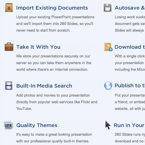
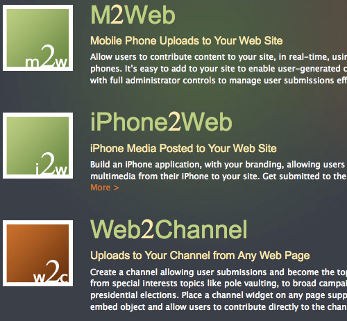
Spice up feature lists
Listing services is a practical and necessary part of effective marketing, but lists are inherently bland and boring. Using icons in conjunction with your feature lists will make them more engaging.
280 Slides
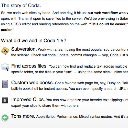
Draw attention to new features in a Web application
Icons are a visual invitation to users to try out the latest and greatest features of your Web application. Icons should capture your users’ attention and direct them to the new feature. Once you’ve grabbed their attention, tell them just what makes the new feature so great.
Coda
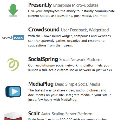
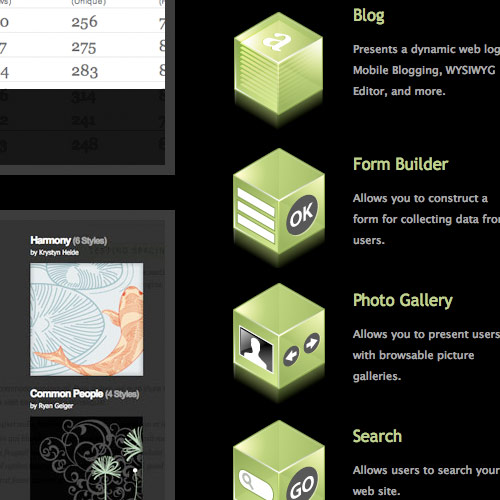
List different applications and products
In this case, think of the icon as a logo, keeping in mind that the goal of a logo is to build a mental association between a product and a particular image. The icon should be unique but simple: most icons are only 128 by 128 pixels, so take a minimalist approach and say more with less.
Intridea
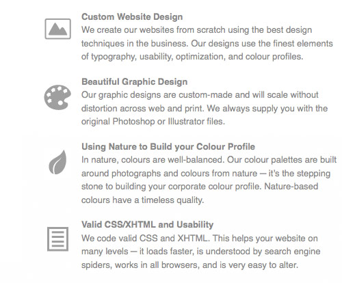
List your services and increase readability
Icons should be relevant to the content and simple in design. Consider what you are trying to express with the content and create the icon based on that. What is the theme of the website or article? What colors are used? What is the style? Modern? Classic? Icons should visually unify the ideas expressed in the content and in the personality of the website as a whole.
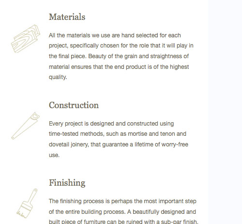
J. Alexander Woodworking
2. Purpose And Placement
Icons make your website friendly, inviting and professional, showing that you care about even the smallest details. Get creative with your icons: headers, sidebars, titles and feature lists are all great places to put them.
Accent headers to give titles a creative touch
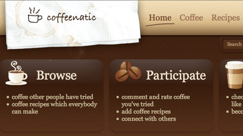
A very simple icon can add charm and personality to a website.
Coffeenatic
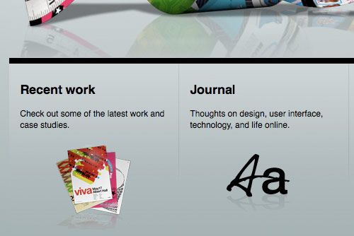
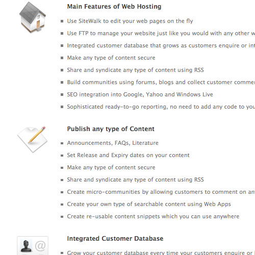
Engage readers on pages with extra long content
Use an icon that encapsulates the point you are trying to get across in your paragraph. This will make the text more accessible to your readers.
Rackspace

Offset headings and sections
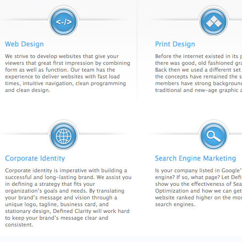
Use icons to provide a visually stimulating point of separation between different sections of text.
Defined Clarity
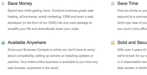
Size doesn’t matter! Even small icons can be effective
Small icons provide the same level of visual interest as large ones, but without the potential to be distracting. Make sure that the icons are easily recognizable and relate closely to the content that they are accenting.
Morgan Hayes
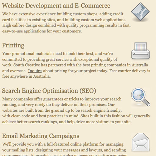
Switch things up by placing icons to the right of the paragraph
Don’t get stuck in a rut with your icon placement. Putting icons on the right is less common and will therefore be more visually striking. Beware, though, as this placement can sometimes look messy.
South Creative
Vary size and placement of icons
Get creative! Changing the size and placement of icons will make the content appear more dynamic and interesting.
Media Temple

3. Choose Your Style
When it comes to style, aim to be effective. If your design is supposed to be unique, then original icons are good, but being effective is far more important. Remember, icons are used to enhance your content and design, so it is especially important to pay attention to how your icons match the rest of your website. Don’t simply purchase a cool-looking set of icons from iStockPhoto. Rather, take into account the style of your website.
It is also crucial that all of your icons match. Grouping mismatched icons, no matter how cool they are individually, is a glaring design mistake and very unprofessional. Here are some examples of icons effectively integrated in the style of their respective websites:
Using light colors and cool 3-D designs complements the look and feel of this website: GoodBarry
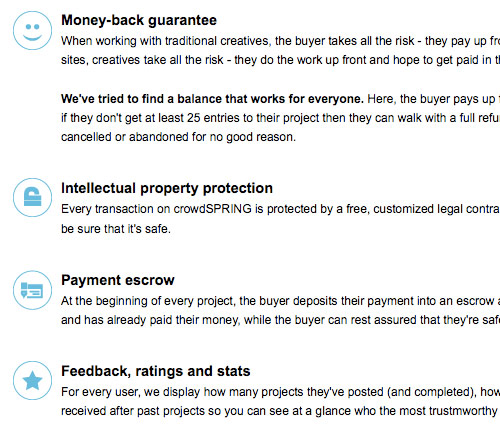
Simplicity is attractive and practical, as shown in this example: CrowdSPRING
Using a grungy style on otherwise 2-D icons can add a lot of depth: Take the Walk
Choosing a unique and consistent style is both dynamic and professional: Squarespace
Monochromatic icons can help accent content without being distracting: Studio 7 Designs
Use the power of suggestion to transform screenshots with simple gradients into unique icons: Gist
Don’t use icons just because they look cool; choose ones that really match your style and brand: Treemo
4. Additional Examples
Here is a gallery of websites that use icons effectively. Hopefully, these will inspire you to better use icons on your own website.
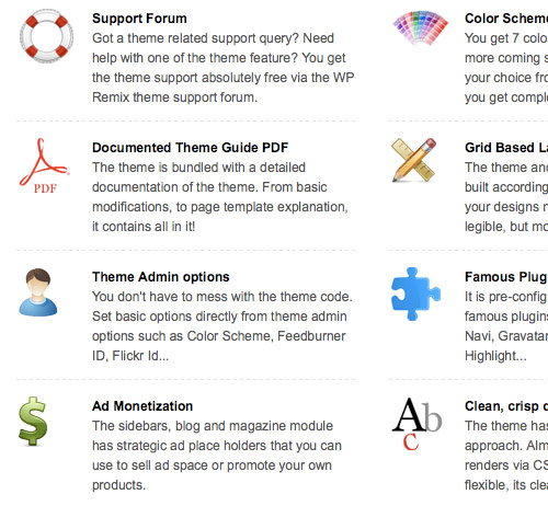
WP Remix
Subcontrast
Shoestring
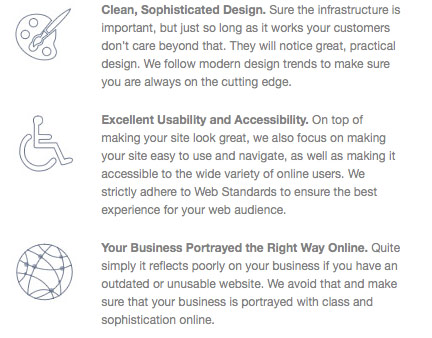
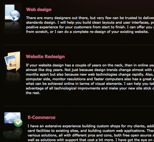
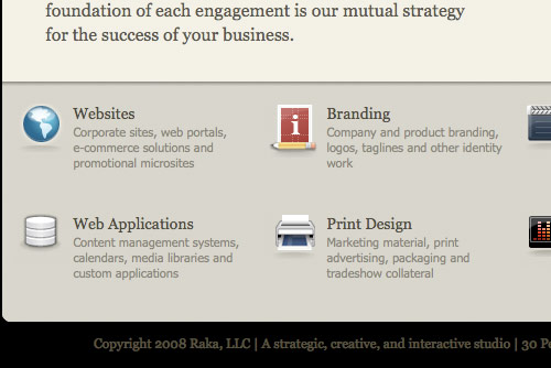
Raka
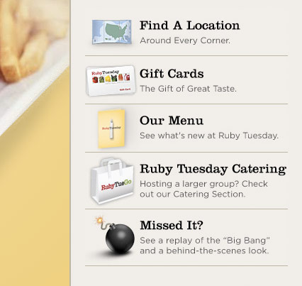
Ruby Tuesday
Transmission Apps
![]()
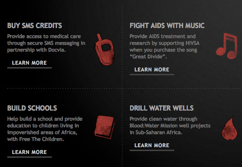
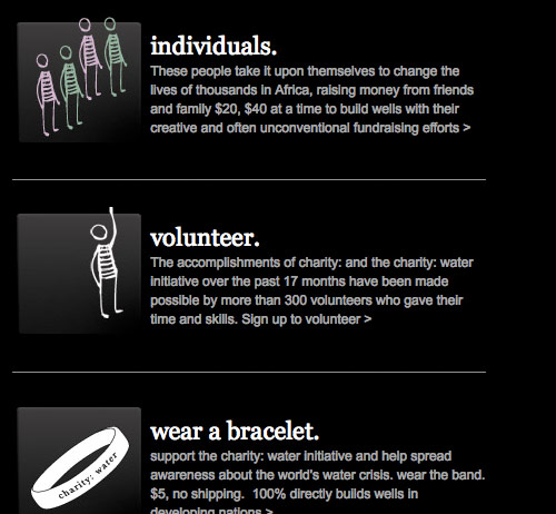
Charity Water
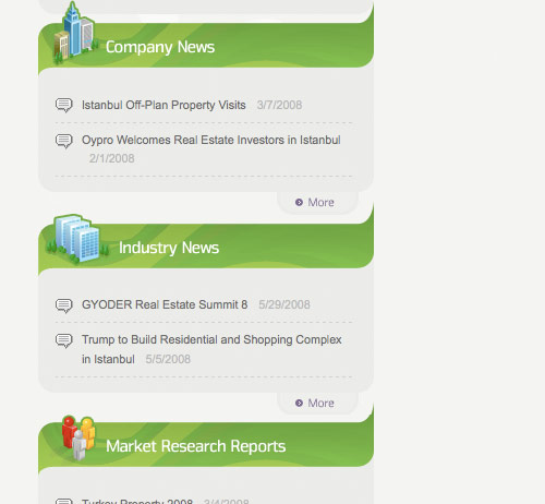
Oypro
QBB Help

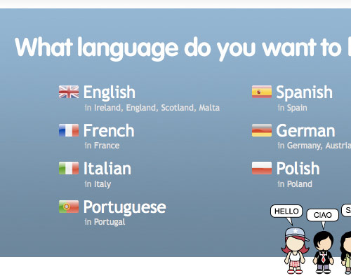
Euro Languages
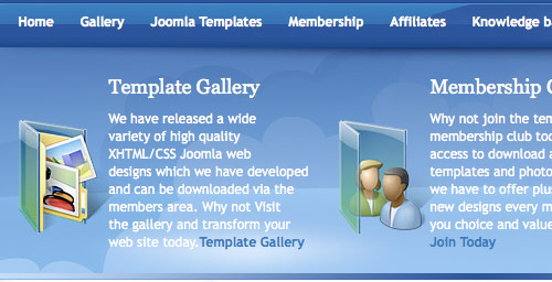
Joomla Designs
The Designs
Midnight Apps
Mach 4
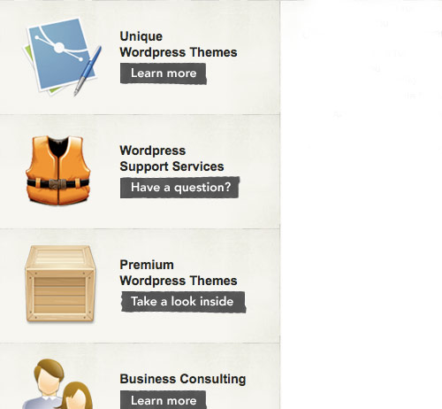
WordPress Designers
Holdfire

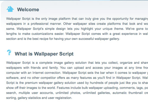
Wallpaper Script
Lee Munroe

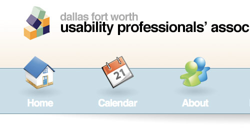
Dallas Usability Professionals
Light CMS
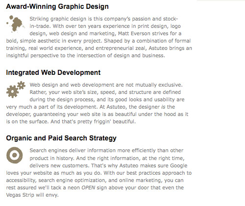
Astuteo
Digital Mash