Slideshows In Web Design: When And How To Use Them

Email Newsletter
Weekly tips on front-end & UX.
Trusted by 182,000+ folks.

 Custom Web Forms for Angular, React, & Vue. Your backend.
 Celebrating 10 million developers

The key to smart strategic Web design is finding an appropriate and interactive way to display information. One comes upon endless possibilities when searching for ways to display information. One solution, slideshows and sliders, is an excellent way to display information such as images in an organized and compact manner. Slider galleries are excellent for organizing content into a nice clean module.
There are many reasons to use a slideshow or image slider. The slideshow is a universally known tool, and anyone who has used the Internet will know how to work a slideshow. Therefore, they are very usable and convenient for any user, and they can be used almost anywhere.
This article focuses on how to implement the slideshow technique correctly. We will cover when you should use a slider and how to make a good slideshow, and we will showcase good slideshows and content sliders.
Please also consider our previous articles:
- User-friendly navigation menus
- Search box design showcase
- Block quotes and pull quotes
- Web Form Designs
- Pagination: Examples and Best Practices
When to Include a Slider?
According to our recent review of 2009 Web Design Trends, slideshows or carousels are becoming more and more popular in modern web designs. Carousels are essentially slideshow navigations, in which the content rotates vertically or horizontally (hence the name “carousel”). To rotate the navigation, users need to click on one of two toggle elements (usually a left/right or up/down arrow). Depending on the toggle element selected, the content is rotated in the desired direction.
Instead of clicking through various sections of the website for their favorite stories, users can quickly skim through the available stories without vertical scrolling or unnecessary mouse movements. The result: users save time, and the carousel focuses their attention sharply on the content, instead of on interacting with the browser. Such slideshow navigation is often used on entertainment websites and big blogs, but designers also make use of it in their portfolios to showcase their work in a more interactive way.
Let’s take a look at some common places where the sliders are often used.
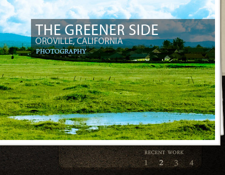
1. Portfolios
When designing a portfolio, there are many different ways to organize your projects. One good way is to use a slider. Using a slideshow to showcase different images from a single project is even more common. Some websites will use it to slide through each project, and each slide brings you to a more detailed description of the project.
2. Slider of Information
Sliders are very popular on home pages of corporate websites. They are very useful for showing important information about a company. Generally, corporations will include an explanation of what the company does, a brief preview of the products, an explanation of what sets their products apart, and many further user options.
Take a look below at the excellent use of the slider technique on Mint.com. This home page slider contains information explaining Mint and what you can do with the service. Also included are graphics, which provide a nice visual to back up the information. This is a very good use of the slider and is extremely convenient for new users on Mint looking to learn more quickly.

3. Featured Blog Posts
Many blogs use slider galleries to feature top posts. It is a great way to show many top posts and not take up too much space. By fitting numerous featured posts into a smaller element, you are allowing more space for other content.
How to Make a Good Slideshow
Although almost every user will know how to work a slideshow, there are still a few ways that you can take it to the next level of usability.
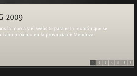
Provide Thumbnails, Numbers or Buttons Thumbnails are one of the more important elements of a good slideshow. They give the user a sense of where they are in the slideshow and where the slideshow is going. It allows for quick navigation and the convenience of finding a desired slide.
There are many ways to achieve this quick navigation. The first is by providing numbers. Highlighting the number of the current slide is very important. Secondly, provide thumbnails for each slide. Finally, buttons can be useful for even easier navigation.
Make it Auto and Manual You will notice that many sliders work in one of two ways: they either slide automatically or buttons are provided for the user to click through manually. The best way to do this is to give both options. It is a good idea to have the slider start automatically, but you should still include buttons so that the user can find a certain slide.
Don’t Overdo It As mentioned, the slideshow is a universally known element, so there is no need to overdo it in an attempt to make it more usable. The main focus of a slideshow is on the content. Only use what’s needed, and avoid using extra buttons and unnecessary features.
Button Placement The key to a usable slideshow is the buttons. More important is where you place those buttons and how they appear. Buttons should most often be placed directly under or over the slider, or on either side (i.e. “Next” and “Previous”). This is standard practice, and there is no need to do anything different.
Good Transitions The way the slideshow moves from slide to slide is actually more important than you may think. There are many transition effects that can be used in a slider, such as fading, horizontal sliding, vertical sliding, the list goes on. Try to pick the transition that best captures the style of the website. For example, if you have a very minimal design, you will want to go with a subtle fade that matches the style.
Border and Button Styling There are not too many styling options within the slideshow itself, but there are a number of ways to style the space around the slider. Most obvious is the border of the slideshow.
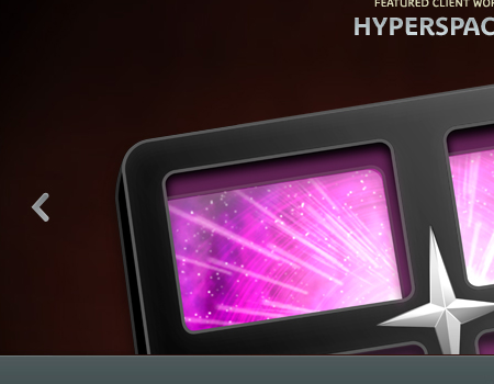
The slider below is a very beautiful image-based one. The border gives the appearance of a stack of images, and the slideshow uses great lighting transition effects that go nicely with the excellent photography. Notice how the border style goes nicely with the theme of the website as a whole, and the transitions also support that theme.
Showcase of Sliders
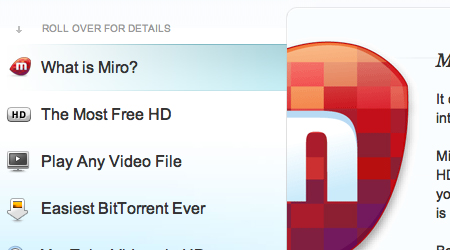
Miro A very clean and simple slider, complemented by great illustrations.
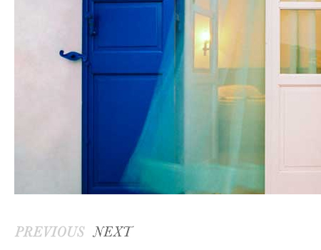
Paramore A beautiful image carousel with nice slide effects, great borders and a convenient explanation feature.

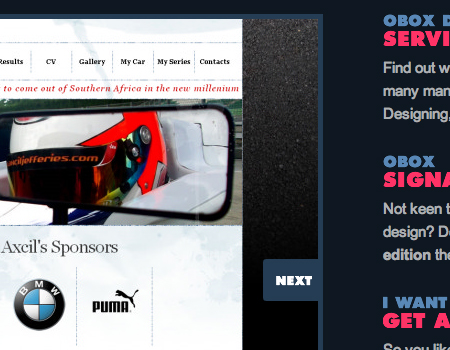
Obox Design Simple and clean, this image slider gets the job done without any unnecessary features.
SpaceCollective This website uses a few nice manual image sliders. This allows for the selection of videos and other objects to be more compact.

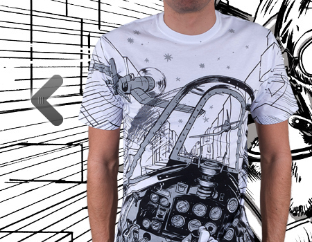
Josh Smith A very simple and minimalist image slider.

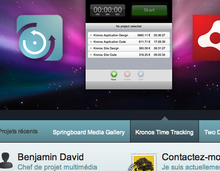
Benjamin David A nice slider gallery with a smooth vertical transition effect.
Design By Humans This website uses a very large slider to show featured products. The backdrop also changes along with the product, which is a very nice feature.
Lucas Hirata This very creative portfolio uses a sliding layout to fit a large amount of projects onto one page.

Designsensory A standard image slider, with a number selection feature and text to accompany each item.

The Wojo Group A great slider layout that flows nicely with the thumbnail selector.
Qlear A good manual slideshow to showcase projects in the portfolio.
Envero.org Another simple-featured slider with numbers to direct the user.
Rob Young This is a very creative and unique portfolio. When clicking on a project, the laptop slides back into view with the new project. This is a very smart way to showcase the work.
HelloThemes This website uses a simple manual slider with large buttons and smooth horizontal slide effects.
MacAllan Each image in this slideshow displays for a set duration. A graphic is included in the corner to show the user when the image is about to change.

Global Oneness Project This home page uses a plain simple slider to show a list of featured videos.

Behance A quick slider with convenient buttons and fade effects.
Ricoverdo A fully styled and usable horizontal slider.

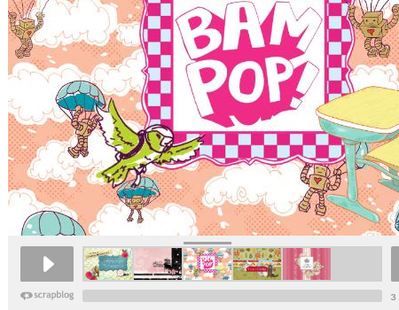
Scrap Blog An in-depth slideshow with a number of usable features and a Cooliris effect.
Deluge Studios Another website with grungy textures and fancy colors.
Daniel Stenberg This is an excellent portfolio that shows a horizontal sliding layout to navigate through the project modules.
Piotr Kulczycji A nice border and tilted display, along with great effects, make this slider worth a look.

World Concern This is a great Flash-based slider that features some really cool selection buttons.

delicious The familiar Delicious home page slider is very simple but serves its purpose nicely.

Household This is a very well-thought-out image gallery with very smooth sliding and a clean layout.
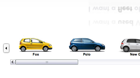
Volkswagen UK This selection tool here is very usable because the user has the option of using either the buttons or the scroll bar.
Cream Scoop One more example of a simple image slider in a clean portfolio.

Cade Martin A very minimal image slideshow, with clean fonts and basic effects.
Barack Obama Obama’s website uses a Java-based slider with creative effects.

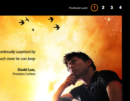
Thomas Prior Another portfolio with a slider to show featured projects. This slideshow has usable buttons and indicators to show where the user is in the slideshow.

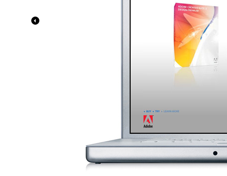
Viktor Jarnheimer This is a very clever portfolio slider that uses an iMac to enclose the images, thus achieving a clean layout.
MVB Web Design A very simple slideshow on a simple website.

James Lai Creative A grungy slideshow with subtle but well-placed navigation buttons.

Trevor Saint This is a great website and includes a slideshow. The slider uses good vertical sliding effects.
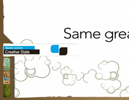
Creative State This video slideshow looks nice and has usable buttons with preview hover effects.
Icon Designer A very large slider of featured projects with a nice layout.
Threadless Kids These two sliders change images when the user hovers over the button.

Phunk’n Creative A nice dark portfolio with a slideshow of featured products.
Related Articles
Pleaso also consider our previous articles:
- User-friendly navigation menus
- Search box design showcase
- Block quotes and pull quotes
- Web Form Designs
- Pagination: Examples and Best Practices


