Redesigning Craigslist With Focus On Usability

Email Newsletter
Weekly tips on front-end & UX.
Trusted by 200,000+ folks.


 Flexible CMS. Headless & API 1st
Craigslist is obviously one of the most popular websites in the world, and each month it serves millions of users who post and view classified ads on the website. At the time this article was written, Craigslist was ranked as the 28th most-visited English-language website in the world by Alexa. Despite the fact that Craigslist receives such a huge amount of traffic each month, it is also criticized for its design, which seems to be at least 10 years out-of-date.
This very basic design has also become a huge part of Craigslist’s branding, and it helps make the website memorable and instantly recognizable. As a result, the company has benefited in some ways from a design that many people consider to be very subpar. Over the years, as various design trends have come and gone, Craigslist has bucked the trends and stubbornly maintained it’s bare-boned approach.
You may also want to check out the following Smashing Magazine articles:
- From Russia With Love: Behind The Responsive Redesign Of Kremlin.ru
- Stop Redesigning And Start Tuning Your Site Instead
- Redesigning With Personality
However, despite the fact that Craigslist has been able to benefit in some ways from its ultra-basic design, there are plenty of reasons to consider making some changes. A simple approach to design and layout that cuts excess and eliminates anything that is less than critical is typically assumed to improve usability.
With Craigslist, however, this is not the case, because the website could benefit from usability improvements in several areas. In the design world, minimalism that conveys a simply beauty is regarded as a very difficult thing to achieve. Minimalist websites can be both attractive and easy to use. However, Craigslist’s design is hardly considered beautiful, even by those who appreciate websites that consist primarily of text.
In this article, we’ll take a detailed look at the design, layout and usability of Craigslist and point out some areas where we feel change and improvement are possible. This is only one opinion of what could be done to improve the site. Our goal is to demonstrate the process of evaluating a website in certain areas and determining specific improvements that can be made. Hopefully this will help other designers who are attempting to evaluate websites of their own or of clients.
Additionally, we hope to start a discussion among Smashing Magazine readers in the comments below about the points raised in this article. The best way to improve the usability and design of any website is to listen to those who are using the website, so we hope that you Craigslist users out there will share your opinions here.
The Goals
Before starting any type of evaluation, it’s important to clarify what exactly we hope to accomplish. In this case, our purpose is two-fold. First, we want to improve the usability of Craigslist by making some minor changes that will result in a more positive overall user experience. Secondly, we want to create a design and layout that is more up-to-date and pleasant to look at.
One major consideration that cannot be ignored is the brand recognition that Craigslist has developed over the years. The company obviously values its website’s consistent look, which hasn’t been updated (at least not heavily at once) throughout the years, and it keeps this approach for a reason. A website as large and popular as Craigslist could easily go in any direction it wanted with a new design. But given the company’s stance on its design and the recognition already in place, it’s clear that drastic changes are not realistic.
As a result, our goal is to suggest improvements for the usability and design of the website while maintaining a simple, basic approach. Even though this is strictly a hypothetical scenario, it would serve little purpose to suggest changes that could never be implemented in reality. Although the end result bears some significant differences to the current website, it still maintains a very simple approach that puts priority on content rather than design.
What’s Wrong With Craigslist?
Before we suggest any changes that need to be made, let’s look at some of the weaknesses of the current website.
1. The Design is Bland and Outdated
As mentioned earlier, and as any Craigslist visitor already knows, the design of the website lacks visual appeal.
2. Logging In, Signing Up, and Managing an Account is More Difficult than Necessary
Craigslist has achieved its success due to the huge community of users it has managed to build. According to its fact sheet, each month over 30 million new classifieds are posted to the website, and over 12 billion pages are viewed. With this kind of activity level, it’s clear that making the process of creating an account, logging in and managing the account should be as straightforward as possible. However, the current website could be improved in these areas. Unnecessary clicks are needed to do anything with an account, and options on the account page are very limited.
3. Screen Space Is Not Prioritized
One issue with the current design of the Craigslist home page, as well as sub-pages, is the use of screen space. Valuable screen space could be used more effectively in some areas to improve the usability of the website.
4. Navigation
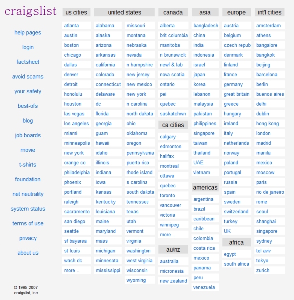
Craigslist is really a network of smaller websites held on sub-domains of Craigslist.org. Each sub-domain, representing an actual location, has its own board of classifieds. Currently, over 550 cities in 50 different countries are represented. With any website of this size and this amount of content, challenges with the navigation will always exist. Some aspects of navigation are rather effective on Craigslist, but others leave room for improvement.
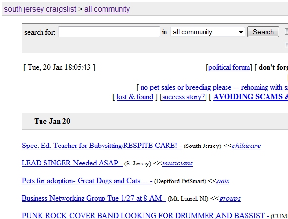
For starters, there is no navigation menu that appears consistently throughout the website. Some pages use a left sidebar, some don’t. Some pages are easily accessible from most areas of the website, but not all. On many of the secondary pages, huge amounts of screen space are left completely empty with very few navigational options. This forces users to hit the “Back” button in their browser to go to another section of the website, something that could be improved by adding more navigational choices on these pages.
What’s Right With Craigslist?
Of course, a number of things are also good about the existing website, and it’s only appropriate to look at them as well.
1. Recognizable
Given the amount of traffic worldwide that the website receives, and an appearance that stands out from other major websites, Craigslist is one of the most recognizable websites in the world. When people want to post classifieds online, Craigslist is usually their number one choice.
2. Clarity of Vision and Purpose
Part of the beauty of Craigslist is that it exists to provide local classifieds and forums, and that’s basically it. There aren’t a lot of extras and options, and there are no ads on the website. Craigslist exists to help people find what they are looking for, and to help people find other people who want what they have, and it does this better than anyone else. The people running Craigslist have not been distracted by other monetization opportunities or other things they could be doing with the website, and they deserve to be commended for sticking to their purpose.
3. Relatively Easy Posting Process
For a website that relies on classifieds being posted by individuals, Craigslist makes the process fairly straightforward and simple. On community pages, there is a clearly marked link for posting classifieds, and users are led through a simple and efficient process once they are logged in. The only drawback here is that you have to navigate from the website’s home page to a local community page before seeing the link to post a classified.
4. Pages Load Quickly
Visitor to the website will appreciate the speed with which pages load. This is especially nice as you’re browsing classified listings and visiting a number of different pages on the website.
Challenges Of Redesign
Before we get into the specifics of our suggestions for change, let’s take a look at some of the challenges of redesigning a website like Craigslist’s.
1. Organization
There’s so much content on Craigslist, with hundreds of different local communities and lots of different categories of classifieds. Any website with this amount of content will face a challenge of organization in terms of structure and navigation.
Of course, the goal is to make it easy to move through the website and find what you want, making it necessary to include plenty of navigational options while minimizing clutter.
2. Improving the Website Without Detracting from the Brand
There are a number of different ways to improve the design of Craigslist and reorganize the presentation of data, but improving the design without straying too far from the current basic approach that has contributed so much to the success of the website is a major challenge. Creating a more attractive design and improving usability are both very achievable, but doing so while maintaining the essence of the company and website is not so easy. Because Craigslist’s identity is so closely connected to the website in its current state, severe changes to the aesthetics of the website could have a major negative impact on the company’s success.
3. Improving Usability with Only Minor Changes
Because so many people throughout the world have used Craigslist to post classifieds, and because so many of them are repeat users, any changes to the process of using the website should be thoroughly considered before being implemented. Even if a website lacks in some area of usability, making “improvements” can negatively impact users who have become accustomed to doing things a certain way.
Regular users know how the website works, and the process is usually easy for them, even if it isn’t so simple for new users. Because Craigslist is so firmly established and the community of users is so large that usability improvements that would confuse regular visitors and make it more difficult for them to use the website should be avoided at all costs.
A Preview of the Suggested Design
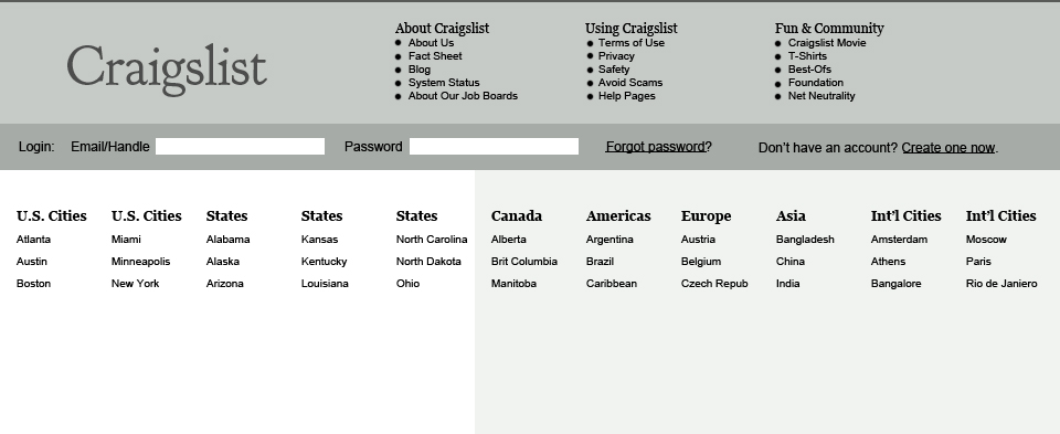
In the rest of the article, we’ll look at details of the suggested changes and why they’re being made, but here is a wireframe that would serve as the starting point of the proposed design. The wireframe only includes the top of the page and is in shades of gray. The proposed color scheme will be discussed later, but for now we have a layout to work with. The columns shown here have only a few items listed, but they would be extended further down the page. (Click the image for a full-sized view.)
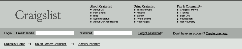
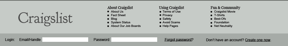
The following image is the proposed header for secondary pages. It is essentially the same as the header on the home page (making it consistent), but it includes breadcrumb navigation.
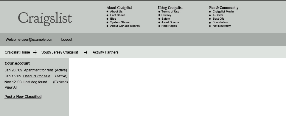
Additionally, the header area includes slight changes when the visitor is logged in, and an account management area is added to the sidebar.
Evaluation of the Design
Now that we’ve defined the context of the website as well as the strengths and weaknesses of the current design, let’s jump into the specifics. We’ll start with the design and then move into usability issues.
1. Color
The current design of Craigslist uses very little color. In fact, aside from the default colors for links and text there is virtually no color at all. The page has a very light gray background, and slightly darker gray boxes are used to make certain pieces of text stand out. The website contains many links in the browser default color of blue. That blue is really one of the distinguishing marks of the website as a result of the sheer number of links and lack of any other color. Visited links are displayed in purple; and when hovered over, links are shown in purple with an underline.
In attempting to improve the design, some modification to the color scheme is justified. However, to keep the identity of the website intact, we won’t add too much color or too great a variety of colors. Instead, we’ll go with a monochromatic color scheme consisting of a few shades of blue. This will give the website a more appealing look, without too dramatic a change. Some grays can be mixed in as well to add some diversity and keep some of the current look.
COLOURlovers has a few monochromatic blue palettes that seem appropriate, including Cold Day:

The boxes that contain links on the home page and the community home pages can be done away with. They are one of the factors that contribute to the website’s out-of-date look, and they don’t really make text any easier to read.
2. Width
Although the width of the home page is not fixed, the table-based layout displays at about 760 pixels in the default font size. Community front pages, such as https://newyork.craigslist.org/, display at about 860 pixels. While it’s possible that the home page is kept to approximately 760 pixels to accommodate a greater number of visitors without horizontal scrolling, this is unlikely a major consideration because most visitors would be on the local community pages.
If keeping the width down to accommodate visitors with smaller screens was a major concern, the local community pages would have to be kept to a similar width, too. Because that is not the case, and because the average screen resolution is bigger, it’s safe to say that the home page could be made wider. With a wider page width, more white space could be added between columns, making the page easier on the eyes. The proposed design uses a fixed width of 960 pixels.
3. Typography
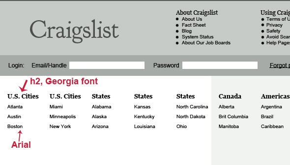
Craigslist makes very little use of special fonts. In the style sheet, “serif” and “sans-serif” are specified for the font family. Some typographical changes could subtly improve the overall look of the website, particularly the home page and the community home pages, where so many links are listed. Bold text is used for headers and sub-headers (although h1 to h6 tags are not used), but a font change here could also help.
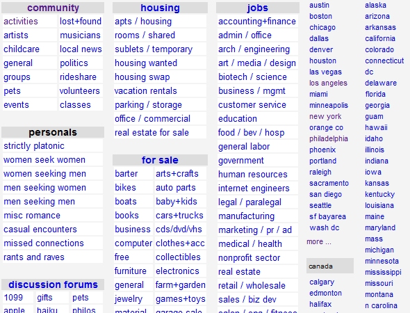
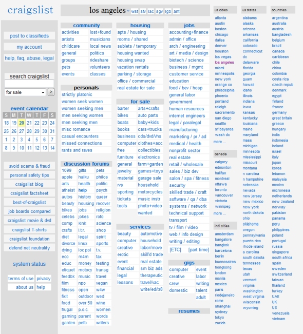
A serif sans-serif font, like Arial, would be appropriate for the body text, with a sans-serif serif font, like Georgia, used for headers and sub-headers. Headers on the home page such as “United States”, “Europe” and “Canada” could be placed in h2 tags. Community home pages, such as the Los Angeles page shown below, could have the location name in an h2 tag, with items such as “community,” “housing” and “jobs” in h3 tags. Both h2 and h3 headers could be styled to be displayed in Georgia font.
Additionally, on the current home page and the community home pages, no capital letters are used; everything is lowercase. Capitalizing appropriate letters would look more professional and might help break up the large amount of text.
4. Branding
Obviously, no logo is used on Craigslist; only plain text is used for the website name. While a fancy logo is not necessary, a change in font could add some visual appeal to the website without causing a major change. Websites like TechCrunch and Ning have also passed on logos, but they instead have a nice branded look with a font that’s not so standard.
A simple change here would be to use an image of the word “Craigslist” in a slightly different font. (Using a text replacement tool such as sIFR is another option.) We don’t want to stray too far from the standard sans-serif font being used on the current website. Goudy Bookletter 1911 is a nice font that would allow the branding to stay very simple.

5. Icons
The community home pages, containing links to various categories of classifieds, with all of those links in the content area, can be difficult to look at. To add some visual appeal and make it a little easier for visitors to find what they want, small icons could be placed next to category titles, such as “community,” “housing,” “jobs,” “personals,” etc. Icons would not change the appearance of the page as drastically as pictures or other visual elements would, but they would make the page look better.
Certainly, other design options could be explored, but these are four particular areas that could be improved without taking away from the character of the website. Now, let’s move on to the structure of the layout.
Layout
Like design elements, the layout of the pages has an impact on both the appearance and usability of the website.
1. Tables
For starters, Craigslist’s layout is table-based. You wouldn’t expect any Web design blog to write about potential improvements to a website without mentioning the tables. The current layout could certainly be achieved without relying on tables: a CSS grid-based system is the logical alternative.
2. Header
The current website doesn’t have much of a header. In many ways, it’s good for the content to begin as high as possible on the page; but a small functional header could be used that would push the content only slightly lower down the page. The header in our redesign serves a few purposes:
- The title/branding area is slightly bigger and features a font that adds a little more variety.
- The header can introduce some color to the website.
- The header appears on every page of the website and so could contain a consistent navigation menu that visitors could easily find.
The header would still be basic in design and not add anything flashy to the website, but it would improve things by adding some consistency, color and navigation.
3. Sidebar
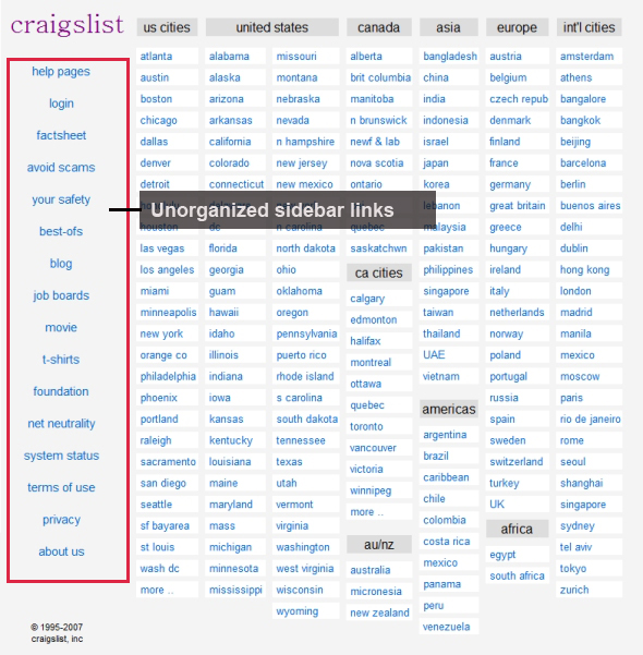
There is a left sidebar on both the home page and the community home pages. Some links are present on both sidebars, but some appear on only one or the other, which can be a little confusing. As a result, the effectiveness of the sidebar suffers a little bit. Additionally, the links in the sidebar on the home page have no organization. There are 15 links, but they don’t seem to be in any kind of order. We’ll relocate all 15 links to the header in our redesign and organize them by putting them into three groups of five.
In our redesign, we’ll take the sidebar off the home page and increase the amount of white space between columns in the main content area. Because there are so many columns, increasing the white space will make it easier to read the content. The sidebar on the community home pages can be improved by cleaning it up and allowing for more usability features when users are logged in (more on that in a minute).
4. Footer
Craigslist currently has no footer. The home page has a copyright notice, but community home pages have nothing at all. With a website of this size, navigation and usability could be improved by including a footer with links to the most important pages. The footer should exist throughout the website, whether you’re on the home page, a community home page, a listing of classifieds or a log-in page.
Usability
For a website like Craigslist’s, which relies so much on user interaction, usability concerns are far more important than the design or layout. For the most part, Craigslist does a pretty good job of making it easy to post classifieds, so huge changes aren’t needed, but some tweaks here and there could make a big difference.
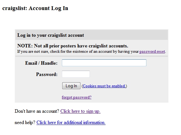
1. Log-In Form on the Home Page
Currently there is a link on the home page for users to log in. This link takes them to a separate page with nothing on it except the typical log-in options. Once they log in, users are taken to a page that lists the classifieds that they have recently posted. The process could be made smoother by simply adding a log-in form to the home page, thus eliminating the need to click to a separate page. In our redesign, we’ve included a log-in form between the header and the main content, where it can be easily seen and accessed.
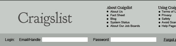
2. Link to “Create an Account” on the Home Page
Next to the form, we’ve added a link for users who have forgotten their password and a link to create a new account. Currently, there is no link to create a new account on any of page except the log-in page. This requires at least an extra click by users who want to create an account; more significantly, it assumes they know to go to the log-in page to create a new account.
3. Consistent Navigation
The current design of Craigslist uses very little color. In fact, aside from the default colors for links and text there is virtually no color at all. The page has a very light gray background, and slightly darker gray boxes are used to make certain pieces of text stand out. The website contains many links in the browser default color of blue. That blue is really one of the distinguishing marks of the website as a result of the sheer number of links and lack of any other color. Visited links are displayed in purple; and when hovered over, links are shown in purple with an underline.
In attempting to improve the design, some modification to the color scheme is justified. However, to keep the identity of the website intact, we won’t add too much color or too great a variety of colors. Instead, we’ll go with a monochromatic color scheme consisting of a few shades of blue. This will give the website a more appealing look, without too dramatic a change. Some grays can be mixed in as well to add some diversity and keep some of the current look.
COLOURlovers has a few monochromatic blue palettes that seem appropriate, including Cold Day:
The boxes that contain links on the home page and the community home pages can be done away with. They are one of the factors that contribute to the website’s out-of-date look, and they don’t really make text any easier to read.
2. Width
Although the width of the home page is not fixed, the table-based layout displays at about 760 pixels in the default font size. Community front pages, such as https://newyork.craigslist.org/, display at about 860 pixels. While it’s possible that the home page is kept to approximately 760 pixels to accommodate a greater number of visitors without horizontal scrolling, this is unlikely a major consideration because most visitors would be on the local community pages.
If keeping the width down to accommodate visitors with smaller screens was a major concern, the local community pages would have to be kept to a similar width, too. Because that is not the case, and because the average screen resolution is bigger, it’s safe to say that the home page could be made wider. With a wider page width, more white space could be added between columns, making the page easier on the eyes. The proposed design uses a fixed width of 960 pixels.
3. Typography
Craigslist makes very little use of special fonts. In the style sheet, “serif” and “sans-serif” are specified for the font family. Some typographical changes could subtly improve the overall look of the website, particularly the home page and the community home pages, where so many links are listed. Bold text is used for headers and sub-headers (although h1 to h6 tags are not used), but a font change here could also help.
A serif sans-serif font, like Arial, would be appropriate for the body text, with a sans-serif serif font, like Georgia, used for headers and sub-headers. Headers on the home page such as “United States”, “Europe” and “Canada” could be placed in h2 tags. Community home pages, such as the Los Angeles page shown below, could have the location name in an h2 tag, with items such as “community,” “housing” and “jobs” in h3 tags. Both h2 and h3 headers could be styled to be displayed in Georgia font.
Additionally, on the current home page and the community home pages, no capital letters are used; everything is lowercase. Capitalizing appropriate letters would look more professional and might help break up the large amount of text.
4. Branding
Obviously, no logo is used on Craigslist; only plain text is used for the website name. While a fancy logo is not necessary, a change in font could add some visual appeal to the website without causing a major change. Websites like TechCrunch and Ning have also passed on logos, but they instead have a nice branded look with a font that’s not so standard.
A simple change here would be to use an image of the word “Craigslist” in a slightly different font. (Using a text replacement tool such as sIFR is another option.) We don’t want to stray too far from the standard sans-serif font being used on the current website. Goudy Bookletter 1911 is a nice font that would allow the branding to stay very simple.
5. Icons
The community home pages, containing links to various categories of classifieds, with all of those links in the content area, can be difficult to look at. To add some visual appeal and make it a little easier for visitors to find what they want, small icons could be placed next to category titles, such as “community,” “housing,” “jobs,” “personals,” etc. Icons would not change the appearance of the page as drastically as pictures or other visual elements would, but they would make the page look better.
Certainly, other design options could be explored, but these are four particular areas that could be improved without taking away from the character of the website. Now, let’s move on to the structure of the layout.
Layout
Like design elements, the layout of the pages has an impact on both the appearance and usability of the website.
1. Tables
For starters, Craigslist’s layout is table-based. You wouldn’t expect any Web design blog to write about potential improvements to a website without mentioning the tables. The current layout could certainly be achieved without relying on tables: a CSS grid-based system is the logical alternative.
2. Header
The current website doesn’t have much of a header. In many ways, it’s good for the content to begin as high as possible on the page; but a small functional header could be used that would push the content only slightly lower down the page. The header in our redesign serves a few purposes:
- The title/branding area is slightly bigger and features a font that adds a little more variety.
- The header can introduce some color to the website.
- The header appears on every page of the website and so could contain a consistent navigation menu that visitors could easily find.
The header would still be basic in design and not add anything flashy to the website, but it would improve things by adding some consistency, color and navigation.
3. Sidebar
There is a left sidebar on both the home page and the community home pages. Some links are present on both sidebars, but some appear on only one or the other, which can be a little confusing. As a result, the effectiveness of the sidebar suffers a little bit. Additionally, the links in the sidebar on the home page have no organization. There are 15 links, but they don’t seem to be in any kind of order. We’ll relocate all 15 links to the header in our redesign and organize them by putting them into three groups of five.
In our redesign, we’ll take the sidebar off the home page and increase the amount of white space between columns in the main content area. Because there are so many columns, increasing the white space will make it easier to read the content. The sidebar on the community home pages can be improved by cleaning it up and allowing for more usability features when users are logged in (more on that in a minute).
4. Footer
Craigslist currently has no footer. The home page has a copyright notice, but community home pages have nothing at all. With a website of this size, navigation and usability could be improved by including a footer with links to the most important pages. The footer should exist throughout the website, whether you’re on the home page, a community home page, a listing of classifieds or a log-in page.
Usability
For a website like Craigslist’s, which relies so much on user interaction, usability concerns are far more important than the design or layout. For the most part, Craigslist does a pretty good job of making it easy to post classifieds, so huge changes aren’t needed, but some tweaks here and there could make a big difference.
1. Log-In Form on the Home Page
Currently there is a link on the home page for users to log in. This link takes them to a separate page with nothing on it except the typical log-in options. Once they log in, users are taken to a page that lists the classifieds that they have recently posted. The process could be made smoother by simply adding a log-in form to the home page, thus eliminating the need to click to a separate page. In our redesign, we’ve included a log-in form between the header and the main content, where it can be easily seen and accessed.
2. Link to “Create an Account” on the Home Page
Next to the form, we’ve added a link for users who have forgotten their password and a link to create a new account. Currently, there is no link to create a new account on any of page except the log-in page. This requires at least an extra click by users who want to create an account; more significantly, it assumes they know to go to the log-in page to create a new account.
3. Consistent Navigation
Using Craigslist to post classifieds, you may notice that logging in and out leaves you on pages that don’t offer many options.
This does help minimize unnecessary distractions, but if you want to leave the page, you may have to use the “Back” button on your browser or click to the home page. Earlier, we established that we wanted a consistent header throughout the website. Some pages would still be very basic, as they are now, but would have a feel that is more consistent with the rest of the website; and some of the basic navigation options would be present on all pages.
Did you forget your Craigslist password? As with most websites, there is an option to have your password emailed to you; but once the email is sent, you arrive on a page that has zero navigation options.
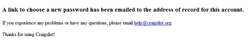
Your only choices are to leave the website altogether or hit the “Back” button on your browser. In fact, you would have to hit “Back” twice to reach the log-in page and three times to get to whatever page you were on before that. Most users would probably go check their email immediately, and the email does contain a link to the appropriate page, but for users who don’t want to check their email right away, this is poor usability. By putting these features on pages that have some sort of consistent navigation, the user at least has a few options.
4. Account Management
Managing your account and viewing a list of your posted classifieds is currently done only on a separate page. Once you’re logged in, this page is accessible from the sidebar. Since we’ll be moving some of the items from the sidebar to the navigation in the header, space will be freed up in the sidebar that can be used to improve usability for users who are logged in. The image below shows what would be available from the sidebar.
Users who are logged in would see a list of their recent classifieds, with the date of each post, its status, and a link to the actual page listing. All of this is currently accessible from the “My Account” page, but adding it to the sidebar would allow users to access this info just a bit more easily. The “View All” link would then take you to the “My Account” page, where everything would be listed.
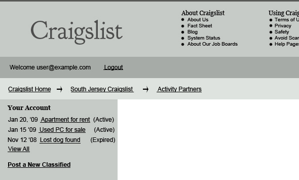
Below this account management section, the sidebar would include the search box and event calendar, which are also currently located in the sidebar. If visitors are not logged in, everything would slide up to take the place of the “My Account” section.
Conclusion
While these changes would not lead to a design that wows visitors, they would help make the website more visually appealing overall and, most importantly, more usable. The goal was to create a simple design that keeps the essence of Craigslist while addressing some of its weaknesses. This is just one user’s opinion on the matter, so please share your thoughts in the comments.


