Breadcrumbs In Web Design: Examples And Best Practices

Email Newsletter
Weekly tips on front-end & UX.
Trusted by 182,000+ folks.

 Custom Web Forms for Angular, React, & Vue. Your backend.


 Celebrating 10 million developers
A “breadcrumb” (or “breadcrumb trail”) is a type of secondary navigation scheme that reveals the user’s location in a website or Web application. The term comes from the Hansel and Gretel fairy tale in which the two title children drop breadcrumbs to form a trail back to their home. Just like in the tale, breadcrumbs in real-world applications offer users a way to trace the path back to their original landing point.

You can usually find breadcrumbs in websites that have a large amount of content organized in a hierarchical manner. You also see them in Web applications that have more than one step, where they function similar to a progress bar. In their simplest form, breadcrumbs are horizontally arranged text links separated by the “greater than” symbol (>); the symbol indicates the level of that page relative to the page links beside it.
In this article, we’ll explore the use of breadcrumbs on websites and discuss some best practices for applying breadcrumb trails to your own website.
We’ve also published a recent article on designing better breadcrumbs UX, with examples and guidelines.
This article is part of our ongoing series on design patterns. It’s also a part of the upcoming 4-weeks live UX training 🍣 and will be in our recently released video course soon.
When Should You Use Breadcrumbs?
Use breadcrumb navigation for large websites and websites that have hierarchically arranged pages. An excellent scenario is e-commerce websites, in which a large variety of products is grouped into logical categories.
You shouldn’t use breadcrumbs for single-level websites that have no logical hierarchy or grouping. A great way to determine if a website would benefit from breadcrumb navigation is to construct a site map or a diagram representing the website’s navigation architecture, and then analyze whether breadcrumbs would improve the user’s ability to navigate within and between categories.
Breadcrumb navigation should be regarded as an extra feature and shouldn’t replace effective primary navigation menus. It’s a convenience feature; a secondary navigation scheme that allows users to establish where they are; and an alternative way to navigate around your website.
There Are 3 Types Of Breadcrumbs
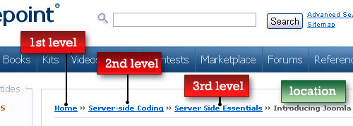
1. Location-based Location-based breadcrumbs show the user where they are in the website’s hierarchy. They are typically used for navigation schemes that have multiple levels (usually more than two levels). In the example below (from SitePoint), each text link is for a page that is one level higher than the one on its right.
2. Attribute-based Attribute-based breadcrumb trails display the attributes of a particular page. For example, in Newegg, breadcrumb trails show the attributes of the items displayed on a particular page:

This page displays all computer cases that have the attributes of being manufactured by Lian Li and having a MicroATX Mini Tower form factor.
3. Path-based Path-based breadcrumb trails show users the steps they’ve taken to arrive at a particular page. Path-based breadcrumbs are dynamic in that they display the pages the user has visited before arriving on the current page.
Benefits Of Using Breadcrumbs
Here are just some of the benefits of using a breadcrumb trail.
Convenient for users Breadcrumbs are used primarily to give users a secondary means of navigating a website. By offering a breadcrumb trail for all pages on a large multi-level website, users can navigate to higher-level categories more easily.
Reduces clicks or actions to return to higher-level pages Instead of using the browser’s “Back” button or the website’s primary navigation to return to a higher-level page, users can now use the breadcrumbs with a fewer number of clicks.
Doesn’t usually hog screen space Because they’re typically horizontally oriented and plainly styled, breadcrumb trails don’t take up a lot of space on the page. The benefit is that they have little to no negative impact in terms of content overload, and they outweigh any negatives if used properly.
Reduces bounce rates Breadcrumb trails can be a great way to entice first-time visitors to peruse a website after having viewed the landing page. For example, say a user arrives on a page through a Google search, seeing a breadcrumb trail may tempt that user to click to higher-level pages to view related topics of interests. This, in turn, reduces the overall website bounce rate.
Mistakes In Breadcrumb Trail Implementation
Using breadcrumb trails is a fairly straightforward affair, and there are only a few guidelines to consider before deciding to implement them on a website. Let’s take a look at some common mistakes to avoid.
Using breadcrumbs when you don’t need to A common mistake in implementing breadcrumbs is using them when there is no benefit.
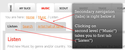
In the above example, Slicethepie risks overwhelming users with too many navigation options. The (1) primary navigation, (2) breadcrumb trail and (3) secondary navigation are very close together. The breadcrumb trail in this application offers users no added convenience because the secondary navigation for lower-level pages sits right below it. Additionally, clicking on the second-level link in the breadcrumb trail (“Music”) takes you back to the first tab (“Listen”), which mistakenly suggests that the first tab is on a higher level than the other two (“Search” and “Artist hall of fame”).
Using breadcrumb trails as primary navigation As stated earlier, use breadcrumbs as an optional aid to navigation.

In the above example, mefeedia does not offer a primary navigation menu for viewing videos. Though there is text link navigation in the footer section, there’s no navigation menu in the body of the pages, making it hard to navigate to other sections of the website.
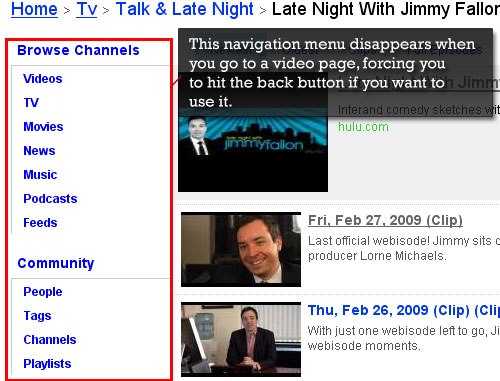
If you arrive on a video page directly – say, for example, through a Google search result – the only navigation option you may have is the breadcrumb trail. Or if you’ve already been browsing a website’s pages and reach a page that does not display the primary navigation menu, you will have to hit the “Back” button in your browser to access the main menu.
Using breadcrumbs when pages have multiple categories Breadcrumb trails have a linear structure, so using them will be difficult if your pages can’t be classified into neat categories. Deciding whether to use breadcrumbs largely depends on how you’ve designed your website hierarchy. When a lower-level page is (or can be put) in more than one parent category, breadcrumb trails are ineffective, inaccurate and confusing to the user.
Breadcrumb Navigation Design Considerations
When designing a breadcrumb navigation scheme, keep several things in mind. Let’s take a look at some questions that might arise when you’re working with breadcrumbs.
What should be used to separate link items? The commonly accepted and most recognizable symbol for separating hyperlinks in breadcrumb trails is the “greater than” symbol (>). Typically, the > sign is used to denote hierarchy, as in the format of Parent category > Child category.
Other symbols used are arrows pointing to the right, right angle quotation marks (») and slashes (/).

The choice depends on the aesthetics of the website and the type of breadcrumb used. For example, for path-based breadcrumbs in which the links do not necessarily have a hierarchical relationship to each other, using a “greater than” symbol may not convey their relationship accurately.
How big should it be? You don’t want your breadcrumbs to dominate the page. A breadcrumb trail functions merely as an aid to users (a convenience); its size should convey this to users and thus should at least be smaller, or less prominent, than the primary navigation menu.
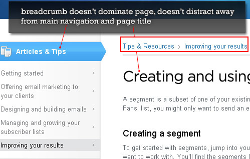
A good rule of thumb to follow when sizing your breadcrumb trail is that it shouldn’t be the first item that grabs the user’s attention when arriving on a page.
Where should breadcrumbs be located? Breadcrumb trails are usually displayed in the top half of the page, below the primary navigation menu if a horizontal menu layout is used.
Breadcrumb Showcase
Now that we’ve discussed the who, what, when, where, why and hows of breadcrumb trails, we should take a look at some live examples. In the following section, you’ll find a few examples of great websites that use breadcrumb trails.
1. Classic Text-Based Breadcrumbs
TypePad Design Assistant

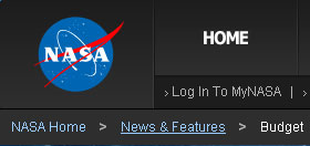
NASA
Nestle uses a breadcrumb trail whose text is significantly smaller than the text on the rest of the page, effectively making it unobtrusive.

Marchand de Trucs

Bridge 55

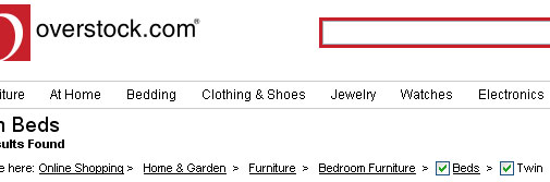
Overstock uses the standard “greater than” symbol for its attribute-based breadcrumb trail. Checkboxes for product attributes are used so that users can uncheck them to filter them out.
2. Replacing > With Other Symbols
TechRadar UK and BP< use right-pointing triangles.


PSDTUTS and Martique use slashes.


Mouse to Minx uses a right-angled quotation mark to denote page hierarchy.

Jakob Nielsen’s Alertbox uses right-pointing arrows.

Target uses colons (:) for separators.

3. Beyond Simple Text Links
One current trend in breadcrumb design basically says, “Breadcrumbs don’t have to be simple”. In these designs, you’ll see beautifully styled breadcrumbs that integrate well with the overall design.
Grooveshark

Yahoo! TV

IDEO

Apple Store
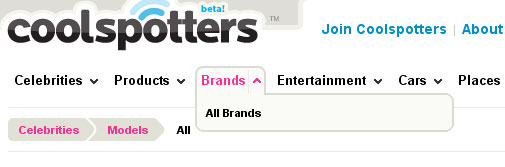
Coolspotters
Devlounge

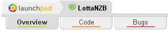
LottaNZB
Pixelpoodle
guardian.co.uk

4. Breadcrumbs For Multi-Step Processes
Statement Tracker uses a breadcrumb trail to indicate the steps involved in registering for an account, as well as a progress indicator.
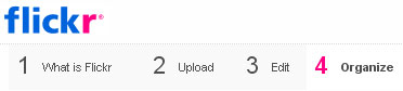
Flickr uses a breadcrumb trail to indicate the number of sections in the Flickr tour.
5. Breadcrumbs With Sub-Navigation
Here are some examples of breadcrumb trails whose links, when clicked on or hovered over, open a sub-navigation panel that lists additional attributes or locations.
MarketWatch has a fly-out sub-navigation menu that appears when you hover over a breadcrumb link.

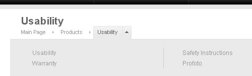
Profoto has a unique breadcrumb trail: clicking on a breadcrumb link opens an area below it that gives users additional attributes to select from.
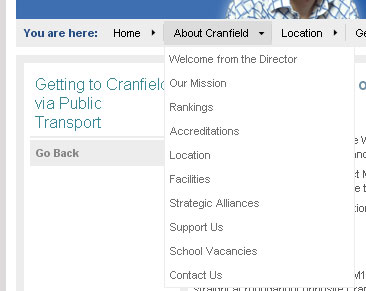
Cranfield University has a similar fly-out breadcrumb scheme, which serves a dual function: as an location indicator for the user and as a robust and interactive secondary navigation scheme.
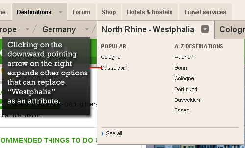
Lonely Planet also has a fly-out breadcrumb trail in which you can change attributes.

Clicking on a breadcrumb link takes you to that item’s page, while clicking on the downward-pointing arrow opens additional options.
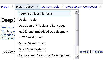
MSDN has a breadcrumb trail that opens a scrollable sub-navigation list when the user hovers over a link.
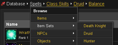
Wowhead has a multi-level sub-navigation scheme.
6. Interactive Breadcrumbs
Delicious lets you remove items in the breadcrumb trail of keyword tags to help you quickly find bookmarks.
7. Experimental Examples
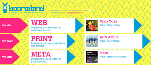
Booreiland uses a breadcrumb-style navigation scheme for its primary menu, allowing visitors to quickly understand what they’re currently viewing.
Further Reading on SmashingMag: Link
- Planning And Implementing Website Navigation
- Web Design Elements: Examples And Best Practices
- Smashing Book 5 — Real-Life RWD (Book)”)
- Mobile Navigation For Smashing Magazine: A Case Study


