[Ask SM: CSS] Equal Spacing, CSS Font Replacement

Email Newsletter
Weekly tips on front-end & UX.
Trusted by 182,000+ folks.
 See the full picture →

 SurveyJS: White-Label Survey Solution for Your JS App
 Celebrating 10 million developers

This is our fourth installment of Ask SM, featuring reader questions about Web design, focusing on HTML, CSS and JavaScript. In this post we’ll cover how you can distribute the horizontal space between elements evenly, how you can achieve maximum sides on images; you’ll also learn best practices for CSS font replacement and answers to a couple of quickfire questions.

Antoine Nicolas writes: *Do you know how to perfectly and dynamically distribute objects horizontally in a container using CSS?* This is a classic example of something that is fairly difficult to do in CSS but probably shouldn’t be. I have approached this problem in a number of different ways in the past. I have revisited it a little now, and I’ll present what I believe is the best solution here.
This is our fourth installment of Ask SM, featuring reader questions about Web design, focusing on HTML, CSS, and JavaScript. In this post we’ll cover how you can distribute the horizontal space between elements evenly, and how you can achieve maximum sides on images. You’ll also learn best practices for CSS font replacement and answers to a couple of quickfire questions.
Further Reading on SmashingMag:
- CSS Baseline: The Good, The Bad And The Ugly
- Using White Space For Readability In HTML And CSS
- Space Yourself
- The Principles Of Cross-Browser CSS Coding
Distributing the horizontal space between elements evenly
Editor's Note (May 22, 2024): CSS has released new features that make equally-distributed columns between elements since the original date this article was published. For example, Flexbox is able to automatically align elements along the inline axis withjustify-content: space-between;. Similarly, CSS Grid is capable of establishing columns that take up a specific fraction of space, e.g.grid-template-colums: 1fr 1fr 1fr;for three equal columns. Please see "The New Layout Standard For The Web: CSS Grid, Flexbox And Box Alignment" to learn more.
Antoine Nicolas writes:
Do you know how to perfectly and dynamically distribute objects horizontally in a container using CSS?
Hi Antoine, this is a classic example of something that is fairly difficult to do in CSS but probably shouldn’t be. I have approached this problem in a number of different ways in the past. I have revisited it a little now, and I’ll present what I believe is the best solution here.
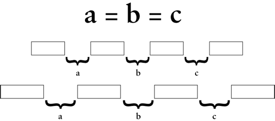
Let’s review the specific goals:
- The left-most object is left-aligned with its parent element.
- The right-most object is right-aligned with its parent element.
- All objects are equidistant from each other at all times.
- The objects will stop short of overlapping each other as the browser window narrows (ideally).
- The objects will not wrap down as the browser window narrows (ideally).
- The technique will work in a fluid-width environment, even one that is centered.
The theory is that the first object will be left-aligned, and the rest of the objects will be right-aligned inside equal-sized boxes that take up the rest of the space. Here is an illustration of what I mean:
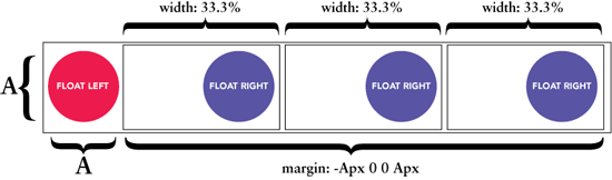
The HTML markup:
name="code"><div id="row">
    <img src="images/shape-red.png">
    <div id="movers-row">
        <div><img src="images/shape-green.png"></div>
        <div><img src="images/shape-yellow.png"></div>
        <div><img src="images/shape-blue.png"></div>
    </div>
</div>
The CSS:
name="code">#row {
    min-width: 480px;
}

#movers-row {
    margin: -120px 0 0 120px;
}

#movers-row div {
    width: 33.3%;
    float: left;
    min-width: 120px;
}

#movers-row div img {
    float: right;
}
And here is a live demo.
Maximum Sides on Images
Editor's Note (May 22, 2024): Please see Responsive Images Done Right: A Guide To <picture> And srcset" for an updated approach to resizing images for the right context.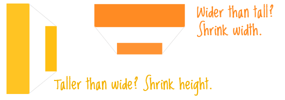
J.J. Sylvia IV writes:
Is there a way to determine the dimensions of an image being displayed and change the <img width="" /> setting based on the overall width? Sometimes I have images with a really large height, and I need them to be displayed with a much smaller width than other images.
I talked with J.J. a little more about this to clarify the problem. The problem actually relates to height: you have a lot of images, and all of them have different dimensions. You could set a max-width to make sure they keep their ratio and all get squeezed to the right width, but that leaves “jagged” heights. In other words, when you control only the width, you get the benefit of maintaining the image ratio, but you cannot control the height and may end up with very tall images screwing up your layout.
So how do you control both the height and width while maintaining ratio? We will need to lean on some JavaScript because we have to perform some calculations. As I happen to be a jQuery guy, we’ll use that. jQuery is a good choice here anyway, though, because we need to target every single image on the page and do stuff do it, and jQuery makes that very easy and rips through the job.
The best route is to turn this into a plug-in, which will make it a very easy call, as well as allow it to be chained and all that good stuff. We’ll call it “maxSide”. It looks at each element it calls on and figures out which dimension is larger. If it’s the width, it sets the width to the “maxSide” (with the pixel setting passed in). If it’s the height, it sets the height to the “maxSide”.
Here is the plug-in:
name ="code" > (function ($) {
   $.fn.maxSide = function (settings) {
   // if no paramaters supplied...
   settings = $.extend(
      {
         maxSide: 100
      },
      settings
   );

   return this.each(function () {
      var maximum = settings.maxSide;
      var thing = $(this);
      var thewidth = thing.width();
      var theheight = thing.height();

      if (thewidth >= theheight) {
         if (thewidth >= maximum) {
         thing.attr({
            width: maximum
         });
         }
      }

      if (theheight >= thewidth) {
         if (theheight >= maximum) {
         thing.attr({
            height: maximum
         });
         }
      }
   });
  };
})(jQuery);
Since we intend to call this plug-in with images, we need to make sure all of the images have loaded first. So, instead of calling it when the DOM is ready, like you see in most jQuery, we need to call it once the window has loaded.
name="code">$(window).bind("load", function() {
    $("img").maxSide({ maxSide: "100" });
});;
This may cause some unsightly flashes of large images… C’est la vie. If it’s really really awful, you may wish to hide the images with CSS and only reveal them (with jQuery) after the plug-in has run.
Here is a live example of this plug-in at work.
CSS Font Replacement
Editor's Note (May 22, 2024): The following explanation is no longer a recommended approach, thanks to more modern and accessible CSS features. Please see "How New Font Technologies Will Improve The Web" to learn more.
@juliuskoroll writes:
I would like to hear font replacement via CSS explained by you guys.
Hi Julius, you got it! We all know we can include images on pages by including an image tag like this:
<img src="https://www.smashingmagazine.com/images/ask-sm-css/..." alt="Some alt text" />That image can be anything. It can be a logo, a picture of a nice cup of tea, a puppy or even a line of text in a custom font acting as a header. If we want to have headers with nice custom fonts on our website, one option available to us is to just insert them in the page with , , etc). This is best for accessibility as well as SEO (search engine optimization).
You may also be aware that CSS allows us to place background images on elements. This is what gives us the power to have the best of both worlds. We can use a proper header tag, but also use an image. The problem now is that the text within the header tag is sitting right on top of the image. We need to somehow hide the text so that only the image is visible. As it turns out, there are quite a few different ways to do this, and each comes with its own theory. I once did some reasearch on this subject and came up with Nine Techniques for CSS Image Replacement.
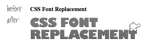
The most popular method, in my experience, is known as the Phark method. While it may not be the absolute best method, it works and is very easy to understand.
HTML:
name="code"><h1 class="replace">
  Smashing Magazine
</h1>
CSS:
name="code">h1.replace {
  width: 350px;
  height: 75px;
  background: url("images/header-image.jpg");
  text-indent: -9999px;
}
Quickfire Questions!
Here are a few questions I wrote down from random sources. Like most Web design questions, they could be answered with a book. But instead, I’ll answer them with a single sentence (or two) and a link!
1) Is there a way to make drop-down menus without JavaScript for IE 6?
Yes, there is, perhaps most famously done by Stu Nicholls of CSSplay, with his ULTIMATE CSS only drop-down menu.
2) Is there a way to get PNG transparency without JavaScript or HTC solution in IE 6?
To clarify, this means alpha transparency. Regular ol’ transparency (think GIFs) works fine with PNGs without any hacks, even in IE 6. Most PNG hacks do indeed use JavaScript or HTC. The root of these techniques is to apply a proprietary CSS “filter” called “AlphaImageLoader” through the “behavior” attribute in CSS. Some of these fixes are incredibly easy to implement, but if you want to avoid them all together, it is a little-known fact that Fireworks can save PNG-8’s with alpha transparency.
3) Is there a way to remove the "Click to activate this control" message for some versions of IE with Flash content?
Yep, inserting Flash objects on your page with SWFObject clears up this issue.
4) Is there a way to have alternate sidebars in WordPress?
Sure, if you have a special page template that you want to display a different sidebar other than your regular one, you can do that. The default WordPress function that calls the sidebar looks like this:
<?php get_sidebar(); ?>It may look like a magical WordPress function, and I suppose it is, but all it does is grab the sidebar.php file from your theme and plop it in. That’s it. So, instead, duplicate that sidebar.php file, call it something like sidebar-alternate.php and call it from your special page template like this:
<?php include (TEMPLATEPATH . '/sidebar-alternate.php'); ?>That does about the same exact thing. You can use that same bit of code to include any file from your theme folder.
5) Can you style "alt" tags using CSS?
The alt attribute for elements is only ever displayed if (for whatever reason) the element to which it is applied cannot be rendered. This is most common for elements, but also for elements and optionally for inputs (because they can sometimes be images). So, the only reason you’d ever see “alt text” is when an image link is broken or you are browsing the Web intentionally without images (e.g. using accessibility software).
The answer is yes, you can style alt text CSS. Simply apply text styling CSS attributes to whatever element it is. I think this is a rather clever idea actually. Images are very eye-catching on Web pages, so when an image is unavailable, why not replace it with very descriptive and eye-catching text.
It seems a little weird, but:
img {
   color: red;
   font: italic 200% Georgia, Serif;
}
This will sure make that “alt” text pop!
 (al, gg)

