Smashing Magazine - we smash you with the information that will make your life easier. really.

Designing Drop-Down Menus: Examples and Best Practices

Advertisement

As a general rule, most Web developers, especially usability enthusiasts, say it is bad practice to use drop-down menus because they are confusing, annoying and oftentimes dysfunctional. From a design standpoint, however, drop-down menus are an excellent feature because they help clean up a busy layout. If structured correctly, drop-down menus can be a great navigation tool, while still being a usable and attractive design feature.

Yes, that’s right: drop-down navigation menus can be user-friendly. Just yesterday Jacob Nielsen the results of his recent drop-down menus study, in which he found out that big, two-dimensional drop-down panels that group navigation options help users to avoid scrolling and can precisely explain the user’s choices with effective use of typography, icons, and tooltips.

These panels appear temporarily and disappear on their own when users move the pointer to another top-level option or to a “regular” part of the screen. You can find more information about Nielsen’s study in his article Mega Drop-Down Navigation Menus Work Well.

Food in Designing Drop-Down Menus: Examples and Best Practices
Huge vertical drop-down panel from foodnetwork.com; notice a close button (the “x” in the upper right corner).

In this article we take a closer look at the nature of drop-down navigation menus, analyze situations in which they should or should not be used, discuss various implementations and finally showcase a couple of bad and good examples of such menus. The article also includes various tips and suggestions to help you work with your drop-down menus.

Where To Use Drop-Down Menus

You will often see many trends in which drop-down menus are used. Here are a few of the most common ones.
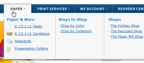
Organize Pages in a Section
Most commonly, drop-down menus are used to pull all of the pages in a certain category together in one organized element. This is essentially sub-navigation. Take a look at the design below. A drop-down element contains all of the different categories for a certain section of the website.

Change Org in Designing Drop-Down Menus: Examples and Best Practices

Organize Categories in a Blog
You will see many blogs use a drop-down menu to organize categories and tags. Why? Blogs are driven by a large amount of information, so the layout needs to be as clean as possible to hold that content. A drop-down menu ultimately helps pull together links, such as categories, out of layout elements, such as the sidebar.

Gomediazine in Designing Drop-Down Menus: Examples and Best Practices

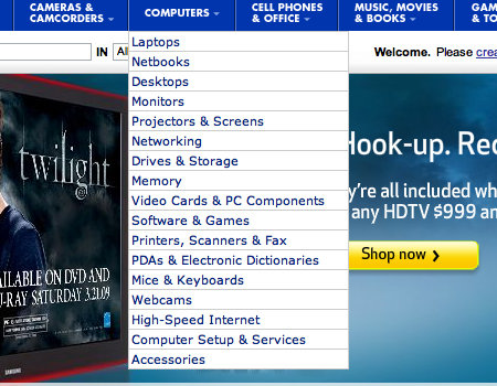
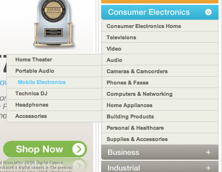
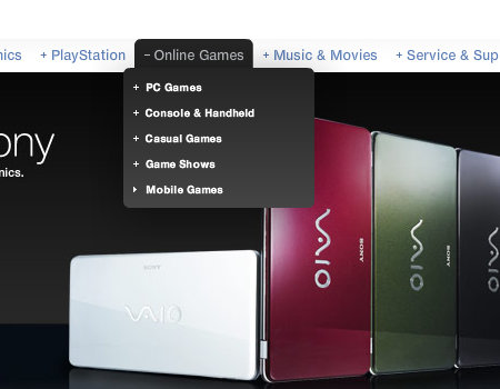
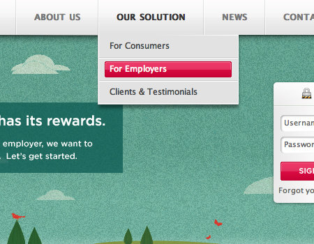
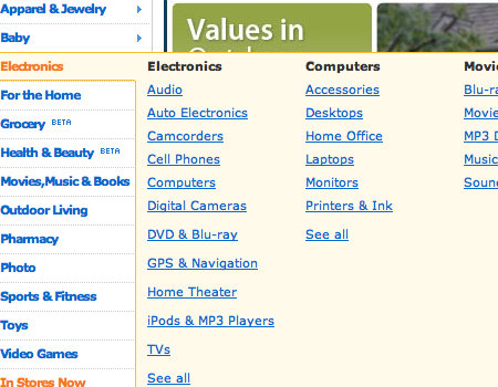
Show Products on an eCommerce Website
You will see many e-commerce websites use drop-down menus to show products or categories of products. The drop-down menu is a friendly feature that all consumers can easily figure out, so it is a perfect way to organize products. The Best Buy website, shown below, does just this.
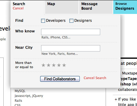
Bestbuy in Designing Drop-Down Menus: Examples and Best Practices

Display Modules
A drop-down can be an excellent way to tuck away an obstructive menu, which the user can click on to reveal. Take the example below, for instance. The sign-in element is part of the navigation, then appears in the form of a drop-down. This is a great way to take this large element out of the layout without negatively impacting usability.

Collabfinder in Designing Drop-Down Menus: Examples and Best Practices

Best Practices

Drop-down menus do in fact organize content into small, uncluttered elements, but if not done correctly, they can be just as bad as a messy layout. Here are some ways to make this controversial element more usable.

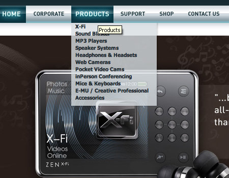
Avoid a Drop-Down with More than Two Levels
Overall, this is just about the worst mistake one could make with drop-down menus in terms of usability. If done with a hover menu structure, the user will lose focus of the menu whenever the mouse pointer moves away from it. If done with a clickable structure, it has too many buttons and doesn’t work nicely.

The website shown below makes this mistake. The menus are very difficult to use because if you even slightly lose focus of the menu with the mouse pointer, you have to start from the top. Notice the tooltip, which also gets in the way of the navigation.

Brita in Designing Drop-Down Menus: Examples and Best Practices

Option 1: Hover Menu
Basically, there are two ways to approach the drop-down menu: with either a hover or a click to activate the menu. From a design and convenience standpoint, a hover menu is better.

Option 2: Clickable Menu
On the other hand, many will argue that a clickable menu is better because it is much more usable. Reason? Because of the way a hover menu is constructed, the user has to have the pointer over the menu at all times. If the user loses focus of the hover menu, it closes. Therefore, it is better to go with a drop-down menu that is activated by clicking a button, then deactivated by clicking the button once more.

CSS-Tricks has a tutorial showing how to create a layout similar to that of Digg. It is a perfect drop-down menu with a click-to-activate/deactivate feature, so it’s certainly something you should take a look at.

Csstricks in Designing Drop-Down Menus: Examples and Best Practices

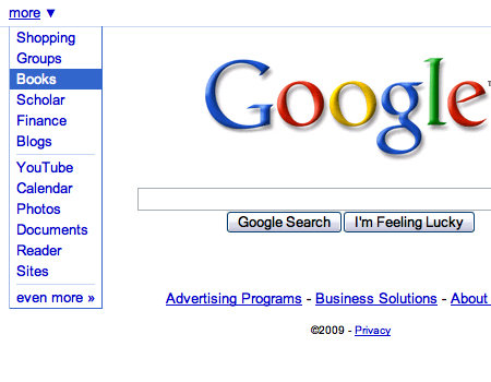
Also, Google features a usable drop-down menu using the click on/off trick.

Google in Designing Drop-Down Menus: Examples and Best Practices

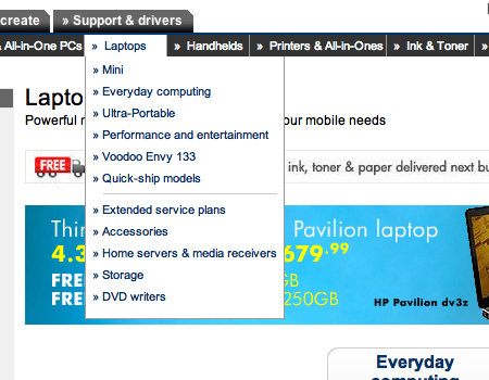
Delay the Deactivation of a Hover
Avoiding a hover structure and many levels in a drop-down may be too much of a restriction for the navigation you are trying to create. There is a solution, though, that can improve the usability of a hover and multi-level menu. With most menus, the drop-down disappears immediately after the user moves the mouse pointer away from the menu. The solution is to delay its disappearance. Or, have a click function that requires users to click outside the menu area to close the drop-down, similar to how a Lightbox functions.

Take Dell, for example. It uses a multi-level drop-down menu, but it is still somewhat usable. This is the only exception to the use of multi-level drop-down menus.

Dell in Designing Drop-Down Menus: Examples and Best Practices

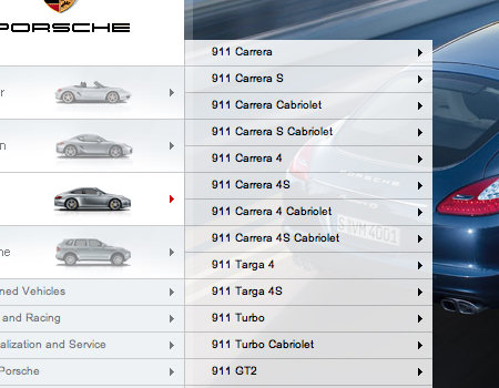
Furthermore, the menu on the Porsche website has multiple levels. However, the menu has a very wide focus range. This means you have to move your pointer a certain distance away from the menu to close it.

Porsche in Designing Drop-Down Menus: Examples and Best Practices

Add a Hover Effect to Menu Options
The navigation itself actually affects the usability of the drop-down menu. One way to make the menu work better with the drop-down is to add a hover effect to the menu options. This shows exactly which button in the navigation the menu is extending from, which will certainly help users.

The example below, the MediaTemple home page, shows a strong hover effect on the navigation options, which helps to support the drop-down menu.

Mt in Designing Drop-Down Menus: Examples and Best Practices

Seamless Transitions
When a drop-down menu appears, it should appear seamlessly and without interruption. The menu should load immediately. Many websites make the mistake of making the menu so “heavy” that it takes more than an instant to load upon the hover.

Transition effects are one more detail that can look really cool. Instead of the menu simply appearing, try throwing in a wipe down or fade in. Just be sure to make the transition quick and not disruptive.

You will notice that Microsoft doesn’t do a very good job of creating a seamless menu. Observe the image below closely. You will notice that outlines from adjacent menus are still visible when the main menu is loading. When you move from button to button in the navigation, the drop-down menus have a slight lag, which looks bad. Of course, this doesn’t occur in all browsers, but it shouldn’t occur in any.

Microsoft2 in Designing Drop-Down Menus: Examples and Best Practices

Remove Tooltips
Of course, when designing drop-down menus, there are always little details that impact usability. One important practice you may overlook is the presence of tooltips, or the lack of tooltips. You should always remove tooltips from buttons with drop-down menus. Reason? Tooltips just get in the way and sometimes even block the first list item in the drop-down menu.

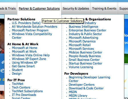
Yes, we will be picking on Microsoft once more. Microsoft makes this mistake on its corporate page. Notice how the tooltip blocks many of the list items, which makes navigation that much more difficult.

Microsoft in Designing Drop-Down Menus: Examples and Best Practices

Styling Techniques

Content backgrounds can be somewhat of a challenge, too. The background has to be subtle, or it will ruin the content. Here are a few ways to liven up content backgrounds without going over the top.

Use a Clean List
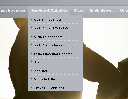
Not only is the element styling important, but the content styling is important, too. Clean typography and a readable list are important. Use smart spacing between elements in the list, and add a border above and below list items.

The example below from Audi shows a very well-organized and readable list. The list items are separated, and there are even list item icons.

Audi in Designing Drop-Down Menus: Examples and Best Practices

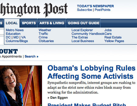
On the other hand, The Washington Post’s website has a very poor list in the drop-down menu. There is not enough spacing between list items, so the menu is very cluttered and difficult to use.

Washingtonpost in Designing Drop-Down Menus: Examples and Best Practices

Hover Effects on List Items
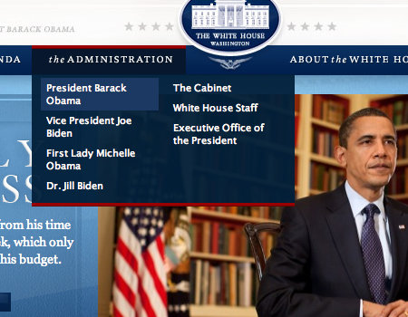
All buttons need some sort of hover effect to be more usable. In drop-down menu lists, apply subtle hover effects, perhaps just a text color or background change. The White House website uses only a background change on list items, but it still helps the user.

Whitehouse in Designing Drop-Down Menus: Examples and Best Practices

Semi-Transparent Background
This won’t work for all designs, but you should consider a semi-transparent background for the menu. The website shown below has a transparency, so the user can still see through to the image background. The key to semi-transparent elements is to keep a strong and readable contrast.

August in Designing Drop-Down Menus: Examples and Best Practices

Keep Styling Consistent with Menu
You will hear everywhere that consistency in styling is a must, and it certainly is. For navigation and a drop-down menu to work together as one unit, as they should, the styling needs to be similar. Use the same fonts and a similar background.

In the example below, the drop-down menu looks as it should.

Macstorm in Designing Drop-Down Menus: Examples and Best Practices

Poorly Constructed Menus

Below are some examples of drop-down menus that fall short somewhere with styling and usability.

Navigant Consulting
This menu is poorly styled and dysfunctional.

Navigant in Designing Drop-Down Menus: Examples and Best Practices

Panasonic
Although this menu is well-styled, it is difficult to use because of a bad hover effect.
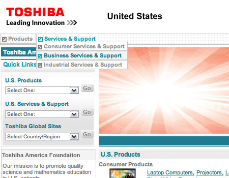
Panasonic in Designing Drop-Down Menus: Examples and Best Practices

Toshiba
The Toshiba menu is too small and does not follow good styling practices.
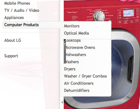
Toshiba in Designing Drop-Down Menus: Examples and Best Practices

LG
Like the Microsoft menu above, this one has a slight lag, which makes it hard to use.
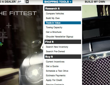
Lg in Designing Drop-Down Menus: Examples and Best Practices

Chrysler
The Chrysler page uses a drop-down menu with very small text, which makes it difficult to read.

Chrysler in Designing Drop-Down Menus: Examples and Best Practices

Sun
These drop-down menus are rather fidgety and hard to use. The tooltip gets in the way, too, and directly above the main navigation is another drop-down menu. All of this makes it very difficult to navigate.

Sun in Designing Drop-Down Menus: Examples and Best Practices

Creative Labs
The menu below is cluttered and does not have a delayed hiding or similar technique, so it is not very usable.
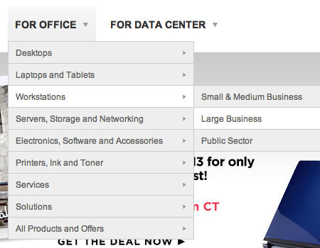
Creative in Designing Drop-Down Menus: Examples and Best Practices

HP
Another hover menu that lacks usable features.

Hp in Designing Drop-Down Menus: Examples and Best Practices

Alienware
The black menu on the black design makes this drop-down difficult to use.

Alienware in Designing Drop-Down Menus: Examples and Best Practices

Good Drop-Down Menus

Here are many drop-down menus that have good usability and styling features.

Sony
A well-constructed hover menu with a good list.

Sony in Designing Drop-Down Menus: Examples and Best Practices

ActionEnvelope
A clean vertical drop-down panel with a lot of padding; notice, how the panel appear to be above other design elements. Simple and beautiful solution.
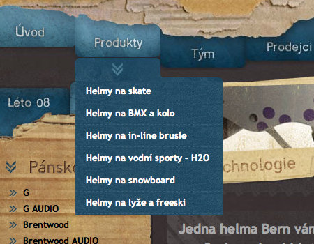
Action in Designing Drop-Down Menus: Examples and Best Practices.

Helmy Bern
A beautifully styled menu, with a fade transition.

Bern in Designing Drop-Down Menus: Examples and Best Practices

RedBrick
This menu is cleanly styled and very readable.
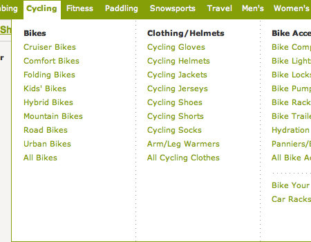
Redbrick in Designing Drop-Down Menus: Examples and Best Practices

REI
This drop-down is very wide, so it is easy to keep the mouse in focus.
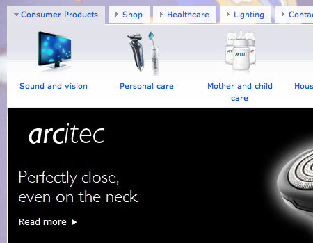
Rei in Designing Drop-Down Menus: Examples and Best Practices

Philips
Philips has a large and usable drop-down module.

Philips in Designing Drop-Down Menus: Examples and Best Practices

Walmart
On the Walmart site, the user clicks on the area outside the menu to close it.
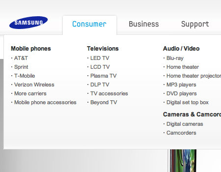
Walmart in Designing Drop-Down Menus: Examples and Best Practices

Samsung
The Samsung menu is usable because of its large size and styling.
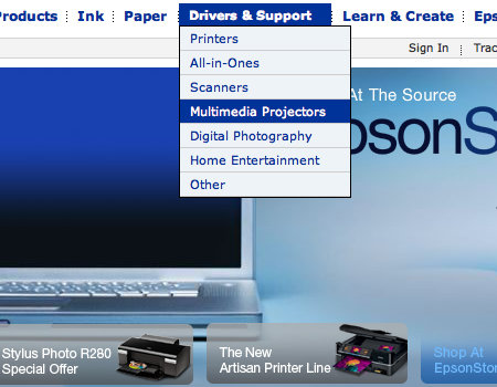
Samsung in Designing Drop-Down Menus: Examples and Best Practices

Epson
Epson shows another usable drop-down menu.
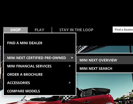
Epson in Designing Drop-Down Menus: Examples and Best Practices

Mini Cooper
This website uses a drop-down menu with delayed closing.
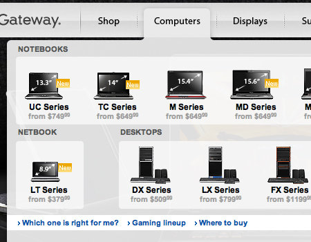
Mini in Designing Drop-Down Menus: Examples and Best Practices

Gateway
Here is another usable drop-down element.

Gateway in Designing Drop-Down Menus: Examples and Best Practices

Asus Global
A well-styled menu that has delayed hiding.
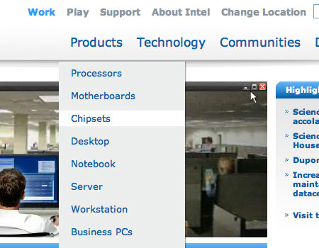
Asus in Designing Drop-Down Menus: Examples and Best Practices

Intel
A very clean drop-down menu.

Intel in Designing Drop-Down Menus: Examples and Best Practices

Target
A well-organized menu that has delayed closing.
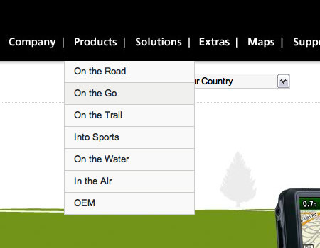
Target in Designing Drop-Down Menus: Examples and Best Practices

Garmin
This drop-down menu is simple yet functional.

Garmin in Designing Drop-Down Menus: Examples and Best Practices

Logitech
A drop-down with very nice styling that matches the menu.
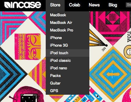
Logitech in Designing Drop-Down Menus: Examples and Best Practices

Incase
This menu is very basic but serves its purpose.
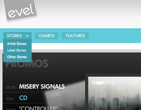
Incase in Designing Drop-Down Menus: Examples and Best Practices

evelMerch
A small yet functional drop-down, with a graphic to show users that the button opens a menu.
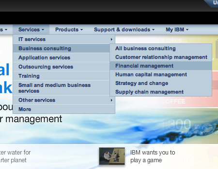
Evel in Designing Drop-Down Menus: Examples and Best Practices

IBM
A multi-level drop-down is used here, but a slight delay makes this one easier to use.
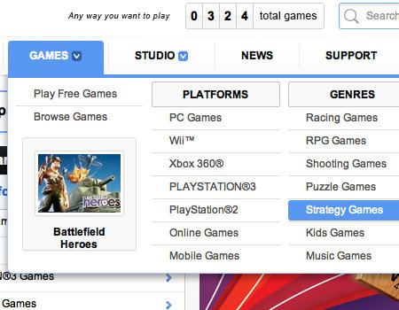
Ibm in Designing Drop-Down Menus: Examples and Best Practices

EA
A very clean and well-organized drop-down element.

Ea in Designing Drop-Down Menus: Examples and Best Practices

ACTIVISION
This menu is clean and has delayed hiding to improve usability and functionality.

Activision in Designing Drop-Down Menus: Examples and Best Practices

Yahoo! Finance
The menu on Yahoo! Finance has large buttons and icons to show where menus can be opened.

Yahoofinance in Designing Drop-Down Menus: Examples and Best Practices

Related posts

Please consider visiting the following related posts:

(al)

Matt Cronin is an avid graphic designer, web designer/developer, Cocoa programmer, photographer, digital artist, and the like. He also enjoys writing, and does quite a bit of writing for Smashing Magazine. He is currently working on a startup called VAEOU, which will have new services coming soon.

Post Rating
1 Star2 Stars3 Stars4 Stars5 Stars (2 votes, average: 4.00 out of 5)
Loading ... Loading ...

Tags: , ,

Advertising
  1. 1
    veerendra
    March 24th, 2009 7:40 pm

    wow great post.. really informative ..

  2. 2
    Tedwick
    March 24th, 2009 7:56 pm

    Nice stuff, but could we get a Smashing tut on how to get MS IE to get off its pasty ass and display those dropdown frakkers properly? Without javascript or flash? Y’know, like every other browser out there does?

  3. 3
    Ryan
    March 24th, 2009 8:15 pm

    Tedwick, why don’t you get off your pasty ass and figure it out.

  4. 4
    DKumar M.
    March 24th, 2009 8:15 pm

    Thanks Matt for optimized showcase. If you would have included some tutorials for Multilevel Drop Down Navigation Menus than it’s handy with your collection for a complete post package lovers.

    I personally don’t use multi-level drop downs as they are HTML evil incarnate! If you find yourself in a situation where you have no choice, you took a wrong turn somewhere and need to go back and retrace your steps.

    Anyway.. Still, a nice round-up you got here.

    DKumar M.

  5. 5
    vishal
    March 24th, 2009 8:24 pm

    Ryan says – “Tedwick, why don’t you get off your pasty ass and figure it out.”

    Nice one. :D

    The idea of having a dropdown is really good because it makes things look neat and clean. Thanks for the post!

  6. 6
    vileye
    March 24th, 2009 8:27 pm

    I like the drop down menu with the “Display Menu”. Thanks!
    Fresh India Jobs

  7. 7
    Pradeep CD
    March 24th, 2009 8:49 pm

    Great post… i’m inspired… thanks

  8. 8
    Alex
    March 24th, 2009 8:52 pm

    Great variety. It’s interesting to see how sites with a bunch of categories/sub categories handle their dropdowns.

  9. 9
    Nidhi
    March 24th, 2009 8:58 pm

    @DKumar: there are various previous posts in the magazine which has a list of some great tutorials on drop down menus…maybe you missed those… use the search bar on top of the page.. you’ll find them… :)

  10. 10
    AYANO
    March 24th, 2009 8:59 pm

    It is always a pleasure to read SM articels. Thank you very much.

  11. 11
    Given
    March 24th, 2009 9:10 pm

    Really great post :) Thanks

  12. 12
    David Smith
    March 24th, 2009 9:12 pm

    ESPN.com’s drop-down menus annoy the hell out of me. They really need a hover delay … everytime my mouse brushes over them to a link I want to click on they’re popping up all over the place.

    grrrr.

  13. 13
    David A
    March 24th, 2009 9:17 pm

    As for the drop-down menus that have about a zillion choices, how can you call that good UI? I’d call it lazy UI. If you can’t make your interface simple, you haven’t worked at it enough. By publishing these as examples of good drop-downs, Smashing has endorsed them. That surprises me.

  14. 14
    snnaqvi
    March 24th, 2009 10:05 pm

    Its a super post.

  15. 15
    Thinker
    March 24th, 2009 10:37 pm

    Hey whats the Problem with “Navigant Consulting”??? Dropdown is working without problems.

    Someone just didn’t wait for the background to be loaded?! Thats poor.

  16. 16
    Jens Törnell
    March 24th, 2009 10:48 pm

    The best way to use drop down menus is to not use them at all, I think. Tabs and submenus work better, like my blog jenst.se, or another example: Wordpress.

  17. 17
    Dustan Franks
    March 24th, 2009 11:15 pm

    Once again a very useful atricle. Just noticed though that the link on the whitehouse website thumbnail leads to zensender not sure if this was intended?

  18. 18
    Kevin-K
    March 24th, 2009 11:47 pm

    Also see the dropdown menu of Magix

  19. 19
    Tomek
    March 24th, 2009 11:51 pm

    This article is one week too late :) From week, i am coding multi-column dropdown menu from zero. Now it works well in ie6/7, mozilla etc.

    …but here i have a lot of good inspiration (and code). Uhhh :)

  20. 20
    Manuj Darshan
    March 25th, 2009 12:11 am

    I feel drop down menus restrict the wrist movements. They should turn a bit left while going down with increasing slope if more rows-responsive middle wheel if possible. Also the vertical should be as low as possible.

  21. 21
    claudio
    March 25th, 2009 12:19 am

    Nice article, I’ve just rewritten for personal purposes the Porsche menu with semantic html, css and Jquery.
    Am I allowed to post a link to my article here?

  22. 22
    Lee Milthorpe
    March 25th, 2009 12:29 am

    Very comprehensive article guys! I’ve considered using drop down menu’s to save space many times but never actually used one!

  23. 23
    Johny
    March 25th, 2009 12:34 am

    The author claims one menu to be poor because of a small text size and in the same size another one is a good example while the text size is the same. I don’t think you have clear judgment there or at least you can’t argument yourself ergo your opinion is useless

  24. 24
    dapas
    March 25th, 2009 12:37 am

    I want to ask something, How to make Menu Semi-Transparent Background? it’s using transparent image or something? I’ve been try with png files, it can works in Firefox only. Anyone can help me?

  25. 25
    Quincy Pabotoy
    March 25th, 2009 12:39 am

    Hi,
    Anyone knows a link to download the sample of mega menu?

    thanks

  26. 26
    OverZero.it
    March 25th, 2009 12:40 am

    Great article.
    I will keep all these advices in mind for one of my next project… well, it will be better if I’ll read this article again when I’ll start the project :)

  27. 27
    Andy P
    March 25th, 2009 12:44 am

    Great post. And great to see Misery Signals getting a nod anywhere on the internet!

  28. 28
    Quakeulf
    March 25th, 2009 1:01 am

    I’m happy to have a website simple enough to avoid the use of drop-down menus. :3

    Personally I don’t really like hiding information like this, I prefer it all visible even though it might get cluttered, and will also require some clever thinking to solve this problem.

  29. 29
    Vishal Gupta
    March 25th, 2009 1:16 am

    Absolutely great article. I love this.

  30. 30
    Tom
    March 25th, 2009 1:16 am

    Well done to Google ad Media Temple being the ones I could find from that list who actually had keyboard access for their drop down menus.

    Unfortunately a lot of people just don’t consider keyboard access from either an accessibility or just plain user preference point of view.

    So well done to them :) An Interesting collection here.

  31. 31
    m_dzo
    March 25th, 2009 1:20 am

    Very nice post! very usefull as usual !! Well done Matt Cronin and thanks :D

  32. 32
    Peter
    March 25th, 2009 1:24 am

    I agree with David A and Jens Törnell. If you use a drop-down on your website it will most likely be less usable than with a traditional vertical/horisontal menu or tabs.

    The main problem with drop-downs is that they often reflect poor site structure… of course you can make them more user friendly using common sense and good design, but it doesn’t cure the disease.

  33. 33
    Tim Holmes
    March 25th, 2009 1:36 am

    Some beautiful menu styling here I must say.

    Although there is a very strong case of drop down menus making a site less usable, I feel in many cases they often improve usability too. It simply depends of how they have been implemented.

    If the basic menu is structured well in the first place this can often alleviate the issue of having drop downs as finding something is simple and easy. Give the user further choice once a section has been accessed.

    I also think that a back up method should be used just incase someone has some functionality turned off. A search can help solve multiple drops too.

    Really nice article though SM

    Cheers

    Tim

  34. 34
    Oliver
    March 25th, 2009 1:53 am

    nice post. great inspiration for future designs. :))

  35. 35
    k42b3
    March 25th, 2009 2:17 am

    Nice article …
    I think the main problem is for users who have javascript not-activated … in this case the drop-down menu is useless and maybe destory the design of the website. I prefer websites without drop-downs. But nevertheless great article.

    regards
    k42b3

  36. 36
    PrabhakaranG
    March 25th, 2009 2:24 am

    OSM, I like this post.

  37. 37
    Robert Hase
    March 25th, 2009 2:26 am

    Intel, Garmin and Logitech dropdowns make it hard to tell which section the dropdown belongs to.

    The EA-dropdown doesn’t seem “very clean and well-organized” at all from the screenshot.

  38. 38
    Noah
    March 25th, 2009 2:36 am

    Drop-down menus are rarely a good idea. Try doing some research into their usability before recommending them. They slow down browsing and misrepresent the content on the site by forcing the user to browse the site the way the designer views the IA instead of what would actually be useful. They really are one of the banes of the internet. Everyone thinks they’re a good idea but they’re far from practical.

  39. 39
    Mark Cameron
    March 25th, 2009 3:30 am

    Another great article. Thanks again!

  40. 40
    Tom
    March 25th, 2009 3:37 am

    There is no problem with Navigant Consulting like the screenshot. Tried the website in IE6 en Firefox. Maybe you should correct that one?

  41. 41
    Idemium
    March 25th, 2009 4:01 am

    From a branding point of view, i think we have to be careful to not hide the logo or main visual with a drop down menu.
    This can give a bad feeling about the brand.

  42. 42
    Tom
    March 25th, 2009 4:21 am

    The Navigant Dropdown works fine with no errors, and the design of it is good, anyway Good Artitcal

  43. 43
    giickr
    March 25th, 2009 4:23 am

    Although I think there are some usability issues with drop down menus, I beg to differ that they are as bad as some here have claimed. Sometimes there is no good way to drill down through sub menu after sub menu especially if offering a wide and diversified series of products. Granted I think that the best possible hierarchy should be developed and provided along side a well developed and easy to use drop down, but the drop down can provide one click access to deeply buried pages.

    Great collection. Got my morning research to do! Thanks

  44. 44
    viz
    March 25th, 2009 4:25 am

    Drop down menus are useless but some still use them

  45. 45
    PureDezigner
    March 25th, 2009 4:29 am

    Great article, Vimeo.com also has an awesome dropdown menu too. Thanks!

  46. 46
    Atom Groom
    March 25th, 2009 5:45 am

    Love the article , Thanks!

    Anybody have a link to the “click to activate” drop downs referenced on css-tricks?

  47. 47
    Raphael
    March 25th, 2009 5:57 am

    Loving or hating drop down – which is other options to manage too many options on a bar or menu?

    Tabs, ajax tabs, div popup (with grayback) ??
    Anything that doesn’t need refresh the page?

  48. 48
    Matt
    March 25th, 2009 5:58 am

    I love the drop down menu on Seattle Sounders. It’s nice and clean and uses advertising wisely within the drop down itself.

  49. 49
    Tx8
    March 25th, 2009 5:58 am

    At last ! Need some code now ;)

  50. 50
    George Campos
    March 25th, 2009 6:00 am

    Great work, very complete.Thanks.

    But is coincidence? http://www.useit.com/alertbox/mega-dropdown-menus.html

  51. 51
    Russ
    March 25th, 2009 6:03 am

    @viz Drop down menus are useless but some still use them

    Think carefully about what you just said, I talk better sense sat on the loo!

    Great article, I found it very enlightening! Good work!

  52. 52
    Krig
    March 25th, 2009 6:17 am

    The Helmy Bern image links to the wrong site (Sony USA.)

    Personally, I would place Helmy in the “Poorly Constructed” category. The navigation tooltips kill the graphic styling and dropdown effects.

    Still, this is a good article, and definitely worth bookmarking.

  53. 53
    h-a-r-v
    March 25th, 2009 6:19 am

    It is worth mentioning that:

    1) Drop-downs are INACCESSIBLE in many ways (problems and good alternatives):

    http://www.message.uk.com/index.php?page=81

    2) They’re not meant to get you somewhere but to LET YOU DO SOMETHING

    http://www.kitsimons.com/journal/bad-practice-in-user-interface-design-misuse-of-the-drop-down-menu

    I won’t bug you with more links. These two are pretty enough to make you think before you get caught by all the fancy stuff written in the article above, basically telling you how to make bigger evil less evil. I’m not an extremist, that’s just for educational purposes. In my opinion, such a big article regarding drop down menus technique not mentioning its very essential issues (everyone should be aware of) is simply not professional. I’d expect more from SM. If you think that’s just a bunch of bullshit, consider why most of the biggest and most popular sites (e.g. CNN, BBC, YouTube, etc.) avoid using drop-downs for navigation and ‘keep it simple, stupid’ instead.

  54. 54
    LayerDown
    March 25th, 2009 6:26 am

    This article is a great compilation of best practices in drop-down menu front-end design.

    If you are ready to get started on your own, you need to check out the code for ADxMenu from Aleksandar Vacić. This is the best example I’ve ever seen. It is 100% CSS except for a small javascript file for IE6. link: aplus.rs/adxmenu/

    I implemented it at http://www.tirerack.com and it worked great. For the record, they requested the multiple-level expanding menus, but because it is all organized in a giant it is great for SEO!

  55. 55
    Kay
    March 25th, 2009 6:27 am

    Awesome post!
    Very usefull!

  56. 56
    Concerned
    March 25th, 2009 6:46 am

    Interesting article, but you left out one very big issue: Most of the sites you choose as being especially functional do not work without javascript. As someone who routinely disables javascript, I see no menus at Porsche or IBM, and the Target.com page never loaded at all. That’s not my idea of a good design.

  57. 57
    Batfan
    March 25th, 2009 6:59 am

    @Thinker
    Even with background loaded on the ‘Navigant Consulting’ menu, it’s still to hard to read.

    @Concerned
    Why do you have Javascript disabled? It’s 2009 man, gotta get with the times. As you stated, many major sites require the use of Javascript. If your worried about security, perhaps you should change your browser :)

  58. 58
    Mulder
    March 25th, 2009 7:17 am

    CSS drop down menus can be very useful when there are many areas to navigate to for a web site, but you failed to mention that working CSS should never be tied to or dependent on the browser having JavaScript running.

    There are quite a few sites I’ve seen that seem to think CSS navigation should not work unless you have JavaScript turned on, which completely defeats the reason for using CSS navigation in the first place.

  59. 59
    myDevWares
    March 25th, 2009 7:36 am

    @Concerned
    Oh please. Who disables JS nowadays? Disabling JS while using the internet is like disabling color when watching TV – you miss out on a lot of good stuff.

  60. 60
    Brad McCall
    March 25th, 2009 7:50 am

    Drop down menus are sure a tricky one – thanks for the samples you’ve put together! I like that a lot of the new menus seem to be more flat color areas with well separated large text links. The boxy, line-filled, compartmentalized menus of the past seem to be going away. Yahooo!

  61. 61
    LayerDown
    March 25th, 2009 8:01 am

    Definitely look into ADxMenu for an excellent example of an easy, powerful, free, highly expandable, CSS drop-down menu structure that uses no Javascript (except for IE6).

    Having implemented it on tirerack.com, I swear by it. Google “ADxMenu”.

    Sorry for comment duplication: I seem to be having trouble getting my comments to post if I provide links. I get stuck at “awaiting moderation”. Is this normal for everybody when you put links in the comment?

  62. 62
    Seriously?
    March 25th, 2009 8:34 am

    Are there any articles on this website that do not find a way to pick on Microsoft? Geesh!

  63. 63
    Nuno Amaral
    March 25th, 2009 8:37 am

    good topic.

    Look:

  64. 64
    Chris Robinson
    March 25th, 2009 8:47 am

    really nice post and roundup of some great inspiration

  65. 65
    natasha
    March 25th, 2009 8:56 am

    I’m surprised this article didn’t mention the emerging trend of using 1 dropdown menu to display all navigation options.

    Here’s an example which uses Flash, though I think this could be done using jQuery just as easily:
    http://ares.netgame.com/

  66. 66
    Laura
    March 25th, 2009 9:10 am

    I was just wondering what the best option to show a search box for a corporate box was… and it is now very clear: a mega drop down

    Great article! thanks for the inspiration!

  67. 67
    Ian
    March 25th, 2009 9:37 am

    Interesting article but there was no mention of keyboard navigation usability issues.

  68. 68
    Matt
    March 25th, 2009 10:06 am

    RE: no javascript…

    There are a wide variety of reasons why someone might want or need to disable js. Here’s a short list:

    1. People who, due to a disability, use alternate methods of navigating the web. It is very common for poorly written javascript (read: almost all of it) to make it difficult or impossible to use keyboard/voice/etc. methods to access content or navigate. As a result, many turn off js in order to not have to deal with the headache.

    2. People who have older, slower machines, and can’t afford to get a new one. Even on my laptop, which isn’t super old, a poorly written script or two can bring the browser to its knees. The only real solution if you want to use the site? Turn off js or install noscript.

    3. Protection against XSS & CSRF attacks. These attacks are browser-independent, and will work just as well on Firefox, Safari, and Opera as they do on IE. Without the protection of an extension like noscript (or without turning off js) I need to trust every single site I visit to not have security holes. Given that I’ve personally found many XSS/CSRF vulnerabilities in supposedly trustworthy commercial sites with just cursory attempts (and I am not a skilled hacker) I have very little faith that randomsite.com can’t be compromised. Hence, noscript.

    I could go on, but my point is that any web developer who says, “It’s 2009, dude! Just turn on javascript already!” is pretty inconsiderate of the very good reasons why someone might not have js on. I think what’s really being said is, “I’m lazy and don’t want to put in the extra effort that would make my site work as plain HTML.”

  69. 69
    ben
    March 25th, 2009 10:12 am

    How do you achieve the transparent background effect? Also the swipe hover effect that media temple uses?

  70. 70
    Leah
    March 25th, 2009 10:41 am

    Great article!

  71. 71
    Mario
    March 25th, 2009 11:26 am

    In the mac.appstorm site, the last menu “how-to” goes to the right on mouseover. I’m using Firefox & 1280px resolution :S

  72. 72
    Mason Sklut
    March 25th, 2009 11:51 am

    Thanks for these navbar designs. I’m in the beginning stages of redesigning a friend’s site and of course it always helps to see what new at Smashing Magazine to get my creativity flowing.

  73. 73
    John
    March 25th, 2009 12:15 pm

    Nice post – good to see some example of ‘what not to do’.

  74. 74
    Merxhan
    March 25th, 2009 12:24 pm

    Nice collection, great article. I checked most of them, but i think Sony Drop Down Sucks

  75. 75
    Dan
    March 25th, 2009 2:04 pm

    “Even with background loaded on the ‘Navigant Consulting’ menu, it’s still to hard to read.”

    Nonsense. Navigant Consulting’s menus are fine.

  76. 76
    Okibi
    March 25th, 2009 2:47 pm

    Nice collection but I would have used “best buy” as an example of what NOT to do, it’s not clear which heading that drop down menu is sitting under.

  77. 77
    ryan
    March 25th, 2009 3:27 pm

    I think Xerox has a great downdown menu.

    A great use of Photography and color
    xerox

  78. 78
    sun
    March 25th, 2009 7:36 pm

    you guys always help me!!
    I’ve been looking for some drop-down menu since morning.
    thanks a lot!

  79. 79
    shin
    March 25th, 2009 11:53 pm

    Tut for a mega drop-down menu will be nice.
    Thanks.

  80. 80
    Praj
    March 26th, 2009 1:10 am

    I think TheITDepot Link[www.theitdepot.com] has a brilliant dropdown.. I haven’t seen it on all broswers, but it definitely looks good on FF…

  81. 81
    Russ
    March 26th, 2009 1:22 am

    Now we need some tutorials on some of these effects.

  82. 82
    Andy
    March 26th, 2009 5:11 am

    I like the dropdown menu on the aviary site aviary.com

  83. 83
    SuperChef
    March 26th, 2009 7:29 am

    I still think that about half of these examples use drop downs as a fix for an otherwise inefficiently structured website. They might look nice, if that’s what you’re going for.

  84. 84
    Siep
    March 26th, 2009 7:34 am

    @Idemium that’s utter and complete nonsense.

    I don’t know how many times i’ve had to put up with people telling me crap like that. Does this mean you ban scrollbars (god forbid a user scrolls the header in your page’s logo out of view!).

    Or how about a paper flyer. Let’s say I fold it, so the company’s big logo on the front is no longer visible. Do you really think I am going to feel bad about this company all of a sudden?

  85. 85
    jianglong
    March 26th, 2009 8:00 am

    great post. i feel Xerox.com’s menu is elegant too…

  86. 86
    David
    March 26th, 2009 8:41 am

    Can anyone tell me how I remove tooltips without having to remove the title attr from the link?

  87. 87
    Bohdan Ganicky
    March 26th, 2009 8:56 am

    Thanks for very informative article. Just one comment on Helmy Bern site: they forgot to prevent the animation queue – when you run fast with your mouse over the navigation back and forth, submenus are fading in and out again and again.

    Quick tip how to solve this is on the Learning jQuery website.

  88. 88
    Rob
    March 26th, 2009 1:57 pm

    Cool; now, does anyone have links to some good tutorials or code-bases for any of these examples? :)

  89. 89
    Burçlar
    March 27th, 2009 1:53 am

    really great post but if you make a tutorial for drop down menus its will be super!

  90. 90
    Jojje
    March 27th, 2009 4:55 am

    Excellent collection of does and don’ts.

  91. 91
    Erik Spaan
    March 28th, 2009 2:25 am

    Hi, nice article. Interesting to see that some big firms get it and other don’t :-)

    For a good overview of pure CSS based dropdown menus see also cssplay.co.uk. Stu Nicholls does a great job there. And also his menus with a touch of JS here.
    Recently he created a seperate page to showcase his cssmenus on cssmenus.co.uk.
    If you’re interested in pure CSS options that work xbrowser check them out.

  92. 92
    John H. Farr
    March 28th, 2009 7:05 am

    Well, I just wasted a week of my life trying to get a CSS drop-down menu to work on a corporate site I’m building. The problem isn’t the menu, but Internet Explorer. By the time I get the menu working right for everyone on Macs and most Windows users, someone with a funky IE configuration complains. There are fixes, sure, requiring an additional script (JS), but in the end, sure enough, there’s someone who has javascript turned off.

    I’m ready to tear the whole thing out and start over.

  93. 93
    Thibaut Allender
    March 29th, 2009 2:06 pm

    Interesting article and examples but I can’t agree on a few points:

    - Hover : if this is the best practice then explain me why ALL (or nearly every) operating systems and applications use clickable dropdown menus? Hover dropdowns appeared on the web and have become a widely used method but still BAD or unusable when badly implemented (as pointed out, you need delays and so on). Moreover, it’s harder and more time consuming to implement.

    - Click to close: yes, but you should attach an event to the document so clicking anywhere closes the menu as well.

    - Levels : only one is enough, question yourself about your website architecture if you need more. A secondary navigation in heavy sections is a far better option.

    I would also warn readers about mixing dropdown menus with flash content… Don’t forget to set the wmode parameter of your flash object to “opaque” or “transparent” otherwise the flash object would always be on top (even if the z-indexes are correctly defined).

    My 2 cents…

  94. 94
    pire
    March 31st, 2009 6:19 am

    good info

  95. 95
    Shaheer
    April 7th, 2009 6:42 am

    Great article……
    Very useful….

  96. 96
    jeewan samant
    April 10th, 2009 11:19 am

    hi,
    i just want to know how to hide the javascript file, what webassist.com had done for their mega menu. i know that with javascript it can not be done.

    thanks

  97. 97
    jeewan samant
    April 10th, 2009 7:09 pm

    sorry for the typo,
    in the above comment i just wanted to say “It can not be done without the help of javascript”.

  98. 98
    Harish
    April 30th, 2009 3:08 am

    Amaging………….. WOW

  99. 99
    worley
    May 6th, 2009 7:41 am

    http://www.emc.com/?fromGlobalSiteSelect

    another extensive menu drop down

  100. 100
    mojitopl
    June 18th, 2009 11:54 am

    I just love You for theese posts! Thanks again

  101. 101
    Joe
    June 30th, 2009 10:55 am

    Oh please. Who disables JS nowadays? Disabling JS while using the internet is like disabling color when watching TV – you miss out on a lot of good stuff.

    A lot of people do. Mainly Firefox users. NoScript is one of the most popular FireFox extensions ever. It disables javascript unless you specifically whitelist a site. A large portion of FireFox users will see your site with JavaScript disabled.

  102. 102
    John
    July 11th, 2009 3:50 pm

    Check out the menu at http://www.gigfish.com. Not bad.

  103. 103
    pista
    August 4th, 2009 2:57 am

    tht thing with the navigant consulting drop down menu. It just isn’t fair, why didn’t you change it? One of the well-designed sites and you put in #1 bad example. Very POOR! Disappointed…

  104. 104
    Cartographic mapping
    September 27th, 2009 9:55 pm

    very useful and informative post. thanks for sharing.
    regards
    SBL

  105. 105
    Mats Snuffels
    October 2nd, 2009 12:28 am

    A nice combination of a simple Drop-Down with Grunge-Design can be found here:

    Moderne Ausbildung – German Education site

  106. 106
    Cutts
    October 6th, 2009 12:03 pm

    Anyone have a demo link to do the Philips drop down. That’s one of the best i’ve seen so far.

  107. 107
    kranti
    October 8th, 2009 10:12 pm

    Nice stuff !!

  108. 108
    Manny
    October 15th, 2009 11:33 pm

    hey guys does any one know of any other tutorials other than the on on sitepoint?

  109. 109
    Maris
    October 22nd, 2009 7:39 am

    Really good staff ! As I’m moving on in web design and development all those delicate things are very usefull to notice and kep in mind. Thank’s a lot!

  110. 110
    Artas Bartas
    November 19th, 2009 1:34 pm

    I found Clinique website menu – http://www.clinique.com/ – very well executed. Looks like put a lot of thought into it.

  1. 00

    There are no trackbacks at this time. If you are interested in leaving a trackback, please use this URL.

Leave a Comment

Make sure you enter the * required information where indicated. Please also rate the article as it will help us decide future content and posts. Comments are moderated – and rel="nofollow" is in use. Please no link dropping, no keywords or domains as names; do not spam, and do not advertise!


Advertisement Advertise with us!
Join in Smashing Forum
Post your job