Backgrounds In Web Design: Examples And Best Practices

Email Newsletter
Weekly tips on front-end & UX.
Trusted by 182,000+ folks.
 Register for Free


 Custom Web Forms for Angular, React, & Vue. Your backend.
 Celebrating 10 million developers
Web design has come a long way since its beginning, especially in terms of styling. Take a look at a website from 10 years ago and compare it to one from today. The differences are enormous. One of the major changes you will notice is the background. Today, backgrounds are one of the core features that determine how visually interesting a website is.
The background holds the theme of the website, and there are a vast amount of possibilities when designing a website background. This article goes over the best practices and popular trends of backgrounds in the current stage of innovative Web design.
You may also be interested in the following related posts:
- Backgrounds In CSS: Everything You Need To Know
- The Whys And The Hows Of Textures In Web Design
- Textures and Patterns Design Showcase
The Basic Background Structures
Before talking about how to design a good background, we need to go over basic background set ups. While not the only structures out there, these three are the most often used.
Body Background The body background is the most “distant” background. It is usually an image, illustration, texture/pattern or other graphical element.
Content Background The other level of the structure is the content background. This is the background of the text, images and other base data or information.
Option 1: Content and Body Background Layered
The first structure is multiple layers of backgrounds. On the bottom is the body background. Then layered on top of that is the content background.
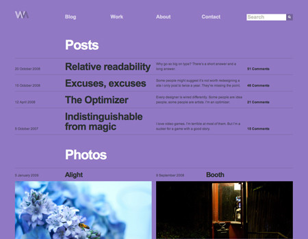
This is one of many styles that use a layered approach. The background is a large image, and containers of content are layered on top of the background. The core content has a solid background, but the titles have a semi-transparent background.
The design above shows a layout in which content elements are separated from each other. Here below is the more common form of a layered structure. The wrapper and content have a set width background, while beyond the set width the bottom layer is visible.
Option 2: Content Directly on Body Illustration or Texture
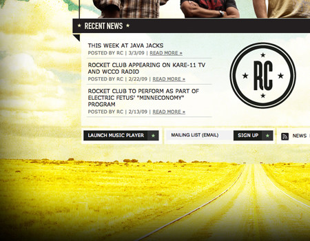
The next structural technique is to lay the content directly on a background. This is generally done with body backgrounds consisting of illustrations, textures and images. This technique is trickier, especially with images, but it can work nicely if you get the color balance perfect. This means a contrast between the background and text that allows the text to be easily readable and scannable.
The website below lays the content, text and images directly on the illustrated background. Because of the contrast between the white text and blue background, the content is legible. The images have a strong border that separates them from the background and brings the image forward.
Option 3: The Body and Content Background as One
The most simple and basic structure is one in which the content background is the body background. This is usually done with a single color or a few different colors, but nothing too complex.
The website below shows this structure used with a single-color background.
Wrapper/Header Backgrounds
Websites have so many places to implement good background design. Two of those places are the header and behind the top of the wrapper. Here are a few pointers on how to work with backgrounds in those two areas.
Standard Header Background
Illustrations, images, textures and colors are good to use for a header background. This is an easy way to liven up the website without interrupting the core content in the wrapper.
Provide a Separator That Flows When designing a header that is separate from the rest of the layout, you need to use a good transition. Sometimes, the contrast between the header and the content background colors or styles will do the trick. In other cases, the two elements need to work together in harmony, instead of against each other.
Here is one example of a header that flows nicely into the content background. Instead of a sharp and immediate transition with the image, the graphic fades out:
The next one is a very different approach than the transition effect but works just as nicely. The large amount of unused space may seem pointless, but it actually helps provide a separation between the top navigation and content.
Flowing Illustrated Wrappers
Using illustration, or any graphic element for that matter, is a very good technique for adding a little more personality and feeling to a website. On top of that, it helps make the design more memorable and plays into the overall theme of the website. Using illustrations in the background of the wrapper in a standard layout, then allowing them to flow over, is an excellent and beautiful technique.
Match the Edge of the Graphic to the Body Color The transition from the wrapper graphic to the plain background is important. It is crucial to match the color on the very edge of the graphic to the color of the website’s body background.
Keep the Style Consistent with the Rest of the Design Consistency is mentioned often in Web design, and that’s because it is one of the more important characteristics a Web design can have. When making an illustration for the wrapper of a website, it should carry the same style as the rest of the website. The color palette should be similar too.
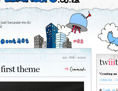
For example, if you are using a hand-drawn style for elements such as typography and borders, then the illustration should also have that same hand-drawn style. The website below shows this by using a hand-drawn illustration along with hand-drawn fonts.
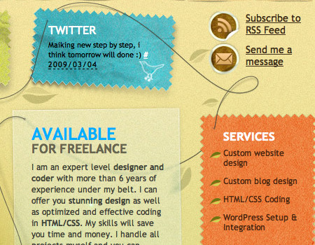
Allow Some Graphic to Bleed into the Content Area To create a smoother layout with an illustrated wrapper, you should not only put graphics behind the content container but allow some of the illustration to flow over and into the content container. The website shown below is a perfect example.
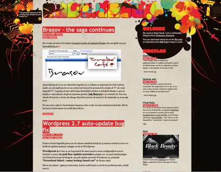
Extend the Graphics throughout the Layout While just the wrapper background may be enough, you may also want to consider continuing the illustration through the rest of the background. Take a look at the beautiful illustration on Web Designer Depot below. Not only is there illustration behind the top of the wrapper, but there are graphics dispersed throughout the rest of the background.
Also, the header illustration is continued at the bottom of the wrapper. This keeps the great theme alive throughout the page.
Full Body Backgrounds
Full body backgrounds are a bit trickier, as they can easily throw off the rest of the design if done incorrectly. Here are some good techniques to help you work around any problems with full body backgrounds and help enhance the visual experience.
Don’t Take Away from the Content As said above, you have so many possibilities when designing a background, but there is a fine line between a beautiful background and one that detracts too much from the content.
You simply have to pay attention to contrast and the number of graphical elements in the background. If the body background is too busy, it won’t look so good. If the background color is too bright, it will grab the user’s attention before the core content does.
Use Highlights or Bevels to Separate Colors One heavily used Web 2.0 technique is highlights (essentially, bevels) to separate different colors in a background – or an element, for that matter. For now, we’ll simply focus on background highlights.
So how do you use bevels? These are simply two 1-pixel lines used to divide colors. Look at the image below. You will notice that when the background color switches, a subtle highlight is used. This makes for a very nice and clean layout while adding dimension to the website.
Below is a closer look at the highlight. The background color of the top container is darker than that of the bottom container. Then, to transition between these containers, there are two lines. The top is a darker color and the bottom is a lighter color. This creates that bevel-like effect that looks amazing when used in transitions.
The bevel is great for colors of slight contrast, and it can also be used with opposite colors if the darker color in the bevel lies closer to the lighter color in the background. The other side of this is the highlight. The highlight works best with colors of high contrast. It is simply a 1-pixel line used for transition, like the bevel.
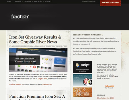
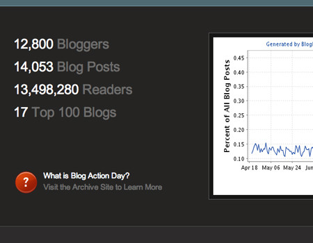
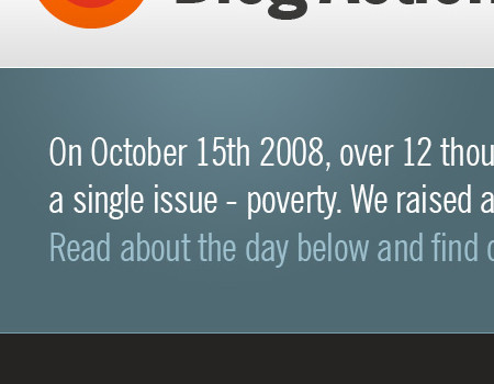
This technique is also used on the Blog Action Day website to separate the green, gray and darker colors. Notice how between the light gray at the top and the green is a 1-pixel white line. Also, below that is a light-green 1-pixel line that separates the green and dark gray.
Mix of Fixed and Liquid Graphics: Parallax Effect Most websites will just use a static background without layered images. If you really want to take an extra step, you could create a collaboration of fluid and fixed layered graphics.
The website below uses this technique. The large light-blue clouds in the far background are a set distance from the left, so they move when the browser is re-sized. The layer in the foreground, the houses and trees, is static and does not move.
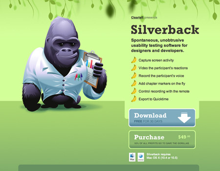
This technique almost creates a parallax effect. I say “almost” because parallax effects usually have many layers to create a movement effect. The most well-known example of a website that has a good CSS-based parallax effect is Silverback.
The Silverback website has about three layers. Each layer in fact moves, but they are all set at different scroll percentages, meaning that they don’t move the same amount when the browser is adjusted. Notice how each layer has different colors and shapes. Also, notice how the top layer is slightly blurred to give the effect more depth.
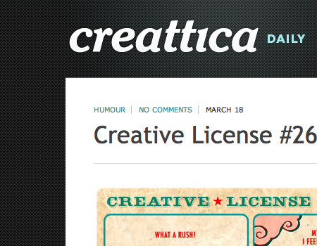
Use a Low-Contrast Pattern or Texture Very subtle textures that are only noticeable on closer inspection add a little more detail to a design. A low-contrast pattern, meaning a pattern that stays within a small color range, does this great. It looks very nice and does not distract the user from other elements.
Creattica Daily uses this very technique. A subtle repeating pattern is used in the background but it stays within a controlled color range.
Another clean design is the Product Planner website, which has a similar pattern and shows the same technique of slight contrast. This texture provides a more compelling visual experience to help engage the user.

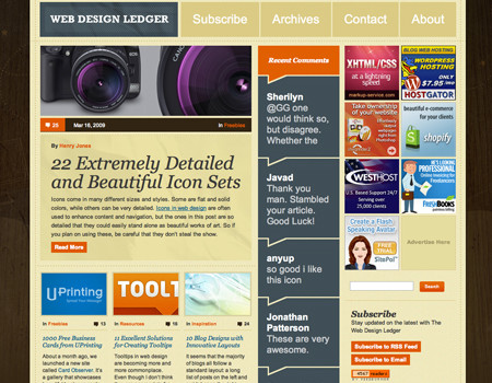
Combine Texture and Illustration Some websites use just one or another, but why not combine techniques? This creates an even more engaging and unique visual experience. The website below, Web Design Ledger, mixes illustration and a wood texture. The illustration is subtle, though, and not a huge contrast to the wood texture.
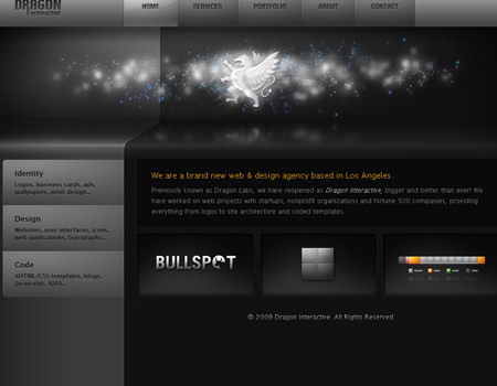
Add Dimension Yet another awesome way to take a website design to the next level is by adding dimension through lighting and illustration techniques. Dimension enhances the visual experience and shows true skill.
This website uses 3-D lighting effects beautifully. The dimension in the background, and every element, looks stunning and really grabs the user’s attention. This level of dimension is sure to leave a good impression and make the website more memorable.
Full Body Images
Use a Fixed Image and Content Background Working with image backgrounds can be a little tricky because you can’t repeat them. Therefore, you must find another way to work the image into the layout.
Below is a perfect example of this technique from Nike. It uses a very large image in the background, but the background is fixed. The content container and content background scroll, but the body background image does not. On top of that, it uses an image that flows in all resolutions, and the image is not scaled.
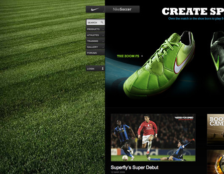
Apply a Slight Vignette Another good technique for implementing images is the vignette effect. This helps to bring more focus to the content in the center and looks very nice with large image backgrounds. It is important to only use a slight vignette though. You will notice the background above does in fact have a subtle vignette.
Here is another website that uses this technique with images. The vignette pushes the eye towards the content and helps intensify the image itself. Also, take a look at the very heavy grunge use. This really captures the mood of the website.
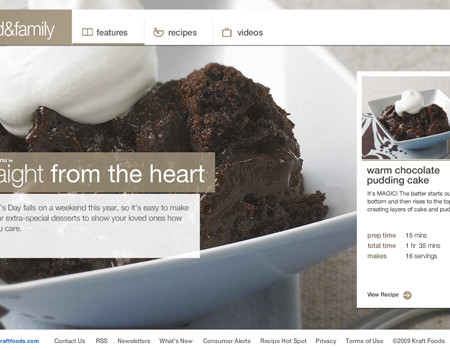
Find a Balance in Contrast Images are excellent, but a problem occurs when the colors in the images have deeper contrast than the content and content background. This immediately pulls the user’s eye from the content to the image, which is obviously a problem for readability.
I will use this same example from Kraft once more. If you look very closely, you will notice that the image actually isn’t very rich in color. This isn’t because it is a bad image, but because it needs to be a little dull to…
Additionally, notice that the image is focused on the sundae. The content is around the sundae, in the areas where the image goes out of focus. The lack of focus behind the content helps bring the eye up to the content in the foreground even more. This of course was achieved by the photographer, but it can be done easily with a simple lens blur effect in Photoshop.
Create Seamless Tiles or Repeat Backgrounds
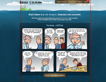
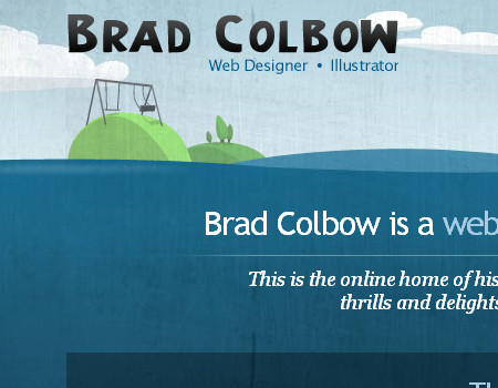
The easiest way to make a good background is to use a repeat. This doesn’t require large images, but you need to be aware of many factors when creating a background that repeats. To make this easier to explain, I will use Brad Colbow’s website as a case study, because it seamlessly tiles an image.
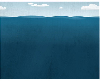
Use Large Images to Repeat To make a really good background, you should use large images. The background image use by Brad Colbow is about 1000 pixels, then it repeats. Take a look at the image below. The red lines show where the image ends and repeats.
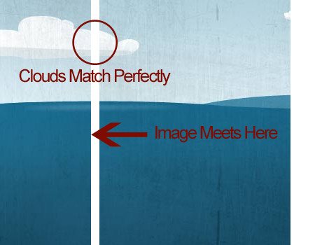
Line Up Edges Perfectly More important than anything, the edges of the images must line up perfectly. The area where the image meets must be the exact same color, meaning when you create your background image, the right and left side need to match up. If using shapes, they must join cleanly.
Take a look at the example below. The first screenshot is the exact image (scaled) used in the background of the website. Then, below that is a screenshot that shows how the image meets when it is set to repeat. The edges of the background image match perfectly. Notice how the cloud flows without any breaks or interruptions, and the water color on both the right and left edge are the same.
Remove Noticeable Objects That Repeat If you are tiling a background image, and an object in the image noticeably repeats, remove it. You want a background pattern that flows without interruption and that looks like one image instead of multiple tiled images. Now, this guideline isn’t so important to Brad Colbow’s website because it uses a very large image, and repeating objects are hard to spot when the image being repeated is so large. This is more something to pay attention to if you are repeating a small image.
Place a Graphic in One Section, But Not Another Another way to mask a repeating image is to place an element in one section of the background but not another. What does that mean? Well, take the example of Brad Colbow’s website once more.
This image shows an island that Brad incorporates into the background. The inland graphic does not repeat with the rest of the background. This provides more variation and makes it harder to notice that the background is in fact a repeating image.
Content/Wrapper Background Techniques
Content backgrounds can be somewhat of a challenge, too. The background has to be subtle or it will ruin the content. Here are a few ways to liven up content backgrounds without going over the top.
A Simple Gradient
Believe it or not, small details can have a huge impact on a website design. One small detail commonly used in layouts is a gradient. Gradients are very simple, yet if used correctly can bring a boring design to life.
Look at the screenshot below, then try to imagine it without the gradient background. It would be very boring and bland. Such a simple effect can go a long way.
A Subtle Texture
Textures are another awesome background technique. Textures help add to the theme of a website. For example, a grungy texture is perfect for a rock-and-roll music website because it reinforces the theme. When using textures as backgrounds, it is very important not to go over the top. The texture should be subtle enough that the text is still legible.
Here below is a decent example of texture use. The body background is very heavily textured. The content background is consistent with this style but not as heavily textured as the body.
Fade the Wrapper to Body Background
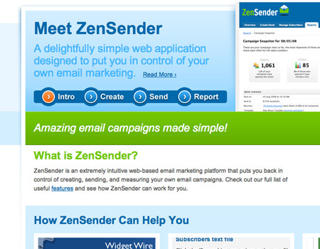
This may sound confusing at first, but it is actually a relatively simple technique and looks very nice if you can do it correctly. To see it in use, look at the screenshot of ZenSender below. At the top, a layered wrapper background is used on the body background structure. Then, about halfway down, the wrapper background fades out and transitions to a single body background. This is just yet another technique to consider.
Style the Borders of the Wrapper/Modules
It is difficult to style the actual background of the wrapper without taking away too much from the content, but you can style the borders and edges of the wrapper to stay consistent with the body background. The website below has a very nice texture and pattern that styles the edges of content elements.
Use Semi-Transparent Content Backgrounds in Layered Designs
One final technique for styling content wrapper backgrounds in a layered structure is using transparency. Transparency allows visibility of the background while separating the background from the text. It is important to use a text color that contrasts well with the background color, and don’t make the background too transparent.
The website shown below finds a perfect balance with semi-transparent content backgrounds. The body image can be clearly seen, but the text is still legible and the body image doesn’t distract the user’s eye.
Showcase of Help Elements
365 Days of Astronomy A beautiful background with a fancy wrapper background illustration.

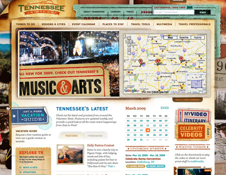
TN Vacation A very nice mixture of grunge style and image collage.
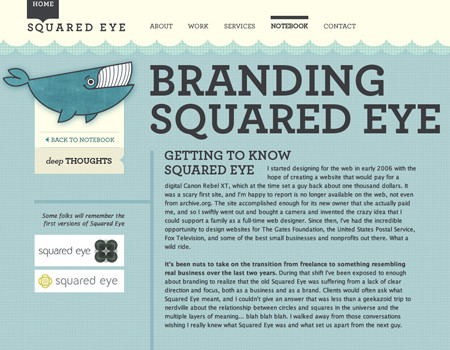
Squared Eye Good background pattern and colors, and nice header design.
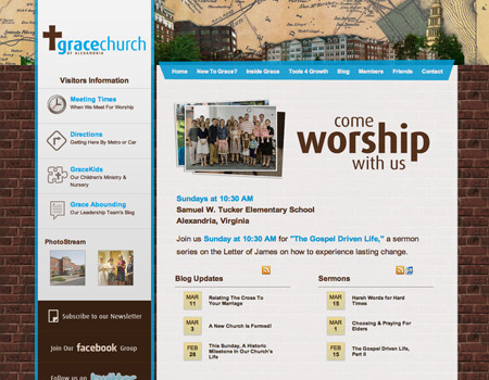
Grace of Alexandria A good example of a pattern that adds to the theme of the design.
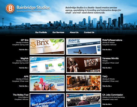
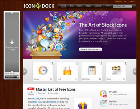
IconDock Besides the beautiful illustration, this website has a great wood texture. The texture graphic is static, so there are no scroll issues.
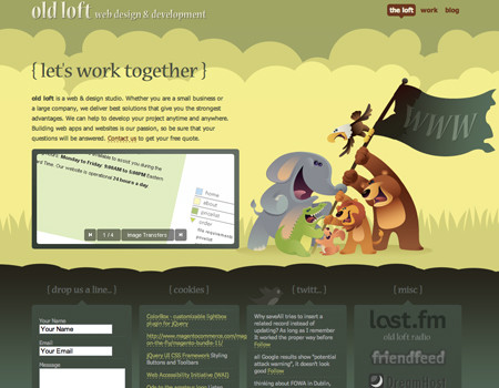
Old Loft Here is an extremely good example of content being laid directly on an illustration.
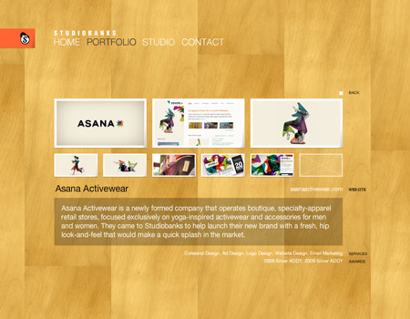
Studiobanks Good background pattern with a perfect color.
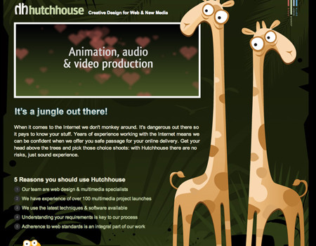
HutchHouse A fun illustrated background that captures the user’s attention.
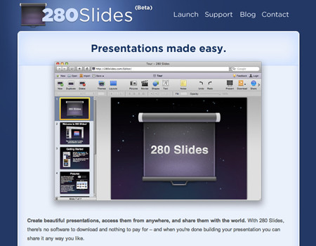
280 Slides Good color combination and gradients to liven up the design.
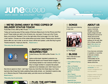
JUNECLOUD An illustrated header and a pattern to separate it.
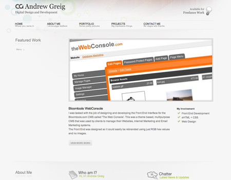
Andrew Greig Colorful header and good use of the bevel to separate the containers.
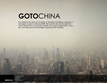
GOTOCHINA A very nice image that fades out, and good use of semi-transparent elements.
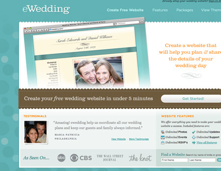
eWedding The low-contrast shapes in the body background complement the rest of the design perfectly.
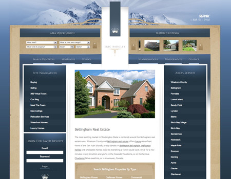
Bellingham Real Estate Good header graphics and a beautifully textured wrapper background.
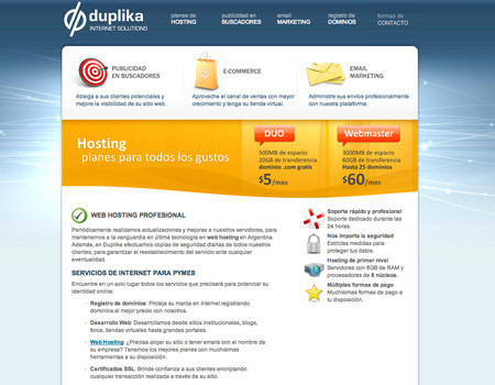
Duplika An excellent and vibrant body background.
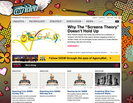
ANidea A funky but powerful body background with wrapper styling that works with the background.
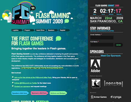
Flash Gaming Summit This website uses a colorful static body background.
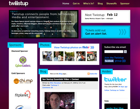
Twiistup A vibrant and intense static background beneath separate content elements.
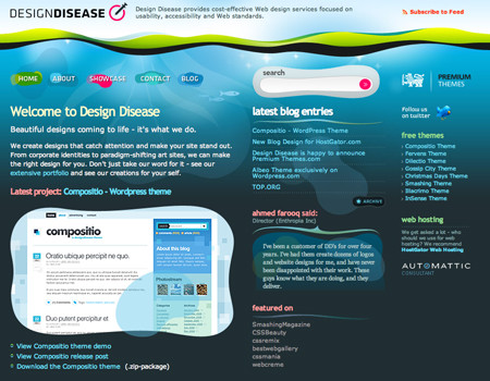
Design Disease Fun and light, the content is laid directly over the background in this design.
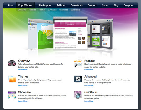
RapidWeaver Beautiful wrapper background that fades to a plain white background.
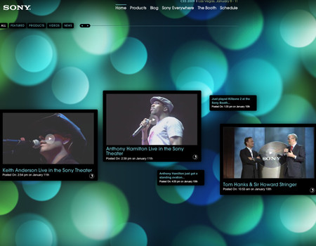
Sony CES 2009 A powerful background with individual modules laid over it.
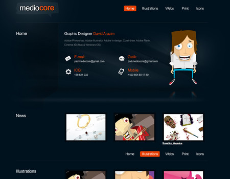
Mediocore This is an awesome background with some good dimension.
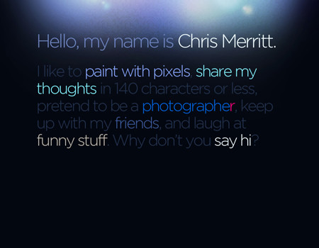
Chris Merritt Some lighting effects with a unique pattern layered on top to create a cool visual effect.
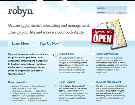
Robyn This background uses an illustration and soft colors to make a visually pleasing experience.
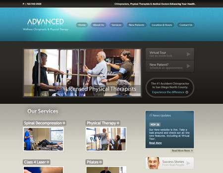
Advanced Wellness The colors in the navigation background immediately grab the user but still work with the rest of the design.
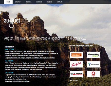
August The background image isn’t overly distracting, and it fades out nicely.