Smashing Magazine - we smash you with the information that will make your life easier. really.
Drawing Inspiration From Creative Logos
As designers, we are always in constant need of inpiration. Whether it be Web or graphic design, other work to fuel our creativity is essential. Logo design requires the most amount of inspiration, however.
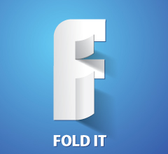
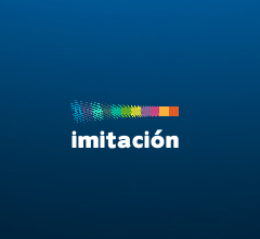
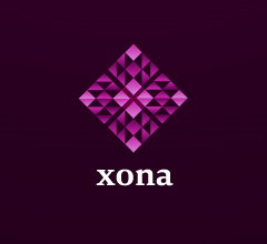
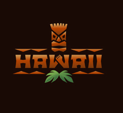
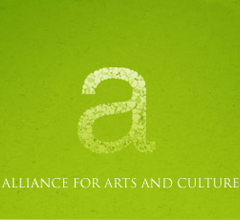
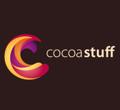
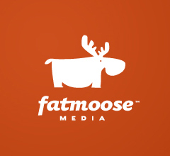
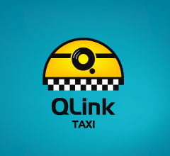
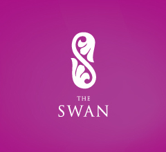
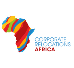
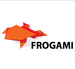
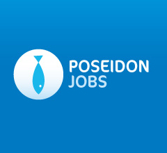
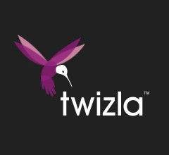
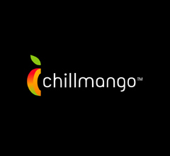
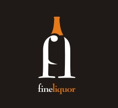
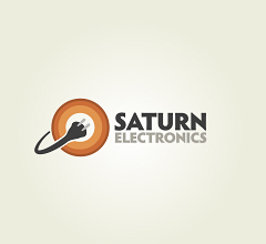
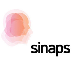
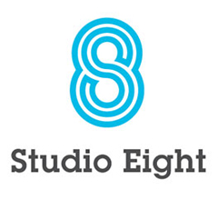
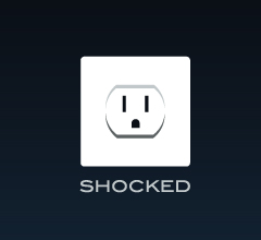
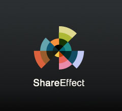
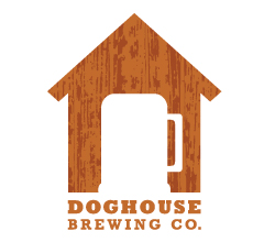
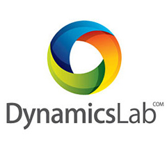
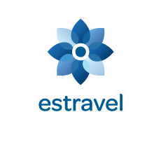
Below we present a showcase of 50 beautiful, clever and creative logo designs that will hopefully inspire you. If you take a closer look at the showcase below, you will notice many trends. Some of these include the usage of simple shapes to create something complex, origami shapes, coloring and transparency trends, and many more.
Why are these logos so excellent? All of these logos use very creative methods to represent the brand through color, shapes, and shape typography. Look at how each of these logos can tell you something about the company that it is supposed to represent. Also note the brilliant color palletes and unique patterns used in many of these. Finally, pay attention to the typography, especially font selection and coloring.
Showcase Of Creative Logo Designs
Further Resources
You may want to take a look at the following related posts:
- Logo Design Trends 2009 (logoorange.com)
- Logo Design Trends 2009 (1stwebdesigner.com)
Matt Cronin is an avid graphic designer, web designer/developer, Cocoa programmer, photographer, digital artist, and the like. He also enjoys writing, and does quite a bit of writing for Smashing Magazine. He is currently working on a startup called VAEOU, which will have new services coming soon.
- 138 Comments
- 1
- 2April 1st, 2009 3:54 pm
Nice collection.
- 3April 1st, 2009 4:12 pm
Really inspiring.
Thanks - 4April 1st, 2009 4:43 pm
that´s amazing! Thanks!
Rego
- 5April 1st, 2009 4:50 pm
There are many wonderful little works of art here. That does not make them great logos.
By my count 29 of the 48 are either way too detailed for their own good, or too reliant on color, gradients, and/or shading. And especially – whoever signed off on Xona, Media Factory, and Surround should be taken out behind the woodshed.
- 6April 1st, 2009 4:52 pm
Can I have one?
- 7April 1st, 2009 5:30 pm
Hawaii and fold it my top picks. great find and very inspiring!
Hrvoje
- 8April 1st, 2009 5:45 pm
Shocked is my favourite there. The double meaning makes it highly memorable
- 9April 1st, 2009 6:38 pm
Trends for 2009 ?
- 10April 1st, 2009 6:59 pm
These are pretty to look at, some are clever, but a lot of them are self indulgent ‘web 2.0′ stuff, in my mind.
- 11April 1st, 2009 7:20 pm
The Twins Logo really inspired me. Using the 2 as an N, Genius! Good collection for the most part.
- 12April 1st, 2009 7:20 pm
fabulous !
- 13April 1st, 2009 7:27 pm
I think logo muat easy to implement on any kind media.. print or digital
Are they do it? - 14April 1st, 2009 7:52 pm
Wow! More Web 2.0 logos! Who would’ve thought!? How about some HDR logos, too! Oh and what about some logos w/ soft drop shadows, semi-transparent glossy candy stripes, oh and those buzz-saw starburst things that say ‘NEW!’ or ‘BETA!’ or ‘2.0′ that would be really original and inspiring. My creativity is really flowing now because, well we haven’t seen any logos that look just like these for the past 5 years. Oh and did I mention round hot doggy fonts,,. gotta have that too.
- 15April 1st, 2009 7:55 pm
Fold It is just absolutely brilliant. There was that split second of “Wait, what am I looking… OHHH!”
- 16April 1st, 2009 8:10 pm
Great Co(ol)lections
I love all the designs… espp “three leaves” awesome
thanks SM
- 17April 1st, 2009 8:13 pm
I’m gonna have to go ahead and agree with the above posts, and say that the majority of these “logos” are as generic as they come. Slapping a gradient on an asymmetric circle and using some offbeat modern typeface seems to be considered a great logo these days. But what about in 1,5, or 10 years? A great mark should be everlasting. If I want a logo like one of these, I might as well head over to a site like CrowdSpring and get 50 different choices for minimum $.
- 18April 1st, 2009 8:20 pm
all of them are briliant :)
- 19April 1st, 2009 8:21 pm
Really nice Interactive logos..
- 20April 1st, 2009 8:45 pm
i think all design is too soft …maybe trends for logo desing in this several year ?
- 21April 1st, 2009 8:46 pm
@ MikeH
I took a trip over to Pentagram per your suggestion (never a bad idea as they are usually the shiznet), and lookie! A groovy typeface with transparencies and all! TRUVIA. I like the package design, but please: Tell me that’s going to be around in a few years? Hardly.
Maybe it’s planned obsolescence on their part, but I’m NOT impressed with that and a few others that Pgram is showing off (the philharmonic logo is atrocious). So by comparison, I don’t think you have convinced me of anything other than maybe Pgram could use some crowdspring action.
- 22April 1st, 2009 9:22 pm
My 2 cents is that all of these are too bajsnödiga.
- 23April 1st, 2009 9:23 pm
thanks for the collections
Rgds
Daya.D - 24
- 25April 1st, 2009 9:55 pm
Love the Twins one.
So simple, great typeface
- 26April 1st, 2009 10:27 pm
Wow… just wow… what were these designer been eating? :P … Bump for Fold it, Twins, and Banana Film!!!
- 27April 1st, 2009 10:34 pm
very nice and inspiring collection.
- 28April 1st, 2009 10:44 pm
yes! they are the very best! thanks for great inspirational list!
- 29April 1st, 2009 10:45 pm
Excellent compilation and I am really honored to get featured here a little bit with 1stwebdesigner.com logo design trends article :) Thanks!
- 30April 1st, 2009 10:59 pm
beautiful, but the majority are not “logos”, they are beautiful pictures at best.
Not because it is “bad” to use color or gradients etc., but because it is bad to do not provide an easily receptable basic form to the eye that can be remembered. Too complex, undefined shapes, too less distinguishion between form and background (shadows and gradients, as well as too many colors do their worst there …).Just have a quick look at one of these Logos, scroll down, and try to remember how it looked like. Very difficult in many cases, the ones that work are monochrome or 2-colored, because the designer hat to rely and work hard on the shape, not the fancy. Fancy is okay, if done afterwards.
Of course there are many that work well (fat moose, modern, and many more). One should compare them to stripped down to black and white versions of the others.
- 31April 1st, 2009 11:12 pm
The logos are really great but the company names are also very symbolic. So if you have a company name without such a basic it’s more difficult I guess to create a creative logo.
Most of them are also not recognizable if you have just seen it one/two times.But beautiful for the eye ..
John - 32April 1st, 2009 11:23 pm
Some very good..but some are crap!
- 33
- 34April 1st, 2009 11:39 pm
cool stuff!
the “colorful swirly swooshy” style (cocoa stuff and dynamics lab) seems to be the next big thing :) - 35April 1st, 2009 11:49 pm
They do look nice but way too many are too complicated for print…
That said – ‘Shocked’ and ‘Fold It’ are excellent
- 36April 2nd, 2009 12:01 am
Modern takes it hand down. Love it.
- 37April 2nd, 2009 12:03 am
Nice list with many creative ‘logos’, but a good logo must have a 1- and 2-colour version that can be used in those cases when CMYK-print is not alternate. Many of the ‘logos’ above loses their functionality and its creative side when all gradients and shades are removed.
but hey, great inspiration..c”,
- 38April 2nd, 2009 12:10 am
Some good examples here, although not that many of them feel truely original.
@Guppy
Good point, I’m guessing most of these logos belong to companies exclusively targetting the web though? - 39April 2nd, 2009 12:24 am
Logos should still work in monochrome so that they can be inverted to be printed onto paper media of white and black, letterheads & fax’s.
You also have to consider other textiles for branding; t-shirt embroidery, car/van stickers etc.
Any logo which doesn’t hold up to that in my opinion fails.
It’s ok to have fancy gradients and shadows provided you can put a black overlay (or inverted white) and still portray the same message.
- 40April 2nd, 2009 12:31 am
Nice logos, it’s good to see them collected in a pool like way (or pond if you will)
- 41April 2nd, 2009 12:47 am
Nice creativity, but hardly high end branding. The kind of thing that would work really nicely as a blog logo … but almost definately not as an actual company, in my oppinion. But then proper bradning can cost millions, so we can’t expect too much from logos that have clearly been grabbed from a forum/logo generator somewhere! :p
———————–
prettyusable.net – Web design blog
- 42April 2nd, 2009 12:50 am
Lots of pretty logos here – but I suspect alot of them to have troubles when inverting the background (which was a problem with our logo – worked on light backgrounds, not so well on dark ones).
Surround’s logo looks very similar to one of Norway’s largest media bureau, Carat.
- 43April 2nd, 2009 12:53 am
Grat examples, I’m a fan of logo art…
- 44April 2nd, 2009 12:57 am
Thanks very much for featuring some my work ;^)
- 45April 2nd, 2009 12:58 am
Some great logos and innovative use of type… v.good
Tim - 46April 2nd, 2009 1:23 am
Thanks for featuring my work. However, i do not like the way you presented all of them with tight space around – it really make them look less attractive that way. Also, some of the comments above regarding usage/timeless factor/etc.. are way off… logo generator? pfhh… yes, that’s me :) There are some really good concepts/executions here. Sean O’Grady’s Shocked is my favorite here :)
- 47April 2nd, 2009 1:38 am
I regocnize a lot of the logo’s from logopond.com.
You guys made a nice collection.
Great inspiration - 48April 2nd, 2009 2:12 am
Great source of inspiration!
- 49April 2nd, 2009 2:47 am
oragmi -> origami IMO (second paragraph)
Anyway this is very nice source of inspiration (as well as the whole website, good job!). I’ve already seen a few of those logos, many of them are amazing and indeed very inspiring.
Well done as always, thanks for this!
- 50April 2nd, 2009 2:49 am
Thank you for featuring my work also.
- 51April 2nd, 2009 3:01 am
You guys are starting to scare me, 4 hours after I start on something an article appears here, keep it up ;p
- 52April 2nd, 2009 3:13 am
The best logo showcase I have never seen!
- 53April 2nd, 2009 3:41 am
Excelente selección.
De los logos más creativos que he visto en el último tiempo. - 54April 2nd, 2009 3:48 am
Agreed on Fold It. Great work!!
- 55April 2nd, 2009 3:54 am
Good work!
- 56April 2nd, 2009 3:59 am
great collections
- 57April 2nd, 2009 4:10 am
Scanned the images… Some looked good, some just ok. Scanned the comments but didn’t read them all so please excuse me if this point was already made…
Without knowing the nature of the brands “behind” the logos, the true quality of these logos is meaningless. As some of the above comments pointed out, anyone can pick a cool type face, add a gradient, etc. but that doesn’t make it right. True good design isn’t just visual.
That said, I understand that this post was to “inspire”. I’m just not so sure I want to be inspired by what might actually be poor design.
- 58April 2nd, 2009 4:20 am
A great, inspiring selection as always! I always try to do something simple that represents the brand in some way, easier said than done sometimes.
- 59April 2nd, 2009 4:26 am
I hate ones like the ‘Shocked’ logo – it totally marks the company down as being a parochial US organisation – every other country uses a different electrical standard, and different plugs to the US
- 60April 2nd, 2009 4:51 am
our logo is missing there ;]
- 61April 2nd, 2009 5:04 am
It seems that such collection of logos already exists…
Go and see …..>
http://abduzeedo.com/great-examples-colorful-gradients-and-3d-effects-logosThis collection is far so good!
- 62
- 63April 2nd, 2009 5:22 am
this is a great collection! thanks for sharing!
- 64April 2nd, 2009 5:32 am
Really cool and inspiring .
- 65April 2nd, 2009 5:35 am
Sorry, but for me, there´s only a couple of logos in this collection. My favorites: Twins, Hawaii and Banana Films. The other ones are cute icons and most of all seems to be grabbed form a template web store.
- 66April 2nd, 2009 5:56 am
thanks for the feature.. i would bet half the people who knocked down these designs have never attempted a logo design.
- 67April 2nd, 2009 6:29 am
I’d like to see these logo’s in black and white, in multiple sizes and on several different media. Most of these logos will fail when they get off the LCD screen.
- 68April 2nd, 2009 6:35 am
Guys, thank you for putting my Rainfall logo on list. It means a lot to us and will make us work event harder :) Thank you once again ;)
- 69April 2nd, 2009 6:37 am
Very nice collection you gathered here some very clean and well thought out designs. Very inspiring ideas to keep in mind when redoing or creating a new logo or trademark.
- 70April 2nd, 2009 6:42 am
Most of these “logos” fail as logos. There seems to be any base thinking in monochromatic terms, only trendy color effects. As someone said above they also are not memorable. The type seems to be an after thought compared to the image.
Smashing should do a revised version of this post that shows maybe 10 good logos with monochromatic, reversed and color versions of logos and an explanation as to why they work instead, of leaving this gallery of personal taste and trend to be it’s own merit.
- 71April 2nd, 2009 6:52 am
There are a lot of really nice logos here. There are also a number that, while attractive, fail as logos.
The true test for for a company logo is this: Fax it to yourself and see how it looks. Yes folks, people do still use fax machines on a regular basis. While I think Fold It is a very clever and beautiful graphic, it fails as a logo. Others, like Coevia and The Swan would work quite well.
I think my favorite is Shocked. It’s simple yet very creative, and it could work in a one-color print job.
- 72April 2nd, 2009 7:20 am
I agree with many of the other comments here that seem educated in logo design. Most of these are NOT good examples of what a logo needs to be. Does it work in 1 color? how about reproducing it at 1″ in an online environment? The few that make the cut (IMHO) are Twins and Poseidon Jobs (which are clever but fairly one dimensional). All that being said… thanks for posting and have a great day!
- 73April 2nd, 2009 7:23 am
AWESOME.
Very creative, the umbrellar is the best.
- 74April 2nd, 2009 7:34 am
@Simon Erich and others:
With all due respect, you’re wrong. I cannot make a great logo, but I will tell you something very important that you may have not known; The interwebs are becoming very popular, therefore eliminating a lot of old conventions. One in particular (the need for single-color logos) is only because of printing limitations and high costs in the past. Well just so you know, printing companies in a last ditch effort to survive, have revolutionized the printing industry with things such as: laser presses that have no plates but maintain the quality of press printing, and as many colors as you want, and many other things.
- 75April 2nd, 2009 7:45 am
Nice, graphically appealing work. However, most venture pretty far from staple philosophies of logo design. As many have noted, there is a heavy reliance on color or gradients in order for the mark to work. That’s generally a bad idea. A good logo should still be a good logo as a solid, 1-color mark. It’s should also maintain legibility when reproduced small. Many of these would not.
I mean all of that constructively. It is very nice work and I’m not trying to “throw stones.”
- 76April 2nd, 2009 7:51 am
Two words: Paul Rand
- 77April 2nd, 2009 7:57 am
These are beautiful logos and great inspiration. Most importantly, however, is that they aren’t boring. It seems the “experts” making comments don’t quite understand that times are a changin’ – companies don’t need to be represented in simplicity anymore and, quite frankly, assuming such is just restricting the market. The internet is so widespread now that fax machines are, and rightly should be, obsolete. That’s what full-color scanners and email are for (and it’s faster and cheaper, too). If someone is printing in black-and-white, it would seem that quality is obviously not an issue (especially if done via a laser printer). Advertising is not done in monochrome and if you’re communicating with someone through prints in black-and-white there is a good chance they are already familiar with your company. Regardless, if any of these that you say “fail as logos” are going to be printed at poor quality the designer could simply just use the text.
- 78April 2nd, 2009 8:25 am
Al Capone is great. Really creative !
- 79April 2nd, 2009 8:25 am
A logo working in one colour isn’t just about printing: if you can reduce a logo to its most basic form and it remains unique and memorable, then it’s a winner – sort of like taking off someone’s makeup and realising they’re still gorgeous.
As for the comment, “Advertising is not done in monochrome”… check out a newspaper.
- 80April 2nd, 2009 8:28 am
Seriously, the haters need to realize that it’s 2009. Don’t get me wrong, I’m all for logos that look just as good monochrome as they do full color, but it’s a totally different world than the one your design school teachers were living in when they learned logo design principles. Attention spans are getting shorter by the day, and if I have to choose between a logo that catches a prospective client’s eye while he’s browsing a website and a logo that looks good embroidered on a company t-shirt, I’m choosing the one that makes me money every time.
- 81April 2nd, 2009 8:47 am
Very cool list…
- 82April 2nd, 2009 8:56 am
nice looking, but fail, since you dont know what the marketing is for at all, disconnected.
- 83April 2nd, 2009 9:08 am
Have any of you pros ever thought that some of these logos can ALSO work as solid in one color or maybe you can not see the actually design itself because your so worried about the gradient or color issues.
- 84April 2nd, 2009 9:19 am
I too keep hearing “looks cool, but does it work in black and white?”
when are we printing in black and white, that is the real question. When is the last time the average startup even has to fax something. And even if they do, whats to say that a black and white version of some or most of these cant be created? I know I for one dont pay much attention to a photocopied logo, because the medium is so quick and dirty, I really dont care how a photocopy or fax looks most of the time. The web is king. Digital print is king. and king by a mile. Almost all of these logos will shine on those two mediums, so thats that. Most of these make a big impact in just a few seconds. I do agree that some of the concepts here are overused trends, but for the most part this is a great example of successful design as it exists in the fast paced cost sensitive marketplace today. More specifically the web and digital print marketplace that dominates a large percentage of viewing material nowadays.
and for the record, Media Factory is one of the most widely respected logo designs of the last year. It has appeared in almost every important logo chronicle I’ve seen.
- 85April 2nd, 2009 9:26 am
Personally I’d rather have a logo that was robust enough to work in any medium, even if my business was primarily on the web.
- 86April 2nd, 2009 9:30 am
great!
- 87April 2nd, 2009 9:35 am
I agree, many logos here rely too much on gradients, bright color combinations and transparency effects. Most of these will not translate nicely on non-web media, for example decals or store-front signage. Some of these logos are very creative and cool though, I specially like the ones with minimal shapes, using one or two colors. -Henry
- 88April 2nd, 2009 9:54 am
Some very novel designs here, but what makes them novel also makes them poor logos. You’d never see a fortune 500 company with a logo like one of these.
- 89April 2nd, 2009 10:08 am
Some good logos! Thanks!
- 90April 2nd, 2009 10:08 am
Awesome. Only thing is, the Dynamic Labs logo looks so much like Google Chrome… I thought it was at first
- 91April 2nd, 2009 10:15 am
I love fatmoose and bananasfilms!
- 92April 2nd, 2009 10:38 am
Logos can be so simple and at the same time such a challenge to design. Cheers to some of the quality work above.
- 93April 2nd, 2009 10:56 am
Don’t you guys ever sleep…lol I like the contents you share, one of the best blogs out there…
Terrance Charles
- 94April 2nd, 2009 11:24 am
Hawaii, Banana Films, and Shocked are the best ones – cafe melody and twins are runners up – some of these are WAY too complex to be a logo – if you took media factory and shrunk it down, it would be a blob of colors, but other than a few bad ones, this is a great post! keep it coming!
- 95April 2nd, 2009 11:45 am
Sean nails it… has to work as a 1 color mark (which more on this page would work if youd think about it). Who ever thought 3 Leaves was brilliant when sitting right next to it is Twi2ns – and I don’t mean to be rude – but wow. I’m about sick though of birds, wings, leaves, showing up as screened images in logos. Imitation is the sincerest form of flattery until everybody is doing it.
Studio Eight, Bananas Films, Fat Moose, Swan, Twi2ns nail it.
Rainfall – close – to in love with their own logo. One less raindrop and you’d be there. Same with Coeva.
But this brings up a good point – Say you have 100% control over your mark and arent interested in a 1-color logo. Do you not have the right to do whatever the hack you want? You know – not everyone wants to advertise in Newspaper – heck – newspapers are going by the wayside.
That being said – Dynamics Labis a beautiful logo and 100% fairplay under that assumption.
Sorry I’m rough around the edges. They are all good work.
- 96April 2nd, 2009 11:54 am
The logo “Studio 8″ is equal “Somlivre.com” Logo. See: http://www.somlivre.com. ;D
- 97April 2nd, 2009 12:19 pm
With respect – I don’t know if Studio 8 didn’t do a much better job with it.
- 98April 2nd, 2009 12:44 pm
Yea, like someone mentioned above. A lot of these are on http://www.logopond.com, which is an extremely great source for identity inspiration.
- 99April 2nd, 2009 1:27 pm
Ok, I don’t understand all the fail comments here. Designers often maintain this false belief that a companies exposure and psychological reach begins and ends with visual branding – it simply doesn’t. Visual branding is just 1 in 1000 little points of contact that influence customer loyalty. You’re most likely seeing these logos on an LCD – that e partially xplains the color choices, background color, contrast etc. Any of these logos, with appropriate modifications, will work fine in B/W print.
And the ultimate test of a logo design is to fax it to myself? Are you serious? Who in the world has ever received a fax and said, “Wow! Just look at that awesome logo these guys have. I’m gonna buy 2 of everything they have just ’cause their branding ROCKS!!!” Come on. Visual branding doesn’t need to look stellar on the copy of a print of jpeg of a fax. I think we as designers could get over ourselves just a little bit and remember that, ultimately, what we bring to the table is limited at best. Customer service, product quality, word of mouth advertising, intellectual capital, product selection, market penetration…this is the stuff that builds and sustains a business, not a flashy logo with just the right typeface.
- 100April 2nd, 2009 1:53 pm
We love the Share Effect logo, it’d be great to see a collection of tutorials on good logo design.
- 101April 2nd, 2009 2:05 pm
Wow, our designed ATC Research logo on smashinmagazine, feels good. :D Thank you.
- 102April 2nd, 2009 2:06 pm
I think they’re all pretty much from logopond. A collection from across different sites would’ve had more impact.
- 103April 2nd, 2009 2:07 pm
Castle Print is the best.
- 104April 2nd, 2009 3:24 pm
very nice collection, my favs are the clinica dentaria and the princes street
overall though i think it’s time to start making more modern logos, a lot tend to come from the same brain cell, if you know what i mean.. - 105April 2nd, 2009 4:03 pm
Creative, yes.
Practical, some. - 106April 2nd, 2009 4:30 pm
Thanks for featuring one of my logos! It’s awesome to see it up with so many other great marks. CastlePrint might just be my favorite out of the bunch.
- 107April 2nd, 2009 8:14 pm
Not adding anything new here, but if you strip the colors and effects from most of these logos they fall apart, and a logo shouldn’t need any “modifications”, as some say, to work. It’s not about faxes or small sizes or whatever – a strong mark should retain its integrity when rendered in black and white, without any Photoshop effects.
Look beyond Logopond, look at Logo Lounge books or any logo book from Rockport and you’ll find plenty of beautiful, inspiring logos.
This “inspiring” collection should at least be taken with a grain of salt.
- 108April 2nd, 2009 9:09 pm
Coooooooooooooooooool!!llll
- 109April 3rd, 2009 1:54 am
Beautiful, some of them are full of colors. I love it.
- 110
- 111April 3rd, 2009 5:01 am
cafemelody logo , perfect !!
- 112April 3rd, 2009 5:06 am
Hey thanks for adding one of my logos.
You can always check my full portfolio here: http://www.denisolenik.com - 113April 3rd, 2009 5:35 am
wow great article, must bookmark this! ^^,
- 114
- 115April 3rd, 2009 7:41 am
Some solid choices, notably Hawaii, Castle Print, Bananas Films and Studio 8. The rest are largely forgettable.
- 116April 3rd, 2009 8:51 am
me encantan estos logos.
- 117April 3rd, 2009 2:31 pm
Thanks you so much for showing the Alliance For Arts and Culture logo here! We’re quite proud of it.
There seems to be a bit of criticism of some of the logos and their respective “printability”. This was a concern for us when designing the logo as it had to work well on the client’s website as well as in all of their print media. We have written an article about some of our design challenges here:
The Alliance For Arts and Culture Logo
You guys rock!
- 118April 4th, 2009 6:47 am
Some of the comments here are by extremely narrow minded people who think they are designers and only spit up what their teachers taught them. I have been designing logos for over 25 years and what I have learned is that branding has many shapes and forms. All these logos are viable within their marketplace. Some are web 2.0 and can be bought through elance for around $300, Others have slightly more value. This is not an inspiring collection. I’ve seen all this a 1000 times before. Show me something innovative. A mixture of styles that I never seen before.
I will say there are 2 that deserve credit. Twins for the clever use of the 2 but I’ve seen that idea before with 5ive. The other is the Modern (Monerd) logo for the interesting use of the D and N. Good logos are the ones that have thinking involved. Cleverness. A logo that works on more than one level is on its way to being a brand. It does not have to work in one color either if the business never uses it that way. If you can make make people think about your logo, you’ve won because they will retain the image thought in their brain and that is what a logo is supposed to do.
Pat - 119April 4th, 2009 6:59 am
Who said media Factory was a cool logo? That sunk with the Yellow Submarine over 30 years ago!
- 120April 4th, 2009 12:05 pm
awsome thanx!
- 121April 4th, 2009 4:28 pm
Love the Shocked logo, is brilliant !!!
- 122April 5th, 2009 9:05 pm
the traditionalist mantra that a logo should work monochrome is fantastic advise to give to a novice or training designer,[ this way it is made sure that the designer logos that are stong in form and thus not reliant on color to achieve it's impact.] however it reveals a naivety when giving such advise to fellow designers.
Intelligent execution of color and or texture, gradient etc can clearly still achieve high quality logos, even if the form of the logo is not brilliant.
The above logos are pretty much all exuding characteristics of last couple of years, [folding, multiply effect, unilever mosaic anyone?!] i dont really see any novel ideas, thats unfortunate, however even lacking this they are generally of a high standard.
- 123April 5th, 2009 9:33 pm
There no chance to make better logo for Studio 8.
It is very very special……..
Rgds,
srinu
+91.996.699.5356 - 124April 6th, 2009 4:04 am
Nice list here.
- 125April 6th, 2009 4:12 pm
Some really good work here, some less so, but all attractive.
Without having read ALL of the comments, I feel it’s a bit hard to judge any logo out of context. The question is: is it a good fit for the company in question? Maybe it’s a trendy, Web 2.0 company and that approach is perfectly appropriate. Maybe it’s a bank, and it’s really not.
In any case, I agree that any logo needs to address the needs of being used in print collateral, letterhead, reversed, etc. Many of these logos would be very hard to use like that (tho admittedly, not as difficult as it would have been once upon a time) assuming that the designer didn’t also provide an alternate version for those uses. Having had to use difficult logos in design, both web and print, I know how important that kind of utility is, and it’s something that’s hard to judge until you actually see it in use.
- 126April 7th, 2009 11:30 am
I love the Poseidon logo and Shocked. I think Poseidon is my favorite though. It’s a fish…and a TIE! GET IT?! (I’m not being sarcastic, I love it).
The Modern Nerd logo is great too, but reading these comments I can see that most people don’t realize that it is indeed “MODERN NERD.” Not MONERD or whatever. So I guess it fails in that sense.
- 127April 8th, 2009 12:57 am
What a surprise to see one of my logos here! [Saturn Electronics]
I am really happy to see it here in this great collection of logos!
Smashing Thanks! :) - 128April 9th, 2009 3:53 am
A lot of these logos do seem to have come from logopond.com.
- 129April 9th, 2009 2:51 pm
Very nice!
- 130April 11th, 2009 3:16 pm
Twins is fantastic.
The rest are adequate but not breath taking by any means. The ones that rely on color, I’m afraid, I’ll have to agree with the critical comments made by other people – they simply will not translate well in black and white. To me this is a must for any good, long lasting logo.
- 131April 15th, 2009 7:36 am
expose (April 1st, 2009, 11:35 pm)
Font is bree
http://new.myfonts.com/fonts/type-together/bree/ - 132April 17th, 2009 2:43 am
Great works of art, but some over the top with gradients and different colours.
- 133April 29th, 2009 2:33 am
dhanshu
- 134May 1st, 2009 3:36 am
Interesting, however I think they are rather plain, and I think thats what they probably want.
- 135July 3rd, 2009 5:05 pm
Love them, thanks :)
- 136August 27th, 2009 12:20 am
Awesome Collection………… :)
- 137September 9th, 2009 5:22 am
One or two nice designs here no question but many seem to have taken a significant influence from already existing logos. While I do think that a truly great logo design should transcend any medium, I also feel that lower quality platforms (fax etc) are being phased out in place of high quality and high availability print sources.
Kit Peverley – Phar Fetched Designs
- 138October 18th, 2009 6:08 pm
Excellent collection. I really love this
- 00
There are no trackbacks at this time. If you are interested in leaving a trackback, please use this URL.
Leave a Comment
Make sure you enter the * required information where indicated. Please also rate the article as it will help us decide future content and posts. Comments are moderated – and rel="nofollow" is in use. Please no link dropping, no keywords or domains as names; do not spam, and do not advertise!
Interact
Popular
- 100 Wordpress Themes
- Photoshop Tutorials
- Fantastic Wallpapers
- 40+ Excellent Freefonts
- Dual-Screen Wallpapers
- Wordpress Themes for 2009
- Illustrator Tutorials
- Incredible Free Icon Sets
- High-Quality Free Fonts
- 30 Scripts For Galleries
- Photoshop Text Effects
- Useful Icon Sets
- Web Design Trends
- iPhone Wallpapers
- Before Launching a Website
- CSS Layouts And Templates
- Photoshop Actions
- Stunning Pictures and Photos
- Fantastic HDR Pictures
- Logo Design Tutorials
- Free Design Templates
- 10 Mistakes In Logo Design
- Photoshop Custom Shapes
- 40 Creative Design Layouts
- 8 Layout Solutions
- 53 CSS Techniques
- Photography Techniques
- Black & White Photography
- Styling Design Elements
- CSS-Based Forms
- 50 jQuery Techniques
- 50 Portfolio Websites
- 50 CSS Techniques
- Creative Logo Designs
- Desktop Wallpapers
- 25 Open Source Mac Apps
- 50 Free Icon Sets
- The Big Showcase Of Online T-Shirt Stores - http://bit.ly/5Tq8uA
- @ilmv oh ok then ;)
- @ilmv no, the SM Book will not be out of date :) We made sure it contains universal design, usability and marketing principles.
- Apple ad bombing Windows 7 on Google - http://bit.ly/28ctPq
- Atatonic - a fresh CSS framework - http://bit.ly/4oOV2w (via @umutm)
- @HrvojeKC yes, that's an interesting idea. Maybe when the waiting is over, we'll write a detailed post about it.


Tbh, they look heavily derivative. Replace fish with a moose and voila! Separate company.
I think you have a singular riff down that will work well for some markets. But I would be hard pressed to believe these are separate companies rather than divisions of the same, given their brand logos.