Smashing Magazine - we smash you with the information that will make your life easier. really.
10 Simple and Impressive Design Techniques
Complex design techniques are often time-consuming and, well, complex. Some of these advanced effects can add plenty of depth to designs, but when used in the wrong place, they do little more than distract viewers from the project’s intended focus. These effects may be precisely what a design needs to have the impact it requires, but even in these cases, they should be complemented by simpler effects.
Simple effects and techniques are the building blocks of today’s designs. For example, what good is a stellar lighting technique if you can’t decide which colors to use or which text-based effects to use in conjunction with the effect?
With a “less is more” mentality, we’ve selected 10 very simple and impressive design techniques that can drastically improve the performance and appearance of your designs.
For more techniques, you may want to look at our previous articles:
- 12 Useful Techniques For Good User Interface Design
- Grid-Based Design: Six Creative Column Techniques
The basics first. Because you’ve got to crawl before you can walk, let’s start with the fundamental concepts of simple and effective design.
1. Add Contrast
Sadly, adding extra contrast is one of the most overlooked and under-used techniques.
Joost de Valk makes great use of thin, high-contrast lines that make it easy for the user to distinguish between different section of the page. In the enlarged portion of the above screenshot, you can see that most of the time this contrast is just a lightly colored 1-pixel line next to a dark 1-pixel line.
On the other hand, the “More” and “Go” buttons on his home page have so little contrast that they’re easy to miss even when you’re looking for them.
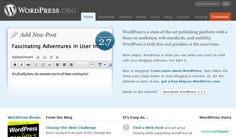
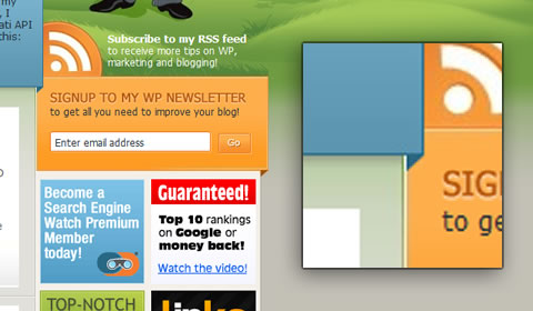
WordPress uses color to add contrast to its most popular link, “Download.” The red stands out among the calm palette of blues and grays but isn’t so bright that it hurts to look at it.
If you’re in doubt about whether you need more contrast, think of it a bit like applying makeup, strangely. The idea is not to get people to say, “Hey, look! Contrast!” You want to naturally draw their attention to important items on the page and highlight features that are already there.
2. Gradients
Developments in technology have brought tools for creating gradients to nearly anyone who wants them. But is that a good thing?
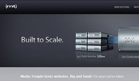
Media Temple has gradients on nearly every page of its website, but moderation and subtlety are the keys to the design’s success. The logo, headlines, buttons and backgrounds all have subtle or minor gradients to emphasize their content. The most complex gradients on the website are found on simple 120 pixel-wide buttons that are intended to grab attention.
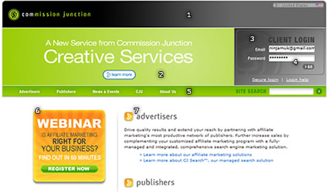
Commission Junction not only uses gradients far less subtly than Media Temple, but implements a variety of different types of gradient:
- Horizontal, linear gradient from black to medium gray at the top of the page.
- Green radial gradient in the background of the green header.
- Faint diagonal gradient over the “CJ” logo in the log-in box
- Light vertical linear fade in each input box background
- Vertical gradient in navigation bar background
- Bright linear fade in Webinar banner
- Another vertical linear fade for headings
The design is a bit adventurous, and for the most part, it works, but it has a few major problems. Most importantly, there’s no consistency. Much like choosing a sensible color palette, designers should carefully choose only a few types of gradient for each project.
For example, the large horizontal gradient (1) pulls the eye along the width of the page. That’s not a problem in and of itself, but right below are both a radial gradient (2) pulling the eye towards the center of the page and another linear fade (3) pulling the eye down and across to the bottom-right corner of the log-in box. This makes the page a little confusing for the user, and the choppy visual flow makes it a little difficult to read.
When working with gradients, it is important to keep a nice visual flow: use gradients sparingly or subtly. And most importantly, use them only when they complement the overall feel of the project.
3. Color
Using color well can be a challenge. Between coming up with a perfect palette and knowing where to put each tone, it’s easy to spend too much time coloring your design.
Realmac Software pulls off a very bold idea by inviting the entire spectrum of colors onto its 404 page. This works for a few reasons. First, Realmac has set the page against a neutral gray background. More importantly, it hasn’t used color anywhere else on the page, with the exception of the blue text links and the small splashes of color far below the fold.
Though the full-spectrum palette grabs attention right away, it’s still simple, and the use of gray keeps it from irritating the eye. Trying to use more than four or five colors in one design would usually overwhelm. Stick to simple four-color palettes unless you’re really confident the design calls for more.
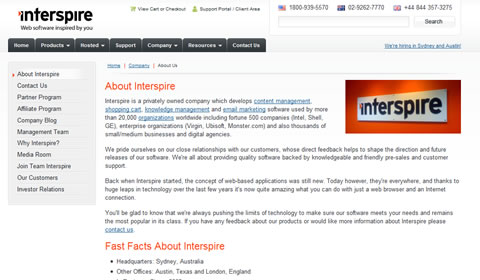
When you use color sparingly and intelligently in your design, it is so much easier to draw attention to important items. On Interspire’s “About Us” page, viewers are quickly drawn in turn to the dash of color in the logo at the top of the page, then straight to the headings and, lastly, to the logo at the right of the page content.
Working with fonts. Typography is an art far deeper than most of us realize. There’s certainly a place for details like ascenders and side bearings, but they’re not nearly as crucial to understand as the following techniques.
4. Letter Spacing
Letter spacing, or kerning, can make a huge difference in headlines, paragraphs, logos and anything else that involves text. It is nothing more than the distance between each pair of letters.
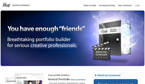
Krop’s new portfolio builder doesn’t do anything too extravagant with the text here. Most of the website’s image-based text reduces letter spacing to make statements more concise and powerful.

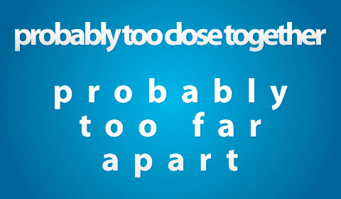
The above illustration shows how letter spacing can have a negative effect on your designs. Small or non-anti-aliased text is most difficult to read with modified letter spacing.
If you haven’t before, tinker a bit with letter spacing in your designs, and you’ll be shocked by the difference it can make. A few good fonts to start with are “Myriad Pro” for images and “Trebuchet MS” for HTML text.
5. Case
… As in uppercase and lowercase. Changing case requires nothing more than pressing the Shift or Caps Lock key, and yet so few designers take advantage of this technique’s potential.
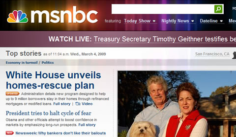
Some of MSNBC’s use of case is obvious. Beyond the all-lowercase logo, however, the company makes subtle use of case in other areas. The large message bar at the top of the page usually says something like “WATCH LIVE” or “BREAKING NEWS.” Considering that the words usually highlight something very important, this is an excellent way to draw attention to these particular announcements.
Additionally, using only uppercase letters allows MSNBC to make its incredibly small buttons just clear enough to be legible. In this 5-pixel-tall application, lowercase letters such as a, m, x and z would be only 2 to 3 pixels tall and not readable at all.
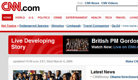
Sticking with news websites for the moment, CNN misses a lot of opportunities to use case to enhance its pages. To its credit, it uses an all-caps navigation menu, but the vast majority of the page is in traditional case, with only the first letter of each sentence capitalized.
6. Anti-Aliasing
Though technically a much more complicated process, anti-aliasing can be summarized as the smoothing out of edges, and it applies to all aspects of design. In the world of Web design, anti-aliasing is partially determined by whether the text will be in HTML or shown as an image. Complicating things a little more, some Web browsers and operating systems automatically smooth out HTML text a bit, but as a general rule, HTML text has no anti-aliasing.
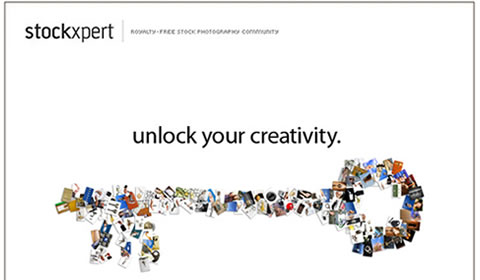
Stockxpert makes a conscious choice on its very simple landing page to anti-alias some lines of text and not others. Most of the text has a very smooth edge and does not appear choppy at all, but that’s not the case for the small text at the top and bottom of the page. Much like the small text on the MSNBC buttons mentioned above, the 5-pixel-tall text needs to have as sharp an edge as possible to be legible. Any blurring or anti-aliasing for text this small would have readers straining their eyes, only to give up.
Mess things up! Thing that look perfect often look fake or uninteresting. Leaves on trees are not exactly symmetrical; lighting of any kind provides uneven shadows and highlights; and camera lenses sometimes blur areas of the shot and produce lens flare. Some designs look great with clean and artificial-looking effects… some need something messier.
7. Imperfection
Anyone who has used a computer for more than 10 minutes will tell you they’re not perfect, but from a design perspective, they can produce perfect results. When you use the Line tool in your favorite design software, with the default settings, you get a perfectly straight line from point A to point B.
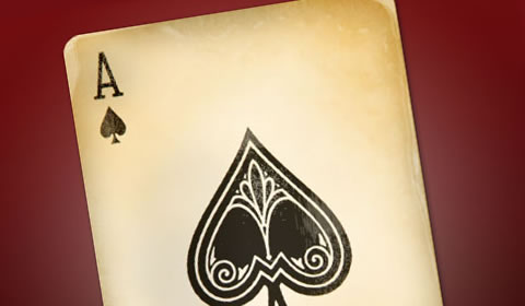
This Antique Ace of Spades tutorial goes through about a dozen steps to make this card look imperfect, which is, admittedly, not very simple. The concept itself, however, is very simple. Make things look old, dirty or otherwise imperfect to give your work a unique touch.

This butterfly photo that looks like it was taken in the mid-1900s is another example of imperfection at its best. The photo was actually taken on a digital camera, then degraded using a few filters and some quick color changes to give it a vintage look.
Successfully adding artifacts and imperfections to a design is easier than you may think. Start by converting items to grayscale or sepia tones, and then go from there.
8. Blur
If you’ve ever been stumped with the predicament of how to make something stand out more, stand out less, or nearly disappear, take a look at using blurs in different ways. By blurring objects in the foreground, background or by blurring the entire design, you can dramatically increase the impact of your project. Focus is, at least in part, relative. By blurring one object, it brings focus to another.
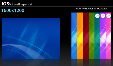
The Ios V2 wallpaper collection uses simple blurs to create a calm, organic view. There are only a few sharp lines to give the image focus, and the blurred background is crucial to the look of the wallpaper as a whole.

Blurs can also be used to give a sense of depth or layering. Windows Vista’s Aero theme blurs anything behind windows for a cool, diffused glass effect. A simple Gaussian Blur tool can create the same effect.
9. Alignment
Even while maintaining clean, straight lines, there are opportunities to give your project that “extra something” it needs.

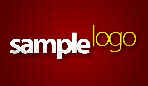
This sample logo gets most of its character from the raised “logo” letters. Altering the alignment of design elements can make them more memorable, more talked about and, consequently, much more effective.
This technique applies not only to text either. Some designers fall back on templates or personal work habits when conceptualizing a design. This can greatly increase the speed with which concepts are turned over to clients; but all too often, it also restricts creativity — especially with regard to alignment.
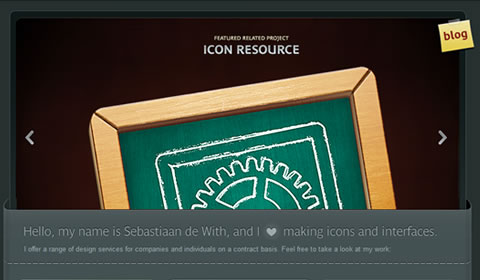
Icon Designer sets itself apart by rotating a few design components. The page would otherwise be fairly monotonous, but the simple rotations keep things interesting.
Most of today’s websites are 700 to 900 pixels wide, are centered vertically in the browser, and have straight edges down each side of the page that determine where content begins and ends. In a lot of cases, this kind of order and predictability is good, but a fair proportion of websites would benefit greatly by their designers’ thinking outside of the box… figuratively and literally.
And most importantly…
10. Trim Fat
Perhaps the most important and under-appreciated design technique, trimming unnecessary parts of a project, is also one of the hardest to do.
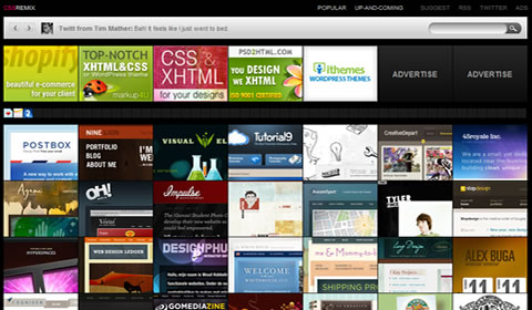
By trimming all unnecessary components, CSS Remix is left with only the essentials and can display seven premium ads (128 by 96 pixels), 53 favicon ads (16 by 16 pixels) and a whopping 56 websites at one time — all in the top 1000 pixels of the page! Even the website’s logo has been trimmed to 53 by 7 pixels.
As with most things in life though, too much of a good thing isn’t always a great thing. The logo is so small that it is hardly recognizable, and the featured websites can be very difficult to distinguish from one another at times. The Twitter feed at the top of the page is, strangely, far more prominent than the website’s logo or navigation.
(al)
Mark Praschan is a Web Developer, Web Designer and Web Project Manager with nearly 10 years of professional experience. He owns and operates Arrival Media and is always looking for innovative new projects to work on. You can follow Mark on Twitter as well.
- 79 Comments
- 1
- 2April 2nd, 2009 1:16 pm
Great article. I think contrast is probably the best way to add something to a design. At a more basic level, it is also a great marketing tool — focusing attention on the most important aspect of the page. In most cases that means the call to action is sticking out.
I also thought the part about imperfection was spot on, too!
- 3April 2nd, 2009 1:21 pm
Nice, very nice. Good designers use it this techniques automatically…its all in your brain !
- 4April 2nd, 2009 1:26 pm
Pretty legit stuff, great examples
- 5April 2nd, 2009 1:45 pm
Another great article, keep up the good work guys !!
- 6April 2nd, 2009 1:45 pm
I like the article, thanks. I agree on the contrast issue, whilst it’s such a powerful tool to emphasize important parts of a page, it’s not used too much, and when it is it’s often in the wrong way.
Why do people believe they can do without designers :P - 7April 2nd, 2009 1:48 pm
Thanks for all the kind words so far guys (and gals) :)
- 8April 2nd, 2009 1:59 pm
This was very well put together! Thank you!
- 9April 2nd, 2009 1:59 pm
really?!…The commission junction is a gradient nightmare… The rest of the stuff is pretty standard design though, nothing new… it’s almost like repeating principles of design that you should already know as a designer… letter spacing, contrast, alignment, not to clutter your designs… etc… but I guess people need that reiterated to them.
- 10April 2nd, 2009 2:05 pm
Interesting article. Do you know where Microsoft stole the semi-transparent borders idea? Remember iMac G4? :-D http://en.wikipedia.org/wiki/IMac_G4
- 11April 2nd, 2009 2:15 pm
Great article! It was a good read.
- 12April 2nd, 2009 2:32 pm
I think Smasing needs more posts like this one, i.e. an analytical breakdown of design principles with links to live sites that I can try and replicate for practice.
- 13April 2nd, 2009 2:36 pm
Great techniques! I’ve naturally been using some of these, and the rest seem very helpful.
- 14April 2nd, 2009 2:41 pm
To be honest, I don’t like the film scratch filters on the Butterfly photo, it looks nothing like a picture taken in the mid 1900s.
- 15April 2nd, 2009 3:04 pm
kinda obvious u guys..
and a bit boring
there’s always a time when you eventually run out of good ideassorry if my comment is a bit harsh, it’s my first here but i’ve been reading your mag for some time and have drawn some inspiration from your posts- so thanks for all the work you do, most of it is great :)
- 16April 2nd, 2009 3:13 pm
Contrast! Color! Gradients! OMG, like so innovating.
If you are going to do a post about design principles, don’t call them “…impressive design techniques.”
- 17April 2nd, 2009 3:19 pm
Contrast! Color! Gradients! OMG, like so innovating.
If you are going to do a post about design principles, don’t call them “…impressive design techniques.”
Second that. Why not focus the posts on more cutting-edge design practices and trends and direct the new designers to books that illustrate basic design principles in more depth? Either that, or at least call it what it is- graphic design 101.
- 18April 2nd, 2009 5:45 pm
Great article. I could not agree more with the importance of gradients, they add depth to the design and liven up designs a great deal.
Excellent job Mark!
- 19April 2nd, 2009 5:50 pm
“call it what it is- graphic design 101.”
Ditto
- 20April 2nd, 2009 5:58 pm
These tips are great but being an art school student at Pratt Institute, I have to add my two sense. There is a clear difference between the types of design tips offered by this website and Pratt’s teachings. I’m only speaking about Pratt because that is all I can attest to. Pratt teaches design as a philosophy. The definition of design is left open ended in the sense that each student must figure out what design means to them. Pratt is there to guide you. They don’t offer a series of tricks and techniques. They teach fundamentals, which are similar to this article, such as letter spacing, but they’re presented in a manner that stresses ‘why’. For example, this article mentions letter spacing, but Pratt teaches you why a certain type of letter spacing works. The difference is design vs. decoration.
Additionally, design follows function and function follows an idea. Pratt teaches students how to be conceptual, how to brainstorm, and how to use design elements to create a design that is true to its purpose.
What do you think? Am I being an art school prick?
- 21April 2nd, 2009 6:02 pm
does anyone know the browser / theme used for this the example under “blur” technique? it’s very pretty and simple
- 22April 2nd, 2009 7:31 pm
I think an 11th design technique that is oft overlooked is the use of white space. Some sites I visit are overrun with content, not giving the visitor any breathing room.
White space is good and it doesn’t necessarily have to be “white,” just some space can help pull a design together.
- 23April 2nd, 2009 7:32 pm
Well written. 5 minutes I’ll definetly get back. Refreshing.
- 24April 2nd, 2009 7:50 pm
Definitely one of my favourite articles on SM! Thank you! Thank you!
- 25April 2nd, 2009 7:51 pm
Letter spacing/tracking ≠ kerning.
- 26April 2nd, 2009 7:53 pm
“call it what it is- graphic design 101.”
Ditto
Ditto your ditto.
- 27April 2nd, 2009 8:30 pm
I absolutely hate it when people don’t hit the Shift key and make proper nouns all lower case. And – I especially hate it when people write in all lower case. (Yes, I’m looking at you Agnes)
The only exception to this rule would be situations like the “iPhone” or “iLoveWhatever” where you try to mash two or more words together but the first word is the letter “I”. In that situation you need to make it lower case to differentiate the two words.
Recently, I worked with someone who was having a logo developed. The company name started with the letter “A”. The designers produced several logos, all of them were all lower case.
The lower case logos looked cool when they were big but the readability was decreased significantly when it was reduced in size for typical placements on the web.
When proper capitalization was used, the logo remained readable at a much, much smaller size because the capitol letter “A” has a very distinct triangle shape.
In general… I would follow the traditional rules of grammar and use proper capitalization whenever possible.
In my opinion – Using all caps or all lower case has a negative impact on readability, especially for people with reading disabilities. Anything that has a negative impact on readability is bad design.
Some people think it creates a more humble persona but I believe it’s a sign of total arrogance. Kind of like people who dress down in business situations where most people would try to look “business like”. (I’m so important, that I don’t need to shave or dress in proper business attire)
- 28April 2nd, 2009 10:27 pm
thanks for helpful post ;)
- 29April 2nd, 2009 10:50 pm
sign #1
Its just a thing everybody knows o0
A professionell “how to” would be much better and usefull,But for the reason to remember all this things its okay :)
- 30April 2nd, 2009 11:03 pm
mmm dave cool down ;)
rotflOk, ok. I’ll behave. But your long winded reply to me has a comical effect considering the fact the text I entered was in a comment section of Smashing Magazine, NOT Time or New York Times to be published in the upcoming issue.
Seriously.. - 31April 3rd, 2009 12:06 am
Very cool tips!
Thank you very much guys. - 32April 3rd, 2009 12:12 am
Thanks for the great article. It’s an excellent reference.
- 33April 3rd, 2009 12:48 am
So cool \m/ Thanks for sharing. I really like the blur one :D I am glad that the design of my blog is nice and follow many of the things mentioned above :)
Regards
- 34April 3rd, 2009 12:51 am
This is a great article. As a designer myself, it is essential that you take all elements of design into account before you start work on a website. The slightest change to a site can either make or break it. From the letter spacing to the colours used and even the imagery, all these factors add up to whether a website will be a success or a fail. Before any work commences, you must research all areas of design. You must research your target market, your competition and current websites that are related to your specific line of work.
- 35April 3rd, 2009 12:52 am
Quick pointer for site-developers, the CSS property text-transform can force text uppercase, lowercase, capitalized. Don’t force your users to type in caps, it will seem mad to screen readers.
Letter-spacing for kerning, word-spacing for … well you get the idea. - 36April 3rd, 2009 12:54 am
This article is a good reminder on things every designer should know by heart but sometimes get forgotten. Thanx for reminding me on the simple basics that have great effect.
- 37April 3rd, 2009 1:29 am
Awesome listing, but …
…where is ‘reflection’? - 38April 3rd, 2009 1:32 am
Thanks, great post. I’m a web developer, not a designer, so these points are useful, even if some call them 101 :)
- 39April 3rd, 2009 2:33 am
Couldn’t agree more!! Let’s not forget the basics. Love your insights, guys. More power…
- 40April 3rd, 2009 3:24 am
Simple and effective tips — thanks!
- 41April 3rd, 2009 3:25 am
Excelente artigo
- 42April 3rd, 2009 3:47 am
as a general rule, HTML text has no anti-aliasing.
That’s not really true any more. IE7 turned on ClearType by default (even if it’s off for the system) on XP, so it’s really only Win2000 users and IE6-on-XP that don’t get anti-aliasing. OS X has good support, Vista has it turned on by default and even Ubuntu has it on by default these days.
- 43April 3rd, 2009 4:24 am
shhh! you’re giving away all my secrets! Subtle design is often the most impressive.
ps. you forgot about shadows :)
- 44April 3rd, 2009 4:40 am
Good tips.
Re: #5 Case
“… As in uppercase and lowercase. Changing case requires nothing more than pressing the Shift or Caps Lock key,”
It’s better to use CSS text-transform
- 45April 3rd, 2009 5:09 am
Thanks for this techniques is verry practice to me :D
- 46April 3rd, 2009 5:31 am
@Melissa “does anyone know the browser / theme used for Link [88.198.60.17] the example under “blur” technique? it’s very pretty and simple”
It looks like Google Chrome.
http://www.google.com/chrome - 47April 3rd, 2009 5:39 am
Melissa, you said:
“does anyone know the browser / theme used for Link [88.198.60.17] the example under “blur” technique? it’s very pretty and simple”
It’s Google Chrome on Vista (with Aero enabled).
- 48April 3rd, 2009 5:55 am
Great article!
- 49April 3rd, 2009 6:04 am
Nice and usefull tips.
- 50April 3rd, 2009 6:18 am
Awesome post! I am going to have to fav this and try to use some of these tips in my designs.
Take care!
- 51April 3rd, 2009 6:31 am
A interesting read. If designers are not already using most of these techniques, and start pushing beyond what they are taught and read, then they are in real trouble.
- 52April 3rd, 2009 7:10 am
Awesome post, a lot of great details that are often times thought over
- 53April 3rd, 2009 7:58 am
Great post! I definitely lol’d at that first comment. Not sure if he’s serious, you never know. . .
- 54April 3rd, 2009 10:07 am
Letterspacing (also known as tracking) is not the same as kerning. Kerning is done only between two specific characters, called a kerning pair. For example, the kerning pair AV should be kerned tigher than OB, and each kerning pair should have varying amounts of kerning depending on the letterforms and how they relate visually to each other. This is a global setting for every time that pair appears, and ideally should be included in the font (any well-designed font does), and if not, can be adjusted in the layout program. CSS has no control over kerning and must rely on the kerning specified in the font. Letterspacing, which was described correctly, adjusts the space between every letter, regardless of shape.
- 55April 3rd, 2009 10:44 am
I was about to say the same thing as Ryan Kirk. He explains it perfectly.
- 56April 3rd, 2009 11:22 am
Great tips. Sometimes its just coming back to an article like this and using one idea that can push a website design that just isn’t quite there yet over the top.
Also, its nice to see you critiquing some sites as well instead of just showcasing dozens of sites that use the techniques you are talking about well.
- 57April 3rd, 2009 8:08 pm
Great article thanks for the simple but VERY important ways to make your page standout.
- 58April 4th, 2009 12:07 am
Ooh… I like these kind of articles very much! More!!
- 59April 4th, 2009 1:09 am
Very excellent article on design techniques. I especially like the important information on gradients and Joost de Valks work.
- 60April 4th, 2009 2:43 am
any of you know for any website where i can REALLY see something new or learn something more than just basics?.. article is good, but for designer newbies.. i belive all can agree on that.
- 61April 4th, 2009 2:52 am
great idee from joost van der valk
- 62April 4th, 2009 4:18 am
what
- 63April 5th, 2009 3:44 am
good post
- 64April 5th, 2009 9:46 am
really an useful post. useful for the designer community. great work dude.
- 65April 5th, 2009 1:29 pm
Great article. Can someone please explain how the “Contrast” effect is created – particularly with the slightly inner displaced 1px contrasting stroke? is there a tutorial on this somewhere?
- 66April 5th, 2009 10:59 pm
Nice Simple tips to Make a simple design look great. Thanks a Lot.
- 67April 6th, 2009 12:20 am
1 – Gradients
You miss off the important point that althorugh different gradietns can lead the user in different ways you should always consider a light source. after variations in light are caused by the light source, and like a painting, every webstie should have one (in my eyes this is THE most important consideration)
2 – Colours
On the first example you say that it works due to the neutral grey background, I have news for you, its not grey, it’s blue. Think you need to sort out your monitors colour profile :)
Apart from that it was an ok article!
- 68April 6th, 2009 2:53 am
I like this ‘ Imperfection ‘.
- 69April 6th, 2009 7:00 am
color, blur, contrast! my favorite :)
thanks :D
- 70April 7th, 2009 4:35 am
very nice topic :) i love it :) thanks
- 71April 7th, 2009 7:29 am
i agree with the following comments:
- “call it what it is- graphic design 101.”
- “you forgot shadows”
- “you forgot gradients”smashing is a miag i really like to read, when i have the time. but using such a title and only showing off the same-blabla-content everybody who lookes at 5 newer/trendy homepages will know this by him-/herself. if not, then she/he is not doing pretty much with designing. not even as a hobby. some more indepth-knowledge would have been appreciated. too many “xynumber of whatever”-articles out there on too many blabla-sites. i thought smashing is on top and not following the croud…
harsh, i know. but i still want to love smashing mag…
- 72April 7th, 2009 7:43 am
Sweet post!! Lots of great small ideas that make huge impact on the design. I re-blogged it on my blog. You guys rock!
- 73April 12th, 2009 9:51 am
Uno de los mejores sitios para diseño y desarrollo que he visto ultimamente!
estoy como 4hr seguidas aca ajjaj.great job
- 74April 16th, 2009 2:11 am
Very good, if a developer/designer follow these precious ideas definately will do better in their field………
- 75April 17th, 2009 11:00 am
I understand the article points basic principles but for all you out there saying “this is design 101″ …well, sometimes it is very useful to go back to the source that we often forget in the middle of all the cutting edge stuff.
If you are so cutting edge yourself, write an article and share it with us ;) - 76April 26th, 2009 6:40 pm
Thanks for the list~
I looked at the Media Temple website and I’m curious to know how they did their menus. Any help would be appreciated. Thanks.
- 77May 18th, 2009 2:15 pm
@Ryan
Late answer, so you probably won’t see this, but… it looks like:
http://users.tpg.com.au/j_birch/plugins/superfish/#examples - 78June 16th, 2009 9:04 pm
REALLY NICE Sweet Article
- Good points for those who are not experts in graphic design.
- Helpful illustrations
- Nice variety - 79November 19th, 2009 2:56 pm
Great Post. Some simple tips but very affective as well.
- 00
There are no trackbacks at this time. If you are interested in leaving a trackback, please use this URL.
Leave a Comment
Make sure you enter the * required information where indicated. Please also rate the article as it will help us decide future content and posts. Comments are moderated – and rel="nofollow" is in use. Please no link dropping, no keywords or domains as names; do not spam, and do not advertise!
Interact
Popular
- 100 Wordpress Themes
- Photoshop Tutorials
- Fantastic Wallpapers
- 40+ Excellent Freefonts
- Dual-Screen Wallpapers
- Wordpress Themes for 2009
- Illustrator Tutorials
- Incredible Free Icon Sets
- High-Quality Free Fonts
- 30 Scripts For Galleries
- Photoshop Text Effects
- Useful Icon Sets
- Web Design Trends
- iPhone Wallpapers
- Before Launching a Website
- CSS Layouts And Templates
- Photoshop Actions
- Stunning Pictures and Photos
- Fantastic HDR Pictures
- Logo Design Tutorials
- Free Design Templates
- 10 Mistakes In Logo Design
- Photoshop Custom Shapes
- 40 Creative Design Layouts
- 8 Layout Solutions
- 53 CSS Techniques
- Photography Techniques
- Black & White Photography
- Styling Design Elements
- CSS-Based Forms
- 50 jQuery Techniques
- 50 Portfolio Websites
- 50 CSS Techniques
- Creative Logo Designs
- Desktop Wallpapers
- 25 Open Source Mac Apps
- 50 Free Icon Sets
- The Big Showcase Of Online T-Shirt Stores - http://bit.ly/5Tq8uA
- @ilmv oh ok then ;)
- @ilmv no, the SM Book will not be out of date :) We made sure it contains universal design, usability and marketing principles.
- Apple ad bombing Windows 7 on Google - http://bit.ly/28ctPq
- Atatonic - a fresh CSS framework - http://bit.ly/4oOV2w (via @umutm)
- @HrvojeKC yes, that's an interesting idea. Maybe when the waiting is over, we'll write a detailed post about it.


Yeah, thanks for telling me about gradients. I’m dumber than most and was always like “how do dey do dat?” my designs will be AWESOME— NOW!!!!!!!