8 Simple Typography Tips For Your Designs

Email Newsletter
Weekly tips on front-end & UX.
Trusted by 182,000+ folks.
 Register for Free
 Celebrating 10 million developers


 Custom Web Forms for Angular, React, & Vue. Your backend.
Many people, designers included, think that typography consists of only selecting a typeface, choosing a font size and whether it should be regular or bold. For most people it ends there. But there is much more to achieving good typography and it’s in the details that designers often neglect.
These details give the designer total control, allowing them to create beautiful and consistent typography in their designs. While these details can be applied across different types of media, in this articles we’re going to focus on how to apply them to web design using CSS. Here are 8 simple tips you can use CSS to improve your typography and hence the overall usability of your designs.
Further Reading on SmashingMag:
- 10 Principles For Readable Web Typography
- Applying Macrotypography For A More Readable Web Page
- 16 Pixels: For Body Copy. Anything Less Is A Costly Mistake
- How To Choose The Right Face For A Beautiful Body
1. Measure
The measure is the length of a line of type. To a reader’s eye, long or short lines can be tiring and distracting. A long measure disrupts the rhythm because the reader has a hard time locating the next line of type. The only time a narrow measure is acceptable is with a small amount of text. For optimum readability you want the measure to be between 40-80 characters, including spaces. For a single-column design 65 characters is considered ideal.
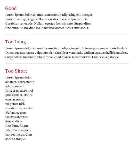
A simple way to calculate the measure is to use Robert Bringhurst’s method which multiples the type size by 30. So if the type size is 10px, multiplying it by 30 gives you a measure of 300px or around 65 characters per line. The code would look something like this:
p {
  font-size: 10px;
  max-width: 300px;
}
I’m using px because it makes the math easier but this also works with em’s.
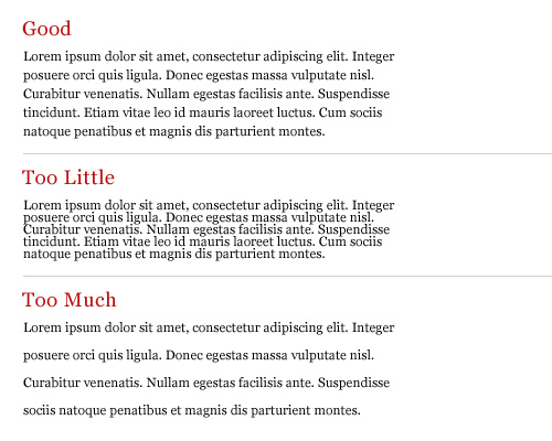
2. Leading
Leading is the space between the lines of type in a body of copy that plays a big role in readability. Correctly spaced lines make it easier for a reader to follow the type and improves the overall appearance of the text. Leading also alters typographic color, which is the density or tone of a composition.
Many factors affect leading: typeface, type size, weight, case, measure, wordspacing, etc. The longer the measure, the more leading is needed. Also, the larger the type size, the less leading is required. A good rule is to set the leading 2-5pt larger than the type size, depending on the typeface. So if you set the type at 12pt, a 15pt or 16pt leading should work well on the web.
This takes some finessing to get the right spacing but here is an example of what the code would look like:
body {
font-family: Helvetica, sans-serif;
font-size: 12px;
line-height: 16px;
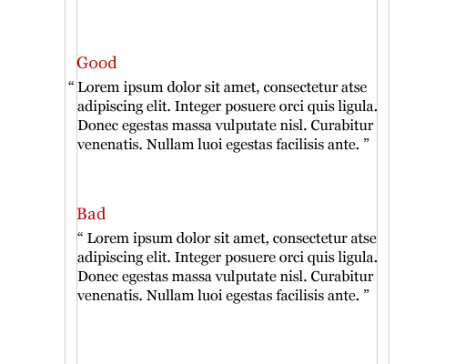
}3. Hanging Quotes
Hang quotes in the margin of the body of text. By not doing so a quotation mark that is flush with the text will interrupt the left margin and disrupt the rhythm of the reader. Hanging quotes keeps the left alignment intact and balanced therefore increasing readability.
This is achieved very easily with CSS using the blockquote element:
blockquote {
  text-indent: -0.8em;
  font-size: 12px;
}
The negative indent will vary depending on the typeface, type size and margins.
4. Vertical Rhythm
A baseline grid is the foundation for consistent typographic rhythm on a page. It allows the readers to easily follow the flow of the text, which in turn increases readability. A continuous rhythm in the vertical space keeps all the text on a consistent grid so that proportion and balance are retained throughout the page, no matter the type size, leading or measure.
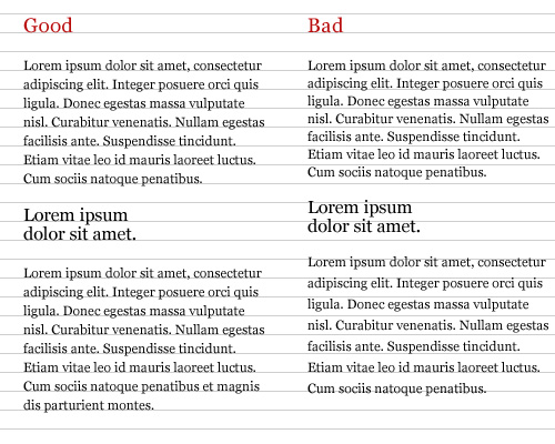
To keep a vertical rhythm in CSS, you want the spacing between elements and the line-spacing (leading) to equal the size of the baseline grid. For example, lets say you’re using a 15px baseline grid, meaning that there are 15px between each baseline. The line-spacing would be 15px and the space between each paragraph would also be 15px. Here is an example:
body {
  font-family: Helvetica, sans-serif;
  font-size: 12px;
  line-height: 15px;
}

p {
  margin-bottom: 15px;
}
This allows each paragraph element to align with the grid, keeping the vertical rhythm of the text.
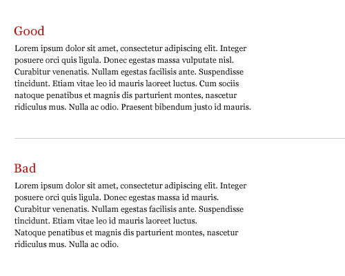
5. Widows and Orphans
A widow is a short line or single word at the end of a paragraph. An orphan is a word or short line at the beginning or end of a column that is separated from the rest of the paragraph. Widows and Orphans create awkward rags, interrupt the reader’s eye and affect readability. They can be avoided by adjusting the type size, leading, measure, wordspacing, letterspacing or by entering manual line breaks.
Unfortunately, there is no easy way to prevent typographic widows and orphans with CSS. One way to remove them has been mentioned above, but there is also a jQuery plug-in called jQWidon’t that places a non-breaking space between the last two words of an element.
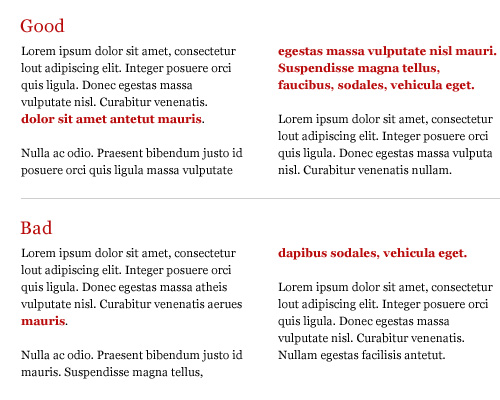
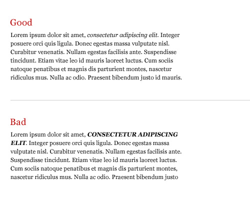
6. Emphasis
Giving emphasis to a word without interrupting the reader is important. Italic is widely considered to be the ideal form of emphasis. Some other common forms of emphasis are: bold, caps, small caps, type size, color, underline or a different typeface. No matter which you choose, try to limit yourself to using only one. Combinations such as caps-bold-italic are disruptive and look clumsy.
Here are some difference ways of creating emphasis with CSS:
span {
  font-style: italic;
}

h1 {
  font-weight: bold;
}

h2 {
  text-transform: uppercase;
}

b {
  font-variant: small-caps;
}
Keep in mind that the font-variant style only works if the font supports the small-caps variant.
7. Scale
Always compose with a scale, whether it’s the traditional scale developed in the sixteenth century that we’re all familiar with, or one you create on your own. A scale is important because it establishes a typographic hierarchy that improves readability and creates harmony and cohesiveness within the text.
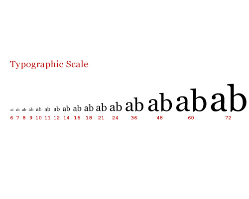
An example of a typographic scale defined in CSS:
h1 {
  font-size: 48px;
}

h2 {
  font-size: 36px;
}

h3 {
  font-size: 24px;
}

h4 {
  font-size: 21px;
}

h5 {
  font-size: 18px;
}

h6 {
  font-size: 16px;
}

p {
  font-size: 14px;
}
8. Clean Rags
When setting a block of text unjustified with a left or right alignment, be sure to keep the rag (the uneven side) balanced without any sudden “holes” or awkward shapes. A bad rag can be unsettling to the eye and distract the reader. A good rag has a “soft” unevenness, without any lines that are too long or too short. There is no way of controlling this in CSS, so to achieve a good rag you must make manual adjustments to the block of text.
Hyphenation can also help with producing clean rags, but unfortunately CSS can’t handle this at the moment. Maybe in the near future we’ll see some control in CSS 3. Not all is lost though. There are some server and client side solutions for auto hyphenation like phpHyphenator and Hyphenator as well as online generators.
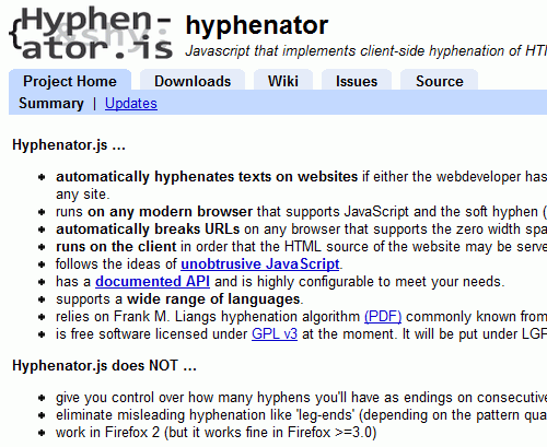 Hyphenator.js is a Javascript-library that implements an automatic client-side hyphenation of Web-pages.
Further Resources
Here’s a list of related articles and books to further help you with the details.
- Compose to a Vertical Rhythm Richard Rutter - 24 Ways
- Setting Type on the Web to a Baseline Grid Wilson Minor - A List Apart
- Setting Web Type to a Baseline Grid Craig Grannell - Opera
- The Elements of Typographic Style Applied to the Web Robert Bringhurst
- How to Size Text in CSS Richard Rutter - A List Apart
- Baseline Rhythm Calculator Geoffrey Grosenbach
- Detail In Typography Jost Hochuli
- The Elements of Typographic Style Robert Bringhurst
- Thinking with Type Ellen Lupton
- Grid Systems in Graphic Design Josef Müller-Brockmann


