Showcase Of Well-Designed Tabbed Navigation

Email Newsletter
Weekly tips on front-end & UX.
Trusted by 200,000+ folks.


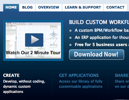
 Flexible CMS. Headless & API 1st

There are an extensive amount of roads you can take in web design, specifically in navigation. Here, we will talk about one specific navigation technique, tab-based navigation. If properly carried out, tabbed navigation can be very clean and organized within a web layout.
So what is tabbed navigation? Well, it is essentially a set of buttons most often set horizontally. Tabs generally follow numerous different styling guidelines. First, a tab set usually is attached to or slightly protrudes from a container, like in the example below. Also, notice how the open tab matches the background color of the container, and the other buttons are darker. This is another common styling guideline.
When you look at tabbed navigations, you will also notice many styling trends. First, many tabs will have rounded corners on buttons. This helps to create a clean look. Also helping to make a clean look is the use of separation between buttons. Most designs use space to separate buttons, but a bevel, single line, or background color contrast will also look nicely.
Further Reading on SmashingMag:
- Designing Drop-Down Menus: Examples and Best Practices
- 50 Beautiful And User-Friendly Navigation Menus
- Best Practices In Modern Web Design: The Ultimate Round-Up
- Navigation Menus: Trends and Examples
You will also see the use of hover effects, which is a common usability characteristic of the tabbed navigation. Gradients, radial and linear, help to achieve an impressve hover effect that brings dimension to the button that the user is selecting. Actually, you will notice that many tab buttons, selected or not, will use a slight gradient to add depth and demension to the button.
This is a very simple detail often used to bring extra styling to many different user interface elements, such as buttons. The most important aspect in the design of tabbed navigation is that the active tab needs to be clear and obvious. This is what separates a tabbed navigation from an ordinary horizontal row of buttons or hyperlinks.
So, with all of that in mind, take a look at these 50 excellent tabbed-navigations shown below. Look for the trends, and follow the link to further inspect the usability of the tabbed navigation and how it looks with the rest of the design.
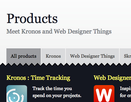
Good Tab Based Navigation in 2009
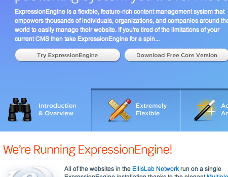
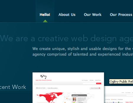
ExpressionEngine This tab set is beautifully styled. It uses a bevel to seperate tabs, large buttons, and clean typography with icons.
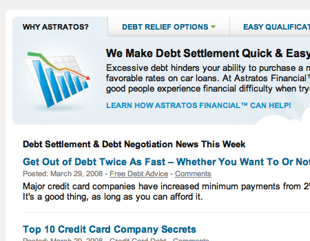
Astratos Another tab navigation that is clean because of rounded corners and use of a gradient to style.
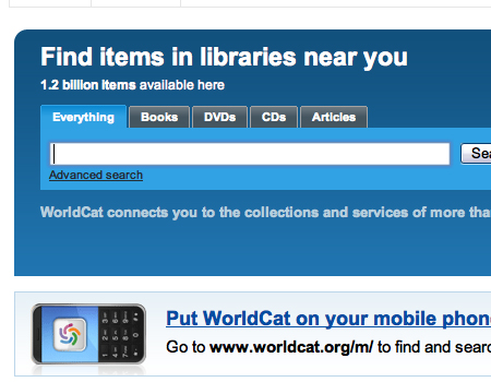
WorldCat Rounded corners and clean separation.
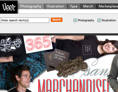
Veer These tabs have beautiful styling. Notice the use of different colors and a drop shadow for separation purposes.
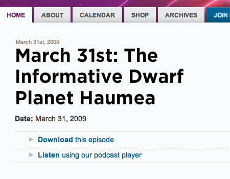
365 Days of Astronomy Use of different colors and a drop shadow to separate the tabs not in use.
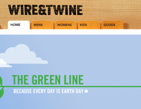
Wire & Twine This is some excellent texture use with a clean layout.
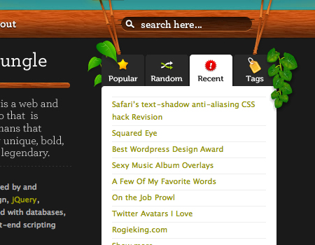
Komodo A good example of tabs used in a module.
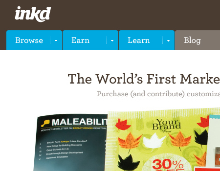
Inkd Good styling and usable because of size and separation.
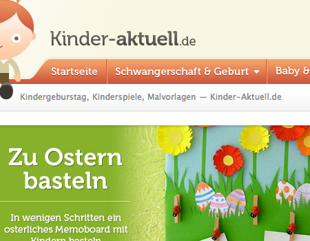
Kinder-Aktuell Good gradient use and separation.
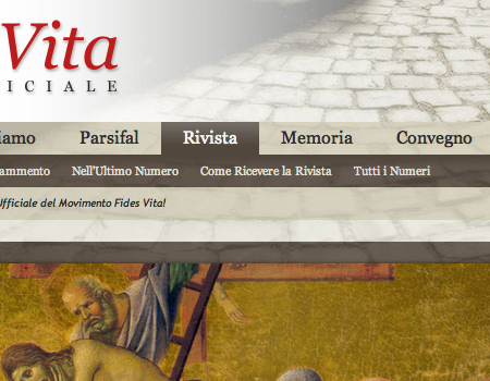
FidesVita Tabs used with a sub navigation.
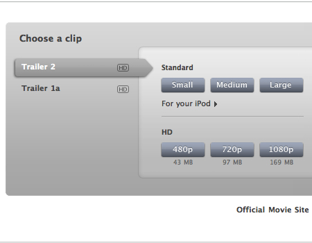
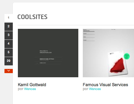
Apple Movie Trailers Excellent styling and a strong example of a vertical tab layout.
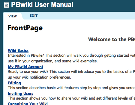
PBwiki Simple yet clean tabs.
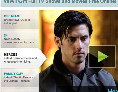
Fancast Another vertical tab set up, this time used in a slider instead of content navigation.
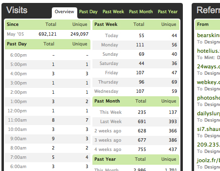
Mint Tabs used in a very content heavy module
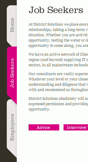
District Solutions Vertical tabs are used very rarely. But they can look good!
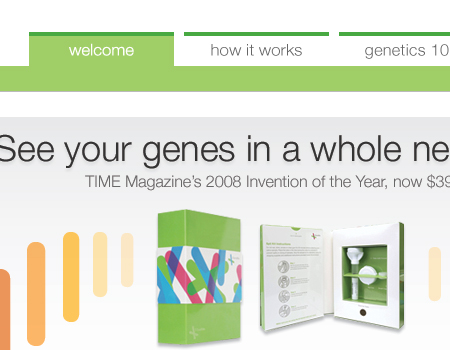
23andMe Good coloring and use of a border to differentiate the tabs from the body background.
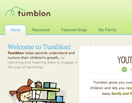
Tumblon Very clean tabs with a border.
STUDIO7DESIGNS This tab styling uses a gradient for a cool fading appearance, and a sub navigation is included.
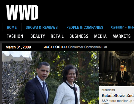
WWD A simple yet usable tab system with a sub navigation.
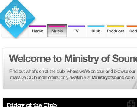
Ministry of Sound On this tab system, a gradient is used to add depth to the selected button.
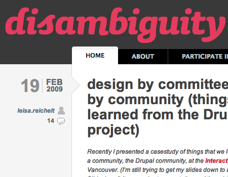
Disambiguity Use of rounded corners and a strong color difference to separate the tabs not in use.
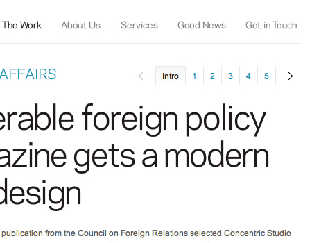
Concentric Studio A very simple and usable tab navigation.
Domestika A vertical tab layout with coloring.
crowdSPRING A simple tab system. This one uses a large size as well as a different color to make the selected button pop.
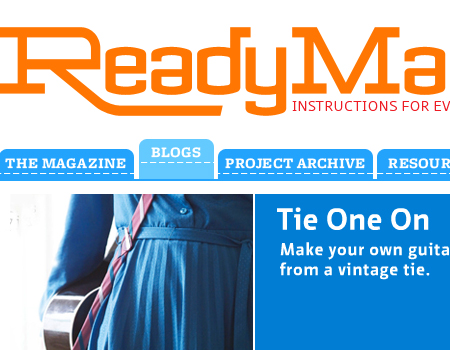
Ready Made A well-styled tabbed navigation.
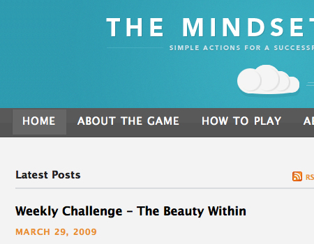
The Mindset Game Another very simple and easy tab navigation that works perfectly.
nclud A little bit different tab setup that only styles the selected button.
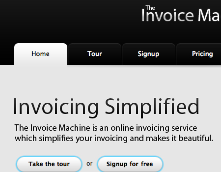
The Invoice Machine The navigation below uses a strong color difference, usable buttons, and borders to separate tabs from the rest of the design.
FreeAgent A good example of the background of the container flowing with the button.

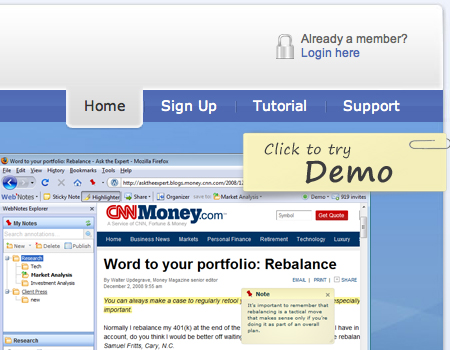
Web Notes This is very organized, and it appears to tab down instead of up like most.
Magpie Doesn’t get much more simple than this, but still a good example.
Two December Nice styling that works perfectly with the rest of the layout.
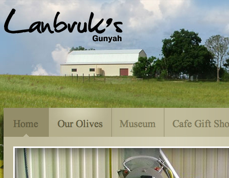
Lanbruck’s Another very beautiful tab layout, notice the slight hover effect that can be seen on the second tab over.
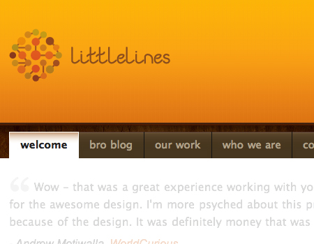
LittleLines This is one of the better examples of styling in this showcase because of the gradients to add dimension to the buttons and strong borders.
Thuiven A very nice color harmony and contrast between the selected tab and the others.
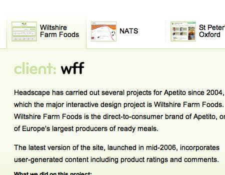
Headscape Another button that uses a gradient to fade out, creating an awesome appearance.
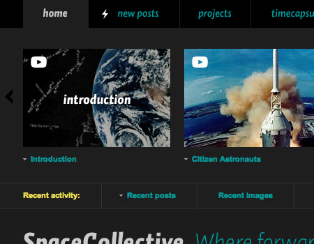
Space Collective Very simple but functional at the same time.
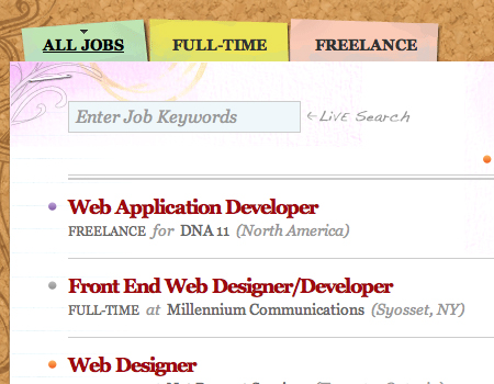
Jobs on the Wall More brilliant styling, these tabs fit perfectly with the other elements on the site.
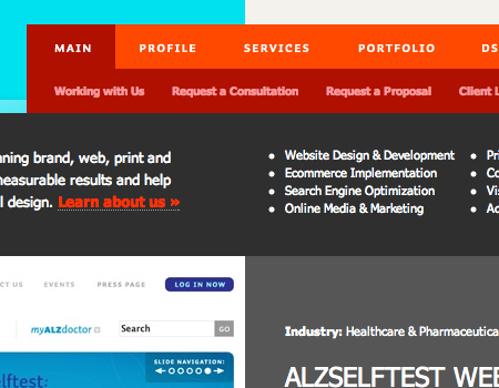
Designsensory Very basic styling with strong colors and a sub navigation.
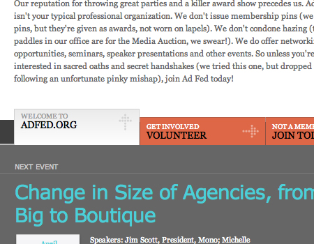
Ad Fed Here is another smooth and visually appealing tab navigation set.
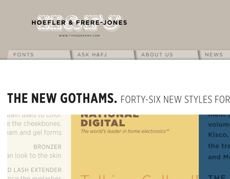
Hoefler and Frere - Jones Use of slanted sides instead of rounded corners makes this tab-based navigation interesting and unique.
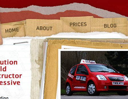
Revolution Drviving Brilliant button backgrounds that aren’t over the top make these tabs really great.
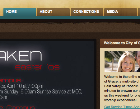
City of Grace A good example of tabs that work nice colors into a usable layout.