The Smashing Book: Vote For The Book Cover Now!

Email Newsletter
Weekly tips on front-end & UX.
Trusted by 182,000+ folks.


 Celebrating 10 million developers
 Custom Web Forms for Angular, React, & Vue. Your backend.

The Smashing Book project is now entering its next phase. Based upon your tremendous feedback, we have finalized the concept and the outline for the book. In fact, the topics have been selected and our writers have already started to brainstorm the ideas for their chapters in the book. The one thing that still remains to be discussed is how the book will actually look like.

And since the Smashing Book is supposed to be the community book, we would like you to decide what design would fit the book best. In this post we present 6 book cover designs that were designed by the community for the Smashing Book Project. We let you decide what book cover the Smashing Book will have. Please vote in the poll below – it’s your turn now!
Details about the book cover
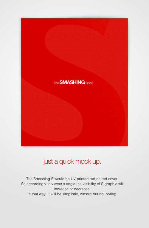
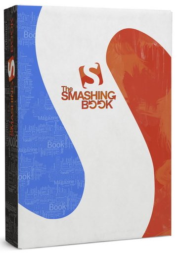
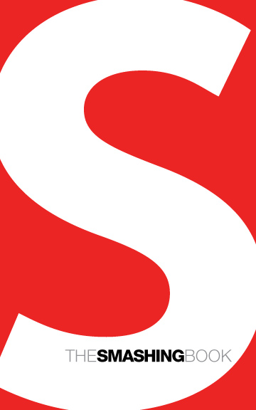
We have picked out 6 most interesting book cover designs amond a number of drafts suggested in the forum. We think that every design presented below is appropriate for the Smashing Book. However, what cover makes the book look really smashing?
Please notice:
- the book will be a paperback, not hardcover as shown in some drafts below,
- the book will not be available in stores or any retail stores — it doesn’t have to fight for customer’s attention against numerous other books in stores.
- the book should make a really good impression online.
What cover design should the Smashing Book have?
Below you’ll find a brief overview of the 6 book cover designs. You will find more detailed information and preview of each design below, under the poll. You can click on the image for a larger preview. You can vote for multiple designs. Please vote now!
What cover design should the Smashing Book have?
( polls)
Participants
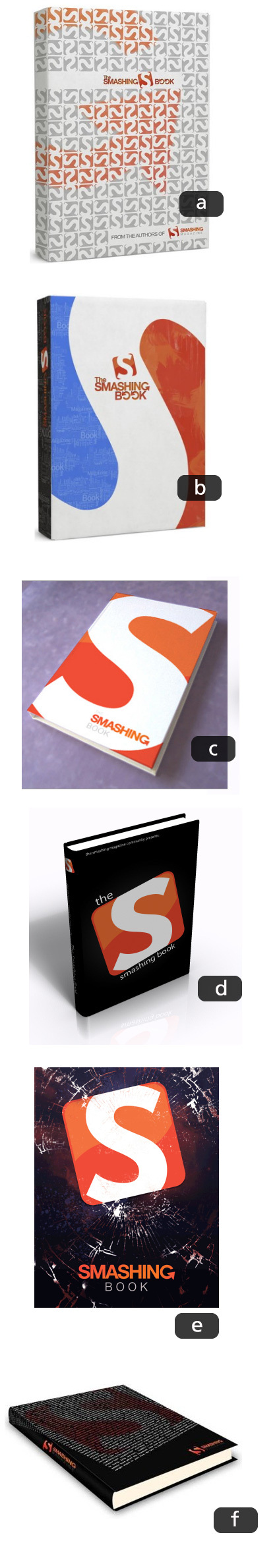
Here are more details and images of each design. Thank you to designers for participation!
- jokr (1)
- jokr (2)
- briannelsondesign
- motd
- Static44
- mjmonserrat
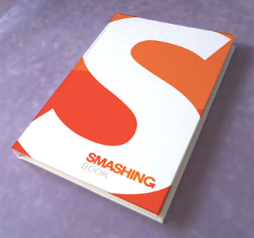
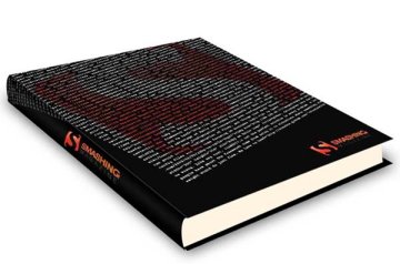
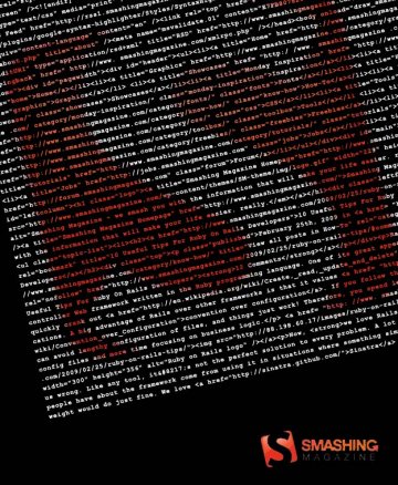
a) jokr 1
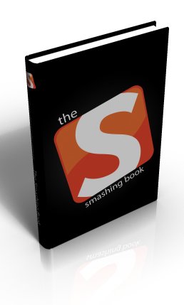
b) jokr 2
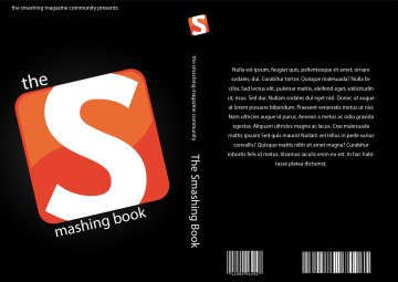
c) briannelsondesign
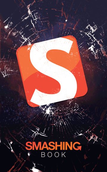
d) motd
e) Static44
f) mjmonserrat
Thank you for participation, folks! And please feel free to let us know your ideas, thoughts and suggestions in the comments to this post! Thank you for your time.


