Smashing Magazine - we smash you with the information that will make your life easier. really.
Beautiful And Creative Logo Designs For Your Inspiration
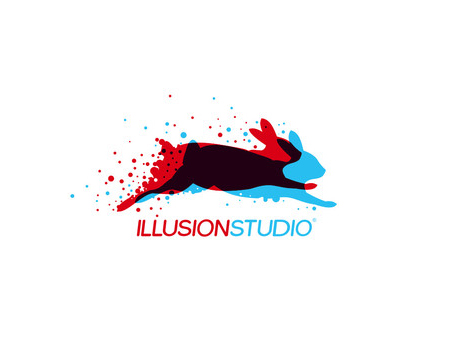
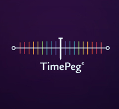
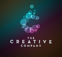
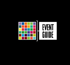
Last week we already presented our first selection of beautiful, clever and creative logo designs. This post presents the second part of our selection, featuring even more beautiful and creative logos that will hopefully inspire you or at least give you the idea of what the current logo design trends look like.
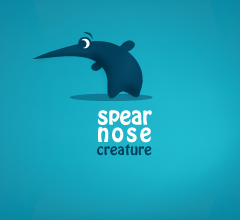
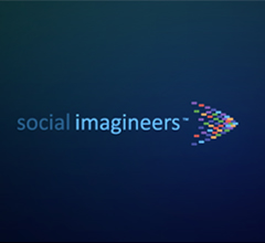
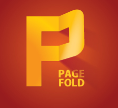
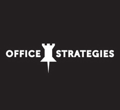
Just as last time, we focused on logos that use creative methods to represent the brand through color, shapes, and typography. Every design presented below tells you something about the company that it is supposed to represent. Also note the brilliant color palletes and unique patterns used in many of these. Finally, pay attention to the typography, especially font selection and coloring.
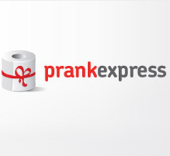
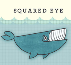
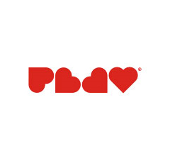
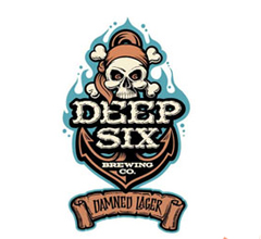
Below you’ll find a collection of 40 more beautiful and creative logo designs to inspire you. Browsing through the showcase, you will notice many trends. Some of these include the usage of simple shapes to create something complex, origami shapes, coloring and transparency trends, and many more. You may want to take a look at the post Logo Design Trends 2009 for further reference.
40 Creative Logo Designs
Further Resources
You may want to take a look at the following related posts:
- Logo Design Trends 2009 (logoorange.com)
- Logo Design Trends 2009 (1stwebdesigner.com)
Matt Cronin is an avid graphic designer, web designer/developer, Cocoa programmer, photographer, digital artist, and the like. He also enjoys writing, and does quite a bit of writing for Smashing Magazine. He is currently working on a startup called VAEOU, which will have new services coming soon.
- 127 Comments
- 1
- 2April 9th, 2009 1:45 pm
these are nice, but where are the WP themes? Are you done with them?
These logos, and inspirations were submitted last week. You should submit and release more
free CSS / XHTML templates for designers to download. - 3April 9th, 2009 1:45 pm
I couldn’t figure out the heart one until I looked away and saw it out of my periphery. What a trip.
- 4April 9th, 2009 1:45 pm
Esooo, bien ahy viejaa….
che va a llegar el libro de smashing magazine a argentina?
besooo
- 5April 9th, 2009 1:45 pm
wow, some real amazing works!
- 6April 9th, 2009 1:52 pm
I was working on a logo – fits along with my day and seeking inspiration nicely. Thanks!
- 7April 9th, 2009 1:53 pm
Some of those are really amazing…yet others are so simple I have to wonder why they are included (maybe they are genius in their simplicity idk).
- 8April 9th, 2009 1:53 pm
The Horror Films logo is about seven shades of brilliant. Excellent work. Honorable mention to the Schizophrenic logo as well. Yes, I like simple. :)
- 9April 9th, 2009 1:55 pm
Great logos! love the Family one.
- 10April 9th, 2009 2:03 pm
i hate wordpress.
- 11April 9th, 2009 2:11 pm
Totally agree – the Horror Films jumped off the page. The “6″ logo or whatever it is – is physically painful to look at. Which must be a brilliant marketing move – though I don’t get it. the rest are very good.
- 12April 9th, 2009 2:14 pm
Great selection!
- 13April 9th, 2009 2:15 pm
Thanks for featuring my work again, but can you please fix the credit/link from my logo? Is it a punishment for my critique on the way you’re presenting the logos here? I still think they are cramped in those tight squares :) Also, is there a particular reason why some of the logos link to sites of the authors, while some of them are linked to various logo portfolios, besides obvious reasons – ie not having the time to research :) There are several personal favorites here, two of them would be play and families. Nice collection!
- 14April 9th, 2009 2:21 pm
Excellent round up! I’ve admired several of this designs before.
Its an honor to have a few of mine included (Horror Films, Schizophrenic and Office Strategies). Thank you!
- 15April 9th, 2009 2:23 pm
When oh when will people learn that schizophrenia has nothing to do with multiple identities and is not bipolar…
- 16April 9th, 2009 2:38 pm
Bojan – which are yours?
Josiah – Horror Films – again – fun brilliant – what is the logo for (project, fun?)
- 17April 9th, 2009 3:14 pm
Awesome logos, recent found this logo and totally love it
- 18April 9th, 2009 3:17 pm
The prank one :) I thought you were joking with me linking it to this article :)
- 19April 9th, 2009 3:48 pm
families and playground. so aweeeeesome
- 20April 9th, 2009 3:51 pm
The one with the hearts is terrible. Yeah it’s kind-of clever, but it is completely impractical.
- 21April 9th, 2009 3:53 pm
the schizophrenic logo is just awesome
- 22April 9th, 2009 4:09 pm
Horror Films, PLAY & Families are my favourites!
Amazing! - 23April 9th, 2009 4:24 pm
I may have to copy some of those straight. haha
- 24April 9th, 2009 5:35 pm
Really? You think shleep is creative? Looks really lazy to me.
- 25April 9th, 2009 5:38 pm
family logo~~I like it~~:)~~~
- 26April 9th, 2009 5:54 pm
Thanks for adding my tiny mouse design logo!
- 27April 9th, 2009 6:05 pm
Some of these logos are very well crafted. Horror Films, Families and More being the best. They’ll work in greyscale, are scalable, are quickly read and understood, and will work even at a small size.
There are quite a few, though, that looks uninspired – some look like a million and one other you see at the Logo mill, churned out by the dozen.
just imo.
- 28April 9th, 2009 6:29 pm
The Paradox logo is brilliant.
- 29April 9th, 2009 6:37 pm
cool
- 30April 9th, 2009 6:55 pm
Nice list, a little something to provoke the thought!
- 31April 9th, 2009 6:58 pm
meh some are ok but half of these would never work in black and white. First rule we were told in school was that concepts for logos should always be able to work in B&W and color.
- 32April 9th, 2009 7:17 pm
Horror films + Paradox jump off the page.
@jamie – you also have to consider the usage; for instance, Microsoft’s Silverlight logo will never reproduce well in print or b+W, but it’s inconsequential because that logo will likely never leave the web (or be low-res, for that matter).
- 33April 9th, 2009 7:37 pm
Yeah, really nice. Ignorant fools might want to read up on the history of Obama’s logo before you talk about how awesome it is.
- 34April 9th, 2009 7:49 pm
The Obama logo just doesn’t belong. Way overrated and over used. Honestly it’s almost worst than the new Pepsi logo.
- 35April 9th, 2009 7:52 pm
i like time mouse design . it is so nice.
- 36April 9th, 2009 7:57 pm
Once again,an excellent list !
- 37April 9th, 2009 9:17 pm
Great collection! It’s exciting to see how many of these logos are from IncSpring! Thanks for sharing!
- 38April 9th, 2009 9:24 pm
The schizophrenic logo makes no sense. The smile/frown face would work if it was called “bipolar” but the essence of schizophrenia has nothing to do with mood. Shame because the logo itself is cool – just people are showing their ignorance when it comes to understanding schizophrenia.
- 39April 9th, 2009 10:07 pm
I like that ‘Families’ one!
- 40April 9th, 2009 10:43 pm
thanks, really nice collection! ;)
- 41April 10th, 2009 12:16 am
I find most of the logos posted too ephemeral and although they demonstrate the Zeitgeist, i’m not certain as to their test in time. My favourite logo is never shown anywhere. It’s on NeMe forum. Pity they don’t use it throughout their site.
- 42April 10th, 2009 12:17 am
Wow, very cool!
- 43April 10th, 2009 12:19 am
Families and Playground are lovely.. Nice typography and a bit of imagination
- 44April 10th, 2009 12:22 am
Horror Films and Families… OAU! Very, very expressive. I’m not an authority in logo design, but as a common mortal, they really spoked to me. Great job on those too.
- 45April 10th, 2009 12:24 am
very inspiring! “the creative company” looks like one those of abduzeebo’s tutorial. awesome!
- 46April 10th, 2009 12:43 am
Good collection. They’re all taken from http://www.logopond.com aren’t they?
- 47April 10th, 2009 12:51 am
Cool Inspiring Collection.. I liked Horror, Cinema Cafe and families. All rest are cool too.. :)
- 48April 10th, 2009 12:53 am
PlayGround logo is really fantastic…
- 49April 10th, 2009 1:05 am
Supercoollll!!!!
- 50April 10th, 2009 1:26 am
Cool list… really inspired… “PLAY” was good…
- 51April 10th, 2009 1:28 am
Thanks very much for featuring some of my work.
- 52April 10th, 2009 1:39 am
the point is there is never going to be a company that’s called “page fold”. companies that want to get a logo done usually have stupid and empty names.
it’s a great logo but creating one for a company with the name “company abc” is the real challenge. - 53April 10th, 2009 1:49 am
schizophrenic is pure genius.
Thanks! - 54April 10th, 2009 2:13 am
My favorites are the “simplier” ones – not fancy gradients, no color overload and all.
Schizophrenic is just excellent, as well as Paradox. I love the Office Strategies one, clever mix of pin and tower.
(For some reason, the “Horror Movies” didn’t work. I don’t like it but I can’t find why) - 55April 10th, 2009 2:35 am
My favorites:
Families – nice and clean,
Schizophrenic is just fine, but what activity it represents – online sanatorium?Horror films is also one of the best together with air turbines
- 56April 10th, 2009 2:42 am
Nice collection!
I made also a list of 35 beautiful logos few days ago
Thanks! - 57April 10th, 2009 2:55 am
Awesome post, many great logos.
- 58April 10th, 2009 3:12 am
# The Ultimate List of Logo Design Resources
# Logo Designer Blog – http://logodesignerblog.com - 59April 10th, 2009 3:39 am
While I agree that some of these logos are greative and great, many dont work well as logos – any designer working on corporate identity will tell you that gradients, shadows, blurs and anything of the like that works well for bitmap and web is terrible for print. This is the reason why most corporate identity logos are crafted first in black and white, and only afterwards are a few choice colors selected. The more colors you use the more it costs to print your logo.
Also, logos with minute details (Illusion Studio or The Creative Company logos, for example) may look good at their intended size, but if they are reduced to say, a 50×50px box, thsoe details are lost and the main image of the logo is unrecognizable. Think of it this way: the Nike Swish is an excellent logo because it works and is recognizable both on the massive scale of a billboard as well as on a tiny web favicon.
- 60April 10th, 2009 3:44 am
My favorites are „schizophrenic“ and „HopeSpark“—they even work well for print and other things. Great post!
- 61April 10th, 2009 4:11 am
No, the Schizophrenic logo is not in any way genius, clever, or great. It makes me angry to think that the designer didn’t even bother to research the illness before designing it, considering that Schizophrenia has nothing to do with multiple personalities or any kind of mood disorder that could be indicated by the :): symbol (hell, even the first description on the first link that appears on Google will tell you that). This logo just perpetuates general ignorance and makes it out to be a quaint disease in which the person suffering is pleasantly loopy. It really is ignorant and just downright offensive.
- 62April 10th, 2009 4:27 am
Great to be featured here again! Thanks. We’re real proud of our logo.
- 63April 10th, 2009 4:42 am
Great Inspiration thanks for sharing. Really like the “families” one.
- 64April 10th, 2009 5:34 am
“No, the Schizophrenic logo is not in any way genius, clever, or great. It makes me angry to think that the designer didn’t even bother to research the illness before designing it, considering that Schizophrenia has nothing to do with multiple personalities or any kind of mood disorder that could be indicated by the :): symbol (hell, even the first description on the first link that appears on Google will tell you that). This logo just perpetuates general ignorance and makes it out to be a quaint disease in which the person suffering is pleasantly loopy. It really is ignorant and just downright offensive.”
BINGO
- 65April 10th, 2009 5:41 am
I’ve seen some of these logos before and I was under the impression that most were made for fictional brands. And while I see the benefit of designers letting loose their creative juices, I also think Jan’s comment about the practically of these as logo/identities more important.
Maybe they could be separated into in-use logo design vs. imagination logo design. Because it also makes it “easier” to design a logo, if the designer has 100% control over everything–color, tone, company name, company’s business etc.
I’d like to be inspired by the great works of people who worked within constraints that most projects have.
- 66April 10th, 2009 6:15 am
Horror Film my favorite.
@JAn – That why logos like “Deep Six” never win recognition. Thanks for the reality check.
@Alicia – Thanks for the info. They got me at first.
We should have more info on what or who the logo represent. - 67April 10th, 2009 7:00 am
i just love those logotype showoffs they’re way better than all this freebie stuff. Thanks SM!
- 68April 10th, 2009 7:33 am
Thank-you for featuring some of my logos here.
- 69April 10th, 2009 7:35 am
I love these kind of posts, logos are so important and it can be hard to find good inspiration. Thanks alot!
- 70April 10th, 2009 7:47 am
I think a logo needs to be clear on what it’s representing. If your going to have a logo without the name incorporated into the focus of the design, make sure you then label it… like the Obama and Squared Eye… not like the Alight logo. And if your going to incorporate the name into the logo, make sure it’s understandable… the Play and Adjika logos fail on this (I thought they were PBDsomething and Adika, respectively).
I really like the ones that use the name in the logo, or the illustrative elements in the name, like Swing, Families and Playground
- 71April 10th, 2009 8:51 am
Great collection. Logos can be one of the more challenging design jobs. When my design tank is in “e” I will come here for some inspiration. Thanks SM…cheers.
- 72April 10th, 2009 9:49 am
Another beautiful list. “Families” is really a cool type logo.
- 73April 10th, 2009 9:50 am
Day one, page fold, office strategies, nice!
-W3bDev
- 74April 10th, 2009 10:53 am
great logos… SM rocks…..
Families & swing are rocking
- 75April 10th, 2009 11:31 am
The Page Fold logo is the exact same idea as the very first logo in the first roundup: Fold It. Wonder which came first….
Also, the Horrorfilms one is genius. And the Families logo is classic…check out the rest of Herb Lubalin’s stuff to see what I’m talking about!
- 76April 10th, 2009 11:57 am
“Play” logo is very creative.
- 77April 10th, 2009 12:07 pm
That Sidewinder logo is so sweet :D Took a while to figure out the snake thing :P
- 78April 10th, 2009 12:16 pm
Thanks for the great collection! I’ll link this post from creativebits.
I always liked logos with an idea, especially if the meaning is not as obvious at first sight. Here a few more logos that have hidden meanings. I don’t mean to spam, I really just want to share.
- 79April 10th, 2009 12:30 pm
awesome share thank u :). do u have any art site related logos too ? Blasting Art
- 80April 10th, 2009 12:48 pm
Yuhu gracias. Ahora solo falta publicar un libro con todo esto que vais publicando..
- 81April 10th, 2009 2:29 pm
Yea I have to say the horror films logo is brilliant. So simple, so effective.
- 82April 10th, 2009 3:21 pm
Every logo on here deserves to be up here for one reason or another. Just because you might not agree with why one or the other should be up here, it is just your opinion. Beauty is in the eye of the beholder. And just because a designer has to work within “restraints” does not mean that the logo should be or has to be, any less imaginative.
- 83April 10th, 2009 3:45 pm
these logos were all horrible… disgrace
- 84April 10th, 2009 10:22 pm
I really dont know why you guys are posting such crap in your site. If i want to check logo for inspiration. then i will just google it i will get thousands of design for being inspire . pls dont spoil you brand name to post such article thanks I have learn many things from you guys and i really appreciate your work :)
- 85April 11th, 2009 2:50 am
I don’t see the relevance of spreading these type of works. The fictional company names and brands are completely inoccuous on their own, and only serve as crutches. “Horror Films”? Really? You shouldn’t confuse the subject for would-be designers by presenting it as “the current trends in logo design” when it isn’t even logo design. It’s pure design masturbation.
- 86April 11th, 2009 3:38 am
absolutely great!
thanks - 87April 11th, 2009 12:42 pm
these r wonderful i think
- 88April 11th, 2009 11:19 pm
very nice logos, beautifull for inspiration..
- 89April 12th, 2009 12:07 am
thnx its nice
- 90April 12th, 2009 6:04 am
Lovely logos.
- 91April 12th, 2009 7:32 pm
nice
- 92April 13th, 2009 4:31 am
I liked the Page Fold & Playground logos………. very nice :)
- 93April 13th, 2009 8:10 am
a lot a great designs here. i think a few might have trouble being converted to b/w and scaled down to 1″ x 1″. good work all around though.
- 94April 13th, 2009 8:30 am
I am looking for a logo for a new website I am working on. Budget very limited
Anyone just starting out who is looking for experience and willing to do inexpensively feel free to contact me:
coffeefreak ::: at :::: ureach dot com
- 95April 13th, 2009 9:33 am
I agree with #59 above. What are these icons going to look like when they’re shrunk down to favicons?
- 96April 13th, 2009 9:52 am
There are some really compelling logos here, while others seem to be art pieces (I think the others have fleshed out what really makes a good logo in terms of communication and functionality). LogoFaves.com is one of my favorite sources of inspiration. I’m a great fan of the Horror Films logo, which I first spotted there.
I have to say though, that some logos I’m starting to see are a little more than just “inspired” by the Obama logo, and I’m not sure if I like that trend. Has anyone else noticed that?
- 97April 13th, 2009 12:00 pm
I completley agree with 85. “Made-up’ logos are not examples of good design, it’s just pure ego massaging.
- 98April 13th, 2009 1:33 pm
Great Stuff… its gives inspiration to create great stuff.
- 99April 13th, 2009 10:23 pm
Very creative and beautiful collection.. LOVELY!
I specially like – Horror Films, Families and Page Fold Logos. A real thought behind them.
Great Work. Cheerss!!
- 100April 14th, 2009 12:30 am
Great.
- 101
- 102April 14th, 2009 3:06 am
The “Horrorfilms” logo does everything right, except for the typography, which could have benefitted from using a bolder version of the typeface.
A logo is not supposed to include everything including your mum, it is supposed to be simple, clean, easily reproducable, recognisable and adaptible to any size/background/setting-variations you can get. I would call many of these emblems rather than logos due to their level of detail.
- 103April 14th, 2009 5:52 am
what a great collection! Tnx guys
- 104April 15th, 2009 12:44 am
nice collection.
- 105April 15th, 2009 1:34 am
Great logos, what about making a selection of the most boring ones? My vote for facebook, twitter, skype…
- 106April 15th, 2009 2:59 am
@verli Why would a designer want a free Wordpress theme? Surely those are for people who can’t design.
- 107April 15th, 2009 5:38 am
Very nice. But I just downloaded a package with 2000 free label logos ready to be used as they are.
Saves me the effort! Optimize your time, prioritize your tasks.
First priority is making money not building a logo so you can build a site so you can drive traffic so you can test affiliates so you can make money.
It might take a while to get into the right optic, I know. - 108April 15th, 2009 5:42 am
Very Good. Modern, i like that
- 109April 15th, 2009 1:39 pm
to #106 (pete) do you get each item of your clothing handmade? Why would you buy clothes from the store…must be for people who don’t know how to sew.
Some of us don’t have time to design a site.
The content of a site always, always, always dictates the traffic it receives.
- 110April 15th, 2009 2:17 pm
Most of these logos look like the $35 crap you get these days.
A couple really stand out like the cleverness of the horror film logo and the colours of subatomic, but the others are certainly not worth mentioning. The ‘a’ logo for Alight is just painful on the eye – how that got past quality control I have no idea – terrible mix of colours and contrasts.
- 111April 16th, 2009 1:16 am
@109
Mark, no I don’t make my own clothes; I’m not in the business of making and selling clothes. I wouldn’t walk into a shop, buy a T-shirt and call myself a Tailor either.If you ‘don’t have time to design a site’, don’t call yourself a ‘Designer’. My point was: Why would a ‘Designer’ want a free Wordpress theme? That would just make them a reseller of free products, a rip-off merchant. It gives a bad name to the rest of us.
- 112
- 113April 22nd, 2009 5:02 am
I think my logo had to be included in the list after all I already beat the Obama logo in March month .
- 114April 22nd, 2009 2:46 pm
i agree these are nice logo designs, on the other hand there are amaizing organic logo designs conceived by a large experience
Logo Corner - 115April 23rd, 2009 3:11 am
Really nice collection,thanks for sharing
- 116April 24th, 2009 4:20 am
Amazed at each one of them! Highly inspiring! Thanks so much!
- 117April 27th, 2009 2:44 pm
These are a great help for my work when i need some extra inspiration! Well done, keep them coming!
- 118April 30th, 2009 6:45 am
Great to see some of my personal favorites in this collection.
- 119April 30th, 2009 6:53 am
@richtaur : “Really? You think shleep is creative? Looks really lazy to me.”
Glad you said that. The logo is suppose to look “lazy”. After all, the name is shleep…a combination of the word sheep and sleep. :-D
- 120May 4th, 2009 4:14 am
hi
- 121June 18th, 2009 9:58 am
Nice collection and impressive too.
Chk the logos that creatively used animals and birds in the design.Neha
- 122July 24th, 2009 12:38 am
Very nice collection! It amazes me how creative some people are. Found some more good ones on Logo Gallery
- 123September 1st, 2009 10:29 am
I couldn’t figure out the heart one until I right clicked and looked at the image properties. What a trip.
- 124September 1st, 2009 5:22 pm
Great.
Nice logo, nice sharing - 125September 12th, 2009 6:09 am
there is an awesome logo contest located here if anyone cares to check it out – I used this page as inspiration – http://logotournament.com/contests/vapexhale
- 126September 17th, 2009 10:24 am
NIce Logos
- 127November 10th, 2009 9:43 am
Hey thanks for putting our logo on here!
I see two chaps – Allen and Joey have had a pop at it – Oh well…You can’t please everyone!
In our defence we rarely showcase our brand without the word Alight underneath it, we (almost) always use the logotype with the typography – in fact if you click on the logo above you do see the whole thing!
Either way we are very happy to see our brand turn up on this prestigious site
Ta!
Peter
- 00
There are no trackbacks at this time. If you are interested in leaving a trackback, please use this URL.
Leave a Comment
Make sure you enter the * required information where indicated. Please also rate the article as it will help us decide future content and posts. Comments are moderated – and rel="nofollow" is in use. Please no link dropping, no keywords or domains as names; do not spam, and do not advertise!
Interact
Popular
- 100 Wordpress Themes
- Photoshop Tutorials
- Fantastic Wallpapers
- 40+ Excellent Freefonts
- Dual-Screen Wallpapers
- Wordpress Themes for 2009
- Illustrator Tutorials
- Incredible Free Icon Sets
- High-Quality Free Fonts
- 30 Scripts For Galleries
- Photoshop Text Effects
- Useful Icon Sets
- Web Design Trends
- iPhone Wallpapers
- Before Launching a Website
- CSS Layouts And Templates
- Photoshop Actions
- Stunning Pictures and Photos
- Fantastic HDR Pictures
- Logo Design Tutorials
- Free Design Templates
- 10 Mistakes In Logo Design
- Photoshop Custom Shapes
- 40 Creative Design Layouts
- 8 Layout Solutions
- 53 CSS Techniques
- Photography Techniques
- Black & White Photography
- Styling Design Elements
- CSS-Based Forms
- 50 jQuery Techniques
- 50 Portfolio Websites
- 50 CSS Techniques
- Creative Logo Designs
- Desktop Wallpapers
- 25 Open Source Mac Apps
- 50 Free Icon Sets
- The Big Showcase Of Online T-Shirt Stores - http://bit.ly/5Tq8uA
- @ilmv oh ok then ;)
- @ilmv no, the SM Book will not be out of date :) We made sure it contains universal design, usability and marketing principles.
- Apple ad bombing Windows 7 on Google - http://bit.ly/28ctPq
- Atatonic - a fresh CSS framework - http://bit.ly/4oOV2w (via @umutm)
- @HrvojeKC yes, that's an interesting idea. Maybe when the waiting is over, we'll write a detailed post about it.


Very Creative These gives me inspiration. I like the horror films logo, Very original, dark bg, and clean font.