30 Brilliant Typefaces For Corporate Design

Email Newsletter
Weekly tips on front-end & UX.
Trusted by 182,000+ folks.

 Register Free Now
 Celebrating 10 million developers
 Try ProtoPie AI free →
Designing a beautiful, legible typeface is hard work and takes time and patience. The type family has to convey a message clearly and effectively, regardless of the setting in which it is used. Of course, thousands of freely available fonts are out there, and some free fonts are very impressive. Yet only a few free fonts manage to beat the look and feel of a carefully designed professional typeface, one that has been painstakingly developed over years with a close attention to tiny details.
We looked around and researched recently released corporate typefaces that have been frequently recommended, mentioned or discussed on popular typography-related blogs, forums and magazines. In the end, we came up with a list of the most promising corporate typefaces and collected information about each of them. The result is this comprehensive showcase of typefaces, together with links to specimens and pricing information.
Below, you’ll find 35 brilliant new typefaces for corporate design. Please note that they are not free, but we’ve focused on typefaces that are definitely worth spending money on. This showcase should serve as a great reference for professional designers looking for some fresh, beautiful typefaces for their corporate projects.
Further Reading on SmashingMag:
- How To Choose A Typeface — A Step-By-Step Guide!
- A Critical Approach To Typefaces
- 80 Beautiful Typefaces For Professional Design
- 60 Brilliant Typefaces For Corporate Designs
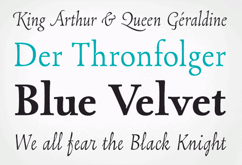
1. Bodoni Script Pro
Bodoni Script Pro | Price: €69+ Designed by Panos Vassillou, this typeface was designed with connected characters and capitals with calligraphic elements. Bodoni Script Pro is a 3-weight family; each font comes with 725 glyphs, including a large number of alternates, as well as 144 ornaments.

2. Geogrotesque
Geogrotesque | Gallery | Price: $50 each Geogrotesque is a semi-modular typeface with a subtle rounded finish. All the characters are based on the same formal principle, with corresponding optical adjustments to adapt the system to an alphabet for texts. ?Although the type family has a geometric or “technological” construction, the rounded finish lends a warm appearance, making the typefaces more accessible.


3. Museo and Museo Sans
Museo | Gallery | Price: $29.95 for all five fonts Museo is a clean yet unconventional semi-serif, designed by Jos Buivenga. This OpenType font family comes in five weights, and each weight comes with support for CE languages, even Esperanto. Besides ligatures, contextual alternatives, stylistic alternates, fractions and proportional/tabular figures, Museo has a “case” feature for case-sensitive forms. The sans-serif version is a sturdy, low-contrast, geometric, highly legible sans-serif typeface that is well suited to any display and text use.

Both typefaces are lucid and versatile, great for cool-looking headlines but also effective as medium-sized text.
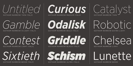
4. Gotham Narrow
Gotham Narrow Gotham is new, economical and designed specifically for text. The typeface can be used in publications, on websites, for branding and on book covers and posters. The typeface includes four different widths, from regular to condensed, and each style is paired with a matching italic. For tables and charts, Gotham’s core styles include a “Numeric” range that contains tabular figures, fractions and extended symbols.
5. Metroscript
Metroscript | Gallery | Price: $99 for all five fonts With Metroscript, New York-based lettering artist Michael Doret has adapted his trademark hand-lettering style to the computer, creating one of the most sophisticated suites of script fonts on the market. Metroscript was successful throughout 2008 and proudly holds the title of MyFonts’ Brush Script Font of the Year.

6. Locator
Locator | Price: $250 (complete family) Designed by Eric Olson in 2002⁄2003, Locator was originally proposed as a custom typeface for the Design Institute at the University of Minnesota. Locator is now a complete family of 12 fonts with true italic. Since its release in the spring of 2003, Locator has been used for a range of projects, including books, signage, corporate identity and even the company’s website.

7. Madawaska
Madawaska | Gallery | Price: $29.95 for all 34 fonts Madawaska, a slab-serif family, has a bit of both: some of the ruggedness of the creator’s display work, and the extensive structure of a text family. With seven weights, including some very subtle hairline versions, it’s versatile and widely usable. Madawaska comes with fractions, old-style numerals and lining numerals. This typeface may not look as solid and professional as others, but it gives your copy a modern, strong and original appearance.


8. Olicana
Olicana | PDF specimen | Price: €79,00 per family A beautiful typeface script in action. There are over 100 ligatures, which, when activated in a layout program, introduce more inconsistencies, making for a more convincing handwritten appearance. The typeface also has a more ornate style (swash feature), so the user has a choice between “old” and “new” styles. There are also replacement ligatures for double swashes appearing together.
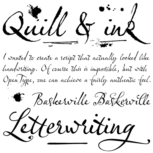
As a final touch of authenticity, there are eight difference lengths of strike-throughs. When inserted after a word, these special characters cross out the “mistake.” There are also eight “splats,” including ink blobs and even partial fingerprints. The typeface comes in two weights, rough and smooth. Designed by Nick Cooke.
9. Ronnia
Ronnia | PDF specimen | Price: €29+ One of the most remarkable characteristics of this humanistic sans-serif is its versatility. Ronnia has been engineered mainly for newspaper and magazine applications, as evidenced by its properties: economical in use, highly legible and friendly and charming in character. Ronnia was part of the Tipos Latinos exhibition 2008 and the 23rd Biennale of Graphic Design 2008 in Brno.


10. Skolar
Skolar | PDF specimen | Price: €49+ Skolar is a serifed typeface that has been designed specifically for scholarly multilingual publications. The relatively large x-height puts the typeface’s proportions somewhere between a book and newspaper’s typeface. The capitals are rather low compared to the ascenders to give the typeface even more texture and space for capital diacritical marks. These characteristics were introduced to improve readability in smaller sizes. Skolar received international recognition at the Ed-Awards competition 2008.


11. Capsa
Capsa | Price: $130 for 6 weights Capsa was inspired by the work of mid-18th-century Parisian printer Claude Lamesle. It is an original design with classical flair, expert typesetting features and full, contemporary character sets. The Capsa family is an ideal book type: highly legible with beautifully fluid swash and italic styles. The Patterns and Vignettes fonts comprise a useful collection of decorative borders and ornaments. OpenType features include small caps, ligatures, alternates, old-style figures, lining figures, tabular figures, fractions, scientific inferiors, superscript, swashes, numerators, denominators and ordinals.

12. FF Meta Serif
FF Meta Serif | Gallery The OpenType version of FF Meta Serif offers Book, Medium, Bold and Black, each including italics and, of course, small caps, OSF, LF, TF and a range of arrows and other symbols. While it stands on its own in a wide range of applications, the extra benefit is its close relationship to the original FF Meta, its sans serif sister.

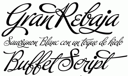
13. Buffet Script
Buffet Script Buffet Script is based on calligraphy by Alf Becker, arguably the greatest American sign-lettering artist of all time. Buffet Script’s OpenType programming contains discretionary ligatures and stylistic and contextual alternates, all interacting with each other to allow the composition of just the right typographic look and feel. This font is best used where lush elegance is a design requirement.
14. Opal
Opal | Preview | Price: €70,21+ per typeface Opal is a text face with noble aspirations, yearning for luxury and still delivering. Because of the long ascenders that rise clearly above the capital letters, Opal should be set with generous line spacing. The typeface’s design has the attributes of the old-style Renaissance serifs, yet Opal is not based on any specific predecessors.
15. Akagi
Akagi | Price: all 20 weights for $400 Akasi is a legible sans-serif family with modern, crisp, clean and legible glyphs for corporate designs and magazines. Designed by Neil Summerour.

16. Encore Sans Pro
Encore Sans Pro | Price: €65,00 per weight This typeface is supposed to be a perfect alternative to any overused classic sans typeface. Encore Sans Pro is a humanistic sans-serif that projects an image of reliability, authority and competence, making it ideal for corporate applications. A functional typeface that combines utility, simplicity, clarity and style. Contemporary and elegant. Coming in OpenType, the family consists of 22 fonts (also available as separate weights).

17. Stag
Stag | Price: $50+ A new slab-serif for bold, forceful headlines, with a very large x-height, extremely short ascenders and descenders, and tight spacing, for a compact, contemporary look. In 2008, three new weights were added in order to match the full range of weights offered in Stag’s sans-serif companion, Stag Sans, in the hope of adding more flexibility to this eccentric family. Designed by Christan Schwartz.

18. Comenia
Comenia | Gallery | Price: €21+ Comenia, a school typeface system, was developed as a typographic system for use at all levels of schools and universities. It introduces new aesthetic standards aimed to improve reading and writing skills and enhance the appeal of texts for pupils, students, teachers and office and IT staff at schools. It offers a clear, understandable and universal graphic tool for electronic typography, information systems and laying out primers, textbooks and educational texts and materials. The family consists of 19 fonts.

19. Router
Router | PDF specimen| Price: $49+ Router is located at the intersection of mechanical and organic. Unlike other rounded sans-serifs with simple rounded terminals, Router flexes outward, mimicking the physical process of carving letters into plastic or metal. These details function exceptionally at display size, and disappear to satisfying effect in text, creating a legible, organic and evenly colored body copy.

20. Paz
Paz | Gallery | Price: $69 for all 4 fonts. Paz, a squarish 4-weight industrial family, ranging from extreme hairline to black, is ideal for editorial headlines in which type plays a major role in the overall design. The fonts were designed by Ariel Di Lisio and digitized by Alejandro Paul.

21. Kewl Script
Kewl Script | Price: €59,00 Kewl Script is ideal for food packaging, book and music covers, magazines and window splashes. “The idea was to go on the heavier and more playful side, but with a South American sign-letterer’s twist, rather than just good handwriting. I did some sketching, took some notes, then got busy with other projects. Some of that stuff eventually seeped into Candy Script and, to a lesser extent, the Whomp font. But it was only a matter of time before I got back to the original concept and finished it.”
22. Tisa
Tisa | Price: €46,00 each Designed by Mitja Miklavcic and initially created in 2006 to fulfill the requirements of an MA in Typeface Design, Tisa was primarily created for use in various magazines that are printed by either web-fed offset or gravure printing techniques. Nevertheless, the typeface can also be successfully used in other printed media, such as newspapers, annual reports, etc. Selected by the TDC judges for the Certificate of Excellence in Type Design, it was released in 2008.


23. Montague Script
Montague Script | Price: €59,00 An incredible contemporary script by Stephen Rapp.
24. Karmina Sans
Karmina Sans | Gallery | Price: $490 for 12 fonts Karmina Sans follows in the footsteps of its successful cousin. While they share stylistic features, Karmina Sans was specifically designed to be a versatile tool for editorial designers. It comes in six weights with matching italics. Each of the OpenType fonts includes nearly 900 characters per weight, with small caps, multiple numeral styles, scientific superior and inferior figures and a set of symbols and arrows. Karmina Sans’ heavy variant delivers one of the darkest and most powerful text styles available, while the text weights are a perfect companion to Karmina Serif.

25. Newzald
Newzald | In Use | Price: $50 each, $150 for Basic and $250 for the whole family Newzald is a modern serif designed for the international editorial environment. Newzald’s large x-height and slightly condensed forms allow many words to the column without looking cramped or ungainly. Newzald has four weights, ranging from the brisk Book to Black. Its character set includes a wide array of accents, seven numeral sets and small caps across all styles. Designed in 2008 by Kris Sowersby.

26. Gloriola
Gloriola Std & Display | Gallery | Price: $75+ Gloriola is a mono-linear sans-serif, whose extremely broad range of nine cuts offers endless creative possibilities. Gloriola Std cuts and corresponding italics are suited to common typesetting needs thanks to the open character of its letters, the sufficient x-height and clear forms, as well as the full possibilities of OpenType, such as small caps, ligatures, tabular figures and alternating characters. Four extreme Display cuts are perfect for display use. Their reduced ascenders and descenders and strong forms are perfect for creating distinct yet harmonious effects when combined with other cuts of the same typeface. See also Marat typeface.

27. Haptic
Haptic | PDF specimen | Price: US $55 each The Haptic family is a sans-serif typeface optimized for use in small-sized text. It serves well in attention-seeking headlines and comes in roman and italic with seven weights each. Through its versatile character traits, Haptic emits visual warmth and draws sympathy, without sacrificing readability.
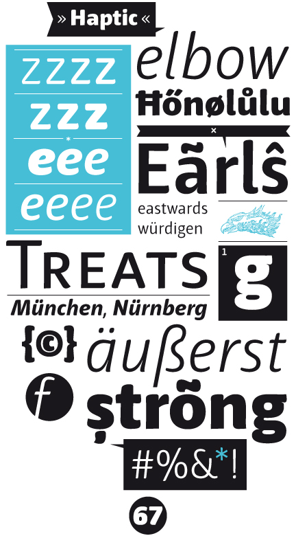
The rounded, slightly broadened stem-heads emphasize the x-height and were adopted from the common ink bleed when writing with ink and pen. The Haptic family has true italic forms available, as well as descenders for f and ß. Designed by Henning Skibbe.
28. Mrs. Eaves XL
26. Gloriola
Gloriola Std & Display | Gallery | Price: $75+ Gloriola is a mono-linear sans-serif, whose extremely broad range of nine cuts offers endless creative possibilities. Gloriola Std cuts and corresponding italics are suited to common typesetting needs thanks to the open character of its letters, the sufficient x-height and clear forms, as well as the full possibilities of OpenType, such as small caps, ligatures, tabular figures and alternating characters. Four extreme Display cuts are perfect for display use. Their reduced ascenders and descenders and strong forms are perfect for creating distinct yet harmonious effects when combined with other cuts of the same typeface. See also Marat typeface.
27. Haptic
Haptic | PDF specimen | Price: US $55 each The Haptic family is a sans-serif typeface optimized for use in small-sized text. It serves well in attention-seeking headlines and comes in roman and italic with seven weights each. Through its versatile character traits, Haptic emits visual warmth and draws sympathy, without sacrificing readability.
The rounded, slightly broadened stem-heads emphasize the x-height and were adopted from the common ink bleed when writing with ink and pen. The Haptic family has true italic forms available, as well as descenders for f and ß. Designed by Henning Skibbe.
28. Mrs. Eaves XL
Mrs. Eaves XL | Preview | Price: $95 for the regular package This is a revised design of the classic Mrs. Eaves, a transitional serif typeface designed by Zuzana Licko in 1996. The main distinguishing features of Mrs Eaves XL are its larger x-height, shorter ascenders and descenders and overall tighter spacing. These additional fonts expand the Mrs. Eaves family to a larger variety of uses, specifically those requiring economy of space. The larger x-height also allows a smaller point size to be used while maintaining readability. Mrs Eaves XL also has a narrow counterpart to the regular, with a set width of about 92%, which allows for even more compact uses.
29. DIN Next
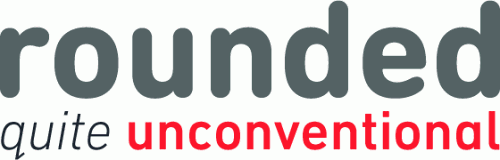
DIN Next | Preview | Price: €82+ per typeface DIN Next is a typeface family inspired by the classic industrial German engineering designs. Each of the seven weights of DIN Next ships in three varieties: Regular, Italic, and Condensed. The typeface family also includes a set of four “rounded” fonts (DIN Next Rounded), bringing the total number of fonts in the family to 25.
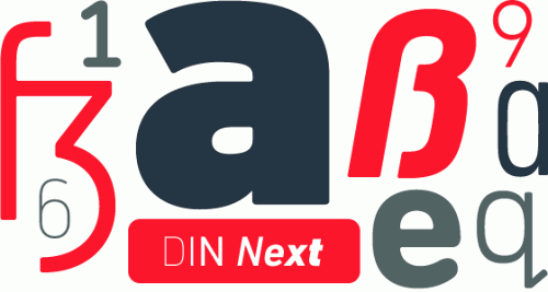
The typeface can be used particularly for industrial signage. It has been tailored especially for graphic designers, but its industrial heritage makes it surprisingly functional for just about any application. The only drawback of the typeface is the simple fact that it is way too expensive.
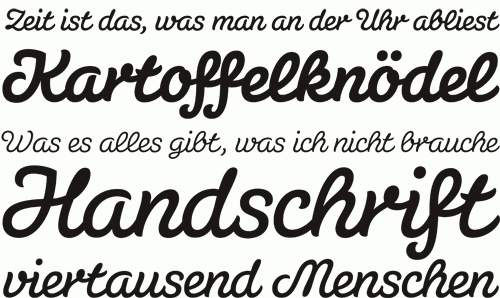
30. Susa
Susa | Price: €39,90+ per typeface This playful typeface is ideal for corporate designs that need a friendlier, less formal look. The typeface is also perfect for educational projects because it imitates blackboard handwriting perfectly. Every connection between letters looks perfect without any alternate glyphs. The weights from light to heavy serve well in text and display.
Bonus: Klavika
Klavika | PDF specimens | Price: $99,00+ per pack Klavika is a flexible family of sans serifs for editorial and identity design. Features like small caps, true italics, multiple language support and several numeral styles make it an ideal workhorse typeface. Since Klavika was designed with identity programs and editorial design in mind, emphasis has been given to alternate numeral styles and typographic details like small caps and ligatures.