5 Simple Tricks To Bring Light and Shadow Into Your Designs

Email Newsletter
Weekly tips on front-end & UX.
Trusted by 182,000+ folks.


 Custom Web Forms for Angular, React, & Vue. Your backend.
 Celebrating 10 million developers
There’s just no escaping light and shadow – it’s everywhere you look. Everything you see reflects light and casts some sort of shadow. Visually, light and shadow help us make sense of what we see and help us understand texture, dimension, and perspective. [Updated January/04/2017]
So, as we try to make our designs on the Web more natural, moving and intuitive, a good understanding of light and shadow is pretty important. Here are 5 ways to better use light and shadow to polish your page designs and make them stand out on the screen.
Further Reading on SmashingMag:
- 35 Examples Of Masterful Lighting Effects In Web Design
- Take Your Design To The Next Level With CSS3
- Push Your Web Design Into The Future With CSS3
- Adobe Photoshop Tutorials – Rainbows, Glows and Light Effects
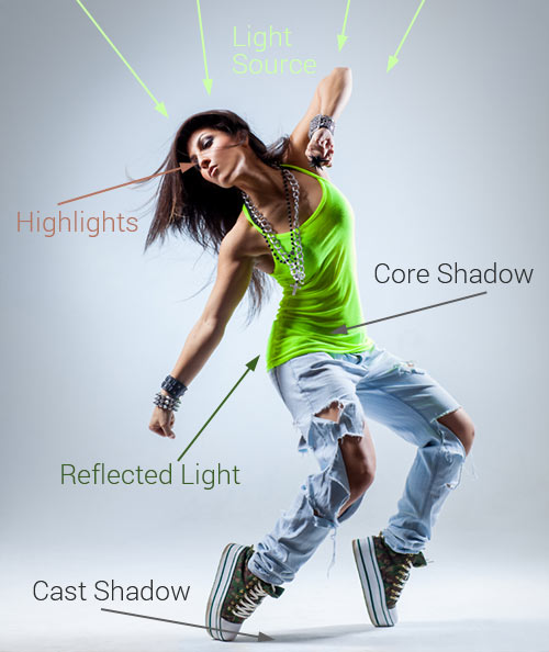
A Quick Anatomy Of Light And Shadow
In the simple diagram below, we can see that the light source is coming from the left. The highlight is where the light is strongest, and the shadows fall on the side furthest from the light source. The appearance of light and shadow tells us a lot about the surfaces and textures in the image.
But what does this have to do with Web design, you ask?
If you’re trying to design rich, tactile interfaces and websites, light and shadow are your friends. In the same way that many classic artists made their paintings jump off the canvas, you can use light to give your designs depth and visual interest. Let’s get into it.
1. Using A Light Source
Perhaps the most important part of working with lighting is knowing where the light(s) is coming from. The light source will most likely determine where the highlights and shadows fall (although with Web design you can afford to bend these rules in places). If you’re working in Photoshop, you can use the “global light” effect so that all of your lighting effects follow the same light direction.
Controlling the source(s) of light in your designs (even if just with a linear or radial gradient) can help create atmosphere in your page designs. It can also help direct the eyes to a focal point in the design.
Examples on the Web
IKEA Get Growing! by Jason Zigrino

Dribbble shots UI by Worawaluns

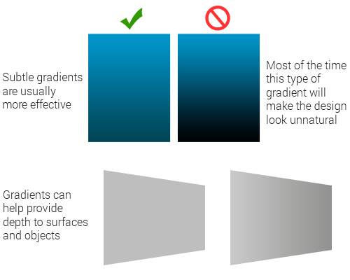
2. Gradients
In the real world, very few things have a flat tone. Light and shade are on everything. Subtly using gradients is a great way to provide depth and makes things come to life on the screen.
The key with gradients is not to overdo them. If you’re using Photoshop, make use of layer styles for your gradients. This gives you the freedom to edit them at any point; it also means that if you resize the element, the gradient will rescale too.
Examples on the Web
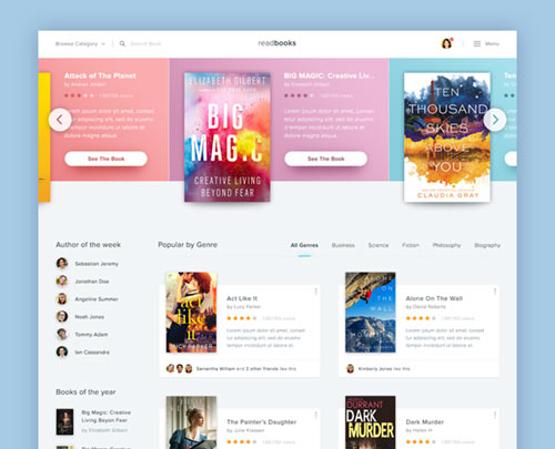
This Book Store Website by Dwinawan is a lesson in subtle yet effective use of gradients to separate and organize content.
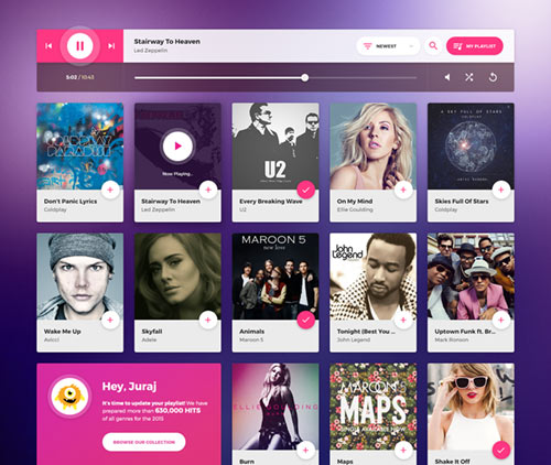
Music web application by Juraj Molnár
3. Highlights
Highlights can help balance shadows and should be used on the edges of objects closest to the light source. Highlights are often overlooked because when used effectively, you don’t even notice they’re there. And while not suited to every situation, a tiny highlight can make all the difference in polishing an interface. The “sharper” the highlight, the shinier the surface will appear.
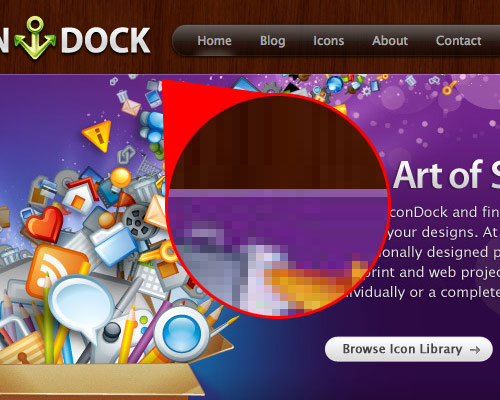
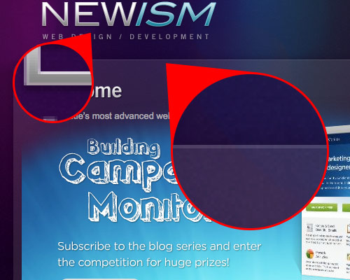
To really appreciate highlights, we need to zoom in a bit close. A good trick for adding highlights is to work at 200% or more, because at 100% it can be hard to see what you’re doing clearly.
Examples on the Web
Icon Dock and Newism both used a semi-transparent white line on the page element’s top edge to give it a highlight. It’s barely noticeable but adds a bucket of polish to the design.
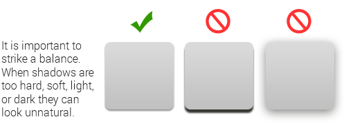
4. Basic Shadows
Like gradients, drop-shadows have become a staple of most Web designers. Shadows can really add visual depth and texture when used the right way. The key is not to overdo it.
The qualities of a shadow depend on the light direction and intensity, as well as the distance between the object and the surface where the shadow is cast. The stronger the light, the darker and sharper the shadow. The softer the light, the softer the shadow.
Examples on the Web
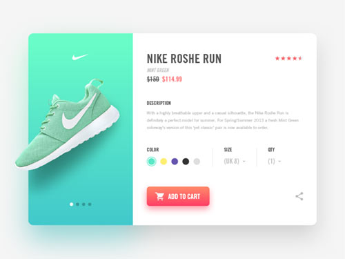
When it comes to online examples of drop-shadows, there are simply too many websites to choose from. When used cleverly, they can add a touch of dimension to even the most minimal design.
Nike Product Page by Ilja Miskov
5. Advanced Shadows
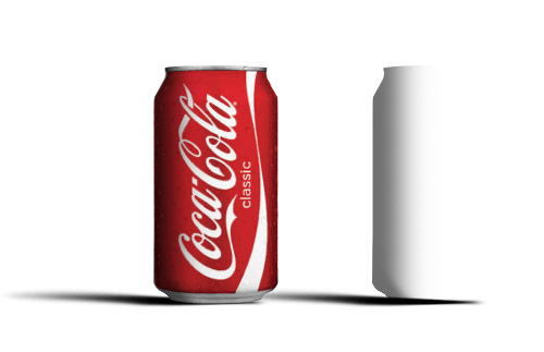
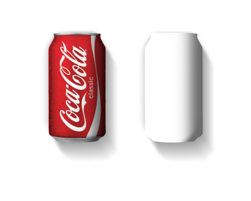
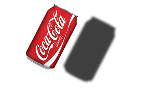
You can do a lot beyond basic drop-shadows to give elements a third dimension. Longer shadows are a great way to change the spatial relationship between objects on a page.
In the examples below, the same Coke can is given completely different positions in space depending on its shading and shadow.
Examples on the Web
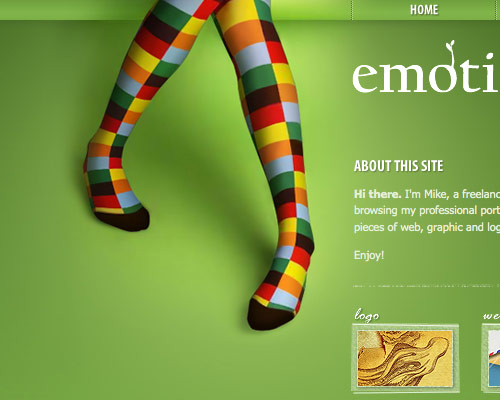
Emotions by Mike cleverly uses shadow (and light) to turn the flat page into a floor.
Further Resources
Area for further articles and related resources.
- Photoshop Cafe Tutorial on casting shadows in Photoshop.
- Advanced Shadow Techniques Working with shadows in Photoshop.
- PSDtop Blog Understanding drop-shadows.
- Peachpit Light and shadow in Photoshop.
- Aviva Casting realistic shadows.
- PSDtuts Using light and shade to bring text to life.
- Build Internet Light and shadows: feathering gradients in Photoshop
- PSDtuts Using gradients to make light and shadow… and a coffee cup!
 (al)
(al)

