Creative Print Typography Layouts

Email Newsletter
Weekly tips on front-end & UX.
Trusted by 182,000+ folks.
 Celebrating 10 million developers

 Custom Web Forms for Angular, React, & Vue. Your backend.

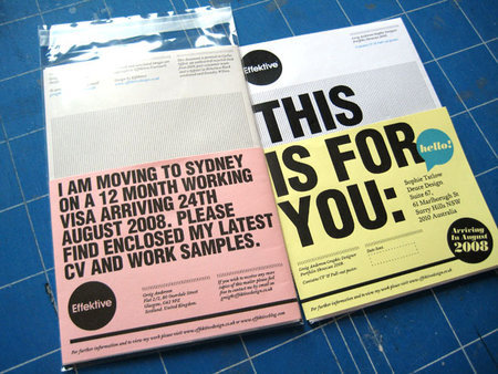
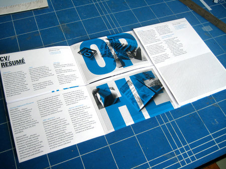
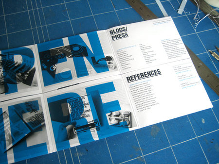
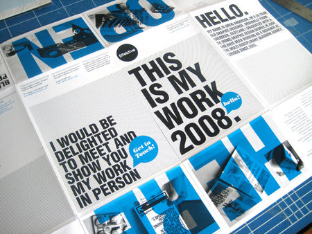
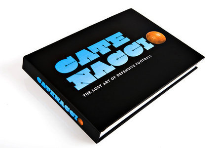
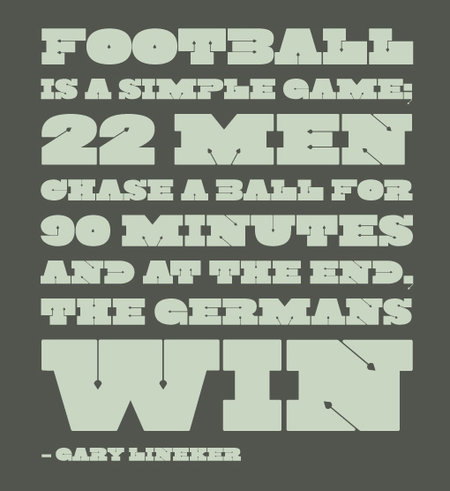
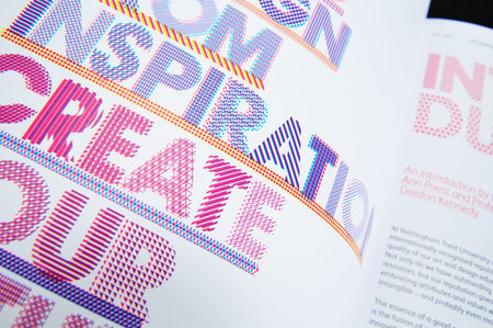
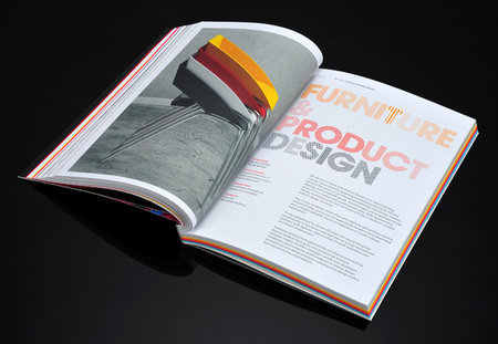
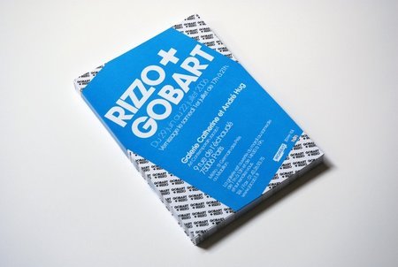
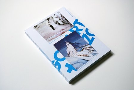
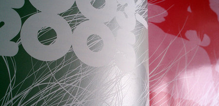
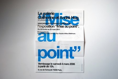
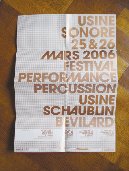
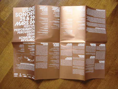
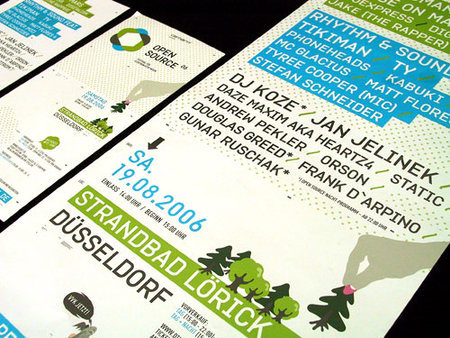
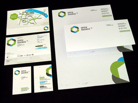
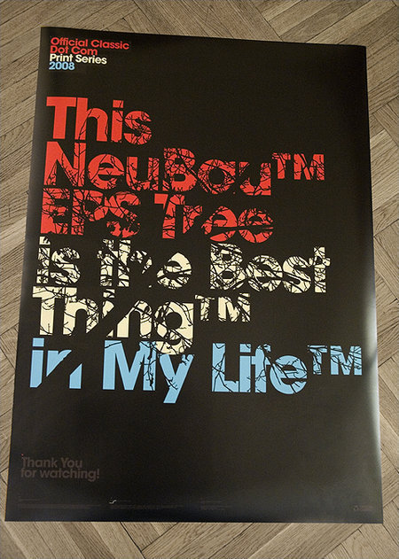
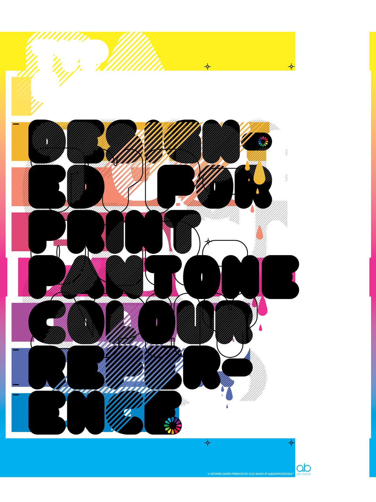
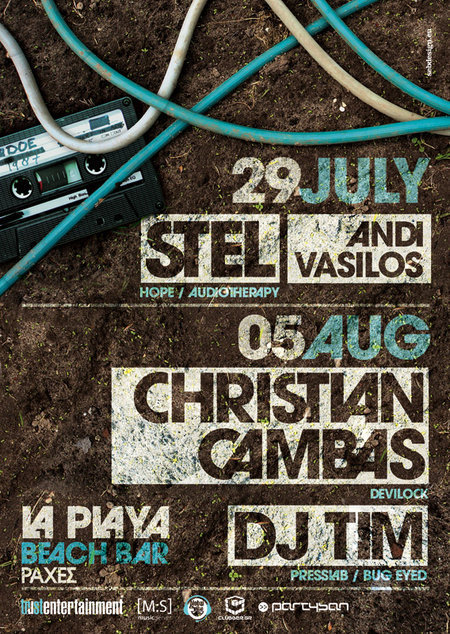
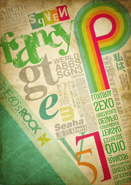
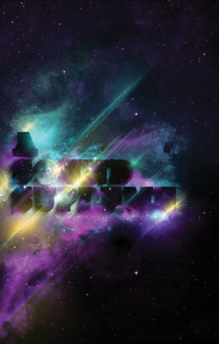
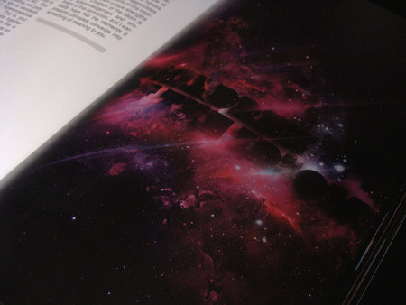
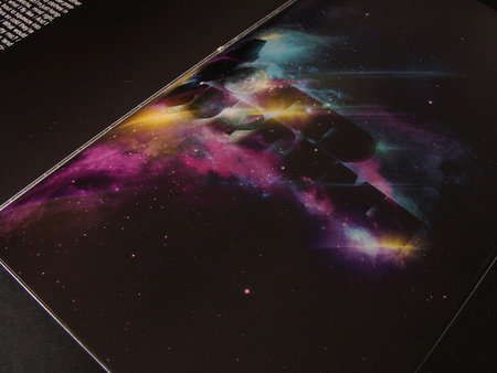
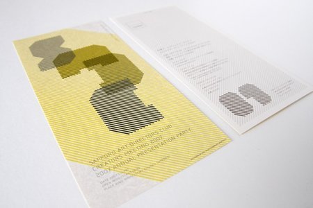
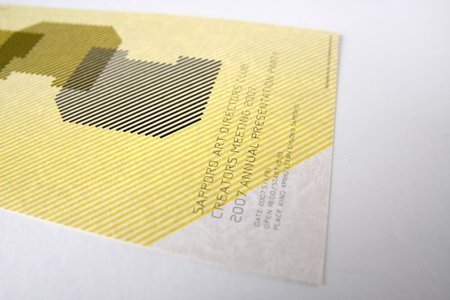
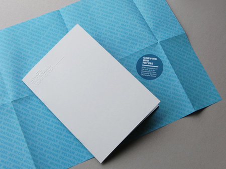
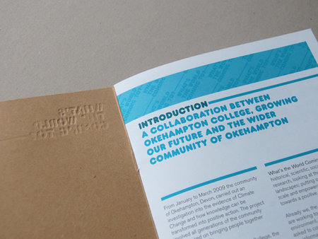
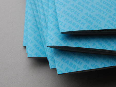
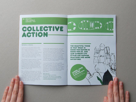
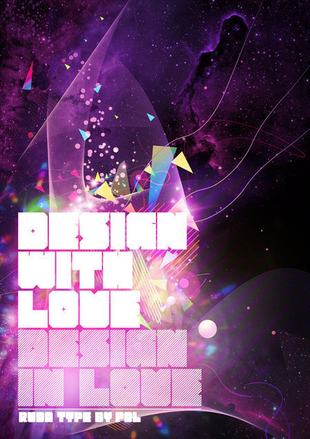
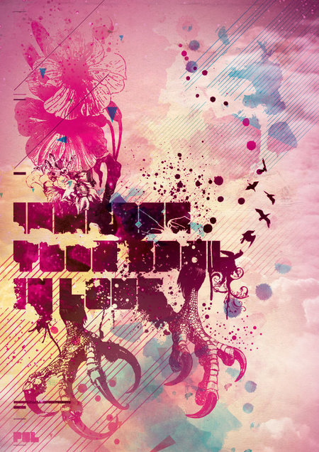
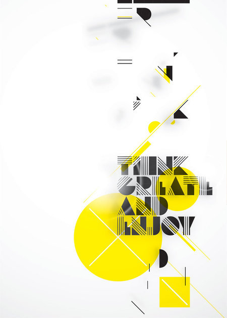
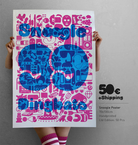
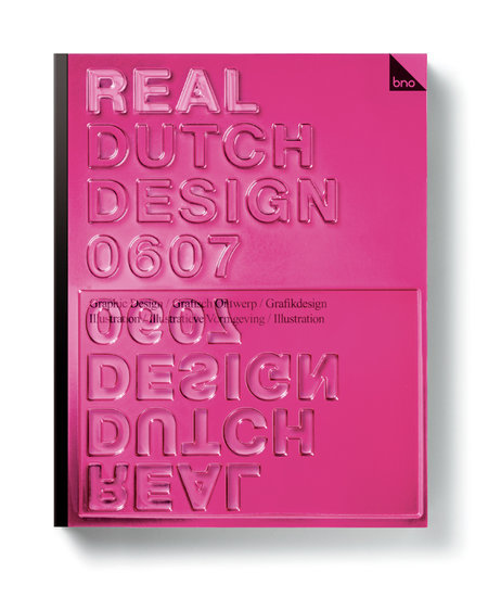
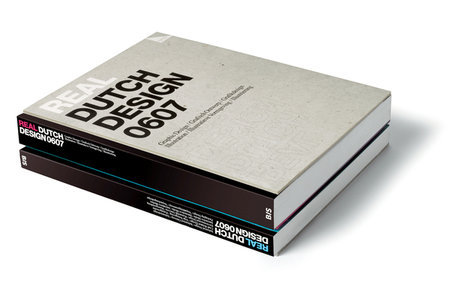
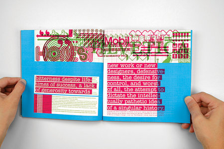
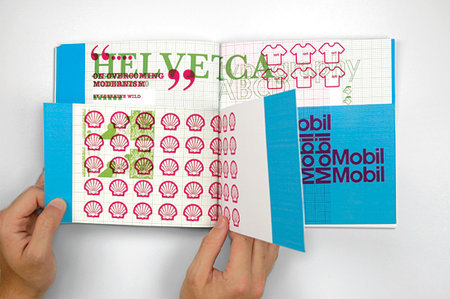
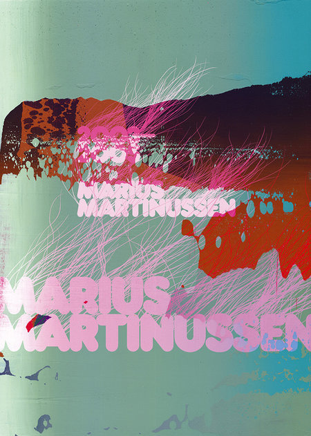
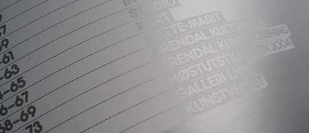
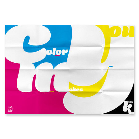
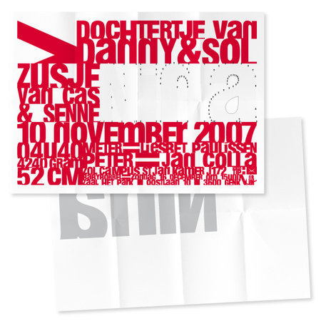
In print, typography doesn’t have to be plain and boring. It can be beautiful, creative, and colorful. There are a number of ways to liven up typography, such as creative and original layouts, using color variations, use of fancy fonts, and much more.
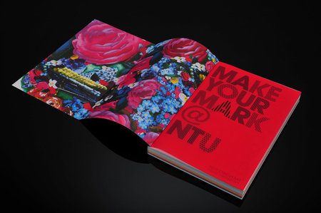
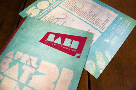
This showcase will focus mostly on the layout and organization schemes. Below are about 40 different typographic layouts used in different fields of print such as brochure design, editorial design, and poster design.
You may be interested in the following related posts:
- Vintage And Retro Typography Showcase
- Sexy, Bold and Experimental Typography
- Breathtaking Typographic Posters
- 40 Creative Design Layouts: Getting Out Of The Box
- 8 Simple Ways To Improve Typography In Your Designs
Creative Print Typography Layouts
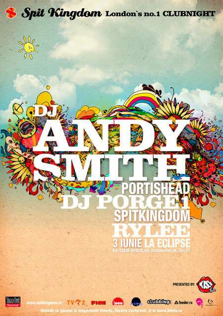
Spit Kingdom
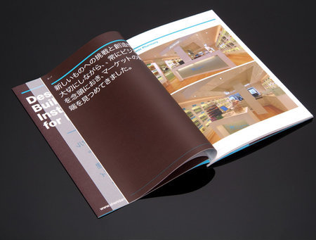
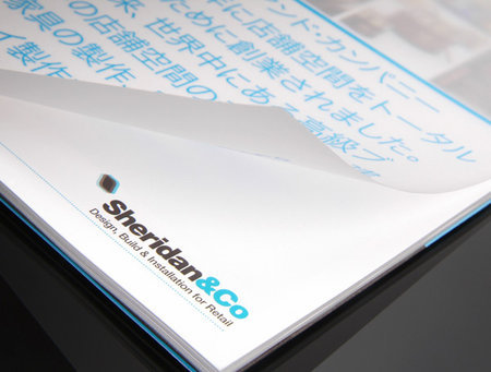
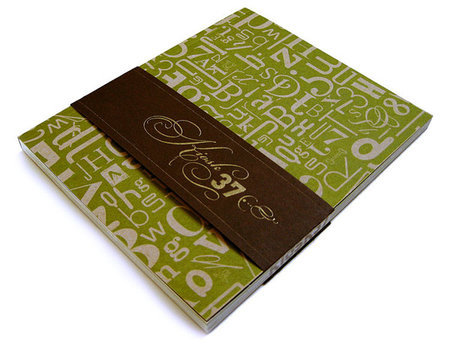
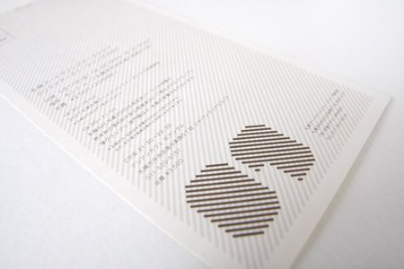
[Sheridan & Co.](https://www.behance.net/Gallery/Sheridan-_-Co-Brochure/87811)
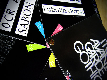
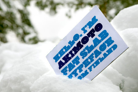
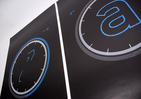
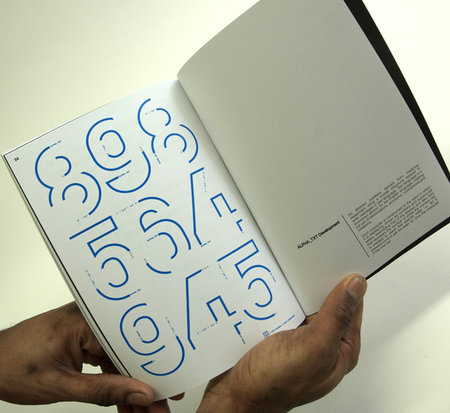
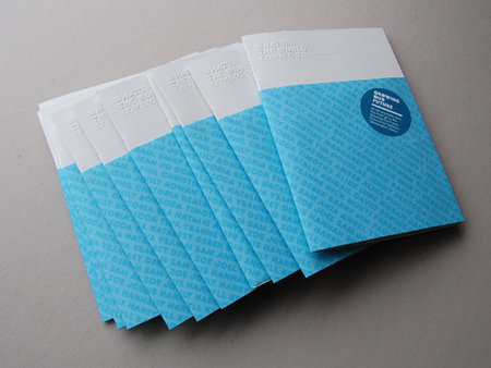
Avant Garde Gothic Typeface Booklet
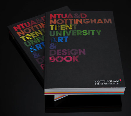
[NTU Art & Design Prospectus](https://www.behance.net/Gallery/NTU-Art-_-Design-Prospectus/145409)
BABE
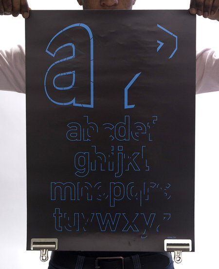
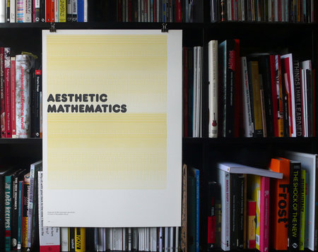
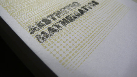
Typography Poster
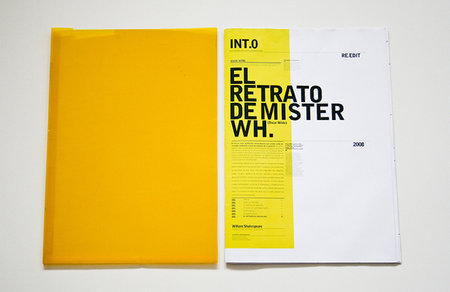
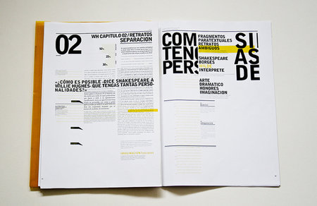
[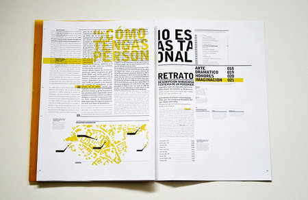 ](https://www.behance.net/Gallery/Oscar_Wilde_Retrospective/135247


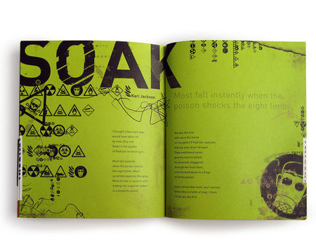
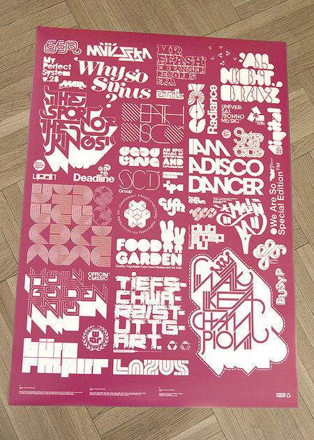
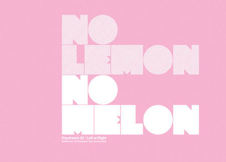
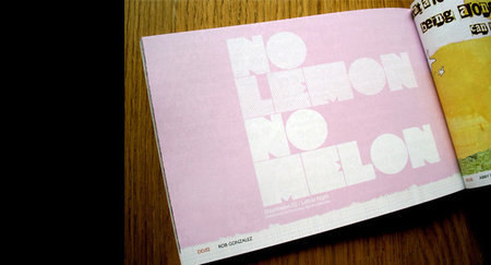
99 Dingbats No Lemon Daydream Magazine
[ ](https://www.behance.net/Gallery/Macro-Micro/102444
[ ](https://www.behance.net/Gallery/DADA-Design/154899
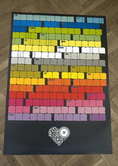
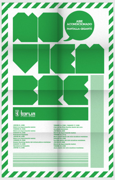
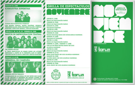
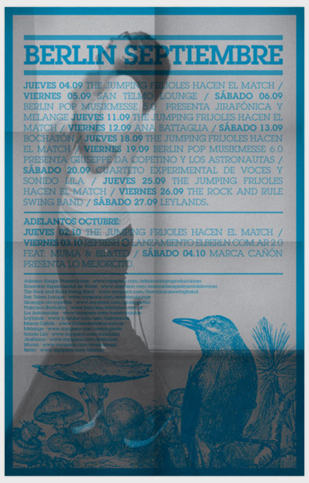
[Berlin Cafe Posters](https://www.behance.net/Gallery/Berlin-Cafe-posters/154788)
Related posts
You may be interested in the following related posts:


