How To Use Help Elements To Improve Your Designs

Email Newsletter
Weekly tips on front-end & UX.
Trusted by 182,000+ folks.


 Celebrating 10 million developers
 Custom Web Forms for Angular, React, & Vue. Your backend.
When designing a website, the most important thing is to make it as usable and convenient as possible. On a website on which users could possibly get confused, it is best to include help elements. Help elements come in all different shapes and sizes: an entire page, a suggestion box or a quick tip. But they all have one thing in common: besides doing the obvious (i.e. helping the user), help elements provide an extra convenience that brings the website closer to that sought-after usability.
With the number of forms, search functions and other navigational elements on websites these days, using them can occasionally become confusing for some users. Providing help elements in as many places as possible can be a great way to make the user’s experience more pleasurable. The better the experience of the user, the more likely the user will buy your product, come back to the website and fulfill the goal that the website was built to achieve.
Below is a compilation of best practices for help elements, an explanation of when to use them and a showcase of excellent help elements.
You may also be interested in the following related posts:
- 9 Common Usability Mistakes In Web Design
- 10 Principles Of Effective Web Design
- 12 Useful Techniques For Good Interface Design
- 10 Useful Web Application Interface Techniques
When To Include A Help Element
Convenience is key to a website, and going the extra mile to make a website more convenient can go a long way. Help pages and help elements bring that extra convenience to users. But where is a help element really needed?
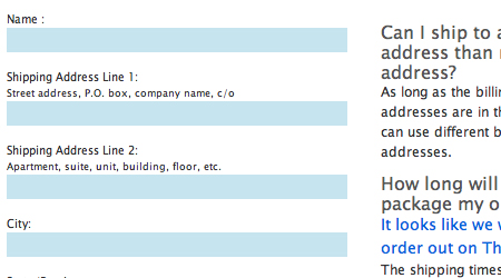
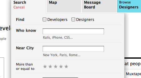
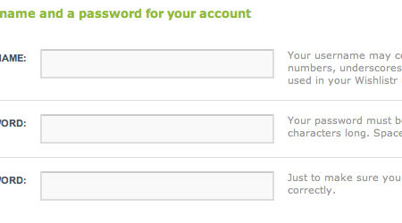
1. Forms To some, forms may be confusing. The purpose of certain objects and inputs may be unclear to users, so suggestions and examples certainly should be included to help users fill them out. Another type of form element is labels.
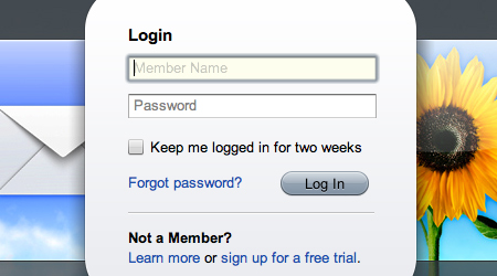
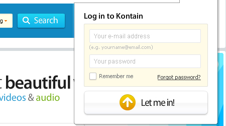
2. Log-Ins/Sign-Ups You want users to sign up for your service, so make it as easy for them as possible. There are a number of ways to make log-ins and sign-ups more usable, one of which is to include help elements. First, as mentioned, you should include help elements within the sign-up form.
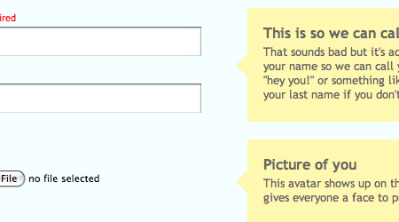
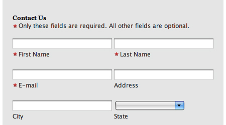
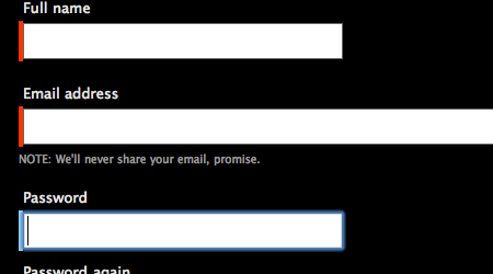
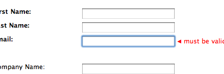
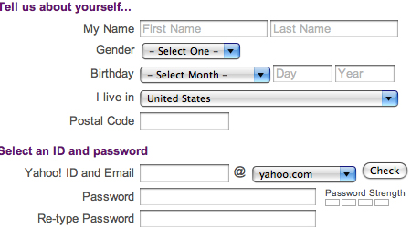
The form below is nicely laid out; it’s clean and has good explanations of each form element. It is overall a usable form with thorough help elements.
3. Checkouts As with forms, some elements of the checkout may be unclear to the user. During checkouts, money is being transferred, so it is essential that the user does not become confused in the process.
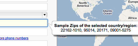
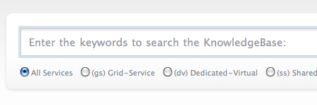
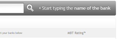
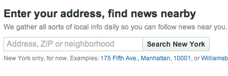
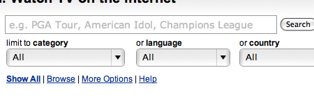
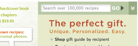
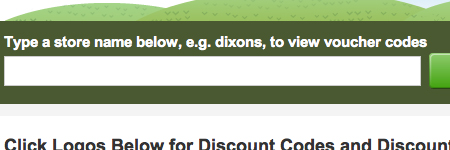
4. Searches There is not too much that’s complicated about a search box, but what to search may be unclear. Providing search examples and suggestions is a good idea. Live auto-suggest boxes are another usable search feature.
What To Include
What to include depends on the type of element and where it is being used, but there are a few guidelines to making a “helpful” help element.
Avoid the Obvious If you are going to make a help element, actually make it useful. Don’t put it there just for the sake of including it.
Quick Tips One type of help element is “tips.” Providing tips to help a user navigate content is often a good idea. Tips and suggestion boxes can be especially convenient to new users.
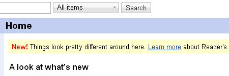
The following is a tip box from Google Reader. In this example, the tip is alerting users to a recent redesign. A link is provided to give users more information. This could be very useful to new users who are confused by the layout.
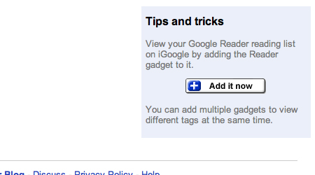
Here is another good example from Google Reader. It shows tips and shortcuts to provide a better user experience.
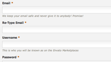
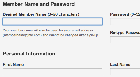
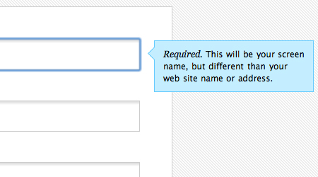
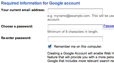
Examples In forms, it’s a good idea to include examples that will help the user fill out information. This includes showing examples of user names, email addresses, etc.
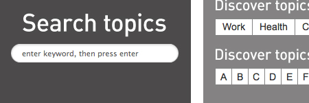
Search Tips/Suggestions With search, many websites add the convenience of search suggestions. This gives users a basis for their search and makes it much easier for them.
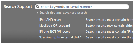
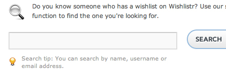
Take a look at the Apple search box below. There is an option to show a list of useful search tips for product support topics. Also notice that the link leading to the list of tips doesn’t get in the way of the search, but it has a convenient location for those who need help.
Password Strength Meter and User Name Check On sign-up forms, password strength meters and user name availability checks are just two small elements that drastically increase the usability of a form.
Labels To take forms to an even higher level of usability, adding labels to inputs is the way to go. Explain form inputs in as much detail as possible.
Usability Is The Key
With any website design, one strives for usability. Usability is the key factor in the success that a website achieves. Usability is simply about making things easier for your users – and help elements certainly do that. But are your individual help elements themselves usable?
Don’t Confuse the User Confusing the user contradicts the purpose of the help element, so avoid it. Only put in content that is appropriate to the element. The way you organize content within the help element affects usability. If the element contains a lot of content, use lists and highlight keywords so that the content is easy to scan.
Placement Has a Major Impact In Web design layout, placement of objects is a top usability consideration. Likewise for help elements, placement affects usability.
Many designers make the mistake of making help elements (i.e. buttons, links, etc.) very small so that they don’t get in the way of the website’s main content. The problem is that they become hard for the user to find. Sure, their small size leaves room for more content, but that won’t help a confused user. Find a balance between subtlety and accessibility.
Also remember that help elements should be optional for the user, not required. Allow the user to choose to get help, instead of immediately showing the element.
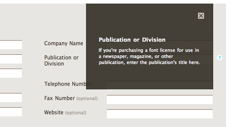
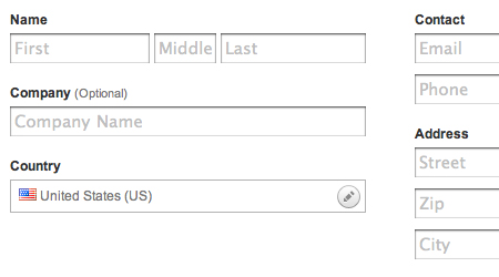
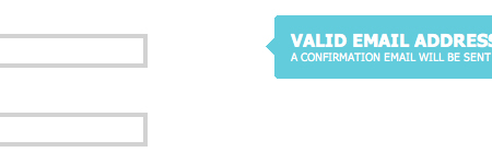
Take a look at the form below. Notice the small question mark icon to the right of one of the inputs. When clicked, this icon pops up a box containing information about the input. The icon is clean, well-placed and out of the way of the form.
Avoid Too Much Clicking, No Pop-Ups The worst thing you can do is force the user to have to click back and forth between help elements and the content on the page. This makes tools that are supposed to help the user completely unusable.
Using Graphics/Icons as Metaphors Using icons and other graphics as metaphors in Web design is quite tricky. The meaning the icon is meant to represent could easily be taken the wrong way by users. Just because you understand it, doesn’t mean that all of your users do. If easy to understand, icons can be very useful in help elements and can even serve as the help elements themselves. Graphics can be used to explain things such as diagrams, charts and directions. Just make sure the graphic or icon is easily understandable for any user.
Showcase Of Help Elements
Help elements appear on many websites, and you often don’t notice them. Here are some examples of websites with usable help elements.
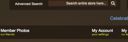
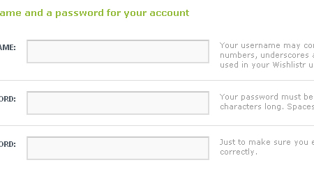
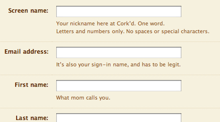
Form Elements
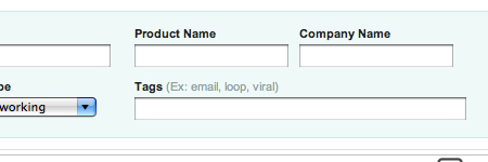
Here are a few nicely laid out forms that contain useful and convenient help elements. The elements give examples and explanations of the inputs to assist users.

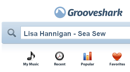
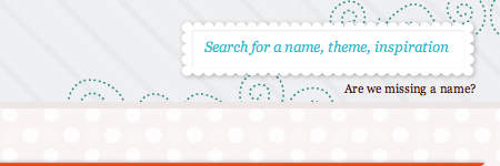
Search Elements/Suggestions
The following are usable search functions that give examples and suggestions to make the user’s search easier.
Log-ins/Sign-Ups
Finally, here is a group of cleanly designed log-ins and sign-ups that use help elements.
Further Resources
You may be interested in the following articles and related resources:
- Pattern Tap Help Collection A great collection of inspiring help elements.
- Designing simple, accessible forms Some nice tips on designing usable forms.
- 10 Usability Tips for Web Designers 10 excellent usability tips to apply to Web design.
- 50 Web Usability Tips that Help You Attract and Retain Visitors to Your Website A thorough list of useful usability tips.


