Captivating Winery Websites For Your Inspiration

Email Newsletter
Weekly tips on front-end & UX.
Trusted by 182,000+ folks.
 See User Testing Live
 Celebrating 10 million developers

 Custom Web Forms for Angular, React, & Vue. Your backend.
From the Napa Wineries in California to the vineyards of Australia and France, the beautiful designs of these wine maker’s websites embody the spirit of the vine. Trends for winery websites have been leaning towards a dynamic Flash introduction, animation and beautiful graphics, which would give the best representation of the products for the target market.
While sites have gone in the direction of a more modern and contemporary approach with fresh and sleek designs, others have taken the more traditional route by captivating their users with the bold earthy Tuscan colors and impressive graphics and art.
You may also be interested in the following related posts:
- Web Design Showcases From Various Industries
- Global Web Design Showcases
- Portfolio Web Design Showcases
There is much to consider when designing a site for a wine maker. Use your creativity to promote the wine and winery, so that the quality portrayed encourages users to inquire how to contact, where and how to buy, and even obtain information on upcoming events.
Good design ≠ Good visual design
Unfortunately, winery sites strongly focus on the visual design, while best usability practices are often ignored. For instance, some web-sites do not offer a search functionality and use hardly readable content (and the size of the text can not be increased, because the text is embedded into a Flash-animation). Besides, since many sites are Flash-based, it’s also impossible to bookmark a specific page, although (in general) it can be achieved in Flash).
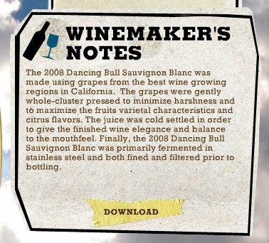
When good visual design fails: the font-size of the text on Dancing Bull Wines can not be scaled up; for many users it may be way too small for comfortable reading.
A good design is not a good visual design; good design is rather a balanced combination of good visual design and usability, resulting in the positive user experience. In our experience, too many sites appear to be very complex and hard to navigate, because in the trade-off between visual design and usability designers often decide against the latter one.
Winery Websites For Your Inspiration
With that in mind, we share with you 40 captivating wine maker’s websites displaying some examples how it can be a rewarding experience – please notice that these sites often can be improved in terms of usability.


3 Blind Moose


Frog’s Leap


Dog House Wine


Gnarly Head

Domaine Carneros


De Saint Gall


Chateau Lazaridi


Bonus: Wine & Beer Bottle Design Tutorials
Wine bottles make exceptional design elements. Following are a few “how to create wine bottle tutorials” – we have added them to this article, since they would add value to this article.
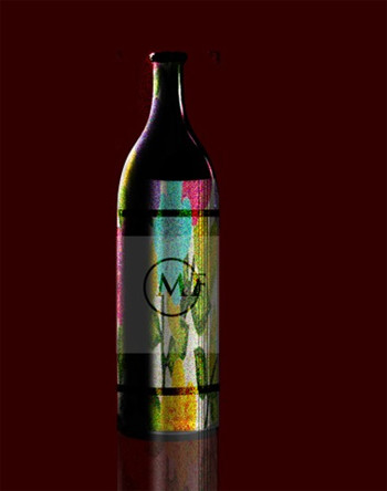
Realistic Decorated Wine Bottle Illustration

Create a Realistic Wine Bottle Illustration From Scratch

Photoshop Glass Bottle Technique
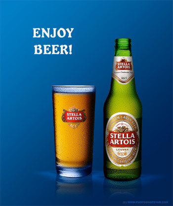
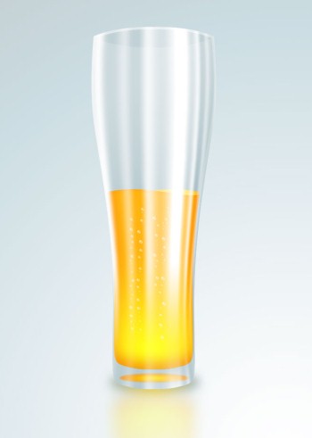
Illustrating a Cool Glass of Beer in Photoshop
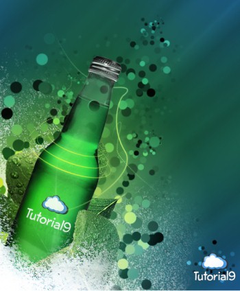
Beverage Ad Enhancer in Photoshop
Design Beer Glass and Bottle in Photoshop