35 Examples Of Masterful Lighting Effects In Web Design

Email Newsletter
Weekly tips on front-end & UX.
Trusted by 182,000+ folks.


 Custom Web Forms for Angular, React, & Vue. Your backend.
 Celebrating 10 million developers

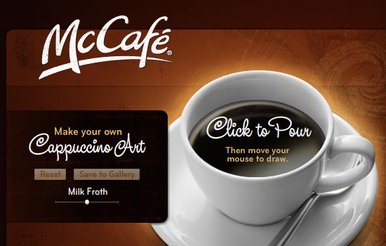
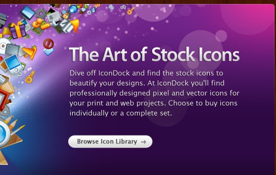
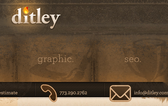
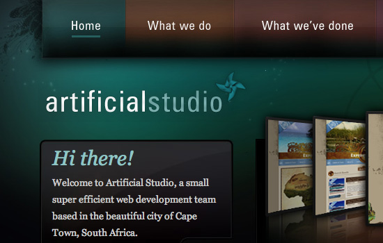
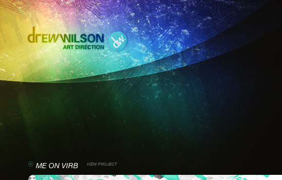
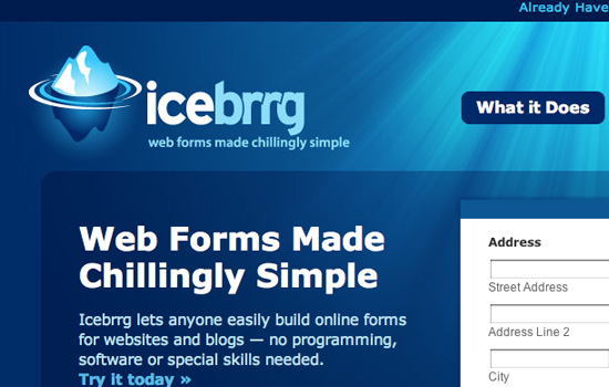
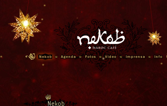
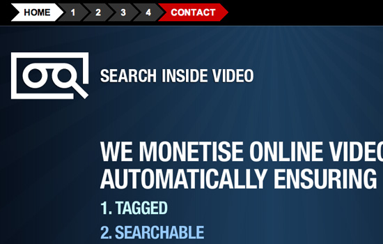
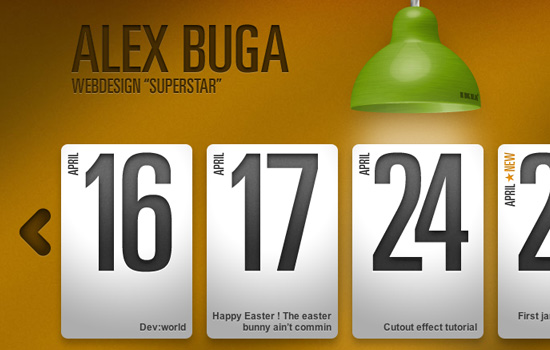
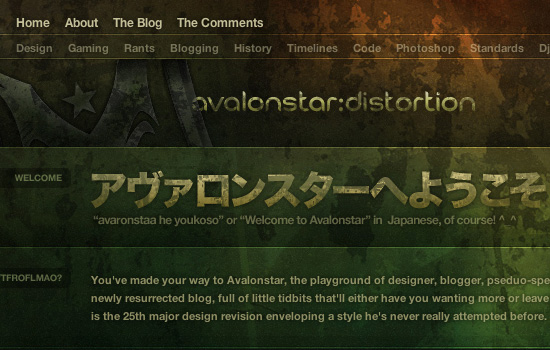
 Lighting can also create a mood for a website. Some websites use bright swirls of light to show energy, while others use a dim glow to create a peaceful mood. In the examples below, you will see a wide range of lighting effects used, from subtle lighting effects to bold rays of light streaking across the page.
You can learn how to better use light and shadow to polish your page designs and make them stand out on the screen in our recent article 5 Simple Tricks To Bring Light and Shadow Into Your Designs.
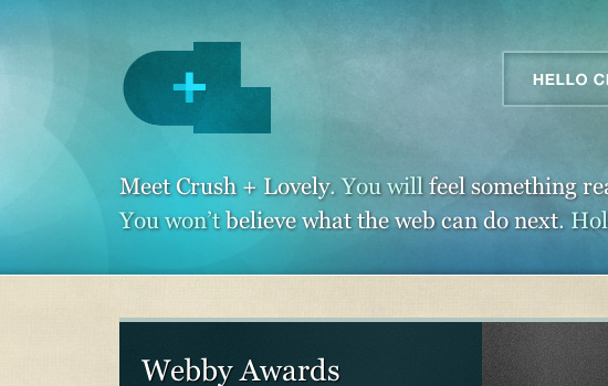
Lighting can also create a mood for a website. Some websites use bright swirls of light to show energy, while others use a dim glow to create a peaceful mood. In the examples below, you will see a wide range of lighting effects used, from subtle lighting effects to bold rays of light streaking across the page.
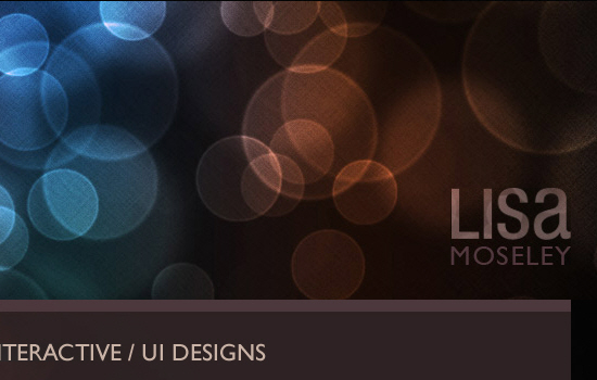
You can learn how to better use light and shadow to polish your page designs and make them stand out on the screen in our recent article 5 Simple Tricks To Bring Light and Shadow Into Your Designs.Using a light source the right way can add dimension and beauty to a website design. Strong light sources create a stark contrast between light areas and shadows in a design, making the elements look more realistic and dimensional and less flat. Some websites opt instead for a dim light source to create a soft glow around particular areas of the website, to attract the eye more subtly.
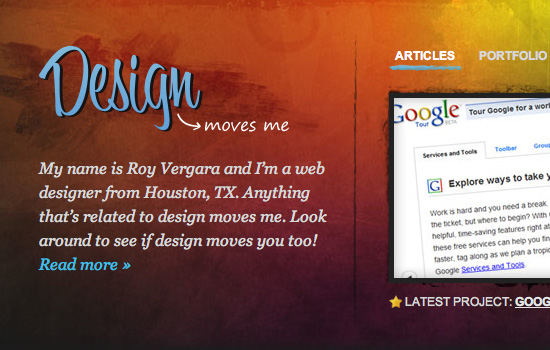
Lighting can also create a mood for a website. Some websites use bright swirls of light to show energy, while others use a dim glow to create a peaceful mood. In the examples below, you will see a wide range of lighting effects used, from subtle lighting effects to bold rays of light streaking across the page.
You can learn how to better use light and shadow to polish your page designs and make them stand out on the screen in our recent article 5 Simple Tricks To Bring Light and Shadow Into Your Designs.
Masterful Lighting Effects In Web Design


McCafe
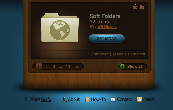
Weloveicons.com
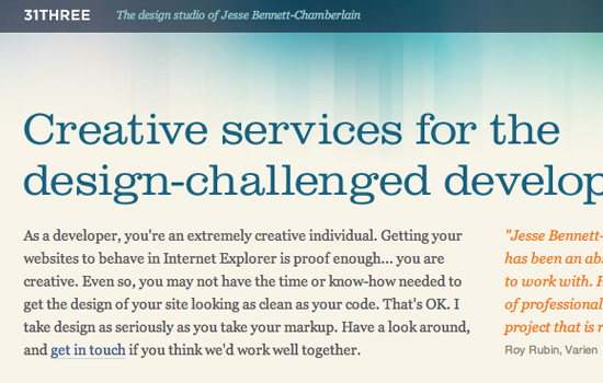
31 Three


Camp Creative Group


Revyver Labs


avalonstar
Viget Labs