15 Fresh High-Quality Free Fonts

Advertisement

Every now and again we take a look around, select “fresh” high-quality free fonts and present them to you in a brief overview. The choice is enormous, so the time you need to find them is usually the time you should be investing in your current projects. We search for them and we find them, so you don’t have to.

In this selection we’re glad to present you Junction, Nadia Serif, Nilland, CartoGothic Std, Bergamo Std, Comic Serif, Birra Stout, Vegur and a couple of other high-quality free fonts. Please read the license agreements carefully before using the fonts — the license can change from time to time.

15 Fresh High-Quality Free Fonts

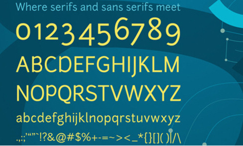
Junction [ Download the .zip-package ]
Designed by Caroline Hadilaksono, Junction is a humanist sans-serif typeface. It has elegant, clearn and very sharp glyphs, but contains only 100 most common symbols. Like Gentium it perfectly fits to body copy, but can also show its strengths, balance and beauty in headlines. Here are some insights from the designer:

“Inspired by my favorite humanist sans serif typefaces, such as Meta, Myriad, and Scala, Junction is where the best qualities of serif and sans serif typefaces come together. It has the hand drawn and human qualities of a serif, and still retains the clarity and efficiencies of a sans serif typeface. It combines the best of both worlds.” Available as OpenType. Released by The League of Moveable Type, an open-source type movement.

Screenshot

Screenshot

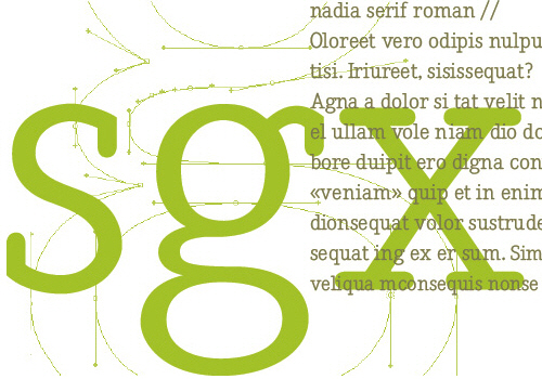
Nadia Serif [ Download Mac (Postscript) | Download PC (TrueType) ]
This serif typeface is available for free download; the only requirement for using it is to send a PDF or any other copy of the work using this typefaces to its designers.

Screenshot

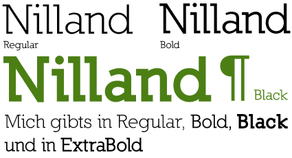
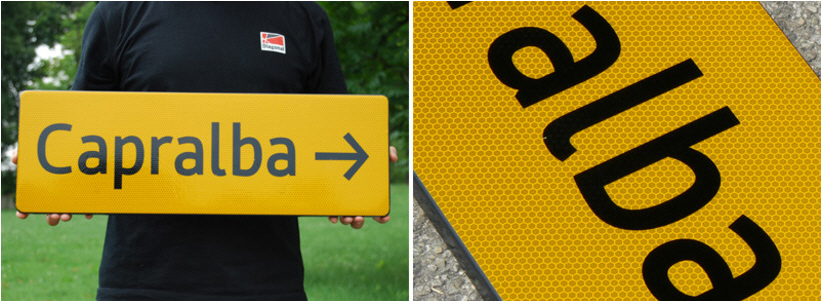
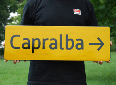
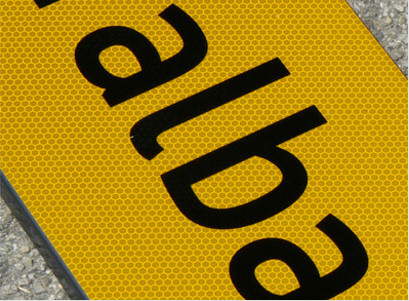
Nilland
A beautiful slab-serif typeface, designed by Manfred Klein. The family consists of 6 weights, regular, bold, extra bold, black, small caps and small caps bold (link and images via DerSven.de).

Screenshot

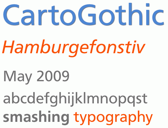
CartoGothic Std
A legible sans-serif typeface, in the opentype format; 4 weights are available: book, italic, bold and bold italic. License agreement. Win and Mac.

Screenshot

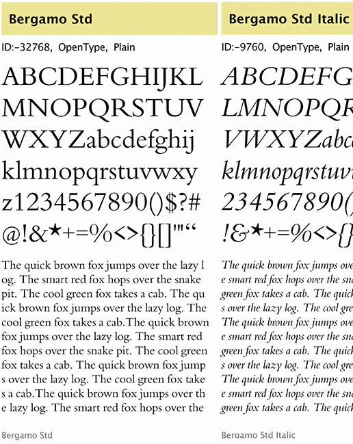
Bergamo Std
A free serif typeface, in the opentype format; 4 weights are available: regular, italic, bold and bold italic. License agreement.

Screenshot

HVD Comic Serif [ specimen ]
So many designers hate Comic Sans. They think people who don’t know design are overusing this funny little friendly font, which is nearly every time out of place. Some years ago, type designer Hannes von Döhren created a free alternative to Comic Sans. The difference: It has serifs and a much cooler look. OpenType Pro, designed by Hannes von Döhren.

Screenshot

Birra Stout [ specimen ]
An elegant old-style typeface with strong elements of handlettering, designed by Darden Studio.

Screenshot

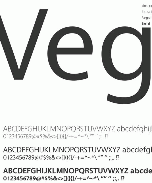
Vegur
This humanist sans-serif family is available in OpenType-format in three weights: ExtraLight, Regular and Bold. The typeface can be perfectly used both in body copy and in headlines.

Screenshot

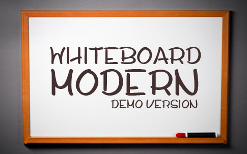
Whiteboard Modern [ currently offline, the link was removed ]
An original hand-drawn typeface, designed by Jay Hilgert. The typeface is currently being designed, so currently only the demo-version is available.

Screenshot

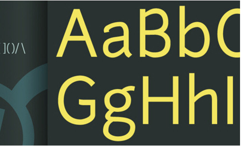
Neighbourhood Type [ Download the .zip-package ]
“I took Neighbourhood as a challenge to create something that had the graphic expression of a display face while still maintaining some of the functionality of a text face. In the end I created something that I feel has the best of both worlds; an ultra simple sans serif text face with a large set of alternates which when combined with the regular characters create a new graphic display look”. Designed by Andy Chung.

Screenshot

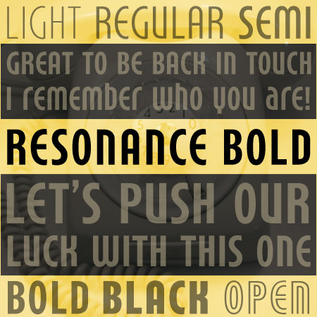
Resonance Bold (Registration is required)
This type family consists of smooth curves and fine lines, and evokes the spirit of the 1970s. Resonance is a great typeface family for use on retro and vintage posters, flyers and also headings.

Screenshot

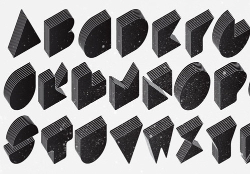
Layer Cake
An experimental typeface, designed by Jakob Nylund. Isometric multiple layered type. Capital letters A-Z, available only in Illustrator AI format.

Screenshot

Reminder: Mayberry Pro SemiBold (registration is required)
AscenderFonts released the font Mayberry Pro Semi Bold available for free download. This font belongs to the Mayberry Pro family. This family is a humanist sans serif designed by Steve Matteson to provide optimal legibility on screen in applications ranging from User Interfaces to web pages. The registration is required to download the font.

Mayberry Pro SemiBold

Bonus: Eco Font and Flaminia Type System

Eco Font [ Download .ttf ]
A Dutch company SPRANQ from Utrecht has developed a new typeface that is supposed to cut ink usage by about 15% – the trick is that the “Ecofont” has little holes in the letters. There is also Ecofont Professional Edition available: every corporate typeface can be adjusted. (via Twenteinside)

Screenshot

Flaminia Type System [ Download the .zip-package ]
Flaminia is a typographical system that allows its users and its future designers to quickly morph (through the use of Multiple Master axes) different variants of the glyphs. By allowing minimal changes of only one variable in the letter shapes, Flaminia also provides a tool to study which are the most relevant factors in the process of reading signs, and can be used free of charge for further researches in this field. Created by Andrea Bergamini, released by The League of Moveable Type, an open-source type movement.

Screenshot

Screenshot

More free fonts!

For more free fonts, please consider visitiong our previous posts:

Vitaly Friedman loves beautiful content and doesn’t like to give in easily. Vitaly is writer, speaker, author and editor-in-chief of Smashing Magazine, an online magazine dedicated to designers and developers.

  1. 1

    Phill

    May 11th, 2009 6:42 am

    Tidy – thanks

    0
  2. 2

    deffault

    May 11th, 2009 6:47 am

    I loved it!

    0
  3. 3

    snnaqvi

    May 11th, 2009 6:47 am

    Great stuff, thanks SM

    0
  4. 4

    spocarum

    May 11th, 2009 6:48 am

    Why give all my personal data incl. CC to download Resonance BOLD. Check “free” fonts first.

    0
  5. 5

    dudelord

    May 11th, 2009 6:54 am

    awesome! the last ones rock the boat

    0
  6. 6

    Cole

    May 11th, 2009 7:18 am

    Your link for the Flaminia Type System is wrong.
    Otherwise a fab list (as always) ;)

    0
  7. 7

    jhoysi

    May 11th, 2009 7:31 am

    Some very elegant fonts on the list. Great finds!

    -1
  8. 8

    Siah

    May 11th, 2009 7:43 am

    thanks SM!

    0
  9. 9

    Nathan

    May 11th, 2009 7:57 am

    I’m sorry, but I cannot see how I can use these on my site. Can you not please advertise a television instead?

    0
  10. 10

    olybop

    May 11th, 2009 7:58 am

    nice selection thanks !

    0
  11. 11

    Horttcore

    May 11th, 2009 8:00 am

    Whiteboard Modern seems to be broken… or am I an idiot?

    0
  12. 12

    Mugros

    May 11th, 2009 8:03 am

    ecofont is ridiculous.

    0
  13. 13

    Vygantas

    May 11th, 2009 8:13 am

    thank you, sir

    0
  14. 14

    antofa

    May 11th, 2009 8:40 am

    Well, that Daphne font family looks a lot like a knock-off of Museo by Jos Buivenga.

    0
  15. 15

    Luke

    May 11th, 2009 8:45 am

    Where do you guys find these gems! Thanks a lot ill be use these definitely

    0
  16. 16

    rutiso

    May 11th, 2009 9:08 am

    Great …! You are the best. Thanks a lot!

    0
  17. 17

    Tobbi

    May 11th, 2009 9:16 am

    Great! Thanks.

    0
  18. 18

    Crystal lee

    May 11th, 2009 9:37 am

    love it

    0
  19. 19

    Tim Smith

    May 11th, 2009 9:43 am

    Great list!! Thanks

    0
  20. 20

    JOHNNY BOY

    May 11th, 2009 9:49 am

    I love em’. This is why I totally support smashing mag. The Fonts!

    0
  21. 21

    Thomas

    May 11th, 2009 9:50 am

    Free is not open. You should distinguish clearly.

    0
  22. 22

    nomad-one

    May 11th, 2009 10:07 am

    Wow, some of the comments on this site are really strange, even scary.

    As always thanks for the great collection of fonts you guys have rounded up for us.

    0
  23. 23

    Andy Morrow

    May 11th, 2009 10:22 am

    Stop putting these shitty lists – who cares about fonts? It’s all about content anyway; I am unfollowing you now and unsubscribing from your RSS-feed. Better come up with something useful for a change! :-(

    -4
  24. 24

    Edward

    May 11th, 2009 10:33 am

    Cool, I find some of them useful. Thanks!

    0
  25. 25

    Manlio Napoli

    May 11th, 2009 10:36 am

    CartoGothic Std and Bergamo Std are clones of Frutiger and Bembo… shame!!!

    0
  26. 26

    Jeff

    May 11th, 2009 10:45 am

    Decent list, but largely useless if you already have Myriad Pro and Frutiger. Seems like half of these are just ripoffs. I was also a bit surprised to see a giant F-bomb on the page, too… Classy.

    0
  27. 27

    Morph

    May 11th, 2009 10:56 am

    There is mistake: Nilland is redirected to Neighbourhood zip file…

    0
  28. 28

    Salih S. Demir

    May 11th, 2009 10:57 am

    very cool.

    0
  29. 29

    Matt

    May 11th, 2009 11:23 am

    Please take down Daphne. It is a low quality font. Replace it with Museo, the high quality font that Daphne ripped off poorly.

    0
  30. 30

    Alessandro

    May 11th, 2009 11:36 am

    Thanks!

    0
  31. 31

    NBS

    May 11th, 2009 12:03 pm

    Eco-font is one of the lamest ideas I’ve ever heard. Talk about defeating the purpose of a font — readability.

    0
  32. 32

    Lailson Bandeira

    May 11th, 2009 12:31 pm

    Nice, but I’d love an OpenType version of Flaminia Type System…

    0
  33. 33

    Michiel

    May 11th, 2009 12:34 pm

    Carto Gothic is the same as Frutiger

    0
  34. 34

    mathiz

    May 11th, 2009 12:49 pm

    Vegur is great but everything is in on the site is japanse… does any have a direct link?

    0
  35. 35

    Kraft

    May 11th, 2009 1:33 pm

    Kinda tired of being assaulted by the profanity in these postings. I used to love visiting this site. I have two young kids and don’t enjoy seeing some of they’re favorite cartoon characters scream the F word. Unfortunately, I’m probably in the minority.

    0
  36. 36

    Ted Graf

    May 11th, 2009 1:35 pm

    Great list.
    How about a link to download them all at once?

    0
  37. 37

    Rutger

    May 11th, 2009 2:10 pm

    that Daphne “font” is horrible and a complete RIPOFF from Museo by Ex Ljbris. See the original that took a lot of effort here: http://www.josbuivenga.demon.nl/museo.html . And how dare they charge for some versions of Daphne! It’s one thing to be inspired, everybody is, but Daphne is beyond that.

    0
  38. 38

    sean farrell

    May 11th, 2009 2:17 pm

    how come i can’t do anything with the flaminia files? vfb file format?

    0
  39. 39

    Jos Buivenga

    May 11th, 2009 2:19 pm

    Daphne is a shameless, lousy ripp off from my Museo font, which is far better *and free*!!!

    (SM) I am very sorry about it, Jos. The link was removed!

    0
  40. 40

    Clever Daisies

    May 11th, 2009 2:30 pm

    Thank you! Love your blog!

    0
  41. 41

    Umm...

    May 11th, 2009 4:05 pm

    Adrian Frutiger and Robert Slimbach would like to talk with some of these font designers who designed certain fonts featured on this page.

    And the League of Movable Type stuff is interesting… except it’s in Multiple Master format. Unless I can find a way to use these without FontForge, it’s useless for web designers.

    0
  42. 42

    Aaron Moody

    May 11th, 2009 4:09 pm

    Been using vegur for some time now, its deffineatly made it into my top 10 lists of fonts, Great font, recomended.

    0
  43. 43

    Yuda

    May 11th, 2009 4:40 pm

    Nice list of font, definitely useful

    0
  44. 44

    Leland Clemmons

    May 11th, 2009 5:24 pm

    The site that features LayerCake (justmytype.org) has really fscking cool fonts.

    0
  45. 45

    lalit

    May 11th, 2009 7:42 pm

    thanx

    0
  46. 46

    Rajnish Gupta

    May 11th, 2009 9:41 pm

    Hey SMASHED… REALLY PRETTY COOL..

    Great thanks to you to help me explore my creative sense….

    0
  47. 47

    francisa

    May 11th, 2009 9:49 pm

    thanks!

    0
  48. 48

    Shuuun

    May 11th, 2009 10:25 pm

    I am using Myriad Pro for so many Pojects, its my new Arial/Helvetica :)

    0
  49. 49

    Andrea Bergamini

    May 11th, 2009 11:58 pm

    I am the author of Flaminia: the League of Movable Type is a project that aims to share opensource fonts.
    Flaminia is a font that needs to be in Multiple Master format (while other fonts featured on the League’s website don’t need to) because it is a system to test the readability of typefaces to use in signage through the interpolation of different variables. It is a scientifical project rather than just a “free font”, and releasing an .otf/.ttf version of it –without the possibility to keep the interpolation available– would make it senseless.

    So Fontlab is required in order to develop the project further, sorry….on my , you can find all the information you might need.

    0
  50. 50

    rcs

    May 12th, 2009 12:10 am

    That’s much more like it sm … fine collection …

    PD_why don’t you make a menue “kids” and put your “wallpapers” and “dark art” there?

    :-)

    0
  51. 51

    Johnny

    May 12th, 2009 12:16 am

    The Eco Font is silly. I suggest they try the same idea with Eco Toiletpaper.

    0
  52. 52

    Quakeulf >:3

    May 12th, 2009 12:18 am

    Oh god #44, I won’t ever escape that smiley now, I thought I was safe here… ;_;

    0
  53. 53

    salami

    May 12th, 2009 1:31 am

    Flaminia is one o the best type families I’ve ever seen!
    but…
    why there’s only a few glyphs in vfb files of Flaminia typefaces?
    ????????????????????????????????????????????????????

    0
  54. 54

    Shivanand Sharma

    May 12th, 2009 2:29 am

    If these fonts are not installed by default on the system it would be impractical to use them in webdesign (unless you are using them in images).

    0
  55. 55

    Vijayta

    May 12th, 2009 3:18 am

    Thanks a lot for such a nice font set :) :)

    http://vijaytapanchal.com

    0
  56. 56

    Pete

    May 12th, 2009 4:38 am

    @Shivanand
    There are enough font replacement techniques out there that let you use non-standard web fonts. Non-standard fonts are no longer an excuse for poor web typography.

    Cufon – http://cufon.shoqolate.com/generate/
    SiFR – http://www.mikeindustries.com/blog/sifr/
    jQuery (sifr plug in) – http://jquery.thewikies.com/sifr/
    Typeface.js – http://typeface.neocracy.org/
    FLIR – http://facelift.mawhorter.net/download/

    0
  57. 57

    Tom Bradshaw

    May 12th, 2009 4:55 am

    Thanks again Smashing!

    0
  58. 58

    Rank Uno

    May 12th, 2009 5:22 am

    looking at ‘ resonance’, its inspirations are not drawn from the 1970s. Perhaps you are a bit too young, but any student of design should be able to spot art deco lines like thos in this font.

    0
  59. 59

    Andy

    May 12th, 2009 5:30 am

    Nice article!

    0
  60. 60

    Pinky_D

    May 12th, 2009 6:37 am

    Thanks! Just what I needed, and perfect timing. Now if only I could design these fonts myself hehehe.

    0
  61. 61

    Disposable_Hero

    May 12th, 2009 7:51 am

    At least Ecofont isn’t called Greenfont…then the designer would have to be smacked.

    0
  62. 62

    Chris Robinson

    May 12th, 2009 8:07 am

    dugg, nice roundup, already had most of these but there were some new ones in there.

    0
  63. 63

    Mario

    May 12th, 2009 8:08 am

    The post title sucks (as well as similar ones) FREE WTF $%@*!!!!
    free to download, free to download my friends…

    0
  64. 64

    Miguel

    May 12th, 2009 8:49 am

    Picky, but italic is not a “weight”.

    0
  65. 65

    sama creation

    May 12th, 2009 11:54 am

    Thanks! great article

    0
  66. 66

    ayb

    May 12th, 2009 12:38 pm

    great article ;) i got it

    0
  67. 67

    Adam Cernik

    May 12th, 2009 1:39 pm

    aaaah. those free fonts are not so good :)

    0
  68. 68

    KC

    May 12th, 2009 7:50 pm

    Sweet, thanks!

    0
  69. 69

    vinhkoon

    May 12th, 2009 8:25 pm

    nice fonts, thanks!!!!

    0
  70. 70

    Jan

    May 12th, 2009 11:31 pm

    Great fonts, thanks! I especially like Vegur. The site Layer Cake has some really cool fonts as well.

    0
  71. 71

    gr8pixel

    May 13th, 2009 12:50 am

    excellent! thanks for the post. :)

    0
  72. 72

    Sloppy Hand

    May 13th, 2009 1:16 am

    Useful stuffs, thanks.
    Any of you like western style fonts?

    Sloppy Hand @
    ROCKBUNCH.com

    0
  73. 73

    Romeo

    May 13th, 2009 2:37 am

    Hey your “Flaminia Type System ” points to Junction font link :D

    Nevertheless excellent collection

    0
  74. 74

    yasense

    May 13th, 2009 4:24 pm

    good~~~ thanks for you~

    0
  75. 75

    justpictures.net.tc

    May 14th, 2009 12:27 am

    CarthoGothic is a stolen Frutiger and Bergamo is a stolen Bembo.

    Flaminia is great!

    0
  76. 76

    Andrea Bergamini

    May 15th, 2009 3:08 pm

    Thank you for your appreciation in Flaminia. I would like to make a little note about it though: Flaminia is not a “font”, it is a typographic system to evaluate the design of fonts to be used for signage.
    .vfb files are necessary to develop the whole system, because it is based on a Multiple Master with variables that need to be interpolated, and that would be lost uploading .otf or .ttf files.
    So all of you designers out there, Flaminia is an opensource project and it still needs a lot of work, but all of you are invited! :)
    cheers from italy,
    a.

    0
  77. 77

    Maximilian Georg Liebscher

    May 16th, 2009 5:32 pm

    Thank u^^

    -1
  78. 78

    satish.borkar

    May 19th, 2009 2:54 am

    hi

    Really very nice fonts
    i like it
    Thanks

    0
  79. 79

    satish.borkar

    May 19th, 2009 3:12 am

    hi
    its so good

    0
  80. 80

    satyaspb

    May 19th, 2009 3:14 am

    i trying my gravatr image

    0
  81. 81

    Andrew M.

    May 19th, 2009 3:22 pm

    Vegur sure looks like a knock off of Myriad Pro, if you ask me…

    0
  82. 82

    gaem

    June 5th, 2009 5:58 am

    thanks for you

    0
  83. 83

    Jay Lopez

    June 6th, 2009 6:34 pm

    Wow Andy Chung’s & Layer Cake’s work is incredible! Thank you Smashing Magazine!

    0
  84. 84

    Rachel Jones

    June 8th, 2009 9:56 am

    Thanks, this is the best resource every.

    0
  85. 85

    Luke Jones

    July 31st, 2009 11:06 pm

    Sweet thank you!!

    0
  86. 86

    borda chido

    August 4th, 2009 10:31 pm

    estan bien chidas

    0
  87. 87

    borda chido

    August 4th, 2009 10:32 pm

    estan bien chidas

    0
  88. 88

    jonas seydel

    October 10th, 2009 4:24 am

    impressive selection. like the nadia most. many thanks and keep goin!

    best regards from germany!

    0
  89. 89

    Dave

    October 13th, 2009 4:26 pm

    An observation:
    You have some real assholes commenting here.
    It’s FREE … take one, say thank you, step aside.
    No bitching about the free stuff, geniuses.
    … and now, from me:
    Thank you.

    0
  90. 90

    aero

    October 30th, 2009 2:53 am

    Mayberry Pro SemiBold direct secure download from their site:
    https://www.ascenderfonts.com/store/download.aspx?d=bb135486-8633-416c-9661-22623df29685

    0
  91. 91

    olis

    January 13th, 2010 1:33 am

    Great article, thx :) lot of inspiration
    Also some nice free fonts fonts2u.com

    0
  92. 92

    Jay

    January 19th, 2010 9:02 pm

    Hey everyone, if anyone has Myriad Pro for Mac or Win, would you mind sending me a copy? I have been looking for it for ages and cant seem to find it. Thanks again. Jay. jay.townsend@live.com

    0
  93. 93

    David

    October 5th, 2010 8:43 am

    Flaminia update: Stop looking for a usable TrueType, OpenType, or Postscript version of Flaminia (aka Flaminia OS). There are none. The designer himself says it right here http://goo.gl/Oj9y on typophile dot com. It’s the comment by berga83. It’s a beautiful proof of concept but an incomplete one at that.

    “Although its glyphs are not all completed yet, the multiple masters and the variables I decided to take into consideration are already all present, and the .vfb files provided allowed the design of the signs pictured above.” — Andrea Bergamini

    When the League of Movable Type states the Flaminia Type System “can be used free of charge for further researches in this field” at http://goo.gl/xm9K they aren’t kidding.

    I commend Andrea Bergamini and The League of Movable Type for what they’re doing. I just wish they would be completely clear that Flaminia is not complete.

    That Smashing Magazine presents Flaminia here as a ‘fresh high quality free font” is a testament to the lack of clarity at the League of Movable Type.

    Would a generous type designer care to pick up where Andrea Bergamini left off? “Further developments of the project will be uploaded on this page http://www.mintea.org/flaminia/, and credit will be given to those who contribute to it.”

    Or maybe Google could commission someone to complete Flaminia OS as an addition to the Google Font API.

    I hope this comment can save somebody a lot of time searching for something that does not yet exist (eg. flaminia.ttf or flaminia.otf).

    0
  94. 94

    Adalberto Schilmoeller

    October 21st, 2010 4:40 am

    wow this is really good site . i love to comment here . Thank you dude

    0

Leave a Comment

Yay! You've decided to leave a comment. That's fantastic! Please keep in mind that comments are moderated and rel="nofollow" is in use. So, please do not use a spammy keyword or a domain as your name, or it will be deleted. Let's have a personal and meaningful conversation instead. Thanks for dropping by!

↑ Back to top