100 Obscure and Remarkable CD Covers

Email Newsletter
Weekly tips on front-end & UX.
Trusted by 182,000+ folks.

 Celebrating 10 million developers

 Custom Web Forms for Angular, React, & Vue. Your backend.
Some CD covers feature heavily edited and airbrushed vanity photos of the musicians or recording artists. Thankfully, others are much more creative and work to create a cover image that reflects the mood, attitude or feel of the music it promotes. The most striking designs are those that capture both a buyer’s attention and the essense of the music.
The CD cover art designs and concepts featured in this showcase present dramatic, quirky, unusual or unique artwork. This type of cover art can make a big difference when a little-known band releases an album. Captivating or iconic cover art can make a band instantly recognizable, which increases sales, which in turn boosts airplay and subsequently demand for the music. Mainstream marketing is rarely this attractive, and the wide variety of beautiful CD cover art makes browsing CDs an enjoyable experience that reaches far beyond the music.
It must be noted that a collection of this nature is never complete, and the value of art is very personal and subjective. While we may love the familiar cover art of some classic favourites because we love the bands and the music, a critical look at the cover art can often be a disappointment. For the purposes of this cross-section of remarkable and obscure cd cover art we have chosen to ignore the musical genius of the albums in favor of showcasing brilliant cover art.
100 Obscure and Remarkable CD Covers
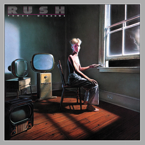
Rush - Power Windows (1985) This strange cover seems to be showing a mirrored world, where we sit and watch a window, surrounded by televisions.
Osaka Popstar - Rock’em O-Sock’em Live! (2008) This gruesome cover is meant to be humorous, but may err on the side of bizarre. What look to be dollish little men have lost their heads, and perhaps some sales opportunities as well.

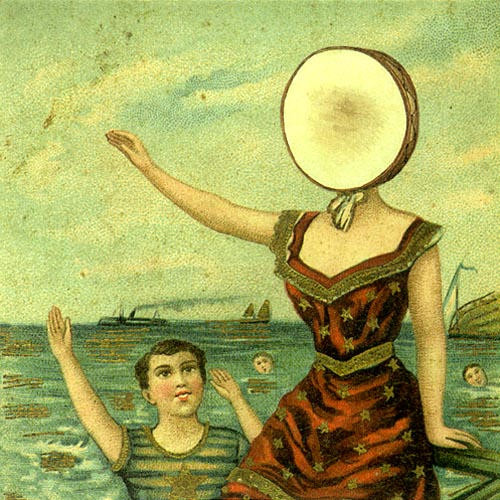
Neutral Milk Hotel - The Aeroplane Over The Sea (1998) Vintage-looking and abstract, this beautiful coverart begs for an explaination.
Tool - Ænima (1996) One of many brilliant cover art designs for Tool, this one is also a stunning optical illusion.

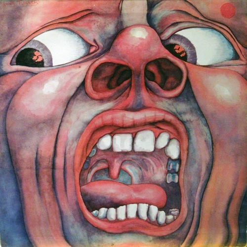
King Crimson - In the Court of the Crimson King (1969) The street-art feel of this cover art is both comical and slightly unsettling.
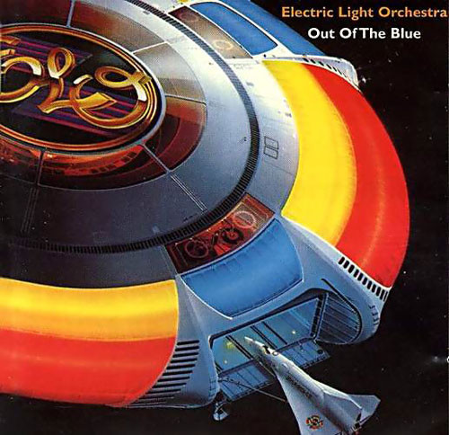
Electric Light Orchestra - Out Of The Blue (1977) This ELO cover art is classic and unforgettable.
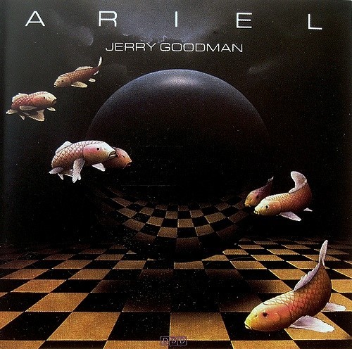
Jerry Goodman - Ariel (1986) Who doesn’t love flying fish? This cover art is confusing without being annoying. Someone might pick up this CD just to try to figure out what is going on with the cover.
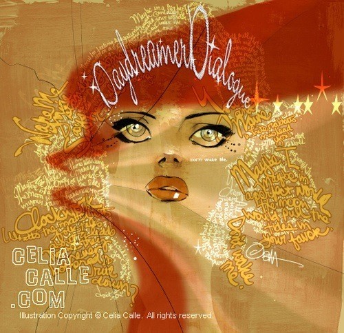
Daydreamer - Dialogue (2008) Bold slpashes of gold and red are used on this cd cover, which features a clever typography image. Haunting eyes peek out from beyond a mass of golden words that serve as hair.
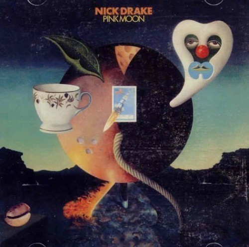
Nick Drake - Pink Moon (1992) A little bit of everything was thrown into this odd but intriguing cover art.
Iron and Wine - The Shepherd’s Dog (2007) Pop art is featured on thie cd cover. Bright colors and an abstract image are combined to create something visually stunning.

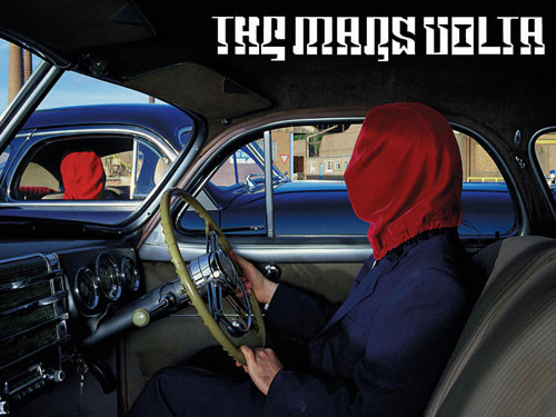
The Mars Volta - Frances the Mute (2005) This cover art photo is organized confusion that might make would-be listeners curious about the music.
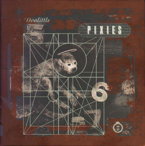
Pixies - Doolittle (1990) With a name like Pixies, you might expect sweet, innocent looking cover art. This is not the case.
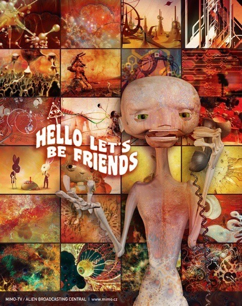
Mimo - Hello Let’s Be Friends Like a trainwreck, it may be hard to look away from this cover. An alien-esque creature would like to be your friend. Would you pass it up?
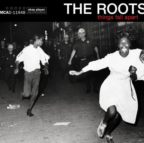
The Roots - Things Fall Apart (1999) This album was released with five different covers, each depicting a social disaster. The most striking of the five, seen here, shows African American teenagers being chased down a street in Brooklyn during the Civil Rights era.
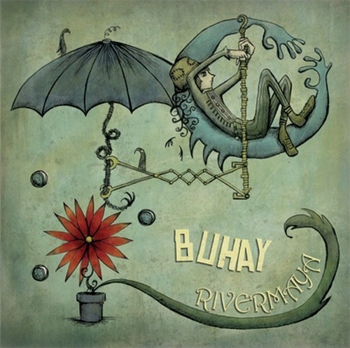
Rivermaya - Buhay (2008) The art on this cd cover is a bit perplexing. The mostly monochromatic design comes to life with a pop of red and yellow. As the eye is drawn into the picture, the oddities become evident.
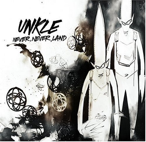
Unkle - Never, Never Land (2003) The hand-drawn art on this cover is stark, simple and unique.
Story of the Year - Page Avenue (2003) The title and art on this cover work beautifully together.

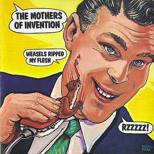
The Mothers of Invention - Weasels Ripped My Flesh (1988) The cover art of this cd colorfully mocks the title.
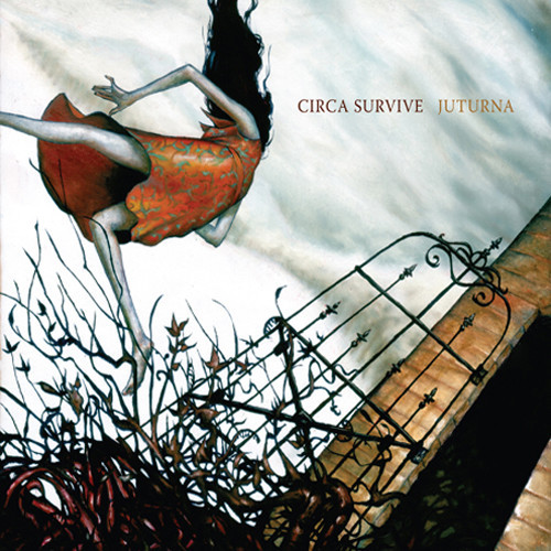
Circa Survive - Juturna (2005) This moody cover art grabs attention and doesn’t let it go.
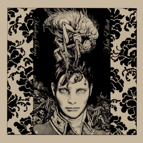
Matt Elliott - Howling Songs (2008) This strange, scary and truly original cover captures attenton and perfectly reflect the music’s essence (experimental rock and folk).
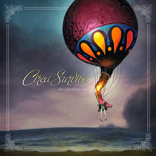
Circa Survive - On Letting Go (2007) Two years later, Circa Survive released a new album with this cover, which seems caught between a dream and a nightmare
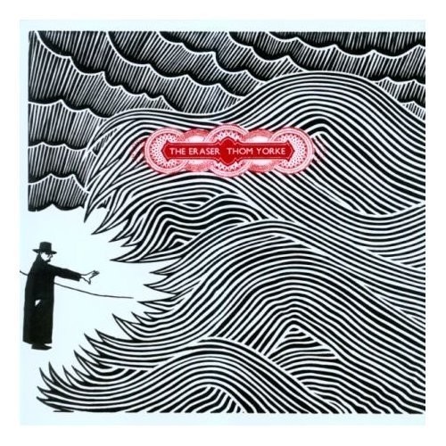
Thom Yorke - The Eraser (2006) This cover, with it’s simple black, white and red hand-drawn design, is captivating.
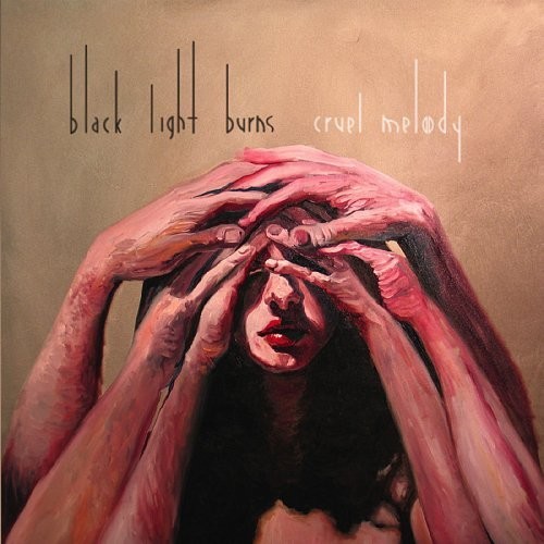
Black Light Burns - Cruel Melody (2007) Taking a more classical route on this cover art, Black Light Burns manages to catch a browser’s eye.
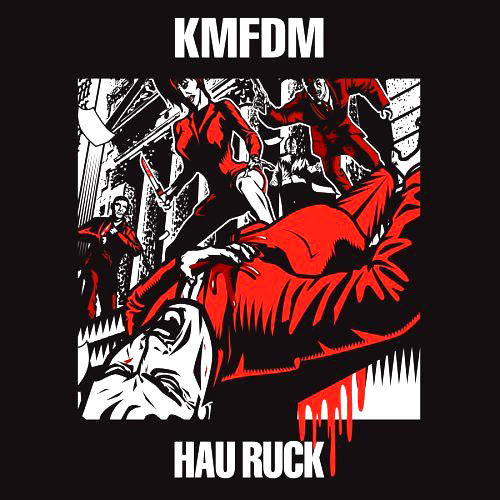
KMFDM - Hau Ruck (2005) Harsh, abrupt, and loud, this KMFDM cover art gets in your face.
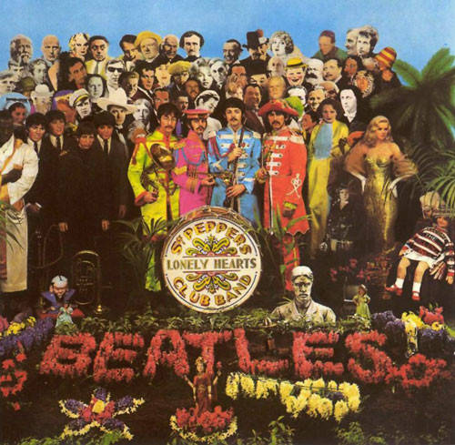
The Beatles - Sgt. Pepper’s Lonely Hearts Club Band (1967) Some say no collection of cover art is worth mentioning without this cover.
As Cities Burn - Hell or High Water (2008) Both Hell and high water make their appearance in this album cover by As Cities Burn, and the heavy relief styling mated with macabre humor do well to quickly catch your eye.

Bring Me the Horizon - Count Your Blessings (2006) Good photographic composition draws the viewer’s eye to the little girl immediately in this cover from Bring Me the Horizon, only to then take it on a tour all over the picture.

Deftones - Deftones (2003) Relaxed and friendly typography tops this self-titled album’s cover art, while perfectly over-contrasted colors surround the skull in the center. This cover stands out anywhere.

Massive Attack - Mezzanine (1998) The idea of such a limited color scheme and so much white space may seem boring on paper, but the execution of this album’s cover art was flawless and the image has been burned to memory for millions of fans world-wide ever since.

Frank Zappa - Ship Arriving Too Late to Save a Drowning Witch (1995) This cover combines a silly title with a Swedish-looking font and an imaginatively simple drawing that, once we’ve read the title, really does look like a drowning witch and a ship’s keel.

Toad the Wet Sprocket - Coil (1997) This album cover, while very full of activity, manages to pull off a gorgeous, monochromatic glow that draws the reader in from the start.

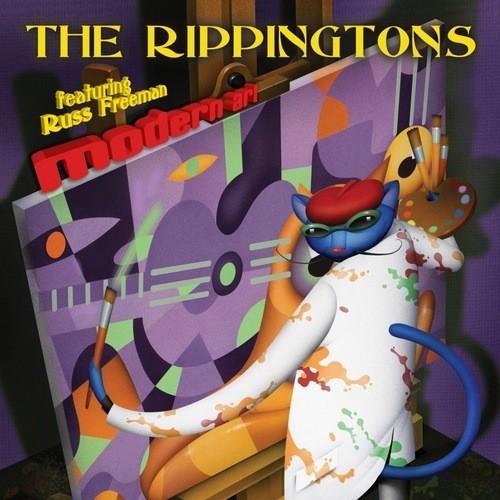
The Rippingtons - Modern Art (2009) While the typography on this cd cover could be much better, the “cool cat” and his art seem to make up for it.
The Van Buren Regulars - 14 Minutes ‘till 3 (2007) Beautiful lighting and a good setting make the photograph in this cover art perfect for what it’s been used for. The title of the album serves as a seat to the band-name and the reader feels relaxed, as though peering over the railing and looking down the stairwell like a child might.

Norma Jean - O God the Aftermath (2005) Like viral marketing, Norma Jean’s album is made to stop a browser in their tracks and force them to wonder what happened on the cover. Did somebody write on it? Is this a used cd? This kind of extended attention is exactly what album art should get.

Green Day - 21st Century Breakdown (2009) Warm and grungy, this cd cover art also captures a tinge of teenage angst.

Lemon Jelly - Lost Horizons (2002) Looking for a lost horizon is exactly what the viewer winds up doing when looking at this album cover, due to the flow given it by the artist.

Out of Enemies - Into the Darkness (2009) Good use of artist rendering here shows a surrealistic scene in modern manga-style illustration. We don’t know what’s in the woods, or why the hero needs to enter. We just know he’s Out of Enemies.

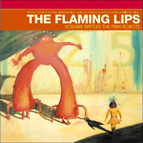
The Flaming Lips - Yoshimi Battles the Pink Robots (1988) This cd cover art is unique and interesting, and with a pink robot, how could they lose?
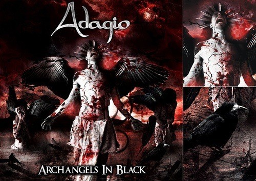
Adagio - Archangels in Black (2009) Dark and moody, this cover art composition was designed to highlight key features. Mystery and anquish draw the listener to this cover.
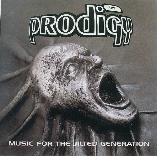
The Prodigy - Music for the Jilted Generation (1995)
Sepultura - Roots (1996) Hot colors with a tribal infusion decorate this cd cover. The disconnect between the head and neck make this image even more interesting.

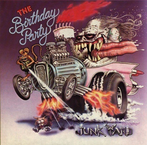
Junkyard - The Birthday Party (1982) This cd cover art is macabre and humorous at the same time. There is a little bit of everything in the image, and with each look one might see something that went unnoticed before.
Caged A budding artist created this image in hope that it would be used as cd cover art. It’s frightening and striking at the same time. The two faces could represent may things and may make an excellent cover image for the right band..

Yeah Yeah Yeahs - Zero (single, 2009) Some covers totally mess with your mind. This is one of them. The bright blue eye seems to be staring out from a pair of shiny red lips. This is an unexpected composition, to say the least, and has helped propel the Yeah Yeah Yeah’s from unknown independents to household names.

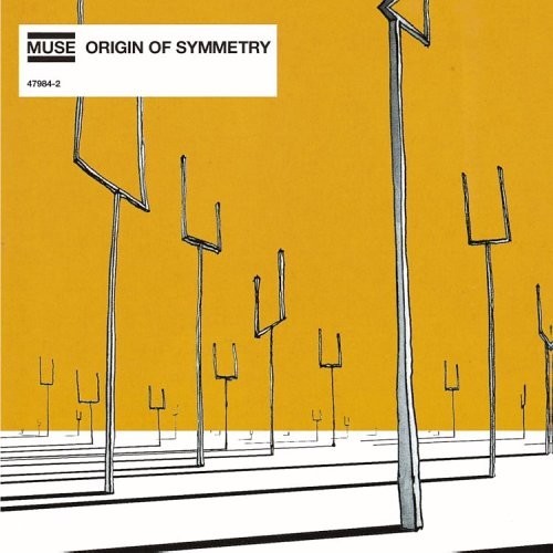
Muse - Origin of Symmetry (2001)
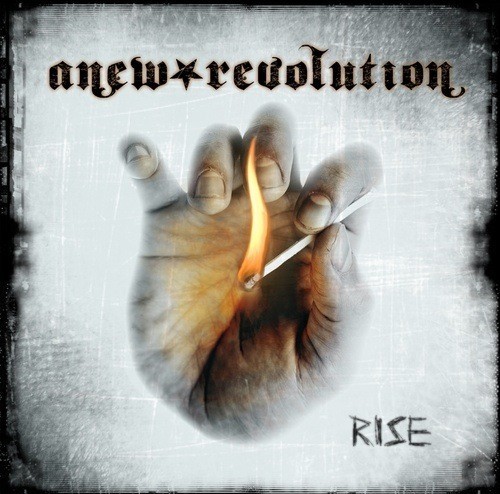
Anew Revolution - Rise (2008) This cd cover art is simple and basic, yet incredibly striking. The edges look charred already, while a hand holds a match in the foreground. While the overall color scheme is subdued, even cold, the flame is embellished to give the illusion of heat.
Further Seems Forever - Hide Nothing (2004) Matching the cover in metaphor to the name of the band is a common trick in album art, but the more abstract the band-name the more difficult it becomes to accomplish. This cover managed to do pretty well in its attempt.

Eagles of Death Metal - Heart On (2008) A startling image, front and center on this cd cover commands attention. The red and black contrast also serve to draw eyes. However, a human heart clenched in a fist may be a bit too strong, and many potential listeners may keep walking.

Ninja Academy - bra’ka dOm (2005) Ninjas are rarely seen, and conjoined-twin ninjas are even more of a rarity. The pair gaze into a crystal ball in an attempt to determine if this cover art will be of any interest to potential listeners.

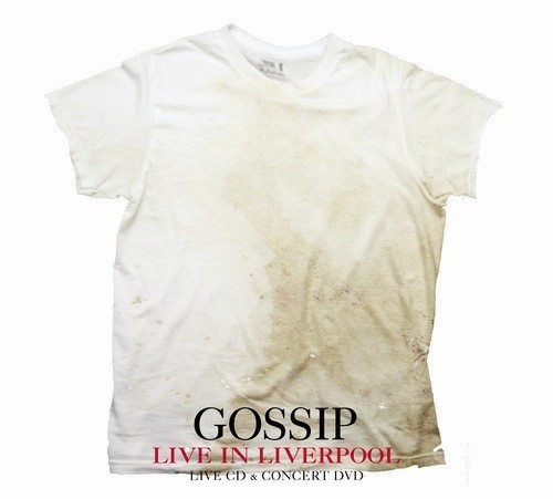
The Gossip - Live in Liverpool (2008) This cover is simple, bold and effectively conveys the message in an instant. The dirty laundry pictured is a clever play off the band’s name.
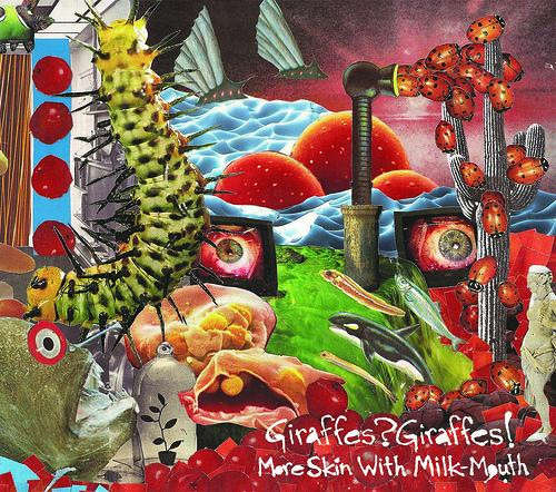
More Skin With Milk-Mouth - Giraffes? Giraffes? (2007) Nothing seems to make sense here, yet it works on this cd cover. More flying fish, an invasion of ladybugs and a Roman statue all fit together in this intriguing, colorful mess.
Alpha Rev - The Greatest Thing I’ve Ever Learned (2008) Another approach to grunge is seen in this cd cover artwork that succesfully combines a retro feeling and a modern touch.

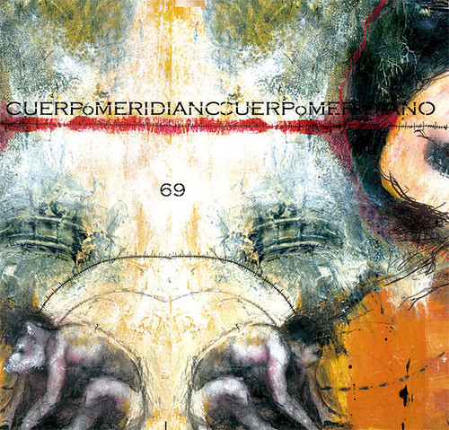
Cuerpo Meridian - 69 (2006) The artwork here is so beautifully abstract that we hardly notice the psuedo-twins crouching at the bottom. A deeper look reveals more embedded messages within this cd cover.
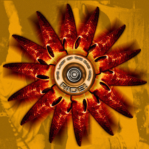
RIDE! - The Last of the Bad Men (2008) This is another example of simple, yet striking cd cover design. Colors and effects were expertly applied to create artwork that is stunning enough for a frame, yet is used to promote another form of art instead.
faux pas’ - europa (never released) This interesting cd cover brings the unexpected into the artwork. While not conventionally attractive, it is interesting and worth a closer look.

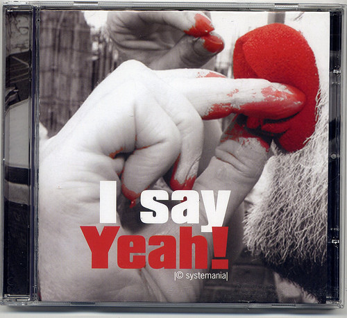
Systemania - I Say Yeah (2007) Black with white and red usually make for a stunning visual combo. This cd cover uses black and white photography with red accents to create a masterpiece.

Mark Cool & the Folk Stars (2007) This charming folk-art cover works perfectly for this folk music cd.

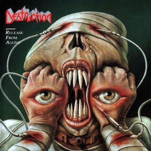
Destruction - Release from Agony (1988) This cs cover has more creep factor than a vintage horror flick, yet is strangely fascinating.
Coldplay - Viva LaVida (2008) A vintage French battleground is the scene for this cd cover. Smear and splatter bring it to life.

Motorhead - Orgasmatron (2006) A cd cover that could inspire nightmares is not quickly forgotten. This Motorhead cd cover features an image that makes an impact.

A Perfect Circle - Mer de Noms (2000) Simple and elegant artwork can also make a great cd cover. This design is particularly attractive because all of the elements work together perfectly to create a memorable and uncluttered cover.

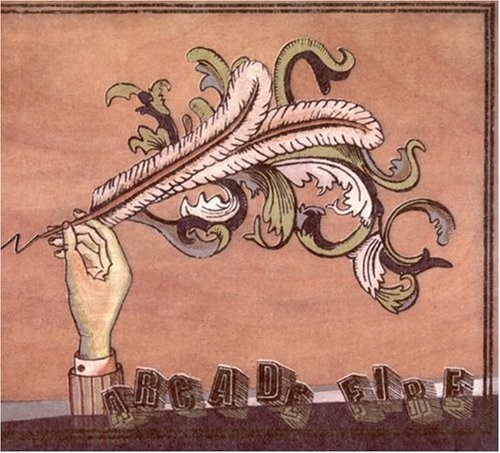
Arcade Fire - Funeral (2004) Completely vintage in appearance, this Arcade Fire cd cover art is nearly monochromatic and simplistic in design.
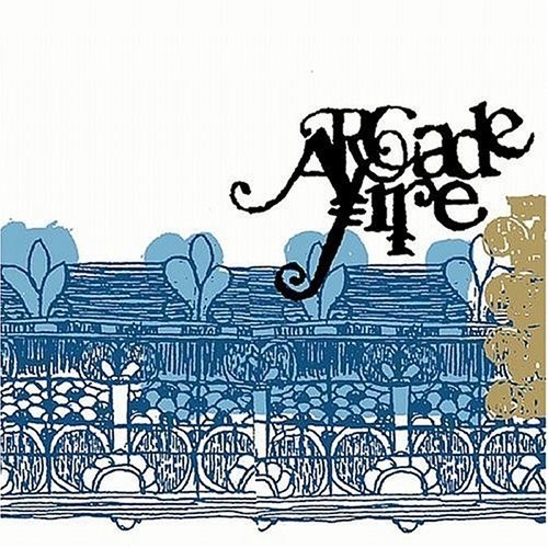
Arcade Fire (2005) The creative use of typography and white space sets this cover art apart.
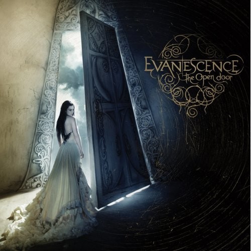
Evanescence - The Open Door (2006) A moody and romantic tone is set with this cd cover art design. The mystery lies on the other side of the door.
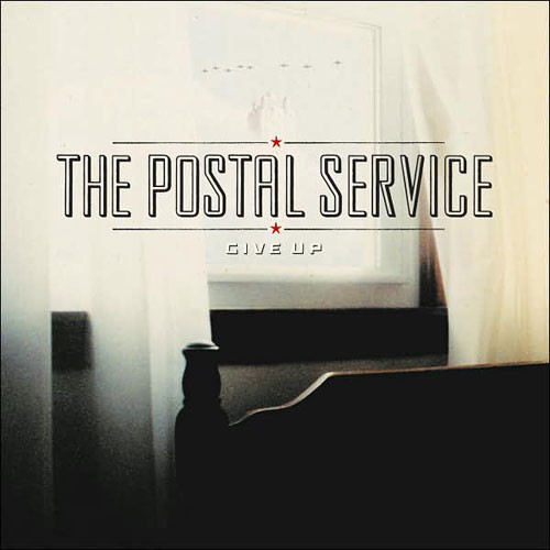
The Postal Service - Give Up (2003) This extremely simple cd cover design is also extremely memorable and effective. Soft focus on the background photo give the cover an understated elegance.
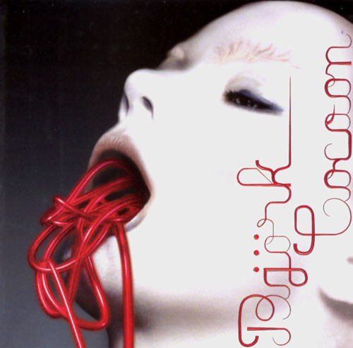
Bjork - Medulla (2004) Bjork covers are generally extremely eye-catching. Rather than straight glamour shots, her cover art generally reflects a unique style that is all her own.

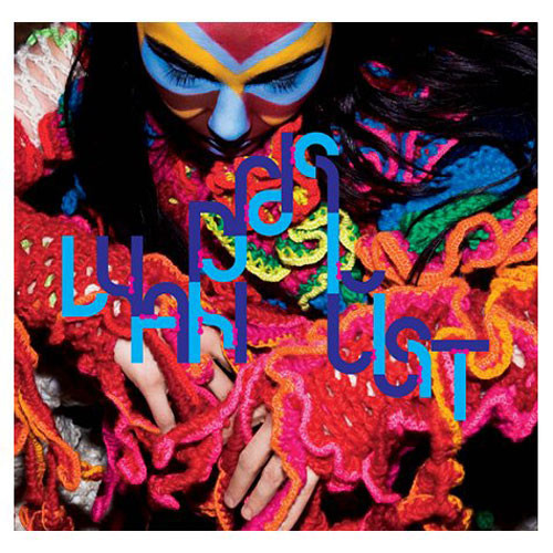
Bjork - Wanderlust (2008)
Cocteau Twins - Treasure (1991) The music on this album has been described as sensual and timeless, and the cover art also falls in line with that description. Its simplicity allows it to withstand the test of time.
Radiohead - OK Computer (1997) The music on this album is about machines dehumanizing people, and the cover art seems to touch on the speed and technology of modern life.
Radiohead - In Rainbows (2007) Taking the rainbow theme to task, the artist used an interesting background and multi-colored text with random keystrokes inserted to create this cover art.
She Wants Revenge (2005) This self-titled album made a splash with this striking cover art.

Wet Striking and self-explanatory, this cd cover art stands out in a crowd.

Shoutin’ - Don Wilkerson (1963) Classic art from the Miles Davis era, when great cover art was in its infancy.
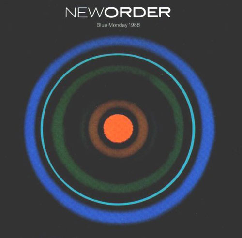
New Order - Blue Monday (1988) New Order departed from its usual style of cover art in favor of this symbolic design for Blue Monday.
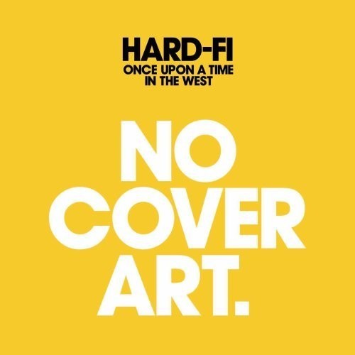
Hard-Fi - Once Upon a Time in the West (2007) A new approach to cover art from Hard-Fi. This is pretty self-explanatory.
Fucked Up - Year of the Rat b/w First Born (2009) The combination of the image, colors and use of white space make this cover hard to resist.

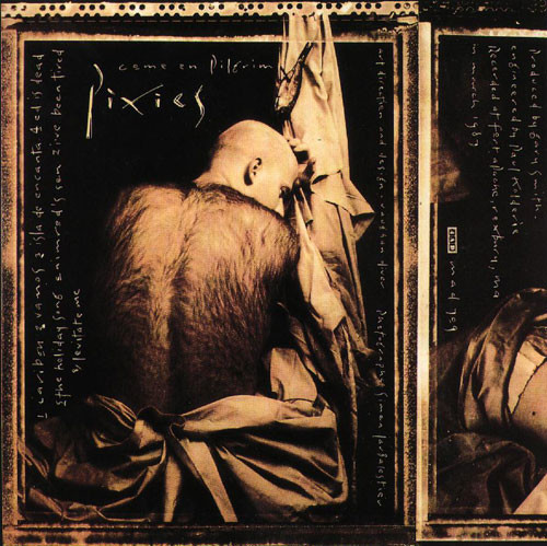
Pixies - Come on Pilgrim (1987) This bold and shocking imagery appeared on the cover of the Pixies’ 2003 release, Come on Pilgrim.
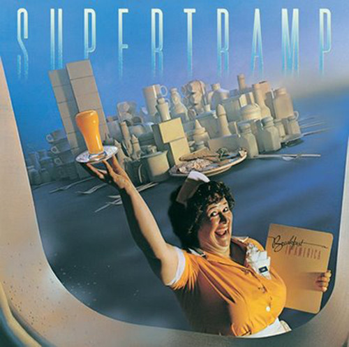
Supertramp - Breakfast in America (1979) Classic cover art no collector should be without.
Orbital - In Sides (1996) Chaotic and colorful cover art decorated the cover of this Orbital cd.

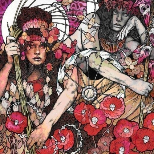
Baroness - The Red Album (1988) This gorgeous cover art was created by Baroness lead singer John Dyer Baizley. Baizley does all of the band’s artwork and has also worked on art for other bands.
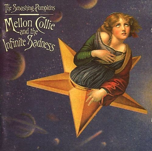
The Smashing Pumpkins - Mellon Collie and the Infinite Sadness (1995) The cover art on this cd looks vintage, but was produced for the 1995 release of this much-loved album.
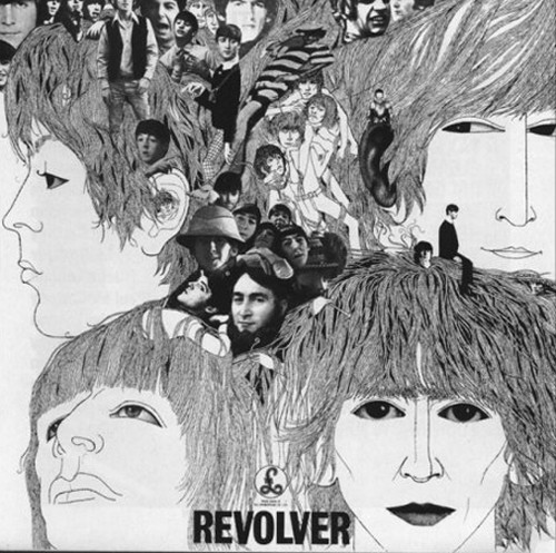
The Beatles - Revolver (1966) This album took place during confusing time for the Beatles, when they were in a state of flux and trying many new things; this cover art conveys the idea of just that.
Pink Floyd - The Darkside of the Moon (1973) Voted and declared on many lists internationally as the greatest album cover art in history, The Darkside of the Moon stands the test of time as it’s still wildly popular in its simplicity.

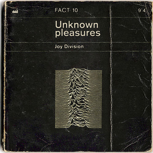
Joy Division - Unknown Pleasures (1979) Joy Division, being known for their commitment to music, as well as being very dark, are personified in this very minimalistic cover.
Muse - Origin of Symmetry (2001)
Anew Revolution - Rise (2008) This cd cover art is simple and basic, yet incredibly striking. The edges look charred already, while a hand holds a match in the foreground. While the overall color scheme is subdued, even cold, the flame is embellished to give the illusion of heat.
Further Seems Forever - Hide Nothing (2004) Matching the cover in metaphor to the name of the band is a common trick in album art, but the more abstract the band-name the more difficult it becomes to accomplish. This cover managed to do pretty well in its attempt.
Eagles of Death Metal - Heart On (2008) A startling image, front and center on this cd cover commands attention. The red and black contrast also serve to draw eyes. However, a human heart clenched in a fist may be a bit too strong, and many potential listeners may keep walking.
Ninja Academy - bra’ka dOm (2005) Ninjas are rarely seen, and conjoined-twin ninjas are even more of a rarity. The pair gaze into a crystal ball in an attempt to determine if this cover art will be of any interest to potential listeners.
The Gossip - Live in Liverpool (2008) This cover is simple, bold and effectively conveys the message in an instant. The dirty laundry pictured is a clever play off the band’s name.
More Skin With Milk-Mouth - Giraffes? Giraffes? (2007) Nothing seems to make sense here, yet it works on this cd cover. More flying fish, an invasion of ladybugs and a Roman statue all fit together in this intriguing, colorful mess.
Alpha Rev - The Greatest Thing I’ve Ever Learned (2008) Another approach to grunge is seen in this cd cover artwork that succesfully combines a retro feeling and a modern touch.
Cuerpo Meridian - 69 (2006) The artwork here is so beautifully abstract that we hardly notice the psuedo-twins crouching at the bottom. A deeper look reveals more embedded messages within this cd cover.
RIDE! - The Last of the Bad Men (2008) This is another example of simple, yet striking cd cover design. Colors and effects were expertly applied to create artwork that is stunning enough for a frame, yet is used to promote another form of art instead.
faux pas’ - europa (never released) This interesting cd cover brings the unexpected into the artwork. While not conventionally attractive, it is interesting and worth a closer look.
Systemania - I Say Yeah (2007) Black with white and red usually make for a stunning visual combo. This cd cover uses black and white photography with red accents to create a masterpiece.
Mark Cool & the Folk Stars (2007) This charming folk-art cover works perfectly for this folk music cd.
Destruction - Release from Agony (1988) This cs cover has more creep factor than a vintage horror flick, yet is strangely fascinating.
Coldplay - Viva LaVida (2008) A vintage French battleground is the scene for this cd cover. Smear and splatter bring it to life.
Motorhead - Orgasmatron (2006) A cd cover that could inspire nightmares is not quickly forgotten. This Motorhead cd cover features an image that makes an impact.
A Perfect Circle - Mer de Noms (2000) Simple and elegant artwork can also make a great cd cover. This design is particularly attractive because all of the elements work together perfectly to create a memorable and uncluttered cover.
Arcade Fire - Funeral (2004) Completely vintage in appearance, this Arcade Fire cd cover art is nearly monochromatic and simplistic in design.
Arcade Fire (2005) The creative use of typography and white space sets this cover art apart.
Evanescence - The Open Door (2006) A moody and romantic tone is set with this cd cover art design. The mystery lies on the other side of the door.
The Postal Service - Give Up (2003) This extremely simple cd cover design is also extremely memorable and effective. Soft focus on the background photo give the cover an understated elegance.
Bjork - Medulla (2004) Bjork covers are generally extremely eye-catching. Rather than straight glamour shots, her cover art generally reflects a unique style that is all her own.
Bjork - Wanderlust (2008)
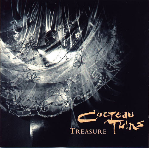
Cocteau Twins - Treasure (1991) The music on this album has been described as sensual and timeless, and the cover art also falls in line with that description. Its simplicity allows it to withstand the test of time.
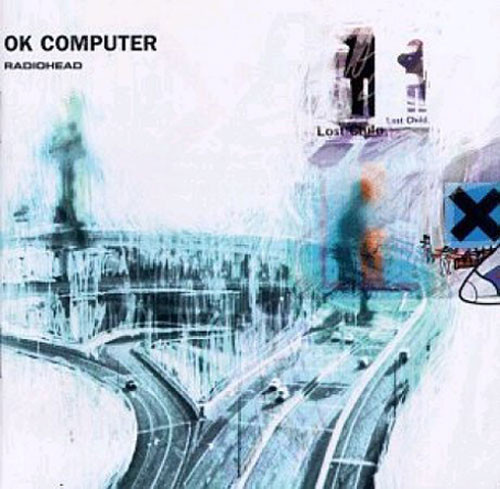
Radiohead - OK Computer (1997) The music on this album is about machines dehumanizing people, and the cover art seems to touch on the speed and technology of modern life.
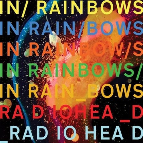
Radiohead - In Rainbows (2007) Taking the rainbow theme to task, the artist used an interesting background and multi-colored text with random keystrokes inserted to create this cover art.
She Wants Revenge (2005) This self-titled album made a splash with this striking cover art.
Wet Striking and self-explanatory, this cd cover art stands out in a crowd.
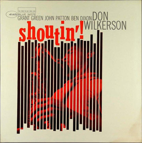
Shoutin’ - Don Wilkerson (1963) Classic art from the Miles Davis era, when great cover art was in its infancy.
New Order - Blue Monday (1988) New Order departed from its usual style of cover art in favor of this symbolic design for Blue Monday.
Hard-Fi - Once Upon a Time in the West (2007) A new approach to cover art from Hard-Fi. This is pretty self-explanatory.
Fucked Up - Year of the Rat b/w First Born (2009) The combination of the image, colors and use of white space make this cover hard to resist.
Pixies - Come on Pilgrim (1987) This bold and shocking imagery appeared on the cover of the Pixies’ 2003 release, Come on Pilgrim.
Supertramp - Breakfast in America (1979) Classic cover art no collector should be without.
Orbital - In Sides (1996) Chaotic and colorful cover art decorated the cover of this Orbital cd.
Baroness - The Red Album (1988) This gorgeous cover art was created by Baroness lead singer John Dyer Baizley. Baizley does all of the band’s artwork and has also worked on art for other bands.
The Smashing Pumpkins - Mellon Collie and the Infinite Sadness (1995) The cover art on this cd looks vintage, but was produced for the 1995 release of this much-loved album.
The Beatles - Revolver (1966) This album took place during confusing time for the Beatles, when they were in a state of flux and trying many new things; this cover art conveys the idea of just that.
Pink Floyd - The Darkside of the Moon (1973) Voted and declared on many lists internationally as the greatest album cover art in history, The Darkside of the Moon stands the test of time as it’s still wildly popular in its simplicity.
Joy Division - Unknown Pleasures (1979) Joy Division, being known for their commitment to music, as well as being very dark, are personified in this very minimalistic cover.
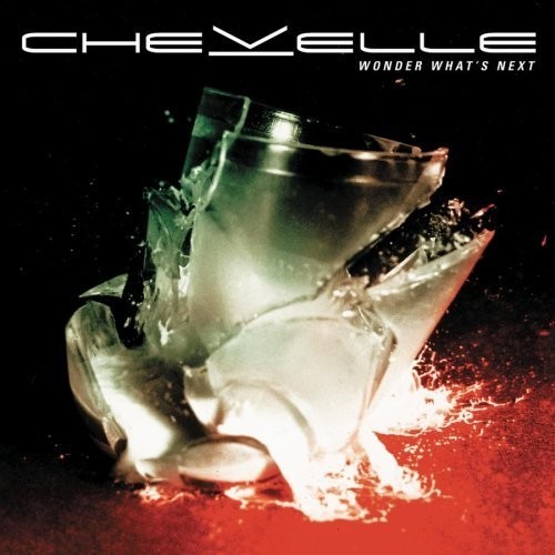
Chevelle - Wonder What’s Next (2002) This cover shows a glass of milk crashing to the floor, the title Wonder What’s Next leads the reader to think of the proverb.
Devin Townsend - Ziltoid the Omniscient (2007) This extremely humorous cover mimics classic sci-fi B-movies. Someone browsing the record store might stop just to see if it’s a misplaced DVD. Covers like this serve to pique curiosity, and often succeed.

Keane - Under the Iron Sea (2006) Using the old imagery of the “Iron Horse” in this cover, Keane manages to make both the name of the album and the cover art flow together as a complimentary pair.

Lee Morgan - The Rumproller (1965) Using extreme distortion on the typography in this cover art causes the reader to pause and pay attention, only to be greeted by the full artist and album information off to the side.

Marylin Manson - Mechanical Animals (1998) Always one for shock value, Marylin Manson made sure he would grab eyeballs with this album cover; the cover was so effective that it had to be altered just to be taken off ban-lists.

Menomena - Friend or Foe (2007) This clever album cover actually housed a several-disc set, and depending on which disc was placed in front, the art would change accordingly, with the disc number visible in the strange being’s hand.

The Sex Pistols - Never Mind the Bollocks Here’s the Sex Pistols (1977) Always out to make a statement, the Sex Pistols used this album cover to not only get a laugh out all who came across it, but also to raise brand-awareness. If you’re going to self-title an album, this is a good way to go about doing it.

Tiger Lou - Partial Print (2008) Typography carries this with creative vignetting, as Tiger Lou catches the reader’s attention instantly.

Beck - The Information (2006) The album was issued with a blank sleeve and booklet and one of four different sheets of stickers for fans to make their own album art. Beck explained to Wired magazine he wanted no two copies of the CD cover to be the same: “The artwork is going to be customizable. The idea is to provide something that calls for interactivity.” However, because the unique album art concept was seen as a gimmick to bolster retail sales, The Information was deemed ineligible to enter the UK Albums Chart.

Opeth - Ghost Reveries (2005) Opeth wants to haunt you in this album cover, to make you stop and think, and wonder. It’s hard not to, as it’s very artistically done so as to draw your attention.

Sila - Imza (2008) Normally a photo shoot of the artist winds up somewhat plain; Sila does things differently in this shot, as it barely looks real. The feathers reminds us more of a cinematic trailer for a fantasy movie or video game, the brightness draws us into the center where her eyes anchor the canvas.

The Darkness - One Way Ticket to Hell… And Back (2005) Wraparound covers, while not quite rare, aren’t common either. So when a good one comes up, it’s always a nice thing to see, and this one is simply amazingly well done.

The Who - Then and Now (2004⁄2006) This album art showcases the fact that The Who have been around since before most of us were born. The vintage styling makes every piece of information “pop” and the whole thing comes together to look like a concert poster.

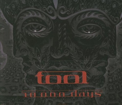
Tool - 10,000 Days (2006) While the cover itself is not amazing, it’s what Tool have done with the packaging that makes it worth a mention. Tool raised the bar with digipacks by including a set of stereoscope glasses to view the accompanying artwork.
The Yeah Yeah Yeah’s - It’s Blitz (2009) Doing what they do best, the Yeah Yeah Yeah’s give another great example of how to turn heads. Upon seeing this, most everyone tends to stop and look.


