Non Profit Website Design: Examples and Best Practices

Email Newsletter
Weekly tips on front-end & UX.
Trusted by 182,000+ folks.


 Custom Web Forms for Angular, React, & Vue. Your backend.
 Celebrating 10 million developers
Non profit websites share many of the same best practices as any website. They need to be user friendly, easily navigable, and use appropriate fonts, colors, and other design elements. But often a non profit website needs to offer more than your typical corporate site.
A non profit’s website needs to make it easy to find out more about their cause, to donate money, and to become more involved. It needs to make it easy for media contacts to find the information they need and the contact information of key personnel. And it needs to do all this in a way that’s inviting to the organization’s targeted donors and/or volunteers.
You may also be interested in the following related posts:
- Usability Review of Charity Websites Taking the Lead
- So You Want To Crowdfund Your Startup App?
- Avoiding The Pitfalls Of Free
Below are a list of best practices for designing non profit websites followed by some examples of non profit websites that are getting things right.
1. Make Your Site Donor-Friendly
Donations are a necessary thing for every non profit organization out there. Your website can be a great place to solicit donations, especially from new donors. It can also make it easier for recurring donors to make additional donations. In either case, you want it to be a simple and straight-forward process for people to give you money.

There are a few things to keep in mind when creating a donor-friendly site. First, make sure your donation page is prominently linked from your home page. Whether you do this with a special banner or button or simply make it prominent in your regular navigation, donors have to see where to donate before they can do so.
Second, make the actual donation process as painless as possible. Don’t require visitors to set up an account to donate. The donation process shouldn’t be any more complicated than any other online transaction. Other than information required to process their credit card or e-check, don’t require any other information. And use a single-page donation form if possible, with just one confirmation page. There’s less chance that there will be browser or connectivity issues if there’s only a single page to deal with.
2. Make Your Site Media-Friendly
Getting media attention can have a huge impact on a non profit organization. Whether the media attention brings in more donations directly or simply raises the profile of the organization, getting attention from journalists, bloggers, and anyone else with an audience is important.
Make it easy for journalists to find information about your organization. Include profiles of your board of directors, founder(s), and other key personnel. Make sure you include contact information (email and phone) for each of these key people. Have a downloadable media kit that includes everything your print media kit does.
Offer downloadable images from your site so journalists and bloggers don’t have to contact your and wait for a response. And include press-ready quotes, both from members and directors as well as outsiders. Make it clear that journalists and other organizations may use these items in news coverage without contacting the organization for prior permission.
3. Make Your Site Volunteer-Friendly
Make it easy for visitors to your site to find information on how they can get involved. There are plenty of people out there who might not have the money to make a donation but are still passionate about what your organization is doing.
Whether you provide detailed information about volunteering directly, steps people can take on their own, or just contact information for your volunteer organizer, make sure you don’t overlook this crucial bit of information.
Providing multiple means of contact makes it easier for volunteers to get in touch, so include an email address, phone number, and a web contact form if you can.
4. Make Sure Your Organization’s Purpose is Immediately Apparent
How many times have you gone to a website and not had a clue what the site was about? This happens all too often. Designers and clients often take for granted what visitors to their site will already know about their organization.
But considering how much information is pushed in bite-size pieces on sites like Twitter and Facebook, there’s no telling how much or how little visitors will know. With some organizations it’s easy enough to figure out what the organization is about just by its name, but for others it’s not so easy.
Putting an abbreviated mission statement right on the home page is one way to solve this. Another way is to put a prominent link somewhere on the home page that takes visitors to an about page that offers concise, plain-language (not “marketing-ese”) information about what the organization does.
5. Make Sure Your Content Takes Center Stage
Design on any site should be transparent, and especially so on non profit sites. That’s not to say your site can’t have an interesting design, just that the design should revolve around your content and your mission, not the other way around. Take into account the types of information you’ll be providing on the site and the formats that will be used.
Consider up front how much multi-media elements will be used, and whether they’ll be used on every page or just in special gallery sections. If you plan to post videos and photos on multiple pages, you’ll need to make sure your column widths other elements are complimentary to the kinds of media you want to use.
Make sure your columns are wide enough to accommodate YouTube videos, for example. If they’re not, any time you embed a video (or similar element), your site design will look haphazard (and some of your site content might end up covered up).
6. Make Sure Your Website is Consistent with Your Other Promotional Materials
Your logo should use the same logo and colors as your other promotional materials. Maintaining a consistent brand throughout your organization greatly increases your chances of being recognized in passing. Your website doesn’t have to (and probably shouldn’t) match your print promotional materials exactly, but echoing the look and feel of those materials increases brand identity.
Make sure the content is consistent, too. Proofread and copyedit your website content just as you do your print materials. While it’s easier to change content on a website, it still gives a negative impression if your site is riddled with errors and inaccuracies.
7. Know Your Site’s Purpose Up Front
The leaders of your organization (or whoever is in charge of the organization’s website) should make a list of what the goals for the site are before starting the design process. Is the site primarily to allow existing members to stay updated? Is it to solicit donations? Is it to get new volunteers or members? Is it to raise awareness in general?
Whatever your purpose is, knowing it and communicating it to your designer going into the design process will save headaches and delays down the road. Make sure everyone is on board with the same vision, too, so you don’t have to make unnecessary changes down the road, which saves both time and money.
8. Include a News Section or Blog
Including a blog or news section has a couple of big advantages for non profit sites. First, it gives people a reason to come back to your site. If you offer news about your organization and your cause, people who are interested in either will come back on a regular basis (or subscribe via RSS). This keeps your site visible and makes it more likely they’ll become more involved in the future (or stay involved if they are already).
Second, blogs and news sites are often quoted by other blogs and news sites. This increases the exposure for your site and will likely bring you more traffic.
Third, constantly-updated content increases your search engine visibility. This makes it easier for people actively looking for information related to your organization to find your site.
20 Examples Of Great Non Profit Sites
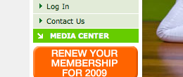
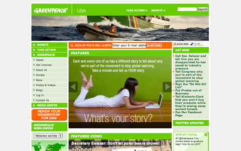
Greenpeace USA The Greenpeace website does a lot of things right. Links for donating or becoming a volunteer are featured prominently in their side navigation. Their media center page is also displayed prominently. The site features integrated mutli-media content in the form of both slideshows and videos, as well as both blogs and a news section.
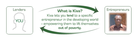
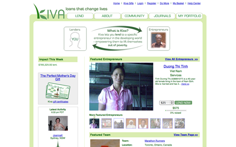
Kiva The Kiva website has a very simple and straightforward design. Right at the top of the page they explain exactly what Kiva does, and they make it very easy for visitors to lend money. They also have a featured entrepreneur on their home page, further encouraging others to join. They also feature an “About” link prominently in the header, which then links to tons of additional information, including a press center.
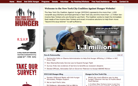
New York City Coalition Against Hunger The New York City Coalition Against Hunger offers up an excellent website. Links to volunteer and donate are featured right on the home page. In the top navigation they include prominent links to both their “Media” section and an “About” section. Recent updates from the NYCCAH Hunger Blog are also included right on the home page.
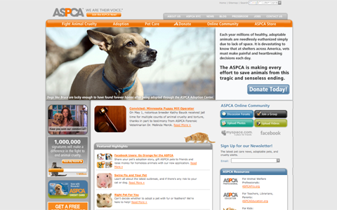
ASPCA The ASPCA website makes it immediately apparent through images and small text areas on their home page what the organization is all about. Donation links are featured both in the main content area of the home page and in the top navigation. Links to the “Pressroom” and “About” sections are also included in the top nav. Links to additional resources are also featured prominently.
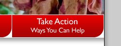
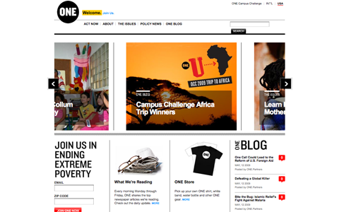
One This is one of my favorite non profit sites. A multi-media slideshow is featured prominently on the home page, showcasing featured content. Links for more information, the issues the organization is interested in, and links to join or take action are all featured prominently in the top navigation and elsewhere on the home page. The site also includes a blog (featured on the home page).
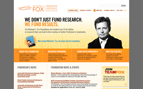
The Michael J. Fox Foundation for Parkinson’s Research The Michael J. Fox Foundation website offers a great home page that includes tons of great information without looking cluttered. Links for living with Parkinson’s, about the foundation, research programs, and how to help are included prominently in the middle of the page. A donation link is also included in the top navigation. And news both about Parkinson’s and the Foundation are also featured prominently on the home page.
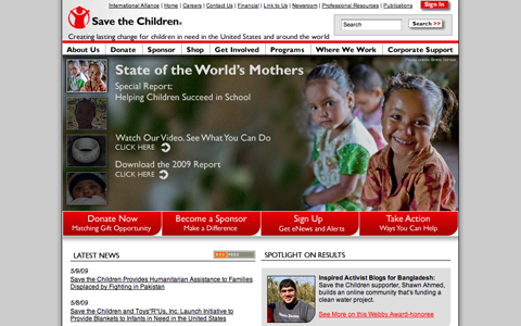
Save the Children The Save the Children website is an excellent example of getting a lot of information into a small space while keeping everything de-cluttered and user-friendly. Links to donate or sponsor a child are included in the top navigation as well as below the slideshow on the home page. There are also links to more information and for other ways to become involved featured prominently. Information on the site is presented in a concise and user-friendly manner, providing plenty of information in easy-to-read chunks.
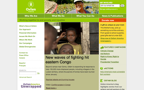
Oxfam America The Oxfam America website uses color to make their donation button stand out on the home page. While the majority of the site is designed in shades of green and tan but the donation link is orange. It stands out without being garish. News is prominently featured on the home page, along with plenty of information about what Oxfam does.
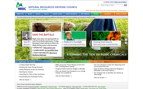
Natural Resources Defense Council The NRDC website also makes use of color to distinguish between different sections of their site. The “Donate” and “Take Action” links are denoted in orange. “Blogs” are in green and everything else, including their “About” and “Policy” page links are in blue. Multi-media content is featured prominently on the home page, as is recent news.
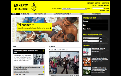
Amnesty International The Amnesty International site makes great use of color, including a bright yellow header and accents mixed with shades of gray and black. A slideshow on the home page shows current news and research. Links to join, donate, or take other action are featured prominently in the sidebar and a link to media information is included in the header. The home page also includes plenty of current news and resources below the main content up top.
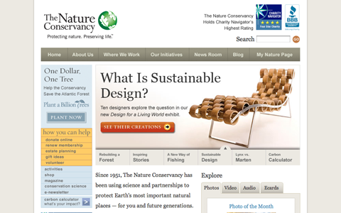
The Nature Conservancy The slideshow on the home page of The Nature Conservancy’s site is one of the best I’ve seen, offering up information about various programs and initiatives they support. The site also includes other multi-media content from the home page. Links to donate, become a member, volunteer and other ways to help the organization are highlighted in yellow in the sidebar, making them easy to find while still fitting with the understated overall site design.
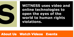
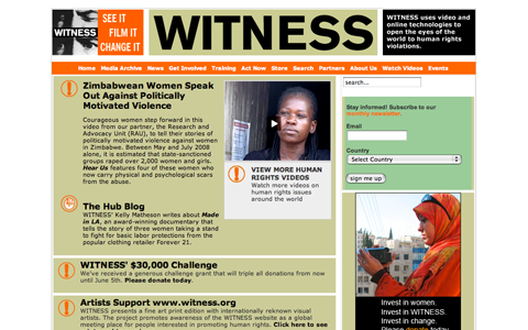
Witness Witness takes a slightly different approach to their site, as monetary donations are not their primary focus. They use their site to effectively solicit video contributions showing human rights violations from countries around the world. Links to news, their media archive, and ways to get involved (including training) are included prominently in the top navigation.
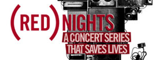
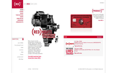
Product (Red) The Product (Red) site features products that support the organization prominently in a slideshow on their home page. They also include links on other ways to get involved, their blog, and learning resources in the sidebar. The overall site design is simple, which is primarily achieved by the limited color palette (red, gray, and white).
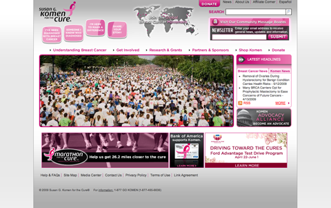
Susan G. Komen for the Cure This site makes great use of space in their header for highlighting important links, including ones to pages for women recently diagnosed with breast cancer, how to make a difference, and a page to share your own breast cancer story. The donation link is featured in the header, making use of a bright pink button where the rest of the header is gray. This is another site that features a slideshow prominently on the home page.
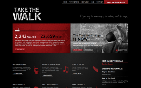
Take The Walk The Take The Walk site makes great use of bold graphics and a slideshow on the home page to immediately capture visitor attention. A graphic showcasing how many miles have already been walked and how many left until they reach their goal is the main highlight of the home page. Below the graphic are the different ways people can contribute and the different causes for which they’re raising money.
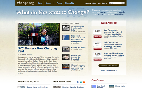
Change.org Change.org is a different kind of non profit site. Their aim is to raise awareness and get individuals to take action on a variety of different causes. Because of this, their “Causes” section is the most prominent feature on their site. Causes are featured in the main content of the home page as well as in the top navigation. Other prominent features are tools to help individuals get started with their own causes.
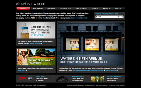
charity: water The charity: water site is a great example of how simple but bold design can make a huge impact. The donate button is red, while the rest of the site employs black and dark gray navigation. Three images linked to different resources on the site make up the bulk of the home page, creating a huge impact without being complicated or fussy. Links for the media, getting involved, and other resources are easily found in the top nav.
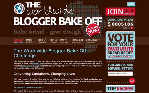
The Breadline Africa Worldwide Blogger Bake Off The Breadline Africa Worldwide Blogger Bake Off site is one of the more Web 2.0-ish non profit sites I’ve seen. It’s easy to find information about the project right on the home page, including brief explanations of every aspect of the event. Links to join the bake off, donate, and to other resources are also featured prominently, as is a counter to show how much money has been raised so far.
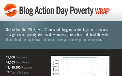
Blog Action Day The Blog Action Day site changes each year based on the cause being blogged about (as well as changing for updates before and after the actual event). In its current incarnation, it’s providing a recap of 2008’s Blog Action Day focusing on poverty. Statistics are prominently featured on the home page (including a chart showcasing the percentage of all blog posts that day focusing on the cause), as is a link to more information about what Blog Action Day actually is. The home page also includes a place to sign up for updates on the next event, press information, and information on how to donate.
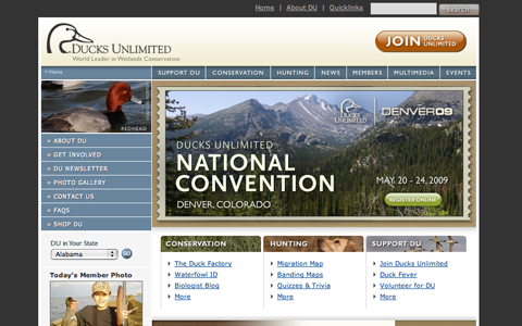
Ducks Unlimited The Ducks Unlimited site focuses on providing useful and relevant content more than anything else. The sidebar is filled with links on how to get involved, their photo gallery, newsletter, FAQs, and about information. A “Join” button is featured prominently in the header but doesn’t detract from the overall design of the site. The top navigation is filled with more links to resources provided by the organization.
Further Resources
Here are additional links that might be of use when designing your portfolio site.
- How Do I Create a Web Site for My Organization? A good overview of website design and development for non profits.
- (Some) Best Practices for Nonprofit Web Site Design Another basic rundown of best practices in non profit web design.
- Web Design Best Practices Checklist A very thorough list of best practices in general website design.
- Web Design and Development: Top 20 Best Practices Another thorough list of best practices.
- Backgrounds In Web Design: Examples And Best Practices A rundown of best practices in designing website backgrounds.
- Pagination Gallery: Examples and Good Practices A rundown on how to organize the pages of your site.


