8 Layout Solutions To Improve Your Designs

Email Newsletter
Weekly tips on front-end & UX.
Trusted by 182,000+ folks.
 Custom Web Forms for Angular, React, & Vue. Your backend.

 Celebrating 10 million developers

In this article, we’ll discuss 8 useful layout solutions and techniques that will help you create a clean and organized content layout. The 8 techniques include sliders, tabs, progressive layouts, structured grids, modal windows, rollover elements, accordions and mega drop-down-menus.
1. Sliders and Carousels
Sliders, also known as carousels, are an organized, interactive and quite smooth way to present information. Sliders are a popular technique because they’re very usable, and you can put a good amount of content into a fixed, compact area – without a slider this content has to be placed somewhere on the page and in many cases you may have no space for it and you may deliberately want to show some information only “on demand”. This helps the user to focus her attention on one content block at a time which is helpful and convenient. And this is exactly where sliders may come in handy.
Examples of Sliders
Thumbnails and icons in the navigation area When designing a content slider or an image slideshow, it’s best to provide users with icons or thumbnails in the navigation area to offer a simple and intuitive navigation. Thumbnails and icons give the user some orientation, explaining where they currently are in the slideshow and what navigation options are available (e.g. a slideshow can have a horizontal or vertical navigation). Besides, the user can quickly select a particular page on the slider.
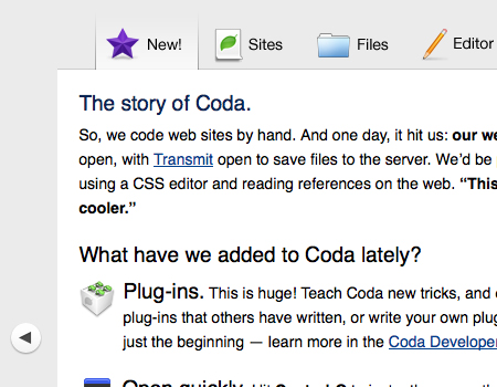
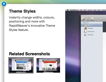
In the slider used on the Coda site you can see that there are tabs provided at the top of the slider. They create a sort of “slider/tab”-element mixed together. This is an excellent idea, because by just looking at the thumbnails, the user can easily find a page in the element. Also, the icons add a very strong, memorable and clear visual support. Apart from icons and labels you can also use image thumbnails or even numbers for the same purpose.
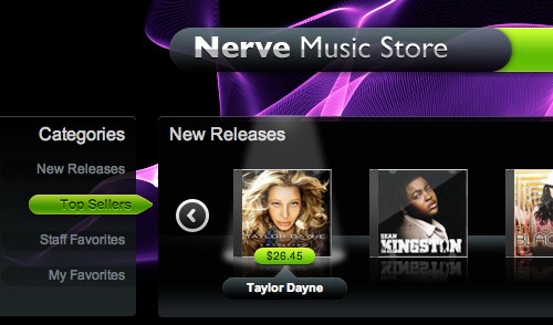
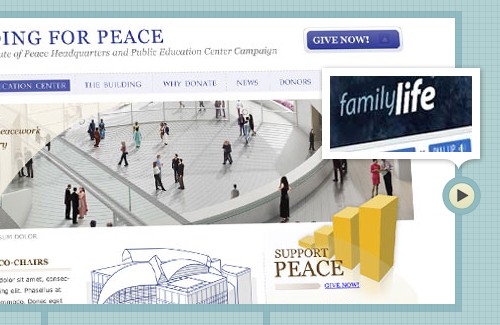
Slider is used for navigation in product items Opposite to the example above, sliders can be used not only to display large chunks of information, but also to help users navigate through dozens or hundreds of available product items in a convenient way. For instance, SourceBits (see the image below) uses multiple sliders (a horizontal and a vertical one) that provide users with an appealing navigation through CD covers.
The slider has large circular buttons on each end to indicate how the navigation works. There are smooth transitions, so the slider looks quite attractive and is comfortable to use. Also, you’ll notice that the illustrations are nicely spaced out, so it is easier to click on individual icons and it is also well-organized. Each item also has a nice lightning hover-effect.
Vertical content sliders with large horizontal “clickbars” Let’s take a look at the slider used on QuickSnapper. It is a very functional vertical slider that works perfectly in the layout. The slider holds a large amount of snapshot items. It is very well organized, and it is easy to find the items within the element. The best part of this slider are the buttons on the bottom and on top of it. They are extended to the entire width of the slider. The large buttons make it much easier to use the slider.
For instance, if you’ve picked one of the presented items and then decided to check further items, you can simply click on the large bar on the top or at the bottom to navigate. That’s convenient and user-friendly. Also, if you go to the site and try it out, you will notice that the buttons also have very nice :active- and :focus-effects, which looks nice and improves usability.
Slider Scripts
You can implement these techniques using the following freely available scripts, techniques and tutorials:
- Slick Accessible Slideshow using jQuery
- Coda-Slider 1.1.1
- jquery.scrollable 1.0.2
- Create an Amazon Books Widget with jQuery and XML
- Agile Carousel
- Easy Image or Content Slider
- Slider Gallery
- Coda Slider Effect
- iCarousel
2. Tabbed Navigation Elements
Basically, tabbed navigation is a technique that is very similar to sliders. You can keep a large amount of data in a compact area that is much smaller than what you would normally need. Tabbed navigation is a common practice, and there a few different ways to carry it out. We’ll focus on the use of tabbed navigation elements within a page, instead of focusing on the use of tabs for main content navigation. A tabbed element obviously separates different content blocks, yet combines them into one area that only takes up a small amount of space.
Examples of Tab Elements
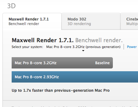
Distinctive backgrounds, large clickable areas, clear separation The first example comes from the “Performance” section of the Mac Pro website, and is a perfect example of a well-constructed tab element. The labels on these tabs are readable, have a large clickable area, and have a good visual separation, so they look exactly as most users expect them to look like. Also, you can see that the currently opened tab has a background matching the background of the main contant area. The inactive tabs have a slightly darker background, and a drop shadow from the content block to add depth and dimension. That’s a very simple effect, yet a very effective one.
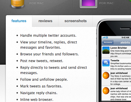
Clean tabs with separation of buttons Here’s another good use of tabs to present the information in a compact manner. The way Atebits’s layout was constructed, there was not a huge amount of space for multiple sections of content. Therefore, they placed the three sections into tabs, so the layout remains very clean and organized. Again, the open tab takes on the background color of the main content area, while the inactive tabs have a darker grey background. Also, you will notice a nice separation between the tabs to further define each individual button. A slight bevel is used to cleanly separate the buttons.
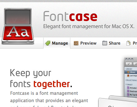
Clean separation of the entire tab set Fontcase has another nicely designed tab set with a strong modern look and feel. Although this design doesn’t have a separation between the unopen tabs, the open one has a clear border. Also, you can see that there is a border above and below the set of tabs. These tabs make use icons and white space to support the text, making the tabs easier to use.
Tab Scripts
You can implement these techniques using the following freely available scripts, techniques and tutorials:
- Create a Slick Tabbed Content Area using CSS & jQuery
- JavaScript tabifier
- Yetii - A JavaScript Tab Interface
- Tabbed Page Interface
- Updated JQuery Nested Tab Set
- Scriptaculous Tabs
- Accordion Tabs
3. Modal Windows
Modal windows, or floating windows, are an excellent way to present additional information that has no space in the page layout. In modal windows, you can present larger images, extra content, alerts/tips that the user will easily notice, videos, and more. When you put information in a modal window, you need to make it clear for your users how to close the window.
It is also important that a link, a thumbnail, an icon, or any other graphic element that triggers the modal window to open is strongly (and clearly) related to the content of the modal window. A similar icon, header or visual can help users to establish a connection between the original link and the opened window.
Examples of Modal Windows
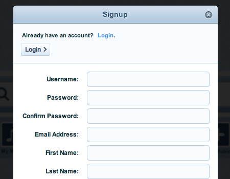
Modal windows for logins and signups The most common element where modal windows are used (apart from “traditional” media-files such as images, audio, video, screencasts etc.) are login- and signup-windows. When you use a floating window for a login/signup, you are saving a good amount of space on each page. Also, the user doesn’t have to load an entirely new page just to login. They can login on any page on the entire website without their current session being interrupted – of course, if the designer of the site made sure that the login- or signup-process can happen behind the scenes with Ajax.
Grooveshark uses a nice signup-window on each page throughout its web-site. Notice that the login-button in the signup-window does not open a new page, but replaces the sign-up form below with the login-form input fields (using the accordion-effect, see below). That’s very convenient and user-friendly.
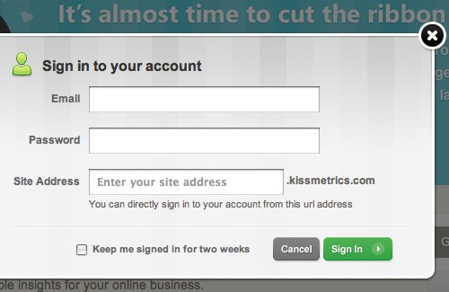
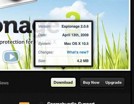
Fade out the page or/and use a drop shadow If you are going to be using a modal window, it is very important to fade out the page behind the window in some way. This could mean using a semi-transparent backdrop, a drop shadow, or both. By doing this, you are making two important design decisions. First, you are bringing the users focus toward the floating window and away from the page behind the window.
Also, you are adding more depth and separation between the window and page, to give the appearance the window is actually physically floating. In the screenshot below (KissMetrics) , you can see a login form contained within a floating window, and the page behind is faded out. By the way, notice, how well the cancel/sign in-buttons are visually designed, too. Beautiful design.
On RealMacSoftware a dropshadow is used behind the window instead of the entire page being faded out. This technique still works nicely by creating depth and separation.
Modal Scripts
You can implement these techniques using the following freely available scripts, techniques and tutorials:
- Fancy Lightbox
- Lightbx 2
- Facebook Image/Content Viewer
- Woork Mootools Lightbox
- nyroModal JQuery Plugin
- JQuery Alert Dialog
- LightWindow
- ThickBox 3.1
4. Rollover Elements
A rollover element is another design element that is nowadays gaining on popularity, particularly in corporate web-sites, portfolios and product sites. The main idea behind the rollover element it that when users hover the mouse over some site element such as a button, the content in some other layout area is displayed automatically. Take a look at the examples below to get a better understanding of what exactly is meant.
Examples of Rollovers
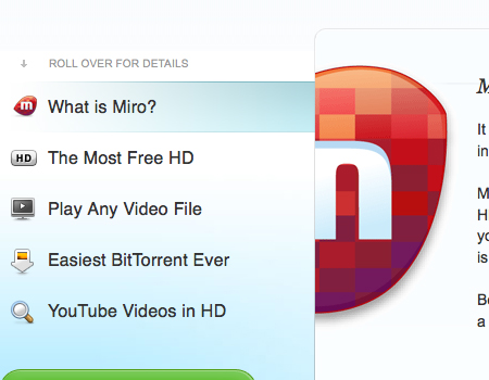
Rollover tabs Below you’ll find a screenshot of the Miro’s homepage where a large and very well-designed rollover element is used. This element is similar to a slider, yet it doesn’t use a button to slide through pages – the sliding takes place automatically.
Subtle rollover hover elements
TaoEffect is a brilliant example of a rollover element that present additional information in a very beautifully styled and clean layout (this effects was used on the Coda-site first, but we chose to use this example instead). The information is presented in a very user-friendly way; all you have to do is hover over the button.
If you visit the site, you can see that this rollover has some nice and soft animated transitions. The opening transition is a vertical wipe with a fade. Finally, you can see that the background is semi-transparent. There is also a highlighted border that adds a clear separation from the other content.
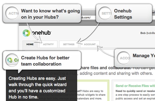
A content map with rollover elements
OneHub uses a rollover element for another effect. Similar to a map, the site page is split into a number of chunk with hints; when a visitors hovers over a hint, additional information is displayed automatically. This effect can be particularly useful for sites that are supposed to showcase product’s features or provide users with explanations or an introduction.
Rollover element integrated in a slideshow Another interesting design approach is presented by SquaredEye – the carousel menu uses rollover effect on the trigger elements to let the users preview previous and next navigation item. In some situations this approach can be useful.
Tooltip/Hover Element Scripts
You can implement these techniques using the following freely available scripts, techniques and tutorials:
- Prototip 2
- Coda Popup Bubbles
- Build a Better Tooltip with jQuery Awesomeness
- jQuery plugin: Tooltip
- Create a Simple, Powerful Product Highlighter with MooTools
- Easiest Tooltip and Image Preview Using jQuery
5. Progressive Layouts
A “progressive layout” is one way to describe a series of content chunks that are supposed to be displayed on a site in a specific order. This is a quite uncommon way to organize information, but it still can be seen on many sites. A progressive layout helps users to move through a long series of information easily.
Examples of Progressive Layouts
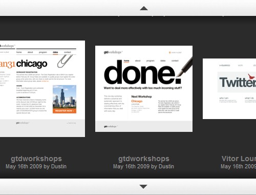
An entire site consists of progressive pages The entire portfolio Sursly.com (shown below) is based on a progressive layout. You can see the “Go” button in the upper right corner of the page. Each page is accessed from the page before it. This progressive system of pages is a substitute for a navigation bar or menu. Of course, the main disadvantage of such layout is the simple fact that it is quite hard to navigate and rather serves the purpose of interactivity.
Although single pages in such layouts can be bookmarked (using the #-anchor), they make it impossible for random visitors to get a broader overview of available navigation options immediately. Besides, such layouts usually have only one “direction” of navigation – forward. It’s not good from the usability point of view.
Progressive Vertical Page
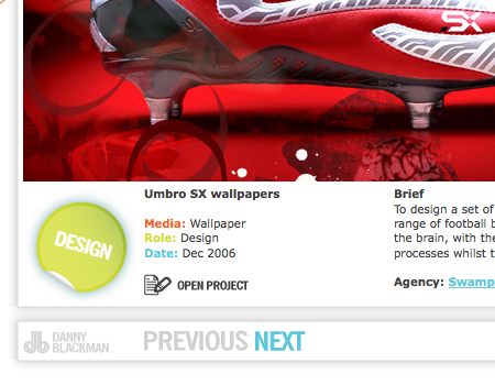
Danny Blackman (the example below) shows a portfolio that is constructed solely on a progressive layout of content. There are separate elements, all displayed vertically on a single page. An auto-scroll feature is provided to bring the users from element to element throughout the page. Again, no menu or main navigation is used, just buttons bringing the user from one element to the next, or back.
ScrollTo Script
- ScrollTo - This is a JQuery plugin that can be used for vertical progressive layouts, like the one shown above.
6. Grids
No article about layouts would be complete without a mention of grids. Grids are often considered to be the fundamental part of any balanced, ordered and concise web layouts. Many designers consider them to offer the most effective way to communicate a large amount of information to the users. Grids can be used solely to display information, without the use of any other techniques. A good grid system will join all of the content of a page into one flowing layout, but still allow for readability and scannability of individual sections.
In the website below, you can see a very strict grid layout in use. There is only a page of content on the entire site, so this page has a good amount of information. However, the information is organized into a clean grid with two columns, creating a strict, strong and solid layout with the fair amount of spacing; the content is readable and scannable.
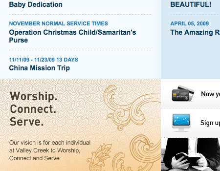
Using different backgrounds to separate sections of a grid When making a grid, you may have a large amount of information in a very compact area. You need to make it clean and organized, but don’t have enough room for a good amount of (positive and negative) white space. Therefore, you can use different backgrounds for each sections of a grid. Instead of spacing between grid sections, you just need a small amount of padding, and it will still look nice. On Valleycreek.org (see the image below) you can see this very tactic being used to create a very well-constructed content layout. You can see that a very thin line is used to divide sections, but aside from that the color contrast provides a separation that is distinct enough.
Grid Generators, Templates, and Tools
- Grid System Generator
- Variable Grid Systems Generator
- 960 Grid System
- Grid Designer
- Grid Calculator
- 50 Useful Design Tools For Beautiful Web Typography (including grid-resources)
7. Accordions
Accordion menus are based on the same concept as sliders and tabs: it takes a large amount of information and encapsulates it in a smaller area. Accordions are blocks organized in a vertical or horizontal manner such that once a tab is clicked, a content-block slides upon the other one – similar to an accordion, hence the name.
Examples of Accordions
Functionality and large clickable areas
Alex Cohaniuc uses a very well-designed and accordion menu. Keeping portfolio items in the accordion is reasonable because it keeps (unnecessary) details about each project hidden and displays them on demand. This accordion is well designed for several reasons. First, you will notice that the headers of each canvas a very large, making them easily clickable. Also, you can see that each header uses a triangle to symbolize whether the accordion tab is opened or not. Finally, in this design, the header of the current tab has a distinctive background color.
Horizontal content slider Jason Reed uses the accordion to keep the content of the entire website on one single page. Instead of having the appearance of a totally out of place element, this accordion takes on the same styling and color as everything else on the page. In addition, this accordion is horizontal (although the navigation options have a vertical orientation). Also, take a look at the tabs. First, you will spot a significant amount of space between each of the tabs. These tabs, or headers, don’t have a separation like you saw it in the last screenshot, so a good amount of space was used to separate here instead. Also, large and readable labels are included in this accordion. These little details are important, because the user needs to know exactly what to expect in each tab.
Accordions containing images and information
Marius Roosendaal uses another excellent vertical accordion to “hold” portfolio images. Each content block is an image showcasing a work, same as before. However, this one includes textual labels for each image. You can see that a small button is used to show/hide these descriptions. You can also find a link to a larger, more in-depth view of the portfolio item. You can’t present huge amounts of information in an accordion this small, so it is always good practice to include a link to more information if possible.
Accordion Scripts
You can implement these techniques using the following freely available scripts, techniques and tutorials:
- Create a Simple, Intelligent Accordion Effect Using Prototype and Scriptaculous
- Apple.com Downoads Page Slide out and drawer effect
- UI/API/1.7.1/Accordion JQuery Plugin
- JQuery UI Accordion
- Simple JQuery Accordion menu
- JQuery Accordion Madness
- jQuery Examples - Horizontal Accordion
8. Mega-Drop-Down-Menus
Navigation doesn’t have to be a simple set of links; recently it is “reinvented” to present not only available navigation options, but also the hierarchy and structure of the site’s content. The so-called “Mega” drop-down menus are commonly seen in e-commerce or product layouts as a way to show detailed information about products. Menus such as these are a new trend, and are quickly catching on because they can instantly provide users with the information that they are looking for – without a single click, quite similar to the concept of a rollover element.
Examples of Mega-Drop-Down-Menus
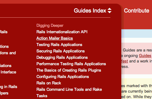
A classic example for a mega drop-down menu is the Guide Index on Ruby On Rails Guide. The menu serves as a well-organized and nicely presented secondary navigation menu. Notice that on contrary to the menus presented above, this menu uses a “switcher” icon on the right hand side to trigger the drop-down menu at the bottom. Also notice a nice soft shadow that gives the menu depths and helps it stand out.
Multi-level menus with information
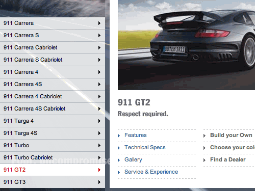
Porsche (shown below) is a perfect example of the technique explained above. Porsche’s homepage contains a multi-level menu that allows users to navigate to all of the cars manufactured by Porsche without a single click. On the third level, a window with information about the selected car can be found. The window contains an image, many links, and quick information about the car. Of course, the large content block is a large clickable area, hence all details and features can immediately be clicked. For a better understanding of the technique, click on the image below and visit the full page.
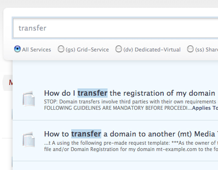
Search results displayed in a drop-down-list A recent trend that is related to this technique is the tactic of including search results in a “drop-down” menu. This technique is used in the Media Temple Knowledge Base. Instead of using an entirely new page to show users the search results, designers chose to display results in a drop-down list, which updates while you type. However, take note of the fact that a link is provided to full search results on a page, which is not to be forgotten in such situations.
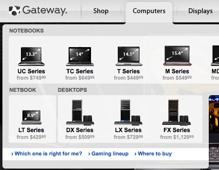
Providing extra information in drop-downs Once again, on Gateway.com you can see a mega menu being used to show information about products, along with links. The products in this drop-down are very well-organized and the images are included to add visual support. This menu provides a bit of information too, such as the price listed for each computer. This helps the user pick products before viewing the page, because many potential customers are likely to be interested primarily in price – at least in the initial stage of the purchasing process. Mega menus such as this ultimately make navigation easier and offer a better way to present information that users are looking for.
Menu Scripts
- Animated Drop Down Menu with jQuery
- Superfish v1.4.8 - JQuery Drop Down Menu
- Make a Mega Drop-Down Menu with jQuery
- How to Make a Smooth Animated Menu with jQuery
- Designing the Digg Header: How To & Download
- Create a multilevel Dropdown menu with CSS and improve it via jQuery
Further Resources
You may be interested in the following related posts:
- 5 Useful Coding Solutions For Designers and Developers
- Designing Drop-Down Menus: Examples and Best Practices
- Slideshows in Web Design: Where And How To Use Them
- 40 Creative Design Layouts: Getting Out Of The Box
- Web Design Trends For 2009
- Table Layouts vs. Div Layouts: From Hell To… Hell?


