67 Gorgeous Examples of Floral Typography

Email Newsletter
Weekly tips on front-end & UX.
Trusted by 182,000+ folks.

 Celebrating 10 million developers
 Custom Web Forms for Angular, React, & Vue. Your backend.

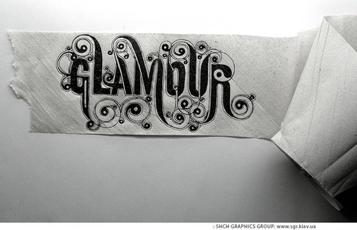
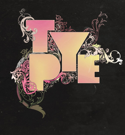
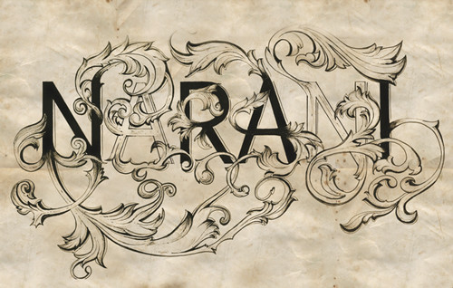
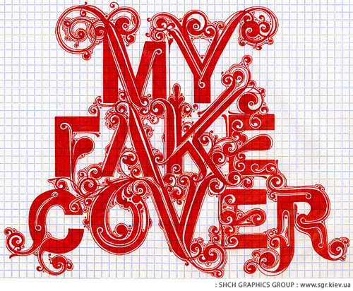
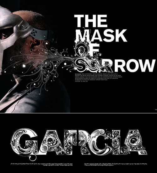
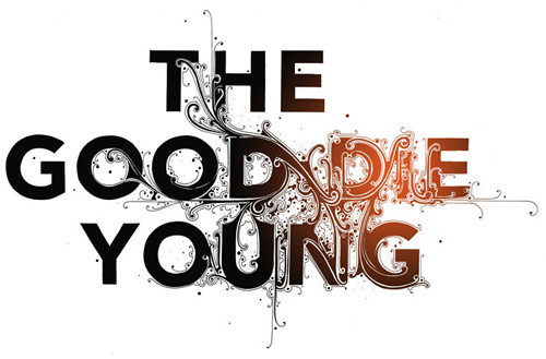
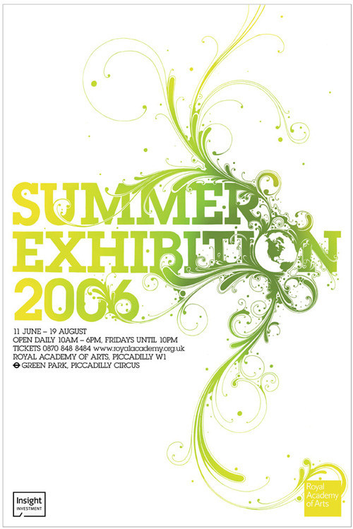
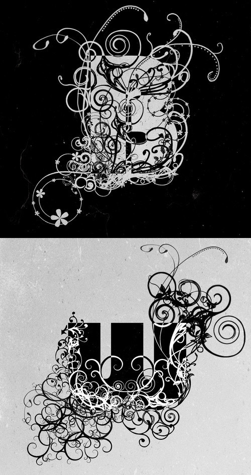
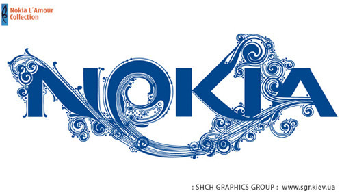
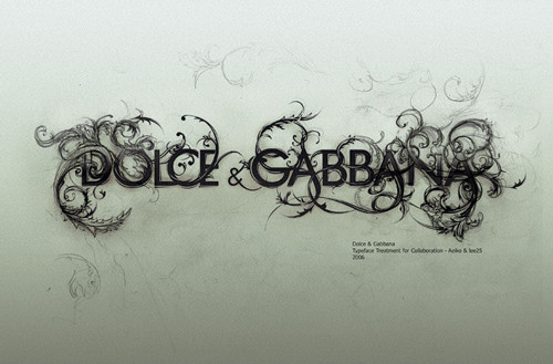
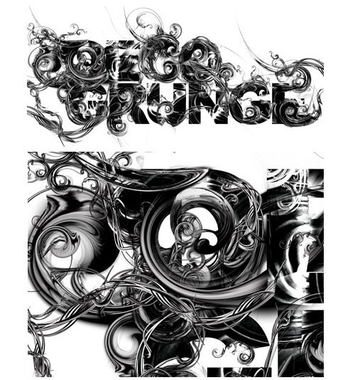
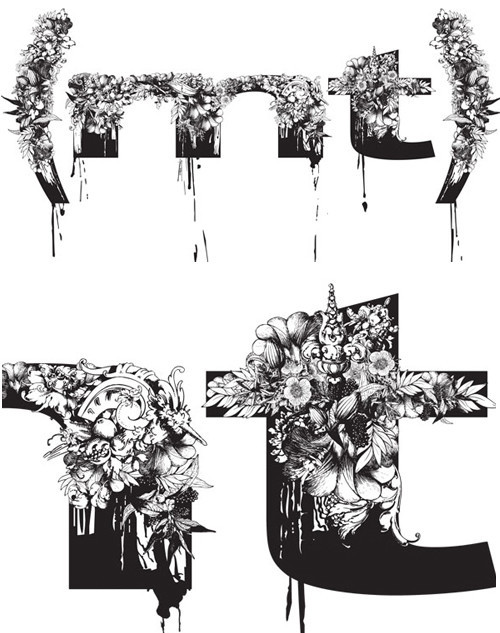
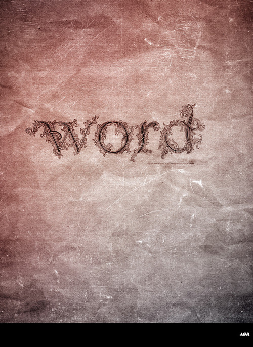
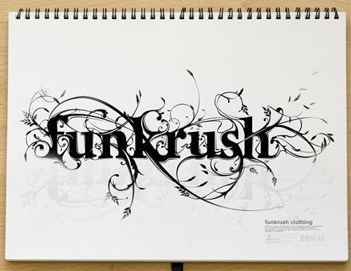
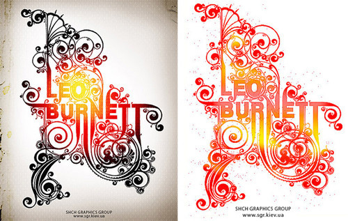
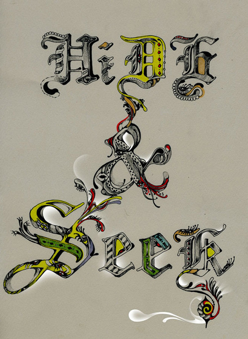
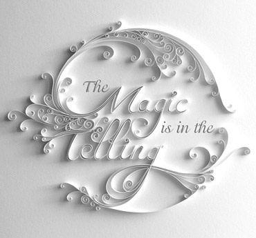
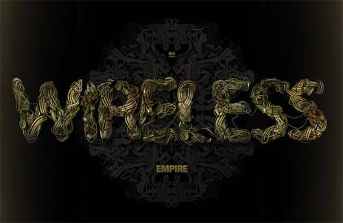
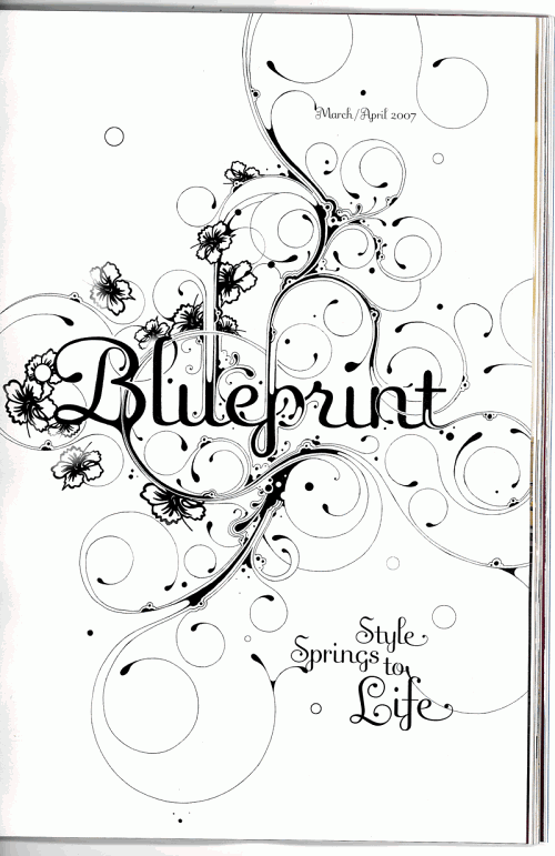
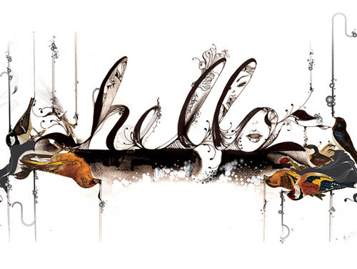
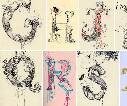
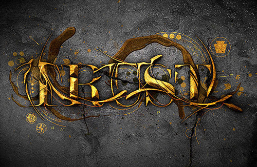
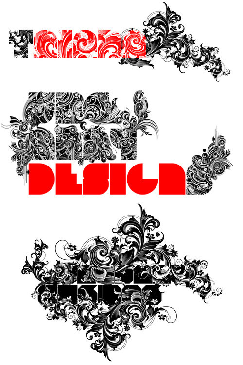
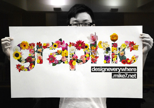
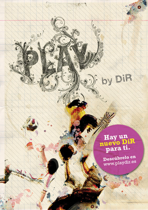
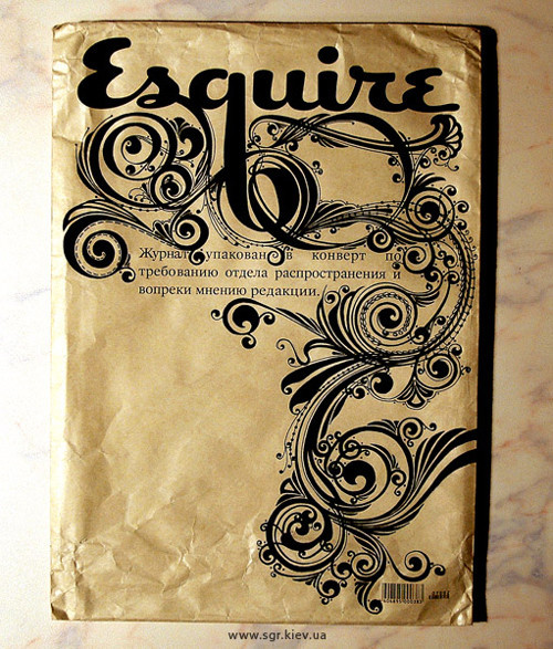
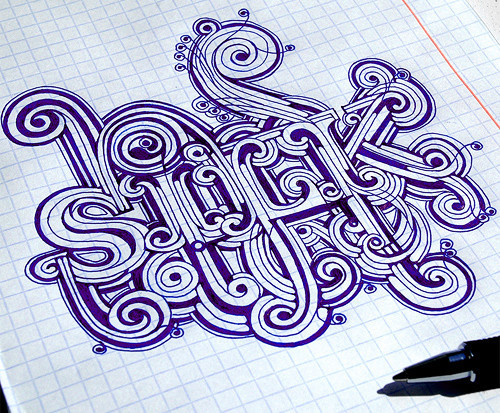
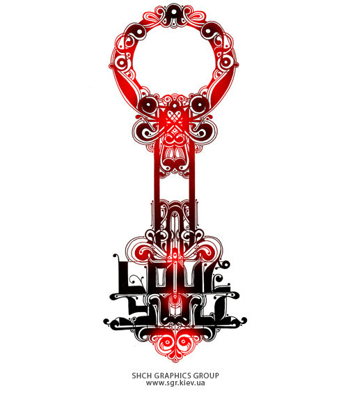
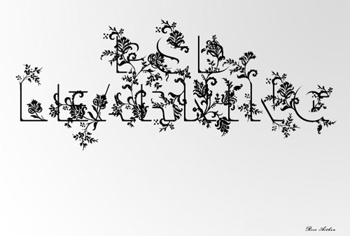
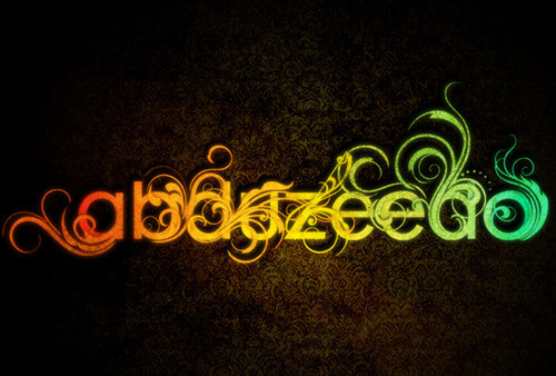
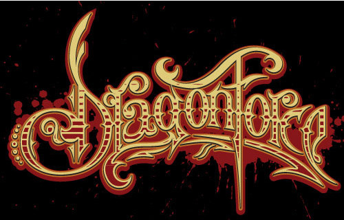
Floral typography is a technique that combines typography, calligraphy and lettering to create dynamic, “flourishing” designs. With the help of floral elements you can create very tempting and vivid artworks in which the typography seems to be shaped by plants and flowers. In this way you can convey your message in a very artistic way. In fact, various floral ornaments – which are the essential component of floral typography – can make the design stand out and help the artist to create inspiring, refreshing and thought-provoking pieces of art.
Further Reading on SmashingMag:
- Massive Collection of Nature Inspired Typography
- Out of This World Typography
- 28 Ideas And Examples Of Amazing Paper Art
- Typographic Design Patterns And Current Practices
Below you’ll find a beautiful collection of floral typography and also some outstanding tutorials that will help you to master the technique or at least get some understanding of how this technique can be used. Please feel free to explore the further works of the artists presented below as well.
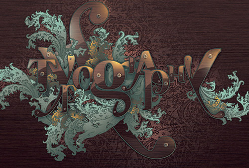
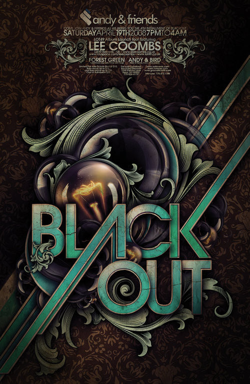
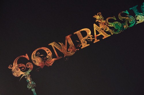
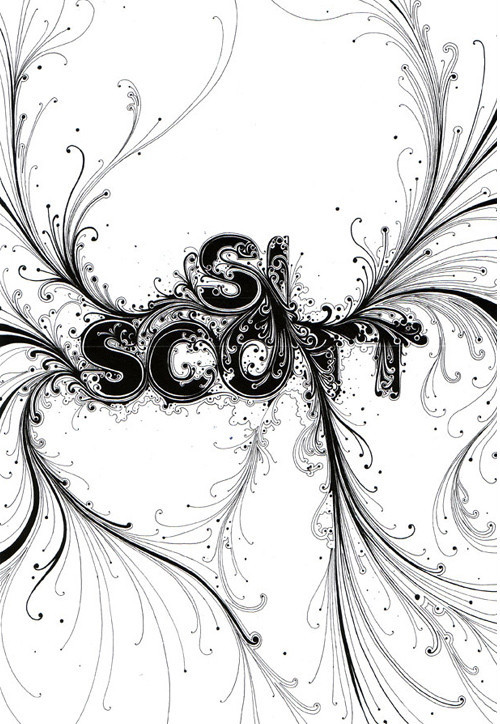
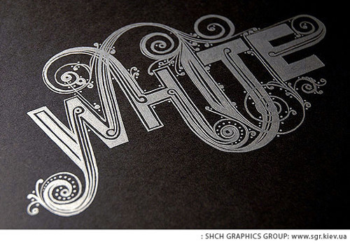
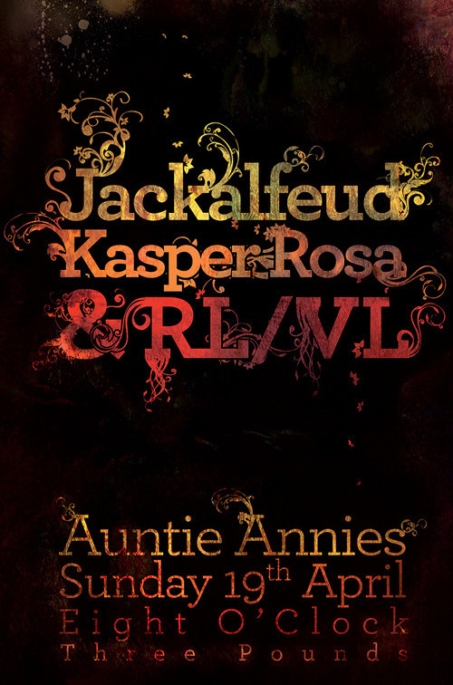
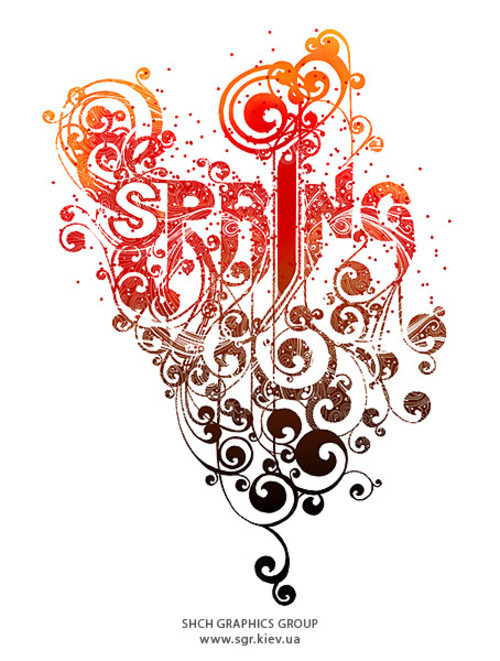
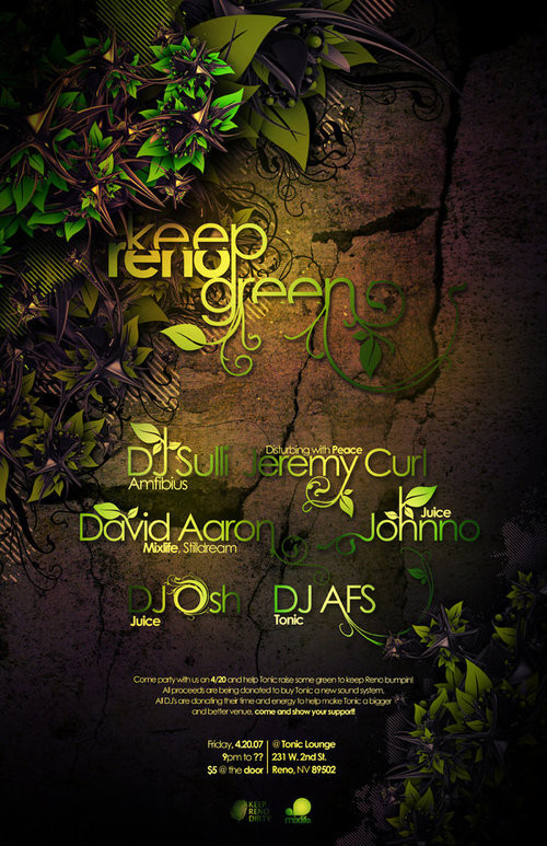
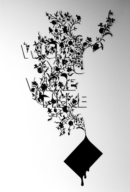
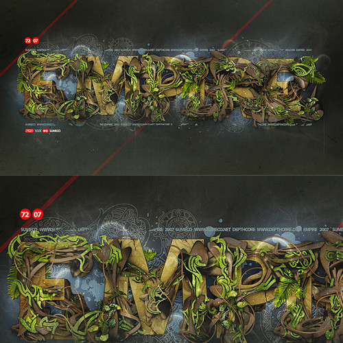
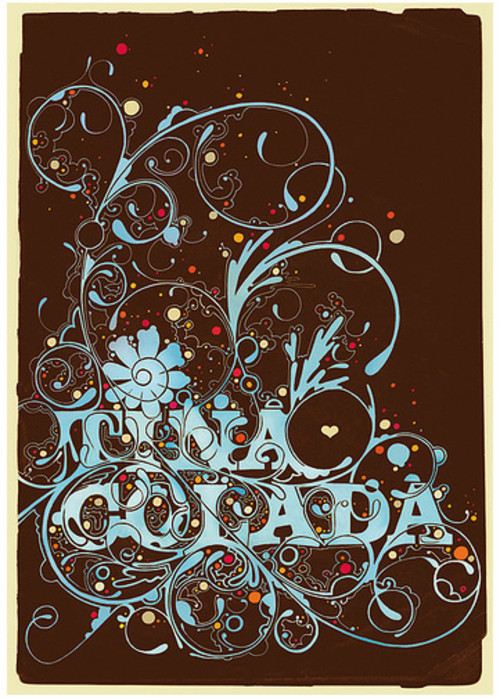
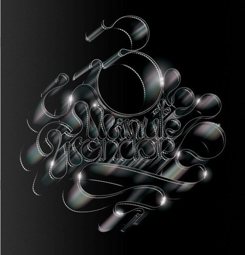
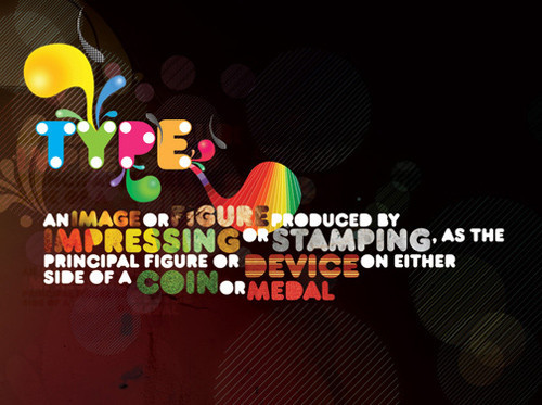
Floral Typography Examples


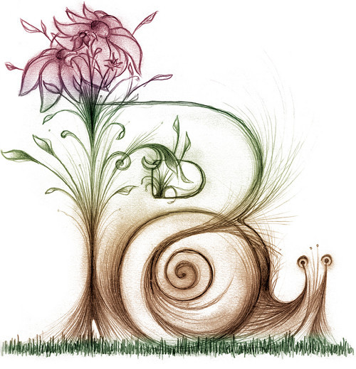


A New Leaf

Floral Love


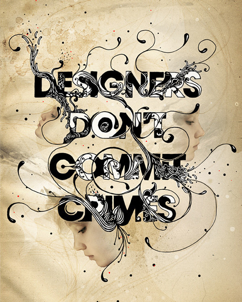
Designers don’t commit crimes
Christmas present - SiScott style


Chaz Maviyane-Davies

Chanel 4 25th Anniversary Book
Floral Typography Tutorials
Create a 3D Flowery Text Effect

Create an Ancient Typography with Dry Soil Texture and Floral Brushset in Photoshop

Create a Spectacular Grass Text Effect in Photoshop

Super Cool Frilly Bits Typography
Old School Type - Line Gradients
Dynamic Recessed Watercolor Typography in Photoshop

How to Create a Richly Ornate Typographic Illustration