Smashing Magazine - we smash you with the information that will make your life easier. really.

Fixed vs. Fluid vs. Elastic Layout: What’s The Right One For You?

Advertisement

The problem has boggled the minds of Web designers for years: fixed, fluid, elastic or a hybrid layout design? Each option has its benefits and disadvantages. But the final decision depends so much on usability that it is not one to be made lightly. So, with all the confusion, is there a right decision? By considering a few factors and properly setting up the final design, you can end up with a successful layout design that reaps all the benefits.

This article discusses the pros and cons of each type of layout. Either one can be used to make a successful website layout, as long as you keep usability in mind.

Also consider our previous articles:

Why all the debate? Web page design comes down to usability, and this can be difficult to balance because website users can account for many different variables among them.

When designing a website layout for a large audience, the designer must consider the following potential differences among visitors:

  • Screen resolution,
  • Browser choice,
  • Whether or not the browser is maximized,
  • Extra toolbars open in the browser (History, Bookmarks, etc.),
  • Even the operating system and hardware.

Without the benefit of a standardized website size to work with, Web designers encounter numerous problems when it’s time to get to work.

1. Difference Between Fixed And Fluid Layouts

Although most designers and developers would consider defining fixed and fluid website layouts to be elementary, we’ll go over it just to be clear.

Fixed Website Layouts

A fixed website layout has a wrapper that is a fixed width, and the components inside it have either percentage widths or fixed widths. The important thing is that the container (wrapper) element is set to not move. No matter what screen resolution the visitor has, he or she will see the same width as other visitors.

Fixed in Fixed vs. Fluid vs. Elastic Layout: Whats The Right One For You?

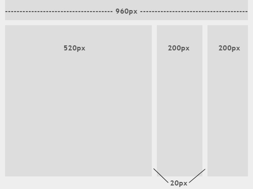
The image above shows the general outline of a fixed-width website layout. The components inside are fixed to 520, 200 and 200 pixels, respectively. A 960-pixel width has become the standard in modern Web design because most website users are assumed to browse in 1024×768 resolution or higher.

Fluid Website Layouts

In a fluid website layout, also referred to as a liquid layout, the majority of the components inside have percentage widths, and thus adjust to the user’s screen resolution.

Fluid in Fixed vs. Fluid vs. Elastic Layout: Whats The Right One For You?

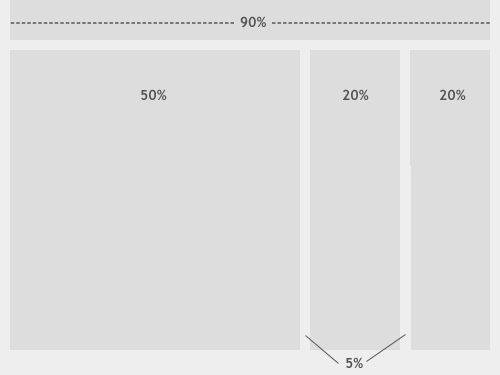
The image above shows a fluid (liquid) website layout. While some designers may give set widths to certain elements in fluid layouts, such as margins, the layout in general uses percentage widths so that the view is adjusted for each user.

2. Fixed Web Page Design

Many designers prefer fixed layouts to fluid ones because they’re easier to make and provide more assurance that what the designer sees, the user sees. However, the pros and cons come out even with fluid-layout design.

Pros

  • Fixed-width layouts are much easier to use and easier to customize in terms of design.
  • Widths are the same for every browser, so there is less hassle with images, forms, video and other content that are fixed-width.
  • There is no need for min-width or max-width, which isn’t supported by every browser anyway.
  • Even if a website is designed to be compatible with the smallest screen resolution, 800×600, the content will still be wide enough at a larger resolution to be easily legible.

Cons

  • A fixed-width layout may create excessive white space for users with larger screen resolutions, thus upsetting “divine proportion,” the “Rule of Thirds,” overall balance and other design principles.
  • Smaller screen resolutions may require a horizontal scroll bar, depending the fixed layout’s width.
  • Seamless textures, patterns and image continuation are needed to accommodate those with larger resolutions.
  • Fixed-width layouts generally have a lower overall score when it comes to usability.

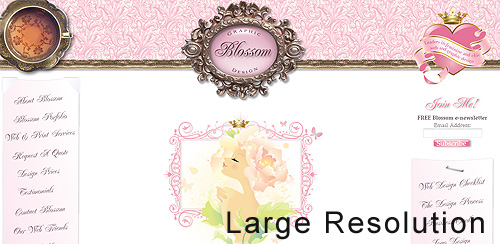
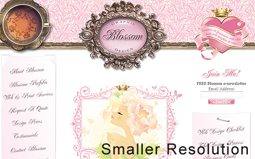
Examples of Fixed-Page Design

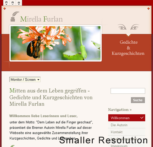
Here are five examples from designers who get the most out of fixed-width layouts. These websites incorporate many design elements, a perfect scenario in which to use a fixed layout. The designers have more control over the placement of extra design elements around the content areas and can work with the content and navigation widths more precisely.

Fixed1 in Fixed vs. Fluid vs. Elastic Layout: Whats The Right One For You?

Fixed2 in Fixed vs. Fluid vs. Elastic Layout: Whats The Right One For You?

Fixed3 in Fixed vs. Fluid vs. Elastic Layout: Whats The Right One For You?

Fixed4 in Fixed vs. Fluid vs. Elastic Layout: Whats The Right One For You?

Fixed5 in Fixed vs. Fluid vs. Elastic Layout: Whats The Right One For You?

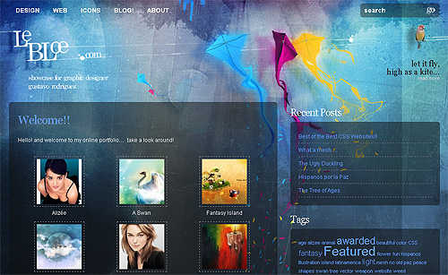
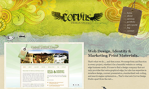
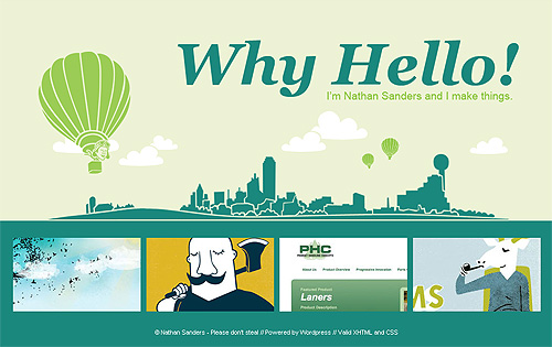
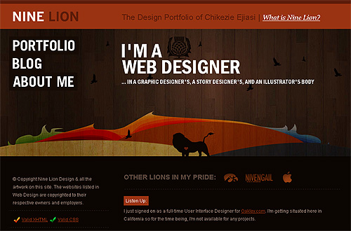
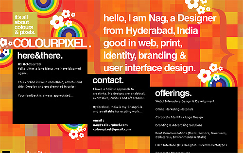
Notice how in all of these examples, the designers use continuous imagery to work with larger screen resolutions.

3. Getting Around The Cons Of Fixed Web Page Design

If you’ve decided on a fixed page design, you should know these few tricks to get around the cons of this layout and create a successful design.

Looking at the Statistics

Today, most designers assume that the majority of Internet users have a screen resolution of 1024×768 or higher. According to a poll published by W3Schools, this is not the case (please notice that one should take the W3Schools statistics with a grain of salt, more details about it follow below):
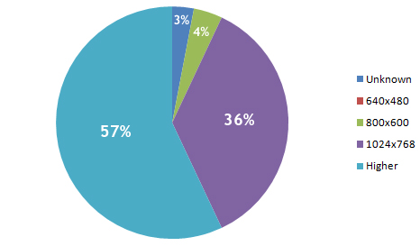
Piechart in Fixed vs. Fluid vs. Elastic Layout: Whats The Right One For You?

As you can see, 640×480 doesn’t even register on the chart. W3Schools’ analysis found a whopping 0% of users have this screen resolution. While, in fact, some users actually do have this screen resolution, the statistics show that they make up a small enough percentage that designers should be able to ignore the size and still offer wide usability.

Even for people who do use this resolution size, they probably use it mainly on smaller portable computers and wouldn’t use it as their primary screen resolution normally.

However, these statistics are probably not as accurate as one might hope. Because W3Schools’ visitors primarily belong to a certain demographic (designers and developers), the information is a little biased. Other research sources show different findings, but only slightly different. According to resolution statistics from individual companies in 2009, the 800×600 screen resolution showed up at somewhere under 10% of users.

This next interesting table comes from SohTanaka.com, whose blogger has done a bit of research comparing how some of the largest websites accommodated screen resolutions in February 2006 versus February 2008.

Topsiteaccomodations in Fixed vs. Fluid vs. Elastic Layout: Whats The Right One For You?

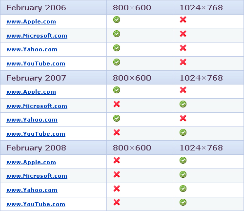
For all four major websites in the study, there was a complete turnaround. Even the biggest companies on the Web are now assuming that their audiences have larger screen resolutions.

For other research on screen resolution, have a look through the sources below:

960px or 760px?

All this being said, most designers choose a fixed width of either 960 or 760 pixels. A layout 960 pixels wide looks good for users with a 1024×768 resolution or above, with a bit of room for margins. For designers who want to accommodate the approximately 10% of users with a 800×600 screen resolution, the 760-pixel-wide layout works well, and is still suitable for larger screens.

Always Center the Layout

When working with a fixed width design, be sure to at least center the wrapper div to maintain a sense of balance (margin: 0 auto; usually does the trick). Otherwise, for users with large screen resolutions, the entire layout will be tucked away in the corner.

4. Fluid Web Page Design

Designers may not use fluid page designs for various reasons, but the layout’s benefits are often overlooked. Below are pros and cons to think about when considering fluid web page design.

Pros

  • Fluid web page design can be more user-friendly, because it adjusts to the user’s set up.
  • The amount of extra white space is similar between all browsers and screen resolutions, which can be more visually appealing.
  • If designed well, a fluid layout can eliminate horizontal scroll bars in smaller screen resolutions.

Cons

  • The designer has less control over what the user sees and may overlook problems because the layout looks fine on their specific screen resolution.
  • Images, video and other types of content with set widths may need to be set at multiple widths to accommodate different screen resolutions.
  • With incredibly large screen resolutions, a lack of content may create excess white space that can diminish aesthetic appeal.

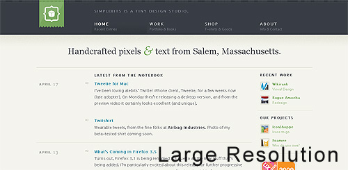
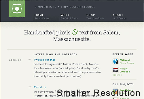
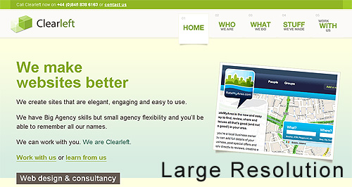
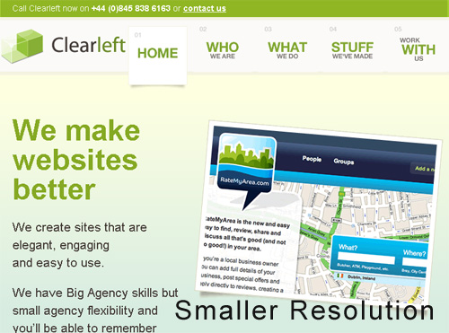
Examples of Fluid Page Design

Below are two designs that use percentage widths to accommodate different screen resolutions. The first example in each set alters the width of the content according to screen width, while the second screenshot uses varying widths for the white space.

Fluid1 Large in Fixed vs. Fluid vs. Elastic Layout: Whats The Right One For You?

Fluid1 Small in Fixed vs. Fluid vs. Elastic Layout: Whats The Right One For You?

Fluid2 Large in Fixed vs. Fluid vs. Elastic Layout: Whats The Right One For You?

Fluid2 Small in Fixed vs. Fluid vs. Elastic Layout: Whats The Right One For You?

5. Getting Fluid Web Page Design To Work

Even though fluid layouts can present a few problems, some of those problems can be overcome with a few tricks.

Use Simple Design

The less a fluid Web design depends on graphics and difficult techniques, the easier it will be to create and maintain. It will also be more compatible with alternate screen resolutions. With cleaner code and design, compatibility problems are more easily prevented, found and dealt with.

Smashing Magazine, for example, uses a fluid Web page layout, and to make it simple only the top black-and-orange navigation bar expands, depending on the user’s situation. Otherwise, the content area expands and contracts as needed, and smart use of CSS covers situations in which the sidebar and internal content could clash.

Min-width and Max-width

Two CSS properties, min-width and max-width, can be used to create a fixed width if the user’s screen is too small or too big for the layout to be usable. In this case, the layout gets a scroll bar and functions essentially as a fixed-width layout. Look over W3Schools’ pages on the min-width and max-width CSS properties below for more details:

Unfortunately, most versions of Internet Explorer don’t support min-width and max-width. Getting around this is simple, though, with an IE-specific expression. Read more about that in the article “Maximum and Minimum Height and Width in Internet Explorer.”

6. Elastic Design

There is a third option when working with Web page layouts. An elastic design is sometimes preferred by designers because it mixes the two other main layout types. It works by sizing all elements with em’s. The quote below explains exactly what an em is and why it can be beneficial.

“A pixel is an unscalable dot on a computer screen, whereas an em is a square of its font size. Because font sizes vary, the em is a relative unit that responds to users’ text-size preferences.”
- Patrick Griffiths, A List Apart

While elastic design is supposed to offer more benefits, it still has its pros and cons like the other two layout styles.

Pros

  • If implemented correctly, this layout style can be very user-friendly. The goal is to have everything grow larger or smaller in proportion with the user’s preference.
  • Elastic layouts are perfect for designers who love both fluid and fixed designs, because the pros of each are found in elastic layouts.

Cons

  • Even given the first pro above, this type of layout can create a huge problem with usability. It takes a lot of savvy and testing to get the layout right for all users.
  • This type of layout is much more difficult to create than the other two, and the extra bit of usability it brings may not always seem worth it.
  • Depending on the specifics of the layout, some elastic designs may require supplementary style sheets and cheats for IE6.

Examples of Elastic Page Design

Elastic and fluid layouts are incredibly similar in appearance, so much so that they are usually confused with each other. However, elastic designs use em’s instead of percentages and depend primarily on font size. These designs adjust to the text size that users set for their browser.

Elastic1 Large in Fixed vs. Fluid vs. Elastic Layout: Whats The Right One For You?

Elastic1 Small in Fixed vs. Fluid vs. Elastic Layout: Whats The Right One For You?

Elastic2 Large in Fixed vs. Fluid vs. Elastic Layout: Whats The Right One For You?

Elastic2 Small in Fixed vs. Fluid vs. Elastic Layout: Whats The Right One For You?

7. Which Is Right For Your Website?

Choosing between a fixed and fluid website will depend a lot on the type of website itself. Weigh the pros and cons above to determine the right solution for your website.

A portfolio website, for example, would probably be best shown in a fixed-width layout, so that you have more control over the design. Not only will you be able to better control the layout of individual elements in the design, but the images in your portfolio showcase will be better handled with a fixed width. Many designers, not just those with portfolios, may prefer fixed-width layouts for the ease of use and assurance it gives them.

Any designer who seeks 100% compatibility should take the time to set up a fluid layout. In such a case, the main challenge isn’t the excess of white space in large screen resolutions, but rather the small percentage of users with a small screen resolution. For websites with large audiences, accommodating even the smallest percentage of users may be important. But even beyond that, websites with large audiences should have a simple and clean design anyway, which can be done effectively with a fluid layout.

Still can’t decide? An elastic or partially elastic design is still an option. When used correctly, elastic layouts can bring the biggest benefits of both other types<. Designers will often employ the elastic-layout principle in using em’s for fonts and containers, and then use a smart mix of percentages and pixel widths to set the rest of the layout elements.

What Other Designers Say

Comment by Heidi Cool on Fixed vs. Liquid vs. Elastic Layout
This designer makes some great points about working with other people who will be using the layout and may not know as much about Web design:

“I go back and forth on this issue. We use a fixed width at case.edu because:

  1. Liquid is more complicated, and we distribute templated designs to users of varying skills who might easily break a liquid layout. (They’re actually regular HTML files rather than Dreamweaver templates.)
  2. We want to ensure our maintainers don’t build pages with line lengths that are too long and thus harder to read.
  3. We try to limit the space available because people have a tendency of filling up whatever space is available. If they have large monitors they could really overcrowd a page not realize how messy it gets on smaller displays.

As you can see the bulk of these issues relate to the fact that our sites are distributed and built and maintained by people of varying skill levels. If I were working on one site alone and I was doing the coding, then I’d base the decision on goals, content, etc.”

Comment by madr on Where Have All the Flexible Designs Gone?
Two more good points are made here about using fixed-width layouts:

Banners and ads are usually made with images and Flash movies, making it harder to do an elastic or flexible design. I have worked in the newspaper world for a year and a half, and the ads really are a holy cow in these areas. So are article images, for which an elastic layout would make the viewing area too big for the top image.

Every browser but Safari 3 and below (Safari 4 is coming), Firefox 2 and below and IE6 and below (which are to be viewed as obsolete/deprecated soon) have support for page zoom instead of text resizing, making the time to accomplish a flexible and elastic design hard to justify since the majority of the visitors won’t even notice it.”

Comment by jphilapy on Where Have All the Flexible Designs Gone?
Two good points in support of fluid-width layouts:

“Flexible sites can be made to work at many resolutions. There is no need for heated debates or research about user screen sizes. Besides, screen resolution statistics are a myth; few people run their browser full-screen and many have toolbars, sidebars, or other widgets that use valuable screen estate.

Mobile phones, such as the iPhone, and games consoles are becoming viable alternatives for web browsing. In general, these devices have smaller resolutions and can benefit from flexible web designs.”

Comment by Calrion on About Fluid- and Fixed-Width Layouts
Clear case for using elastic designs:

“I think the ‘elastic’ layout is the best option. Fluid to a point, then fixed to ensure lines of text, etc., don’t become ridiculously long.

I’m a Windows user, and I maximize.

Mostly, I maximize because I can get the best look at whatever app I’m using, and because I generally have large amounts of detritus on my desktop. Additionally, maximizing my browser (Firefox) allows the maximum space for interface elements, specifically the links toolbar and tabbed area.

In terms of usability, fluid is probably best for savvy users, as their browser width is in control. For less experienced users, elastic is probably best, as it will automatically stop itself from becoming too wide.”

Comment by Georg on About Fluid- and Fixed-Width Layouts
An explanation of how one designer uses a mix of all three to get the best results:

“Fluid main part, fixed sidebars and (maybe) some elastic parts is my preferred layout method. I always keep text areas within 600px max-width though, and hack IE/win.

Using min/max for the whole page, so it’ll stay within 600 – 1200px and centers above. The same hacks for IE/win.

Testing everything on 600 to 2400 wide screens, and leave the rest to each visitor. Text lines will not get too wide (600px max), and the page doesn’t break too early under stress.

Most comments I get are that visitors don’t notice anything that really disturbs them, and that it makes easy read. Guess that means that it’s a working compromise.

Your site works fine for me, so I’ll call it a good compromise. My old eyes say the text is a bit too small, so I zoom it to 200% in Opera on a 1280 screen. No problems whatsoever.”

Further Resources

You may also be interested in these extra references:

(al)

Kayla Knight is a college student, freelancer and blogger. In her spare time, she maintains two blogs, Webitect.net and DesignFinds.Me, as well as her portfolio. Feel free to get in touch with her through her blogs.

Post Rating
1 Star2 Stars3 Stars4 Stars5 Stars (No votes yet)
Loading ... Loading ...

Tags: ,

Advertising
  1. 1
    brian
    June 2nd, 2009 12:08 pm

    Good article. I deal with this all the time with clients.

  2. 2
    Mad
    June 2nd, 2009 12:09 pm

    nice. just what I was looking for.

  3. 3
    www.afiq.orgg
    June 2nd, 2009 12:10 pm

    Fixed rules!

  4. 4
    DKumar M.
    June 2nd, 2009 12:21 pm

    nice explanations…. might be useful for many n00bs !!

    DKumar M.
    @instantshift

  5. 5
    Matt Lindley
    June 2nd, 2009 12:27 pm

    I have been using em’s for sizing my page elements more and more. Does anyone know of any reports on approximately what percentage of users actually change their browser’s default font size? I would guess that most don’t even know that it is an option. It seems like this would be a valuable metric, but I have not been able to find any such reports.

  6. 6
    Milan
    June 2nd, 2009 12:32 pm

    Well written, well explained. Thanks!

  7. 7
    Quakeulf
    June 2nd, 2009 12:58 pm

    I fixed my latest personal blog-project at 512 pixels, smack bang in the middle of the screen and called it a day: http://colonthree.suxos.org/ >:3

    Great article! :3 Of course it all depends on the project etc., but I have great fears this is one of those things you can debate until you die and still get no further…

  8. 8
    Josh
    June 2nd, 2009 1:10 pm

    nice!

  9. 9
    David Hellmann
    June 2nd, 2009 1:11 pm

    100% fixed for nice looking pages. fluid and flex for simples pages are ok. but all my that i design use fixed layouts with 960px! BAM!

  10. 10
    veron
    June 2nd, 2009 1:26 pm

    I prefer a flexible layout like this http://htmlstars.com

  11. 11
    steve
    June 2nd, 2009 1:34 pm

    Im more on the print side of design, but found this interesting and informative, thanks!

  12. 12
    gregory
    June 2nd, 2009 1:37 pm

    i’m down for the fixed at 960px type of site. as a designer it just works best for most clients and me.

    good article though.

    peace-

  13. 13
    Laegnur
    June 2nd, 2009 1:42 pm

    Hello

    There is one more option. When you have a fixed design, in which the css with the design sizes is changed by javascript, adapting it to the user resolution

  14. 14
    Alex R.
    June 2nd, 2009 1:50 pm

    I have a 22 inch wide-screen monitor and it’s really unpleasant to look at fluid layouts
    in my opinion the fixed width websites are the best choice for usability

  15. 15
    Craig Wann
    June 2nd, 2009 1:58 pm

    This is great! Don’t get me wrong… I will always lean toward fixed, but I am thinking of experimenting with fluid soon.

  16. 16
    veron
    June 2nd, 2009 2:05 pm

    “A 960-pixel width has become the standard in modern Web design because most website users are assumed to browse in 1024×768 resolution or higher.”
    I don’t think so. 980-pixel width is more better and useful. You get 20px in additional ))

  17. 17
    Don B.
    June 2nd, 2009 2:29 pm

    Also, don’t assume that just because a user has a high-resolution, widescreen monitor that they are using the browser maximized. I, like many of my coworkers, have several browser windows set at a width that probably resembles full-screen 1024×768.

  18. 18
    Jose
    June 2nd, 2009 2:37 pm

    Very good article.!!, although I would’ve liked to see something about navigation in cell phones. Which layout would be the best one in that case…

  19. 19
    dan
    June 2nd, 2009 2:53 pm

    good article, but how many times have we seen this Nine Lion website screenshot on here? I mean, yeah it’s a cool small portfolio site, but come on.

  20. 20
    smultron
    June 2nd, 2009 3:19 pm

    Hi, I think “always center the layout” is a WRONG. I think the correct position for layout (for user that dont maximize) is up-left, this position could be me define the horizontal size, i like minimize at min-horizontal size (800 or 1024), this hack could be me more space on screen. I think that we can view if maximize => center; if not maximize => not center.

    I think it’s imposible (and other WRONG) the same design gets to view in a monitor, in a projector, in a movile, in a psp, etc. because the resolution could be the same but not the size of screen.
    I think we could to diference if the user views the web from a psp, from a movile, etc…
    And create one design for each other (2 or 3 similar designs, but DIFERENTS, not elastic, not fluid, we must define a minimum size of letter for each design, i propose 14px for TFT monitors, and design to this size of letter). Of course the user can be change the size of letter, but the design could be deform naturally. This form has the advantage that each design for each platform will optimize.

    Anonimous Software Ingennier

  21. 21
    web develop
    June 2nd, 2009 4:02 pm

    Sweet article. Personally I like flexible. It’s a little more difficult than fixed, but it allows for the future.

  22. 22
    Brad Proctor
    June 2nd, 2009 4:53 pm

    I design just about everything fixed at 980. I like this width better than 960 because I don’t use any kind of grid system and 20 extra pixels is nice to have.

    The fluid and elastic layout just doesn’t work in most cases. I find it very rare that fluid or elastic design can be made to look good on both 1024 and 1920 width monitors.

    Probably a few years down the road, but I am looking forward to the day that I can start designing for 1280 monitors.

  23. 23
    Jacob Gube
    June 2nd, 2009 4:58 pm

    A comment on the Clearleft image under Elastic layouts: that’s not the best way to showcase what an Elastic layout is because if it were elastic, the line lengths of the text would be the same when the user increases the font size.

    In the screenshot, the text “We make websites better” wraps to three lines on the higher resolution version, when in fact, the goal of Elastic layouts is to preserve the proportion of the design regardless of the user’s font size settings.

    A better way would be to use (*gasp*) Internet Explorer, then use Page > Text Size (or in Firefox, View > Zoom Text Only). The only difference you should see is that the width of the layout adjusts so that the proportion of the layout is preserved; thus, Elastic layouts are based on font sizes instead of the browser’s view port width (Fluid layouts).

    It’s a subtle, but very important point to make so that people understand what an Elastic layout is and what makes it different from Fluid layout.

  24. 24
    Imokon
    June 2nd, 2009 7:02 pm

    What I would love to see is more about how to design gorgeous websites for PDAs and phones :(

    And lets not forget netbooks!

    Eventually PC, notebooks, netbooks, PDAs and phones are going to blur into one another… and I betcha in our lifetime too!

  25. 25
    Kevin Bui
    June 2nd, 2009 7:38 pm

    Can anyone explain why in Fluid Website Layouts illustration, the header is 90% while content is 100% (50 + 20*2 + 5*2)?

  26. 26
    afraz
    June 2nd, 2009 8:13 pm

    Great article. But I will use fixed width, cuase no hassle :(

  27. 27
    Kelly
    June 2nd, 2009 8:18 pm

    Thanks Smashing,

    This was exactly the article I was hoping for … providing a great balance of detail for noobs (like me) and points to debate for the more experienced designers.

    I would love a discussion about how we might deal with the iPhone phenomenon (alternate css?).

    Kelly.

  28. 28
    gr8pixel
    June 2nd, 2009 9:56 pm

    Very interesting article! Thought of designing a liquid layout for my new portfolio website. :D

  29. 29
    Andris
    June 2nd, 2009 10:31 pm

    This article was a very good read. Thanx a lot for that.

    I think it’s pretty depending on what project you work which layout style you use. But I guess in most cases a fixed layout is the best and easiest solution.

    I my case I get the layouts for a website from a graphic designer. So I mostly have to use the fixed layout. Because they often don’t care about screen resolutions and what happens with the design if the browser window is resized.

    And concearning mobile phones and so on. I guess if there’s enough money or time you should build an extra version for the mobile use of your website like mobile.domain.com and shrink your content to the minimum for that. But that’s not always possible.

  30. 30
    Infomedia
    June 2nd, 2009 10:33 pm

    Hi, nice article – just it should be mentioned that decision of choosing fluid or fixed / 760 or 960 etc.. depends on how much content is on page..

  31. 31
    Harish
    June 2nd, 2009 11:02 pm

    Wonderful article and well written.

    I use 960px fixed width layout design. Its very easy to maintain and it looks good in all the browsers in 1024 or more resolutions.

    I think I do is that when I work on any website I check it in alomost all the browsers for compatability reason becasue I don’t know which user is using which browser.

    Thanks for posting such a good article.

    Keep posting………. :)

  32. 32
    Bleyder
    June 2nd, 2009 11:07 pm

    Very, very goooood article!!

  33. 33
    Tom
    June 2nd, 2009 11:09 pm

    Hey there,

    I don’t think that expressions are an option fixing min- and max-width for complex, fluid layouts in ie6. From my experience they tend to stop working without a reason and they behave very slowly compared to normal javascript.

    I prefer using an external script which fires on the resize event and compares the actual width with the preferred min- and max-widths.

    Regards, Tom

  34. 34
    Kedarweb
    June 2nd, 2009 11:26 pm

    I’ll go with fixed width layout. Good article !!

  35. 35
    Mugros
    June 3rd, 2009 12:04 am

    Today, most designers assume that the majority of Internet users have a screen resolution of 1024×768 or higher. According to a poll published by W3Schools, this is not the case

    1024×768 + higher resolutions cover 93% of all users (maybe slightly more, considering unknown) according to the data. This is the majority. The cited sentence doesn’t make sense.

  36. 36
    hiddenson
    June 3rd, 2009 12:08 am

    A pleasant read.

    After experimenting with the three options, I create elastic designs with a touch of fixed elements. Sure, it takes more work to create than fixed designs, but work is what we are paid for, and the benefits are clean and up to modern standards. That said, small fixed designs with well-thought negative space can be gorgeous.

    Fluid should be abandoned… If you go the extra mile from fixed, you might as well push a bit more and go elastic.

    My 2c.

  37. 37
    Jehzeel Laurente
    June 3rd, 2009 12:13 am

    I still prefer fixed rather than fluid layouts because it’s easier to code. You don’t need to check again and again to see if it’s compatible with different resolutions. :)

    The only downside is that, if your client wants it to be fluid.

    You can also write a little javascript to use fixed layouts that varies from different resolutions. If the resolution is more than 1920, then use this layout or redirect to this page blah blah.

    Just like what Yahoo did, when you view it in 800×600. It uses a new CSS.

    You can also do conditional statements for fixed layouts and use a different CSS when viewing a page in a different resolution.

    You can do everything you want. But it’s also time consuming if you compare it when coding fluid layouts (because you don’t need to create another set of CSS again).

    Others love fluid, while others love fixed. (We don’t have the statistics yet what the majority prefers) But if you want to please more users, just like what the graph shows above, fluid layout is the way to go. (also fixed with conditional statements).

    I think you should also right about different ways to change your CSS from different resolutions. :)

  38. 38
    Milana
    June 3rd, 2009 12:20 am

    Thanks a lot for this article guys.
    Unfortunately a lot of clients ask for fixed width, we use a mixture of elastic and fluid for the mobile sites (since there is too many variables in the process of testing). I think that is a fine compromise :D

  39. 39
    Robert Wünsch
    June 3rd, 2009 12:22 am

    Thanks for the article! But you’re skipping an important point when considering the width of fixed layouts and the percentages of your users. When you have 10,000 users a day and let’s say 2% of them have a resolution smaller than your fixed width, that’s still 200 people a day failing to see your website as intended. And if you’re doing e-commerce that’s not a number to ignore.

    Here’s a nice example of a fluid 16 columns (960px grid) layout:
    http://www.designinfluences.com/fluid960gs/

  40. 40
    petergavrilov
    June 3rd, 2009 12:22 am

    That is very helpful! Thanks SM

  41. 41
    Simon Day
    June 3rd, 2009 12:24 am

    I’m lucky to have many websites covering many different topics and sales. 800×600 users are under 3% for all sites and once they dipped below 5% I stopped catering for them.

    All I want now is IE6 users to blow their computers up and I’ll be even happier :-)

    Ooohhh I love GA custom reporting. Just gone through the sales by resolution and 800×600 are unlikely to spend. According the stats on the 6 sites I can test 800×600 users accounted for between 0.02% and 0.8% of sales.

  42. 42
    lucky
    June 3rd, 2009 1:02 am

    interesting article. very helpful.
    Since you always write such great resumes on interesting topics, I would like to suggest one. Itwould be very helpful/great to have an article, that gives a nice overview which parts of different codes (e.g. html, php, etc) stands for what category of design in a page in a more visual sense. In other words, show the code and highlight all the parts that belong to a certain category ( e.g. fonts, layout etc) so people who like to get into writing code have a quick start and good overview in the different languages what needs to be modified, and where i can find it. And what is not part of what i want to change in code.

    thx

    lucky

  43. 43
    emonweb
    June 3rd, 2009 1:03 am

    fluid style is the best way with a max-width for very wide screens and min-width to give your content the minimum space.

  44. 44
    Ian
    June 3rd, 2009 1:05 am

    The stats from W3Schools are probably skewed as you say. Would be far more interesting if the sites with a broad user base like Google could provide the same stats. Google Analytics records this information afterall!

    Wouldn’t this info be of benefit to the web as a whole, rather than us all making educated guesses about how many users see this or that?

    This also works on the assumption that the user has the window maximised, which I often don’t (loving the web developer ff toolbar resize function!)

  45. 45
    maddo
    June 3rd, 2009 1:19 am

    I like them all: fixed & fluid & elastic. I prefer centered fixed width blog like page layouts for readability, however there are some additional constraints to consider from time to time.

    While the problem of different browser resolutions and the implications on usability have been mentioned, there remains the problem of large content, i.e. tables and images, where you don’t know the width of in advance.
    Tables and images accidentally overlap with navigation sidebars and the like. In non-fixed layouts the browser window will generate horizontal scrollbars for you so that you can adjust the viewport. You still might get a horiz scrollbar not knowing which element exactly produced it. Sure you can wrap all wide content into an overflow:auto div showing local scrollbars. This will prevent them from bleeding into right nav bars. However the div scrollbars are by far not that usable as those of the browser window.

  46. 46
    Marvin
    June 3rd, 2009 2:33 am

    I think for normal Weblayouts the fixed one is better. easier and more design freedom. but for applications like gmail the fluid one is better. depends on the topic..

  47. 47
    JHMorales
    June 3rd, 2009 2:43 am

    I prefer fluid layout with some touches of elastic one. I try to show the same layout no matter the screen resolution or window size. The main problem, for me, with this layout is that the text-size must keep its proportions with the design. High resolutions shows the font too small and low resolutions show the font too large. To get a solution to this deal I’ve designed a plugin for jquery that resizes the font of the web taking into account the screen resolution and window size of the browser. I uses this in my webs and it have been tested in a wide number of browsers. You can check it at fontReSizer.js

  48. 48
    Hay
    June 3rd, 2009 3:21 am

    An important reason to choose fixed over fluid that i haven’t seen mentioned here is that fluid designs are not very nice for reading text. Let’s say you have a paragraph that is 50% of the screen. That might be readable on a resolution of 1024×768, but if you have a 21″ screen the text lines will be so long that it will be practically unreadable. There’s a reason why newspapers use small columns instead of one big block of text: the optimal number of characters in a line for the human eye to read is around 60.

  49. 49
    r_jake
    June 3rd, 2009 3:27 am

    Good balanced article outlining the pro and cons. I tend to use fixed layouts to cut down development time but have pangs of guilt as it does seem like the lazy option.

    As some other commenters have mentioned, would love an article on how browsing on mobile devices might drive us back to accomodating to lower resolutions. iPhone has a relatively large screen but is still a measly 480×320! Surely this is going to become a big issue for us all…

  50. 50
    Calítoe.:.
    June 3rd, 2009 3:32 am

    Great article. About 10% of my visitors use 800×600 and I do think that’s a lot, so I always go for fluid or 800×600 compatible layouts. I like max-width / min-width because it helps avoiding huge blank spaces on large resolutions.

  51. 51
    Glyndon
    June 3rd, 2009 4:07 am

    Great article.

    My rule of thumb is that if my client comes across as the ‘wannabe designer’ and tries to dictate the design down to the last pixel then I stick to fixed width.

    If however, the client has a genuine interest in the usability of the site and is generally aware of the ‘real’ end user then I tend to push for a fluid layout.

  52. 52
    Tom Bradshaw
    June 3rd, 2009 4:34 am

    I always use a fixed width for my designs – I think it’s the best for all users and is better for design. I always centre the site and make the width no bigger than around 1000px.

  53. 53
    Steam Multimedia
    June 3rd, 2009 5:22 am

    There is a place for both fixed and fluid designs depending upon what that website calls for.

    As you would know each website design can be different depending on what is being required for that website and what the design entails.

    In my opinion would be that the 2 design methods are becoming closer together with the new way that websites are being designed.

    My preferred method would be fixed at this moment in time as it adds more structure to the website. My own website was build using this method

  54. 54
    Stephane
    June 3rd, 2009 5:33 am

    Like Hay already mentioned, one of the pro of a Fixed layout and cons of a Fluid layout is the line length. A line too long becomes hard to read, so unless the liquid layout provides a way to increase the font size depending on the width, the legibility will always suffer compare to a good line length in a fixed design.

  55. 55
    Luke
    June 3rd, 2009 5:56 am

    We have only 3% of our users using 800px or less screen resolutions, so I thought 10% seemed a little high, but it probably depends a lot on the type of site you are managing.

  56. 56
    SeanDFeeney
    June 3rd, 2009 6:27 am

    I tried using fluid centric designs but, they almost always spiral downhill fast. Once you fix one issue you introduce a new one. A good fixed design that floats in the middle seems to work the best for me. It looks more professional, easier to maintain, and far less buggy.

  57. 57
    Sean
    June 3rd, 2009 6:28 am

    800×600 may only be 3% of the market in the real world but in the corporate world it’s a bit different. I work at a large bank (50,000+ employees) with more than 50% on 800×600. There is a split between office workers with decent monitors and tellers and other branch personnel with tiny monitors. I aim for 1024×768 with the hopes that some day the 800×600 people get upgraded – but I still have to keep them happy without horizontal scrolling. Liquid with set min and max widths is the only way to go.

  58. 58
    Parallax
    June 3rd, 2009 6:34 am

    Interesting article, it brings up a few key points. For my part, the deal-breaker on fluid layouts is that often times they DON’T improve usability. In many cases, they destroy typography and readability that would otherwise be carefully set. Nice paragraphs getting drawn out into a single, very long line of text … the very sort of thing that I try to avoid when creating my messaging system.

  59. 59
    James Kelly
    June 3rd, 2009 6:39 am

    How about site that are a bi of a cross-breed? Fixed content width, but with fluid design elements. I did this recently here: http://www.crystalclearimages.ca/

    The header is fluid, but the actual content and navigation are fixed. This is an approach that I think bridges the gap nicely. A really large monitor won’t just have huge white space bracketing the site.

    Thoughts?

  60. 60
    Stryker
    June 3rd, 2009 6:48 am

    Look this great solution for fluid design style: Link

  61. 61
    8bitmag
    June 3rd, 2009 7:33 am

    I love fixed layouts more.

  62. 62
    Gary
    June 3rd, 2009 8:18 am

    Personally, I’ve been going for Elastic layouts in a lot of my recent work, partially because I’m quickly coming to love typography, partially because I think it’s the best solution – but mostly I think, because of the feeling of a zen-like state of enlightenment brought about by a successful implimentation.

  63. 63
    nick
    June 3rd, 2009 8:30 am

    Yea… I’m tired of seeing the same screenshots and samples over and over and over again..
    You guys use the same sites over & over.. So lame..

    They paying you or something?

  64. 64
    ross kendall
    June 3rd, 2009 8:31 am

    With the increasing popularity of netbooks, iPhones and other portable internet devices, a lot more attention needs to be given to smaller screen resolutions. Perhaps the jump from 760px to 960px is premature.

  65. 65
    kreatif tworzenie stron www
    June 3rd, 2009 8:41 am

    fixed rules ;)
    nice article like always

  66. 66
    Heidi Cool
    June 3rd, 2009 8:46 am

    Thanks for quoting me regarding the issues we faced at Case Western Reserve! This is a great overview of the liquid/fixed design issues. I’m now an independent designer and am still tussling with these dilemmas.

    I built a fully liquid site for a client awhile back. The client was happy but I was never quite satisfied with the way it varied across different screens. While line-length is still a critical issue for me when it comes to readability, I also often use float to position photos/images/video to the right or left of text. This site had varying amounts of text so if a page was light on copy the first image might float too far too the right and any additional images would either wrap below or stay to the right in a column depending on whether I’d put them in one or more containing elements. Either way it looked off balance on larger monitors.

    These days I’m working more with fixed or hybrid solutions. I’m using ems for type, and depending on the project, I may let the headers and footers expand and contract while I keep the middle bits fixed. Max-width is also very helpful. The design here on Smashing Magazine, in which the right column is fixed but this main column contracts or expands only to the point of the max-width, is a great solution. It allows a bit of flexibility while ensuring readability and design integrity. I hadn’t even noticed that Smashing was using this technique until I read this article and started resizing my browser window. The fact that I’d not noticed seems to be a good indication that it works!

  67. 67
    Anthony Proulx
    June 3rd, 2009 9:14 am

    It all really depends on the sites nature, the viewers, and the content.

  68. 68
    blixen
    June 3rd, 2009 9:41 am

    I stopped reading after the absurb statement “Always Center the Layout”…

  69. 69
    Kayla Knight
    June 3rd, 2009 9:42 am

    @Jacob Gube
    I see what you mean now about the elastic layout and fluid layout difference. My post does seem to merge the two together. Perhaps I’ll write a post either here or on my own blog better defining the two. I definitely agree that designers need to know the difference!

    @Parallax
    “For my part, the deal-breaker on fluid layouts is that often times they DON’T improve usability.”

    I’ve realized this when working with my own fluid layouts. Imperfection with a fluid layout can mean a much bigger loss of usability. I’m coming out with a post next week that should combat a few of these issues, hopefully it can help designers better see the benefit of fluid layouts. (This should also help most of you other commentors favoring fixed-width for specific reasons)

  70. 70
    Damien
    June 3rd, 2009 10:11 am

    Very good info, comparisons and examples.

  71. 71
    Christoph
    June 3rd, 2009 11:21 am

    One point to consider is what Baekdal already said in 2006 – but what obviously never has been heard by the community: Everybody talks about screen size – but what actually matters is the size of the browser’s content area.

    Many users don’t always surf with the browser window in full screen mode or they have sidebars open, sometimes taking up to half of the screen (watch your Mom!). One more factor to consider is browser zoom, especially when targeting older users, too.

  72. 72
    Zivko
    June 3rd, 2009 12:05 pm

    Fluid designs must be designed with a limit in mind. If not, then with very smart coding.

    One of the best fluid websites I’ve seen lately is Deviant Art – http://www.deviantart.com – but it’s best when viewing a profile, or when you look at your page. It’s so clever and well spaced

    Since I transfered from a 17″ to a 22″ widescreen, I started to appreciate good fluid designs like Deviant art a lot more. For example – look at Facebook – open it on a 22″ and you see a looooot of empty space and then in the middle – everything crammed with text. It’s so ugly I manually resized and stretched it via Stylish. :)

    But definitely – websites like Webdesignerwall and others with fixed width and a lot of background elements deserve all praise :) as they look even more beautiful on big screens.

  73. 73
    cassis
    June 3rd, 2009 1:03 pm

    check layout-festival.onzeweb.com
    3 columns CSS layout, fixed, fluid, or both at the same time!

  74. 74
    Russell Heimlich
    June 3rd, 2009 4:20 pm

    “Fixed-width layouts generally have a lower overall score when it comes to usability.”

    What in the world does this mean? Call me crazy, but I don’t think useability qualities can be determined from a fixed-width or fluid layout. This whole post is moot these days since every modern browser supports zooming.

  75. 75
    Okibi
    June 3rd, 2009 4:31 pm

    Sorry veron that html stars example you posted in your comments is an example of where fluid design fails, I think they need to find a domain name that’s more suitable.

  76. 76
    waqar
    June 3rd, 2009 7:18 pm

    Yep! Excellent work. I am too confuse about this while discussing it with client.
    For me i would like to go with fixed kind of design because of better control.

  77. 77
    Drew
    June 3rd, 2009 8:43 pm

    Nice post. I’ve been working with a fixed 10 col 980wide grid for a while and love it because its easy to work with and flexible too.

  78. 78
    John Bokma
    June 3rd, 2009 9:23 pm

    few people run their browser full-screen

    Does have anyone some real numbers for this claim other then guesstimates?

  79. 79
    Pandjarov
    June 3rd, 2009 10:10 pm

    On the second screenshot there is 110% of a page width :) LOL

  80. 80
    Ashely Adams : Sticker Printing
    June 3rd, 2009 10:53 pm

    I wouldn’t call myself a hardcore designer, but just somebody who happens to know a little about web designing and know a good design from a bad one when she sees one. I have consistently found that fixed designs are able to carry themselves out much better than fluid ones. I think the key here is stability. There is also something called the optimum size of an image. In other words, not every bit of graphic on a page looks good when blown up. Some things are better left small. And that’s what makes fixed designs so popular.

  81. 81
    alex
    June 4th, 2009 12:06 am

    Elastic is the one!!!

  82. 82
    Craig
    June 4th, 2009 10:39 am

    A small point: the reason 960px is often used as the standard for “fixed” designs is not just because it fits on 1024×768 screens. It’s because 960px is easily divisible by 2, 3, 4, 5, 6, 8, etc., which makes it a very useful width, especially when you’re dealing with grids.

  83. 83
    Craig
    June 4th, 2009 10:57 am

    Also, forget about using expressions in CSS to hack a solution together for min-width and min-height in IE. This is very bad advice. A far better solution is Dustin Diaz’s Min-Height Fast Hack [link] (which also works with min-width). CSS expressions should be avoided at all costs, specifically because they slow down web pages [Link]. Expressions get evaluated a *lot* more frequently than you would expect: they get evaluated when the page is rendered, resized, when the page is scrolled – even when a mouse is moved! If the Min-Height Fast hack doesn’t work for you, then use JavaScript for your sizing needs (or jQuery). In the same way you shouldn’t have embedded CSS in your HTML code, CSS is not the place for expressions.

  84. 84
    Rebecca
    June 4th, 2009 12:39 pm

    this may be a little off topic, but SM’s example #2 for fluid designs is just about the ugliest site I’ve seen in a while. I understand this article is about fluid vs fixed, but at least use decent sites as examples. That site was built using a dreamweaver template and it’s use of CSS is horrible. IMO of course….

    relating to the article: fixed is my preference, but it really all depends on the project.

  85. 85
    Michael
    June 8th, 2009 10:29 am

    Who stole the design?

    Found this in the above post: http://clearleft.com/ and thought it looked very much like one I saw the other day…
    http://www.internetstudios.org/web/

  86. 86
    Tommaso Baldovino
    June 10th, 2009 2:16 am

    I often use a fluid layout in my projects, and I think it’s the best way to improve accessibility. It’s not easy to create a good fluid layout, but it’s a test that every web designer should take. You can see here an example of a fluid layout link.

  87. 87
    Hannah Swain
    June 10th, 2009 11:13 pm

    Very good article. I found some interesting facts in it and I’ll definitely be using it to help describe the differences to clients. Thank you!

  88. 88
    arun
    June 11th, 2009 9:13 pm

    Informative article.

    ThanKs !!!

  89. 89
    Rannajee
    June 16th, 2009 11:05 pm

    It’s very good article, It’s helps the new comers in web designing.

  90. 90
    Christy
    July 1st, 2009 5:23 pm

    Does Fixed work with iPhone?

  91. 91
    July 5th, 2009 12:04 pm

    A really good article, once more… Thanks.

  92. 92
    Siegfried
    July 6th, 2009 4:43 am

    Good summary.
    I can not see very good and thus have special requirements that do not apply to the majority. These requirements are a large screen plus large font size. So for me a good designed page respects this and displays well on this large screen, using 100% of the width and the font size i’ve set up (22px). The best option is a mix between fluid and elastic layout. Some containers like navigation bars and/or sidebars with short text are better off with elastic width, while the main container should be fluid.
    To overcome the danger of ridiculously long lines there are two very simple tricks to handle that. First, add a percentual padding to the body. This lets the lines in the main container grow slower than the screen or viewport width. And the page as a whole keeps more of its overall proportions. Very simple, very effective. Additionally there is the possibility of multi-column content via css. This is not supported by IE, but in Firefox, Opera and Safari it is. The trick here is to _not_ specify the number of columns but the column width, in em. So on smaller screens you have 1 or 2 columns, on larger screens you may have 2 to 4 columns, depending on screen width and font size. This keeps any text readable, regardless of what the user has set up, uses and/or needs.

    There is one pro/con you forgot: Web sites are not always viewd on-screen. And if, they are not always viewed on a landscape-type screen. iPhones normally have a portrait format, although it can be flipped. And if you print the page, it will be portrait format. No fixed design could cope with all that. Fluid/elastic layout can.

    BTW, i think, on smaller screens you would normally use smaller fonts, on larger screens larger fonts. But that may also depend on the resolution (dpi). Larger screens tend to have smaller pixels. So with smaller pixels you would normally choose larger fonts to have them equally well readable.

    I experimented with the media queries with Firefox 3.5 to adjust the font size depending on the viewport width, but i’m not sure if this is a good idea. The user setting should always be respected. So if any user wants/needs to use an 80px font on an 800×600 screen… It’s not up to the designer to decide about the users needs. Adjusting font sizes depending on viewport width is nice if you size the window. But it may not be good if the page is shown maximized on a large or small screen. I’m still thinking about that.

    All arguments about simpler handling by the designer are no good arguments. The designer is the professional. The visitor is the non-professional customer. So the designer needs are no point at all, the user needs are crucial and the only relevant criteria.

  93. 93
    tony
    October 26th, 2009 12:33 pm

    article with good ideas but terrible english,…

  1. 00

    There are no trackbacks at this time. If you are interested in leaving a trackback, please use this URL.

Leave a Comment

Make sure you enter the * required information where indicated. Please also rate the article as it will help us decide future content and posts. Comments are moderated – and rel="nofollow" is in use. Please no link dropping, no keywords or domains as names; do not spam, and do not advertise!


Advertisement Advertise with us!
Join in Smashing Forum
  • Re: Correct way to learn PHP

    Start off by reading all the 15 parts of PHP 101 on Devzone.

  • Re: Using Tutorials?

    I say you're okay. I wouldn't straight up jack someone else's design and present it as my own, even if it was a tutorial, but it's certainly acceptable to learn some…

  • Correct way to learn PHP

    So, I'm a designer but I wanna expand my abilities and learn PHP, to be more exact I wanna learn CI - Codeigniter!

  • I wanna make comics!

    Hello,I'm designer but I've never involved in vector painting so I need your help

  • Re: Twitter

    @gatorwebdesignShould tweet something really...

Post your job