9 Crucial UI Features of Social Media and Networking Sites

Email Newsletter
Weekly tips on front-end & UX.
Trusted by 182,000+ folks.
 See User Testing Live

 Custom Web Forms for Angular, React, & Vue. Your backend.
 Celebrating 10 million developers
The main function of a good user interface is to provide users with an intuitive mapping between user’s intention and application’s function that manages to provide a solution to the given task. Basically, user interface describes the way people interact with a site and the way users can access its functions. In fact, usability is a biproduct of a good user interface and it determines how easily a user can perform all of the functions provided by the site. Usability is a crucial part of every design, especially on websites with a large amount of functions and users.
This article goes over crucial features of the user interfaces of social media and social networking sites. It discusses important features, techniques and concepts behind these designs and explains why they are important, with examples from top sites. These easy and general usability strategies can be applied almost anywhere and to almost any type of user interface.
You may want to take a look at the following related posts
- 12 Useful Techniques For Good User Interface Design
- 10 More Useful Techniques To Improve Your User Interface Designs
- 10 Useful Web Application Interface Techniques
1. Simple Interface Is The Key
Before getting into the specifics of the user interface, it’s important to point out the fact that simplicity in user interface is a shared characteristic of social media and networking websites. Social media websites are rather simple in terms of color scheme and graphics. The color scheme usually consists of a few colors along with slight monochromatic variations; the background is generally white, updates (e.g. status updated) are often highlighted with a light color as well (usually green or yellow; alerts are usually highlighted with a red background color).
Also, you will notice that graphics are always very simple and are used very sparingly. There are multiple reasons for this. The most important reason is the simple fact that vivid visual design isn’t really useful on social networking sites. Social applications are supposed to provide a shared environment where the content can be easily produced and where conversations can take place – a strong visual design would create unnecessary noise and make it harder for users to focus on their conversations.
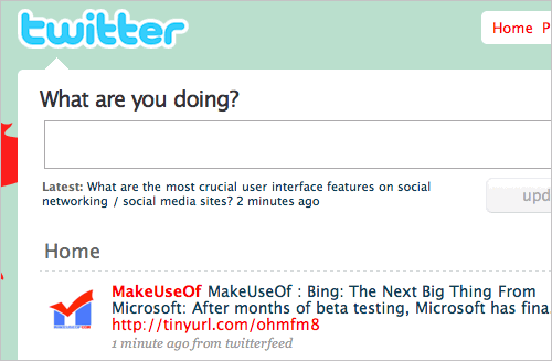
For example, Twitter has probably one of the most minimalistic social user interfaces; the UI is very simple, uses few colors and puts the main feature of the service in the foreground – a textarea-box that is supposed to be used to send out short messages.
In other words, since the information flow is quite large for most users, it is almost natural to make the interface as simple as possible. If the interface is overdone with graphical elements, users will feel uncomfortable and confused, since it will be hard to focus on specific tasks or areas. Simple interface doesn’t just mean a simple visual design, though. More importantly, it means that available interface options are designed, placed and presented in an intuitive way.
The colors on social media and social networking sites are always calm and supportive, rather than bright and obnoxious. Features do not fight for attention; many of them remain invisible most of the time. In fact, most social media interfaces are context-sensitive, displaying many features only “on demand”. With such a large amount of data and functions, bright colors would simply get in the way and distract the user.
2. Prominent and Functional Search
Good search functionality is undoubtedly the pinnacle of good usability and good user interface. In the social media a search functionality is a must – simply because of the vast amount of available information. The search, however, has multiple dimensions: apart from the traditional content search, social applications also provide an advanced search of connections in the social graph – be it groups, communities or interests. The upper-right corner of the site is the most suitable location for a search box. Users expect it there: a search input area and a clearly visible search button.
A common feature in social applications is the use of live search results and filtering. When you type into the box, the results are filtered out in a drop-down style. The filtering helps users to quickly find the content they are looking for and get rid of any content that isn’t relevant to them. You want the experience to be fine tuned to each individual user and filtering searches does just this.
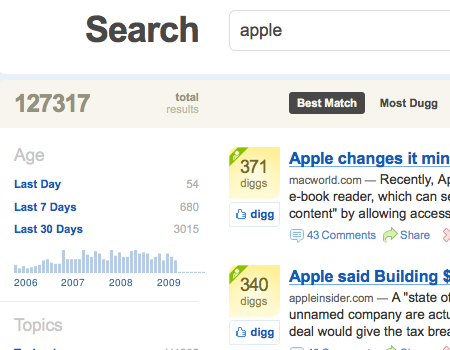
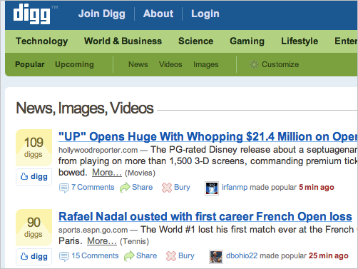
The search results page is even more crucial than a user-friendly design of a search box. Digg recently updated their search engine and it is now an example of the extremely functional and very user-friendly search functionality. You can organize search results by options such as best match, most Diggs, and newest. On the right side you’ll find a list of age ranges, Digg ranges, popular topics, and top categories. Furthermore, you can search by the source of the content, too. The search results page also includes a large search bar at the top, which helps the user refine their search if necessary.
3. Prominent Call-To-Action-Buttons
Of course, social applications contain many functions that need to be communicated in some way. Consequently, buttons and links need to be placed almost on every page (a sign-up form is probably the only reasonable exception). Some links relate to navigation and some let the user adjust specific application functions. Buttons are often used to animate users to actions, while links are often more passive and subtle. Buttons are also often larger, more vivid and more memorable. No matter what task a button performs, it needs to be large and clickable.
Often social networking sites have only few call-to-action-buttons that are supposed to motivate users to actions (see also Web Design Trends: Call To Action Buttons, Buttons Design Showcase and Good Call-To-Action Buttons for good guidelines for the design of call-to-action-buttons). These buttons are usually designed and placed prominently, while other design elements remain very subtle and simple (see the screenshot below).
In general, the usage of real-life metaphors in user interface designs is highly recommendable. It is therefore a good idea to not only make the button look like a button (for instance, using drop-shadow), but also make sure that the :active- and :focus-states are designed accordingly, communicating that the button was actually “pressed”. In this situation it is better to add the embossing-effect instead of just changing the color of the button or its border.
A button should be large enough to be noticed and selected without difficulty. However, size isn’t the only characteristic of a clickable button or link. Another important factor is padding. If you have a line of links tightly packed together, it will be impossible to click the one you actually want to click. You may consider providing visual support for your links or buttons.
In the case of links, it is sometimes useful to include icons or small illustrations. However, this doesn’t always work, especially when the link is not that important to most users. If you need to highlight some important links, you should consider adding spacing to the link, use a background that stands out, make it a large clickable block or just replace it with a prominent button. Use a background that stands out, but isn’t overly complicated.
It is also important to mention the importance of hover effects. The hover effect lets the user know that the button is in fact clickable and confirms that the user’s action is understood by the system.
4. Calm Separation of Elements
A meaningful organization and presentation of various chunks of information is probably one of the advanced design problems that designers of social user interface have to deal with. In order to make the content readable, scannable and easy to perceive, content blocks need to be visually separated. In other words, each element needs to be defined as and presented a separate element in some way. In fact, the separation of elements in a layout is one of the most simple ways to achieve a more clean user interface that the user can easily interact with.
However, if many elements are visually separated, the interface contains more chunks of information and consequently the layout becomes more complex. Therefore, to make sure that the layout remains scannable, the visual separation needs to be subtle. In most cases horizontal and vertical lines designed in neutral, calm colors (for instance, grey) are used. A strong, vivid color – that often is difficult to overlook – would distract the user, fighting for her attention. On the contrary, “calm” lines are easier to ignore and provide visual support.
What exactly does it mean to separate elements in a layout? Twitter uses visual separation to structure the layout. You can see that between each tweet there is a line splitting up the two. Without this dividing line, it would be nearly impossible to quickly scan through dozens of text lines. It’s small details such as this that help to significantly improve a user interface, making it easy to use.
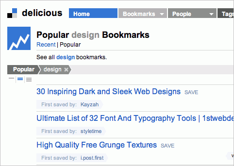
[Delicious](https://www.delicious.com) uses thin 1px-grey lines to separate the popular bookmarks of its users.
You can also see a separation between elements being used on Mixx.com. Just like on Twitter, a single grey pixel line separates the large amounts of text, making it much easier to scan.
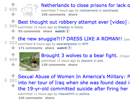
On the contrary, Reddit doesn’t use a separation between stories which makes an interface more cluttered, and therefore more difficult to scan. Sometimes, a large amount of active white space may also help to separate elements in the layout; however, the disadvantage of this approach is that the page may become too long and the user will have to scroll vertically. In the Reddit’s case the scannability is improved by the bright title links. The focus is meant to be brought to the title completely, which is definitely a good idea in this design.
Another technique to separate elements is by using an appropriate layout structure that would visually separate content block from each other or/and using whitespace for the same purpose. E.g. [Slashdot](https://slashdot.org/) put each content block in an easily recognizable box and uses background-images for the headline to highlight each headline.
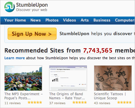
StumbleUpon uses a rigid grid-based-structure in which each content item is put in the block of the same height and width. That's another design approach to calm separation of content that works as well.
5. Treat text as User Interface
In the presentation Nine skills that separate good and great designers Cameron Moll mentioned that good designers treat text as content, while great designers treat text as user interface. While content is basically a huge block of text, user interface incorporates subtle variations of text color, background, font-sizes and link presentation to make the content more accessible.
In fact, on social media sites a good user interface practice is varying size and color of elements to create a clear visual and structural hierarchy on the site. This is similar to the previous tip because this technique helps to provide separation and define elements, as well as cleaning up the interface. Apart from improving usability, treating text as user interface helps to improve readability because it arranges clear relations between design elements, implying their weight and hence the importance in the layout. The result: the page is much easier to scan.
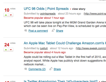
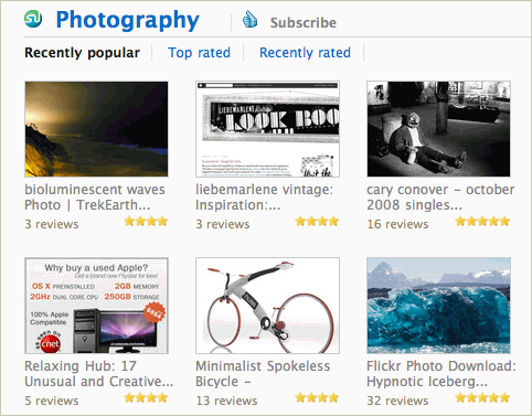
As an example for this concept, consider the Digg’s user interface (see the image below). When browsing it, you’ll spot many variations in sizes of textual elements, and different colors in text and in other elements used in a very consistent way. Also notice how well the design manages to provide users with a clear navigation pathway; while the main link is underlined and has a blue color, the “more…”-link is grey, while other links aren’t underlined, and some textual elements are red or grey.
Each content block has 7 various design elements (headline, source, description, the “more”-link, category section, time stamp and further links below the description). However, the design works well, because the visual weight of each element is very distinctive and communicated very clearly. That’s a good design.
Also, you can see a simpler example on the Twitter’s screenshot from above. First the post is shown, then below is smaller and more subtle text is displayed – it is easy to find only if you are looking for it. Otherwise, the user’s eye will just flow directly over it, which is exactly the point.
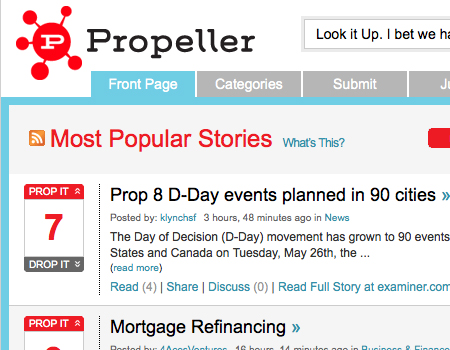
Another example of this is Propeller. The items in the main content area alternate in background color of white and grey. The elements of each block have different shades, and the main content has a clearly visible border. These color variations make the interface look much nicer.
6. Simple and Usable Forms
Web forms are probably the most important design element for social media and networking sites. Forms and inputs are used in everything from sign-up to search, log-in, replying to a post or adding some other content. Since forms are extremely important, they must be usable. This is especially true for the sign-up forms, because without a “working” sign-up-form, it may be difficult to gain a critical mass of users that would keep a social media site alive.
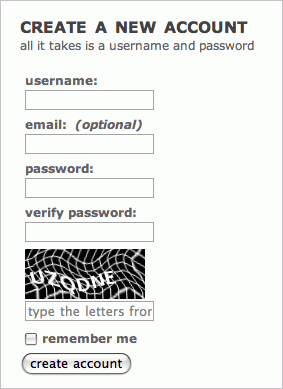
A number of factors will help to keep the forms usable. The easiest is keeping it as short as possible. Many social media sites include only essentials in the sign-up-form (only e-mail and password) and leave the extra information for the user to edit once their account is created (e.g. bio, location, and other general information). If possible don’t require any e-mail or password-confirmation and do not use a captcha.
Some services require e-mail confirmation and e-mail activation which takes user’s time and doesn’t necessarily help the user to start playing around with the system immediately. The rule of thumbs: the simpler your web form is, the better it is for the user; the more fields and requirements you remove, the more users will sign-up for your service. You will find more useful information about the design of usable sign-up forms in our study Web Form Design Patterns: Sign-Up Forms (see part 2 as well).
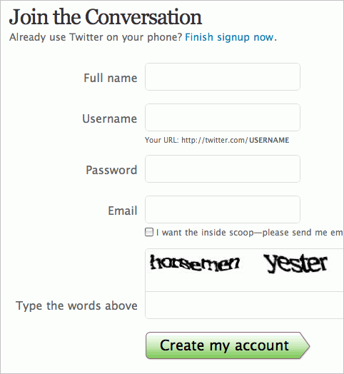
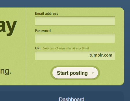
Reddit uses a very short sign-up field that can be filled in in seconds. No e-mail confirmation or activation is required. The form is clean and simple. Twitter also uses a simple and a clean sign-up form that doesn’t require password confirmation. When an input field is clicked, a hint is displayed right to the input field, informing the user on the details of the input. The ultimate example of an easy sign-up-form is Tumblr. The sign-up has three pieces: email, password, and username, that’s it.
Twitter also uses a simple and a clean sign-up form that doesn’t require password confirmation. When an input field is clicked, a hint is displayed right to the input field, informing the user on the details of the input.
The ultimate example of an easy sign-up-form is Tumblr. The sign-up has three pieces: email, password, and username, that’s it.
7. Real-Time Updates
        One of the reasons why micro-blogging services have managed to take off over the last years, was their ability to bring the new, "real-time" dimension to the social interaction on the Web. Different from instant messaging where users were mostly focused on the two-way-conversations, Twitter & Co. delivered many-ways-conversations to the Web.

<p>Modern users want to see an incoming message or post as soon as it comes, <strong>observing what happens <em>right now</em> in his social graph in real-time</strong>. For designers of social user interface it means that users should have a real-time update feature that would deliver updates as soon as they are submitted within the application. An automatic and eye-catching (yet unobtrusive) update helps the user to "stay in flow", i.e. focus on his primary tasks and get instantly informed about secondary information that may be important as well.
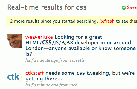
Twitter search shows user updates in real-time, with new updates highlighted at the top of the search box. This is probably how the search and news stream will look like in the future (Google and Digg, we are looking at you).
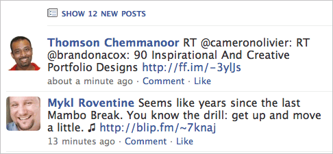
Facebook shows the updates at the top of the page and lets the user see them on demand – with AJAX and without a site reload, of course.
8. Word-Of-Mouth-Advertising and Personalization
Probably the best strategy for an effective word-of-mouth-advertising is providing a good quality of service and a good user experience. The more comfortable a user will feel with a social networking site, the more likely she will be to improve its social capital and expand her social circles. To achieve this, a social networking site needs to offer attractive features and provide functions that would have advantages both online and offline. Therefore it's quite understandable that social networking sites often utilize personalization, offering more flexible and more adaptive user interfaces.
On its core, personalization is a very powerful technique that can be utilized to deliver only relevant content to the users of a social application. Recommendation systems are often used to provide users with the information that is very likely to interest them or meet their expectations. It is important to mention that such systems usually require a lot of time to take off, because in the very beginning they have very little information about the user and his preferences and are therefore unable to suggest useful recommendations. Continuous learning of interests, based upon users' activities, search logs and other actions is then used to create a model of the user and search for good personalized suggestions.
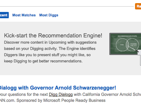
Again, Digg does this with their Digg Recommendation Engine. With this engine, the user can see stories that are Dugg by Diggers who like stories that you like. It also recommends users that like stories similar to you.
It is important to understand that most users of social networking applications are not just looking for ways to connect with the people that they already know (although according to Joshua Porter's book "Designing for the Social Web", the first things users do is connecting with the people they know), but discovering new, like-minded people (thanks, Brad Nunnally). Personalized recommendation systems are often very popular in social applications, because they improve the social presence of a user and help to establish new connections.
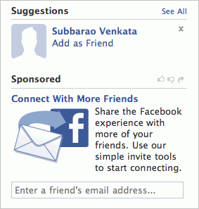
Apart from that, most social networking sites also make it easy for users to invite their friends to the network and spread the word in social circles ("share this message", "share this link" etc.). Facebook's "Connect with more friends" feature is exemplary for this strategy.
The reason behind it is the classic network effect – the effect that one user of a service has on the value of that product to other people. The more people use Facebook, the more valuable Facebook is to each owner. This creates a positive effect because a user may sign up in Facebook without intending to create value for other users, but does so in any case. The accumulation of small "network contributions" results in a valuable and highly popular applications – which Facebook has certainly become today.
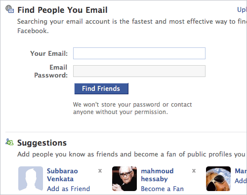
Facebook goes even further and makes it possible for users to integrate their contacts from other services (e.g. from Google Mail) to Facebook and invite them automatically using the open APIs from other social service providers. No user would willingly take time to manually invite each of his friends to an application – Facebook takes care of it, automatically and painlessly.
9. User-Centric User Interface
Since social software is social, it provides users with a user interface that is strongly focused on the personal interests of its users. And because social media and social networking sites live by the actions of its users, it's no wonder that social user interfaces are extremely user-centric. Twitter, Facebook and other social applications put the user in the middle of the application, focusing on the little details of users' profiles, suggesting new friends, interests, events, groups etc. in the attempt to extend their social circles and intensify the engagement of the user.
Facebook's front page is exemplary for an egocentric user interface. It provides detailed information about updates and notifications of a user and also provides a one-click-interface that makes it easy to update the current status, hide information provided by friends and it updates you about people a user may know or groups or conversations that the user may be interested in. Hence Facebook emphasizes the personal value of the application, putting the person at the center of the software. Twitter is another example for a similar approach: the front page is all about the user, his connections and conversations among his friends.
From the usability point of view, this approach is almost obvious – since an application is created for the customer, it should be all about the customer. However, most social applications are not task-specific like common online-banking-software, but more activity-specific: it's all about engagement and being connected. And it's also about using the service not to solve single tasks, but to use the application continuously and as often as possible. The more engaged the user is, the more traffic she delivers back to the service and the more users are getting engaged by the word of mouth advertising. That's the key of social applications – and egocentric user interfaces leverage this strategy to effectively bind users to using these applications.
Further Resources
You may want to take a look at the following related posts
- 12 Useful Techniques For Good User Interface Design
- 10 More Useful Techniques To Improve Your User Interface Designs
- 10 Useful Web Application Interface Techniques
- 8 Layout Solutions To Improve Your Designs
- 10 Simple and Impressive Design Techniques
- Seeing Friends: An Eye Tracking and Usability Study
According to recent eye-track studies, big, scannable friend lists are very important in social networking sites UIs.


