Adaptive CSS-Layouts: New Era In Fluid Layouts?

Email Newsletter
Weekly tips on front-end & UX.
Trusted by 182,000+ folks.
 Celebrating 10 million developers

 Custom Web Forms for Angular, React, & Vue. Your backend.

If you as a designer are going to go through all the extra work of creating a functional fluid layout, why not go a bit further and make it compatible with all resolutions, instead of just most? You can use a few techniques to create an incredibly versatile, adaptive layout that will stay perfectly functional with the constantly changing screen sizes.
In this article, we’ll discuss effective techniques to create 100%-functional adaptive CSS-layouts, and provide details on other tutorials and practices.
Also consider our previous articles:
- Fixed vs. Fluid vs. Elastic Layout: What’s The Right One For You?
This article discusses the pros and cons of each type of layout. Either one can be used to make a successful website layout, as long as you keep usability in mind. - Flexible Layouts: Challenge For The Future
Discusses the challenges of flexible layouts for the future. - Screen Resolutions and Better User Experience
Introduces the issue of screen resolutions, then considers the average user’s profile.
1. Fluid Layout Using A Grid
Most of us have heard of the 960 Grid System for designing fixed-width Web pages. Using 960 often makes fixed-width design preferable to fluid layouts. However, there is a way to create a grid-based elastic layout. Elastic layouts are, technically, different than fluid layouts in their coding structure, but they provide almost identical results for the user.
What Is a Fluid Grid?
A fluid grid can be created through a smart use of DIV layers, percentages and very simple math. The idea comes from Ethan Marcotte, who realized that the “em” unit could go further than font size. We’ll go over the basics here, but for a complete and detailed overview of the method, read the article Fluid Grids by Ethan Marcotte, which is a complete walk-through and tutorial on creating a grid-based elastic layout.
The idea here is to use relative units, a combination of percentages and em’s, and to use simple division to find the equivalents of pixel widths that would normally be used for fixed-width design.
The Benefits
- This method allows you to have a grid layout, which once only seemed possible with fixed-width layouts.
- The user can view the entire layout using their preset text size, and everything will stay in proportion.
- The layout style uses concepts that are cross-browser compatible.
- Once understood, the concept is a fairly easy fix for most problems with fluid design.
How to Create a Fluid Grid Layout
The first step in creating this fluid layout is to create a mock-up of the preferred fixed-width layout. This way, the designer can still see the proportions and can apply Divine Proportion, balance and appropriate spacing techniques.
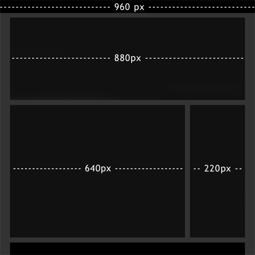
From the simple layout above, we can see how we would code this in CSS. 960 pixels would be our fixed width, and we would force a horizontal scroll bar for any resolution narrower than this. All of our content is in a wrapper that is 880 pixels wide. We have 40-pixel margins on both the left and right side, and 20 pixels of spacing between all of our elements.
Everything’s fine until we start thinking about usability. This type of layout would probably work well for many users; but not for everyone. So, let’s transfer this to a fluid layout. If we want this layout to maintain its proportions at any screen resolution, we’ll have to change our 960-pixel width to 100%, and then find the percentage equivalents of 880 pixels, 640 pixels and 220 pixels.
This just requires some rational thinking. In our fixed-width mock-up, our entire wrapper was 880 pixels, within the 960-pixel-wide design. If we want the equivalent in a percentage, all we have to do is divide:
880 pixels ÷ 960 pixels = 0.91666667
Take that decimal number, turn it into a percentage and you get 91.666667%. Now, because browsers handle percentages differently, it would not be wise to put all those decimals places straight into the layout. Browsers either round up or down, so to know exactly what we’re working with, we should round it to a whole number ourselves. Since it’s closer to 92%, we’ll round up. If we need to round it down later because of extra spacing issues, that’s easily done.
name="code">
wrapper {
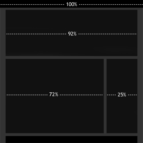
width: 92%;
}For the content and sidebar areas, we need to do the same thing, but in the right proportion. Because these two areas are within the 880-pixel-wide wrapper DIV, we need to find the percentages of these relative to this DIV:
640 pixels ÷ 880 pixels = 0.727272 → 73%
220 pixels ÷ 880 pixels = 0.25 → 25%
name="code">
content {
    width: 73%;
}

sidebar {
    width: 25%
}
Let’s actually round the content area down to 72%, so that our layout doesn’t break. Because it has to be positioned next to the navigation bar, we don’t want it to be too wide.
This is a very easy concept and a much more efficient way to handle proportions in fluid design. With this technique, a designer doesn’t have the excuse that proportions cannot be maintained and ruin the aesthetic appeal of their layouts.
A Note About Margins
Designers will determine the length of the margins in different ways. One way is to calculate the percentages of the margins (in this case, 20 pixels ÷ 880 pixels). Another is to set fixed margins or, as in our example, hard-code them in as 20 pixels.
Each method has its pros and cons. With percentage margins, the designer risks the margins being too wide in very large screen resolutions but probably achieves better proportion. Fixed margins may cause slight imperfections in the proportions but guarantees that the spacing will look right no matter what the screen size.
2. Adaptive Content
Another common problem with fluid designs is that even though they adapt to many screen resolutions, if the resolution gets too small (such as on a phone or PDA) or incredibly large, things start to look a bit funny. For example, a three-column layout would look very cluttered on a PDA screen whose resolution is only 240-pixels wide.
To address this problem, we can use a technique that involves adapting content to a specific ranges of screen resolutions. Fortunately, we can still use the technique outlined above to retain our proportions, and then we can add this technique for even better usability.
Fluid Layout with Adaptive Content
Most fluid layouts look great in screen resolutions of 800x600 pixels up to 1280-pixels wide and larger. However, it would be even better if we could break it up a bit more and create slightly different custom-made layouts for resolutions that are 800 to 1024 pixels, 1024 to 1280 pixels and 1280 pixels and up. Likewise, custom adjustments could be made for screen resolutions that are 640 to 800 pixels, 320 to 640 pixels, 240 to 320 pixels, and 240 pixels and below.
An example of this technique is used on The Man in Blue:
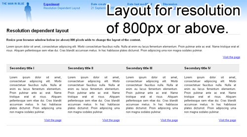
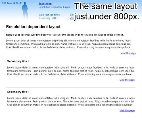
The example above has only two separate style sheets: one for resolutions wider than 800 pixels and one resolutions narrower than 800 pixels. A better implementation of this technique would have several layout styles to more accurately accommodate different screen resolutions. Marc Van Den Dobblesteen’s layout example, Switchy McLayout, provides a perfect example of using these alternative style sheets.
The Benefits
- The designer is able to see with greater accuracy what a design will look like in different resolutions.
- Better adherence to design principles of spacing and balance, no matter what platform the design is viewed on.
- The tiniest and largest resolutions are handled with perfection.
Create a Fluid Layout with Adaptive Content
To create this type of layout, we need two things: separate style sheets for every range of screen resolutions, and a way of determining a user’s screen resolution. A popular walk-through of this is the article Dynamic Resolution-Dependent Layout Technique by Kevin Hale.
The first step is to create a set of alternative layout files. For example, one could be called narrow.css and would be tailored to very narrow resolutions. Another could be normal.css and would apply to conventional computer screen resolutions, and a third could be wide.css and would handle unusually large resolutions.
We can then use JavaScript to make some simple alterations depending on the preset style sheets. Dynamic Resolution Dependent Layouts offers some sample JavaScript in the demo explains how it is being used. Declarations of all the style sheets and the JavaScript file are then put in the header, just like any other type of layout.
<!-- Narrow style sheet -->
<link rel="alternate stylesheet" type="text/css" href="css/narrow.css"
title="narrow"/>

<!-- Default style sheet -->
<link rel="stylesheet" type="text/css" href="css/normal.css" title="default"/>

<!-- Wide style sheet -->
<link rel="alternate stylesheet" type="text/css" href="css/wide.css"
title="wide"/>

<!-- Included JavaScript to switch style sheets -->
<script src="scripts/dynamiclayout.js" type="text/javascript"></script>
Notice the title attribute in all three links to the style sheets: “narrow,” “default” and “wide.” Taking a closer look at the DynamicLayout() function in the JavaScript source, we can see that it is quite easy to customize which style sheet is called according to each title attribute. We can also see how to change the pixel widths accordingly.
function dynamicLayout(){
    var browserWidth = getBrowserWidth();

    // Narrow CSS rules
    if (browserWidth < 640){
        changeLayout("narrow");
    }
    // Normal (default) CSS rules
    if ((browserWidth >= 640) && (browserWidth <= 960)){
        changeLayout("default");
    }
    // Wide CSS rules
    if (browserWidth > 960){
        changeLayout("wide");
    }
}
This technique is very easy to implement and works great with other techniques for creating more usable fluid layouts. Take a closer look at the JavaScript to see in more detail how things work.
Similar Techniques
For a similar technique, look over [Dynamic layouts with adaptive columns](https://www.brandspankingnew.net/archive/2005/12/dynamic_layouts_with_css_javascript.html) over at [Brand Spanking New](https://www.brandspankingnew.net). It features generally the same code, although slightly different. There are fortunately many options and script examples for getting the same adaptive content technique to work.
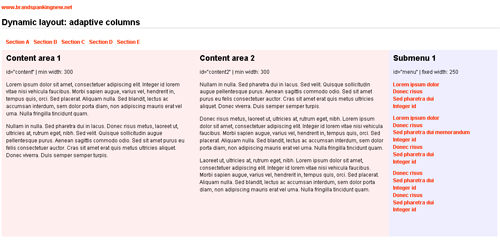
[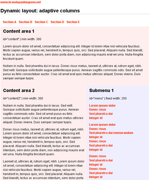](https://www.brandspankingnew.net/specials/adaptLayout/adaptive_columns_01.html)
To download the script for this version of adaptive content, go to [Dynamic layouts with adaptive columns](https://www.brandspankingnew.net/archive/2005/12/dynamic_layouts_with_css_javascript.html).
The concept isn't difficult, and many developers have made their own version of this technique. A great source to find even more examples of adaptive content layouts and scripts is Clagnut.com's blog post, "[Variable fixed width layout](https://clagnut.com/blog/1663)". There is even one such technique featured on this post that requires no JavaScript whatsoever: [CSS Drop Column Layout](https://muffinresearch.co.uk/archives/2006/02/07/css-drop-column-layout).</p>
3. Images In A Fluid Layout
One major concern among developers of fluid layouts is dealing with images and other content that requires a set width. In most cases, we’d all like our images to be as large as possible, or at least to prevent any awkward white space if they’re too small. In a fixed-width layout, adjustments can be made manually, but quite easily, to overcome these issues. However, in a fluid layout, in which the width of the area where images appear is constantly changing, these problems can come up all over again.
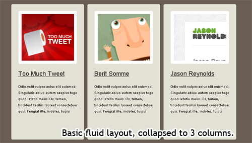
Automatic Magazine Layout
One solution requires some smart algebra and PHP. The full explanation (including the math) and the downloadable source code is available in the article Automatic Magazine Layout by Harvey Kane. The title derives from how images are displayed in magazines: organized and always perfectly aligned. Of course, a magazine designer has to go through a certain process to achieve this look, involving resizing and manual placement.
There is now a technique that achieves this effect for us, too. Below is the first example of what the script can do:
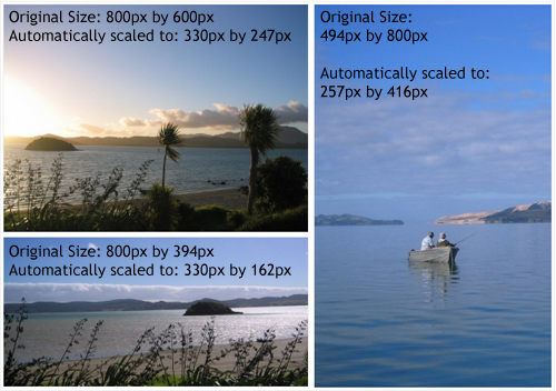
As you can see, things are definitely prettier. But how does it make things more usable with a fluid design? Harvey Kane gives the PHP script that we need to use:
# include the class file
require_once('magazinelayout.class.php');

# Define the width for the output area (pixels)
$width = 600;

# Define padding around each image; this *must* be included
#in your style sheet (pixels)
$padding = 3;

# Define your template for outputting images
# (Don't forget to escape the &)
$template = '<img src="image.php?size=[size]&file=[image]" alt="" />';

# create a new instance of the class
$mag = new magazinelayout($width,$padding,$template);

# Add the images in any order
$mag->addImage( 'landscape1.jpg' );
$mag->addImage( 'portrait1.jpg' );
$mag->addImage( 'landscape2.jpg' );

# display the output

echo $mag->getHtml();
We can predefine the width that we’d like our entire magazine-inspired image layout to render as. So, if we can find out what the user’s browser width is, we can determine how wide our image layout should be. This is easy enough, because we’ve already done it with our second technique: fluid layouts with adaptive content. In his script, Kevin Hale uses a method called getBrowserWidth(). You can get a more in-depth look at the code for this method in his article.
If we can use this method to retrieve the browser’s width as a number, then we can use this number to find the pixel width of our content area (or whatever area these images are going to be placed in). Let’s say we’d like to put the images in our content area, which is set to 70% width. Using simple math, we just need to find out how many pixels is 70% of the browser’s width.
Pixel width = Percentage of Content Area x Browser Width
$width = 0.70 x getBrowserWidth();
This is, of course, pretty basic math, and a pretty basic solution for dealing with images in fluid layouts, once the initial PHP script is set up. Adjust the PHP script to automatically find the pixel width of the images, and you’ve got a great way of dealing with images, or any other content that has a set width, in a fluid layout.
4. jQuery Masonry
There are enough problems in CSS without thinking about constantly changing screen resolution. There is one common problem, though, that many designers may face more than others — multiple content boxes. When working with many floated elements, some awkward extra whitespace may show up between sections of varying heights. An example of this is below.
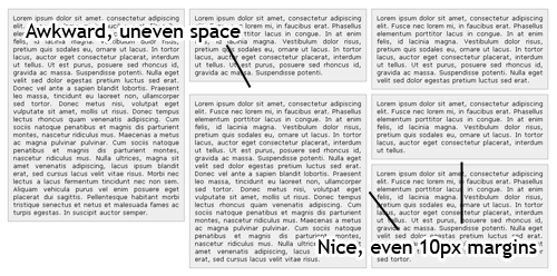
If we want to use divs in this way in a fixed-width layout, the fix is easy: just manually adjust the divs until everything is in place. Dealing with divs in this fashion in a fluid layout almost seems impossible. Every time the layout is adjusted, we get weird whitespace in a new spot, and in different amounts.
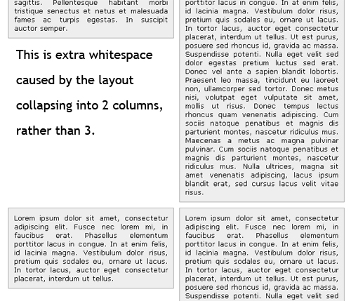
Viewing the same layout in a thinner resolution causes the layout to collapse into a 2-column layout, as it should. However, when this happens, we get a different whitespace issue. Any designer can see this is a very ugly problem for layouts, and often times layouts like these are forced into fixed width because there seems to be no way around the problem.
Fortunately, it's not an impossible fix, but rather an incredibly easy one — thanks to David DeSandro's jQuery Plugin: jQuery Masonry.</p>
What is jQuery Masonry?
jQuery Masonry is a very easy to use jQuery plugin. In the words of David DeSandro himself, "Think of Masonry as the flip side of CSS floats. Where as floats arrange elements horizontally then vertically, Masonry arranges them vertically then horizontally. The result leaves no vertical gaps between elements of varying height, just like a mason fitting stones in a wall."
How to Use the jQuery Masonry Plugin
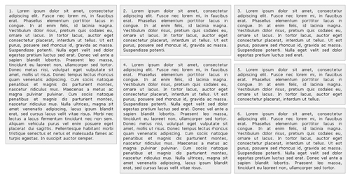
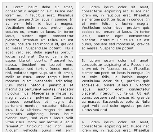
In the example above, all of the boxes are placed in paragraphs with an ID of "item". This item ID has a set width of 30%, and floats to the left. All of these 'item' paragraphs are then placed inside of a very basic wrapper with its own fluid width of 90%. Once the paragraphs reach the end of the wrapper width, they'll go to the next available line — whether it causes too much whitespace or not.
Fixing it is as easy as downloading the jQuery Masonry plugin, and applying the .masonry() method to our wrapper ID.
<pre class="js" name="code">$('#wrapper').masonry();</pre>
The two images below show the power of this plugin. First is the layout on a large screen resolution, second is the same layout on a lower screen resolution when collapsed to two columns.
One Bug to this Plugin, and One Fix
To download the script for this version of adaptive content, go to [Dynamic layouts with adaptive columns](https://www.brandspankingnew.net/archive/2005/12/dynamic_layouts_with_css_javascript.html).

The concept isn't difficult, and many developers have made their own version of this technique. A great source to find even more examples of adaptive content layouts and scripts is Clagnut.com's blog post, "[Variable fixed width layout](https://clagnut.com/blog/1663)". There is even one such technique featured on this post that requires no JavaScript whatsoever: [CSS Drop Column Layout](https://muffinresearch.co.uk/archives/2006/02/07/css-drop-column-layout).</p>
3. Images In A Fluid Layout
One major concern among developers of fluid layouts is dealing with images and other content that requires a set width. In most cases, we’d all like our images to be as large as possible, or at least to prevent any awkward white space if they’re too small. In a fixed-width layout, adjustments can be made manually, but quite easily, to overcome these issues. However, in a fluid layout, in which the width of the area where images appear is constantly changing, these problems can come up all over again.
Automatic Magazine Layout
One solution requires some smart algebra and PHP. The full explanation (including the math) and the downloadable source code is available in the article Automatic Magazine Layout by Harvey Kane. The title derives from how images are displayed in magazines: organized and always perfectly aligned. Of course, a magazine designer has to go through a certain process to achieve this look, involving resizing and manual placement.
There is now a technique that achieves this effect for us, too. Below is the first example of what the script can do:
As you can see, things are definitely prettier. But how does it make things more usable with a fluid design? Harvey Kane gives the PHP script that we need to use:
# include the class file
require_once('magazinelayout.class.php');

# Define the width for the output area (pixels)
$width = 600;

# Define padding around each image; this *must* be included
#in your style sheet (pixels)
$padding = 3;

# Define your template for outputting images
# (Don't forget to escape the &)
$template = '<img src="image.php?size=[size]&file=[image]" alt="" />';

# create a new instance of the class
$mag = new magazinelayout($width,$padding,$template);

# Add the images in any order
$mag->addImage( 'landscape1.jpg' );
$mag->addImage( 'portrait1.jpg' );
$mag->addImage( 'landscape2.jpg' );

# display the output

echo $mag->getHtml();
We can predefine the width that we’d like our entire magazine-inspired image layout to render as. So, if we can find out what the user’s browser width is, we can determine how wide our image layout should be. This is easy enough, because we’ve already done it with our second technique: fluid layouts with adaptive content. In his script, Kevin Hale uses a method called getBrowserWidth(). You can get a more in-depth look at the code for this method in his article.
If we can use this method to retrieve the browser’s width as a number, then we can use this number to find the pixel width of our content area (or whatever area these images are going to be placed in). Let’s say we’d like to put the images in our content area, which is set to 70% width. Using simple math, we just need to find out how many pixels is 70% of the browser’s width.
Pixel width = Percentage of Content Area x Browser Width
$width = 0.70 x getBrowserWidth();
This is, of course, pretty basic math, and a pretty basic solution for dealing with images in fluid layouts, once the initial PHP script is set up. Adjust the PHP script to automatically find the pixel width of the images, and you’ve got a great way of dealing with images, or any other content that has a set width, in a fluid layout.
4. jQuery Masonry
There are enough problems in CSS without thinking about constantly changing screen resolution. There is one common problem, though, that many designers may face more than others — multiple content boxes. When working with many floated elements, some awkward extra whitespace may show up between sections of varying heights. An example of this is below.

If we want to use divs in this way in a fixed-width layout, the fix is easy: just manually adjust the divs until everything is in place. Dealing with divs in this fashion in a fluid layout almost seems impossible. Every time the layout is adjusted, we get weird whitespace in a new spot, and in different amounts.

Viewing the same layout in a thinner resolution causes the layout to collapse into a 2-column layout, as it should. However, when this happens, we get a different whitespace issue. Any designer can see this is a very ugly problem for layouts, and often times layouts like these are forced into fixed width because there seems to be no way around the problem.
Fortunately, it's not an impossible fix, but rather an incredibly easy one — thanks to David DeSandro's jQuery Plugin: jQuery Masonry.</p>
What is jQuery Masonry?
jQuery Masonry is a very easy to use jQuery plugin. In the words of David DeSandro himself, "Think of Masonry as the flip side of CSS floats. Where as floats arrange elements horizontally then vertically, Masonry arranges them vertically then horizontally. The result leaves no vertical gaps between elements of varying height, just like a mason fitting stones in a wall."
How to Use the jQuery Masonry Plugin
In the example above, all of the boxes are placed in paragraphs with an ID of "item". This item ID has a set width of 30%, and floats to the left. All of these 'item' paragraphs are then placed inside of a very basic wrapper with its own fluid width of 90%. Once the paragraphs reach the end of the wrapper width, they'll go to the next available line — whether it causes too much whitespace or not.
Fixing it is as easy as downloading the jQuery Masonry plugin, and applying the .masonry() method to our wrapper ID.
<pre class="js" name="code">$('#wrapper').masonry();</pre>
The two images below show the power of this plugin. First is the layout on a large screen resolution, second is the same layout on a lower screen resolution when collapsed to two columns.


One Bug to this Plugin, and One Fix
When using this plugin, one will notice that the div layers stay in the same spot if a user were to resize their browser. Upon refresh, the layout is fixed and works appropriately again. However, the user will not know they need to refresh to fix the problem, so changing the HTML code below will correct this bug quite easily.
<pre class="js" name="code"><body onresize="window.location=window.location;"></pre>
Now, every time the user changes their browser size, the browser will autmoatically refresh and reload the entire script.</p>
5. Smart Columns with jQuery & CSS
The jQuery fix above solves problems with divs of varying height, but for a layout intended to have even div heights, it might not be the best solution. Soh Tanaka of SohTanaka.com has come up with a jQuery script and a smart use of CSS to make columns in fluid layouts collapse and expand elegantly. For an example, check out the demo: Smart Columns w/ CSS & jQuery.</p>
What are Smart Columns with jQuery & CSS?
Smart Columns are a script that can alter the width of the divs for the best viewing quality, and also determine how may columns can be viewed across that page for the browsers current size. It is also perfect for users who resize their browsers, rather than just accomodating browser size on entry to the website.
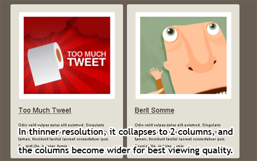
The script takes the remaining whitespace off of the end of a row of columns, which may be caused by varying browser widths, and then places them evenly throughout the columns using jQuery.</p>
How to Get Smart Columns
The code is all laid out in Soh Tanakas blog post: Smart Columns w/ CSS and jQuery. It can be set up using a list, with each block item as a <li> element.
<ul class="column">
    <li>
        <div class="block">
        Block 1
        </div>
    </li>

    <li>
        <div class="block">
        Block 2
        </div>
    </li>

    <li>
        <div class="block">
        Block 3
        </div>
    </li>
</ul>
Then, by intserting the CSS and jQuery code into the page (Soh Tanaka has easily laid this out in the above post), the smart columns will work. Customizing the code is easy, and only requires editing the CSS in terms of width, height, and margins.</p>
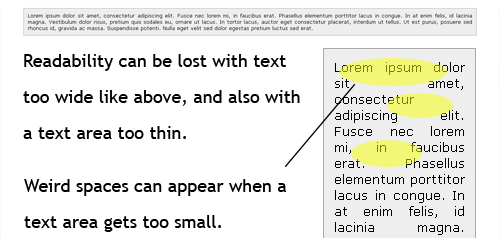
6. Text Zooming
Another common problem among fluid layouts is the concern that the text either gets so stretched or squished that the layout loses readability. The image below shows this problem, both for an incredibly wide screen, and then for a very thin screen. The very thin screen seems to host the biggest problem by causing big gaps in the text, but both instances can frustrate the user equally.
<p>One method to combat this is to use min-width and max-width, although that has two problems:
- Min-width and max-width are not supported in all browsers,
- the layout is then just resorting to a partially fixed-width layout, and we lose overall flexibility again.
<p>Luckily, James over at <a href="https://tinnedfruit.com">Tinned Fruit</a> has created a script that does something to fight this problem.</p>

<h4>What is Text Zooming?</h4>
<p>Text Zooming, as he calls it, is a JavaScript that automatically resizes text based on the width of the user's screen. As the screen gets wider, the text gets larger. Likewise, as the screen gets thinner the text gets smaller. In addition to this basic functionality, a designer can set a max and min text size so the user never sees any oddly sized text.</p>

<p>For a live demo, go to his Text Zooming page. As one can see, the script degrades nicely, and the larger text is easy to read on a wide resolution, just as the smaller text is to read on a thinner resolution. Better yet, the header and navigation don't change in size, so a designer can choose which elements should use the text zoom.</p>

<p class="showcase"><img loading="lazy" decoding="async" src="https://archive.smashing.media/assets/344dbf88-fdf9-42bb-adb4-46f01eedd629/5ef0e871-558a-454d-868e-0410ab919486/tz.gif" alt="Text Zooming in action." width="450" height="370" /></p>
<p>Above is a portion of the maximized page (large width) that is displaying larger text.</p>
<p class="showcase"><img loading="lazy" decoding="async" src="https://archive.smashing.media/assets/344dbf88-fdf9-42bb-adb4-46f01eedd629/141890e9-8a3a-41e7-b564-3a9d782e3743/tz2.gif" width="450" height="380" alt="Text Zooming in action." /></p>
<p>Above is the same page, only minimized to about 700px in width. The text is resized along with the browser.</p>

<h4>How to Get Text Zooming</h4>
<p>Text zooming is a basic JavaScript that one can include to a web page externally. To download the JS file and read further instructions, head on over to the demo page: Text Zooming.</p>

<p>Below the external script line, it's as easy as intserting the following code and changing it as necessary.</p>
<script type="text/javascript">
  var contentZoom = new TextZoom(
    "Content", // Reference element
    "Content", // Target element
    0.22, // Zoom ratio
    70, // Minimum font size (%)
    130); // Maximum font size (%)
  addLoadEvent(textZoomInit);
</script>
Conclusion
All of these techniques can be implemented in one design to create a very user-friendly fluid layout. A smart use of the fluid grid can create an adaptable layout whose proportions remain faithful to the Rule of Thirds, balance and other design principles. The adaptive content technique can handle unusually small and large screen resolutions with a bit of customization, so the designer is sure to get the perfect look for all users. And the third technique is a good one for making sure that images and other pieces of content with set widths aren't too large for the screen.
jQuery Masonry leaves no vertical gaps between elements of varying height, just like a mason fitting stones in a wall; thet "Smart Columns techniques" makes columns in fluid layouts collapse and expand elegantly and Text Zooming provides a JavaScript that automatically resizes text based on the width of the user's screen.
Hopefully, advanced fluid layout techniques will signal a new era in layout design. With the growing variety of screen widths, it's only a matter of time before these techniques become essential.
Further Resources
You may also be interested in these additional resources:
- Responsively Retrofitting An Existing Site With RWD Retrofit
- Responsive Web Design: What It Is And How To Use It
- Responsive Web Design Techniques, Tools and Strategies
- The State Of Responsive Web Design
- Design Process In The Responsive Age
 (al)
(al)

