Take Your Design To The Next Level With CSS3

Email Newsletter
Weekly tips on front-end & UX.
Trusted by 182,000+ folks.

 Celebrating 10 million developers
 Custom Web Forms for Angular, React, & Vue. Your backend.

So why is it that, when it comes to CSS, we’re stuck in the past and so afraid of experimenting? Why is it that we still use inconvenient CSS hacks and JavaScript-dependent techniques for styling? Why can’t we make use of the rich CSS3 features and tools available in modern Web browsers and take the quality of our designs to the next level?
It’s time to introduce CSS3 features into our projects and not be afraid to gradually incorporate CSS3 properties and selectors in our style sheets. Making our clients aware of the advantages of CSS3 (and letting older deprecated browsers fade away) is in our power, and we should act on it, especially if it means making websites more flexible and reducing development and maintenance costs.
In this article, we’ll look at the advantages of CSS3 and some examples of how Web designers are already using it. By the end, we’ll know a bit of what to expect from CSS3 and how we can use its new features in our projects.
Please also consider reading our previous, related article:
- Learning CSS3: A Reference Guide
- Push Your Web Design Into The Future With CSS3
- Why We Should Start Using CSS3 And HTML5 Today
Using Browser-Specific Properties
To use most CSS3 properties today, we have to use vendor-specific extensions together with the original properties. The reason is that until now, browsers have only partially implemented new CSS3 properties. Unfortunately, some properties may not even become W3C recommendations in the end, so it’s important to target browser-specific properties by differentiating them from standard properties to (and then replacing them with the standardized ones when they become superfluous).
The disadvantages to this approach are, of course, a messy style sheet and inconsistent design across Web browsers. After all, we do not want to revive the need for proprietary browser hacks in our style sheets. Internet Explorer’s infamous <marquee>, <blink> and other tags were employed in many style sheets and became legendary in the 1990s; they still make many existing websites inconsistent or even unreadable. And we don’t want to put ourselves in the same situation now, right?
However, websites do not have to look exactly the same in all browsers. And using browser-specific properties to achieve particular effects in certain browsers sometimes makes sense.
The most common extensions are the ones used for Webkit-based browsers (for example, Safari), which start with -webkit-, and Gecko-based browsers (for example, Firefox), which start with -moz-. Konqueror (-khtml-), Opera (-o-) and Internet Explorer (-ms-) have their own proprietary extensions.
As professional designers, we have to bear in mind that using these vendor-specific properties will make our style sheets invalid. So putting them in the final version of a style sheet is rarely a sound idea for design purists. But in some cases, like when experimenting or learning, we can at least consider including them in a style sheet together with standardized CSS properties.
Useful Links
1. Selectors
CSS Selectors are an incredibly powerful tool: they allow us to target specific HTML elements in our markup without having to rely on unnecessary classes, IDs and JavaScripts. Most of them aren’t new to CSS3 but are not as widely used as they should be. Advanced selectors can be helpful if you are trying to achieve a clean, lightweight markup and better separation of structure and presentation. They can reduce the number of classes and IDs in the markup and make it easier for designers to maintain a style sheet.
Attribute selectors
Three new kinds of attribute selectors are a part of CSS3 specs:
[att^="value"]Matches elements to an attribute that starts with the specified value.[att$="value"]Matches elements to an attribute that ends with the specified value.[att*="value"]Matches elements to an attribute that contains the specified value.
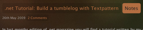
tweetCC uses an attribute selector to target links that have a title attribute ending in the words “tweetCC”:
a[title$="tweetCC"] {
    position: absolute;
    top: 0;
    right: 0;
    display: block;
    width: 140px;
    height: 140px;
    text-indent: -9999px;
    }
Browser support: The only browser that doesn’t support CSS3 attribute selectors is IE6. Both IE7 and IE8, Opera and Webkit- and Gecko-based browsers do. So using them in your style sheet is definitely safe.
Combinators
The only new kind of combinator introduced in CSS3 is the general sibling selector. It targets all siblings of an element that have the same parent.
For example, to add a gray border to all images that are a sibling of a particular div (and both the div and the images should have the same parent), defining the following in your style sheet is enough:
div~img {
    border: 1px solid #ccc;
    }
Browser support: All major browsers support the general sibling selector except our favorite: Internet Explorer 6.
Pseudo-Classes
Probably the most extensive new addition to CSS are new pseudo-classes. Here are some of the most interesting and useful ones:
:nth-child(n)Lets you target elements based on their positions in a parent’s list of child elements. You can use a number, a number expression or theoddandevenkeywords (perfect for Zebra-style table rows). So, if you want to match a group of three elements after the forth element, you can simply use:name="code">:nth-child(3n+4) { background-color: #ccc; }:nth-last-child(n)Follows the same idea as the previous selector, but matches the last children of a parent element. For example, to target the last two paragraphs in adiv, we would use the following selector:name="code">div p:nth-last-child(-n+2):last-childMatches the last child of a parent, and is equivalent toname="code">:nth-last-child(1):checkedMatches elements that are checked; for example, checked boxes.:emptyMatches elements that have no children or are empty.:not(s)Matches all elements that do not match the specified declaration(s). For example, if we want to make all paragraphs that aren’t of the class “lead” to appear black, we would write:name="code">p:not([class*="lead"]) { color: black; }.
On his website, Andrea Gandino uses the :last-child pseudo-selector to target the last paragraph of each blog post and apply a margin of 0 to it:
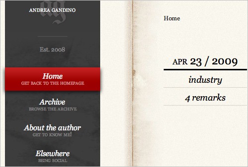
#primary .text p:last-child {
    margin: 0;
    }
Browser support: Webkit-based and Opera browsers support all new CSS3 pseudo-selectors. Firefox 2 and 3 (Gecko-based) only support :not(s), :last-child, :only-child, :root, :empty, :target, :checked, :enabled and :disabled, but Firefox 3.5 will have wide support of CSS3 selectors. Trident-based browsers (Internet Explorer) have virtually no support of pseudo-selectors.
Pseudo-Elements
The only pseudo-element introduced in CSS3 is ::selection. It lets you target elements that have been highlighted by the user.
Browser support: No current Internet Explorer or Firefox browsers support the ::selection pseudo-element. Safari, Opera and Chrome do.
Useful Links
- Selectors Level 3: W3C Working Draft
- CSS3: Attribute selectors: CSS3.info
- Compatibility table: CSS3 Selectors
- CSS selectors and pseudo selectors browser compatibility
- CSS3 Attribute Selectors
- ::selection
- General Sibling Selector
- CSS3 Pseudo-classes
2. RGBA And Opacity
RGBA lets you specify not only the color but the opacity of an element. Some browsers still don’t support it, so it’s good practice to specify before the RGBa color another color without transparency that older browsers will understand.
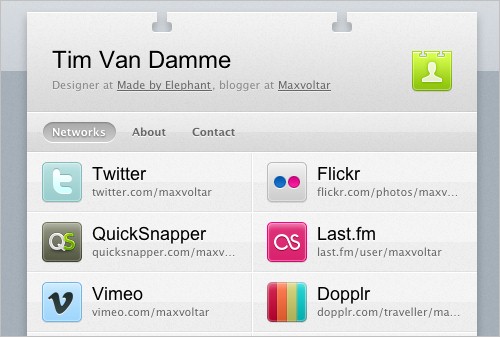
Tim Van Damme uses RGBA colors on hover effects on links
On his website, Tim Van Damme uses RGBA colors on hover effects; for example, on the network links on his home page:
#networks li a:hover,
#networks li a:focus {
    background: rgba(164, 173, 183, .15);
    }
When setting an RGBA color, we must specify the red, blue and green values either with an integer value between 0 and 255 or with percentages. The alpha value should be between 0.0 and 1.0; for example, 0.5 for a 50% opacity.
The difference between RGBA and opacity is that the former applies transparency only to a particular element, whereas the latter affects the element we target and all of its children.
Here is an example of how we would add 80% opacity to a div:
div {
    opacity: 0.8;
    }
Browser support: RGBA is supported by Webkit-based browsers. No Internet Explorer browser supports it. Firefox 2 does’t support it either, but Firefox 3 does, as does Opera 9.5. Opacity is supported by Opera and Webkit- and Gecko-based browsers, but is not supported by either IE release.
Useful Links
- CSS Color Module Level 3: W3C Working Draft
- RGBA colors: CSS3.info
- RGBa Browser Support
- RGBA color space
- Is CSS3 RGBa ready to rock?
- Super-Awesome Buttons with CSS3 and RGBA
3. Multi-Column Layout
This new CSS3 selector lets you achieve multi-column layouts without having to use multiple divs. The browser interprets the properties and create the columns, giving the text a newspaper-like flow.
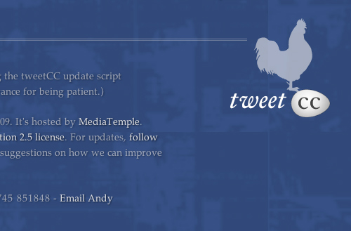
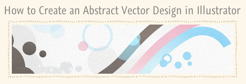
tweetCC uses CSS3 multi-column selector on its home page
tweetCC displays introductory text in four columns on its home page. The four columns aren’t floated divs; instead, the Web designer uses the CSS3 multi-column layout as follows:
.index #content div {
    -webkit-column-count : 4;
    -webkit-column-gap : 20px;
    -moz-column-count : 4;
    -moz-column-gap : 20px;
    }
We can define three things with this selector: the number of columns (column-count), the width of each column (column-width, not used in the example) and the gap between columns (column-gap). If column-count is not set, the browser accommodates as many columns that fit in the available width.
To add a vertical separator between columns, we can use the column-rule property, which functions pretty much as a border property:
div {
    column-rule: 1px solid #00000;
    }
Browsers that don’t support these properties render the content as simple text, as if there were no columns.
Related properties: column-break-after, column-break-before, column-span, column-fill.
Browser support: Multi-column layouts are supported by Safari 3 and 4 and Firefox 1.5+.
Useful Links
- CSS3 module: Multi-column layout: W3C Working Draft
- Columns
- CSS3 - Multi-Column Layout Demonstration
- CSS3 Columns
- Designing tweetCC
- Introduction to CSS3 - Part 5: Multiple Columns
4. Multiple Backgrounds
CSS3 lets you apply multiple layered backgrounds to an element using multiple properties such as background-image, background-repeat, background-size, background-position, background-origin and background-clip.
The easiest way to add multiple backgrounds to an element is to use the shorthand code. You can specify all of the above properties in a single declaration, but the most commonly used are image, position and repeat:
div {
    background: url(example.jpg) top left no-repeat,
        url(example2.jpg) bottom left no-repeat,
        url(example3.jpg) center center repeat-y;
    }
The first image will be the one “closest” to the user.
A more complex version of the same property would be:
div {
    background: url(example.jpg) top left (100% 2em) no-repeat,
        url(example2.jpg) bottom left (100% 2em) no-repeat,
        url(example3.jpg) center center (10em 10em) repeat-y;
    }
In this case, (100% 2em) is the background-size value; the background image in the top-left corner would stretch the full width of the div and be 2em high.
Because very few browsers support it, and because not displaying backgrounds on a website can really impair a website’s visual impact, this is not a widely used CSS3 property. However, it could greatly improve a Web designer’s workflow and significantly reduce the amount of markup that would otherwise be needed to achieve the same effect.
Browser support: multiple backgrounds only work on Safari and Konqueror.
Useful Links
- Layering multiple background images
- Multiple backgrounds with CSS3 and CSS3.info
- Introduction to CSS3, Part 6: Backgrounds
5. Word Wrap
The word-wrap property is used to prevent long words from overflowing. It can have one of two values: normal and break-word. The normal value (the default) breaks words only at allowed break points, like hyphens. If break-word is used, the word can be broken where needed to fit the given space and prevent overflowing.
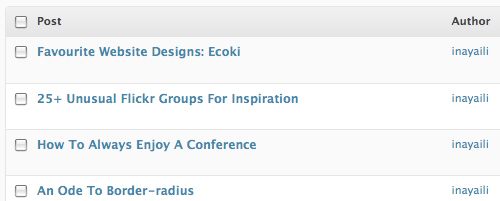
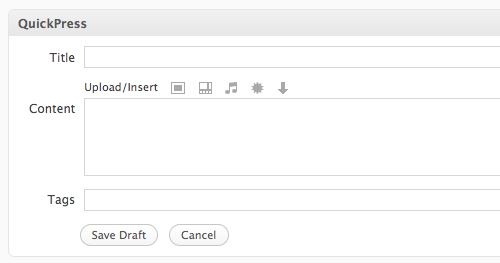
The WordPress admin area uses word-wrap in data tables.
In the WordPress admin area, the word-wrap property is used for elements in tables; for example, in lists on Posts and Pages:
.widefat * {
    word-wrap: break-word;
    }
Browser support: word-wrap is supported by Internet Explorer and Safari. Firefox will support it in version 3.5.
Useful Links
- Force Wrapping: the ‘word-wrap’ property — CSS Text Level 3: W3C Working Draft
- word-wrap: CSS3.info
- CSS word-wrap
- word-wrap: Mozilla Developer Center
6. Text Shadow
Despite existing since CSS2, text-shadow is not a widely used CSS property. But it will very likely be widely adopted with CSS3. The property gives designers a new cross-browser tool to add dimension to designs and make text stand out.
You need to make sure, though, that the text in your design is readable in case the user’s browser doesn’t support advanced CSS3 properties. Give the text and background color enough contrast in case the text-shadow property isn’t rendered or understood properly by the browser.
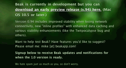
Beakapp uses the text-shadow property on its website: for the content area.
BeakApp.com uses the text-shadow property for the content area, adding depth and dimension to the text and making it stand out without the use of an image replacement technique. This property is visible only in Safari and Google Chrome.
The CSS for the website’s main navigation shows the following:
.signup_area p {
    text-shadow: rgba(0,0,0,.8) 0 1px 0;
}
Here, we have the shadow color (using RGBA, see above), followed by the right (x coordinate) and bottom (y coordinate) offset, and finally the blur radius.
To apply multiple shadows to a text, separate the shadows with a comma. For example:
p {
    text-shadow: red 4px 4px 2px,
        yellow -4px -4px 2px,
        green -4px 4px 2px;
    }
Browser support: Webkit-based browsers and Opera 9.5 support text-shadow. Internet Explorer doesn’t support it, and Firefox will only support it in version 3.5.
Useful Links
- Text Shadows: the ‘text-shadow’ property — W3C Working Draft
- Text shadows: Web Style Sheets CSS tips and tricks
- Text-shadow, Photoshop like effects using CSS — CSS3.info
- Make Cool And Clever Text Effects With CSS Text-Shadow
- Safari’s Text-Shadow Anti-Aliasing CSS Hack
- text-shadow
- text-shadow: Mozilla Developer Center
7. @font-face-Attribute
Despite being one of the most highly anticipated CSS3 features (even though it’s been around since CSS2), @font-face is still not as widely adopted on the Web as other CSS3 properties. This is due mainly to font licensing and copyright issues: embedded fonts are easily downloaded from the Web, a major concern to type foundries.
However, a solution to the licensing issues seems to be on the way. TypeKit promises to come up with a solution that would make it easier for designers and type foundries to agree on licensing issues that would significantly enrich the typography in Web design and make the @font-face attribute usable in practice.
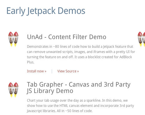
Mozilla Labs JetPack website resorts to the font-face rule to use the DroidSans typeface
One of the few websites that use the property is the new JetPack MozillaLabs.
@font-face{
    font-family: 'DroidSans';
    src: url('../fonts/DroidSans.ttf') format('truetype');
    }
To use embedded fonts on your websites, you have to declare each style separately (for example, normal, bold and italic). Make sure to only use fonts that have been licensed for such use on the Web and to give the designer credit when required.
After the @font-face rule, you can call the font with a normal font-family property in your style sheet:
p {
    font-family: "DroidSans";
    }
If a browser doesn’t support @font-face, it will revert to the next font specified in the font-family property (CSS font stacks). This may be okay for some websites, if the @font-face font is a luxury for supported browsers; but if the font plays a major role in the design or is a key part of the visual identity of the company, you will probably want to use another solution, such as sIFR or Cufón. Bear in mind, though, that these tools are more appropriate for headings and short passages of text, and copying and pasting this kind of content is difficult and not user-friendly.
Wouldn’t it be nice to have such type for body copy on the Web? Dave Shea experiments with Cufón and Museo Sans. Beautiful!
Browser support: @font-face is supported by Safari 3.1+. Internet Explorer supports it if EOT fonts are used. Opera 10 and Firefox 3.5 should support it.
Useful Links
- Font Descriptions and @font-face — W3C Working Draft
- Web fonts with @font-face
- @font-face — Sitepoint
- Fonts available for @font-face embedding
- @font-face
- beautiful fonts with @font-face
- Introducing Typekit
8. Border Radius
Border-radius adds curved corners to HTML elements without background images. Currently, it is probably the most widely used CSS3 property for the simple reason that rounded corners are just nice to have and aren’t critical to design or usability.
Instead of adding cryptic JavaScript or unnecessary HTML markup, just add a couple of extra properties in CSS and hope for the best. The solution is cleaner and more efficient and can save you from having to spend a couple of hours finding clever browser workarounds for CSS and JavaScript-based rounded corners.
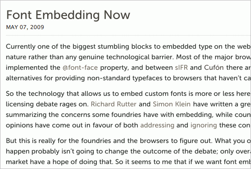
Sam Brown’s blog using border-radius on headings, categories and links.
On his website, Sam Brown uses the border-radius property heavily on headings, links and divs. Achieving this effect with images would be time-consuming. This is one of the reasons why using CSS3 properties in our projects is such an important step towards efficiency in Web development.
To add rounded corners to category links, Sam uses the following CSS snippet:
h2 span {
    color: #1a1a1a;
    padding: .5em;
    -webkit-border-radius: 6px;
    -moz-border-radius: 6px;
    }
We can go one step further and add the original CSS3 property and Konqueror proprietary extension, making it:
h2 span {
    color: #1a1a1a;
    padding: .5em;
    -webkit-border-radius: 6px;
    -moz-border-radius: 6px;
    -khtml-border-radius: 6px;
    border-radius: 6px;
    }
If we want to apply the property to certain corners of our element, we can target each corner separately:
div {
    -moz-border-radius-topright: 6px;
    -moz-border-radius-topleft: 6px;
    -moz-border-radius-bottomright: 6px;
    -moz-border-radius-bottomleft: 6px;
    -webkit-border-top-right-radius: 6px;
    -webkit-border-top-left-radius: 6px;
    -webkit-border-bottom-right-radius: 6px;
    -webkit-border-bottom-left-radius: 6px;
    border-top-right-radius: 6px;
    border-top-left-radius: 6px;
    border-bottom-right-radius: 6px;
    border-bottom-left-radius: 6px;
    }
Browser support: border-radius is supported by Webkit- and Gecko-based browsers but not by any version of Internet Explorer or Opera.
Useful Links
- border-radius: W3C Working Draft
- Border-radius: create rounded corners with CSS! — CSS3.info
- Introduction to CSS3, Part 2: Borders
- An Ode to border-radius
- CSS3 Border-Radius and Rounded Corners
9. Border Image
The border-image property allows you to specify an image for the border of an element, freeing you from the usual solid, dotted and other border styles. This property gives designers a better tool with which to consistently style the borders of design elements, being better than the background-image property (for advanced designs) or rigid default border styles. We can also explicitly define how a border should be scaled or tiled.
The SpoonGraphics blog uses the border-image property for its images borders
On the SpoonGraphis blog, border-image is used for the images borders as follows:
#content .post img {
    border: 6px solid #f2e6d1;
    -webkit-border-image: url(main-border.png) 6 repeat;
    -moz-border-image: url(main-border.png) 6 repeat;
    border-image: url(main-border.png) 6 repeat;
    }
To define the border-image, we must specify the image location, which part of the image should be cropped and used for each side of the element and how the image should be scaled and tiled.
To create a div that uses the image below as its border, we would use the following code (we will add in the Opera and Konqueror extensions for this example):
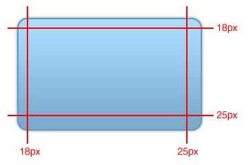
div {
    border-width: 18px 25px 25px 18px;
    -webkit-border-image: url(example.png) 18 25 25 18 stretch stretch;
    -moz-border-image: url(example.png) 18 25 25 18 stretch stretch;
    -o-border-image: url(example.png) 18 25 25 18 stretch stretch;
    -khtml-border-image: url(example.png) 18 25 25 18 stretch stretch;
    border-image: url(example.png) 18 25 25 18 stretch stretch;
    }
The last value of this property can be stretch (default), round (only a whole number of repeated images will fit the space allowed) or repeat. In our example, the top, bottom, left and right border images are stretched. If we want only the top and bottom sides to stretch, we would use this CSS:
div {
    (...)
    border-image: url(example.png) 18 25 25 18 stretch repeat;
    }
We can also target each corner separately if we want to use a different image for each:
div {
    border-top-image: url(example.png) 5 5 stretch;
    border-right-image: url(example.png) 5 5 stretch;
    border-bottom-image: url(example.png) 5 5 stretch;
    border-left-image: url(example.png) 5 5 stretch;
    border-top-left-image: url(example.png) 5 5 stretch;
    border-top-right-image: url(example.png) 5 5 stretch;
    border-bottom-left-image: url(example.png) 5 5 stretch;
    border-bottom-right-image: url(example.png) 5 5 stretch;
    }
If a browser doesn’t support the border-image property, it will ignore it and only apply the other defined border properties, such as border-width and border-color.
Browser support: border-image is currently only supported by Webkit-based browsers. Support in the next release of Firefox is not certain.
Useful Links
- The ‘border-image’ property: W3C Working Draft
- Border-image: using images for your border — CSS3.info
- border-image in Firefox
- border-image demonstration page
- Replicating iPhone Buttons the “webkit” way!
10. Box Shadow
The box-shadow property adds shadows to HTML elements without extra markup or background images. Like the text-shadow property, it enhances the detail of a design; and because it doesn’t really affect the readability of content, it could be a good way to add that extra touch.
10to1 uses the box-shadow property for its navigation background and hover states.
10to1 adds a simple shadow to its navigation area and uses the property for a hover effect on the navigation links:
#navigation {
    -webkit-box-shadow: 0 0 10px #000;
    -moz-box-shadow: 0 0 10px #000;
    }
    #navigation li a:hover,
    #navigation li a:focus {
    -webkit-box-shadow: 0 0 5px #111;
    -moz-box-shadow: 0 0 5px #111;
    }
The box-shadow property can have multiple values: horizontal offset, vertical offset, blur radius, spread radius and shadow color. Horizontal and vertical offset and shadow color are the most commonly used.
To apply a red shadow positioned four pixels to the right and bottom of a div, with no blur, we would need the following code:
div {
    -moz-box-shadow: 4px 4px 0 #f00;
    -webkit-box-shadow: 4px 4px 0 #f00;
    box-shadow: 4px 4px 0 #f00;
    }
Browser support: box-shadow is currently supported only by Webkit-based browsers, but the upcoming Firefox 3.5 will very likely support it as well.
Useful Links
- The ‘box-shadow’ property — W3C Working Draft
- Box-shadow, one of CSS3’s best new features — CSS3.info
- Box Shadow — Surfin’ Safari blog
11. Box Sizing
According to CSS 2.1 specifications, when calculating the overall dimensions of a box, the borders and padding of the element should be added to the width and height. But legacy browsers are well known for interpreting this specification in their own and quite creative ways. The box-sizing property lets you specify how the browser calculates the width and height of an element.
WordPress uses the border-box property in all input fields (text type) and text area elements in the admin panel.
The WordPress admin area demonstrates this property in all its input tags with a text type and textarea tags (among other elements):
input[type="text"],
    textarea {
    -moz-box-sizing: border-box;
    -webkit-box-sizing: border-box;
    -ms-box-sizing: border-box;
    box-sizing: border-box;
    }
The third property (-ms-box-sizing) only works in Internet Explorer 8. With other selectors, the WordPress style sheet also adds the Konqueror property: -khtml-box-sizing.
The box-sizing property can have one of two values: border-box and content-box. Content-box renders the width as specified in CSS 2.1. Border-box subtracts the padding and border from the specified width and height (as done by legacy browsers).
Browser support: box-sizing is supported by IE8, Opera and Gecko- and Webkit-based browsers.
Useful Links
- ‘box-sizing’ property: W3C Candidate Recommendation
- Box-sizing, box-model fixes for the simple people: CSS3.info
- CSS3 box-sizing attribute
12. Media Queries
Media queries let you define different styles for different devices based on their capabilities. For example, you may want your website’s sidebar to appear under the main content when viewed on devices with a viewport narrower than 480 pixels, in which case it shouldn’t be floated and displayed on the right side:
#sidebar {
    float: right;
    display: inline; /* IE Double-Margin Bugfix */
    }

@media all and (max-width:480px) {
    #sidebar {
        float: none;
        clear: both;
        }
    }
You can also target devices with color screens:
a {
    color: grey;
    }

@media screen and (color) {
    a {
        color: red;
        }
    }
The possibilities are endless. This property is useful because you no longer have to write separate style sheets for different devices, nor do you have to use JavaScript to determine the capabilities and properties of each user’s browser. A more popular JavaScript-based solution to achieve a flexible layout would be to use an adaptive fluid layout, making the layout more responsive to the user’s browser resolution.
Browser support: Media queries are supported by Webkit-based browsers and Opera. Firefox plans to support them in version 3.5. Internet Explorer currently doesn’t support them and doesn’t plan to support them in upcoming versions.
Useful Links
- Media Queries: W3C Candidate Recommendation
- Media Queries: CSS3.info
- The bleeding edge of web: media queries
- Media types
13. Speech
The speech module in CSS3 lets you specify the speech style of screen readers. You can control various aspects of the speech, such as:
voice-volumeSet a volume using a number from 0 to 100 (0 being silence), percentages or a keyword (silent,x-soft,soft,medium,loudandx-loud).voice-balanceControl which channel sound comes from (if the user’s sound system supports stereo).- Speak Instruct the screen reader to spell out particular words, digits or punctuation. Available keywords are
none,normal,spell-out,digits,literal-punctuation,no-punctuationandinherit. - Pauses and rests Set a pause or rest before or after an element’s content is spoken. You can use either time units (for example, “2s” for 2 seconds) or keywords (
none,x-weak,weak,medium,strongandx-strong). - Cues Use sounds to delimit particular elements and control their volume.
voice-familySet specific types of voices and voice combinations (as you do with fonts).voice-rateControl the speed at which elements are spoken. This can be defined as a percentage or keyword:x-slow,slow,medium,fastandx-fast.voice-stressIndicate any emphasis that should be applied, using different keywords:none,moderate,strongandreduced.
For example, to tell a screen reader to read all h2 tags in a female voice, from the left speaker, in a soft tone and followed by a particular sound, set the CSS as follows:
h2 {
    voice-family: female;
    voice-balance: left;
    voice-volume: soft;
    cue-after: url(sound.au);
    }
Unfortunately, this property has very little support now but is definitely worth keeping in mind so that we might improve the accessibility of our websites in future.
Browser support: Currently, only Opera browsers for Windows XP and 2000 support some of the speech module properties. To use them, use the -xv- prefix; for example, -xv-voice-balance: right.
Useful Links
- CSS3 Speech Module — W3C Working Draft
- CSS3 Speech — CSS3.info
- Aural CSS: Support for CSS 2 Aural Style Sheets / CSS 3 Speech Module
Conclusion
CSS3 properties can greatly improve your workflow, making some of the most time-consuming CSS tasks a breeze and allowing for better, cleaner and more lightweight markup. Some properties are still not widely supported, even by the most recent browsers, but that doesn’t mean we shouldn’t experiment with them or give visitors with modern browsers advanced features and CSS styling.
In this regard, keep in mind that educating our clients is both useful and necessary: websites don’t have to look exactly the same in every browser, and if a difference doesn’t negatively affect the aesthetics or usability of a website, it should be considered. If we continue to waste valuable time and money making every detail pixel-perfect (instead of adopting more flexible and future-oriented solutions), users won’t have an incentive to upgrade their browsers, in which case we would have to wait a long time before older browsers become legacy browsers and robust modern browsers become the standard.
The earlier we experiment with and adapt new CSS3 properties, the earlier they will be supported by popular browsers and the earlier we’ll be able to use them widely.
Further Reading And References
- Responsively Retrofitting An Existing Site With RWD Retrofit
- The State Of Responsive Web Design
- Design Process In The Responsive Age
 (al)
(al)

