Informative And Usable Footers In Web Design

Email Newsletter
Weekly tips on front-end & UX.
Trusted by 182,000+ folks.
 Register for Free


 Celebrating 10 million developers
 Custom Web Forms for Angular, React, & Vue. Your backend.
Website designs have so many different elements that work together to convey information in a usable and organized manner. For a website to be effective, every element on the page, from the header to the footer, needs to add to its overall usability and readability.
In this article, we’ll take a look at the footer and see what exactly makes for a good website footer. Keep in mind that just because the footer is at the bottom of the page doesn’t mean you should slack off with good design practice.
We’ll look here at what to include in footers, the importance of site maps, usability practices and styling ideas and trends. We’ve also compiled almost 50 well-designed footers to give you ideas and inspiration for your own footer designs.
You might be interested in the following related posts:
- Footers In Web Design: Creative Examples and Ideas
- Mobile Navigation For Smashing Magazine: A Case Study
- Web Design Navigation Menus – Articles And A Beautiful Showcase
What To Include In Footers
Before we go over how exactly to design the footer, let’s talk about common elements to include in footers and the importance of each. Of course, you don’t need to include all of these items; just use this list to gather ideas.
Site Map
Usability is foremost in importance in Web design. Providing a site map in the footer, no matter how small, improves usability. It’s one of those small elements that often go unnoticed but are occasionally useful to some. One benefit of providing a site map is its convenience for users. A site map is simply a detailed list of the pages on a website, divided into categories. It tells a user exactly what pages and information can be found on the website and provide access to those pages.
In the site map below, visited pages show up differently than the other links. You can see here that the “Overview” page has been visited because the link has a different color and a check mark instead of a triangle. This is an excellent idea to improve the usability of your site map.
Quick “About” or “Contact” Information
This is a good idea for freelancer portfolios, business websites and other similar websites. Usually, when looking for information about a website, I often scroll to the footer. Putting such information there is a good way to provide easily accessible information on every page.
Be sure to make the information brief, though. Keep “About” content to a single paragraph, a brief few sentences describing what the website is all about. For contact information, include just an email address and phone number. Always be sure to include a link to the full “Contact” or “About” page.
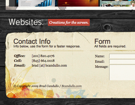
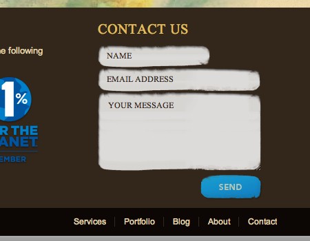
A Simple Contact Form
Many take this last idea to the next level by including a contact form in the footer itself. This is an excellent idea, because it allows users to contact you without having to navigate to the contact page. Many users won’t actually use it, but it provides added convenience to some.
Look at the example below. In this footer, contact information is provided, along with a contact form. Notice that the form is simple, containing only fields for a name, email address and message.
Back to Top Links
Another usable element commonly found in footers is the “back to top” link. When a user scrolls down to find information in the footer, they don’t want to have to scroll all the way back to the top of the page. Yes, they can use the “Home” button on their keyboard (but which isn’t even included on all keyboards), but most users don’t know about that function. The “back to top” link is one of those small details that really go a long way in enhancing usability. The placement of this link is usually just above the footer or at the very bottom of the footer.
Link to Full Site Map
Sometimes you can’t fit links to all of your pages in the footer’s site map. In this case, you can display a condensed site map in the footer and then add a link beside it to the full site map.
Styling Footers
Good style is essential to any website design. It improves not only the look but the visualization of the website’s content. Here are a few styling tips to keep in mind when working on your footer.
Show Hierarchy
Don’t forget about the importance of good typography, either. A good footer not only is laid out cleanly but is scannable. A user should be able to quickly glance at the information without getting confused. The column layout improves scannability, but good typography helps, too.
Most importantly, show the hierarchy of the content. Look at the screenshot below. Notice that each column begins with a strong and unmistakable title. A bit of space follows the title, and then comes the content. The title is essential because it grabs the user and tells them what is in that column. This one small readability detail makes finding information easier and should not be overlooked.
UX Booth includes copyright information (a standard element) as well as links to other useful information. Each piece of information is separated as its own element.
Good List Styling
Like good typography, good list styling is important for site maps. Spacing has been a big theme in this article, so let’s start there. Adequately spacing out list items is essential in Web design because it improves legibility and focus. The same holds true for site maps and other lists in the footer. Also, be sure that column titles are given more white space than list items, to better convey the hierarchy.
Borders can be used to separate list elements. Take a look at the example below, in which bevels (two single-pixel solid lines) are used to cleanly separate list items. The bevels look nice and better define the list items. Another trend is to separate list items with dotted lines, as seen in the second screenshot in the section titled “Simple Multi-Column Layout” below.
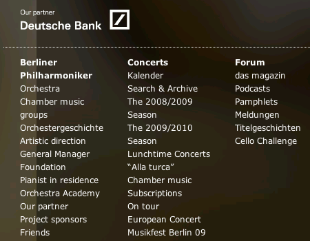
For comparison, look at the example below. Berliner-Philharmoniker.de uses a large footer to display various navigation options; however, the list styling is not good enough: the navigation is hard, because some links take up two lines and there is no clear visual separation between two adjacent links.
White Space is Key
We’ve mentioned white space several times in this article because it is crucial for the layout of footers. Let’s go a bit more into detail on the importance of white space.
Why use white space? In footers with column layouts, white space draws the reader’s eye to each block of content, improving focus and readability. Keep in mind that white space doesn’t have to be white; it just means empty space with no information or content.
Columns are not the only things that should be separated by white space. The top of footer and the footer’s content should have plenty of padding. And the space between the footer’s content and the bottom of the page should have a fair amount of padding. The screenshot below shows the Media Temple footer. We’ve labeled each area to make it clear how much is a fair amount of spacing and to show where to put the spacing.

Separate the Footer from the Content
One of the first things you’ll notice when browsing the screenshots in this article is that each footer appears distinct in some way from the rest of the website on which it appears. The footer is often a different color than the area above it. Take the screenshot just above, for instance. The color of the footer’s background is different than the color of the main content area’s background.
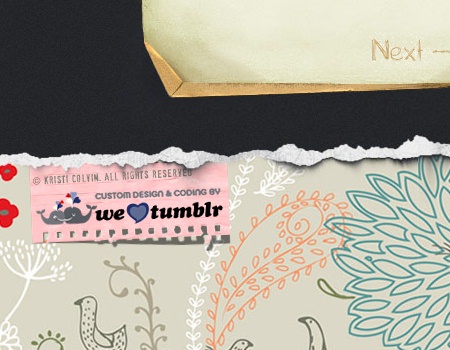
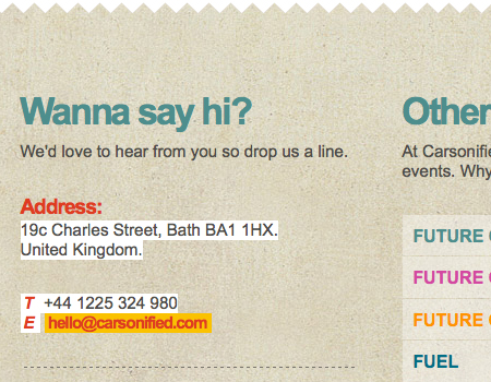
Footers are usually given a darker background. Some have a graphic or illustrated background. Kris Colvin (see the image below) makes sure that the content area is clearly separated from the footer area. A “torn-off” tiled wallpaper looks nice and perfectly fits to the atmosphere of the site.
Blog Footers
Including other kinds of information in the footer of a blog can be useful, too. Below are a few types of information that bloggers now tend to include in their footers.
Recent Posts
Blog footers commonly contain a list of 5 to 10 recent posts. When a reader finishes a post and wants to read another recent post, they can simply scroll down to the footer, instead of going all the way back to the home page.
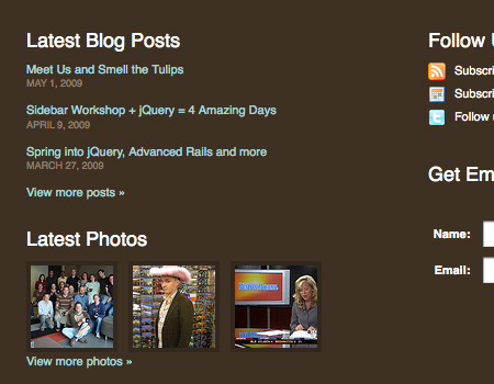
Idea Foundry uses a grid layout to show the latest posts. It also contains subscription links, a photostream and more.
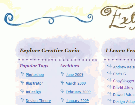
Tags
Tag clouds are excellent for blogs, too, especially ones with much and varied content. They provide another way for users to easily find information they are looking for. But tag clouds can take up a lot of space. Some put tags in the sidebar, but sidebars usually don’t have enough space to accommodate so much text, especially text in large font sizes. Putting tags in the footer may work better. This way, they can be accessed on each page, as they would in the sidebar, but are not in the way of other elements.
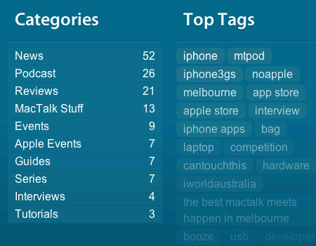
MacTalk uses a list of tags instead of a tag cloud to display the most popular tags on the site.
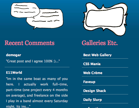
Latest Comments
Another trend in blog footers is to list recent comments. Not everyone wants to see a stream of comments, so putting it in a prominent location, such as the sidebar, doesn’t make much sense. Put it instead in the footer. The blog below follows this practice.
John Cow displays recent comments in the footer, together with an illustration of himself.
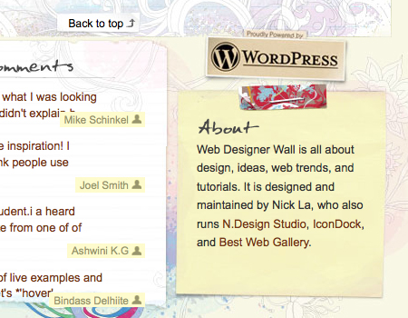
About or Contact Information
We’ve already talked about the importance of including “About” information in the footer of corporate and other similar types of websites, but what about blogs? This isn’t as common but is still done often. Below is a screenshot of Web Designer Wall, which has a quick paragraph about the blog in the footer.
Flickr Photostream
One popular element for personal blogs is a Flickr photostream. Again, the sidebar has no room for this, so the best place for it is the footer. You also see this on design blogs, where Flickr group photostreams are shown.
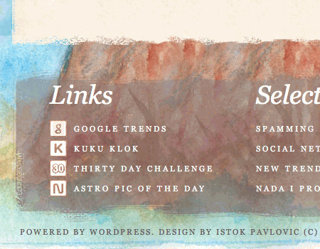
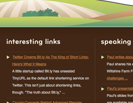
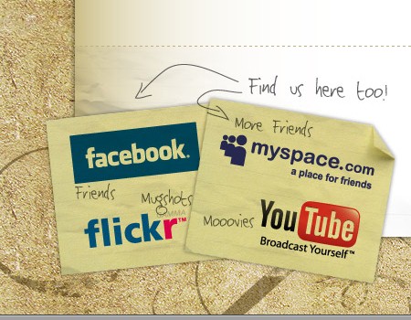
Links to Resources and Friends’ Websites
Finally, you will often see links to other resources and friends’ blogs in the footer of blogs. Again, they are out of the way of the content but easy to find.
The website shown below includes a list of interesting links, which some users will find very useful.
Footer And Site Map Layout
Layout shapes how information is presented and is always an important part of any design. In this section, we’ll go over a few key points to keep in mind when laying out the footer.
Simple Multi-Column Layout
The best way to set up a footer is with a simple multi-column layout. Most footers have three or four columns. The footer below is an excellent example of a column layout showing a site map. All of the links are categorized, and each category has its own column. Notice that the columns are well spaced, too.
Psdtuts+’s footer has a lot of information, including copyright information. Under the “Write a Tutorial” excerpt, a link takes the user to get more information on the topic. This footer shows good contrast, and its border separates it from the content well. This is how a nice simple multi-column layout looks like.
Here’s another example of a clean grid layout, but not a site map this time. This footer is for a blog, so it contains tags, a list of recent posts and more. Again, notice the ample spacing used to achieve a clean layout.
Separate Columns
White space is the best way to separate columns, because it’s simple and forces the user to focus on a single column at a time. However, some designers like to make a bit more separation, such as with a single solid line, a bevel or a dotted vertical line. You can also add backgrounds to separate columns, using different colors or graphics to give them contrast.
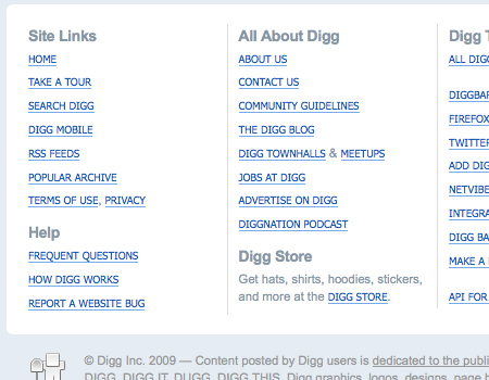
Digg has a very content-heavy but well-organized footer. It uses white space and a single-pixel line to separate columns.
Separate Links Into Categories
This is very important when working on a large site map. If you don’t organize the links into categories, the site map will lack structure and be much too confusing to navigate with. You want your website to be usable, and a site map improves usability. But if the site map is laid out incorrectly, it becomes useless.
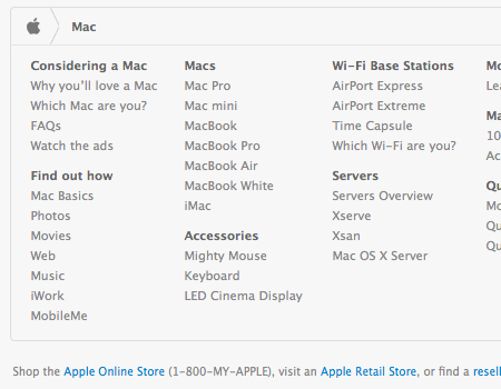
Apple does a perfect job of this. Actually, its website is so extensive that it divides its site map into large sections. Each section (or product) has its own individual site map in the footer. The screenshot below is of the Mac product page, and the site map shows all the links one could want for Mac products. Apple also does a good job of organizing the links into categories. Links are organized by product type. For example, Mighty Mouse is listed under “Accessories.” If these links were all in one big list, finding specific products would be much more difficult.
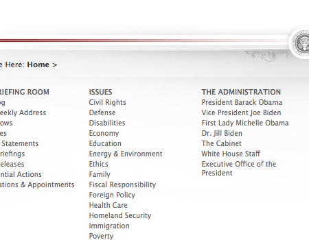
The White House website is a totally different type of website but employs the same principle. All of the pages of this website are organized into categories. If you’re looking for information on health care, you can quickly find it in the “Issues” category. Also, notice that each category has its own column, and the bigger categories don’t flow into the next column, thus improving readability and scannability.
Showcase Of Footers
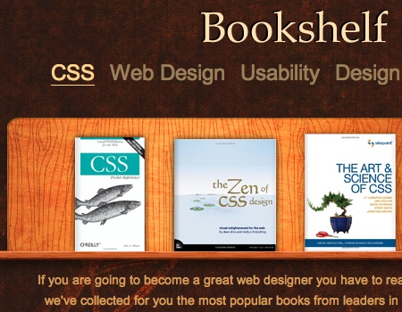
CreamyCSS In its footer, CreamyCSS puts book covers on the shelf.
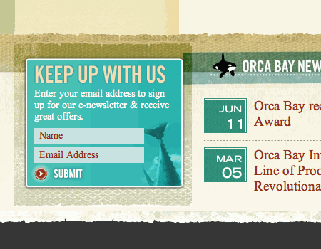
Orca Bay Cooking and Recipes Notice how well the content and the footer area are separated, even although they have a common motif and are designed very similarly. Here the newsletter box is placed in the footer – it may be not the optimal placement as footer is often overlooked or ignored.
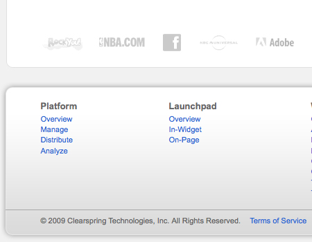
Clearspring A good example of a site map on a corporate website: clear hierarchy, nice column layout and a lot of white space. The background of the footer is different than that of the rest of the website, giving it definition.
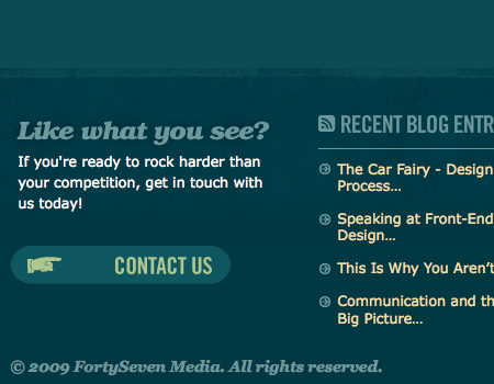
FortySeven Media Another standard blog footer layout, with columns and a list of recent posts. The footer background is darker than the content background, and a faint texture acts as a border.
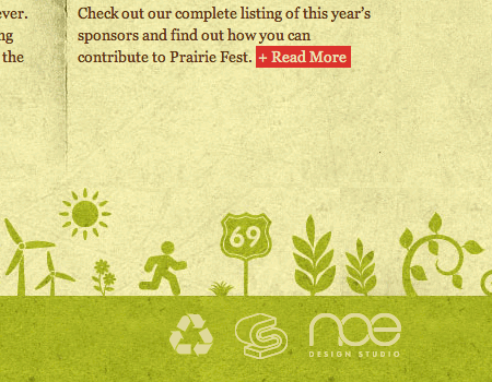
Huxley Prairie Festival A nice retro design with a quite original footer design that fits to the motif of the site.
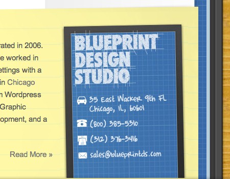
Blueprint Design Studio Blueprint Design Studio puts a “contact” box in its footer. You’ll find a nice hand-drawn “back to top”-link on the left side as well.
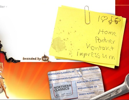
Nothern Classics Nothern Classics with a couple of vintage images, stick-it-notes, a sexy girl on a motocycle and a stamp.
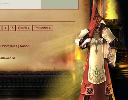
Lineage II A gamer’s blog with a mysterious footer that perfectly fits the atmosphere of the site.
Thechantikl Here the footer has a rainbow, a cute dog and some flowers.

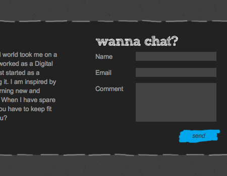
Agami Creative Sometimes footer is a nice place for some short and nice contact form.
Spout Creative Spout Creative has a large, colorful footer with a Twitter block on the right side.
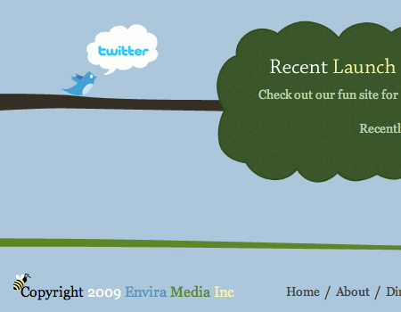
Envira Media Envira Media has an original, beautiful layout and a nice footer with illustrations.
Mark McGall Mount Rushmark: George Washington, Thomas Jefferson, Theodore Roosevelt… Mark McGall?!

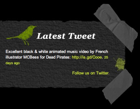
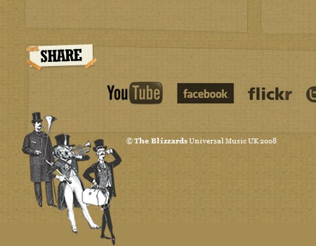
The Blizzards Sometimes it makes sense to put a “Share”-box in the footer, making it easier for readers to share and promote your site. It fits here: the site is the official web-site of the band “The Blizzards”.
Show And Tell Sale The footer here has 4 columns which are properly aligned and have a lot of whitespace. Simple, clean, attractive and beautiful.
Snopp.no Snopp.no with a huge illustration on a cardboard in the footer.

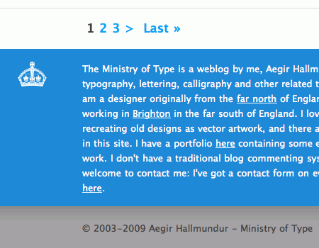
Aegir Hallmundur Some designers put some information about themselves in their footers.
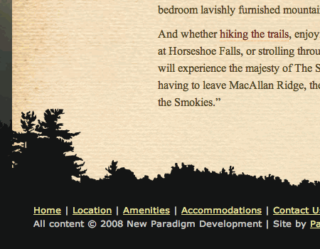
MacAllan Ridge A very simple, yet nice moody footer design.
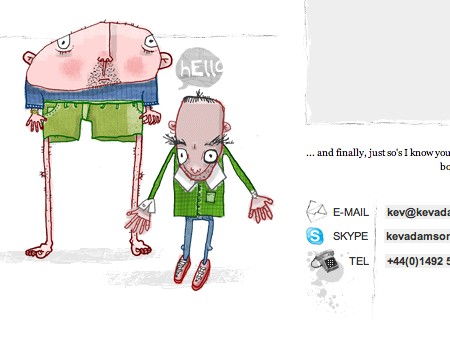
Kev Adamson You can be pretty sure that Kev Adamson’s footer is one of its kind. That what makes a unique and exclusive design. A very original, interesting footer design solution by Kev Adamson.
EdgePoint Church A nice visual footer with links to social networking sites (left side) and information about the site (right side).
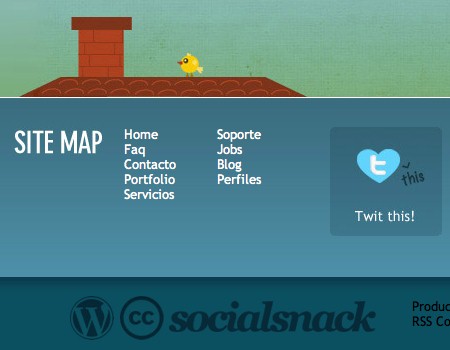
Social Snack An interesting footer that perfectly combines social icons, a site map, an illustration and the Anti-IE6-icon in one single place.
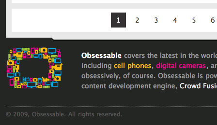
Obsessable Obsessable has a colorful footer with a nice, well-structured site map. Well done!
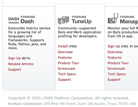
Fiveruns Fiveruns uses 6 content blocks in the footer; however, spacing and alignment help to keep the blocks scannable and readable.
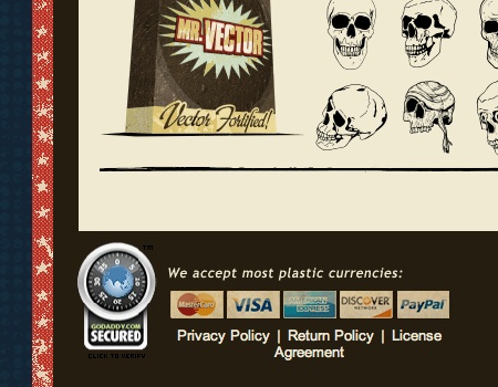
Mr Vector Putting the supported payment options in the footer works quite well for some online-shops…
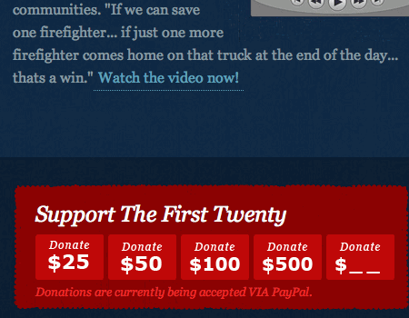
The First Twenty …and a donation-button may work for some charity organizations. Please notice how much spacing is used in the footer which height is overall over 700px.
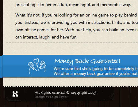
Games For Her By You An interesting idea: this online-shop has a ribbon with “Money-Back-Guarantee” written on it in the footer. Will it make user more confident and comfortable in purchasing the product?
Ecto Machine A large, stylish footer with Flickr entries, recent blog entries and a Twitter/RSS-box.
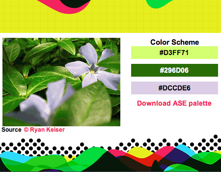
Ryan Keiser Ryan has put a daily color inspiration block on its footer – a color scheme is updated every day.
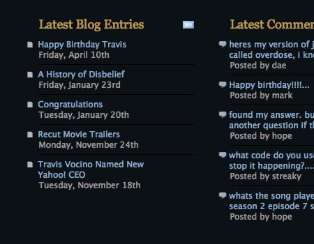
Vocino Another great blog footer. Here you can see columns with lists of recent blog posts and comments. The lists demonstrate good hierarchy and nice typography. And single-pixel lines separate list items.
graffina[box] In this footer, a small contact form is included for the convenience of users. Also, the background graphic and border help separate the footer.
Seed Hunter Greetings from Indiana Jones – a nice, original footer design.

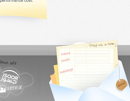
eSpace Another excellent example of a small contact form in the footer. This one is cleverly designed in the style of a handwritten letter, but it is still easy to use.
We Are Not Freelancers The hand-drawn illustrations in this footer visually support the different categories in the columns. A list of recent comments and further resources appears also.
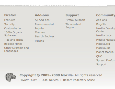
Mozilla Firefox A simple but readable and scannable site map, with plenty of space and good colors. The texture above acts as a good border.
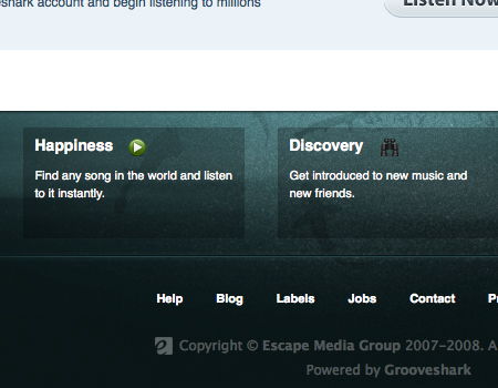
Grooveshark Features This footer has a dramatically different background to show that the content is finished. Notice how each footer element has its own box, with a clean semi-transparent background. A bevel separates the links as well.
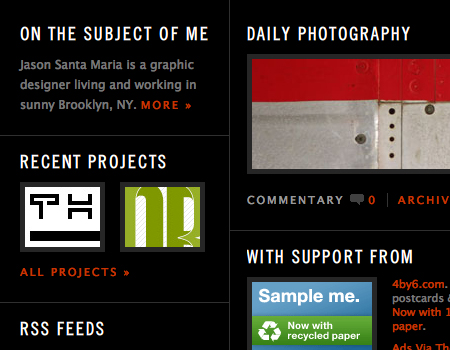
Jason Santa Maria A content-heavy footer, with a well-structured grid layout. The grid is divided by solid lines and plenty of padding.
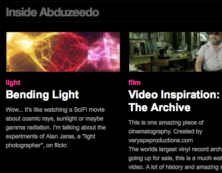
Abduzeedo Abduzeedo packs a lot of content into its footer, including blog post titles, a large but organized tag cloud, sponsors and a few important links.
Future of Web Apps Here, a texture is used for the footer background, and a ridged border is used to set off the footer. The column is well laid out, and standard elements, such as contact information, are included for easy access.
SamRayner.com Another perfect example of a border and contrast that add definition to the footer. The content area is cut off by a brush texture, which acts a border for the footer.
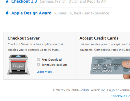
Checkout App In this footer, each element is enclosed in a light-gray container, providing clear separation from the white background of the rest of the website.
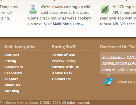
MailChimp A drop-shadow and color contrast is used here for definition. The small site map is organized into separate columns, and each column has a nice heading punctuated by a subtle single-pixel line.
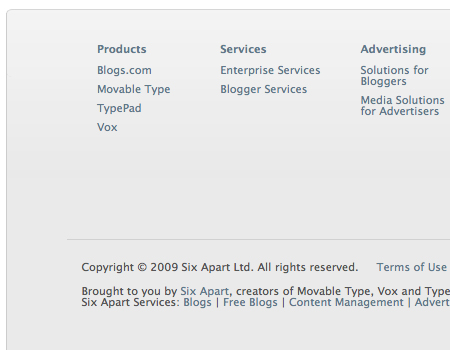
Six Apart A site map helps users navigate this corporate website. Generous white space and padding are used, creating a very readable layout.
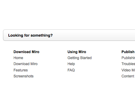
Miro No color contrast here, but a border sets of this footer.
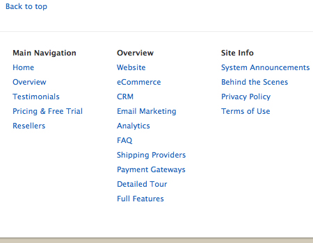
Good Barry This website has a minimalist site map with little detail, but it still works well. A thin gray line sets off the footer, and a “back to top” link appears above the footer.
Last Click
YackFou Well, what about placing a foot in the footer? That’s exactly what this site does. The footer contains a foot with the link to “Making Of”. That’s unusual and creative: even if the footer link leads to a 404-error-page.

Further resources
- Modern Sitemap and Footer: Best Practices
 (al)
(al)

