10 UI Design Patterns You Should Be Paying Attention To

Email Newsletter
Weekly tips on front-end & UX.
Trusted by 182,000+ folks.

 Custom Web Forms for Angular, React, & Vue. Your backend.


 Celebrating 10 million developers
Design patterns were first described in the 1960s by Christopher Alexander, an architect who noticed that many things in our lives happen according to patterns. He adapted his observations to his work and published many findings on the topic. Since then, design patterns have found their place in many areas of our lives, and can be found in the design and development of user interfaces as well.
In short, design patterns are solutions to recurring problems. By extension, UI design patterns are solutions to common user interface problems. This article goes over 10 interesting UI design patterns that you can use in your own projects. In fact, you may already be using them now without knowing it.
You may be interested in the following related posts:
- 9 Crucial UI Features of Social Media and Networking Sites
- 40+ Helpful Resources On User Interface Design Patterns
- 10 Useful Techniques To Improve Your User Interface Designs
1. Lazy Registration
To fully appreciate the problem of registration, we should consider an annoyance that has led to the opinion that sign-up forms must die. This certainly doesn’t mean they should be completely omitted but rather that they should be only one part in the process of introducing users to a system, and should come late in the process. Such an approach is called “lazy registration” and relates to the account registration pattern.
When would you actually use lazy registration? Although it may seem like lazy registration could be used all the time, some circumstances are ideal:
- When users are allowed to try out your website product or service before making a decision (which not every website permits, though).
- When it is important to familiarize users with your system before they sign up, which can be a crucial step in their process of deciding whether to register.
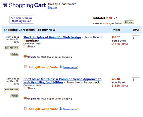
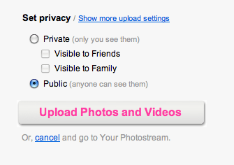
Amazon lets you browse and add products to your shopping cart before signing up.
This pattern is meant to allow users to use your system and take action before registering. If satisfied with your service so far, users will regard this quick act of registration as just another small step in the entire process and not an obligation. The shopping cart is a good example of this pattern: users can browse and choose products and only have to register when they proceed to check out.
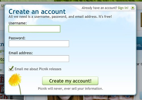
Picnik is was another good example of lazy registration. Users can use all of the service’s functions to edit their photos online. They are asked to register only before saving their work.
Recommended reading
- Sign-up forms must die: here’s how we killed ours! An interesting article on how 90percentofeverything implemented lazy registration.
- Web Form Design Patterns: Sign-Up Forms, Part 1 and Part 2 Interesting and useful research that Smashing Magazine conducted last year
2. Progressive Disclosure
This pattern is used to show only the information or features relevant to the user’s current activity and to delay other information until it is requested. By hiding more complex or infrequently used features, you de-clutter the user interface; by revealing them only as they are needed, you help users perform a complex, multi-step process on a single page.
The goal is to show only essential information in the first step and then invite users to take the next step. When the user completes a step, you reveal the information in the next step, keeping all previous steps visible. By keeping previous steps visible, you allow users to change what they have entered. And the data they input in the current step can affect the behavior of the next step.
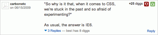
Digg uses progressive disclosure in its comments section. Users can read a comment and, by clicking on the “Replies” link, see all of the replies to that comment. The link also tells you how many replies will be shown.
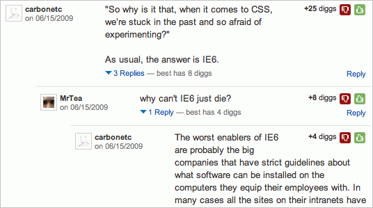
Once the replies are revealed, users can not only read them but also reply to and rate them. Comments below the viewing threshold are collapsed by default and are revealed by clicking “Show.”
Examples of progressive disclosure are everywhere. A simple “Show more” link that reveals more information is one of the simplest forms of progressive disclosure. But it can be used for more complex cases, such as filling out Web forms. Try to open an account on Picnik (which we mentioned in the lazy registration pattern) to see how progressive disclosure can be used at a more complex level.
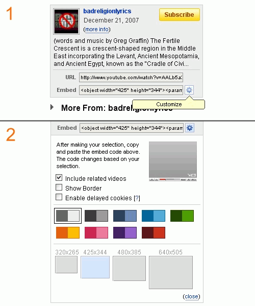
YouTube uses progressive disclosure when users customize the look of the video player. When a user clicks the icon, customization features open up below.
Recommended reading
- Progressive disclosure Excellent insight from Jakob Nielsen.
- Read more… about progressive disclosure Good explanation of progressive disclosure, with several examples.
3. Forgiving Format
Search functions can offer users various options and sometimes be complex. When searching weather and street maps, for example, users can use such criteria as city name, street name and zip code. To indicate to users that they can use several criteria, interfaces tend to show multiple options and become overly complex. Instead of adding clutter to the interface, use the forgiving format pattern, which lets users enter data in various formats and leaves it to the system to parse the data.
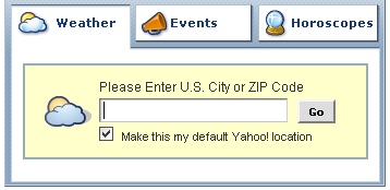
Yahoo weather search allows users to search by city or zip code.
To convey which formats are supported, give users hints on how to search, whether by listing all available formats, as in the example above, or by providing a link to a help page, as in the example below.
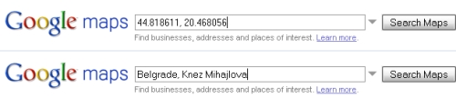
Google Maps allows users to search by city, street, zip code and even latitudinal and longitudinal values.
The forgiving format pattern significantly simplifies user interfaces. However, it may require a lot of work from back-end developers. The more options users have, the more difficult parsing becomes.
4. Clear Primary Actions
Simple Web forms often allow just one action (“Submit,” “Save” or “Send”). The user knows exactly what their final action in filling out the form will be, because they have only one option. However, users may sometimes be faced with several options and have to distinguish between primary and secondary actions.
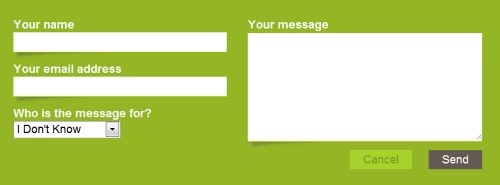
Clearleft makes a distinction between primary and secondary actions with color.
What are primary and secondary actions? Primary actions lead to the completion of a form; for example, clicking “Save” or “Send.” Secondary actions usually do not lead to a form’s completion; these include clicking “Cancel.” There are exceptions, though. Which are the primary and secondary actions when you see “Save,” “Save and continue” and “Publish” buttons all in a row? When users have several options, highlighting primary actions and de-emphasizing secondary actions are good practice.
This can be done in two ways:
- By giving primary and secondary actions different colors; for example, giving primary actions a vibrant color and secondary actions a shade of gray.
- By styling primary actions as buttons and secondary actions as links.
Flickr highlights the primary action by putting the secondary action in a small label below.
Both ways clearly distinguish between primary and secondary actions, relieving the user from having to think about which option to choose in order to complete their task.
Recommended reading
- Web Form Design: Filling in the Blanks Probably one of the best resources for designing Web forms.
5. Breadcrumbs
Breadcrumbs show the path from the front page of the site to the current location of th users in the website’s page hierarchy. They are a form of secondary navigation that helps users understand the hierarchy and structure of the website. Breadcrumbs start with the home page and end with the page currently being viewed. Each label in a breadcrumb trail is linked to its respective page or section in the hierarchy, the exception being the one for the current page, which should just be an unlinked label.

Apple’s breadcrumbs are graphic elements that fit the overall design of the website well.
Breadcrumbs take up minimal space and are usually positioned at the top of the page, below the header and above the content. They would serve no purpose on the home page and so should not appear there. Breadcrumbs can appear simply as text links separated by the “>” sign, or they can be graphic elements, like the breadcrumbs on Apple’s website:
Recommended reading
- Breadcrumb Navigation Increasingly Useful Jakob Nielsen explains breadcrumbs in depth.
- Simple scalable CSS-based breadcrumbs A very good simple tutorial on how to create breadcrumbs.
6. Account Registration
The definition of this pattern varies from place to place, but we can say that it solves three somewhat related problems:
- Certain content is accessible only to registered users,
- Users need to re-enter their personal data often,
- Users need to be able to access personalized content on a system.
The solution to allowing users to access protected content is to have them register for an account on the system and store their personal data, to be reused later. The benefits are numerous. For instance, users can be shown personalized offers, as seen on Amazon. Users could also perform tasks more efficiently if the system reused the information submitted during registration. Storing shipping details is just one example. Because filling out forms is not a favorite task of users, requiring only necessary information is important. Another important thing is to clearly highlight all of the benefits users will receive, so that they become more willing to register.
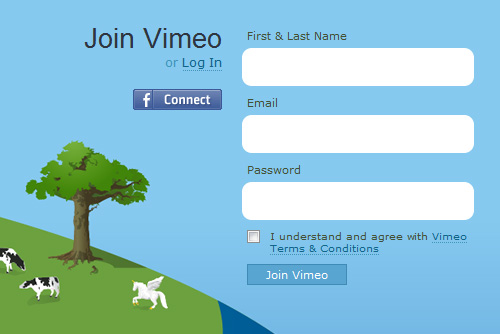
Vimeo has a simple but attractive sign-up form.
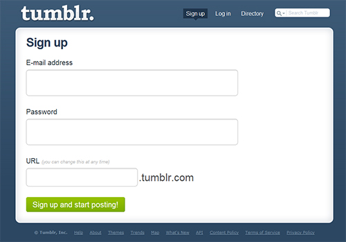
Tumblr requires only minimal information of the user to sign up.
Recommended reading
- Web Form Design: Filling in the Blanks A must-read book on creating usable Web forms in general.
- User Membership With PHP A simple implementation of sign-up and log-in forms.
- Accessible HTML/XHTML Forms: Beginner Level How to create an accessible Web form.
7. Required Field Marker
Making the user interface obvious is essential. This applies just as much to Web forms. One of the best ways to make the interface of Web forms obvious is by marking required fields. The purpose of these markers is to alert the user to information they will need to provide. This way, users won’t feel they have to fill out the entire form to avoid seeing an error message.
Ideally, you should remove all optional fields and let the user type only the information that is necessary for the interaction. A rule of thumbs: the simpler and shorter a web form is, the better is the user experience. Another interesting idea is to make it possible for users to remove all optional fields – you can find more about how to implement it in practice (as well as a ready-to-be-used-script) in Andy Clarke’s article Trimming Form Fields.
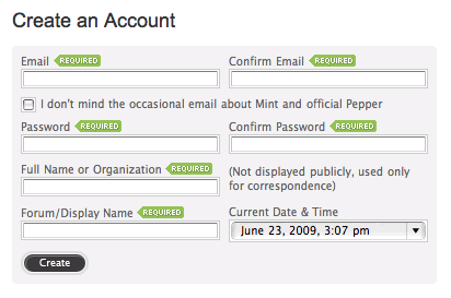
Haveamint.com puts “Required” markers next to field labels on its contact form.
You can position required field markers in one of two places:
- Next to labels, allowing users to scan the form quickly,
- Next to or inside input fields; if the fields are the same width, users will be able to scan the form quickly.
When deciding on which fields to require, take into account the total number of fields in the form. If the form is complex and most of its fields are required, the user will likely see it as unnecessary clutter.
8. Steps Left
This pattern is widely implemented when users have to fill in data in multiple steps. The purpose of this pattern is to:
- Guide users,
- Explain the scope of the process by clearly stating how many steps are needed to complete it,
- Show the user’s current position in the process by visually highlighting the current step.
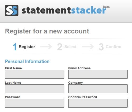
StatementStacker clearly shows the number of steps and highlights the current step.
Steps are usually displayed horizontally and connected by arrows, showing the order in which the steps will be performed. Also, each step is usually marked with a large number and very concise description of what users should do in that step. The important thing here is consistency: a progress indicator should always appear in the same position across the pages and show users where they are at.
This pattern is usually combined with the well-known “wizard” pattern to create a multi-step process, such as for registration or a shopping cart.
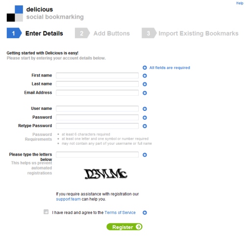
Delicious has a good-looking progress indicator that clearly defines the purpose of each step. It also highlights the current step by displaying it in a different color.
9. Subscription plans
This pattern is suitable if the website offers one product or service that comes in different plans and requires regular payments, usually monthly payments. Each plan should be descriptive and provide the following information:
- Name of the plan, such as “Basic” or “Professional,”
- Price of the subscription plan and how long it is valid for,
- List of features (the cheapest plan usually has the fewest features),
- Sign-up button.

Wufoo clearly shows its subscription plans, the prices and the differences between them.
Always show your plans in order. Plans are usually ordered from most to least expensive. You can highlight the plan you want users to buy by using a different color or size.
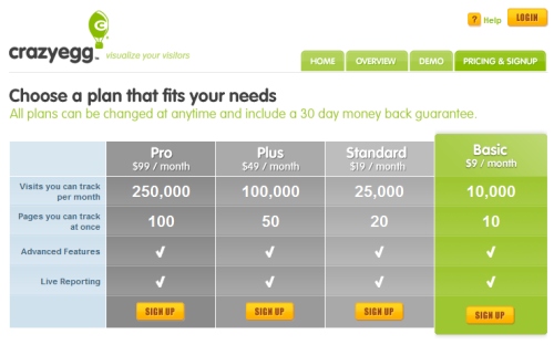
Crazyegg’s subscription table draws attention to the “Basic” plan.
10. Hover Controls
When a user interface has many elements in which the user can perform actions, the page can become cluttered and hard to scan. This is especially common in the administration section of Web applications, where users can change table data. A good way to handle this is to hide each element and reveal it when the user hovers over that area.
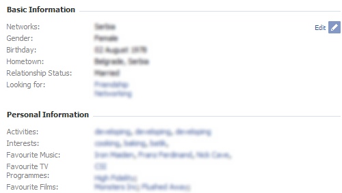
An “Edit” link is revealed as the user hovers over each section of their Facebook profile page.
Hiding controls and revealing them on hover significantly de-clutters the user interface without taking away functionality.
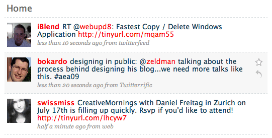
Twitter reveals “Reply” and “Favorite” links when the user hovers over each tweet.
 (al)
(al)

