Module Tabs in Web Design: Best Practices and Solutions

Email Newsletter
Weekly tips on front-end & UX.
Trusted by 182,000+ folks.
 Register for Free
 Custom Web Forms for Angular, React, & Vue. Your backend.
 Celebrating 10 million developers


A module tab is a User Interface (UI) design pattern where content is separated into different panes, and each pane is viewable one at a time. The user requests content to be displayed by clicking (or in some instances hovering over) the content’s corresponding tab control.
Module tabs are seeing an increase of use as websites and web applications push for optimizing web page screen areas without sacrificing the amount of information presented at once. For example, in weblogs, they are used in secondary content sections (such as the sidebar) to present relevant and interesting information such as a listing of blog posts which users can interact with to get to web pages quicker. This inevitably allows for an unobtrusive and compact manner of presenting content.
This article discusses the use of the module tabs design pattern for use in websites and web-based applications. We share with you some best practices to consider when using module tabs, a listing of real-world examples of websites that take advantage of module tabs, as well as tutorials and free downloadable scripts for building and deploying module tabs in your sites.
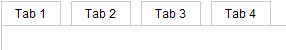
Anatomy of a Module Tab Area
It’s worth a few moments to identify the key parts of a module tabs for the purpose of standardization of the terminologies used in the discussion.
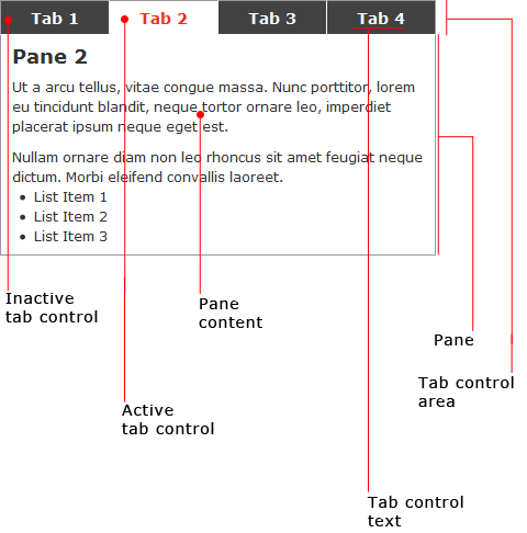
- The tab control area is the location of the tab controls.
- Tab controls are the interface component for navigating through the module tabs panes.
- The tab control text is the text that describes the tab control. It should be short (one to two words) and should effectively depict the corresponding pane information.
- The active tab control refers to the tab control that is presently selected. Only one tab control should be active. The first tab control is the default active tab control when the web page first loads.
- Inactive tab controls are the tab controls whose panes are not currently showing.
- A pane is where information is displayed; it should have a corresponding tab control so that panes that are not displayed are accessible by clicking its tab control.
- Pane content is the content being presented inside of a pane.
- The active pane is the pane that is currently being shown; it is paired with the active tab control. The pane that is displayed immediately when the web page first loads is the default active pane.
- Inactive panes (not shown in the illustration) are the panes that are currently not being shown. An inactive pane becomes the active pane when its tab control is clicked.
When to Use Module Tabs
The primary goal of the module tabs UI pattern is to permit users to view a group of related data one at a time, which in turn allows designers to modularize this group of information in a compacted manner, saving valuable screen real estate. In this section, we’ll discuss the instances when module tabs are desirable.
Information that is related
Information in the panes of module tabs must have some connection to each other so that users can make a logical correlation towards the content of the component.
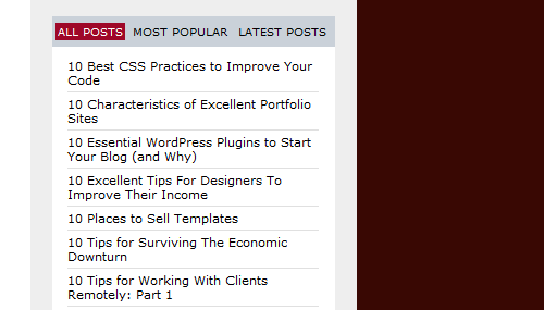
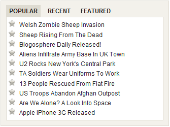
For example, having a module tab for blog posts is a great use of module tabs; pane information can be organized into categories such as recent posts, popular posts, and most commented posts.
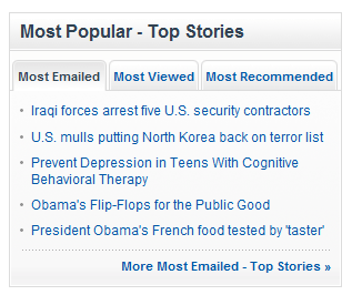
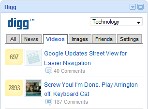
In the following image, you can see the module tab design pattern in action on Webdesigner Depot’s sidebar using panes for all posts, the site’s most popular posts, and latest posts.
Information that Doesn’t Need to be Compared or Accessed Simultaneously
Using module tabs means that information in different panes will be shown to users one at a time. Only when the appropriate tab control is activated will the view switch to another pane. When information on panes must be compared to each other, or when pane information is better presented simultaneously, it’s best not to use the module tabs pattern because it can produce an annoying experience when website users have to click back and forth to compare and contrast information.
As a counter-example, the module tabs implementation in BGPatterns is a situation where you should avoid using module tabs. When designing a background pattern, users must click back and forth through the tabs to tweak their designs; this adds an unnecessary hindrance for modifying the background pattern being designed. For convenience and usability, this type of content should be presented concurrently.
Information that can Have Short Categorical Names
Module tabs have space limitations which restricts the length of tab control text. Because of this, the tab control text must be succinct, typically using only one to three key words. This not only preserves the design pattern’s primary intent, which is to allow the presentation of data in a condensed area, but also allows for easier processing of information so that users can anticipate what content will be presented in the panes.
Module Tabs is for Terse Content
Module tabs are meant to contain modular and easily digested information, and as such, module tabs are only appropriate for data that is succinct and to the point such as lists, data conveyed as graphics (data visualization), or one to two short paragraphs of text.
Pane Content Should be Related
The module tabs design pattern implies that there is a relationship between information displayed on each pane, therefore you should have content that can be logically grouped together.
For example, using module tabs for “most popular posts”, “recent posts”, and “most commented posts” have a rational category.
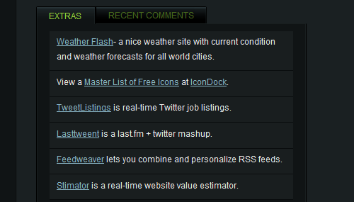
As a counter-example, consider Best Web Gallery’s implementation of module tabs on the site’s sidebar content. The module tabs show “Extras” (which contain noteworthy links according to the site owner) and “Recent Comments”: two groups of information that have no logical connection with each other. This can lead to user confusion as they try to make sense of why these two groups of information are presented together. The content in the module tabs is best conveyed separately.
Module Tabs Usability and Best Practices
In this section, we shall discuss some important usability guidelines to make module tabs an effective and user-friendly component of a web design.
Highlight the Active Tab Control Effectively
The user must know which pane is currently active, and to do so, you must make the active tab easily distinguishable when compared to inactive tab controls. Choosing background-colors that highly-contrast with each other for inactive tabs and the active tab is highly recommended to trigger visual cues for which pane is currently active.
Show Tab Controls in a Single Row
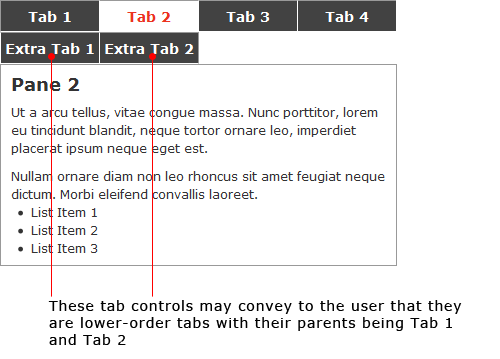
Module tabs typically use horizontally-oriented tab controls (though if you wish, you can adapt this pattern for singular vertical/columnar orientation) because having multiple rows makes the interaction confusing.
When you have more than one row of tab controls, it implies a hierarchical relationship where lower-positioned tab controls are children of (or the subcategory of) higher-positioned tab controls.
The need for more than one row of tab controls is indicative of having too many panes and/or that the tab control text is too long and should be revised for terseness.
Switching in Between Panes Should be Fast
A purpose for using module tabs is to permit quick and interactive presentation of content. For this, you should try to have the inactive pane contents written inline in the HTML document, and then use CSS and JavaScript to style and hide the pane visually, which is quicker than requiring a page reload or requesting remote-source data.
Avoid page reloads when switching in between the panes because this significantly delays navigation in between panes. Remotely-loaded content using Ajax can be an option for dynamic and remotely-located pane information but presents a challenge for screen reader users who may not be aware of asynchronously DOM-inserted nodes in the document’s tree.
Use Short and Logical Names for Tab Control Text
Tab controls are meant to be as narrow as possible to accommodate multiple tabs without the need to lay them out in multiple rows.
Having shorter tab control text that content key words also makes it easier for readers who like to scan web pages or users who use in-page search for quickly finding content they’re looking for.
It is also very important to use relevant and logical key words to describe the content of the panes, so the tab control text should be well thought out.
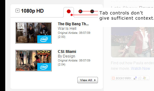
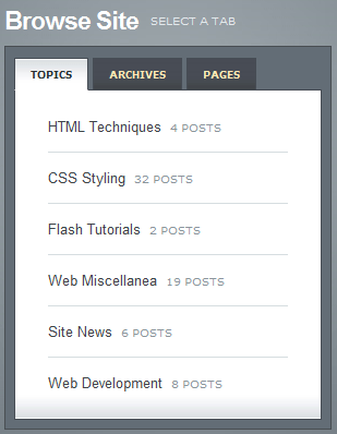
In the following example, you can see a poor implementation of module tabs on CBS.com. The tab control text is not descriptive, giving us no context of what to expect when switching to an inactive pane.
on the Navigant Consulting website, use numbers, which can indicate an ordered sort for the data, but still do not convey what panes contain. It is ambiguous at best and can cause unneeded confusion with regards to the module tabs content.

Don’t Use Scrolling Inside Panes
Scrollbars are an added encumbrance to users interacting with module tabs: to access the information that they are looking for, not only do they have to click on tab controls, but they also need to use scrollbars to see if the content they want is farther down the pane.
The need for scrollbars inside panes outlines an issue with regards to the length of the pane information or the design of the module tabs; either the content being presented is too long for the module tabs design pattern, or that the pane area is not tall enough for your content. Consider revising content for terseness, extending the height of the pane area, and/or allowing for variable height of the pane area depending on the pane information length of the active pane.
Module Tabs Accessibility Considerations
Web accessibility is currently one of the hottest topics. The advent of more complex user interaction, asynchronous content updates without a page refresh, and an enumerable number of ways which website content is viewed has made it difficult for certain individuals who have atypical needs for accessing websites. In this section, we shall talk about some accessibility issues you should keep in mind when building module tabs.
Use High-Contrast Colors for Active and Inactive Tabs
Users with low-vision must be able to see which tab control is the active tab control. Using highly contrasted background colors to distinguish the active tab control from the inactive tab control is good practice.
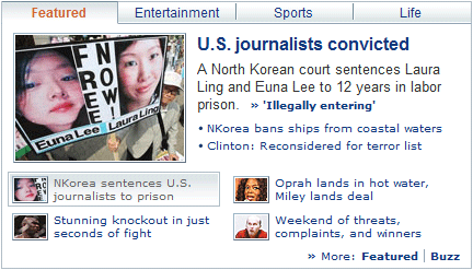
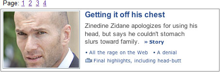
As a counter-example, the module tabs utilized in the Yahoo! News website has very little contrast between active and inactive tabs; they may be fine for sighted users, but can be troublesome for low-vision users.
Also, make sure that the tab control text color (foreground) is sufficiently contrasted with the tab control color (background), even for inactive tab controls, so that users can easily read the text in inactive tabs. It is not a good idea to deemphasize inactive tab controls by graying them out.
Use Screen-Reader accessible Methods for Hiding Inactive Panes
To be accessible, module tabs should hide inactive panes using techniques that only hide them visually, but not remove them entirely from the DOM tree. For example, don’t use display:none; or visibility:none; for hiding panes via CSS: these methods are not screen-reader accessible. See Roger Johansson’s article called “Hiding with CSS: Problems and solutions”.
Use a Semantic HTML Structure for Tab Controls
Placing the tab controls inside an unordered or ordered list improves accessibility because screen reader users are able to identify the tab controls as a set of elements. For tab controls that use images for tab control text, use ALT and/or TITLE properties with meaningful descriptions of what the tab controls say.
Allow Keyboard Navigation
Keyboard navigation accommodates individuals with mobility impairments that prevent them from using conventional input devices such as a mouse. It is essential that users that use alternative forms of site navigation (i.e. keyboard-based or voice-based) must be able to focus onto the tab controls in order for them to select and activate their desired pane.
An easy way to test for keyboard navigation is to use the Tab key on the web page that contains module tabs: check to see if you can focus in on each tab control. Pressing the Enter key when a tab control is focused on should result in the presentation of the target inactive pane, making it the active pane.
Ensure Graceful Degradation When Using Client-Side Technologies
Module tabs, at the very least, must degrade to web accessible content so that users who don’t/can’t use these technologies will still be able to access pane information. For JavaScript, check to make sure that content is viewable with the browser’s JavaScript turned off. For Flash, serve an alternative for module tabs content, such as a text-based HTML page, for users who do not have the Flash plugin installed or who cannot interact with Flash objects.
Module Tab Enhancements
After covering recommendations and the basic features of a usable and web accessible module tabs we should also discuss some methods which you can use to further improve their usability.
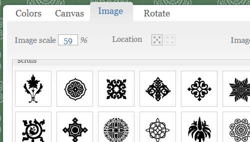
Use Icons in Tab Controls to Create Visual Context for Pane Content
Using relevant icons that portray the content within the module tab panes is a great way of enhancing tab control context.
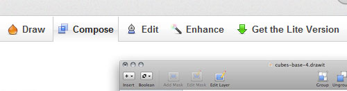
For example, in DrawIt, icons are used to add more context to what panes will contain.
When using icons to enhance tab controls, make sure they are relevant; do not use icons solely for visual merits, which can counteract their purpose of improving content scanability and recognition.
Avoid using icons to substitute tab control text because symbols can mean different things to different people - the safest bet is using plain text to describe pane information.
Use Animation for Transitioning Between Panes
Using an animation effect when transitioning to another pane can be a great way to provide visual feedback that the active pane has changed.
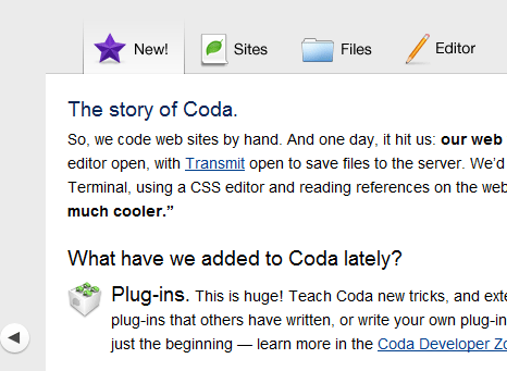
For example, in the Coda website, clicking on a tab control slides the panes left or right to reveal the requested pane content.
Implement a Hover State for Inactive Tab Controls
Let users know that they can click on tabs by changing the mouse cursor property to a pointer. By default, this happens when users move their mouse cursor over hyperlinks, but you should make sure that this also happens when entering a tab control.
In addition, it’s a good idea to change the tab control color of inactive tabs when the mouse cursor is brought over them. This can be useful in sites that attract new computer users who may be unfamiliar with module tabs interaction.
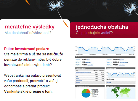
In the following example, Vyniknite.sk highlights inactive tabs with a red background when you mouse over inactive tab controls.
Examples of Module Tabs in Web Design
Now that we’ve explored module tabs in detail, it’s time to see various real-world examples of module tabs in action. In this section, we present some examples of module tabs for inspiration and analysis.
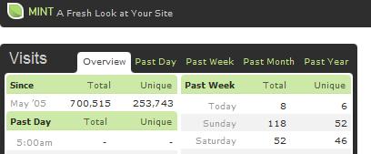
Haveamint.com
This site implements multiple module tabs in their front page to display a large quantity of information.
Yahoo!
Yahoo! applies module tabs in its front page to compress and modularize content and information.
iGoogle
In iGoogle, wigets can use module tabs so that they can contain plenty of information without taking up a lot of screen space.
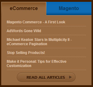
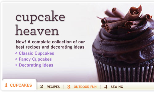
Blue Acorn
Blue Acorn uses module tabs to display the site’s popular articles, categorized into the topic of “eCommerce” and “Magento”. The module tab also contains a call-to-action button in case users want to see the site’s full list of articles.
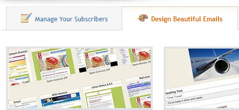
MailChimp
On this site, you can see the use of icons to improve the context of module tab text.
WebNotes
On the WebNotes site, they position the tab controls below the pane area and performs an animated fade-out/fade-in effect when transitioning in between panes.
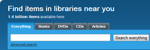
WorldCat.org
WordCat.org uses tab controls for its site search feature so that you can narrow down your search to particular types of media (such as books, DVDs, or articles).
Martha Stewart
In the Martha Stewart website, you can see them use a module tab for featured content. The module tabs have animated transition in between panes and an auto-play feature for hands-free navigation through panes.
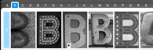
Krista’s Creations
Krista’s Creations have module tabs with graphical pane information; the tab control text are letters of the alphabet.
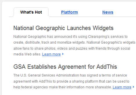
Clearspring
Clearspring exhibits module tabs with high response times and is a good example of a classic module tab implementation.
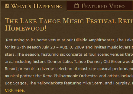
Homewood
In the website of Homewood, you can see them implement tab controls with icons to enhance context.
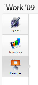
Apple - iWork<br /iWork uses singular, columnar-oriented tab controls (often referred to as “stacked tabs” or side tabs”) with icons to help users gain visual context.
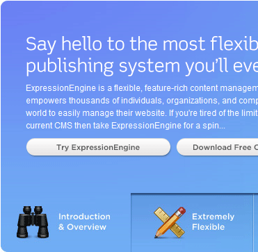
ExpressionEngine
The ExpressionEngine site has the tab control area positioned at the bottom of the pane area and is a great example of fast-loading panes and responsive pane-switching.
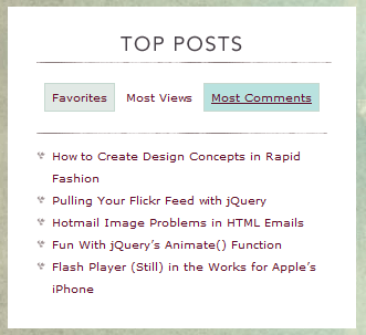
Viget Inspire
Viget Inspire has a module tab for its most popular posts; the module tabs have a fade-in/fade-out animation effect transition and accommodates panes with longer pane information by variably adjusting the pane’s height.
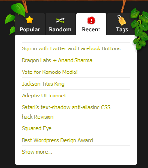
Komodo Media
Komodo Media uses module tabs with icons on top of the tab control text.
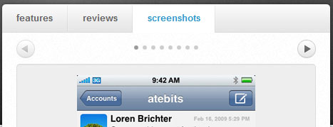
atebits
atebits presents information about the product in module tabs, showcasing the pattern’s effectiveness in being able to contain a lot of information in such a small space.
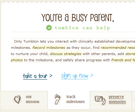
Tumblon
Tumblon positions its tab controls below the pane area and exemplifies fast-response pane switching. A negative of the module tab implemented on the site is that it may not have sufficient contrast between active and inactive tab controls.
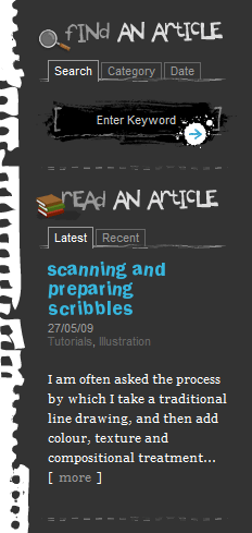
kevadamson.com
In Kev Adamson’s website, you can see several module tabs in the site’s right-hand sidebar. To provide distinction between module tabs, the site uses headings with relevant icons, giving users improved contextual recognition on what each module tabs may contain.
Tutorials on Creating Module Tabs
There are many tutorials that show you how to build and implement the module tabs interface into sites. Below, we’ll go through some top-notch tutorials that you can review to learn more about the pragmatics of using module tabs.
Building Tabbed Content
By reading through this beginner-level tutorial, you can learn how to create a simple module tab that uses the Prototype JavaScript Framework.
Create A Tabbed Interface Using jQuery
Dan Harper walks readers through a method for constructing module tabs powered by the jQuery library in this Nettuts+ tutorial.
Accessible Image-Tab Rollovers
Learn how to create accessible tab controls applied for navigation tabs that can be easily adapted to module tabs in this tutorial at SimpleBits.
Create a Slick Tabbed Content Area using CSS & jQuery
Web/graphic designer and entrepreneur Collis Ta’eed walks readers through the creation of a module tab that has animated transitions in between panes.
Scripts for Module Tabs
If you’re in search of pre-made scripts for quickly employing module tabs into your website, here are some free solutions.
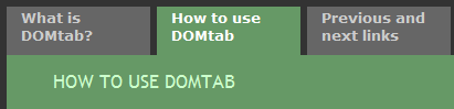
DOMTab
DomTab is a popular a script for easily creating module tabs; it transforms ordinary lists of links into a tabbed interface.
JavaScript Tabifier
This plug-and-play JavaScript from BarelyFitz Designs permits you to quickly implement a tabbed interface into your website; it gracefully degrades under the JavaScript off scenario.
TabView
TabView is a component of the YUI Library that you can utilize to reduce the need to create the code and graphics for module tabs, instead opting for this prepackaged solution.
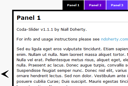
Coda-Slider
Coda-Slider is a script inspired by Coda’s module tabs which have panes that slide horizontally to transition to new active panes. It has alternative navigation controls on the left and right side of the content area so that you may access pane information without clicking on its corresponding tab control.
idTabs
idTabs is a straightforward plugin for jQuery users. It has a robust set of options and features to make simple to more complex module tabs interaction.
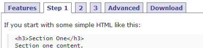
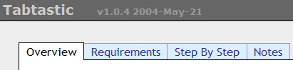
Tabtastic
This JavaScript library is for implementing a simple module tab interface. Read the Step by Step pane for instructions on how to use the script.
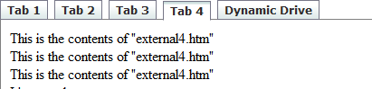
Ajax Tabs Content
For dynamic and remote data, you can use Dynamic Drive’s Ajax Tab Content script to allow for pane information that is asynchronously refreshed when requested.
Carousel - Module Tabs
This module tab script is a simple but highly-configurable script that enables animation and auto-play.
Related Resources
If you liked this article, you should consider reading the following related content on Smashing Magazine:


