Welcoming And Informative Introductions In Web Design

Email Newsletter
Weekly tips on front-end & UX.
Trusted by 182,000+ folks.
 Register for Free
 Custom Web Forms for Angular, React, & Vue. Your backend.

 Celebrating 10 million developers
Using an introduction has several benefits. The first is that introductions can coax the user further into the website. If the introduction is colorful, well-designed and has a good title, the user will be interested in the rest of the content. The other advantage is that you can provide quick information about your business or website to new users.
You might be interested in the following related posts:
- Best Practices For Effective Design Of “About me”-Pages
- What You Need To Know About Anticipatory Design
- What Is User Experience Design? Overview, Tools And Resources
Where To Use An Introduction
You will most often see introductions on general corporate pages. These companies could be selling anything from hardware to services. The introduction offers quick information about the company and its services and entices the user to navigate deeper into the website. You can even see this technique used on pages for non-profit organizations.
Freelance/Studio Websites
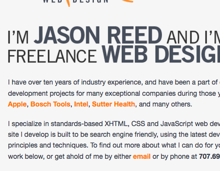
You will also notice these introductions on the websites of freelancers more often than not. These introductions generally include some sort of welcome in large typography with the designer’s name. Then below is usually a description of the designer that is a few sentences long. There is often a link to a longer description below that.
In the personal portfolio below, you can see this technique in action. At the top is a single sentence with the freelancer’s name and title. Then below is a brief description of the designer, including his experience, clients, knowledge, skill set and more.
Software and Application Websites
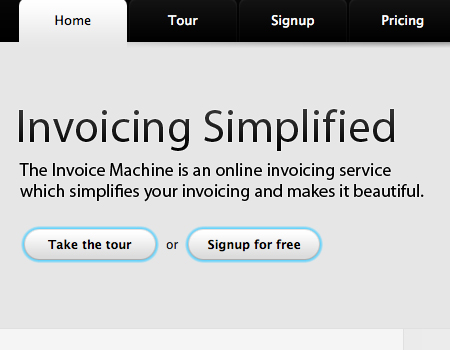
You will also see introductions on websites that promote software and applications. In these cases, the introduction gives quick information about the software, explaining what it does and its top features. These introductions almost always include a graphical element of some sort, usually an illustration or logo for the software, but sometimes screenshots in the case of Web applications. Directly below that, you will often find a button or two linking to the download or purchase page.
Here’s a website for a Web application that includes an introduction. The first thing you see is the large typography, which immediately grabs the user. The user sees this first, then their eye is guided to the sentence below, which provides more information. Next are two buttons: one for a tour, which gives the user more information, and the other to sign up. You can’t see it in the screenshot, but an illustration is next to the text that grabs and intrigues the user visually.
The Layout And Components
Web design is about layout first and foremost. So, this next section goes over the layout of the introduction and the elements included in it.
Text with Hierarchy
Every good introduction contains some sort of textual content, including information about the content on the page. This text is usually made up of two parts, different in hierarchy: a title and an informative paragraph.
1. The “Grabber” Title The first part you see is the title, which should immediately grab you. Titles are usually very large and styled different than the rest of the typography, so they stand out and become a focal point for users. When an introduction is included on a page, it is the very first thing users see, so its title has to be informative and intriguing enough to pull users into the website.
2. The Informative Copy The copy (text) is usually a brief paragraph below the title. You can’t fit a whole lot of information in the header, so you need to provide this paragraph below the title that gives users more information about the page and its contents.
Graphical Element to Grab the User
The title and other copy in the introduction should grab users and make them feel compelled to take action, but you should also add an attractive illustration or background to entice the user further. Take the screenshot below, for instance, which has a colorful and detailed illustration that quickly grabs the user. You can see the large title and brief information to the left. The copy is the first element users see, and then their eyes move over to the illustration. The background is vivid and colorful, which helps add light to the entire website, thus attracting the user. The illustration and text have plenty of space between them, which makes the overall layout of the introduction cleaner and more readable.

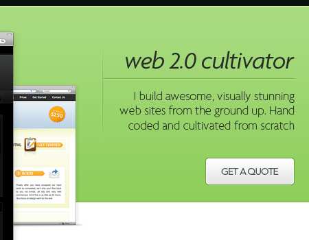
Buttons to More Information/Sign Up
One final element that is usually a part of the introduction is a set of buttons. On corporate product websites, these buttons generally link to product information pages, sign-up/log-in pages, purchase pages or trial pages in the case of software. These buttons help you convert users into customers and thus profit more from your website.
On the portfolio website below, the introduction includes a button that brings potential clients to the contact page to get a quote, making it easier for them to enlist the services of the designer.
How the Introduction Fits Into the Page Layout
So far, we’ve gone over the layout of the introduction itself. Now, let’s see how to incorporate the introduction in the layout of the entire page.
The most common corporate pages include some sort of introduction in the layout. As an example, we’ll use the Envato corporate website (below). In this layout, the top-most element is the header, the dark area that contains the navigation and logo. Next up is the introduction, which has a bright background that pops and provides a good contrast to the other sections of the layout. You really want your introduction to be the section of the website that stands out the most so that users see that area first.
One more note: Envato’s introduction has slight highlights above and below it. At the top, the highlight is a light green, and at the bottom it is a light-gray color. The highlights add extra pop and dimension to the introduction; these small details go a long way towards improving the visual experience of the user.
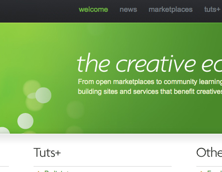
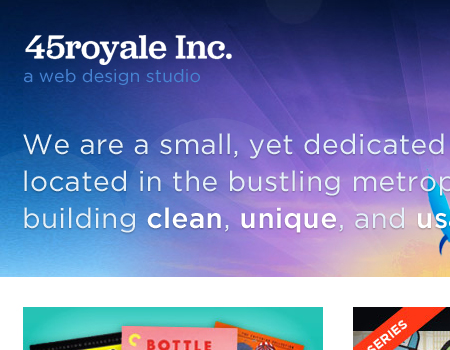
This next website below has a similar layout to Envato’s but doesn’t visually separate its header. In 45royale’s layout, the logo and navigation are one with the introduction. All of it is against the same background, which is another common layout style. Yet another example of a beautiful and attractive background that gets the user interested.
Showcase of Introductions
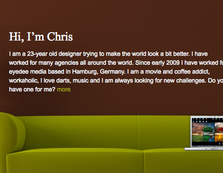
Chris Hortsch Here is a freelancer’s portfolio with a welcoming header that includes an informative paragraph about the designer. Graphical elements are also included to make the introduction more appealing to the eye.
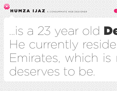
Humza Ijaz An example of a simple introduction. This one is simply text. The section extends to the full width of the page and immediately catches the user’s eye.
Aleandru Cohaniuc Here’s another nice introduction by a freelancer. This one doesn’t have the standard layout you see on other freelancers’ websites. The page layout is unique but still positioned at the top of the page and quite noticeable.
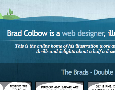
Brad Colbow This introduction isn’t contained in its own separate section, but it still flows very nicely with the design. The typography is large and the hierarchy is clear, which makes this introduction a good focal point.
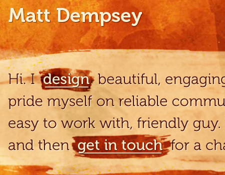
Matt Dempsey A well-styled portfolio introduction. The background has a brush texture with a different color so that the introduction copy pops. The typography is nice, and the links in the text are highlighted.
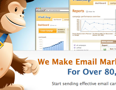
MailChimp Many graphical and textual elements are balanced in this one. The chimp illustration catches the user’s eye. The eye moves next to the text with information. And then the screenshots above give a better picture of the application.
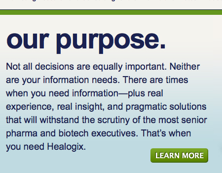
Healogix This introduction has a very large header with a paragraph below. This website is a good example because it has a button that the user can click to find out more information. The common “Learn More” is used here, which is the best phrase to use in a case like this.
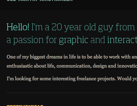
Ole Martin Kristiansen This introduction has two sets of copy. The first is a single sentence in large and colorful text. Then below are a few sentences that go into further detail about the designer.
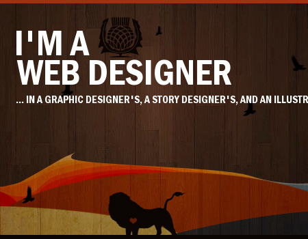
Nine Lion Design Very short and to-the-point introductory text, but with a beautiful illustration and perfectly matching background that attracts potential clients.
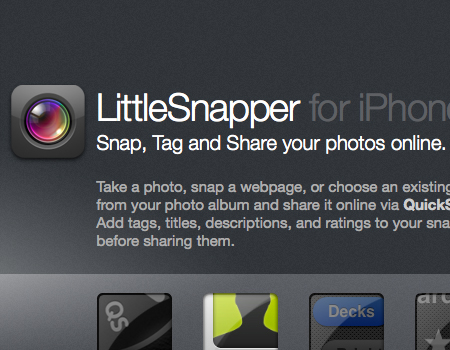
LittleSnapper for iPhone An introduction for an iPhone software website. Visually, the elements are mixed, and good typography is used for the text.
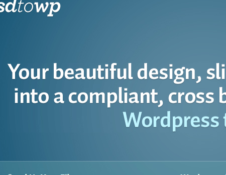
PSD to WordPress A very simple introduction. It is large, with a lot of space and little text, but it still looks very nice. The text is large and so is the first thing users see when they enter the website.
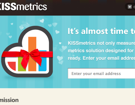
KISSmetrics This introduction has a standard corporate layout: very bright colors and visual elements that get users interested in the content. Also, an input area appears just below the text that lets users enter their email address to get updates.
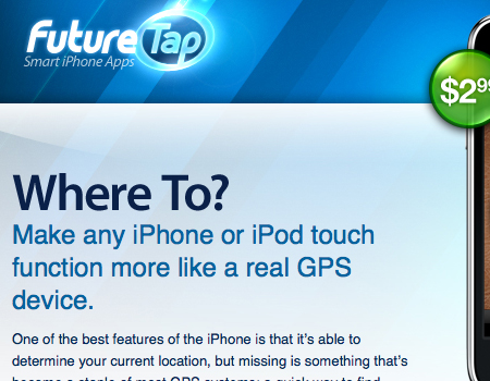
FutureTap This introduction is solely text. The header immediately grabs the user. It is large, and users are intrigued by the simple question.
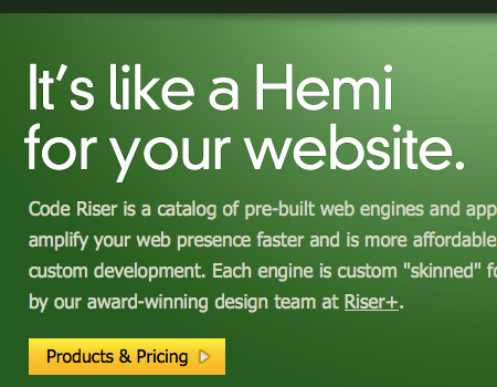
Code Riser A good introduction has to be clever, and this one certainly is. The header is interesting and gets the user interested. Text appears below to explain more, as does a link to the products and pricing.
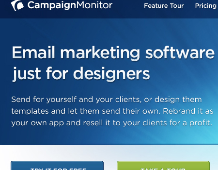
Campaign Monitor Another beautiful introduction with beautiful typography that is readable and clean. The background is colorful, and a screenshot provides visual information.
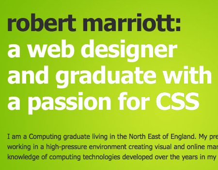
Robert Marriott The typography in this introduction is large, and the white text works perfectly against the green background. Below is a paragraph in gray, which pops less than the large white description.
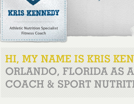
Kris Kennedy Another example of large typography used in an introduction. The background pattern separates it from the rest of the website.
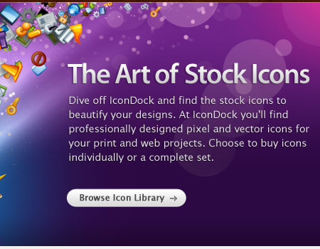
IconDock An extremely well-designed and colorful introduction. The website isn’t that colorful, so the bright introduction livens up the design. The typography, especially in the header, is clean, and the introduction features an extremely detailed and colorful illustration against a great background.
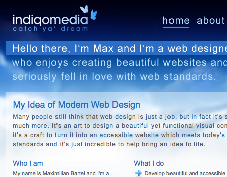
indiqo.media The majority of introductions we’ve seen so far are rather complex compared to this one. This one is very simple and just fits the layout. Notice how the first sentence in the copy is highlighted. Instead of using a large font size, the designer here uses background color to make the text stand out.
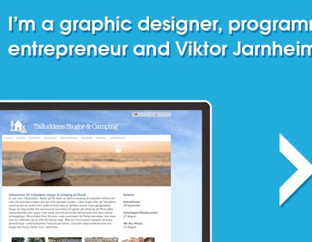
Viktor Jarnheimer This introduction is also a bit different in that it is only a single short sentence, with no extra visual elements. It is simple but still works perfectly in the context.
Francesco Mugnai Again, a unique introduction. Instead of giving direct information about the freelancer, this introduction has quotes. This gets the user interested and intrigued, more than a simple title would.
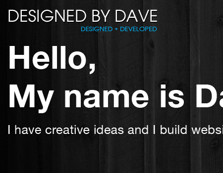
Designed by Dave A freelancer’s introduction with welcome text and the designer’s name in very large typography, which jumps off the page.
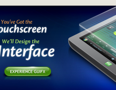
Guifx A beautifully illustrated and detailed design that immediately grabs the user’s attention. The title to the left is well-structured and flow nicely, and a link is included to help the user find more information.
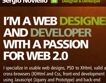
Sergio Noviello This separated introduction has classic typographic elements. A brief but large header with a longer and more informative paragraph below.
Pixelcraft This is a sliding introduction. Each slide contains text and a visual to support the text. The introduction has a different color and a defined border to make it stick out.
![]()
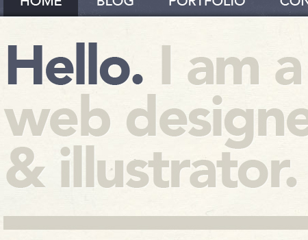
Matt Hamm Another very simple introduction, containing only large typography. Also, the “Hello” is very bright compared to the rest of the text.
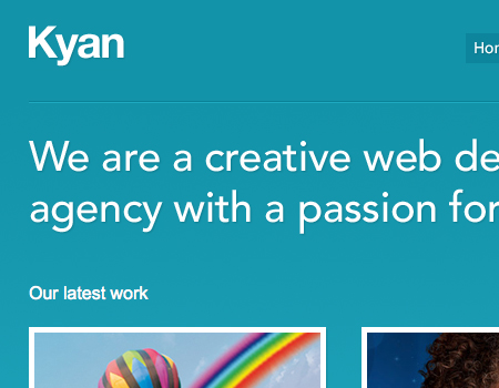
Kyan Media Yet another simple introduction, with only text. I included this one to show the bevel that separates the navigation and header above from the introductory text below.
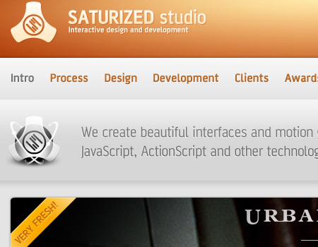
Saturized Studio A subtle and simple introduction that gives quick information about the studio and what it does.
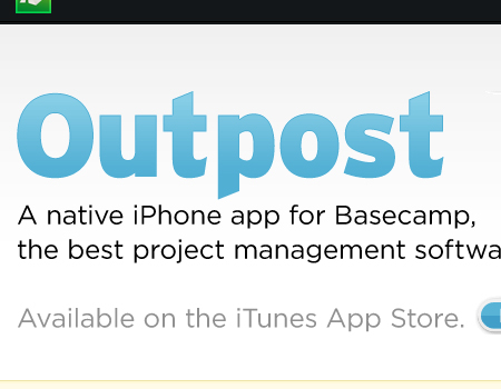
Outpost Another iPhone application website. The large blue text just pops out at the user.
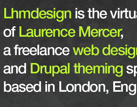
Laurence Mercer The typography here is very large. Important keywords are highlighted in the introduction as focal points for the visitor.
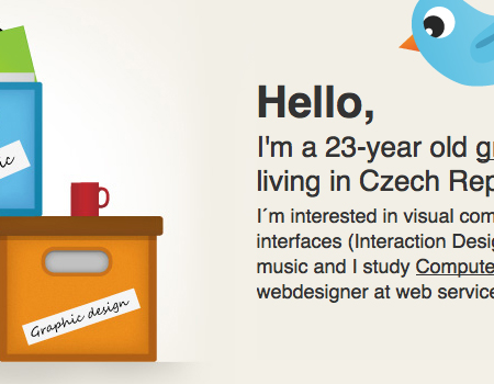
Pavel Maček Another good example of typographical hierarchy in the introduction. This one has three levels of hierarchy. Also, multiple illustrations are used, which looks great.
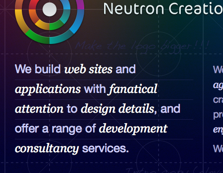
Neutron Creations The copy here fits perfectly in the grid layout. The text is nicely styled, and again focal points are used.
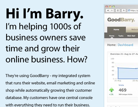
GoodBarry Hierarchy works well here. The welcome text is large and gets the user to read more. A screenshot provides a preview of the application.
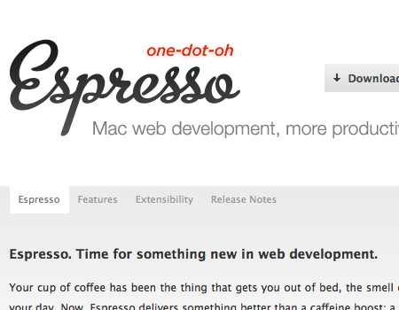
Espresso This header is nice, and below a quick sentence is added. Again, a graphical element is included, this one a beautifully illustrated coffee mug that evokes the name of the company.
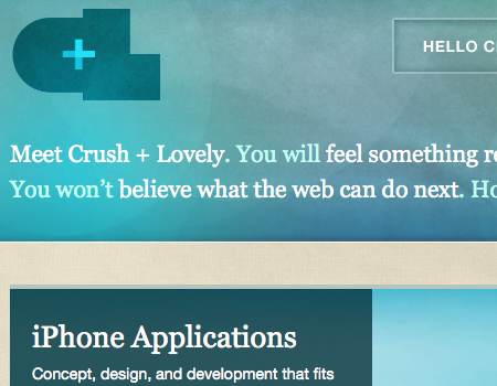
Crush + Lovely Nicely highlighted text against a masterfully textured background.
Clearleft The header really sticks out here and is the perfect color for the rest of the website. Below, more information is included.
![]()
Paramore | Redd A simple, quick header with brief information in this introduction.
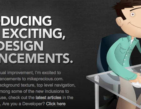
Mike Precious This header is clean and just right for the website. The illustration to the right is perfect and does its job in attracting visitors.
Further Resources
Area for further articles and related resources.


